ADVERTISEMENT

Design exists to solve problems—functional ones, aesthetic ones, or both. But sometimes, instead of improving things, it creates even more problems than it fixes. And if you need proof, just look at this subreddit dedicated to design fails, where people share examples that are so bad, they almost circle back to being good.

Bizarre typos, baffling text placements, confusing instructions, questionable interiors, stairs that seem actively out to get you—it’s all here. Scroll down for the full parade and upvote the best ones. Or the worst ones. At this point, there may not be much of a difference.

#1

When You Skip The Typography Section Of Your Groupon Graphic Design Course

Sign outside a building with a creepy skull logo and stylized text, an example of terrible product design flaws.

xkelsx1 Report

Grape Walls of Ire
Community Member
13 hours ago Created by potrace 1.15, written by Peter Selinger 2001-2017

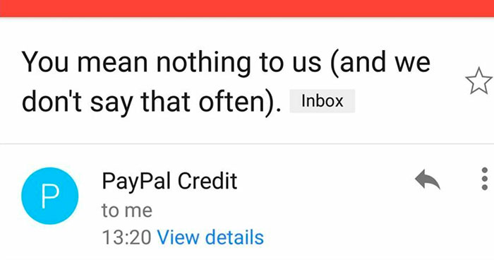
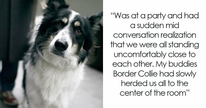
With all the divisiveness in the US, it's sure nice to have fart jokes as common ground.

View more comments
RELATED:
    #2

    Those Are Five Steps Or More

    Black and white patterned floor blending with stairs, creating a confusing and potentially hazardous product design flaw.

    g87a_l Report

    #3

    Long Invisible Steps

    Sidewalk with uneven and poorly aligned paving stones showing terrible product design flaws.

    roman_pokora Report

    Barbara Wilcock
    Community Member
    12 hours ago Created by potrace 1.15, written by Peter Selinger 2001-2017

    Why do I have 2 broken ankles looking at this

    View more comments
    #4

    It's Like A Fun Maze For Blind People!

    Sidewalk with tactile paving designed for the visually impaired blocked by metal poles, a terrible product design fail.

    BinaryBible Report

    V
    Community Member
    11 hours ago Created by potrace 1.15, written by Peter Selinger 2001-2017

    Is it bad that I hear Benny Hill music when I see that...

    View more comments
    ADVERTISEMENT
    #5

    The Place I’m Staying Has Running Water On Top Of A Cabinet That Doesn’t Have A Sink

    Faucet placed directly over tissue box making it unusable, showing one of the terrible product designs in a bathroom setup.

    Carrmann Report

    Snackmachine
    Community Member
    Premium
    13 hours ago Created by potrace 1.15, written by Peter Selinger 2001-2017

    I'm going to be thinking about this for longer than I should

    View more comments
    ADVERTISEMENT
    #6

    Grocery Store Barcode Scanner Was Scanning Its Own Advertised Barcode, So They Had To Cover It With Permanent Marker

    Checkout scanner stand with confusing design causing terrible product design issues in a retail store environment.

    Troner892 Report

    #7

    This Building's Billboard Lights Point Straight To My Bedroom

    Cityscape at night with illuminated buildings and trees, showcasing lighting as a terrible product design example.

    Correct_Win_7396 Report

    #8

    The Woman Was A Man. And The Girl Was An Adult

    A camera on a tripod recording a mother and daughter baking together, illustrating terrible product designs.

    wtclover Report

    Luke || Kira (he/she)
    Community Member
    7 hours ago Created by potrace 1.15, written by Peter Selinger 2001-2017

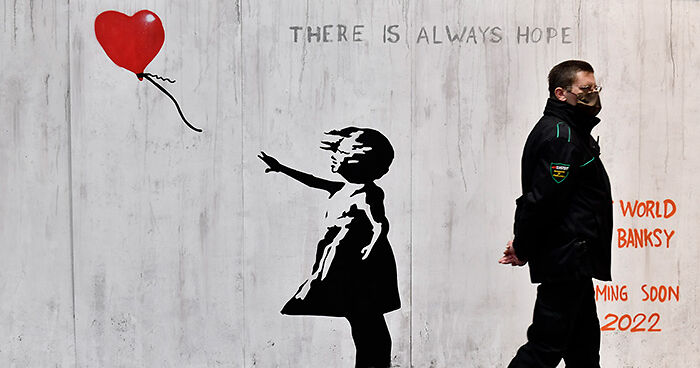
    The camera looks into the future where the girl grew up and the father happily transitioned

    View more comments
    ADVERTISEMENT
    #9

    Transparent Sticker With Writing On Mirror

    Hotel bathroom mirror with housekeeping notice partially covering reflection, an example of terrible product designs.

    Majestic_Phase3452 Report

    Made You Look
    Community Member
    6 hours ago Created by potrace 1.15, written by Peter Selinger 2001-2017

    The stupidity of this idea is clearly reflected

    View more comments
    ADVERTISEMENT
    #10

    Half Of The Dosage Instructions For Persil Washing Powder Are Printed On The Strip You Tear Off To Open The Box

    Two boxes showing terrible product designs with confusing packaging and unclear usage instructions for eco-friendly laundry detergent.

    fearville Report

    Tobi Ornot
    Community Member
    4 hours ago Created by potrace 1.15, written by Peter Selinger 2001-2017

    They are optimistic about our memory skills.

    View more comments
    #11

    I Know It Is Sold By Weight, And Contents May Settle ... But Maybe It's Not The Best Idea To Put The Clear Window In The Middle Of The Package?

    Grocery shelf with poorly designed chip bags featuring a large transparent window that makes the bag look empty.

    Pale-Lynx328 Report

    #12

    Coasters From A Local Designer, But The Sand Is Elevated So The Cups Fall Off

    Set of three round tables with ocean wave designs and rough textured surfaces, showcasing terrible product designs.

    Ecstatic-Yak-6016 Report

    Alexia
    Community Member
    5 hours ago Created by potrace 1.15, written by Peter Selinger 2001-2017

    I have similar-design coasters, they look beautiful but the margins are elevated, so the cup is unstable and may fall 😄

    View more comments
    ADVERTISEMENT
    #13

    This "Sudoku" Christmas Tree Decoration Is Clearly A Bingo Card

    Hand holding a terrible product design ornament of a glittery Sudoku game with an oversized pencil attached.

    Conorcat Report

    ADVERTISEMENT
    #14

    Watched A Dozen People Try To Push This Door Open Today During Brunch

    Outdoor café seating with a poorly designed door placement blocking easy access and causing inconvenience for customers.

    Full disclosure: I tried to push it open, too. The push plate was not a push plate, the door handle is on the right. All they have to do is spray paint that plate black to fix the issue. 

    Literally every customer who came in pushed the wrong side initially. And to top it off, every sticker and sign on the door is symmetric so there's no hint for which side of the door opens!

    Best banana bread pudding French toast in the world, though, so I forgive them.

    Illustrious_Can_1656 Report

    #15

    Instruction Manual References Parts By Diagram Number, But Diagram Isn’t Labeled

    Diagram of a sprayer with components and operation instructions highlighting product design flaws.

    TRB4 Report

    R Dennis
    Community Member
    5 hours ago Created by potrace 1.15, written by Peter Selinger 2001-2017

    I just put together a popcorn machine with a cart. It had stickers on each piece, but they don't correspond to the instructions (Parts 6-12, but stickers 15-21). After putting it together, 6-12 were stamped on the edges of the part, but hard to see under the powder coat paint.

    View more comments
    ADVERTISEMENT
    #16

    Which Way To Temple 38? Or Group F? Took Me Half A Day To Figure Out That These Signs Are Both Pointing Straight Ahead

    Wooden forest trail sign with confusing design pointing to Temple 38 and Group F, illustrating terrible product designs outdoors.

    -davros Report

    LizzieBoredom
    Community Member
    4 hours ago Created by potrace 1.15, written by Peter Selinger 2001-2017

    This is what happens when the guy in charge of making arrows doesn't get a raise.

    View more comments
    #17

    Stairway To Heck

    House with poorly designed brick stairs that block access to the front door, an example of terrible product design.

    Catalina_whine_fixer Report

    Bob Bob
    Community Member
    12 hours ago Created by potrace 1.15, written by Peter Selinger 2001-2017

    You're meant to dive through the window

    View more comments
    #18

    The Buttons To Change Temp On My Fridge

    Refrigerator temperature control panel showing unclear cold and colder settings with confusing design buttons.

    MrNobodyX3 Report

    #19

    Record Label Sumerian Records Uses An Image Of The Sphinx

    Sumerian Records logo featuring a stylized Sphinx and pyramids highlighting terrible product design elements.

    Time4Homework Report

    Kira Okah
    Community Member
    9 hours ago (edited) Created by potrace 1.15, written by Peter Selinger 2001-2017

    Should have used a Lamassu (I know that name is Akkadian, the Sumerian currently escapes me), though I know most people don't have a clue what one is.

    View more comments
    ADVERTISEMENT
    #20

    Bathroom And Kitchen Combined

    Small bathroom with unclear shower partition and kitchen appliances visible, showcasing terrible product design flaws.

    JopeliH Report

    Toujin C'Thlu
    Community Member
    13 hours ago Created by potrace 1.15, written by Peter Selinger 2001-2017

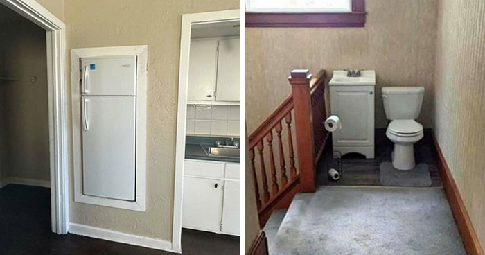
    Even the cheapest studio apartments have a separate kitchen and bathroom

    View more comments
    #21

    My Soul Just Fell Down These Stairs

    Steep stairs with an illogical design and mismatched carpet pieces illustrating terrible product design flaws.

    NerdyBirdyAZ Report

    #22

    This Promotional Shot Makes It Look Like The Pump Is Malfunctioning And Causing Major Leakage

    Vitamin C Complex Serum bottle leaking sticky liquid, illustrating one of the terrible product designs.

    yaamen Report

    #23

    This TV That Is Way Too Far From The Bed And Obscured By The Wardrobe @ A Scotland Hotel

    Cozy attic bedroom with slanted ceilings, a sleeping dog on the bed, and visible terrible product design elements.

    headshotpaul Report

    ADVERTISEMENT
    #24

    My Local Park Benches Made Of Stainless Steel. Too Cold To Sit On In Winter, Too Hot To Sit On In Summer

    Metal bench with uneven seating bars creating an uncomfortable design flaw, an example of terrible product designs.

    TheHyperFlame Report

    Kali Chaos
    Community Member
    13 hours ago Created by potrace 1.15, written by Peter Selinger 2001-2017

    Because making it even harder for the unhoused to survive is a totally righteous hill to die on /s

    View more comments
    #25

    Austrian Elevators Are Hard To Understand

    Elevator control panel with confusing button layout and unclear labeling, example of terrible product designs.

    Austrian_printer Report

    Jihana
    Community Member
    14 hours ago Created by potrace 1.15, written by Peter Selinger 2001-2017

    It's hard to read, but it seems to be an elevator in a hospital. The signs tell you which wards are on which floor.

    View more comments
    ADVERTISEMENT
    #28

    Eye Drop Bottle Does Not Note That It Is Eye Drops

    Small eye drop bottle with confusing label showing the number 8 instead of the letter B, a terrible product design flaw.

    gachunt Report

    Made You Look
    Community Member
    6 hours ago Created by potrace 1.15, written by Peter Selinger 2001-2017

    These are not eye drops, they are 8-symptom relief drops

    View more comments
    #29

    Safety Is Chimney Check Your Clean

    Jamesville Fire Department outdoor sign with digital display showing chimney safety message in daylight setting

    JshWright Report

    Slop Generator
    Community Member
    13 hours ago Created by potrace 1.15, written by Peter Selinger 2001-2017

    "Safety Is Chimney" is a safety concept I've never been familiar with

    View more comments
    #30

    The Button For The Third Floor Is Located At The Very Top Of The Elevator Panel

    Elevator panel with floor buttons, including an unusual 3rd floor button placed above rows of higher floors, terrible product design.

    [deleted] Report

    Slop Generator
    Community Member
    13 hours ago Created by potrace 1.15, written by Peter Selinger 2001-2017

    the builders forgot the third floor during construction and had to put it on top of the building when it was almost done

    View more comments
    #31

    No Room To Store The Wrench That Comes Outside The Plastic Container As Demo

    Poorly designed toolset with a wrench awkwardly strapped to yellow plastic case, an example of terrible product designs.

    cimocw Report

    ADVERTISEMENT
    #32

    The Words On The Display Of The Marzipan Museum In Germany

    Close-up of a product with a dense pattern of irregular black shapes on a yellow background, showing terrible product design.

    CottonPendulum Report

    #33

    This Mailbox Speaks For Itself

    Metal mailbox with confusing signage warning of garbage behind, an example of terrible product design fails.

    muppetcowboy Report

    #34

    Imagine The Logistics And The Cleaning

    Toilet covered with elaborate lace and fabric, showcasing one of the terrible product designs that should have never seen the light of day.

    Alpoh1502 Report

    Otto Katz
    Community Member
    13 hours ago Created by potrace 1.15, written by Peter Selinger 2001-2017

    How dare you insult me on the day of my daughter's quinceanera???

    View more comments
    #35

    It's Pepper, It's Red, But We Decided To Assign Red To The Cheese

    Packets of crushed red pepper and grated Parmesan cheese on a cluttered countertop with poor product design.

    morgred13 Report

    Kira Okah
    Community Member
    10 hours ago Created by potrace 1.15, written by Peter Selinger 2001-2017

    That parmesan packet in this picture is purple, not red. Even looked up the brand to make sure, it's definitely purple.

    View more comments
    ADVERTISEMENT
    #36

    Nothing Says "Buy Our Seed" Like 50% Of The Ear Being Undeveloped

    Packaging design showing a realistic ear of corn that could confuse shoppers, an example of terrible product designs.

    McChiser Report

    #37

    This Was Not A Fun Experience

    Toilet installed in a cramped bathroom with awkward angled wall and shower enclosure, showcasing terrible product design.

    Atkinator1 Report

    UnclePanda
    Community Member
    Premium
    4 hours ago Created by potrace 1.15, written by Peter Selinger 2001-2017

    All the comforts of an airline loo at home!

    View more comments
    #38

    Drano Suggests To Use 1/3 Of A Bottle, But Markings On The Side Are In 1/4 Increments

    Drain cleaner bottle with unclear measurement markings, an example of terrible product designs causing user confusion.

    acherion Report

    Bill Swallow
    Community Member
    14 hours ago Created by potrace 1.15, written by Peter Selinger 2001-2017

    This is gonna be great for all those morons who were certain that a 1/3 lb burger was smaller than a 1/4 lb burger.

    View more comments
    #39

    This Birthday Plate Where The Balloon Strings Just Look Like Hair

    Partially eaten cake with thick frosting on a festive paper plate and a blue plastic fork, example of terrible product designs.

    FtMFandomBoy Report

    nomnomborkbork
    Community Member
    1 hour ago Created by potrace 1.15, written by Peter Selinger 2001-2017

    All I'm focused on is that huge piece of cake with all that icing! Yum!!

    View more comments
    ADVERTISEMENT
    #40

    Page Folds On Africa In Global Hunger Map In My Textbook

    Open book showing a global map with color-coded regions, illustrating data on hunger as a terrible product design example.

    Xancrim Report

    Glix Drap
    Community Member
    Premium
    5 hours ago Created by potrace 1.15, written by Peter Selinger 2001-2017

    At least New Zealand is shown.

    View more comments
    #41

    Wear No Clothes Sign Is Actually A Penalty Warning

    Street scene with a sign showing a confusing product design about clothing rules and penalties in a public area.

    Flintloq Report

    Laszlo Larthlanc
    Community Member
    5 hours ago Created by potrace 1.15, written by Peter Selinger 2001-2017

    Where was people wearing no clothes on the street a problem?

    View more comments
    #42

    I Guess We Dont Need Spacing Between Go On

    Green witch illustration on a container with the phrase "You're Free," showcasing a terrible product design fail.

    Blue_Storybook Report

    #43

    I’m No Dogologist But…

    Plush toy holding a heart with mismatched text, illustrating terrible product designs in a retail store setting.

    Blackbyrn Report

    Daya
    Community Member
    12 hours ago Created by potrace 1.15, written by Peter Selinger 2001-2017

    A scottish lad who loves puppies, obviously!

    View more comments
    ADVERTISEMENT
    #44

    Apparently This Is A Promo For A Writer's Festival

    Confusing calendar design with misaligned text and scattered stars, showcasing a terrible product design fail.

    simsimdimsim Report

    Mrreoww
    Community Member
    10 hours ago Created by potrace 1.15, written by Peter Selinger 2001-2017

    I think the person who designed this should have themselves checked out.

    View more comments
    #45

    A Playground Where You Can Get Burned In Summer

    Large metal playground slide with a burn risk warning label, illustrating terrible product design safety issues.

    Sarahsurlalune Report

    Spidercat
    Community Member
    12 hours ago Created by potrace 1.15, written by Peter Selinger 2001-2017

    Just like the 80s when any decent adventure playground came with an element of danger or dêath...

    View more comments
    #46

    Hip-Pinching Chairs: I’m A Skinny Guy & These Bang Into My Hip Bones. How Can They Possibly Be Comfortable For Anyone Wider?

    Black metal chair with a broken backrest design, an example of terrible product designs in a café setting.

    carlcrossgrove Report

    Grace Sssssss
    Community Member
    12 hours ago Created by potrace 1.15, written by Peter Selinger 2001-2017

    YES I hate these chairs. I've just got to slouch, sigh

    View more comments
    #47

    These Leviton Switches Have Raised Lettering That Love Gathering And Keeping Dirt In Them

    Three white light switches with identical design creating confusion in terrible product designs that should have never seen the light.

    samureyejacque Report

    ADVERTISEMENT
    #48

    On The Mcdonalds’ Monopoly Game They Removed The ‘Go To Jail’ Character’s Whistle But Left His Cheeks Blowing

    Hand holding a McCafé coffee cup with a confusing design showing a man holding a tiny coffee cup illustration.

    SilverApples Report

    LakotaWolf (she/her)
    Community Member
    Premium
    12 hours ago Created by potrace 1.15, written by Peter Selinger 2001-2017

    He's ... blowing on his hot coffee... cup... to cool it down... yeah, that sounds about right XD

    View more comments
    #49

    Do You Want A Zero Protein Diet? Look No Further

    Protein wafer packages with confusing labeling and similar designs causing a terrible product design issue on the shelf.

    Kayonji02 Report

    Kira Okah
    Community Member
    9 hours ago Created by potrace 1.15, written by Peter Selinger 2001-2017

    Saw this before, looked it up. Zero is the product name of the wafer, it really needs to be separated more on the packaging.

    View more comments
    #50

    Weird 90° Power Supply Plug That Doesn't Have Enough Clearance To Fit Correctly Into The Intended Outlets. Need To Buy An Extra Cable To Use It

    Power adapter plugged into a wall socket at an awkward angle, showcasing terrible product design flaws.

    DrCyb3r Report

    #51

    This Balloon Is 26 Inches Wide. That Is Neither 2 Feet Or 1 Person Tall

    Starburst Balloon product design showing a pink spiky balloon and human size comparison in centimeters and feet.

    [deleted] Report

    Ripley
    Community Member
    12 hours ago Created by potrace 1.15, written by Peter Selinger 2001-2017

    26" is pretty close to 66cm, so they more or less got that right. But that's not 2', and wow, that dude is really short.

    ADVERTISEMENT
    #52

    Outdoor Boot Bag For Skiing Pockets Don’t Close So Snow And Rain Can Get In

    Close-up of a black backpack with defective zipper design showing zipper pullers that cannot properly close.

    DarkThunder312 Report

    #53

    I Was Wondering Why My Niece Always Zones Out Halfway Through While Counting On This Toy, Until I Noticed

    Foam puzzle pieces with numbers arranged incorrectly showing a terrible product design flaw in children's educational toys.

    d-the-luc Report

    #55

    My Pants Pockets Are Only As Deep As The Bottom Of The Opening, So Anything I Put In Them Will Fall Out

    Plaid shirt with a pocket design flaw where a black wallet is partially hidden, illustrating terrible product designs.

    Knopes Report

    ADVERTISEMENT
    See Also on Bored Panda
    #56

    What Was Even The Plan Here?

    Metal handrail with a sharp bend blocking access to stairs, illustrating terrible product design flaws in public spaces.

    Mundane-Low7125 Report

    #57

    Our Small Shopping Centre Has Really Good Direction Signs

    Faded and barely visible building directory sign showing poor product design and usability issues.

    longitudinisx Report

    Batwench
    Community Member
    Premium
    4 hours ago Created by potrace 1.15, written by Peter Selinger 2001-2017

    It looks like one that should have lights in the sides to illuminate the etchings. However, these seem to be missing.

    View more comments
    See Also on Bored Panda
    #58

    Public Notice Where The Font Is The Main Obstacle To Being Informed

    Public hearing notice sign with confusing text layout, illustrating one of the terrible product designs that should have never been made.

    Pitiful-Bluebird7951 Report

    ADVERTISEMENT
    See Also on Bored Panda
    #59

    The Wear On This Sticker Where People Have Pressed It Instead Of The Actual Functioning Button

    Door with confusing lock and open instructions using red and green touch sensors, illustrating terrible product designs.

    NewNiklas Report

    David Paterson
    Community Member
    11 hours ago Created by potrace 1.15, written by Peter Selinger 2001-2017

    Our local toilets have the same problem. What looks like a button is a label. What is actually a button looks like a naff decoration.

    View more comments
    #60

    You Switch It Off By Positioning The Rod Exactly In The Middle, No Locking, Free Movement In Any Direction, Opposite To Switch It On

    Water faucet with poorly designed spout causing water to splash, shown as an example of terrible product designs.

    eXus_Nerubis Report

    LakotaWolf (she/her)
    Community Member
    Premium
    12 hours ago Created by potrace 1.15, written by Peter Selinger 2001-2017

    My mom installed a faucet just like this in the other bathroom in this house where I live. I hate it XD If you move the faucet rod one half-centimeter too far, the water temperature goes to scalding in an instant.

    View more comments
    #61

    Missing Numbers On Kids Height Measurement

    Height measurement chart shaped like a hand holding a ruler, an example of terrible product designs in public spaces.

    YourAverageRedRum Report

    Multa Nocte (she/her/86 47)
    Community Member
    Premium
    4 hours ago Created by potrace 1.15, written by Peter Selinger 2001-2017

    Is that a too small distance between 1000 and 1150 or am I reading that wrong?

    View more comments
    See Also on Bored Panda
    #62

    If You Ever Wanna Watch Yourself

    Toilet placed against a mirror causing a confusing reflection with toilet paper rolls in a poorly designed bathroom setup.

    superiorgarlic Report

    Bunny Wood
    Community Member
    14 hours ago Created by potrace 1.15, written by Peter Selinger 2001-2017

    Its the low down toilet paper in men's bathrooms that gets me...Who is this for? Tiny midgets? If so-where is the ladder to the flush button???

    View more comments
    ADVERTISEMENT
    See Also on Bored Panda
    #63

    My Family Took Me To The Titanic Exhibit For My Birthday

    Man posing in a Titanic artifact exhibition photo with ship background, showcasing terrible product design flaws.

    That_EngineeringGuy Report

    Peeka_Mimi
    Community Member
    13 hours ago Created by potrace 1.15, written by Peter Selinger 2001-2017

    I would love that but I'm a history nerd. I am going to take myself to the Colorado History Museum for my birthday.

    View more comments
    #64

    Three Different O Widths Hurts My Brain

    Signboard with poorly designed text layout showing Italian dishes, an example of terrible product designs in public advertising.

    tfowers Report

    LakotaWolf (she/her)
    Community Member
    Premium
    12 hours ago Created by potrace 1.15, written by Peter Selinger 2001-2017

    It's like running out of O letters on the outdoors billboard thingy and having to use zeroes, except someone did that intentionally in a computer graphic when they didn't NEED to XD

    View more comments
    #65

    H Wha Fun 🎀

    Red polka dot gift bag with a pink bow and misspelled holiday greeting showing terrible product design.

    7ofeggs Report

    See Also on Bored Panda
    ADVERTISEMENT
    See Also on Bored Panda
    #67

    Kids Lingerie 🤔 Not A Good Design

    Sign with confusing product design reading kids lingerie tasty café displayed on blue wall by staircase.

    slysam69 Report

    #68

    Sweet Home Home!

    Wooden tray with the misspelled phrase "Sweet Home Home" displayed among other home decor, a terrible product design example.

    Worldly-Return-9417 Report

    LakotaWolf (she/her)
    Community Member
    Premium
    12 hours ago Created by potrace 1.15, written by Peter Selinger 2001-2017

    Home Home, where Moon Moon the wolf lives XD

    View more comments
    #69

    Please Excuse The Mess Made, Memories Are Being

    Product design fail with a sign that confusingly says "please excuse the mess made memories," highlighting terrible product designs.

    Zendo7777 Report

    Phantom Phoenix
    Community Member
    Premium
    13 hours ago Created by potrace 1.15, written by Peter Selinger 2001-2017

    Please excuse the memories mess are being made

    View more comments
    #70

    The Elevator In This Brand New Parking Garage

    Elevator control panel with confusing button labels showing a terrible product design example from poorly made controls.

    Grsz11 Report

    Luke || Kira (he/she)
    Community Member
    7 hours ago Created by potrace 1.15, written by Peter Selinger 2001-2017

    Press them in a secret sequence and it'll take you to a parallel universe

    View more comments
    ADVERTISEMENT
    #71

    Ritz’s Guide To A Serving Size

    Nutrition facts and confusing serving size design on a food package, example of terrible product designs in packaging.

    Reddit-Sama- Report

    #72

    What Could Go Wrong! (Btw It’s Pitch Black Until You Hit The Light Switch)

    Red fire alarm, white switch, and green door opener stacked on a wall illustrating terrible product design and poor usability.

    Potential_Lock_5212 Report

    Tobi Ornot
    Community Member
    2 hours ago Created by potrace 1.15, written by Peter Selinger 2001-2017

    It´´s nice to can hear an overture outside by pressing a k**b.

    #73

    They Proudly Presented The New Logo Of The Austrian Football Association (Öfb)

    Abstract red geometric shapes and numbers with a modern design illustrating terrible product design concepts.

    Visual_Fold_7826 Report

    #74

    Apparently That's A 'C'

    Packaging for Gorilla Pin Her Pals toy with warning label, illustrating one of the terrible product designs.

    Firehydrnt Report

    ADVERTISEMENT
    #76

    This Odd One Out Puzzle Doesn't Have An Odd One Out!

    Puzzle showing acorns with a design flaw, asking which acorn is different, illustrating terrible product designs.

    easywrite Report

    Kira Okah
    Community Member
    9 hours ago Created by potrace 1.15, written by Peter Selinger 2001-2017

    A is the only one without a mirrored partner, does that count?

    View more comments
    #77

    Bathroom Of An Appartment I Was Viewing For Rent

    Small bathroom with a sink awkwardly overlapping the bathtub, showcasing terrible product design flaws.

    chaoze50 Report

    #78

    Because Potty Training Needs More Splatter-Producing Elements

    Green frog-shaped toddler urinal with a spinning wheel inside, an example of terrible product designs.

    parothed28 Report

    sofacushionfort
    Community Member
    13 hours ago Created by potrace 1.15, written by Peter Selinger 2001-2017

    There’s an idea for generating electricity there somewhere

    View more comments
    ADVERTISEMENT
    #79

    Mmmm Colour-Blind Simulator

    Halloween-themed connect four game with pumpkin tokens and ghosts, an example of terrible product designs.

    PotatoPotatoApple Report

    elianah howey
    Community Member
    2 hours ago Created by potrace 1.15, written by Peter Selinger 2001-2017

    For those who really can’t see it, its two different shades of orange

    View more comments
    #80

    Lunchbox Company Uses A Woman Making Juice To Show Their Product Is Hand Washable

    Bento box product being microwaved, hand washed, freezer safe with 40oz capacity and included flatware.

    PURPLZMM2 Report

    Fat Harry (Oi / You)
    Community Member
    8 hours ago Created by potrace 1.15, written by Peter Selinger 2001-2017

    And a woman looking in a regular oven to show it's microwave safe, AND a man looking in a FRIDGE to show it's freezer safe... almost none of it is correct.

    View more comments
    #81

    This Company’s URL Can Be Any Combination Of These Letters. Guess Which One It Is!

    Dent marks on white vehicle door with confusing circular logo and phone number, example of terrible product design fail.

    darlzC Report

    Slop Generator
    Community Member
    12 hours ago Created by potrace 1.15, written by Peter Selinger 2001-2017

    motplans-dot-com maintenance of traffic plans, signs, barricades.

    View more comments
    #82

    No Pain No Paizza

    Mug with confusing text design featuring pizza slices, an example of terrible product designs and poor creativity.

    Violet_Walls Report

    EmJay
    Community Member
    Premium
    13 hours ago Created by potrace 1.15, written by Peter Selinger 2001-2017

    If only pizza had a letter shaped like the slice.

    View more comments
    ADVERTISEMENT
    #83

    Regularly Updated Billboard Near My House

    Green utility box blocking a colorful outdoor advertising billboard, illustrating terrible product design placement.

    macdaibhi90 Report

    #84

    Good Luck Plugging Your Charger Into This Outlet On The Hungarian National Railway

    Close-up of a dirty, poorly placed electrical socket inside a narrow space, showcasing terrible product design flaws.

    GotHelpGiveHelp Report

    #85

    The Dice Shaker That Comes With Yahtzee Is Exactly Two Dice Wide And Has An Internal Edge That The Dice Constantly Get Stuck Behind

    Hand holding a poorly designed black dice shaker revealing dice inside, illustrating terrible product designs.

    Kimos Report

    Daya
    Community Member
    12 hours ago Created by potrace 1.15, written by Peter Selinger 2001-2017

    A traditional cup wasn't fancy enough? Or - and I know I will seen as crazy - use hands?

    View more comments
    #86

    Happy New Year Everybody!

    Gold-colored 2026 glasses with hollow lenses, showcasing a terrible product design flaw in the numbers and structure.

    Greainy Report

    ADVERTISEMENT
    #87

    This Bingo Card From The Female Lead That Was Definitely Designed By Someone Who Has Never Played Bingo

    Perimenopause bingo card with phrases illustrating symptoms in a colorful grid, showcasing terrible product design concept.

    haleylovesvirgil Report

    Nadine
    Community Member
    4 hours ago Created by potrace 1.15, written by Peter Selinger 2001-2017

    Exactly how I feel constantly ( all of them)

    View more comments
    #88

    The Pre-Cutting On The Paper LEGO Bags Is Pointless

    Hand holding a poorly designed perforated tape strip with uneven tearing, showing terrible product designs flaws.

    TomtomXDD Report

    Stygtand
    Community Member
    Premium
    12 hours ago Created by potrace 1.15, written by Peter Selinger 2001-2017

    The smal ones are annoying. The rip point is on the middle of the bag.

    View more comments
    #89

    In The Bathroom At A School I Work At…

    Wall decal with badly placed s***w separating the phrase never give up, showing a terrible product design fail.

    thatfood Report

    SCP 4666
    Community Member
    12 hours ago Created by potrace 1.15, written by Peter Selinger 2001-2017

    Never let down. Never run around. Never make cry. Never say goodbye. Never tell lie.

    View more comments
    #90

    The Emojis Make The A’s Look Like O’s

    Parking spots labeled for a café with confusing sign design contributing to terrible product designs visible outside the building.

    92233720368547758080 Report

    Gail Lott
    Community Member
    Premium
    12 hours ago Created by potrace 1.15, written by Peter Selinger 2001-2017

    Above the Doy Doy sign, is that "Eat Not Fat BBQ Doubtful Life" or "Fat Not Fat BBQ Doubtful Life"? Just curious lol

    View more comments
    ADVERTISEMENT
    #91

    The Math On The Back Of This Cereal Box, Is The Polar Opposite Of The Truth

    Close-up of a product box showing donut hole math used in a questionable product design idea.

    slammahytale Report

    Roxy222uk
    Community Member
    1 hour ago Created by potrace 1.15, written by Peter Selinger 2001-2017

    Just using my eyes tells me that plainly not true

    #93

    I’m Not A Design Bruh, But I Couldn’t Even Read This

    Book cover with overlapping letters displaying the word connectedness, illustrating a terrible product design example.

    HappySheep84 Report

    MistBorn
    Community Member
    14 hours ago Created by potrace 1.15, written by Peter Selinger 2001-2017

    Not that bad cause the name is given at the top of the box , the fancy letters just are for deco

    View more comments
    #94

    Ah Yes, Let's Just Extend The Railing For Some Reason

    Concrete stairs with a broken handrail obstructing the path, an example of terrible product design outdoors.

    acumen94 Report

    wuchi51
    Community Member
    2 hours ago Created by potrace 1.15, written by Peter Selinger 2001-2017

    Why the jog into the middle of the steps, just keep it a straight run along the edge

    View more comments
    ADVERTISEMENT
    #95

    Spotted At Seaworld, They Used A Y Shape To Represent A W. So Now It Reads "The Yhale Shop" Shop Instead Of "The Whale Shop"

    Sign for The Whale Shop featuring a whale tail design, an example of terrible product designs and branding fails.

    gruggiwuggi5 Report

    #96

    Belgian Urban Design

    Poorly designed pedestrian crossing with incomplete lines in a residential area, showing terrible product design flaws.

    laferrarinz Report

    Bunny Wood
    Community Member
    14 hours ago Created by potrace 1.15, written by Peter Selinger 2001-2017

    Weird-here in Australia Trees are obliged to cross at Traffic lights...

    #97

    Small Gap In Phones Case, Broke First Time I Dropped It

    Damaged smartphone screen with distorted display lines shows one of the terrible product designs flaws in everyday devices.

    Zazarian Report

    #98

    This Plaque Is Having An Identity Crisis

    Vintage double-decker bus illustration with Route 66 signs and various license plates in a framed poster design.

    Mr_Kek Report

    ADVERTISEMENT
    #99

    This Birthday Card I Saw In A Store In Switzerland For $5

    Hand holding a birthday card with awkward collage design showcasing drinks and cheers text, illustrating terrible product designs.

    biwook Report

    Kira Okah
    Community Member
    9 hours ago (edited) Created by potrace 1.15, written by Peter Selinger 2001-2017

    Graphic design is my passion! (note: Tumblr meme parodying the cliché phrase, commonly used when someone poorly slaps together word art/awful fonts/clip or stock art and calls it graphic design)

    View more comments
    #100

    So Is It Off Or Set To 60 Watts?

    Yellow glue gun with a power switch labeled 60W and 100W, highlighting a terrible product design flaw.

    jbosh999 Report

    Kira Okah
    Community Member
    9 hours ago Created by potrace 1.15, written by Peter Selinger 2001-2017

    Just as last time: the wrong switch has been used. It's 60W, not off. IME with this type of glue gun, "off" is "plug is not in the wall".

    View more comments
    #101

    My Friend Just Had A Baby And She Has This Sign Above Her Crib

    Wall decal above white crib with poorly arranged text making it hard to read, illustrating terrible product design flaws.

    Strange_Occasion_370 Report

    #102

    These Storage Steps In A Homemade Tiny Home Look Like An Accident Waiting To Happen

    Stacked wooden shelves on a wall with poor structural design creating an unstable and impractical setup for everyday use.

    ThorWinchester Report

    Mike F
    Community Member
    12 hours ago Created by potrace 1.15, written by Peter Selinger 2001-2017

    Not to mention the need to jump up for each step

    ADVERTISEMENT
    #103

    What Good Is The Design If The Words Aren't Legible?

    Billboard with two men wearing sunglasses and hats, featuring a terrible product design obstructing the street sign.

    GreatestOneInTheSky Report

    David Paterson
    Community Member
    11 hours ago Created by potrace 1.15, written by Peter Selinger 2001-2017

    Don't complain about illegible advertising. I wish it all was.

    View more comments
    #104

    Media Buttons On Razer Keyboard Are Unlit

    Close-up of a keyboard with moon-shaped volume knobs highlighting terrible product designs in technology.

    Rouven-Dillinger Report

    #105

    I Just Bought This Thinking It Was Washing Detergent. Nowhere Does It Say Its Fabric Softener

    Laundry detergent bottle with confusing dosage instructions and unclear design, highlighting terrible product designs.

    Geofferz Report

    General Anaesthesia
    Community Member
    9 hours ago Created by potrace 1.15, written by Peter Selinger 2001-2017

    Nowhere Does It Say Its Fabric Softener. Nowhere does it say washing detergent, either. Either way, it's probably safest not to drink it.

    View more comments
    #106

    Impossible To Read "What Are We" Without Knowing What You're Trying To Read

    Black and white collage of nine diverse faces with a grid overlay, illustrating creative but terrible product design concepts.

    Yukki64 Report

    ADVERTISEMENT
    #107

    Curb To Trip On Between The Sidewalk And Crosswalk

    Poorly designed sidewalk curb creating an awkward and unsafe transition, an example of terrible product design fail.

    HappyChandler Report

    Johnnynatfan
    Community Member
    6 hours ago Created by potrace 1.15, written by Peter Selinger 2001-2017

    The detectable warning pad is there for a reason. If they made the curb flush to the pavement then blind people would have a hard time figuring out where they were in relation to the cross walk.

    #108

    The Official Coat Of Arms Of Zambesia, An Unrecognized Region In Southern Africa Striving For Independence

    Bird standing awkwardly on water lilies, illustrating one of the terrible product designs that should have never seen the light of day.

    meliax Report

    David Paterson
    Community Member
    11 hours ago Created by potrace 1.15, written by Peter Selinger 2001-2017

    The main problem is that Zambesia is too easily confused with the totally unrelated Zambezia. And with Zamnesia.

    View more comments