Get Premium
Dark mode theme is available exclusively for premium users. Learn more about the benefits of subscribing.
No fees, cancel anytime.

 Dark Mode Ad-Free Browsing Unlimited Content
 Ad-Free Browsing Unlimited Content Dark Mode
Join 1.2 million Panda readers who get the best art, memes, and fun stories every week!

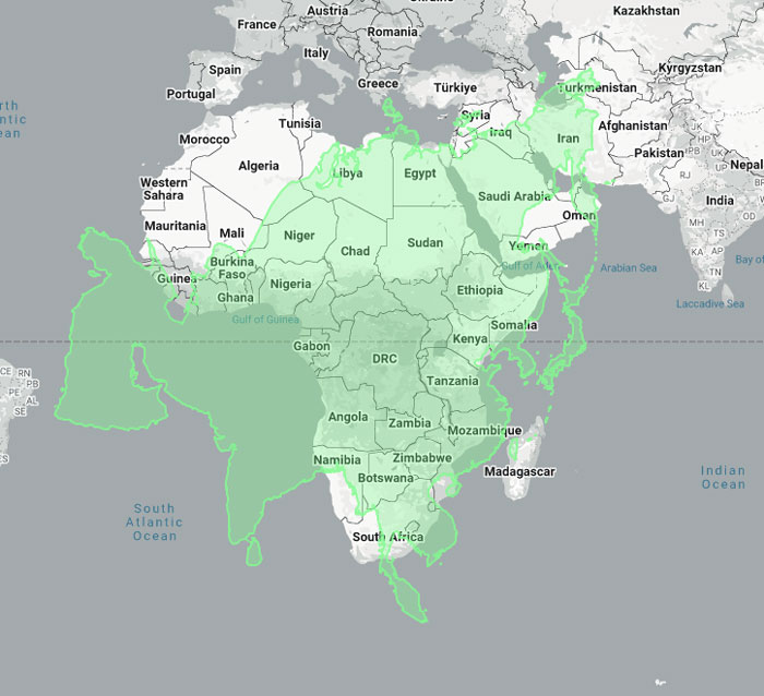
As we grow up, we realize that some things we’ve learned in school as kids aren’t exactly accurate. For example, we’re taught we only have five senses, but we actually have around 20 (including balance, temperature, and pain). The same can be said about something in geography class: we think we know what a world map looks like, but is our knowledge accurate?
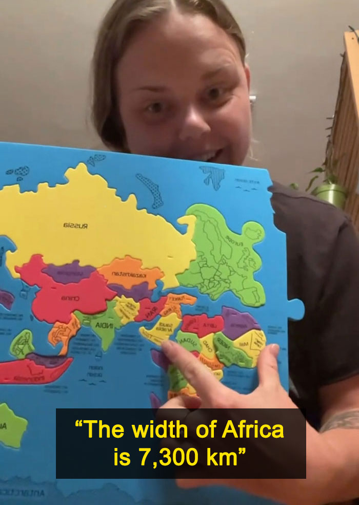
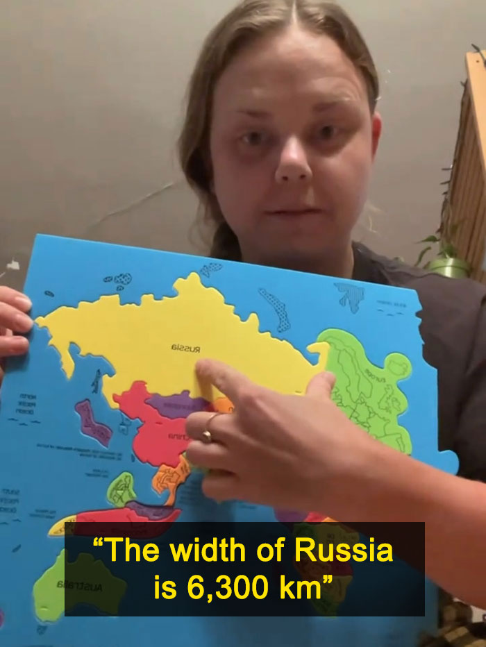
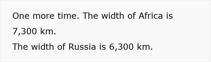
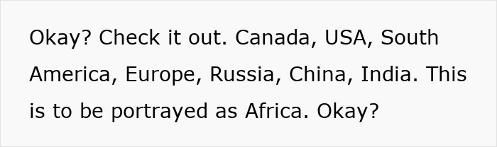
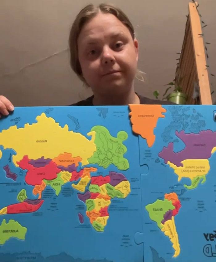
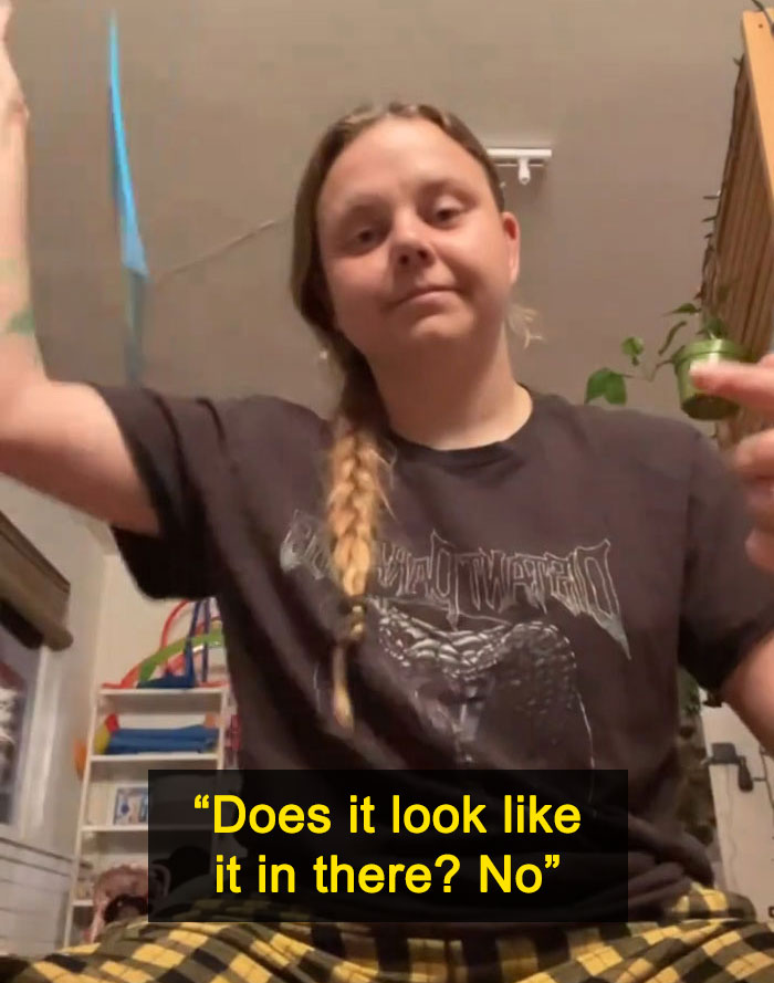
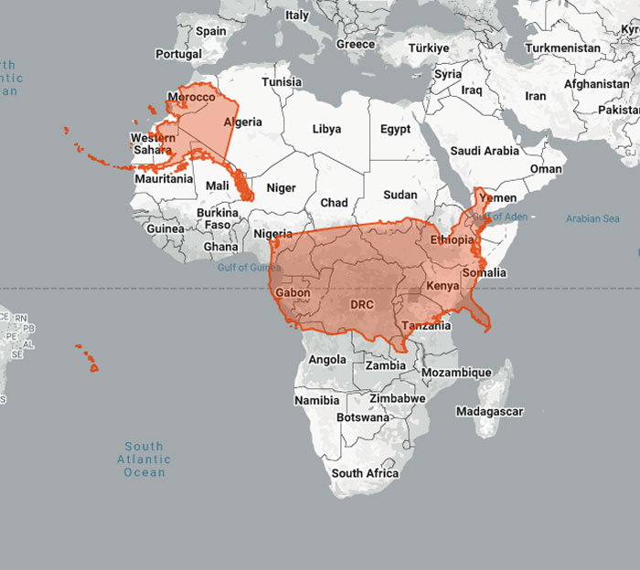
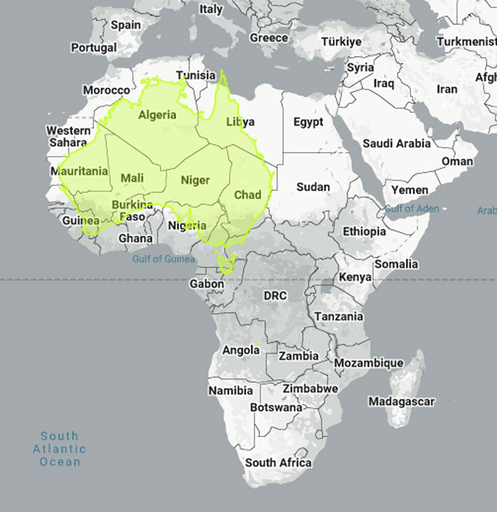
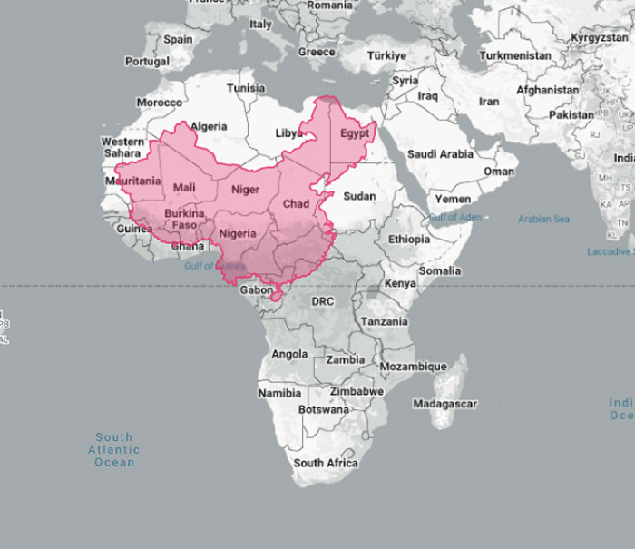
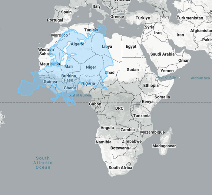
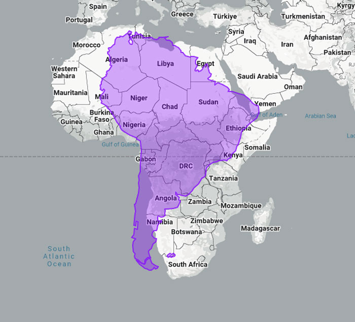
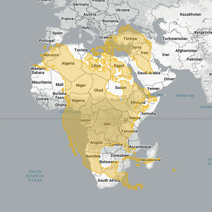
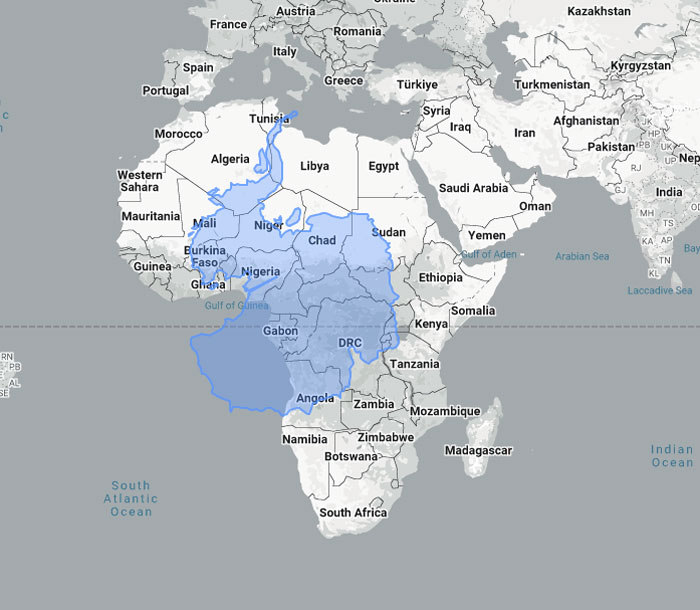
One woman on TikTok recently reminded us that it’s not. She compared the true size of the African continent with what we usually see in our maps. Turns out, they’re wildly inaccurate, and her video soon went viral as people started questioning what’s the reason for these inaccurate maps and whether that reason could be political.
Image credits:Tima Miroshnichenko / Pexels (not the actual photo)
Image credits: vankovajaja
Image credits: vankovajaja
Image credits: vankovajaja
Image credits: vankovajaja
Image credits: US Government
Image credits: engaging-data.com
Image credits: thetruesize
Image credits: thetruesize
Image credits: thetruesize
Image credits: thetruesize
Image credits: thetruesize
Image credits: thetruesize
Image credits: thetruesize
Image credits: thetruesize
Image credits: thetruesize
@vankovajajaFixing maps is long overdue♬ original sound – jajavankova
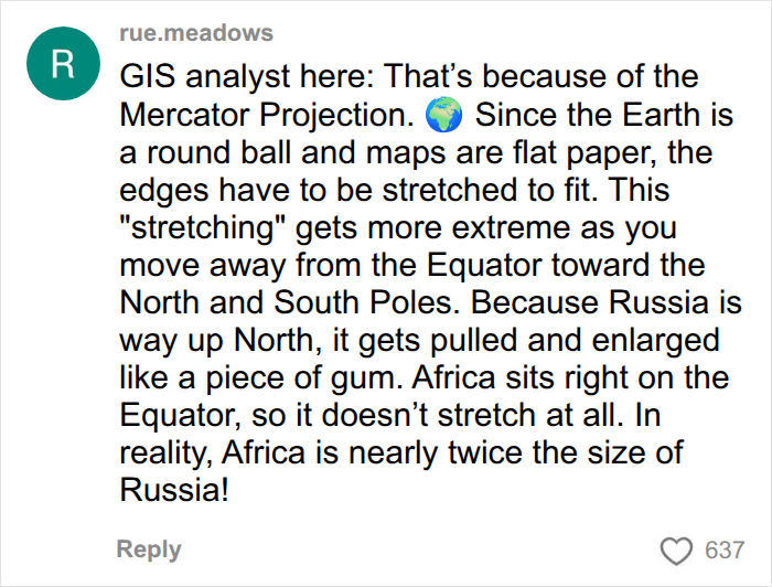
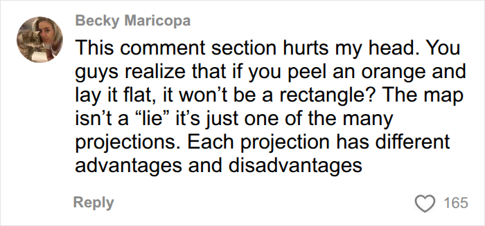
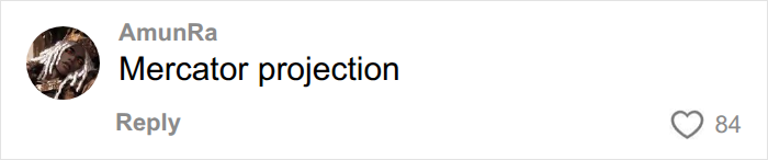
Some commenters cleared up the confusion about why the sizes of some countries and continents on maps aren’t accurate to real life — that’s because of the Mercator projection. In 1569, Gerardus Mercator developed a way to map the world using a cylindrical projection.
In his theory, you have to imagine the Earth as a balloon. If you put it inside a paper sheet folded in a cylinder shape and inflate it, you would get an “accurate” representation of land and oceans on that sheet of paper.
Or you can imagine it another way: you’d basically wrap a sheet of paper around a sphere (sorry, flat earthers!) and map out the world on it. Yet that doesn’t really work because there’s no way to perfectly fit a square piece of paper on a round ball without creases, gaps, or cuts.
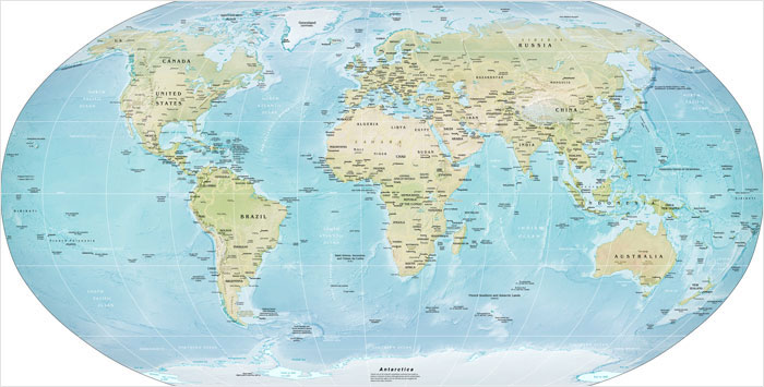
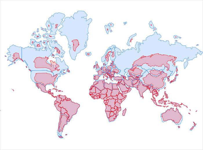
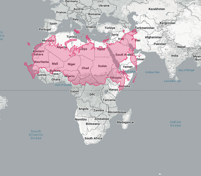
So, even in Mercator’s projection, the objects on the top and bottom of a map are stretched out to fill in that sheet of paper. That’s what ruins its accuracy: the continent closest to the equator appears the smallest and the ones farthest from it appear inaccurately large. That’s why Greenland looks ridiculously big, and Russia appears so much bigger than the African continent, even when that’s far from the truth. In reality, Greenland is smaller than the Arabian Peninsula.
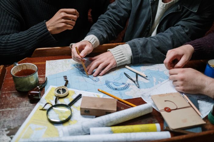
Why is this map so widely used, then? Why is it the default map in textbooks, on weather news, and almost everywhere else we see a world map? Because it was made to make navigation easier. The Mercator projection wasn’t about accuracy; it was all about making it easier for sailors to navigate the seas and the oceans. A straight line on a Mercator projection map corresponds to a constant compass direction.
Image credits: cottonbro studio / Pexels (not the actual photo)
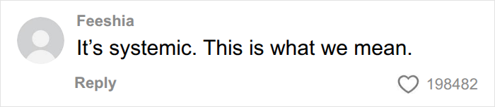
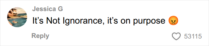
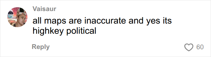
Some commenters claimed that the Mercator projection maps are inherently quite racist. Some even noted that the size of the countries or continents on the map correlated with the country or continent where the map was constructed. For example, if it was an American map, the USA and North America would be bigger. If it was a Russian map, the country would appear larger than it actually is.
While they are both close to the North Pole and therefore appear stretched beyond their real size, there is some truth to those claims. Maps can often be political, and many people over the years have noted that the Mercator projection made the colonial powers look bigger and Africa look smaller. A country that looks big on a map evokes a sense of power and can be used for propaganda quite easily.
In Mercator’s projection, mapmakers could include many more details on maps of Europe and North America, such as towns, roads, and cities. The same detail-oriented approach wasn’t used for non-Western countries, perpetuating stereotypes about non-Western cultures.
“The world maps that prevail today have been embedded in Western imaginations since the British Empire,” professor of Global Media and Politics at Goldsmiths, University of London, Marianne Franklin, told CNN. “They continue [to prevail] despite many challenges to their fairness and accuracy because they underpin the ongoing Anglo-Euro-American presumption that the world belongs to them, and pivots around these geo-cultural axes.”
Those of us who grew up with the Mercator projection as the default might feel bamboozled, but nowadays there is a simple solution to the problem: teaching children to compare different kinds of maps. Although there is no perfect map, the Gall-Peters projection is often cited as the most accurate because it depicts countries’ sizes accurately relative to one another. It does, however, distort the true shapes of continents.

By entering your email and clicking Subscribe, you're agreeing to let us send you customized marketing messages about us and our advertising partners. You are also agreeing to our Privacy Policy.
Thank you! You've successfully subscribed to newsletters!


i would say you are right, but since maps like mercantor are still used to teach people today, this is weirdly still important to share
Load More Replies... I mean come on, i've learned about the mercator projection in the geography class like 30 years ago or so. It's time for US of A to update their learning materials.

Overblown American ignorance about a perfectly well known fact - the Mercator projection. Just buy a globe & look at the actual sizes.

There was a globe in every American classroom when I was going, and yeah we learned the actual size of Africa. In my geography classroom, we had a map that was the inverse of the Mercator, with the southern hemisphere distorted the same way the northern is in Mercator. Likely, these people learned this, and just don't remember, since it's not exactly a big worry, day to day.
Load More Replies... i would say you are right, but since maps like mercantor are still used to teach people today, this is weirdly still important to share
Load More Replies... I mean come on, i've learned about the mercator projection in the geography class like 30 years ago or so. It's time for US of A to update their learning materials.
Overblown American ignorance about a perfectly well known fact - the Mercator projection. Just buy a globe & look at the actual sizes.
There was a globe in every American classroom when I was going, and yeah we learned the actual size of Africa. In my geography classroom, we had a map that was the inverse of the Mercator, with the southern hemisphere distorted the same way the northern is in Mercator. Likely, these people learned this, and just don't remember, since it's not exactly a big worry, day to day.
Load More Replies...


















 No fees, cancel anytime









29
27