Get Premium
Dark mode theme is available exclusively for premium users. Learn more about the benefits of subscribing.
No fees, cancel anytime.

 Dark Mode Ad-Free Browsing Unlimited Content
 Ad-Free Browsing Unlimited Content Dark Mode
Join 1.2 million Panda readers who get the best art, memes, and fun stories every week!
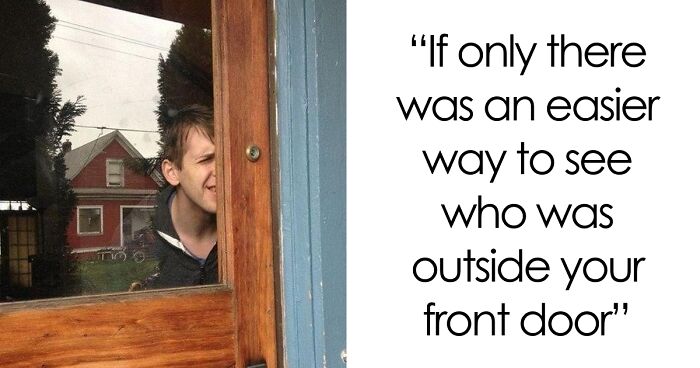
Design seems like such a simple, elementary thing when you think about it, but hordes of people keep getting the basics wrong, often with hilarious and side-splitting results. Buildings are hard to design, as are other objects, but we usually take the lettering and layout of sentences and phrases for granted, as though everyone will be able to understand us no matter how.we.words.our.place.
Well, the truth is, designing text so it’s readable isn’t as easy as you’d expect. There’s a system to it. There are processes that must be followed. Typography rules that ought never be broken. Except that those rules are broken all the time by some oblivious people. Bored Panda collected some of the best examples of incredibly bad text design that is wonderfully enjoyable to make fun of. From lame ads to funny posters, nodofy is safe from bad design. So upvote the best/worst fails, see if your friends can figure out what’s actually written, and let us know in the comments if you've seen design fails that compare to these ones.
We know how much you enjoy these funny fails concerning design, so you can read Bored Panda’s previous posts about them here, here, here, here, and here.
This post may include affiliate links.
One of the online communities where similar text design fails are shared daily is the subreddit ‘Don’t Dead Open Inside,’ which prides itself on collecting the most egregious examples of signs and media that don’t make any sense if you read them normally. The community, which was established in May 2014, is large, having grown to over 513,000 members.
Bored Panda reached out to the 'Don't Dead Open Inside' subreddit moderators. According to one of them, the community was inspired to form because of the 'Don't Dead Open Inside' frame from the very first episode of the hit TV show The Walking Dead.
According to one moderator, people make mistakes while designing text because "they're either not thinking or they want to be original. Our main mission statement is to show them that they are wrong."
They also had advice for those individuals willing to step up their game design-wise: "People in the west read left to right, then top to bottom. Do not "liven up" your text by making it "quirky". Hard to read means lost attention which translates to lost revenue."
Canva has some handy tips for those of you willing to up your design game when it comes to words. For example, Canva suggests that you limit the number of fonts that you use and use simple ones, rather than complex ones that might not mesh together well.
Spacing, something most of us rarely think about, is also important and can bring about radically different effects simply by eliminating the negative space between letters, words, and sentences.
Meanwhile, colors are equally important: use them to your advantage to create harmony between different parts of the text. Use contrasting and complementary colors. Lines can be used to guide the reader’s attention and create symmetry; however, badly used lines can turn a sign or a design into a catastrophe. Think you’ve got all that? Good. Let us know how you’d fix the text designs in this list.
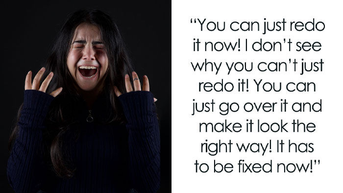
This is so stressful no I wouldn't know what accident to do, this is too much responsibility
I get the stupid title, but seriously black bean smoothies sounds gross!!!!!!!
Finally! You have no idea how hard it is to find a shop selling shosple colupis!!
If being okay is not okay, is being not okay, okay? And if so, isn't that also not okay?
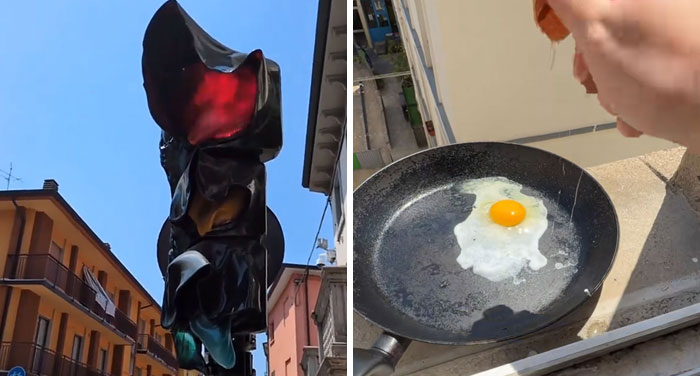
If the intention was to slow your actions down it worked very well! 10/10 success.
To be fair, it does look like a castle, so it could be the Prince of Hotels in that sense. And it could be in Wales, as well.
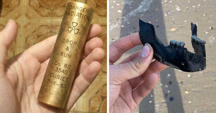
Not to mention the fact that it's the teeth of 2,187 and a half persons
If they have to fix it again it doesn't say much for their work...
“So I don’t take a chair but I gotta put a chair away? That’s deep, man...”
What a wasted opportunity, they had "TMI" in there which would certainly apply.
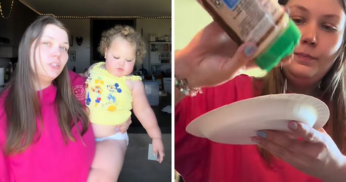
Aw but he's just a kiddo not a trained designer like some of these fails
Well, if you follow the logic on this one, actually is correct. UP -> DOWN -> RIGHT -> UP...If you straighten the band you will see the words written correctly.
Do people learn to read from top to bottom and then from left to right these days? In my time we went left to right, then top top to bottom...
There is such a thing as separated columns, and many try to accomplish that effect. Without success :)
Load More Replies...Do people learn to read from top to bottom and then from left to right these days? In my time we went left to right, then top top to bottom...
There is such a thing as separated columns, and many try to accomplish that effect. Without success :)
Load More Replies...


 No fees, cancel anytime