Get Premium
Dark mode theme is available exclusively for premium users. Learn more about the benefits of subscribing.
No fees, cancel anytime.

 Dark Mode Ad-Free Browsing Unlimited Content
 Ad-Free Browsing Unlimited Content Dark Mode
Join 1.2 million Panda readers who get the best art, memes, and fun stories every week!
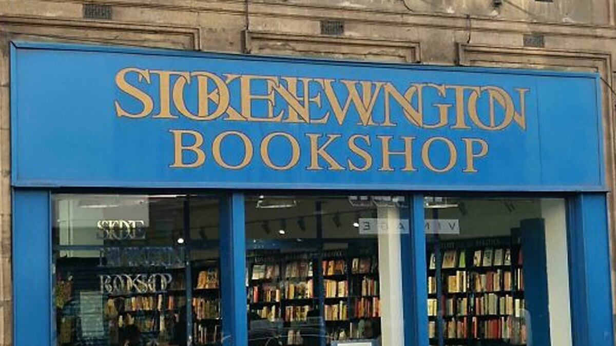
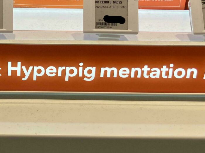
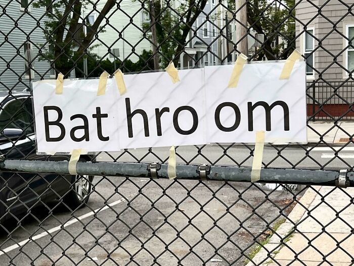
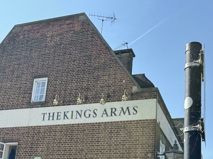
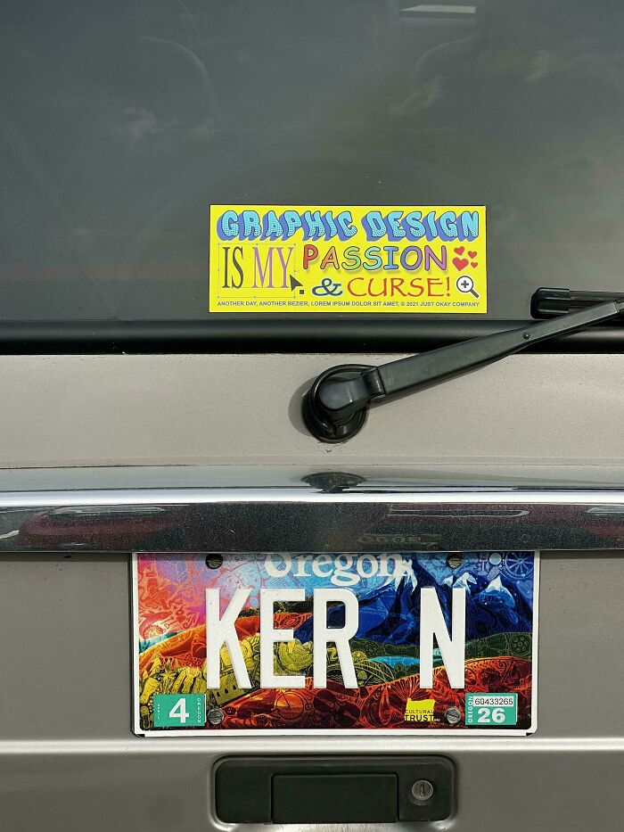
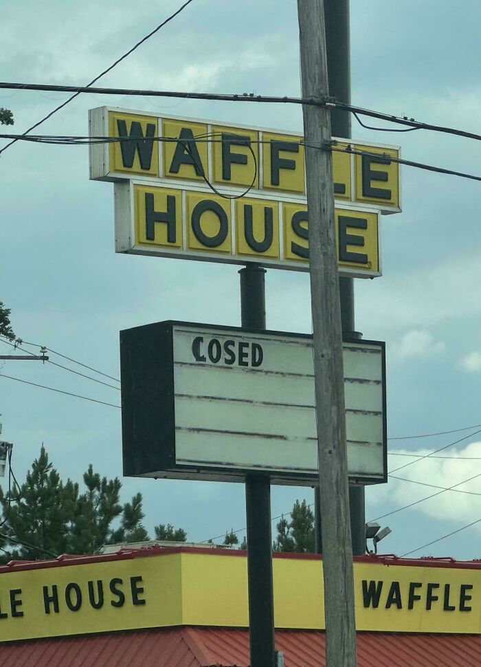
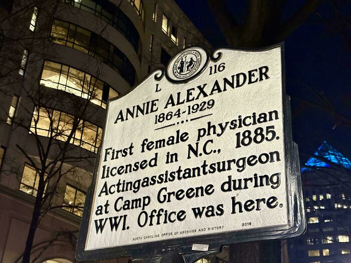
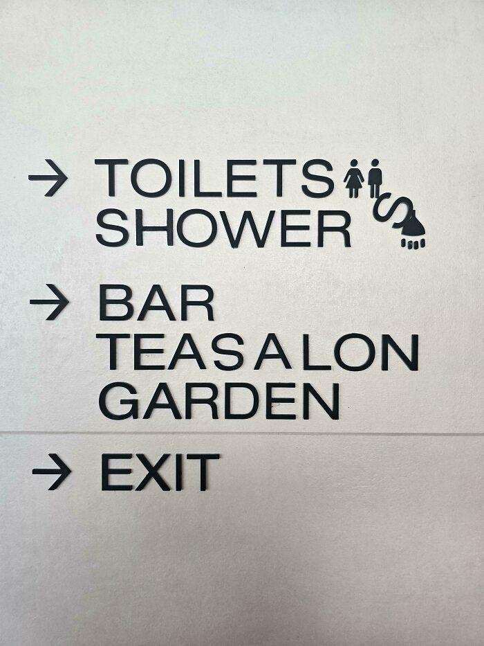
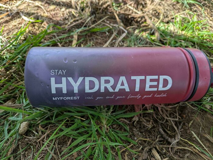
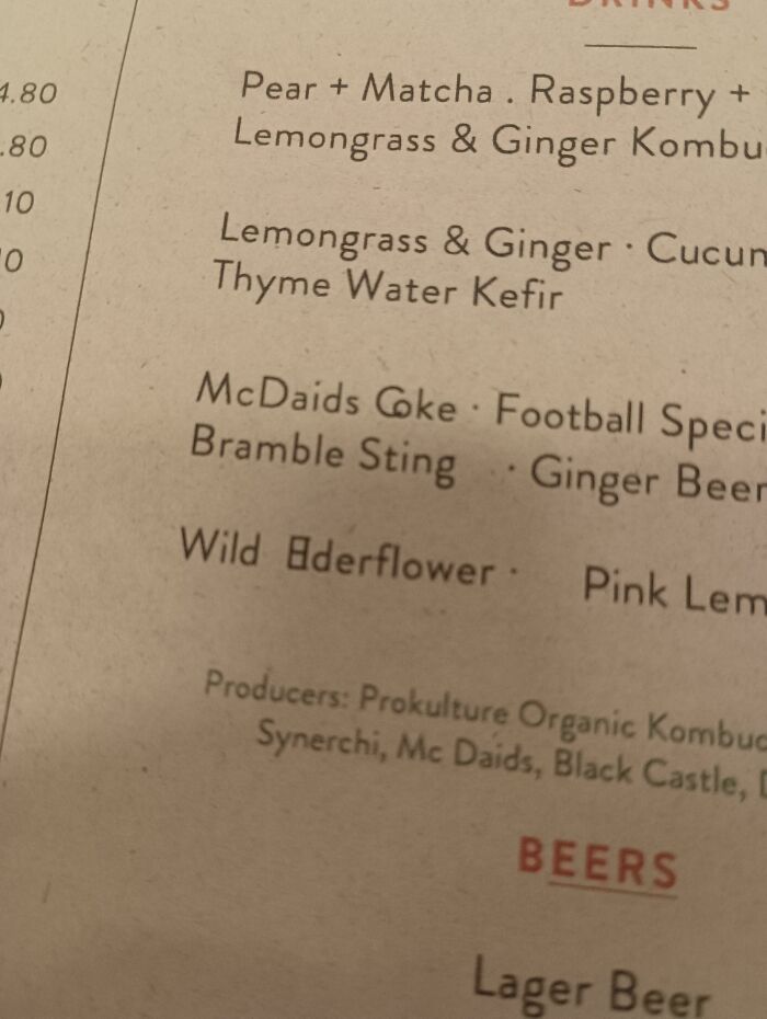
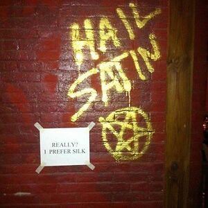
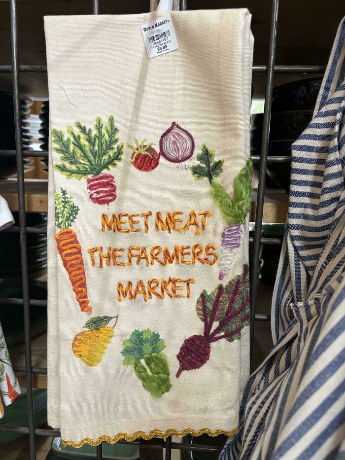
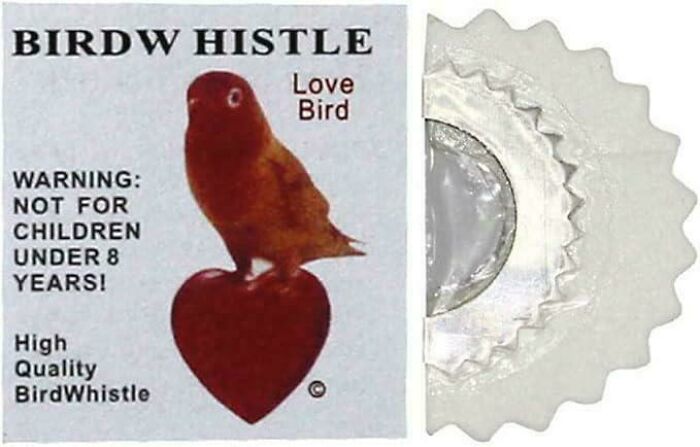
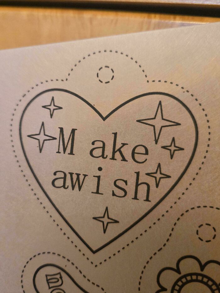
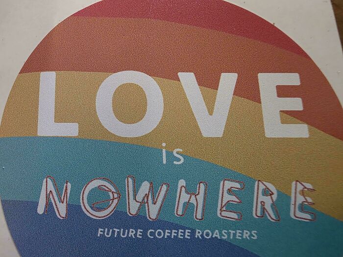
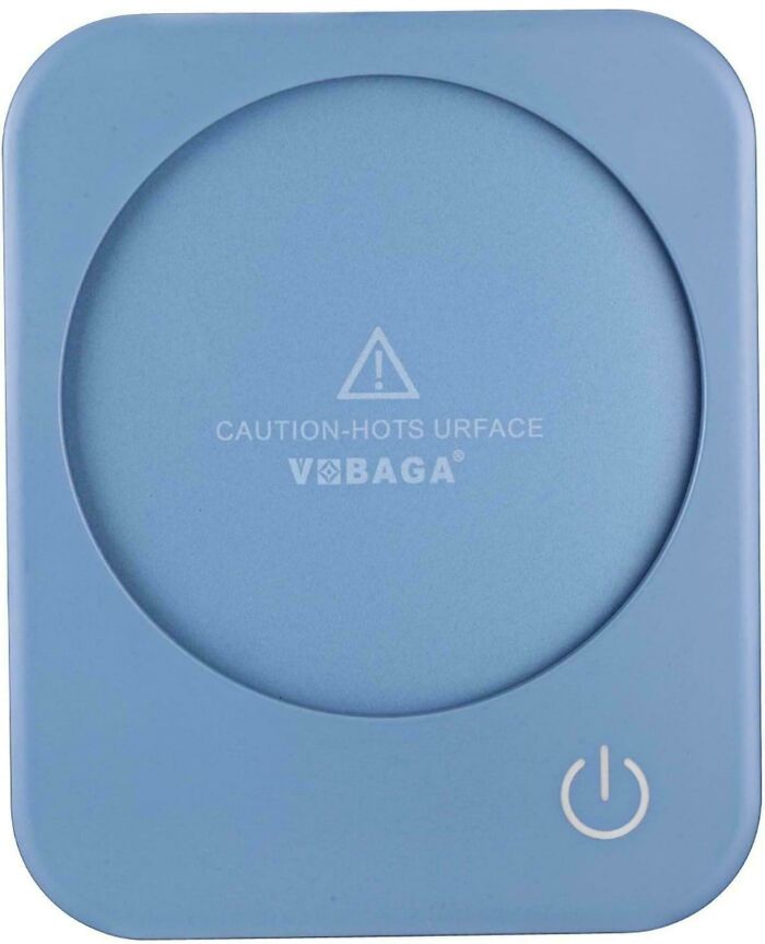
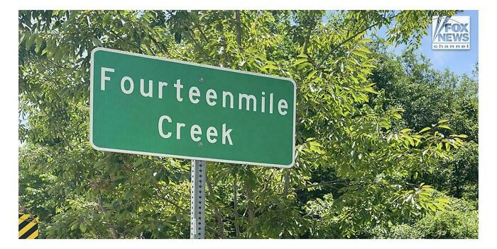
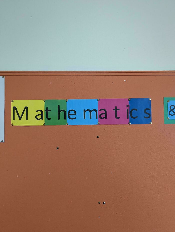
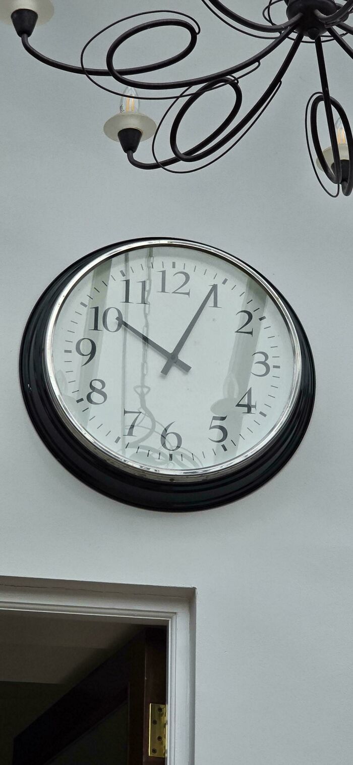
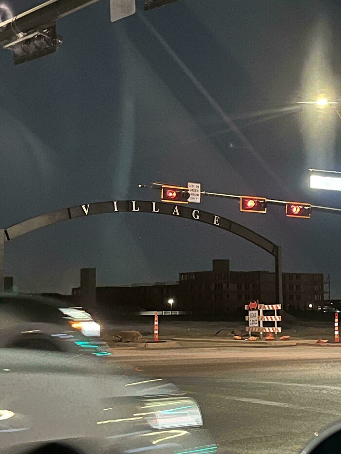
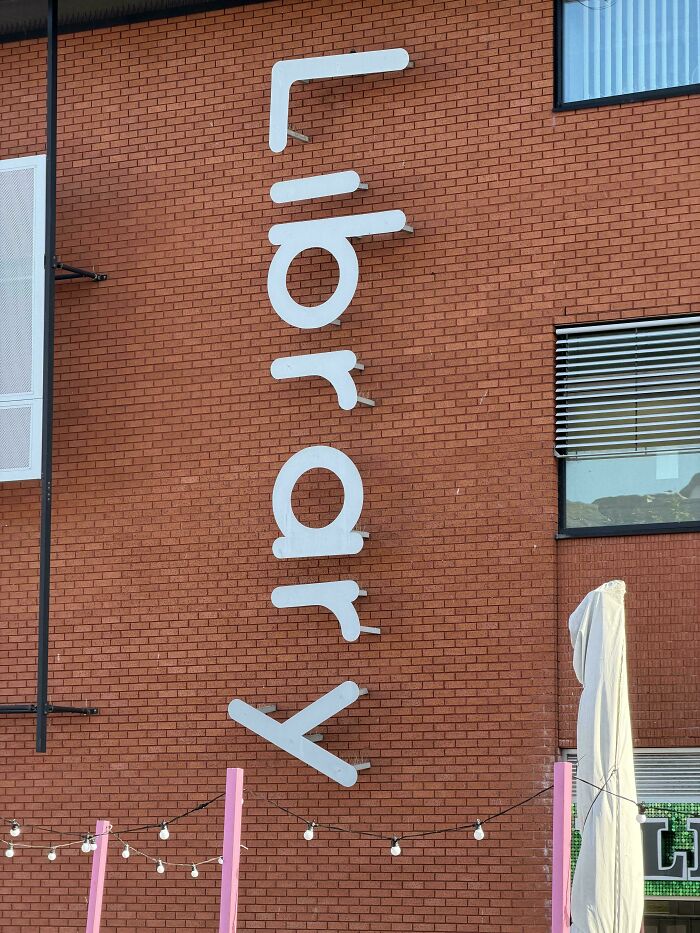
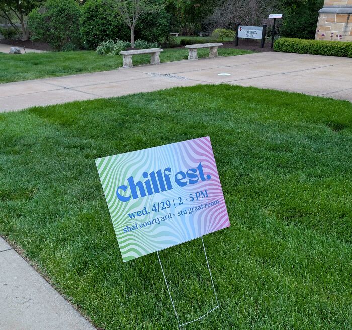
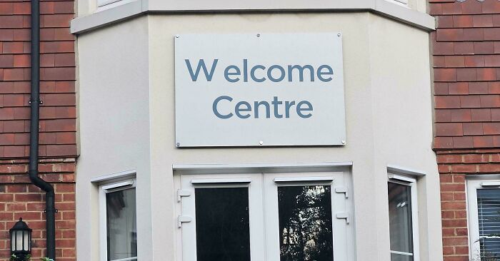
In typography, kerning is the process of adjusting the space between two specific characters. Most of us never give it a second thought, but it’s wild how much that tiny detail can matter.
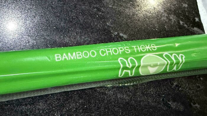
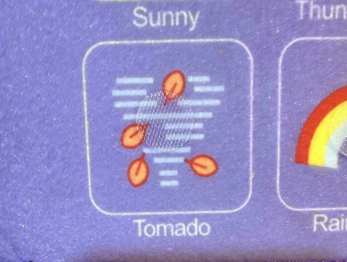
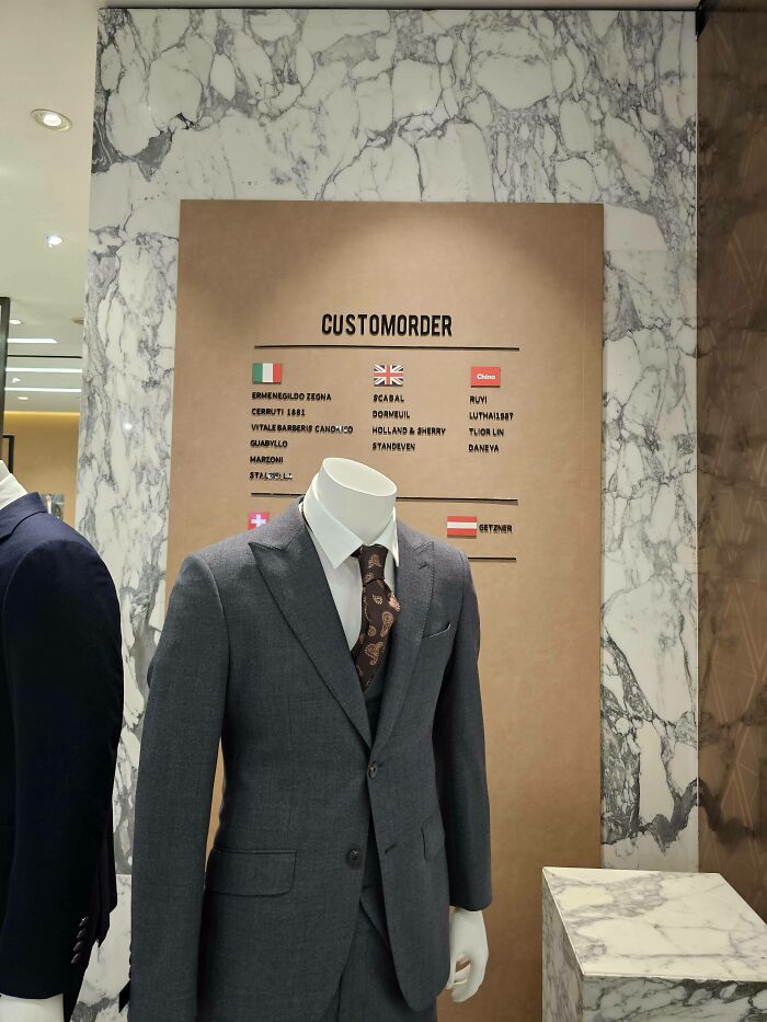
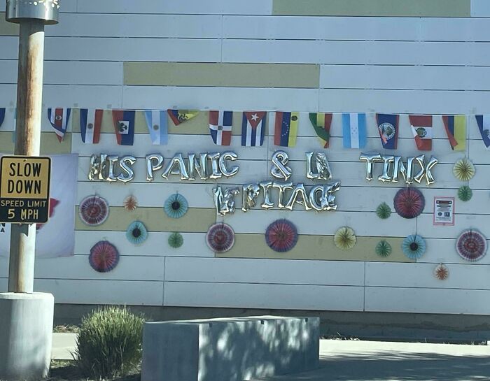
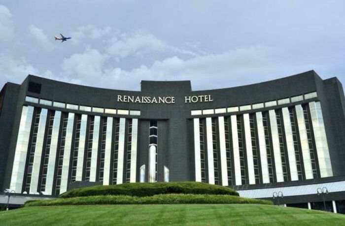
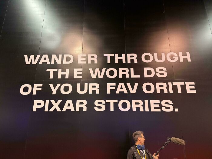
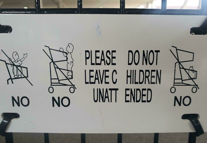
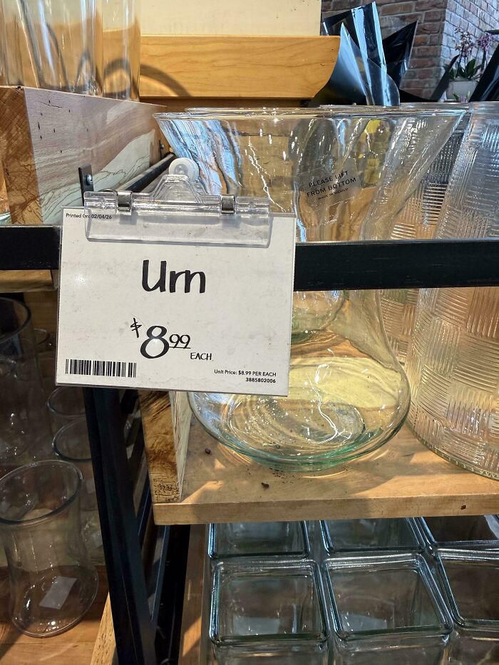
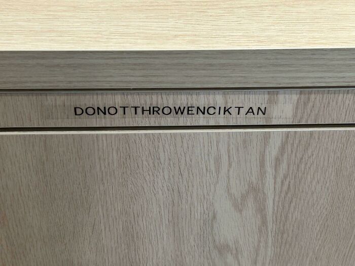
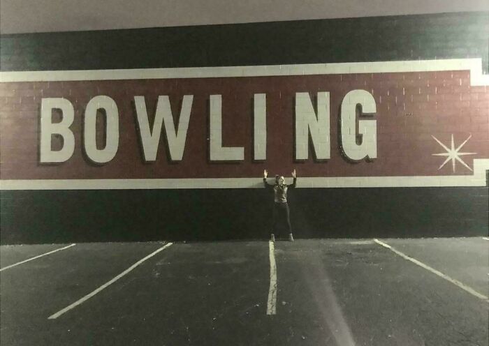
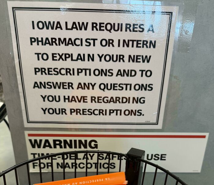
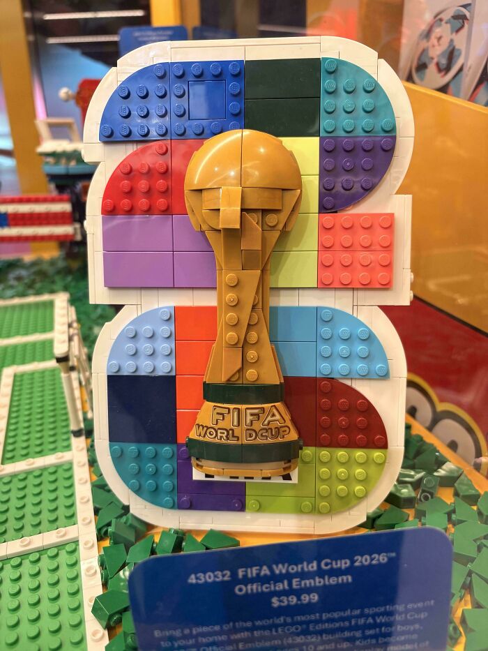
Put two letters a little too close together, or leave too much room between them, and suddenly a perfectly normal phrase can take on a completely different meaning. Sometimes, the result is hilariously unfortunate.
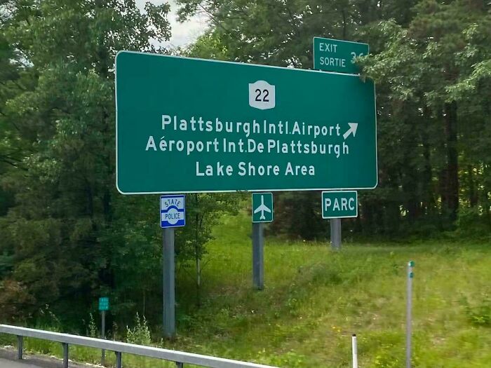
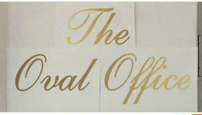
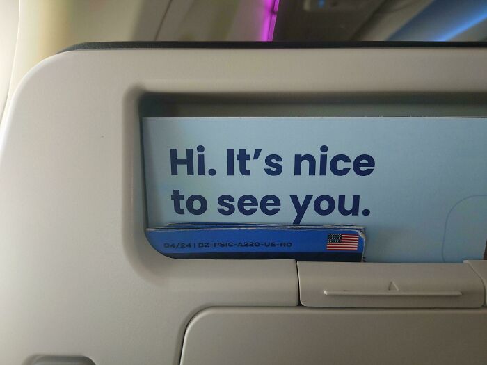
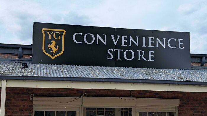
To show you what we mean, we’ve rounded up the funniest spacing fails from the subreddit r/keming. Scroll down to check them out.
This post may include affiliate links.
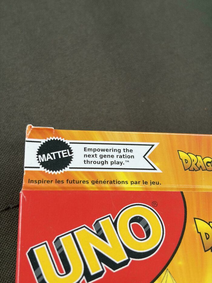
It's not *un*true...the next generation is our next ration of genes... /s

Well clearly the spacing here is the problem the third line. Sign was made too small.

From Buffy/Angel? You've been around a lot longer than 23 years, girl...
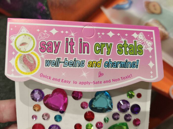
So I can say anything in these cry stals AND they're sate? Thank heavens!

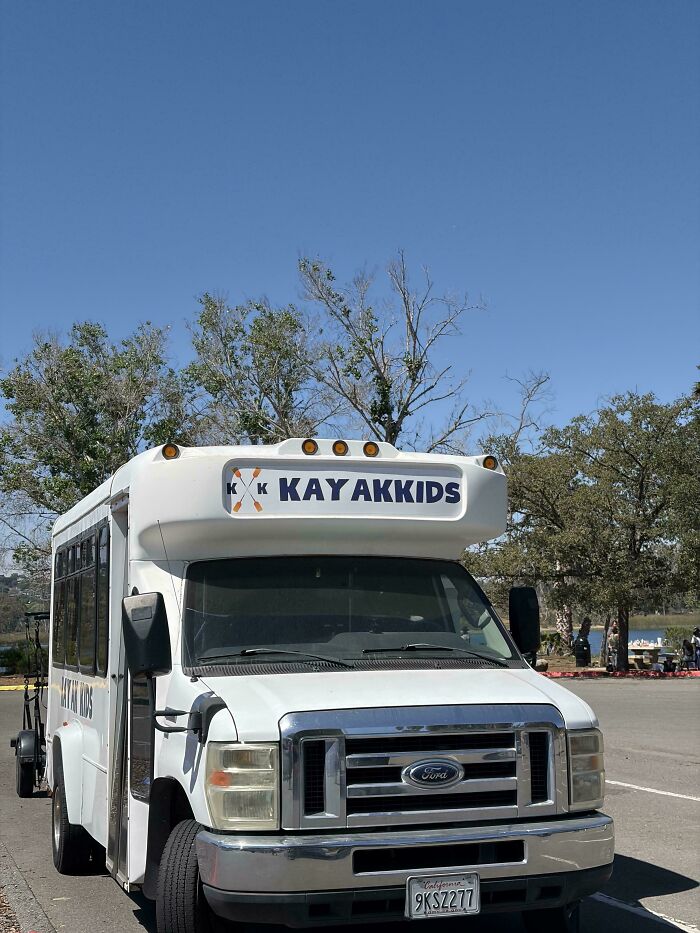
It's even worse. There are two smaller k's in the logo, so ik says 'k k KAY AKKIDS'

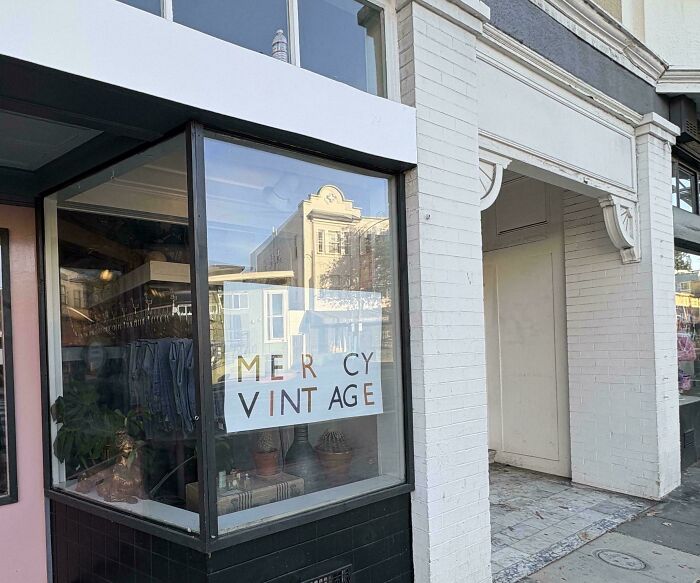
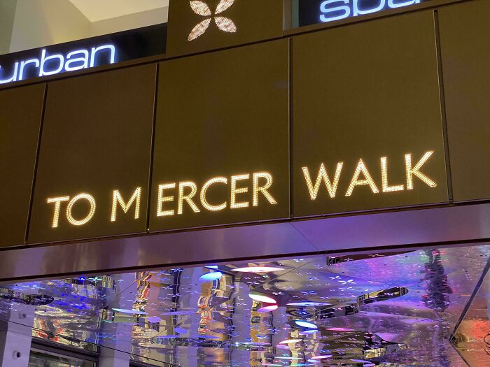
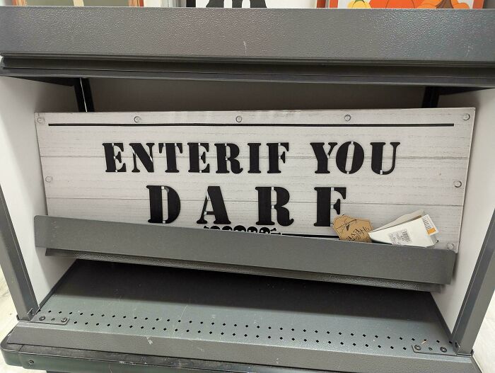
Maybe a tribute to Tommy Mercer (Anthony Mayweather/Crimson)...? Though if you walk this path, expect NO MERCY! XP

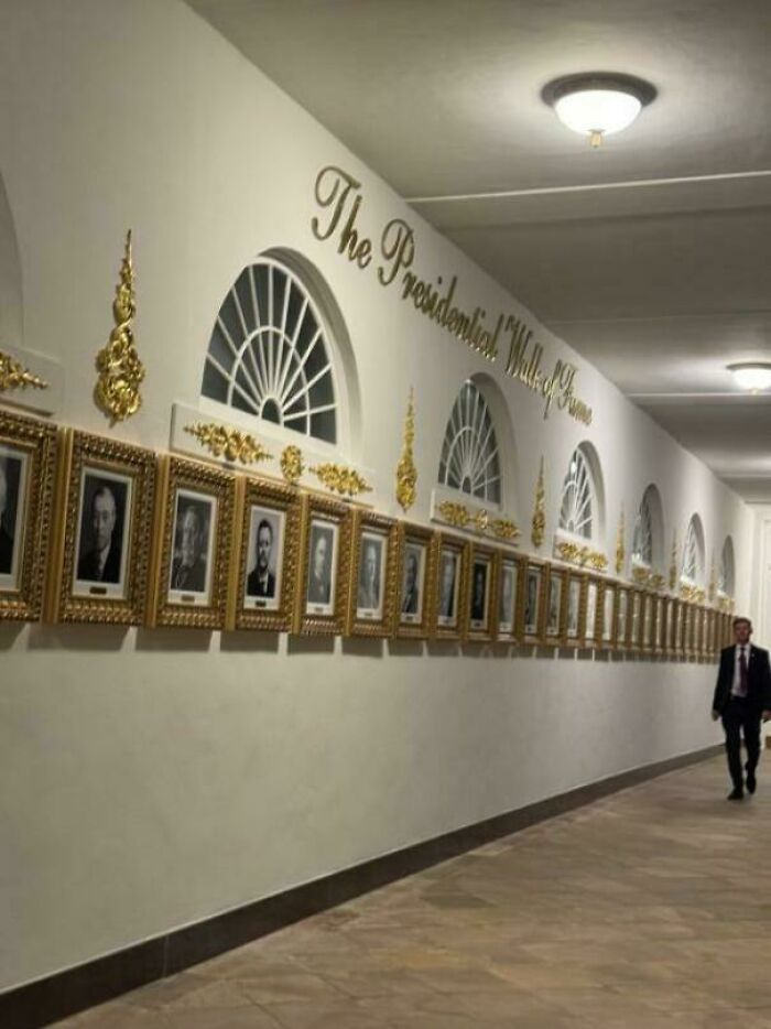
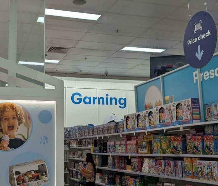
I don't know what Garning is, but I'll ask Jennifer when I next watch Alias.
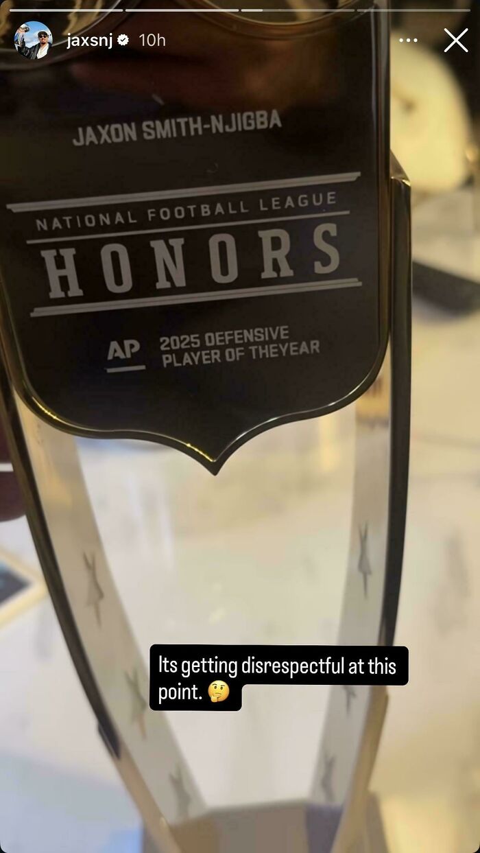
For anyone not familiar, Smith-Njigba was the OFFENSIVE player of the Year.

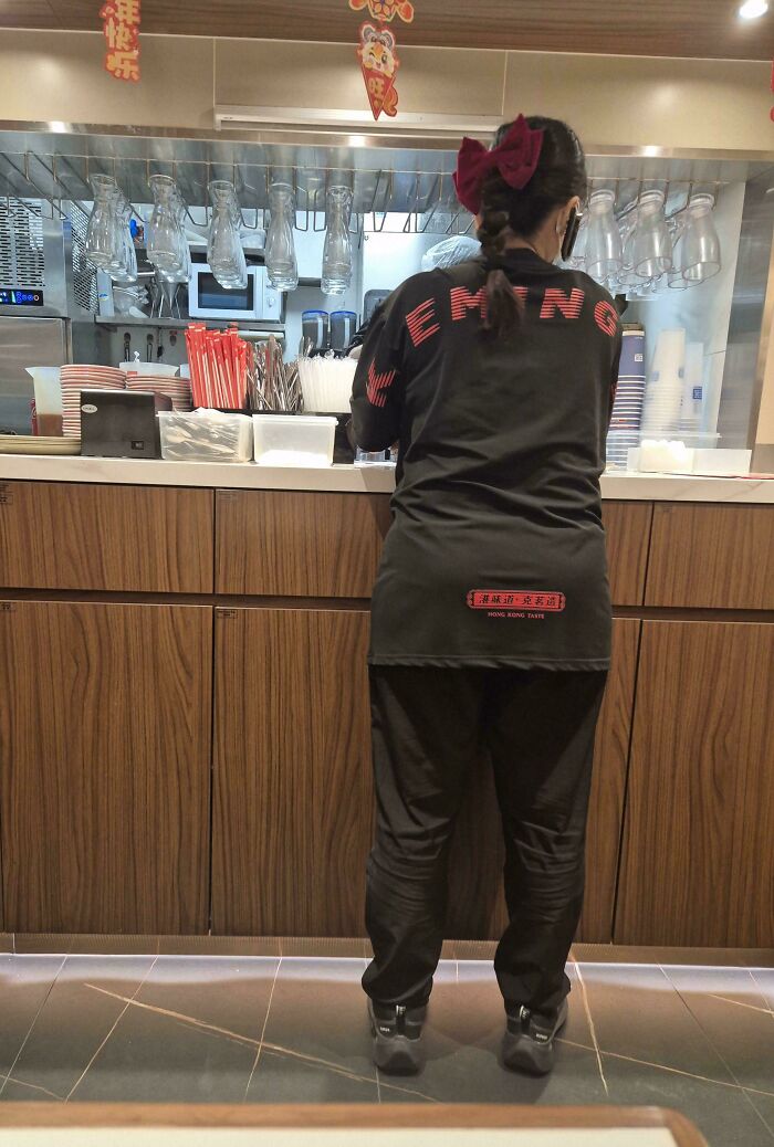
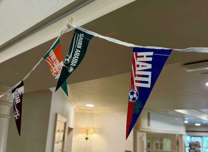
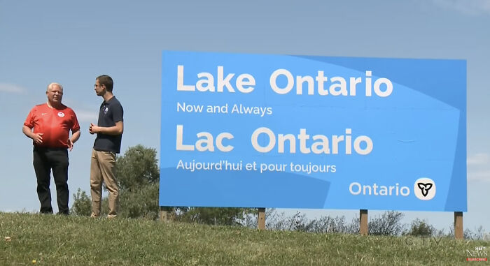
Look, as long as it doesn't say Am Erica, I'm not complaining (despite my loathing for Premier Doug Ford, who is on the left in this photo but who is normally found on the Right).

While you're at it have a look at the logo for Australia's Commonwealth Bank. Deliberately bad spacing.

"A stonemason has been fired from his job at the insistence of the regents of Tulane University. He had carved this epigraph in marble above the entrance of the new library: THE PEN IS MIGHTIER THAN THE SWORD. The Regents maintain that the stonemason deliberately reduced the space between the second and third words." (Thomas M. Disch, Camp Concentration, 1968)
I’ve spent a good few years putting tour posters together for rock bands. My eye twitches if I make errors like these. Kerning, font choice and colour are critical and please get a dispassionate eye to read it, you’ve stared at it for days or weeks, you won’t spot a speeling mistook. Biggest request… stop using A.I.slop, a simple, human-made poster is a thousand times better and I might attend your event, if you use generic A.I. posters then I can 100% guarantee that you won’t see me.
While you're at it have a look at the logo for Australia's Commonwealth Bank. Deliberately bad spacing.
"A stonemason has been fired from his job at the insistence of the regents of Tulane University. He had carved this epigraph in marble above the entrance of the new library: THE PEN IS MIGHTIER THAN THE SWORD. The Regents maintain that the stonemason deliberately reduced the space between the second and third words." (Thomas M. Disch, Camp Concentration, 1968)
I’ve spent a good few years putting tour posters together for rock bands. My eye twitches if I make errors like these. Kerning, font choice and colour are critical and please get a dispassionate eye to read it, you’ve stared at it for days or weeks, you won’t spot a speeling mistook. Biggest request… stop using A.I.slop, a simple, human-made poster is a thousand times better and I might attend your event, if you use generic A.I. posters then I can 100% guarantee that you won’t see me.






 No fees, cancel anytime