Get Premium
Dark mode theme is available exclusively for premium users. Learn more about the benefits of subscribing.
No fees, cancel anytime.

 Dark Mode Ad-Free Browsing Unlimited Content
 Ad-Free Browsing Unlimited Content Dark Mode
Join 1.2 million Panda readers who get the best art, memes, and fun stories every week!
A logo is a very important asset to any brand, but what sometimes really makes it stand out is a friendly mascot. Some of them are with the companies from the very initiation of the business and some come along over the years, creating that special touch in branding. The mascots change over the years, anything from slight touch-ups to completely successful revamps or occasionally spurring a ‘why tho’ reaction.
Bored Panda selected a few mascots from popular companies to compare the now-and-then looks of these now-iconic symbols. Some of them might take you down memory lane and a few new ones might make you look twice. Share in the comments whether you think the older or newer versions are better!
This post may include affiliate links.
The original design is pretty cool looking. Like something out of a children's book.
The Tiger who came to tea? tiger-6048...f2606d.jpg 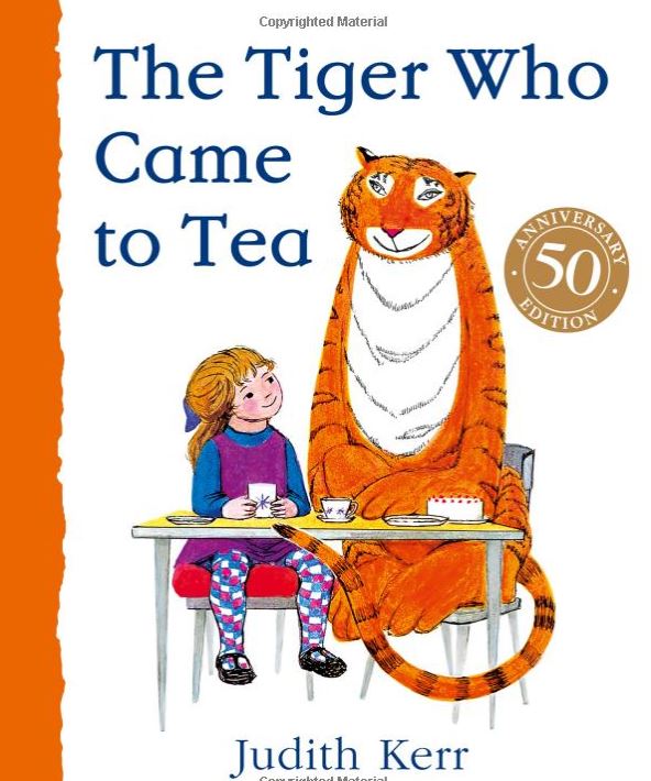
I quite like the more unique style of the older illustration.
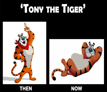
Why did they change him to this modern one? The old one was grrreat! Plus, notice how they removed the word sugar from the box?
The "sugar" disappeared some time in the '80s, if I recall correctly.
Load More Replies...Tony should have been retired when Thurl Ravenscroft passed. No one else will ever be able to equal that voice.
The mascots make their respective brands really easily recognizable and become a part of the product or service itself. The responsibilities that land on designers’ laps can be immense as, at the point of refreshing the recognizable icon and giving it a facelift, they can be facing quite a vast audience that sets the bar high. The expectations vs reality do not always balance out, but when the result exceeds it all, it can definitely be rewarding.
IT has got absolutely nothing on the cursed Ronald McDonald. I feel like the older mascot would lurk in the "ball pit" and lure unsuspecting children with soggy nuggets and lead them to their untimely doom.
I don’t understand the reason for a plastic face when you could just hire an actor
their slogan was "breakfast is the most important meal of the day" so it isn't true, only marketing

I agree but I think this because simpler “retro” designs are coming back after the over-the-top transition logos went through in the 80s/90s.
Load More Replies...even ronald mcdonald? and the koolaid guy? and michelin man? and mr peanut? and the pringles dude?
Load More Replies...It was "Moneybags." Pennybags wouldn't make you very rich, would it?
Load More Replies...There were two cereals I loved when I lived in the States. One was Trix but I can't remember the other one! For shame!
Except for Ronald McDonald I think the old ones were better and should not have been changed.
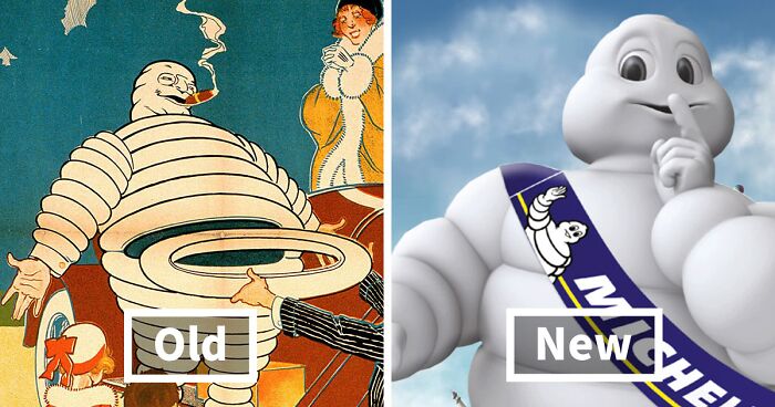
I think a lot of the new ones look a bit naff, although the Michelin man is a vast improvement.
Their down voted comment I think is link tree, basically where people share all of their social media ,etc.
I agree but I think this because simpler “retro” designs are coming back after the over-the-top transition logos went through in the 80s/90s.
Load More Replies...even ronald mcdonald? and the koolaid guy? and michelin man? and mr peanut? and the pringles dude?
Load More Replies...It was "Moneybags." Pennybags wouldn't make you very rich, would it?
Load More Replies...There were two cereals I loved when I lived in the States. One was Trix but I can't remember the other one! For shame!
Except for Ronald McDonald I think the old ones were better and should not have been changed.
I think a lot of the new ones look a bit naff, although the Michelin man is a vast improvement.
Their down voted comment I think is link tree, basically where people share all of their social media ,etc.


 No fees, cancel anytime