Get Premium
Dark mode theme is available exclusively for premium users. Learn more about the benefits of subscribing.
No fees, cancel anytime.

 Dark Mode Ad-Free Browsing Unlimited Content
 Ad-Free Browsing Unlimited Content Dark Mode
Join 1.2 million Panda readers who get the best art, memes, and fun stories every week!
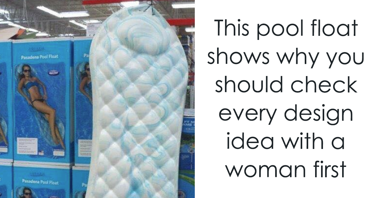
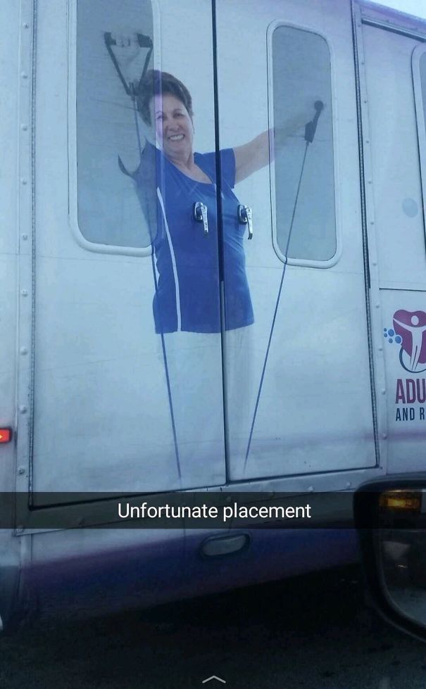
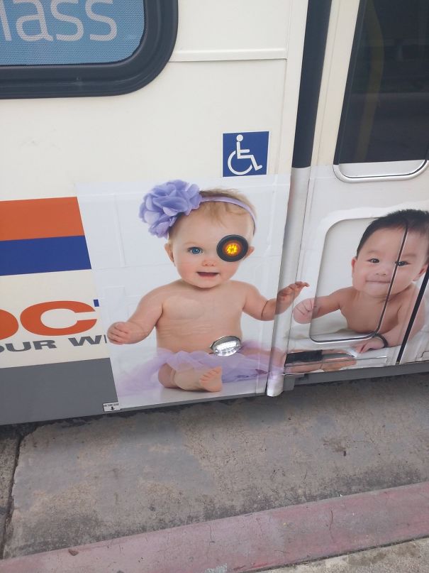
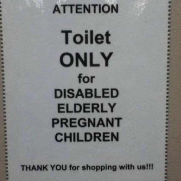
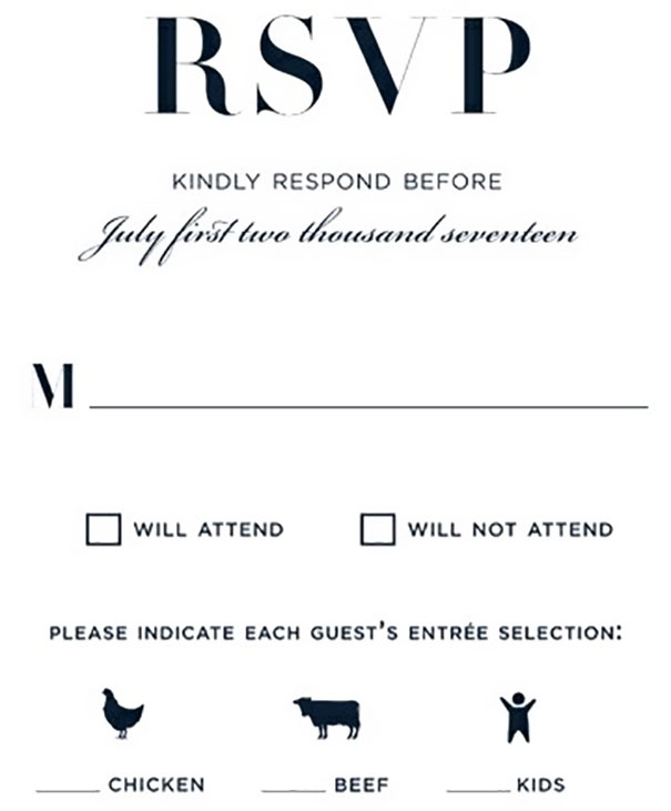
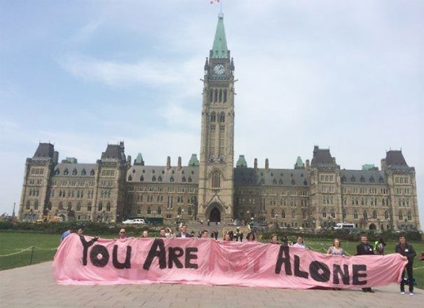
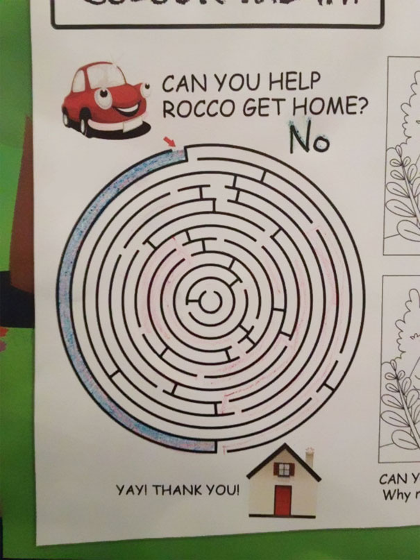
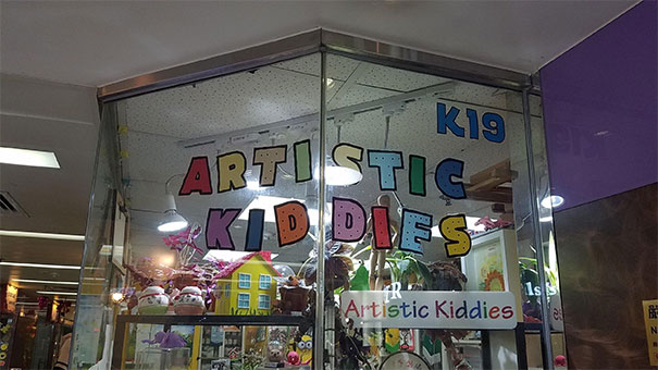
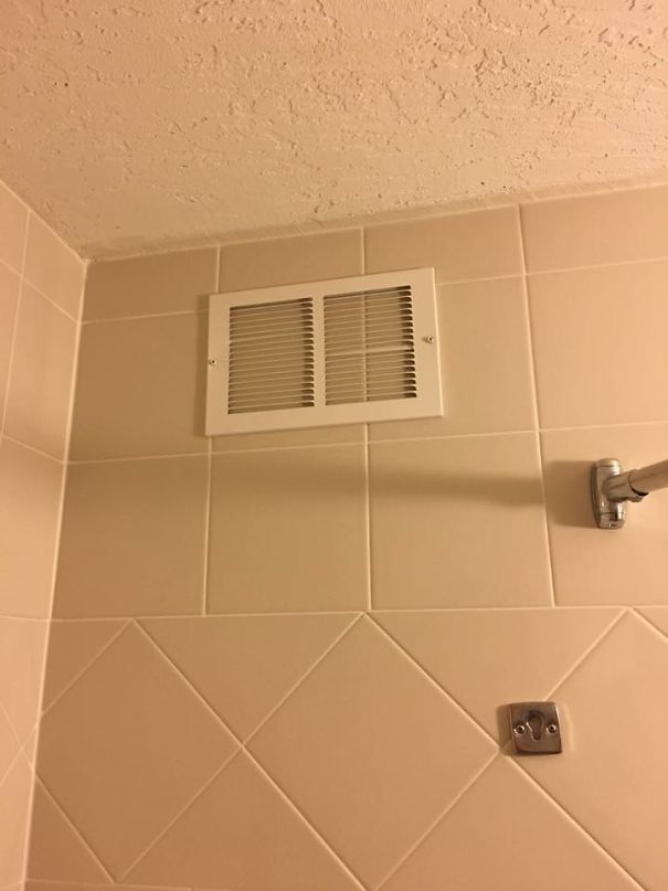
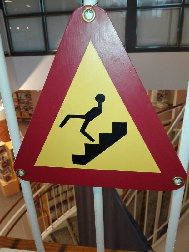
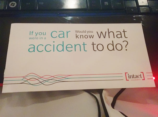
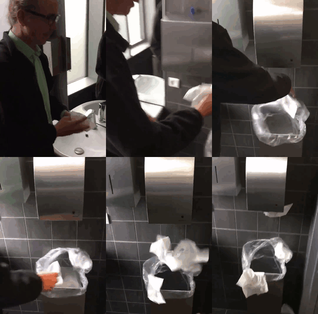
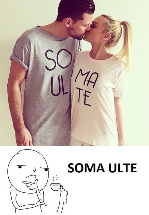
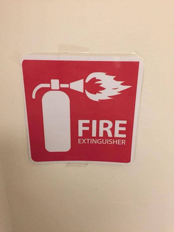
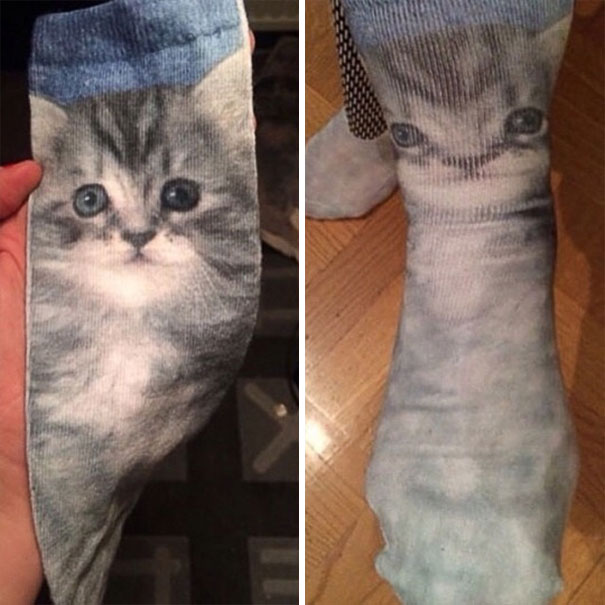
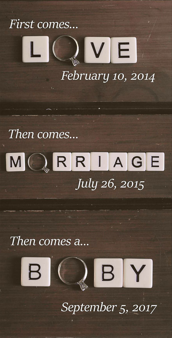
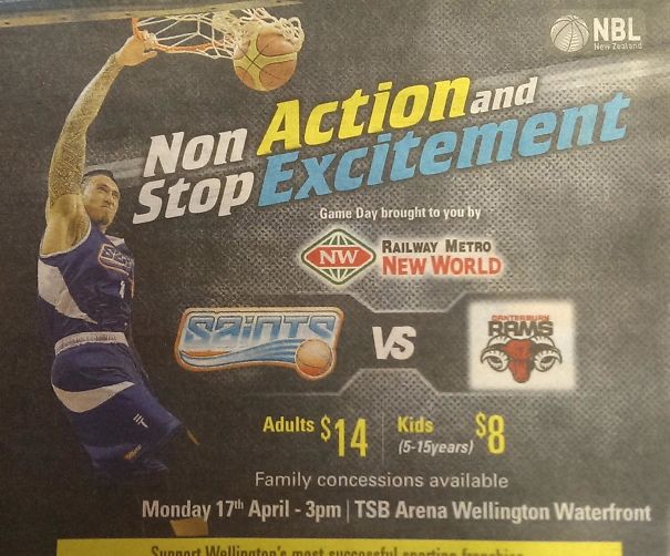
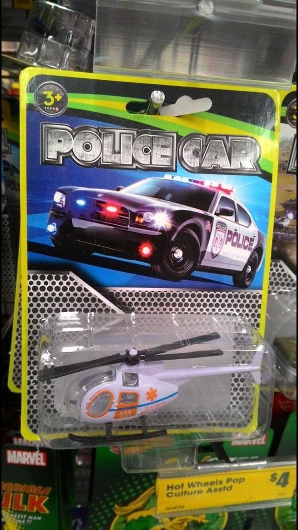
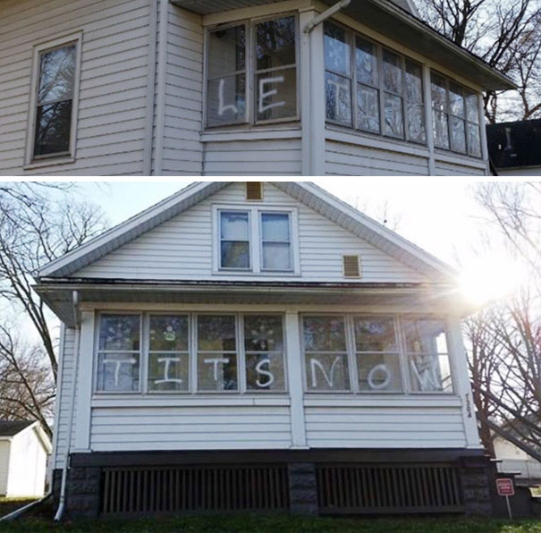
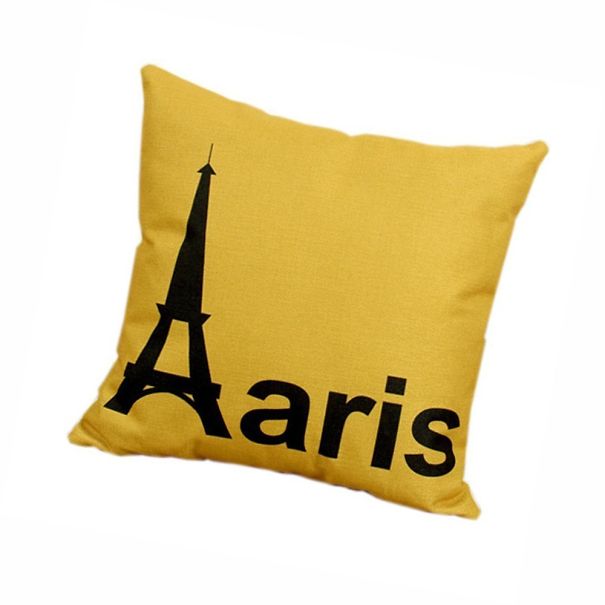
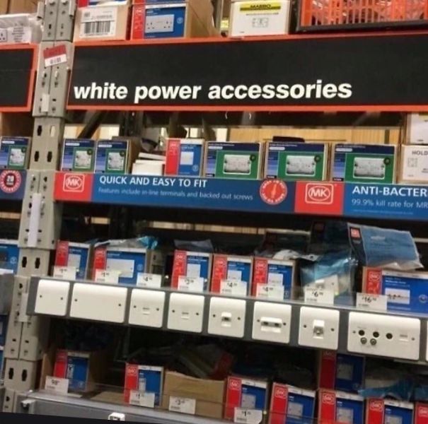
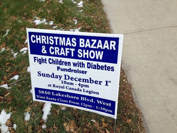
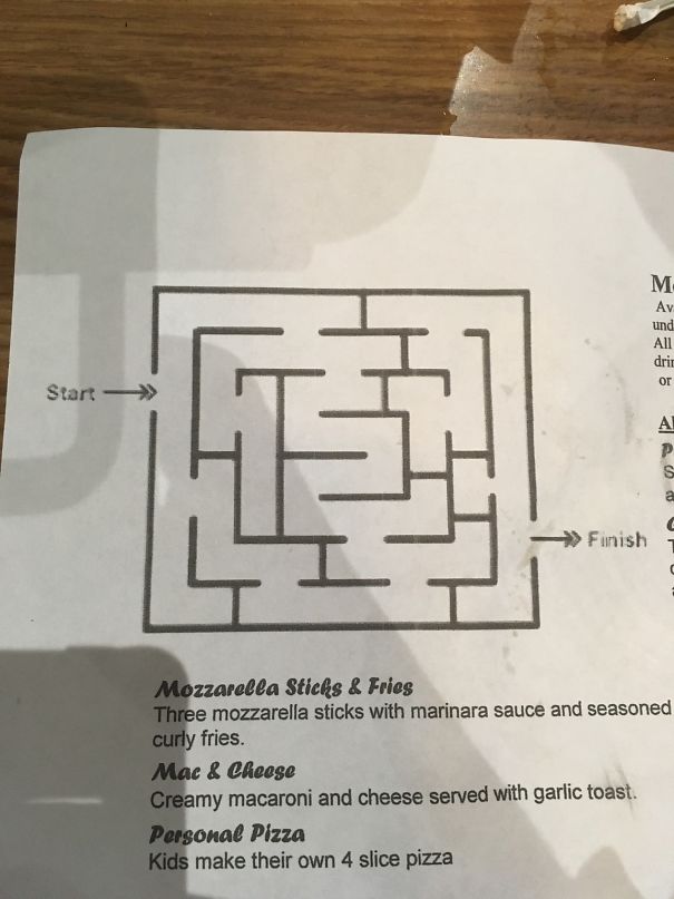
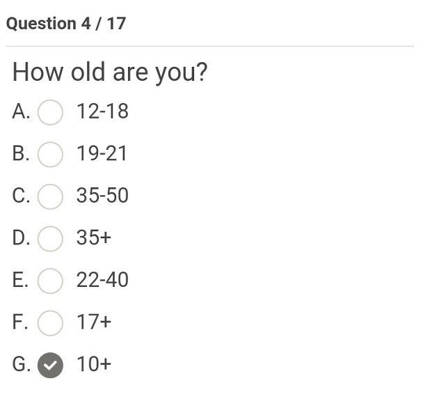
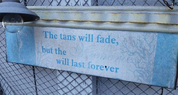
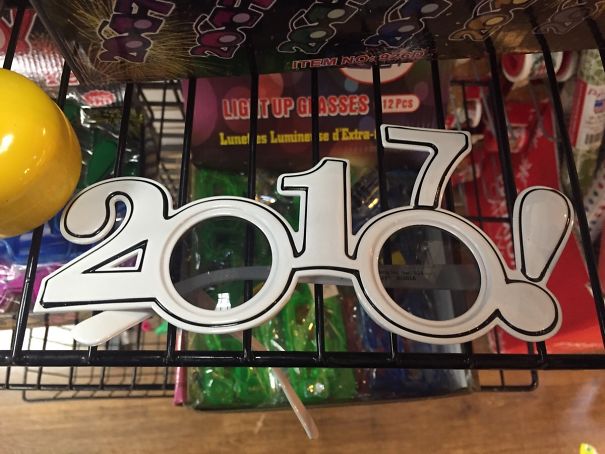
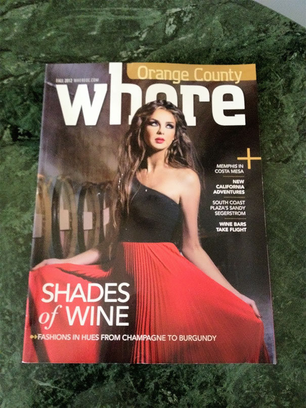
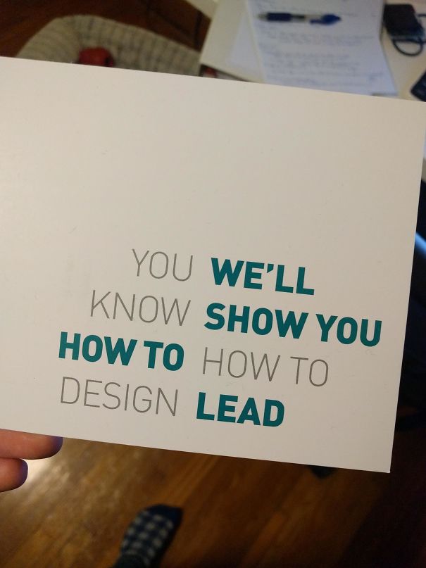
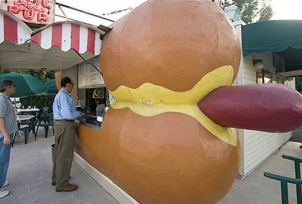
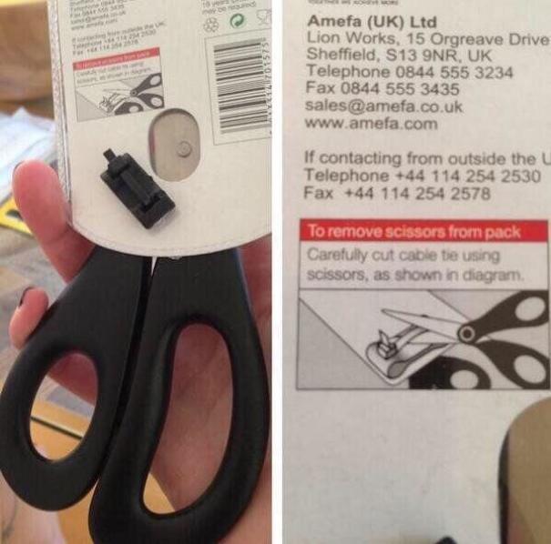
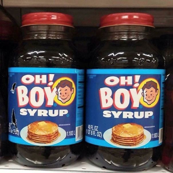
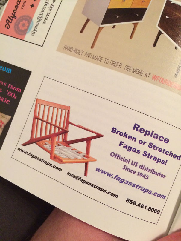
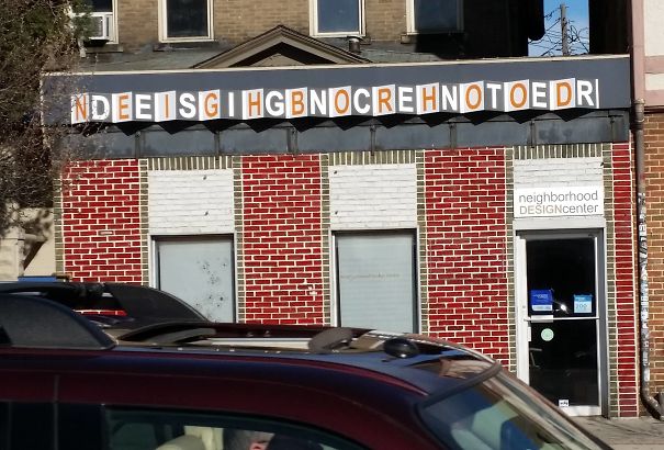
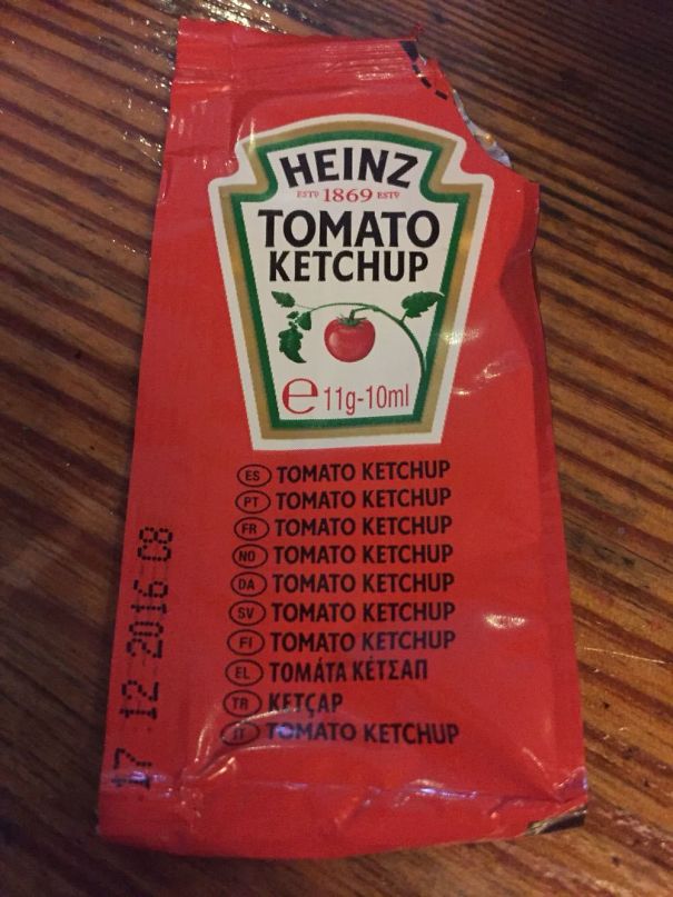
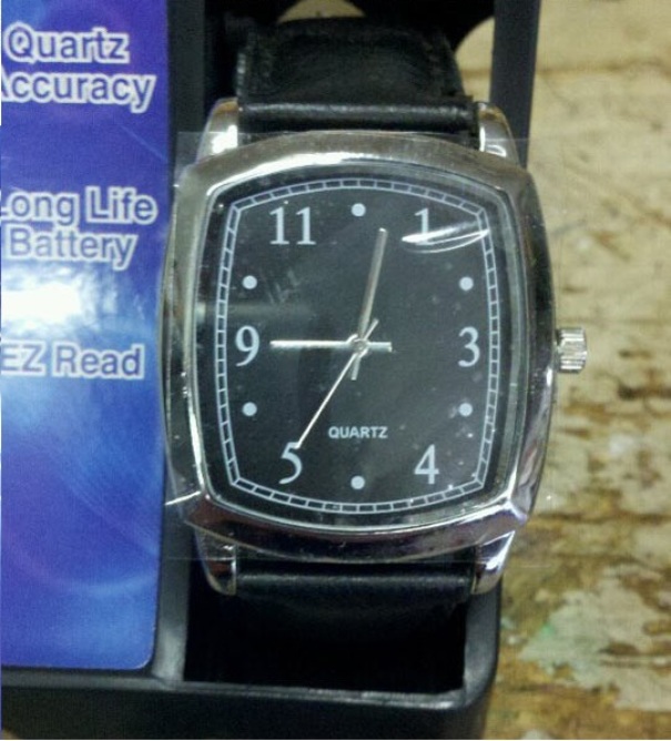
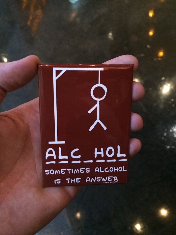
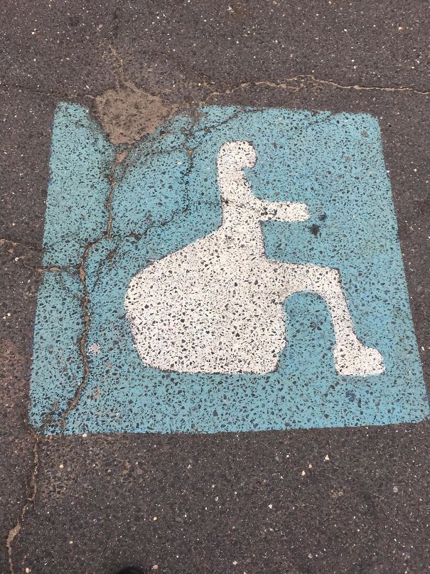
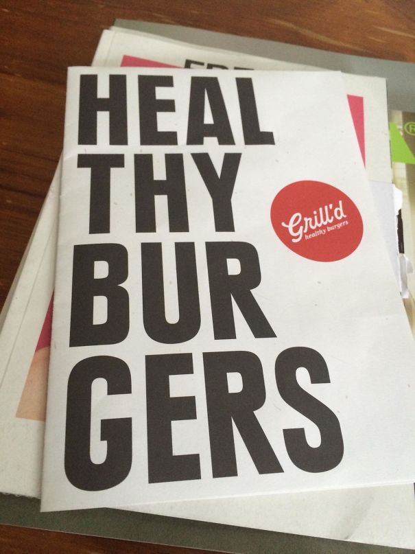
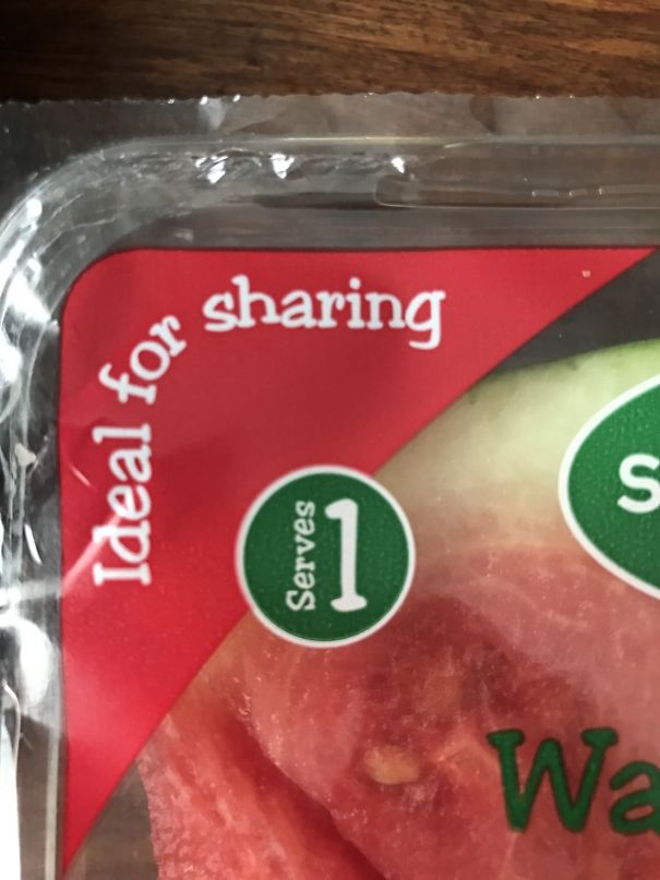
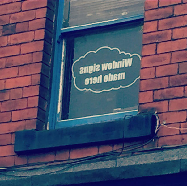
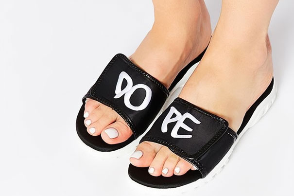
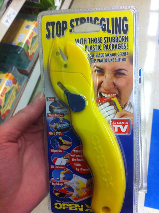
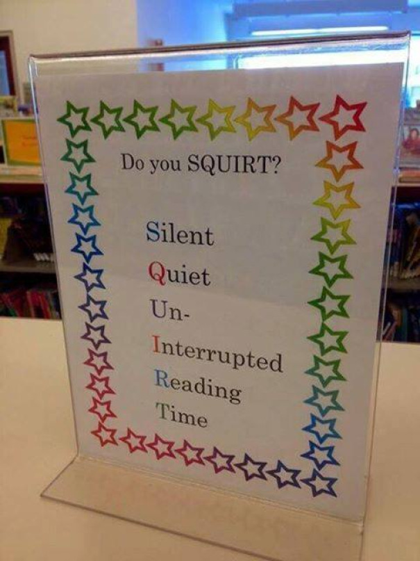
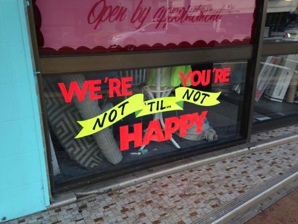
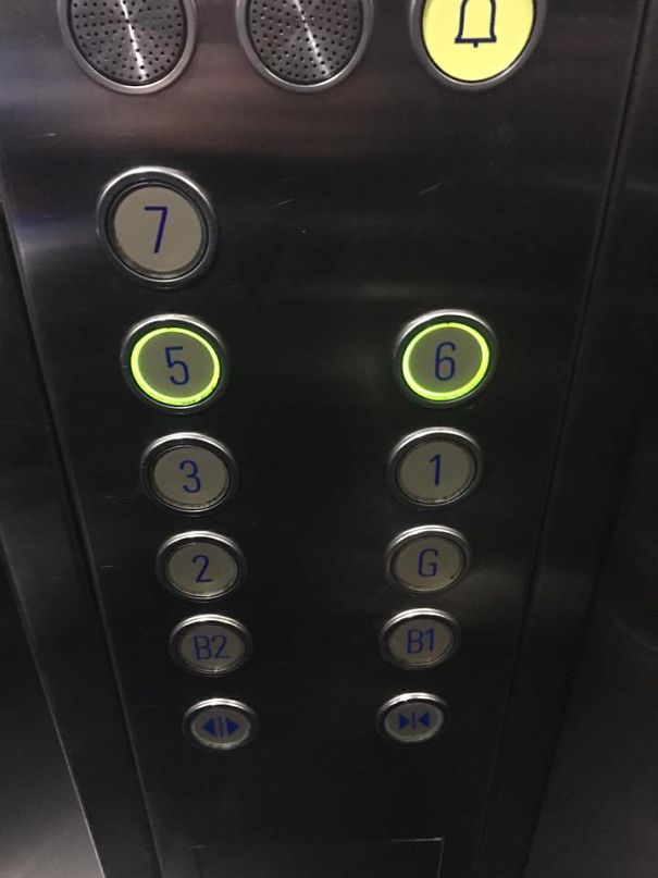
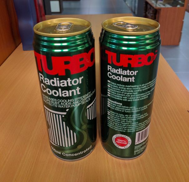
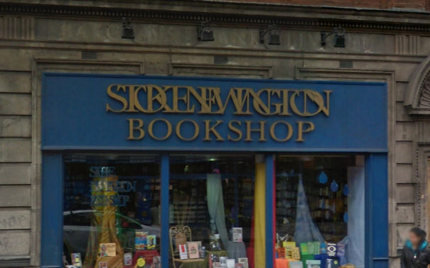
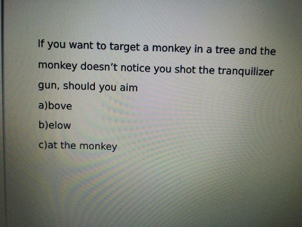
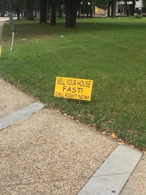
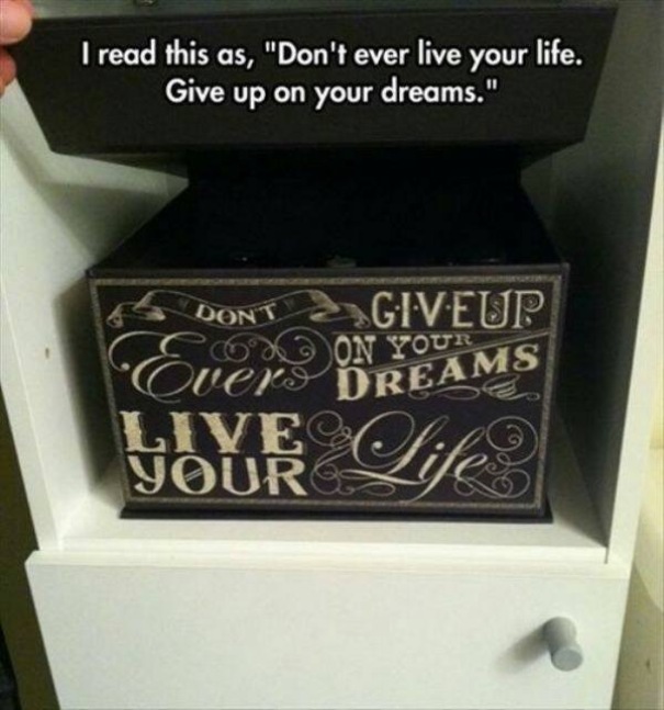
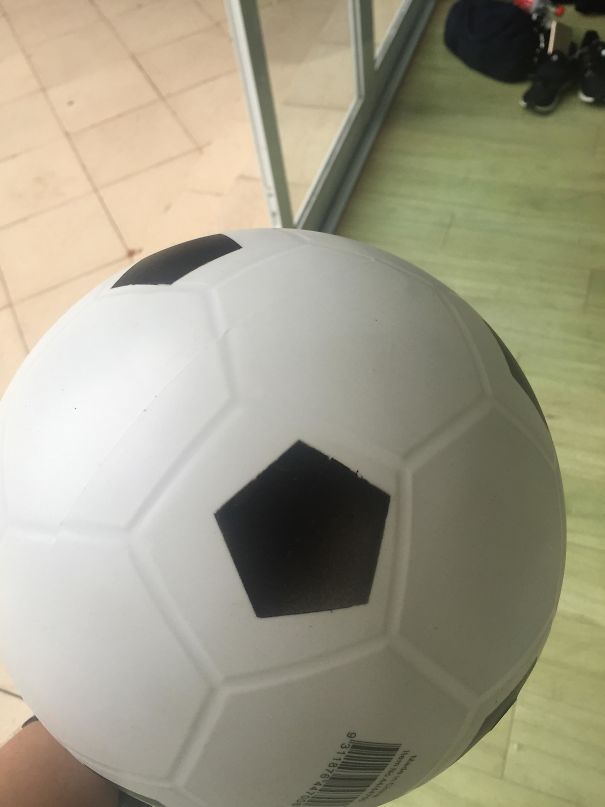
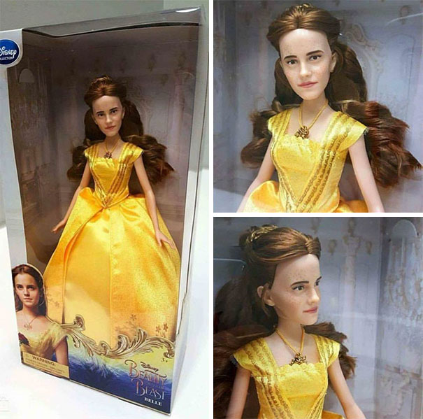
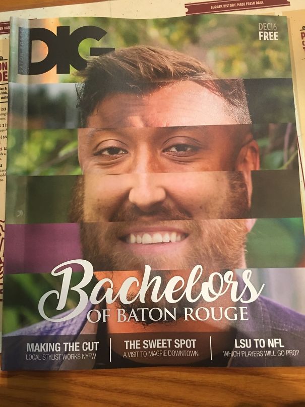
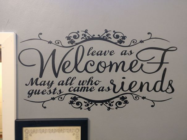
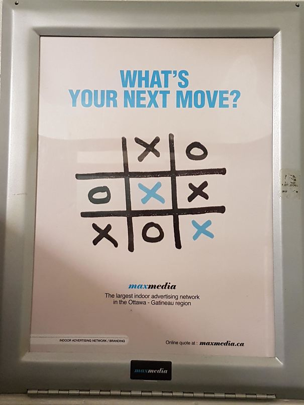
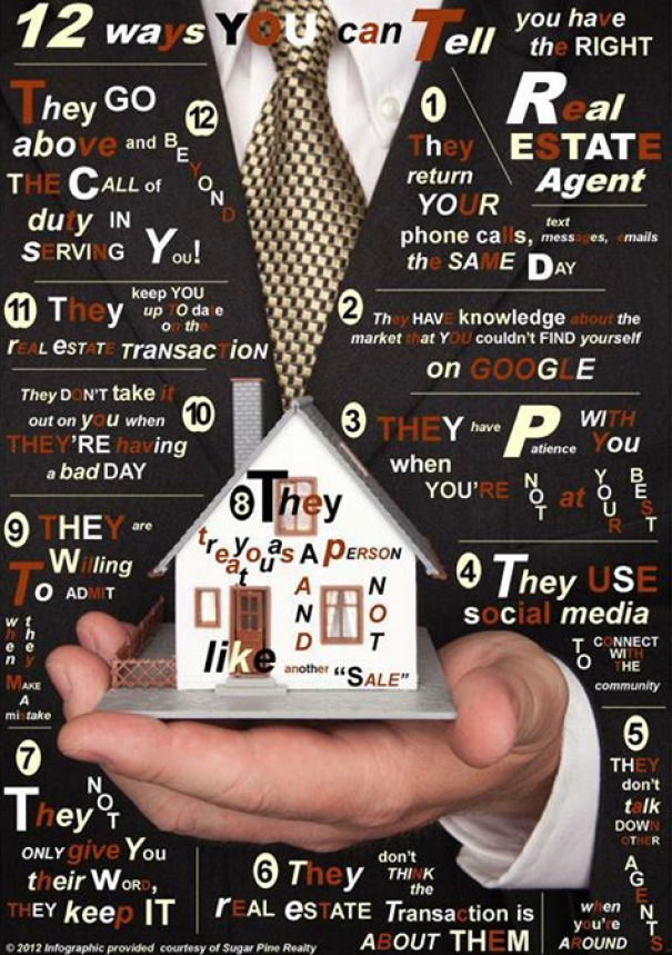
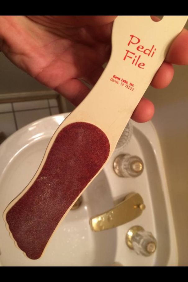
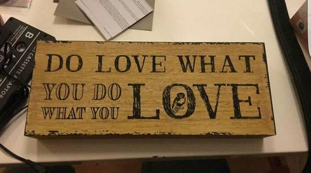
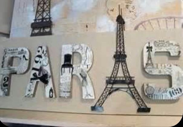
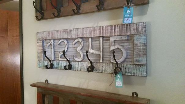
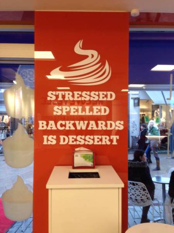
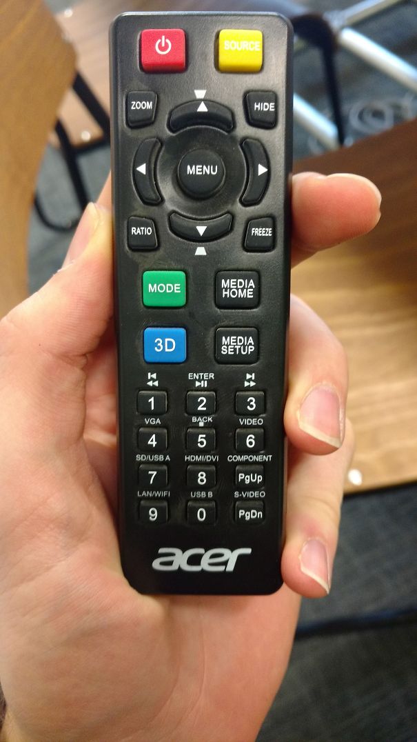
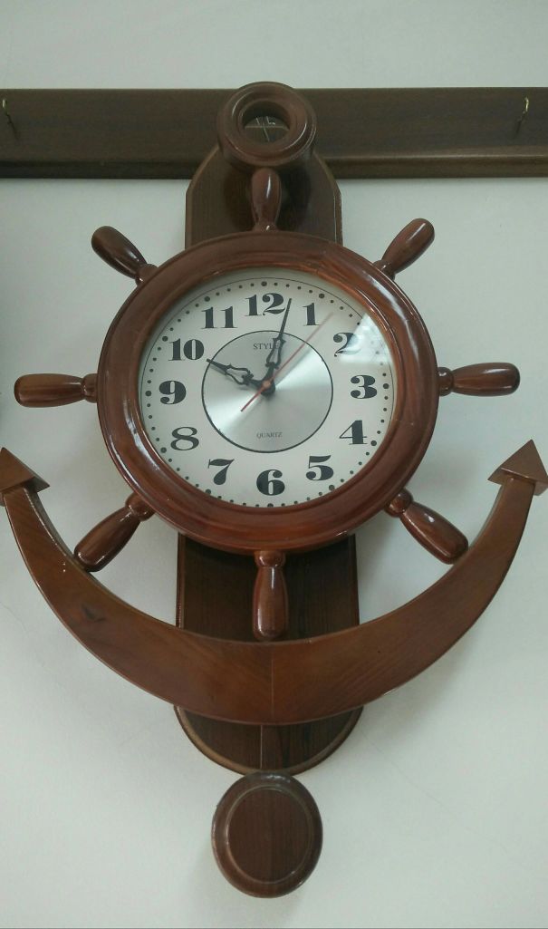
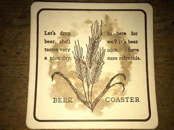
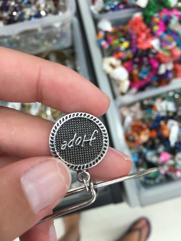
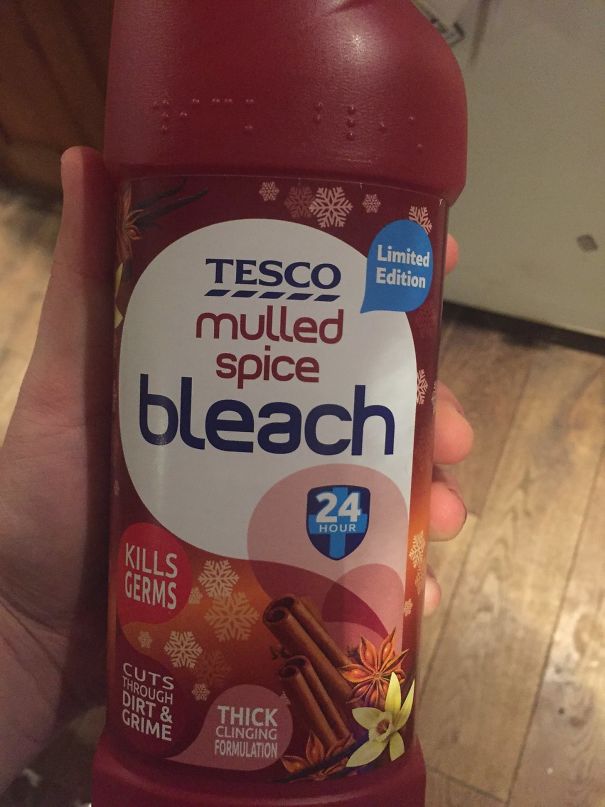
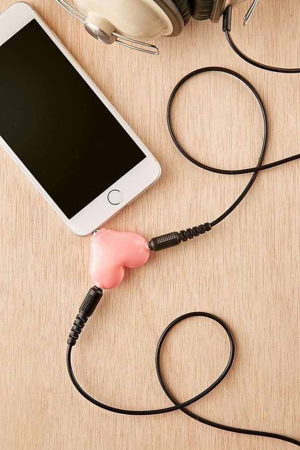
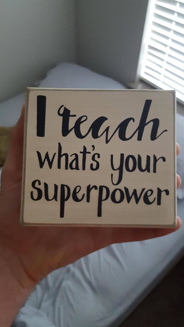
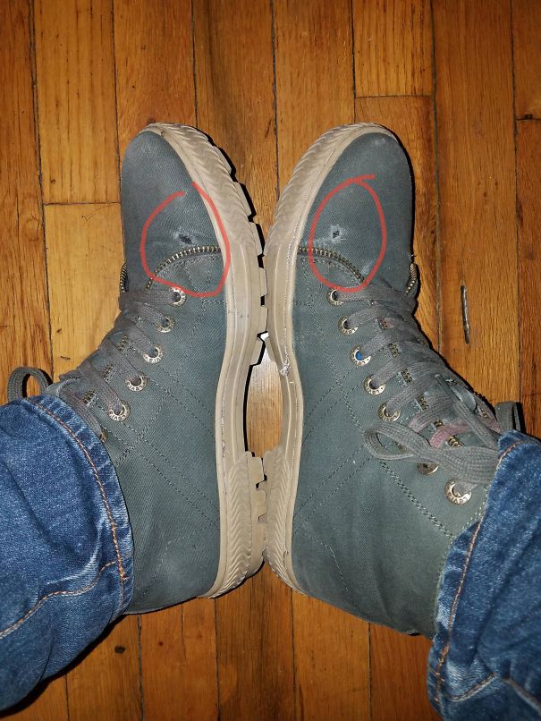
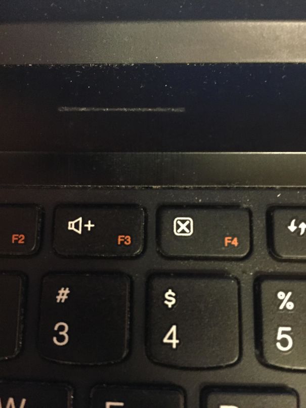
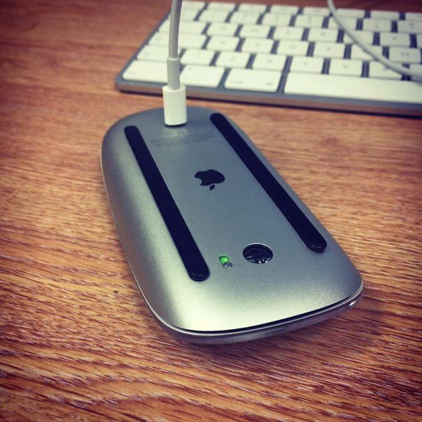
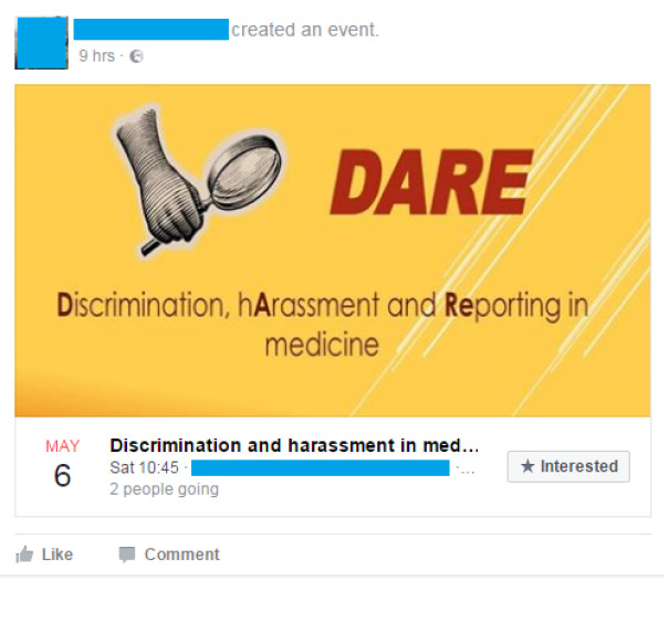
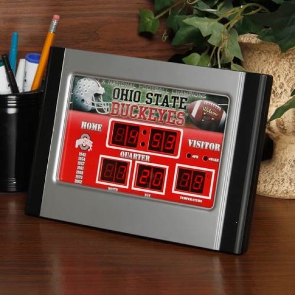
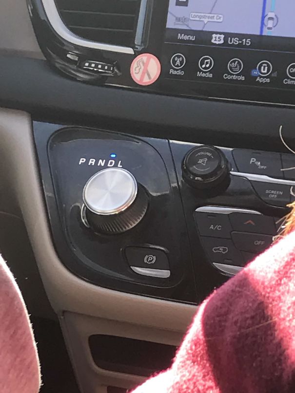
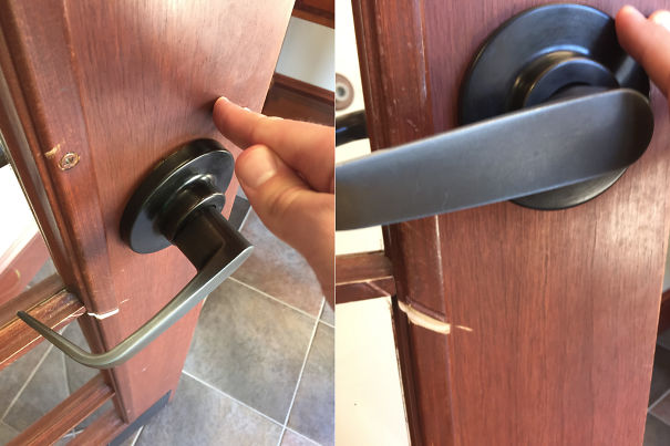
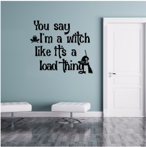
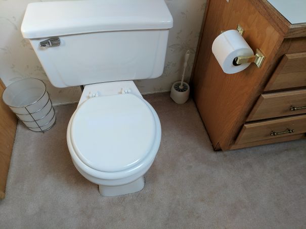
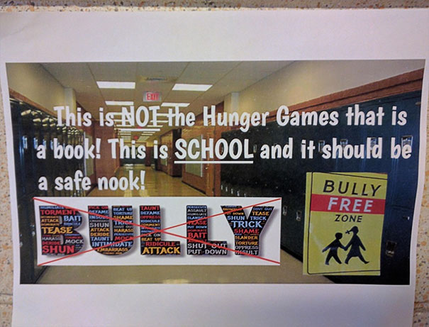
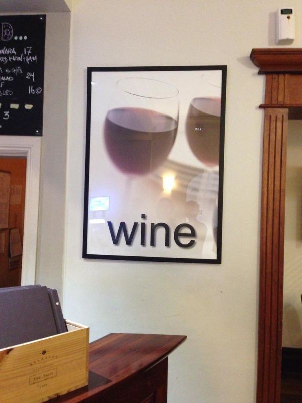
From two gay lions on Noah’s Ark to a bottle of boy syrup, these hilarious fails show that designers are always just a tiny step away from screwing up. These pics were collected from a subreddit called Crappy Design, which features some of the funniest examples of their work that prove the importance of every punctuation mark and other little details.
These designers don't necessarily have bad intentions (except the one who decided to install mirror ceilings in the bathroom). Still, their creations turned out to be better at amusing people rather than carrying out the tasks they were supposed to.
So, ready for some laughs? Here’s a collection of the funniest design fails, the kind of hilarious mix-ups that’ll have you laughing out loud and wondering, “What were the designers thinking?”
This post may include affiliate links.
Let’s break it down. Bad design happens when it doesn't do what it’s supposed to—communicate effectively.
Like a website crammed with elements (excessive colors, a jumble of fonts, images everywhere, and text packed like sardines), clutter makes it tough for the viewer to focus on anything. Instead, good design gives each element space to breathe and be noticed.
Inconsistency is another no-no. Mixing styles, fonts, and colors randomly can be jarring. Good design sticks to a theme, so users don't feel like they’re in a funhouse mirror maze—and that’s why many companies embrace style guidelines.
Typography shouldn’t be overlooked, either. Ever seen a menu where it’s hard to tell the starters from the desserts? That’s bad typography. Good typography knows what to emphasize, what to whisper, and what to shout, making the journey through the content enjoyable and effective.
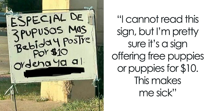
Last but not least, bad design fails to consider different cultural perceptions. Understanding the target audience and their cultural context is key to great design.





















 No fees, cancel anytime