ADVERTISEMENT

Hey there, logo enthusiasts! We sincerely hope you've had your daily dose of coffee because we're about to take a wild ride through the weird and wacky world of logo design fails (I mean, who doesn’t like funny things?). So Pandas, strap in, because we're about to showcase some examples where designers took 'thinking outside the box' a little too literally.

#1

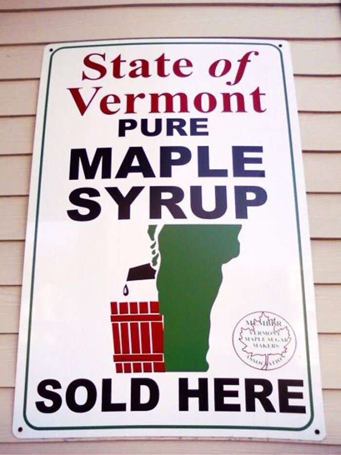
Vermont Maple Syrup Logo

Vermont Maple Syrup Logo

manfredaman Report

Sergy Yeltsen
Community Member
3 years ago

I thought it was Canadians who had maple in their blood. And their urine...

View more comments
RELATED:
    #2

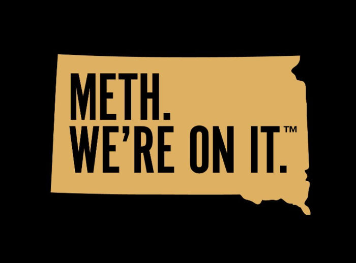
    South Dakota’s Logo For A New Anti-Meth Campaign

    South Dakota’s Logo For A New Anti-Meth Campaign

    adamhasabeard Report

    Loverboy
    Community Member
    3 years ago

    That's great, so am I! Twinsies /s

    View more comments
    #3

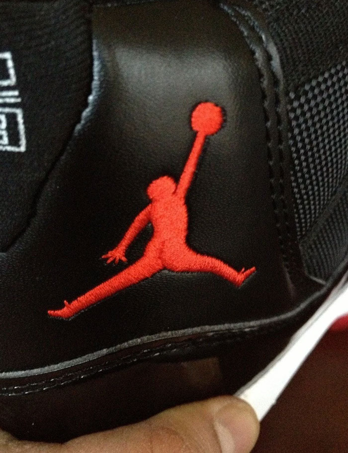
    Ordered Jordan's Online. Got Fake Ones, Jordan Logo Has An A*s Crack. Wtf Lol

    Ordered Jordan's Online. Got Fake Ones, Jordan Logo Has An A*s Crack. Wtf Lol

    Hunchmine Report

    Lily bloom
    Community Member
    3 years ago

    You got air gordons

    View more comments
    #4

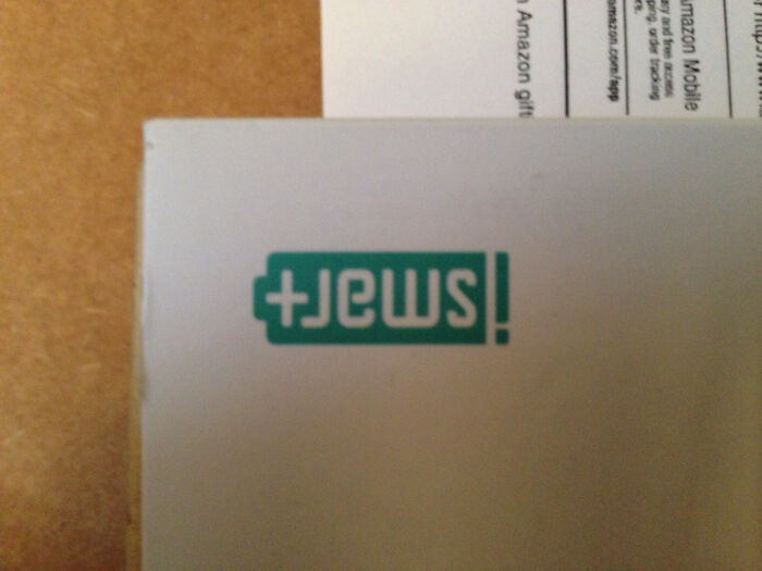
    iSmart's Logo Really Thew Me For A Second

    iSmart's Logo Really Thew Me For A Second

    TinaTeaspoon Report

    Take me to dinner first
    Community Member
    3 years ago (edited)

    oh damn, it's upside down! i was like "how the hell is this ismart?" (at least is +jews and not -jews)

    View more comments
    ADVERTISEMENT
    #5

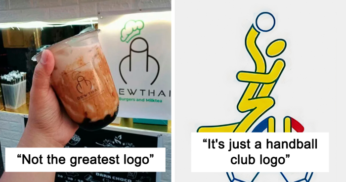
    Not The Greatest Logo

    Not The Greatest Logo

    1aappyy Report

    Loverboy
    Community Member
    3 years ago

    No, greatest logo ever.

    View more comments
    ADVERTISEMENT
    #6

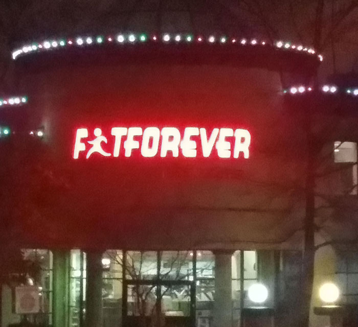
    An Unfortunate Logo For A Fitness Center

    An Unfortunate Logo For A Fitness Center

    Dingwallace Report

    Monday
    Community Member
    3 years ago

    Welp if I'm going to be fat forever I may as well skip the gym.

    View more comments
    #7

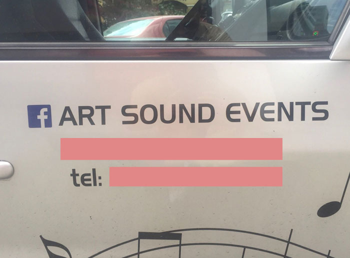
    Unfortunate Placement Of The Facebook Logo

    Unfortunate Placement Of The Facebook Logo

    tanghel Report

    NickTheDuck
    Community Member
    3 years ago

    Hehe farts funny

    View more comments
    #8

    Logo Of My Local Doctor's Office

    Logo Of My Local Doctor's Office

    tlvrtm Report

    KJ
    Community Member
    3 years ago

    Yay, the patient doesn't need any more treatment.

    View more comments
    ADVERTISEMENT
    #9

    Don't Overthink This, It's Just A Handball Club Logo

    Don't Overthink This, It's Just A Handball Club Logo

    tarandfeathers Report

    Loverboy
    Community Member
    3 years ago

    What state of mind would the person who made this had to have been in?

    View more comments
    ADVERTISEMENT
    #10

    The Logo For The 1973 Archdiocese Youth Commission

    The Logo For The 1973 Archdiocese Youth Commission

    Krackajak_78 Report

    Loverboy
    Community Member
    3 years ago

    Technically true...

    View more comments
    #11

    "Yes, A Hanged Family Would Make A Great Logo For Our Company"

    "Yes, A Hanged Family Would Make A Great Logo For Our Company"

    refeer Report

    Bobby G
    Community Member
    3 years ago

    I mean they aren't sick anymore

    View more comments
    #12

    This Store Is Called Jupiter, Their Logo Is The Moon

    This Store Is Called Jupiter, Their Logo Is The Moon

    GaraMind Report

    NickTheDuck
    Community Member
    3 years ago

    We were on the verge of greatness. We were this close!

    View more comments
    ADVERTISEMENT
    #13

    This Logo Of A Turkish Water Brand. It Obviously Sucks

    This Logo Of A Turkish Water Brand. It Obviously Sucks

    sercan35 Report

    cats_from_the_void
    Community Member
    3 years ago

    Age is just a number, jail is just a place... (brilliant title)

    View more comments
    ADVERTISEMENT
    #14

    This Logo Design!!

    This Logo Design!!

    FaustoYoshihara Report

    Loverboy
    Community Member
    3 years ago

    As an added bonus, I read sperm first.

    View more comments
    #15

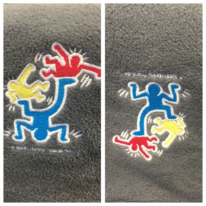
    Logo For A Children’s Hospital. Right Side Up Is A Man Juggling/Playing With Kids. Upside Down Is An Angry Man Stomping On Kids

    Logo For A Children’s Hospital. Right Side Up Is A Man Juggling/Playing With Kids. Upside Down Is An Angry Man Stomping On Kids

    bb_or_not_bb Report

    saltypancakes
    Community Member
    3 years ago

    Keith Haring!

    View more comments

    Never miss a story that brings joy to the world. Add us on Google

    #16

    Your Logo Designer Is Still Laughing

    Your Logo Designer Is Still Laughing

    1morepic_really Report

    Ziggyc
    Community Member
    3 years ago

    Looks like a wonderful weaner

    View more comments
    ADVERTISEMENT
    #17

    I Just Feel Like Someone Should’ve Noticed How Bad The Logo Is

    I Just Feel Like Someone Should’ve Noticed How Bad The Logo Is

    reddit.com Report

    Potato Chimps
    Community Member
    3 years ago

    Thong meat is my fav.

    View more comments
    ADVERTISEMENT
    #18

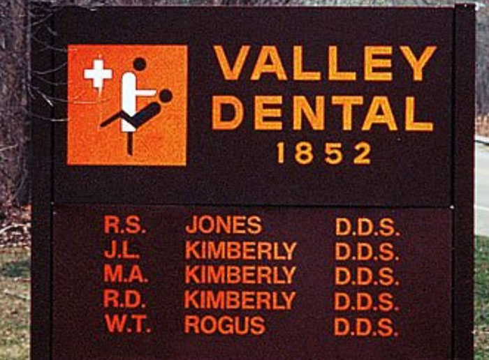
    This Dentist's Choice Of Logo Near My House

    This Dentist's Choice Of Logo Near My House

    krukemeyer Report

    NickTheDuck
    Community Member
    3 years ago

    You guys notice how most of these are in the boring corprate art style?

    View more comments
    #19

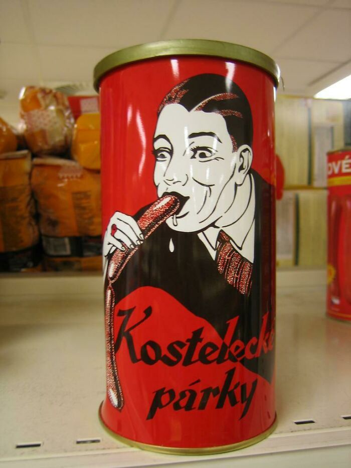
    This Logo Of Czech Sausage Company

    This Logo Of Czech Sausage Company

    RadyoP Report

    cats_from_the_void
    Community Member
    3 years ago

    the white juice...

    View more comments
    #20

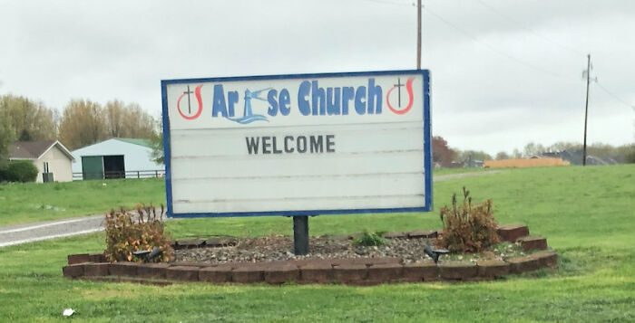
    This Church Near My House Should Probably Rethink Their Logo

    This Church Near My House Should Probably Rethink Their Logo

    bcain204 Report

    S. E. in Indiana
    Community Member
    3 years ago

    Parking around back. Please enter there.

    View more comments
    ADVERTISEMENT
    #21

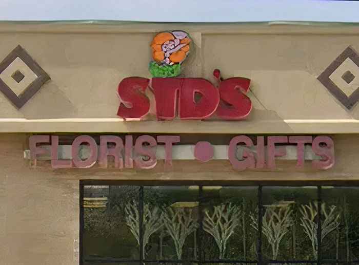
    The Unfortunate Logo Of A Florists Near Me. I've Been Calling It Std's For Years. It's Sid's

    The Unfortunate Logo Of A Florists Near Me. I've Been Calling It Std's For Years. It's Sid's

    Cupnooble Report

    NickTheDuck
    Community Member
    3 years ago

    I have a florist near me that has zebra finches in the shop. sometimes i stop by just to look at the little cuties.

    View more comments
    ADVERTISEMENT
    #22

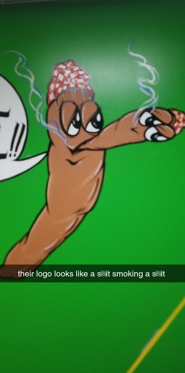
    This Is The Logo From A Local Dispensary

    This Is The Logo From A Local Dispensary

    TulsaIsMyCountry Report

    Apachebathmat
    Community Member
    3 years ago

    Maybe it’s good sh!t

    View more comments
    #23

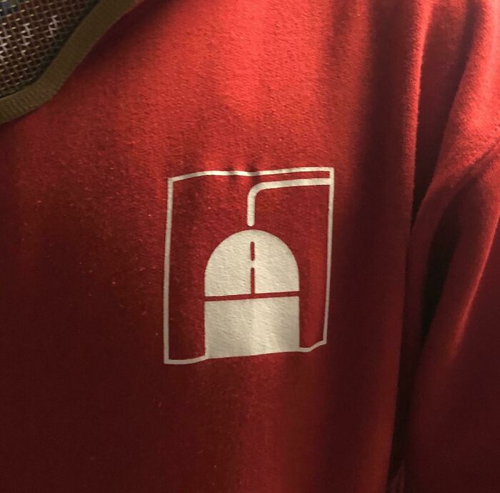
    The Logo For My Son’s IT Class At School

    The Logo For My Son’s IT Class At School

    WarrenZevonsSkull Report

    Monday
    Community Member
    3 years ago

    It took me way too long to notice the penis, I just saw a computer mouse.

    View more comments
    #24

    Probably The Worst Logo I've Ever Seen. It's For A Plastic Surgeon

    Probably The Worst Logo I've Ever Seen. It's For A Plastic Surgeon

    Phedericus Report

    IDidntChooseReality
    Community Member
    3 years ago

    run.

    View more comments
    ADVERTISEMENT
    #25

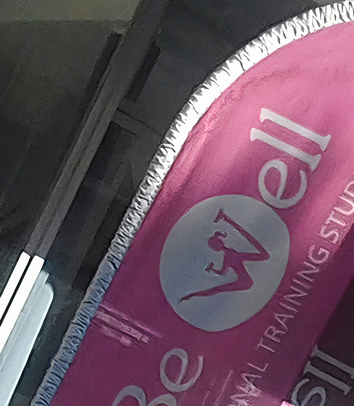
    This Horrific Logo

    This Horrific Logo

    reddit.com Report

    Choco Cookie
    Community Member
    3 years ago

    To reach the optimum level of wellness, you must gain the ability to mutate into.......

    View more comments
    ADVERTISEMENT
    #26

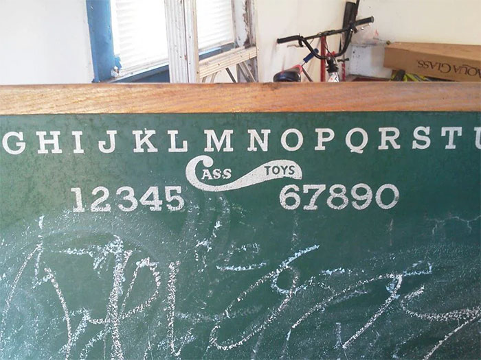
    "Cass Toys" Didn't Think Their Logo Design Through Too Well

    "Cass Toys" Didn't Think Their Logo Design Through Too Well

    cthulhuscock Report

    TGHW
    Community Member
    3 years ago

    I was very disappointed by their selection!

    View more comments
    #27

    This New Sushi Restaurant Logo Has A Racist Cra*py Design

    This New Sushi Restaurant Logo Has A Racist Cra*py Design

    MrsSanedunk Report

    cats_from_the_void
    Community Member
    3 years ago

    ohhhh noooo

    View more comments
    #28

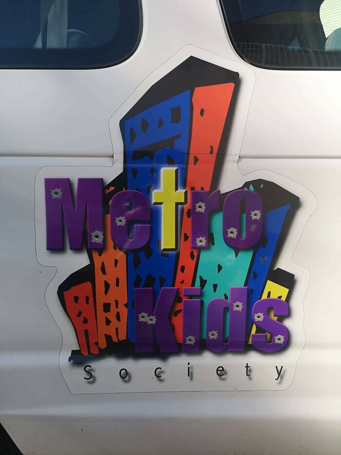
    This Kids Society Logo... The Bullet Holes Are An Interesting Touch

    This Kids Society Logo... The Bullet Holes Are An Interesting Touch

    clarkj1988 Report

    cats_from_the_void
    Community Member
    3 years ago

    This comment has been deleted.

    View more comments
    ADVERTISEMENT
    #29

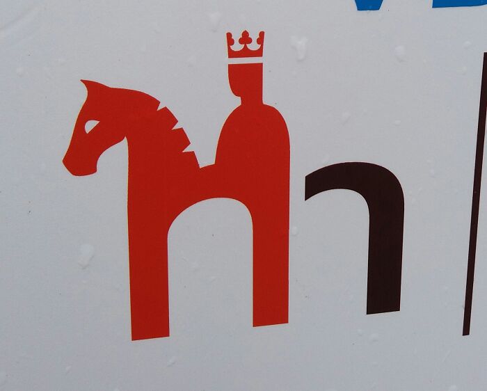
    Logo Is Having A Bad Case Of Diarrhea

    Logo Is Having A Bad Case Of Diarrhea

    LordGhoul Report

    SparkDragon
    Community Member
    3 years ago

    I'm more worried about what the king is doing to that poor horse!

    View more comments
    ADVERTISEMENT
    #30

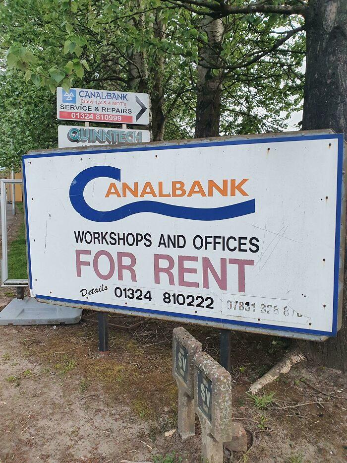
    This Bank Logo In My Hometown

    This Bank Logo In My Hometown

    calumstevenson7 Report

    DiscoqueenJ
    Community Member
    3 years ago

    Never ever separate the C and A in the word canal. It happens way too often.

    View more comments
    #31

    Ontario’s Logo (Trillium Flower) Looks Like 3 Dudes In A Hot Tub

    Ontario’s Logo (Trillium Flower) Looks Like 3 Dudes In A Hot Tub

    GDML Report

    Luke Wensley
    Community Member
    3 years ago

    Well, now I'm gonna think of this whenever I see it

    View more comments
    #32

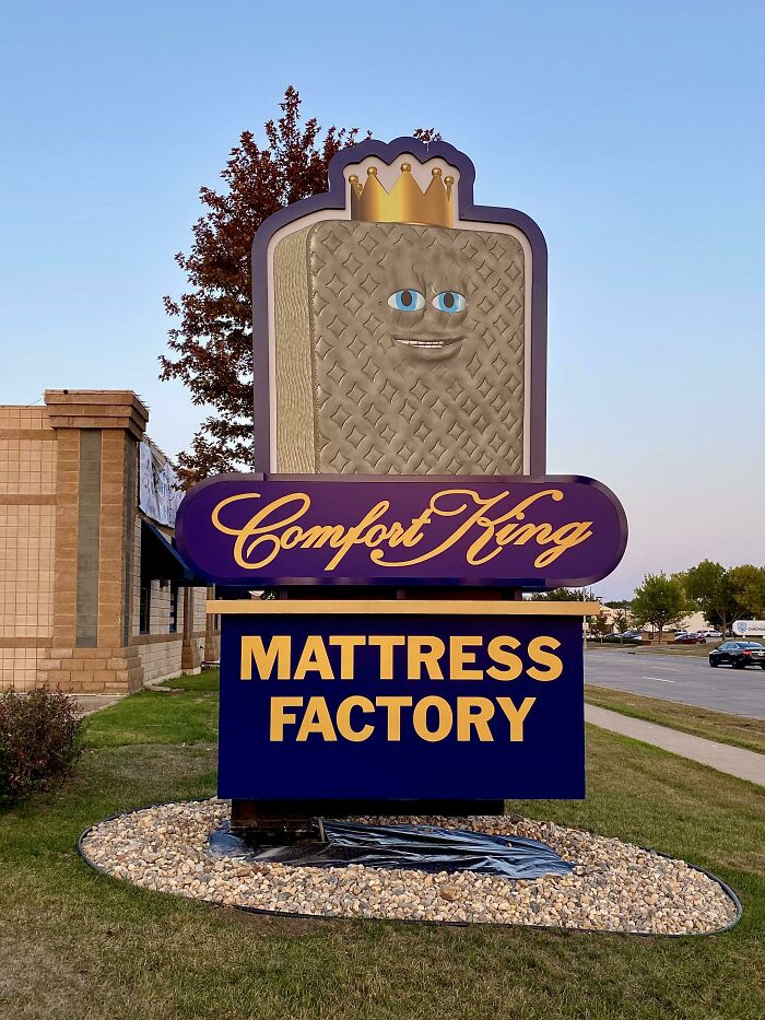
    Someone Paid Money For This To Be Their Sign And Logo/Mascot. I’m Convinced This Is Drug Lord’s Money Laundering Business

    Someone Paid Money For This To Be Their Sign And Logo/Mascot. I’m Convinced This Is Drug Lord’s Money Laundering Business

    SoDakZak Report

    Kristal
    Community Member
    3 years ago

    Mattress looks high

    View more comments
    ADVERTISEMENT
    #33

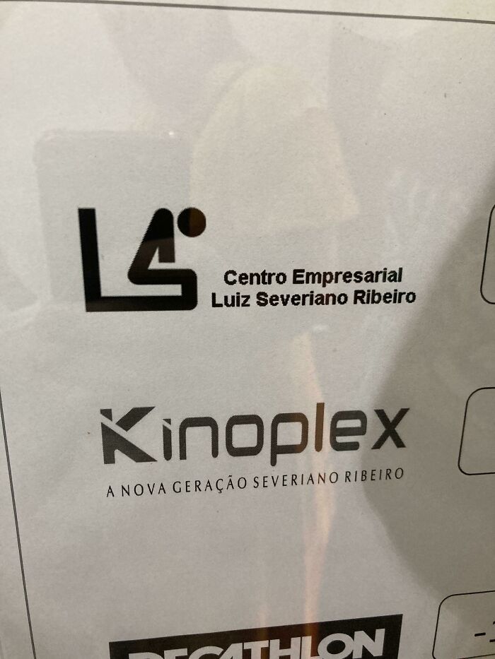
    Business Center Logo Looks Like A Guy Taking A Dump

    Business Center Logo Looks Like A Guy Taking A Dump

    bernardo15 Report

    S. E. in Indiana
    Community Member
    3 years ago

    No s**t, we are the best.

    View more comments
    ADVERTISEMENT
    #34

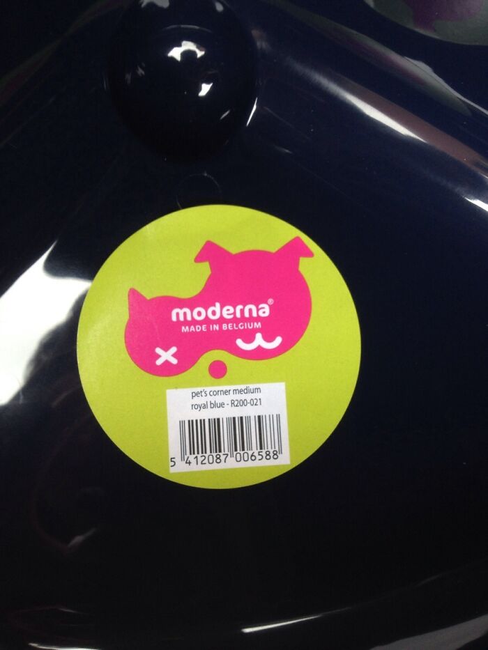
    This Pet Supplies Company's Logo Is Meant To Depict A Cat And A Dog, But What I See Is A Dead Bird

    This Pet Supplies Company's Logo Is Meant To Depict A Cat And A Dog, But What I See Is A Dead Bird

    sentient_salami Report

    °CORLEONE°
    Community Member
    3 years ago

    I see a rhino. "x" is the mouth for reference.

    View more comments
    #35

    They Really Need A New Logo

    They Really Need A New Logo

    ForeverInaDaze Report

    Samantha Mannion
    Community Member
    3 years ago

    Lmao well that's an interesting twist on am eiffel tower

    View more comments
    #36

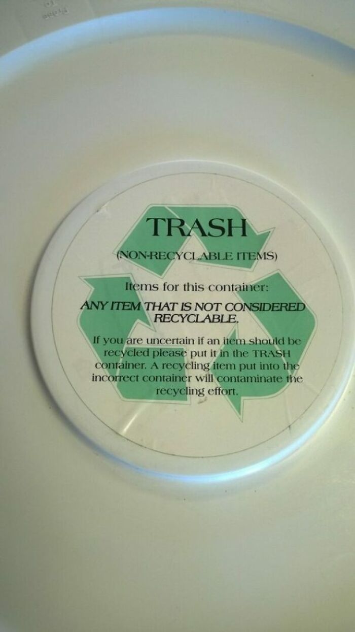
    Then Why Use The Recyclable Logo?

    Then Why Use The Recyclable Logo?

    kimmbahley Report

    David
    Community Member
    3 years ago

    let's put this logo here to make the text difficult to read so folks will just see the logo and put their recyclables here.

    View more comments
    ADVERTISEMENT
    #37

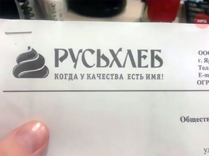
    Russian Bread Company Logo. Literally Cra**y Design

    Russian Bread Company Logo. Literally Cra**y Design

    WildWasteland42 Report

    Boris Long-Johnson
    Community Member
    3 years ago

    Looks like the Edinburgh golden turd! https://www.edinburghnews.scotsman.com/business/consumer/you-cant-polish-a-turd-but-you-can-clad-it-in-bronze-coloured-steel-3301450

    View more comments
    ADVERTISEMENT
    #38

    My School's Logo Looks Like A Crying Face

    My School's Logo Looks Like A Crying Face

    raviioli Report

    Eldritch_catt0
    Community Member
    3 years ago

    Why did they have to draw the bodies like this?? There are literally so many other, more reasonable ways. Did they just want to be original or sthng?

    View more comments
    #39

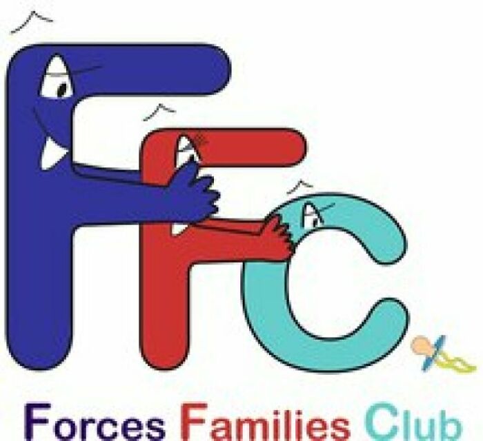
    Quite A Bizarre Logo

    Quite A Bizarre Logo

    SupraPseudo Report

    Stardust she/her
    Community Member
    Premium
    3 years ago

    The heck is this? The red F kind of looks terrified, blue F looks creepy like he knows what he’s doing and the C is just staring out into the distance because he doesn’t have a mouth so he can’t use the pacifier

    View more comments
    #40

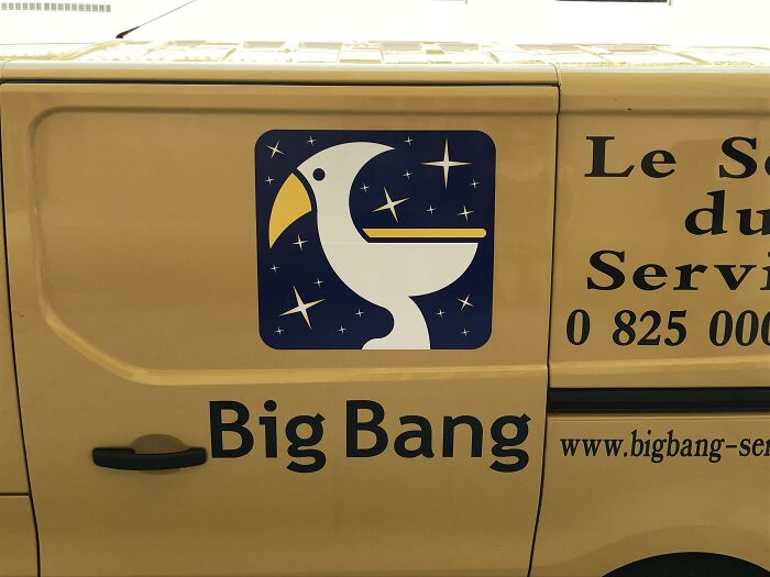
    This Logo Of A Bird Also Looks Like A Character Wearing A Hat Puking

    This Logo Of A Bird Also Looks Like A Character Wearing A Hat Puking

    bunsharu Report

    S. E. in Indiana
    Community Member
    3 years ago

    Looks to me like he swallowed a fork.

    View more comments
    ADVERTISEMENT
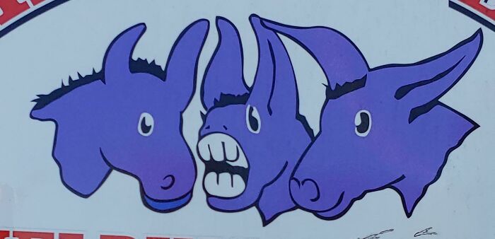
    #41

    Rodent Logo With Teeth Coming Out Of It's Nose Instead Of Mouth

    Rodent Logo With Teeth Coming Out Of It's Nose Instead Of Mouth

    the_local_hobo Report

    two-sided llama
    Community Member
    3 years ago

    nose teeth

    View more comments
    ADVERTISEMENT
    #42

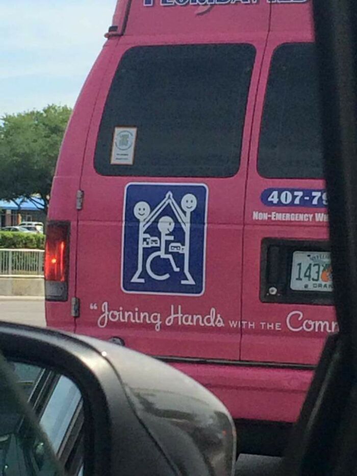
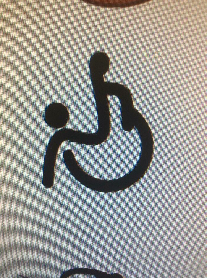
    This Disability Logo

    This Disability Logo

    iam4real Report

    Xray0976
    Community Member
    3 years ago

    BB-8's cousin??

    View more comments
    #43

    This Backpack Logo

    This Backpack Logo

    rubbersoul121 Report

    cats_from_the_void
    Community Member
    3 years ago

    Good morning, today could I please have 200g of your finest Sample Text? Oh and could I please buy a backpack with the Sample Text logo? Thx

    View more comments
    #44

    This Logo Design By Square Enix

    This Logo Design By Square Enix

    Groenboys Report

    S. E. in Indiana
    Community Member
    3 years ago

    Well as long as you are not allergic to polyester fiber it should be safe to use. So, have fun.

    View more comments
    ADVERTISEMENT
    #45

    The Logo For Wheelchair Rugby Looks Like A Guy Falling Off A Wheelchair

    The Logo For Wheelchair Rugby Looks Like A Guy Falling Off A Wheelchair

    LilNebo_ Report

    SparkDragon
    Community Member
    3 years ago

    Well, to be fair, that happens a fair bit in the game too!

    View more comments
    ADVERTISEMENT
    #46

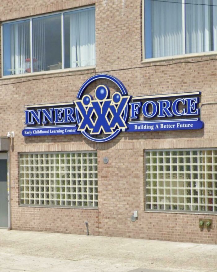
    Childcare Logo Looks Like XXX

    Childcare Logo Looks Like XXX

    TuxedoFloorca Report

    The other-other David Wong
    Community Member
    3 years ago

    That’s some hardcore childcare

    View more comments
    #47

    This Kindergarten Logo

    This Kindergarten Logo

    esn97 Report

    IDidntChooseReality
    Community Member
    3 years ago

    what they teaching

    View more comments
    #48

    The Brazilian Cinematheque Logo

    The Brazilian Cinematheque Logo

    ColdSunnyMorning Report

    Take me to dinner first
    Community Member
    3 years ago

    y'all see a too much in everything lol, looks like the symbol of division to me

    View more comments
    ADVERTISEMENT
    #49

    What Does This Logo Even Say?

    What Does This Logo Even Say?

    SindreSand Report

    Ole Peder Amrud Hagen
    Community Member
    3 years ago

    Kristiania. It's a college in Oslo.

    View more comments
    ADVERTISEMENT
    #50

    The New Logo Of My University

    The New Logo Of My University

    xShiigerun Report

    cats_from_the_void
    Community Member
    3 years ago

    to pass the entrance exam one must decipher the code to prove one's intellectual skills and patience. they award scholarships to those that can do it in under 1 hour.

    View more comments
    #51

    Client: So For My Logo I Want A Bird, The Moon, And A Toilet. Designer: I Mean Ok, But Are You Sure, It'll Look A Bit Odd? Client: Yes

    Client: So For My Logo I Want A Bird, The Moon, And A Toilet. Designer: I Mean Ok, But Are You Sure, It'll Look A Bit Odd? Client: Yes

    ianjaynorris1981 Report

    ThatFriendlyFox (she/her)
    Community Member
    3 years ago

    What did you see first?

    View more comments
    #52

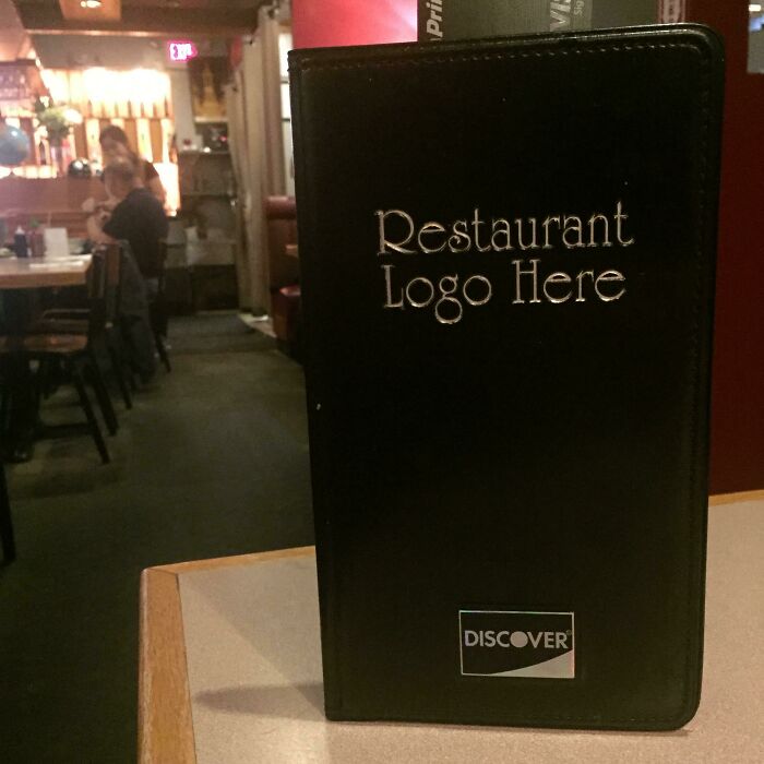
    I Love Eating At Restaurant Logo Here

    I Love Eating At Restaurant Logo Here

    vaguevisibility Report

    not your average weirdo
    Community Member
    3 years ago

    Well that is a very original name

    View more comments
    ADVERTISEMENT
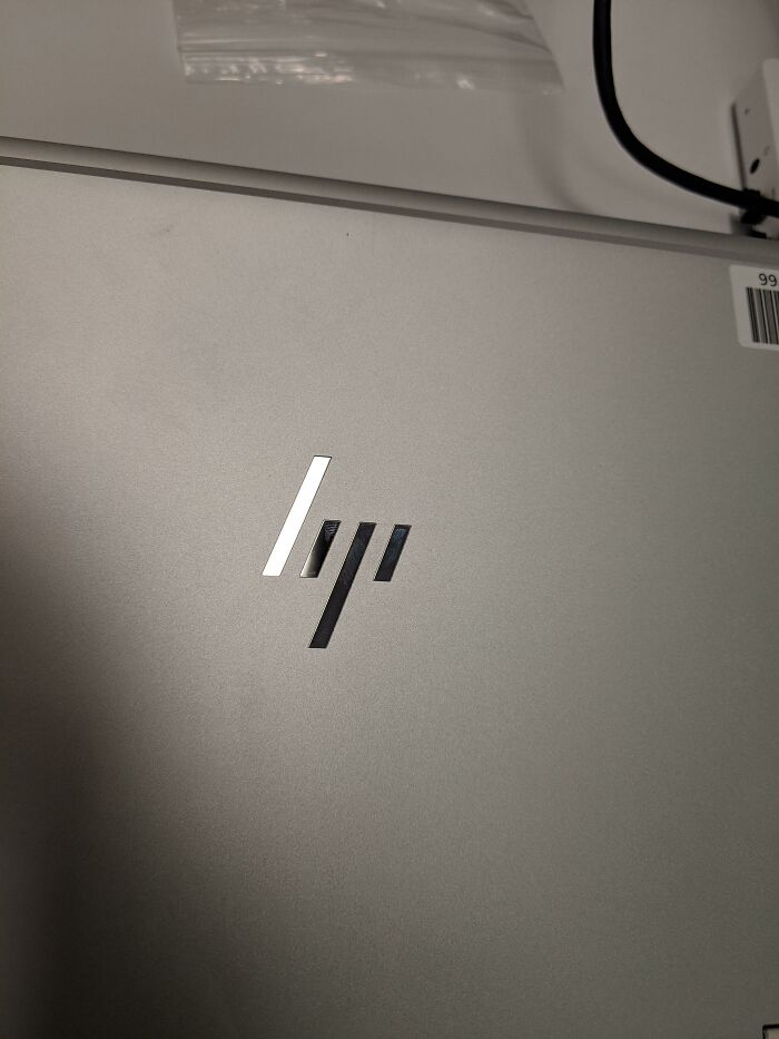
    #53

    Hp New Logo Can Be Either Hp Or Bp Or Lqi Or Lip

    Hp New Logo Can Be Either Hp Or Bp Or Lqi Or Lip

    Maax42_ Report

    Error 404 (He/They)
    Community Member
    3 years ago

    Those are lines

    View more comments
    ADVERTISEMENT
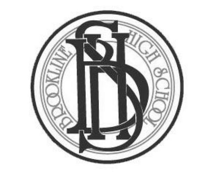
    #54

    I Always Thought My Old High School's Logo Was An Abomination. (It's Supposed To Read Bhs)

    I Always Thought My Old High School's Logo Was An Abomination. (It's Supposed To Read Bhs)

    YahooAnswersUser Report

    Phase9.ka
    Community Member
    3 years ago

    *dies of dyslexia*

    View more comments
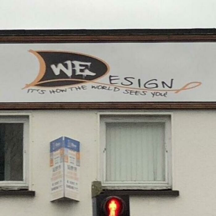
    #55

    This Graphic Design Company Sabotaged Themselves From The Very Start With One Of The Worst Logos Of All Time

    This Graphic Design Company Sabotaged Themselves From The Very Start With One Of The Worst Logos Of All Time

    Pontifff Report

    cosmoforsdragon (he/they)
    Community Member
    3 years ago

    is that spray paint?

    View more comments
    #56

    New England Airways’ Logo Just Looks Like Paint Chipping Off The Tail

    New England Airways’ Logo Just Looks Like Paint Chipping Off The Tail

    ThatOneGayDJ Report

    Li’l E.
    Community Member
    3 years ago

    It’s Block Island! But it’s true, it does look like the paint peeled off unless you’re familiar with that particular part of Rhode Island.

    View more comments
    ADVERTISEMENT
    #57

    Saw This Terrifying Logo Today

    Saw This Terrifying Logo Today

    swimking413 Report

    Strahd Ivarius
    Community Member
    3 years ago

    the version with the elephant is truly terrifying

    View more comments
    ADVERTISEMENT
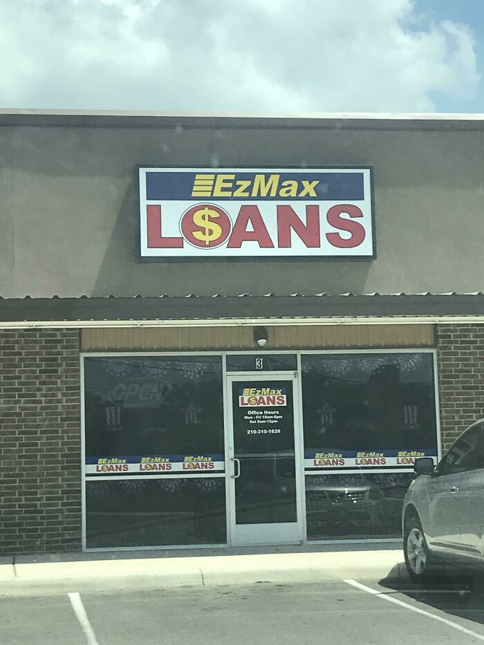
    #58

    If Only There Was A Letter In The Logo That Looked Like A Dollar $ign

    If Only There Was A Letter In The Logo That Looked Like A Dollar $ign

    unbuckledbren Report

    Mangelo Il Fumatori
    Community Member
    3 years ago (edited)

    LoSans

    View more comments
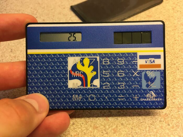
    #59

    "Let’s Put The Logos Behind The Buttons"

    "Let’s Put The Logos Behind The Buttons"

    ljungqvistaxel Report

    cosmoforsdragon (he/they)
    Community Member
    3 years ago

    wait what is that lol is it a calculator or fake credit card

    View more comments
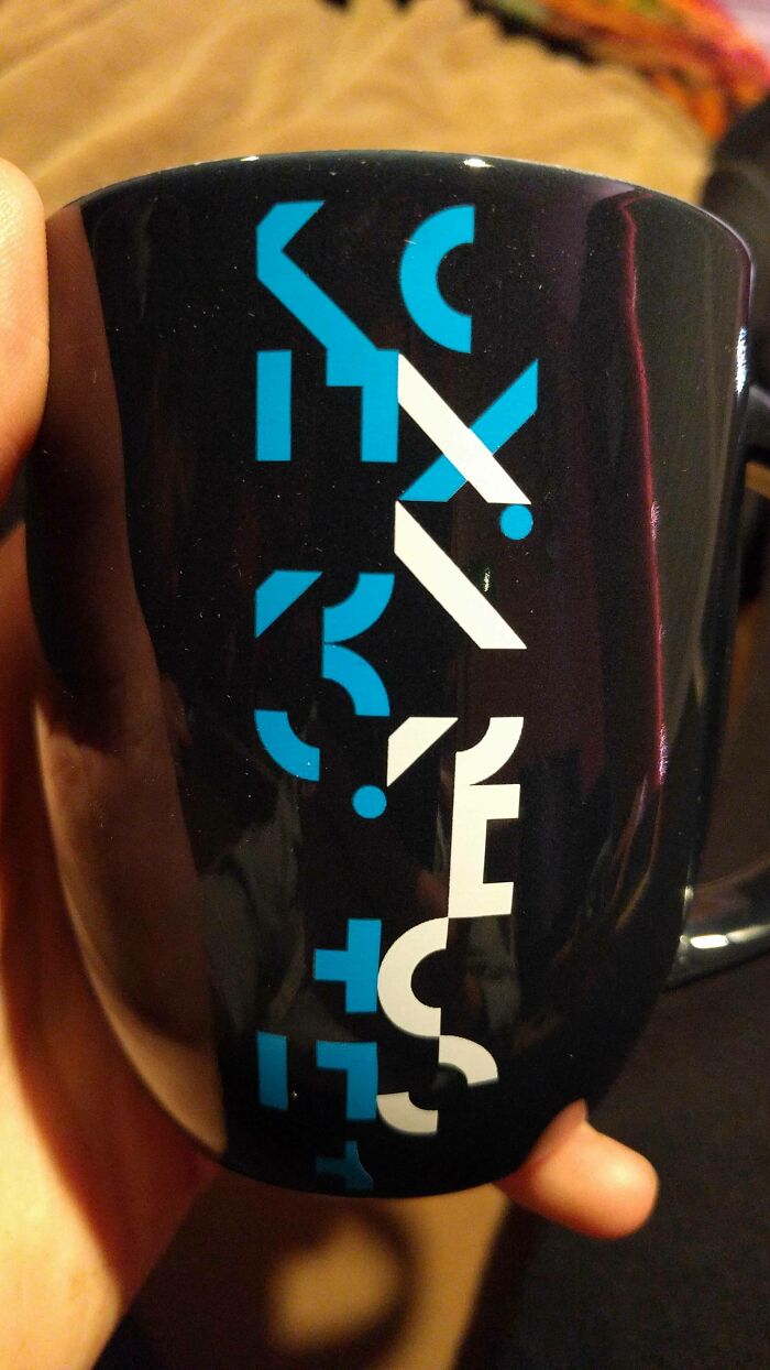
    #60

    The New Logo For Arhus University

    The New Logo For Arhus University

    fredo3579 Report

    Sergy Yeltsen
    Community Member
    3 years ago

    What the eff? Do you have to be stoned/drunk to read it?

    View more comments
    ADVERTISEMENT
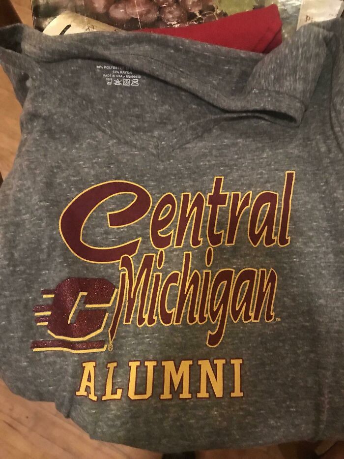
    #61

    Instead Of Using The University’s Logo To Replace The “C” In Central, They Just Kind Of Threw It On There

    Instead Of Using The University’s Logo To Replace The “C” In Central, They Just Kind Of Threw It On There

    xFly1ngPengu1nx Report

    Kimbowa
    Community Member
    3 years ago

    Another opportunity missed.

    View more comments
    ADVERTISEMENT
    #62

    This Logo Is Actually Kind Of Sad

    This Logo Is Actually Kind Of Sad

    reddit.com Report

    Sergy Yeltsen
    Community Member
    3 years ago

    MS Paint is responsible for many hideous atrocities.

    View more comments
    #63

    Youtube Sports Logo Looks Like Biohazard Warning Logo

    Youtube Sports Logo Looks Like Biohazard Warning Logo

    PsykoloGG Report

    Billy Harrelson
    Community Member
    3 years ago

    I dunno, you ever smelled the boys locker room at high school after a game? Might just be pretty accurate.

    View more comments
    #64

    The 1928 Nfl Champion Providence Steam Rollers Logo

    The 1928 Nfl Champion Providence Steam Rollers Logo

    feetandballs Report

    cats_from_the_void
    Community Member
    3 years ago

    it's elon musk!!!

    View more comments
    ADVERTISEMENT
    #65

    This Idiotic Logo For An Eyewear Store. Music Notes? What?

    This Idiotic Logo For An Eyewear Store. Music Notes? What?

    reddit.com Report

    cosmoforsdragon (he/they)
    Community Member
    3 years ago

    dotical solution

    View more comments
    ADVERTISEMENT
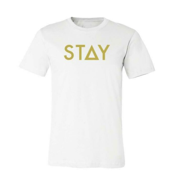
    #66

    The Clothing Company “Stay Wear” Encourages People To Stay Who They Are... And Uses The The Mathematical Symbol For Change In Their Logo

    The Clothing Company “Stay Wear” Encourages People To Stay Who They Are... And Uses The The Mathematical Symbol For Change In Their Logo

    DR4G0N_4RMY Report

    Doodilydoo
    Community Member
    3 years ago

    Why would you want to stay who you are? You're supposed to grow and change as a person! If you're the same as you were ten years ago, you're doing it wrong.

    View more comments
    #67

    I Hate This Logo So Muc H…

    I Hate This Logo So Muc H…

    LeifSized Report

    cats_from_the_void
    Community Member
    3 years ago

    omg I love that place, they have the best blood baths and their weekly summoning rituals are to DIE FOR. 5/5

    View more comments
    #68

    My Hometown’s New Logo Which Cost Them $97,000

    My Hometown’s New Logo Which Cost Them $97,000

    eilsna Report

    Xray0976
    Community Member
    3 years ago

    The 90s are calling and they want their web designer back

    View more comments
    ADVERTISEMENT
    #69

    When A 6 Year Old Designs Your "Signature" Logo

    When A 6 Year Old Designs Your "Signature" Logo

    liquidtension10s Report

    S. E. in Indiana
    Community Member
    3 years ago

    I really don't see a problem here.

    View more comments
    ADVERTISEMENT
    #70

    Actual Logo For A Mexican Restaurant In My Town

    Actual Logo For A Mexican Restaurant In My Town

    OnionTuck Report

    Mangelo Il Fumatori
    Community Member
    3 years ago

    Sloth is their mascot?

    View more comments
    #71

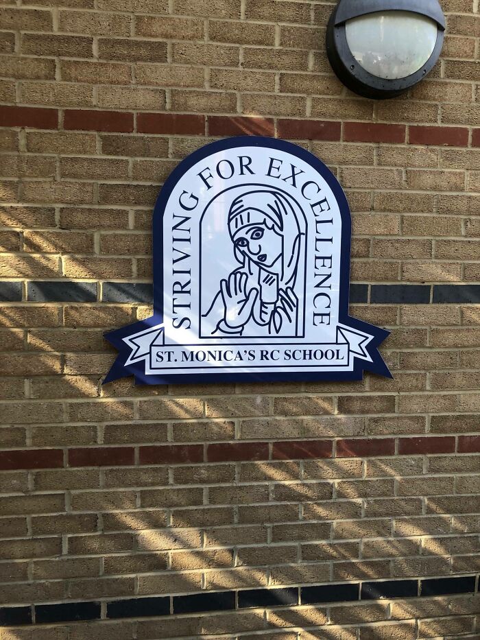
    The Actual Logo Of A School Near Me

    The Actual Logo Of A School Near Me

    MagL33To Report

    Mangelo Il Fumatori
    Community Member
    3 years ago

    "Striving for Excellence... Falling Way Short"

    View more comments
    #72

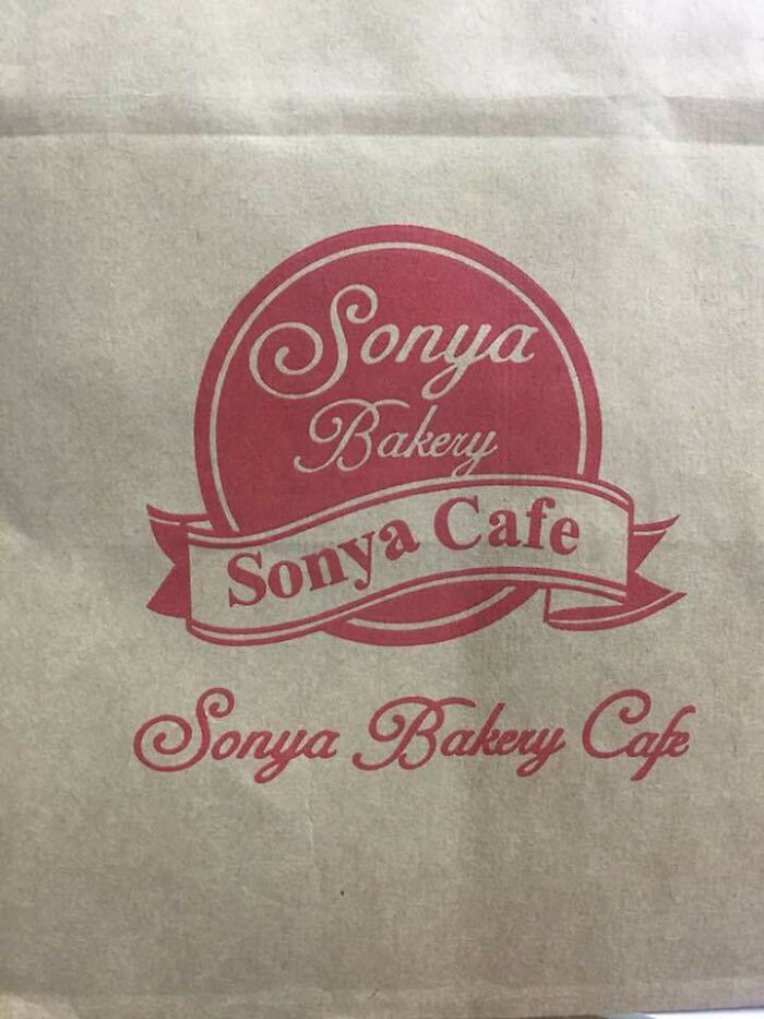
    The Most Redundant Logo Ever? Baked Goodies Were Delicious Though

    The Most Redundant Logo Ever? Baked Goodies Were Delicious Though

    AnalFissureSmoothie Report

    The other-other David Wong
    Community Member
    3 years ago

    If you say Sonya 3 times maybe a cookie appears

    View more comments
    ADVERTISEMENT
    #73

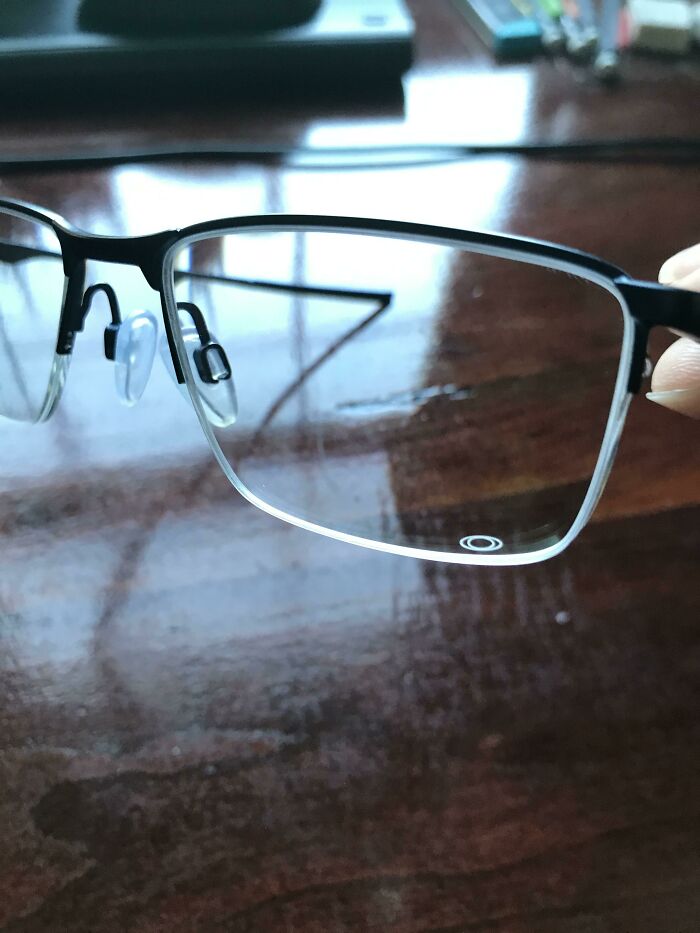
    My Glasses Have An Oakley’s Logo In The Bottom Left Lens. I Frequently Think There Is A Smudge On My Glasses, But Nope!

    My Glasses Have An Oakley’s Logo In The Bottom Left Lens. I Frequently Think There Is A Smudge On My Glasses, But Nope!

    GallifreyanPrydonian Report

    Sherman
    Community Member
    3 years ago

    That would p**s me the f**k off.

    View more comments
    ADVERTISEMENT
    #74

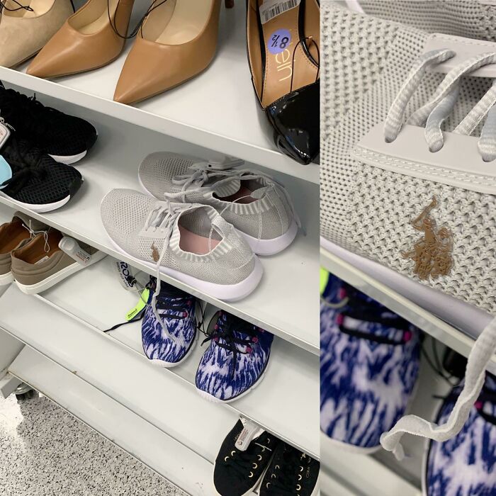
    Putting Your Brown Logo On White Shoes

    Putting Your Brown Logo On White Shoes

    tofuwa Report

    Élizaan Jansen van Rensburg
    Community Member
    3 years ago

    Looks like a poo stain.

    View more comments
    #75

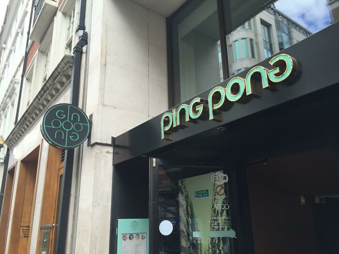
    Gin Ooo Ng - Even Trying I Can't Make This Logo Work

    Gin Ooo Ng - Even Trying I Can't Make This Logo Work

    nklv Report

    Jake stenhouse
    Community Member
    3 years ago

    Hah, this place is just off Carnaby street in London. They make a great lychee martini

    View more comments
    #76

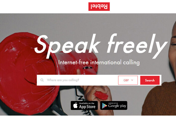
    Let's Try The Logo Upside Down, It's Gonna Be So Edgy

    Let's Try The Logo Upside Down, It's Gonna Be So Edgy

    fromITroom Report

    Amalie Jaye
    Community Member
    2 years ago

    For a gravity-defying new product …

    ADVERTISEMENT
    #77

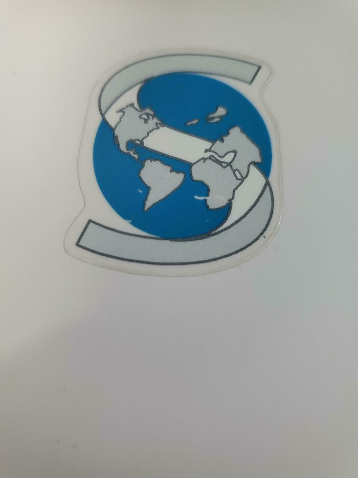
    A Logo Including A Globe Where Greenland, Iceland And The UK Have Decided To Fly Away Into The Arctic

    A Logo Including A Globe Where Greenland, Iceland And The UK Have Decided To Fly Away Into The Arctic

    doxysqrl410 Report

    Friendly neighborhood possum
    Community Member
    3 years ago

    As well as Australia and half of Asia.

    View more comments
    ADVERTISEMENT
    #78

    Stutterstock's Logo Looks Better Than Ours Anyway

    Stutterstock's Logo Looks Better Than Ours Anyway

    smksmk Report

    JMBZ
    Community Member
    3 years ago

    *Shutterstock

    #79

    Crappy Website Logo

    Crappy Website Logo

    Hamster-Pants Report

    James016
    Community Member
    3 years ago

    Audioseen.com?

    View more comments
    #80

    Cafe Logo: Halfcup Brunch

    Cafe Logo: Halfcup Brunch

    ATWOWAYMIRROR Report

    Stardust she/her
    Community Member
    Premium
    3 years ago

    I see “Halp Run” more clearer than the other letters

    View more comments
    ADVERTISEMENT
    #81

    This Logo Is For A Band Called "Fade"

    This Logo Is For A Band Called "Fade"

    hurricane4 Report

    Mangelo Il Fumatori
    Community Member
    3 years ago

    Exfad

    View more comments
    ADVERTISEMENT
    #82

    The Shoe Placement On This Local Pizza Joint Logo

    The Shoe Placement On This Local Pizza Joint Logo

    shebearluvsmegadeath Report

    Xray0976
    Community Member
    3 years ago

    That's no shoe...

    View more comments
    #83

    If It Were Level With Karma I'd Feel Better, But There's No Way To Balance This Logo

    If It Were Level With Karma I'd Feel Better, But There's No Way To Balance This Logo

    Natscobaj Report

    Kimbowa
    Community Member
    3 years ago

    The Good is literally just hanging there.

    #84

    Prints Company Logo On "Transparent" Background

    Prints Company Logo On "Transparent" Background

    TheSameBaron Report

    S. E. in Indiana
    Community Member
    3 years ago

    I don't see anything wrong here either.

    View more comments
    ADVERTISEMENT
    #85

    Delivery Company Copied Their Logo Too, But From Ie And FedEx

    Delivery Company Copied Their Logo Too, But From Ie And FedEx

    Get9 Report

    Mat O'Dowd
    Community Member
    3 years ago

    Copied from Fedex is a strong word... What makes the FEDEX logo is the arrow formed by the whitespace (negative space) between the E and the X - They didn't copy it, because they were trying to cram in the Exxon logo as well !!!!!! Here is an explainer I made (too much time on my hands!) mix-646ccc...a96d40.jpg mix-646ccc1a96d40.jpg

    ADVERTISEMENT
    #86

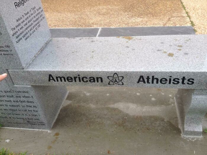
    The Atheist Monument In Florida. All Of That Money Spent And Nobody Thought To Center The Logo


    The Atheist Monument In Florida. All Of That Money Spent And Nobody Thought To Center The Logo
    trevlacessej Report

    Paul Neff
    Community Member
    3 years ago

    Looks like the logo was too large to properly fit. This is poor design scaling. Possibly a pro-theistic form of protest, but unprofessional if so.

    View more comments