Get Premium
Dark mode theme is available exclusively for premium users. Learn more about the benefits of subscribing.
No fees, cancel anytime.

 Dark Mode Ad-Free Browsing Unlimited Content
 Ad-Free Browsing Unlimited Content Dark Mode
Join 1.2 million Panda readers who get the best art, memes, and fun stories every week!
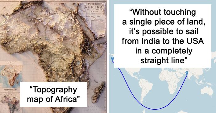
Maps can look absolutely incredible, but they require a lot of focus and dedicated effort. Whether you’re an artist, adventurer, geographer, engineer, statistician, or just a fan of good design, quality cartography can bring you a whole lot of joy.
The ‘Epic Maps’ account on X (formerly Twitter) is a fabulous project that celebrates great examples of cartography. Many of these designs are unique, creative, and unusual, so we wanted to share the very best ones with you, dear Pandas. Scroll down for a look, and don’t forget to upvote your favorite ones!
More info: X | Instagram | YouTube | Newsletter
This post may include affiliate links.

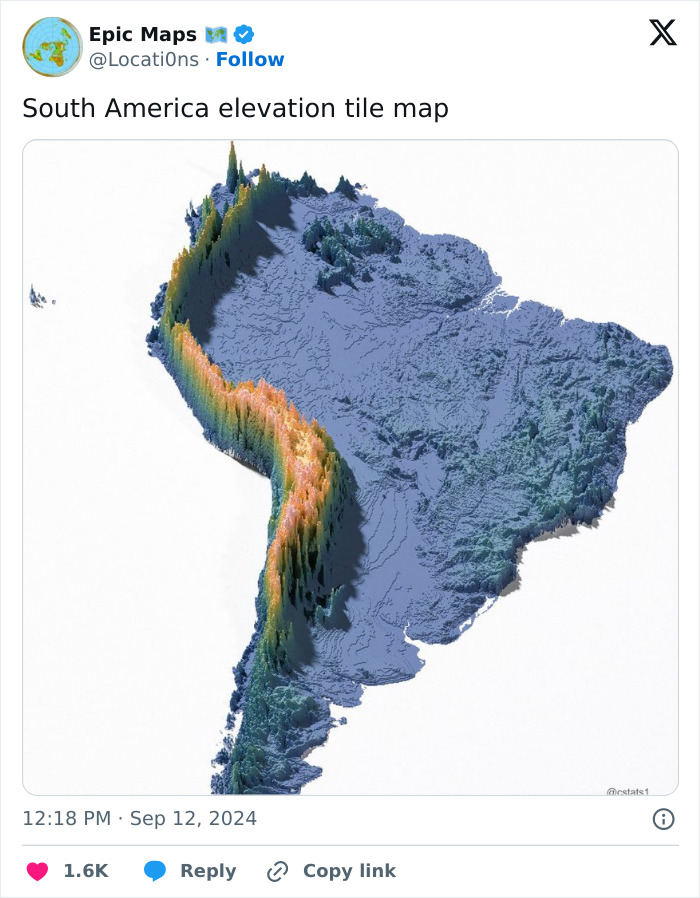
The Earth may not be a perfectly round sphere for space football, but it would be an amazing sensory widget for stimming. What I mean is, I want to touch this map.

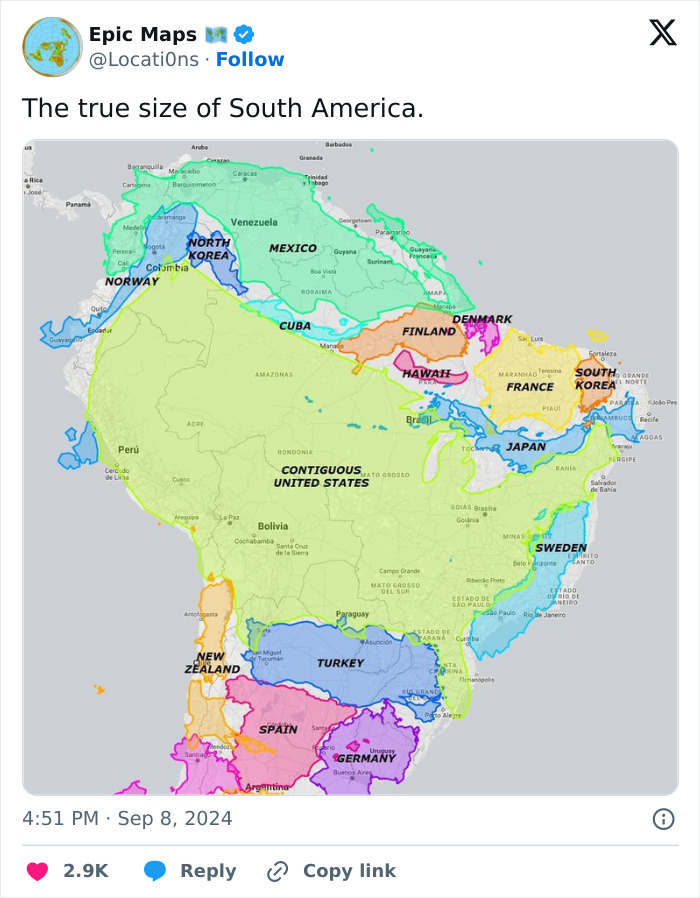
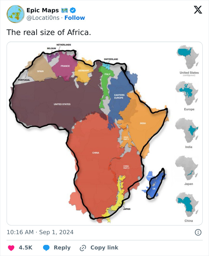
I wish we learned in school that the Mercator projection and the actual size/shape of the Earth's landmasses are often wildly different

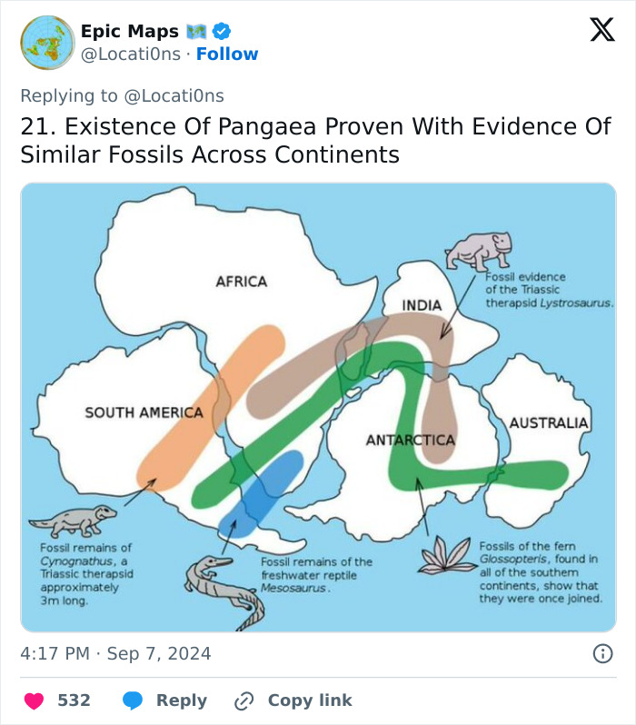
And matching rocks, and seafloor spreading rates and directions as determined by magnetic orientations of oceanic rocks. And radiometric dating.

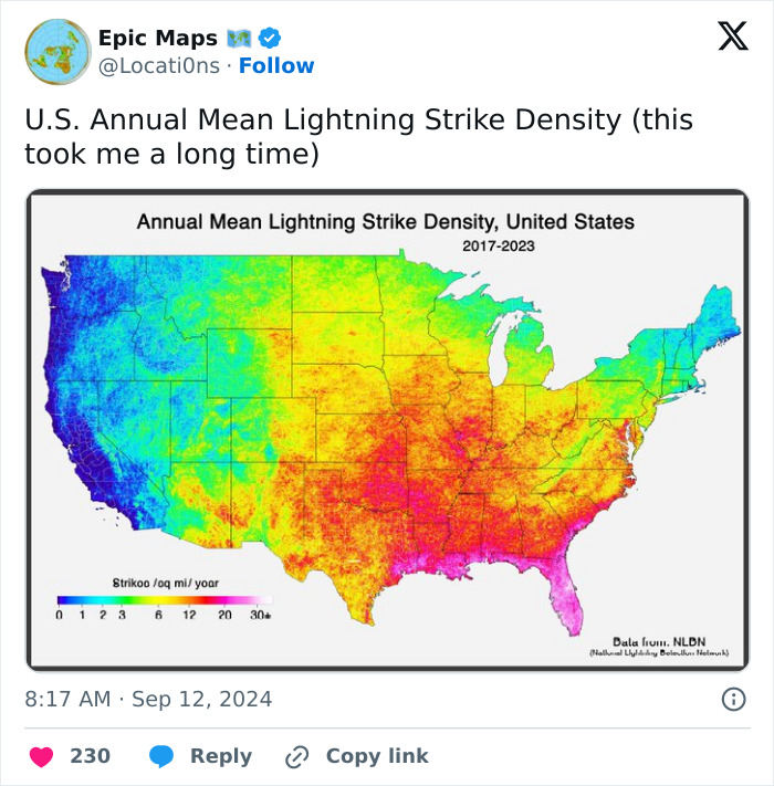
Living in San Francisco for 48 years and I've seen lightning here less than 10 times.

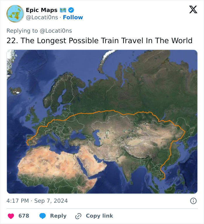
I looked at doing this back in 2019. The plan was to try and get to Japan without flying- you can get the ferry from Korea at the end. However I talked to someone who had done the Trans Siberian express and found it really dull and testing. Day after day of looking at pine trees drives you a bit mad, and I have some dietary issues so would worry about not being able to eat any food they sold. Might be good as a meditation or writing retreat! In the end I took the train from London to Bologna in Italy, visited a friend there, and then flew to Tokyo. This year I did my first sleeper train (London to Penzance) and really didn't enjoy it, so I think I made the right choice!
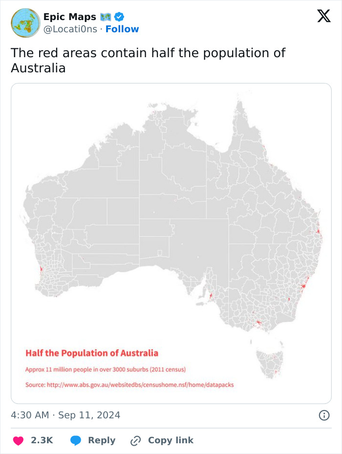
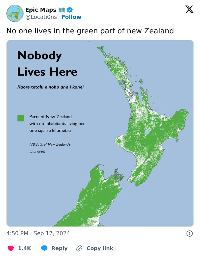
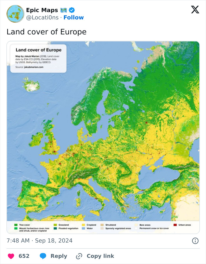
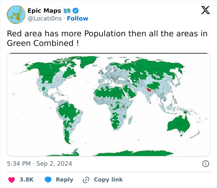
Not quite true. More like no cities, or big towns, in the green zones. But there are lots of little communities or farms in there.
Africa is a continent, so why would it be in any way surprising that it should fit many countries in it? That's basically what a continent is, after all. (And yes, Europe is also a continent, but it's very small).
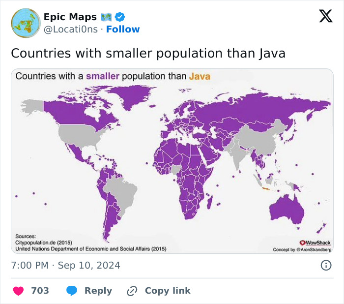
Java has a population of 150 million. Indonesia has a population of 275 million.

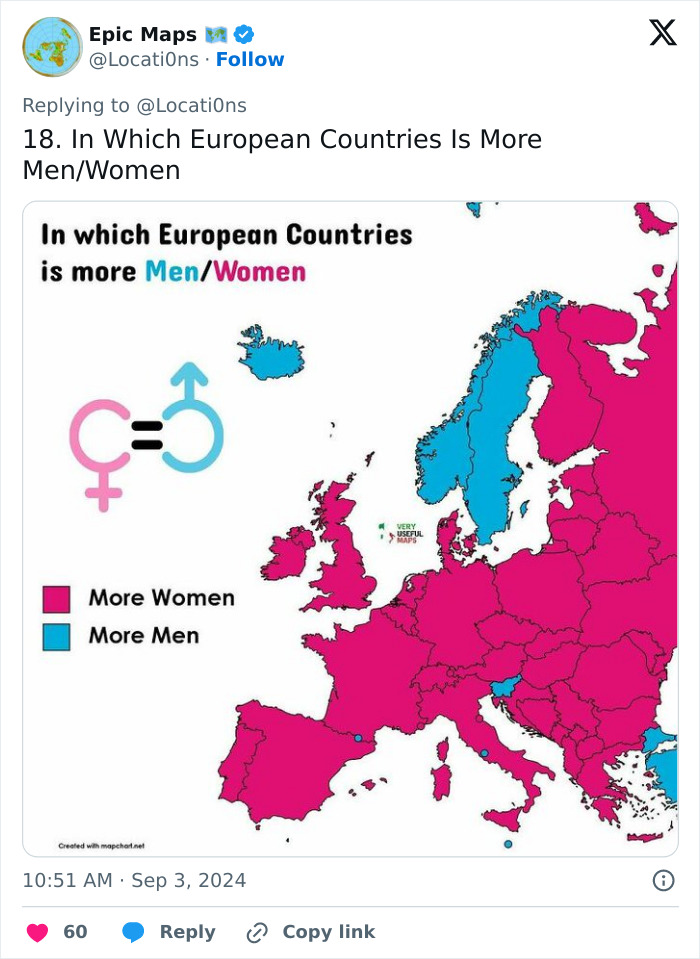
This is a fascinating topic. There are several factors that mean in most of Europe more males.are born than females (distance from the equator being one); but differences in migration and life expectancy change that balance when you look at everyone.

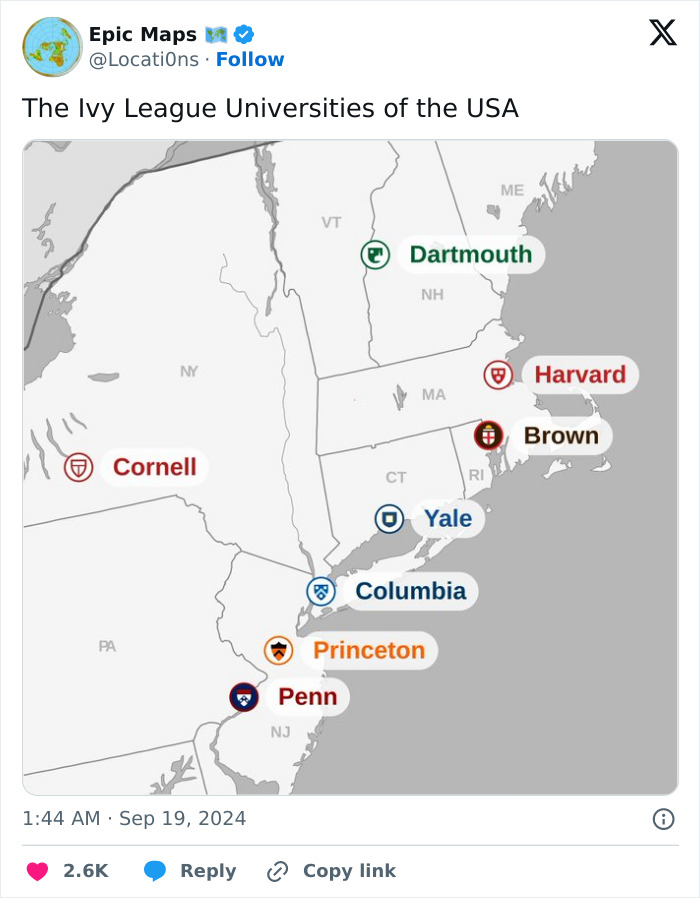
It was originally called the "IV League" because of football - Harvard, Yale, Princeton, and Dartmouth - that played together.

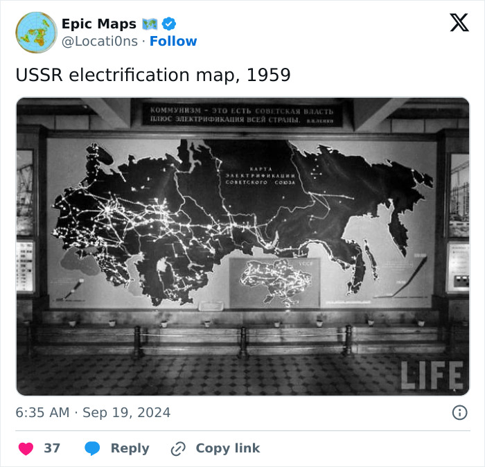
Russia.....also a repressive communist dictatorship...(USSR) Nothing has changed since the 60s.

Somehow I feel like urban areas should be a bit larger. Or is this just counting large cities?
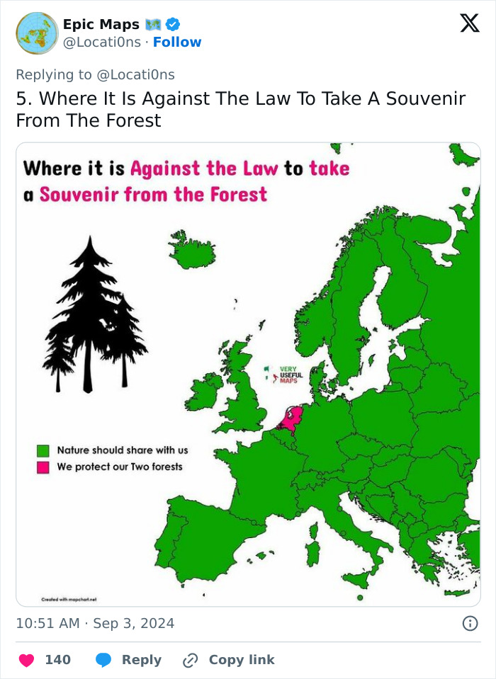
Mmm. In the UK, it's illegal to collect wild flowers and other wild plants. Even picking up fallen sticks on the ground is technically theft. Whoever produced this map doesn't seem to have paid careful attention, although admittedly the UK does have more than two forests...
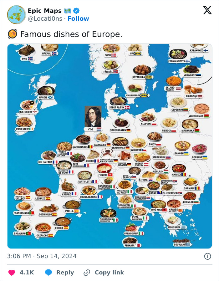
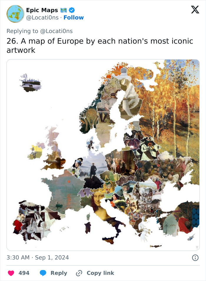
I don't disagree with most of the choices. I'm mostly just curious how each was chosen. What criteria was used to select the most 'iconic'?

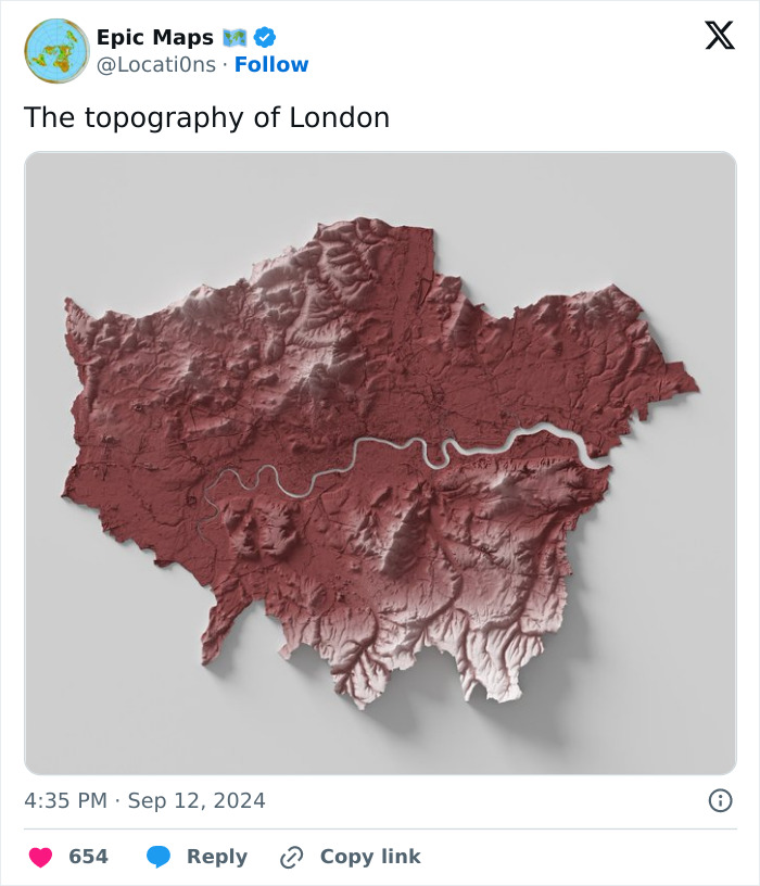
I don't know why (well, ignorance, of course) but I always thought of London as flat.

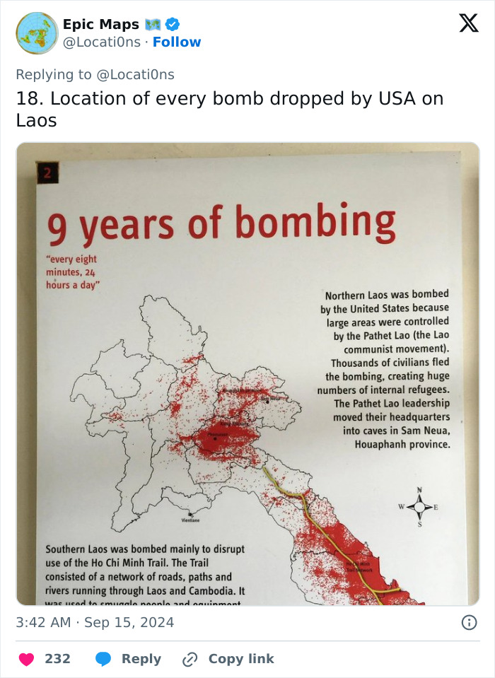
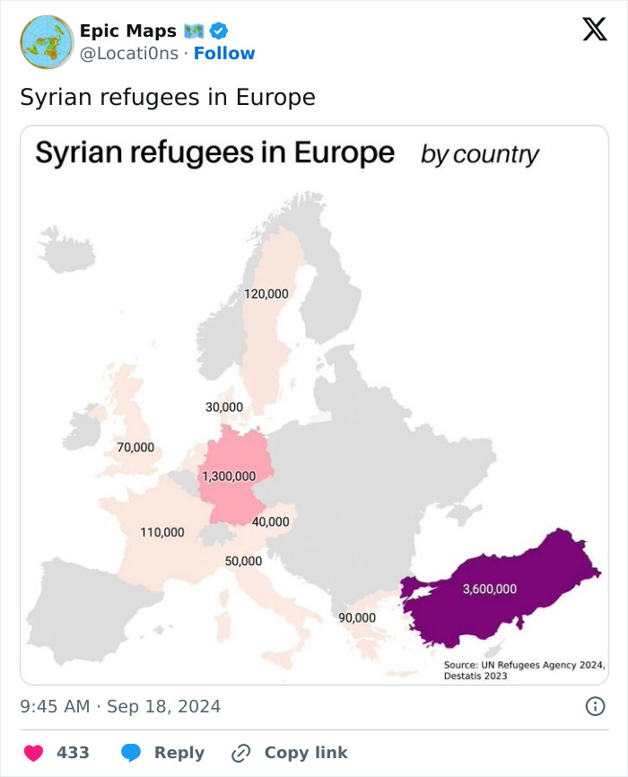
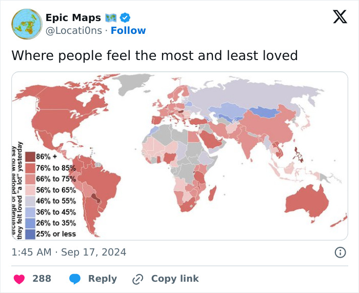
the fact people feel the need to flee their own country is sad. why cant we have a semi-peaceful world where you don't have to be scared in your own home?
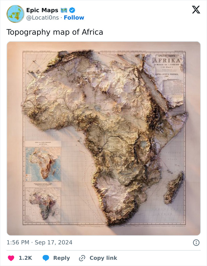
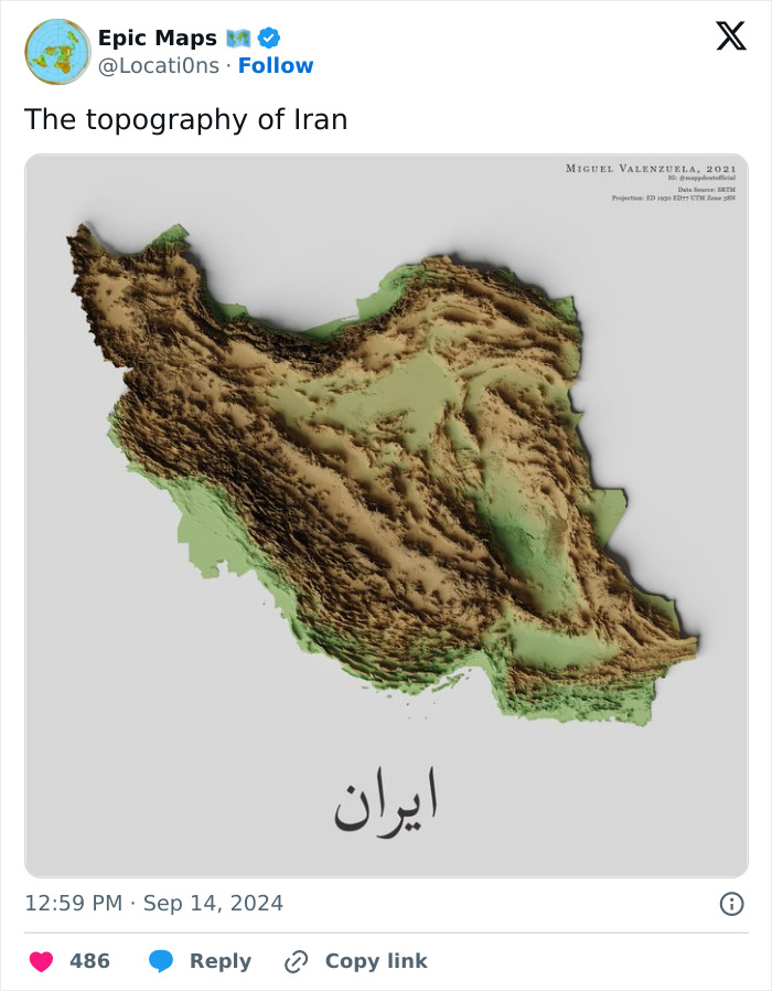
just want to run my fingers across this image ( don't make this dirty please!)
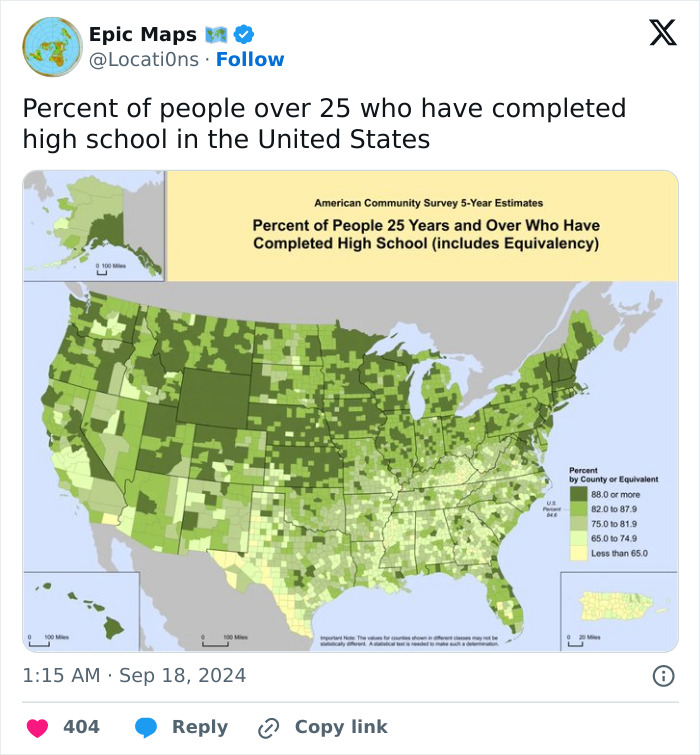
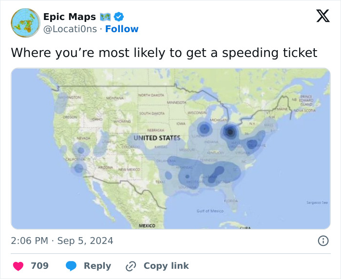
That's because in some places, people whine about paying taxes. But the jurisdiction has to get money some way, so the main occupation of the cops is catching speeders. Those are also the places where you pay a fee for every fricking thing you do.
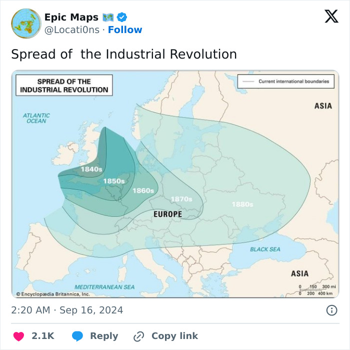
Whatever the source for this map, it's got it horribly wrong - because it suggests that the industrial revolution hadn't reached Scotland or much of northern England by the 1880s - hadn't even reached Liverpool by the look of it. The first intercity railway opened in 1830 between Liverpool and Manchester and was a bit of a significant landmark in the industrial revolution, which arguably began in around 1705 in Cornwall (Newcomen's pumping engine, with a bit of help from France), which according to this map only got the industrial revolution in the 1850s. And never mind what was going on in Italy and Spain... Basically, the map's nonsense.
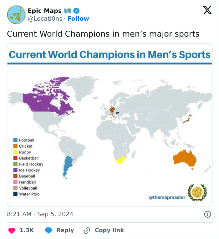
Cricket is a tricky one because there are three main formats and you can have a separate champion in each. Australia are the Test and ODI champions, but India are the T20 champions.

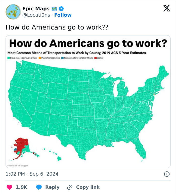
To be fair, for most of the country, businesses are kinda far from homes. We did have a culture of walkable businesses before the turn of the century. Now, not so much.
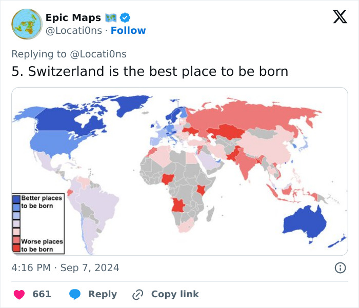
Better? Worse? Without metrics, this just looks like somebody's opinion.
I love these kinds of maps. I'm a very visual person, maps and graphs are my love language!

These maps give an insight into the internal structure of how our world is constructed.

I love these kinds of maps. I'm a very visual person, maps and graphs are my love language!
These maps give an insight into the internal structure of how our world is constructed.

































 No fees, cancel anytime