Get Premium
Dark mode theme is available exclusively for premium users. Learn more about the benefits of subscribing.
No fees, cancel anytime.

 Dark Mode Ad-Free Browsing Unlimited Content
 Ad-Free Browsing Unlimited Content Dark Mode
Join 1.2 million Panda readers who get the best art, memes, and fun stories every week!
“It's through mistakes that you actually can grow. You have to get bad in order to get good."
Paula Scher, one of the most influential graphic designers of our time, once uttered those words in reference to design. And while I’m sure she was being honest, I think some designers really took those words to heart and somewhere along the way abandoned the “getting good” part of their plans.
Below, we’ve gathered some of the most atrocious examples of design that have been shared on this subreddit that’s dedicated to roasting terrible design. From signs that induce headaches just from trying to read them to ovens that melt their own knobs, apparently, there are plenty of bad designers out there who need to grow a bit (or a lot) before they start producing excellent work.
Be sure to upvote all of the photos that make you want to fire a designer somewhere out there, and let us know in the comments what the worst examples of design you’ve ever seen were. Keep reading to also find an interview we were lucky enough to receive from graphic designer, writer and the man behind Identity Designed, David Airey. Then if you’re interested in checking out even more examples of horrific design, you can find some of our previous articles on the same topic here, here and here.
This post may include affiliate links.
When you're used to seeing products, buildings, packaging, websites and more that have actually been designed well, it's easy to take beautiful design for granted. But when you realize just how much terrible design there is out in the world, you start to understand how valuable great designers are. The Bad Design subreddit, which is dedicated to calling out examples of awful design, has over 3 million members who are constantly sharing all of the poorly designed items and spaces they come across in the world. From public bathrooms that have absolutely no privacy to labels on products that look extremely unappealing, it's hard to believe that all of these awful designs were actually signed off on.
But don't let this list make you lose faith in the designers of the world; there are plenty out there making the world a more efficient and aesthetically pleasing place too. Their work just won't be shared on this particular subreddit. To gain some insight from one such designer, we reached out to graphic designer, writer, and brand consultant David Airey. First, we asked David why good design is so important. “Your visual identity should reflect the quality of what you sell, otherwise there’s a disconnect between what people see and the impression you want to give,” he told Bored Panda.
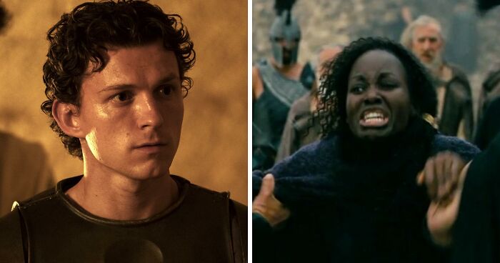
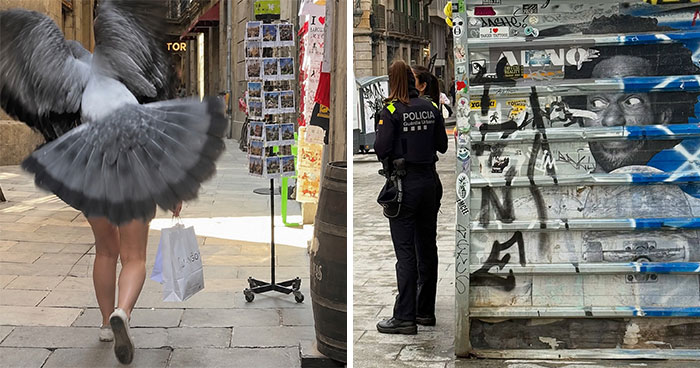
Bet you it's an art installation which is supposed to make an Important Statement about suicide or something like that.
“A thoughtfully designed identity is an investment that, when combined with an excellent product or service, gives a return year after year. It can help change potential buyers into loyal customers,” David explained. “A good identity should be simple enough in appearance to be easily recognizable, yet distinctive enough to separate from the competition. It should also be appropriate, because if it looks out-of-place within the market then people will be less likely to trust what’s being sold.”
In addition to focusing on his own work, David also runs a site called Identity Designed, which he describes as “a small way to showcase respected work from around the world”. “The website led to an approach from Rockport to write an accompanying hardback (a bestseller in Amazon’s branding category),” David shared. “In the words of Adobe’s principal designer, Khoi Vinh, it’s ‘not just a beautifully designed book, but also beautiful in its depth and detail about the identity design process’.” If you’re looking for a palette cleanser after viewing this list of bad design, I highly recommend checking out Identity Designed’s website; it’s full of pure eye candy.
Makes you wonder if even the publishers read the book...
We also asked David what the most important factors to consider are when choosing a designer to work with. “There’s nothing more important than the portfolio,” he told Bored Panda. “But in addition, you get a sense of what people are like when you talk to them — whether they seem trustworthy, easy to communicate with, genuinely interested in doing the work. Talking to a few designers before choosing one is always worth the time.”
We then asked David if he could share any examples of particularly bad design that he’s seen over the years. “The Tropicana packaging redesign from some years ago is a good example of design having a negative impact,” he noted. “When the new cartons were put on shelves, customers couldn’t recognize them and sales were hit hard. So the company reverted to the previous design. That would’ve wasted a ton of money, not just in sales, but in meetings, and tooling, and production time.”
“Most people choose what they’re familiar with, so any design change needs to be respectful of brand equity,” David explained. “The old PriceWaterhouseCoopers logo always seemed a bit of a car crash, with the letters bunched together at different heights, fresh from colliding,” he added.
“I love a good logo, and some of my favorites include Paula Scher’s H monogram for the Highline, Paul Belford’s forward-pointing book for New Chapter, Magpie’s playful mark for Bandido, and the late 300million’s symbol for The Guild of Food Writers,” David says. He also noted that he’s shared these, among other examples of great logos, in a series on Logo Design Love that you can find right here.
And if you’re looking for even more examples of satisfying design, be sure to check out David’s portfolio right here.
It’s easy for us to hate on terrible design that we see out in the world, but would we actually be capable of creating anything better? Clearly, being a designer is not the simplest job in the world, so we consulted this article from Rasmussen University to hear from real graphic designers what they think the most challenging aspects of the job are. For one thing, designers apparently often have to deal with feedback that is not very conducive to their process. “You're going to have clients who have feedback— sometimes that feedback will go against rules of design and may make a design worse,” says designer Levi Olmstead. But if a client is paying for you to make a sign in Comic Sans and they won’t listen to your advice as a professional, you might sometimes need to compromise. Just make sure the design doesn't get so bad that it can end up on a list like this.
Another struggle graphic designers often face is creative burnout. “I don’t care how long you’ve been designing, the burnout stage will happen at some point,” says graphic designer Nick Avola. “New designers need to be prepared. Your creativity has limits. You need to care for and replenish it—otherwise, your process will become mechanical and emotionless, and the final products will suffer.” Avola says that sometimes designers need to pass on work to give their brains a break, but it will be worth it in the long run. Burning out can be detrimental to your creative process and your mental health.
Damn these unrealistic body standards expecting us to have no legs!!
Contrary to what some of the posts on this list may lead you to believe, breaking into the field of graphic design can be quite challenging. There may be plenty of graphic design jobs out there, but very few of them are entry-level. (And we all know that companies nowadays often advertise positions as “entry-level” then slip in the fact that 5+ years of experience are needed.) According to Flat Icons, there are a few things upcoming designers can do to help land jobs (and possibly prevent terrible designers from snagging those same positions). The first tip they recommend is making your portfolio shine. It should only showcase a designer’s best work, and it should be tweaked when applying for jobs to feature what is most relevant.
I always say that I wish planners/ architects/ builders etc had wheelchair users on their team that could test designs and show what is good and what doesn't work! I could send so many photos of poor planning for access for wheelchairs
Graphic designers should also be promoting their work everywhere. “Getting your work seen on the web is a great place to start,” Flat Icons notes. “You can share your projects on specialized networks like Behance and Dribbble, or with your friends and followers on social media. Many potential clients visit these websites when looking for graphic designers, so learning how to build a strong online presence is very important.” It’s also recommended for designers to take freelancing jobs when possible, especially when trying to build their portfolios and gain confidence in their work.
Graphic designers can also work on building a strong peer network to help one another get jobs. Not everyone is perfect for every opportunity, so it can be very useful to have others looking out for jobs that they can pass your way when you would be the perfect fit. Unfortunately, bad design can sometimes come down to a designer just not being right for the project. But if you have a community of skilled designers around you, you can all help one another grow and gain feedback from individuals that you trust in the field.
Formaldehyde is a naturally occurring organic compound with the formula CH₂O and structure H−CHO. The pure compound is a pungent, colourless gas that polymerises spontaneously into paraformaldehyde, hence it is stored as an aqueous solution
Are you suddenly feeling like you have what it takes to be a designer? We hope you’re getting a kick out of these examples of terrible design and that you’re not cringing too hard. Keep upvoting the pics that you find most amusing, and feel free to let us know in the comments what the worst examples of design you’ve ever witnessed were. Then if you’re interested in checking out even more design fails, you can find some of our previous articles featuring the same subreddit here, here and here.
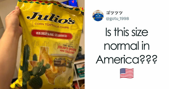
I dunno. Makes me think of the cans in my great grandpa's house. Shows the longevity of the brand. I kinda dig it.
It's not the will to win that matters- everyone has that it's the will to prepare to win that matters ?
Every month there's a tour bus out of Salt Lake City that ferries naturists to and from Las Vegas. I wonder if that's what their bus looks like afterward under black light.
REALLY? After all these years people still have to be told this? Let 'em smoke and decrease the surplus population.
Ok... so thats what the younger folks are calling it these days...Im gonna go see if my wife wants to go for a walk...
Do parental exercise after office. Think that is how the baby happened in the first place.
At least no one seems to have died from car accidents according to this...
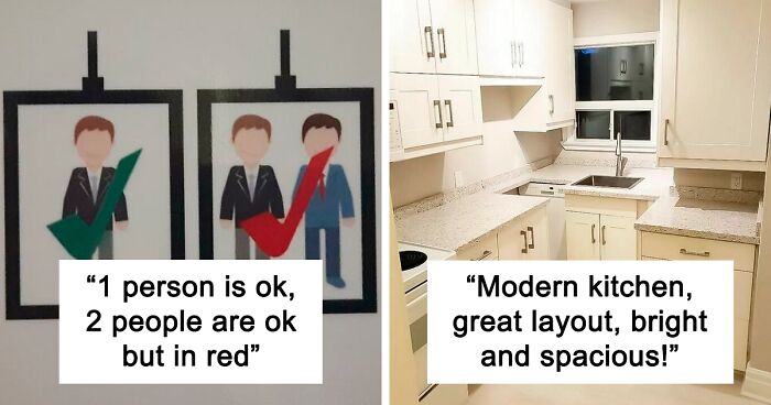
"Do, or do not. There is no try." Just like there was no try on the part of whoever made this diagram.


 No fees, cancel anytime


")


")


")


")