Get Premium
Dark mode theme is available exclusively for premium users. Learn more about the benefits of subscribing.
No fees, cancel anytime.

 Dark Mode Ad-Free Browsing Unlimited Content
 Ad-Free Browsing Unlimited Content Dark Mode
Join 1.2 million Panda readers who get the best art, memes, and fun stories every week!
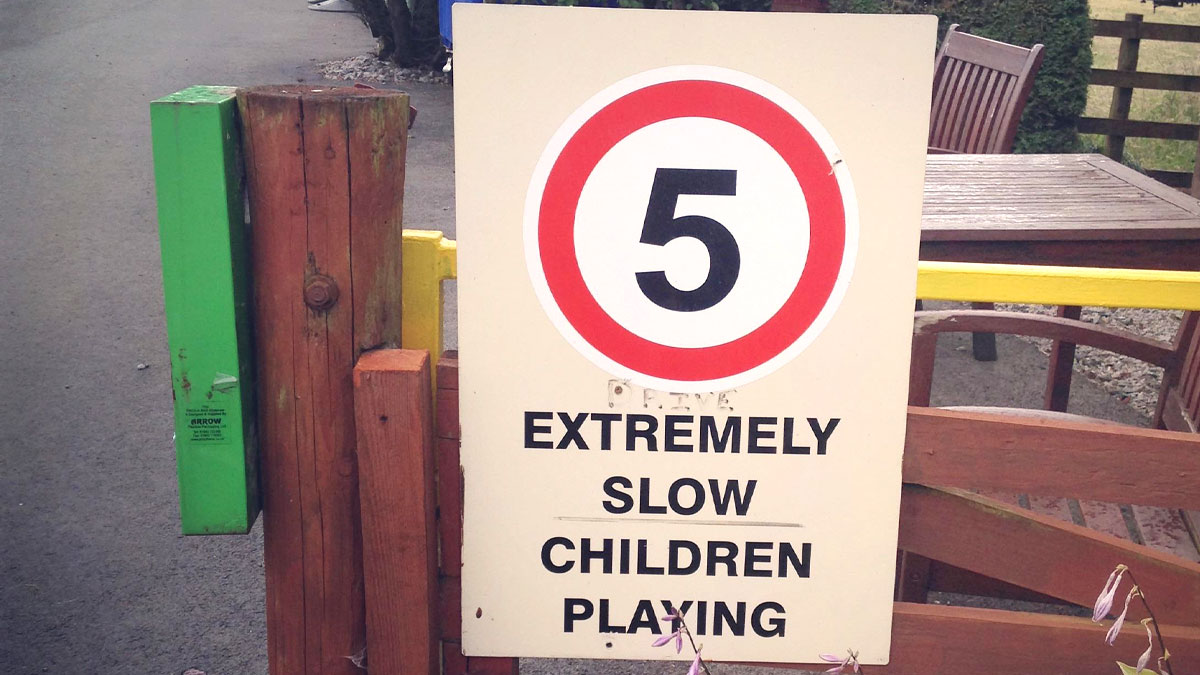
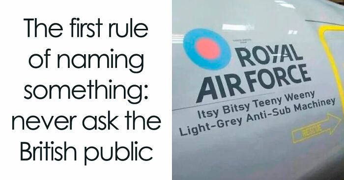
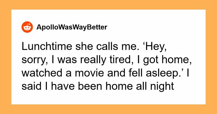
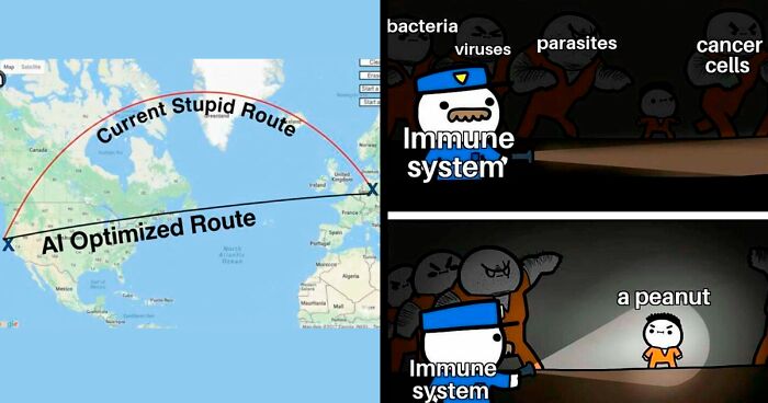
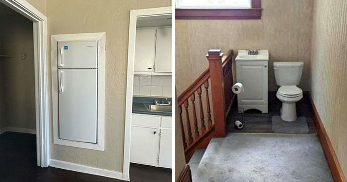
We rely on visual cues as we navigate this world. Signs are a part of that process: road signs, logos, placards, and badges let us know things like what to do or not to do, where to turn, and what's on the menu. But signs can also fall victim to bad design; if they're not clear, they more often than not confuse rather than help.
This online community is all about signs that are in dire need of reworking. It's where people post signs "that read as nonsense if read normally: from left to right," according to their bio. So, check out yet another compilation of badly designed signs that are proof quirky doesn't always mean good.
More info: Reddit
This post may include affiliate links.


 No fees, cancel anytime