ADVERTISEMENT

We all make mistakes, even at work. At best, we manage to correct them, or they're harmless enough to not lose sleep over. At worst, they get printed, installed, built, or manufactured. Then end up on the internet, leaving people wondering whether the lights are on but no one's home.

Good design is meant to make life easier. But every so often, someone misses the point completely. It's almost as if they worked with their eyes closed and had nobody around to spot their blunders before it was too late. From confusing signs that proclaim, "No entry. Entrance only," to forks that seemingly want to identify as spoons, design fails are everywhere.

Bored Panda has compiled a list of some of the wildest and most hilarious ones spotted in the wild. They may not have served their intended purpose, but they've certainly provided us with some much-needed laughter.

#1

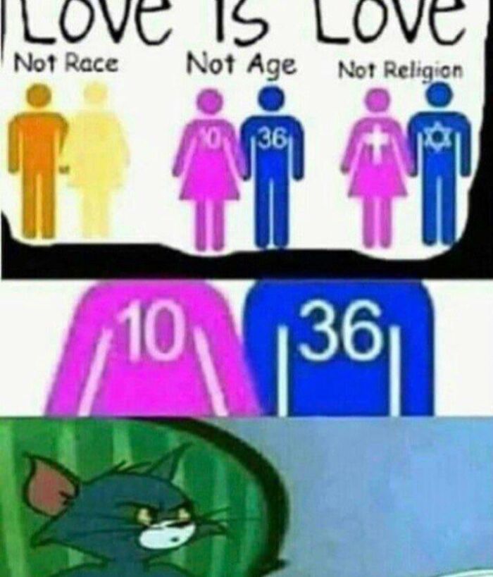
Bruh

Design fail showing an awkward love age mismatch illustration paired with a confused Tom meme from cartoon humor.

reddit.com Report

Elladine DesIsles
Community Member
5 months ago

This just looks like something a social media troll cooked up to stir up controversy and provoke bigots who want to make false equivalencies. It reminds me of the comment I read on another platform just this week regarding LGBTQIA2S+ acronyms, suggesting that "everyone knows" the next letter added will be M, for "minor attracted person". Which of course couldn't be further from the truth.

View more comments
RELATED:
    #2

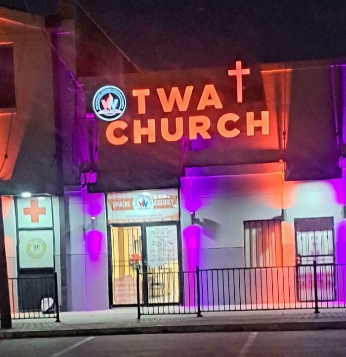
    It's Real!!!

    Sign for a church with missing letter due to poor design, showcasing designers working without common sense in a humorous way.

    spazzola12 Report

    Did I say that out loud?
    Community Member
    5 months ago

    This comment has been deleted.

    View more comments
    #3

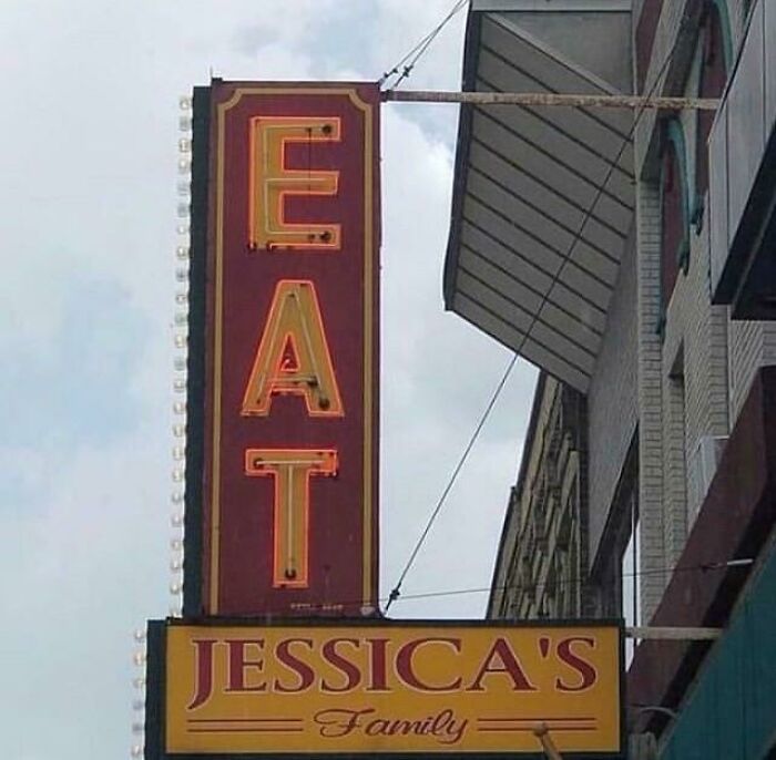
    Language

    Sign with the word EAT designed vertically above Jessica’s Family, showing a common sense design fail by designers.

    reddit.com Report

    A. Br.
    Community Member
    5 months ago

    Well, you never know; they could be tasty!

    View more comments
    #4

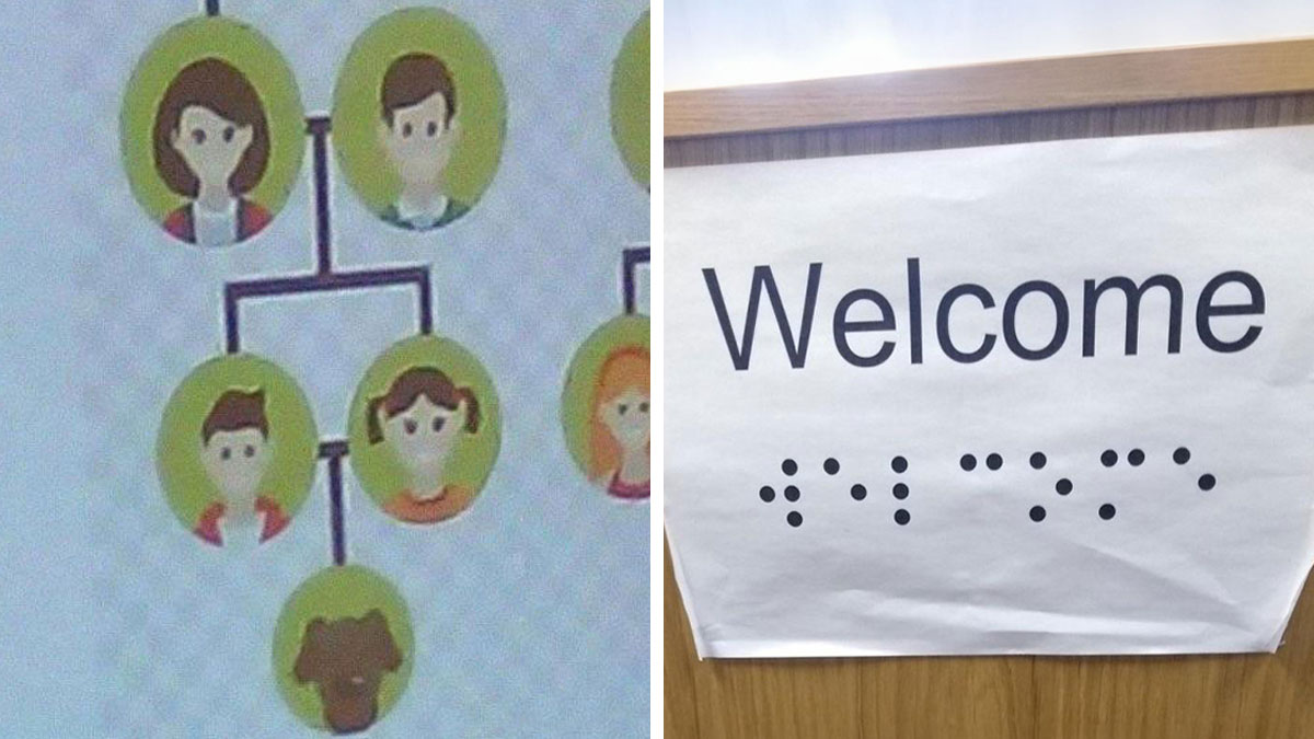
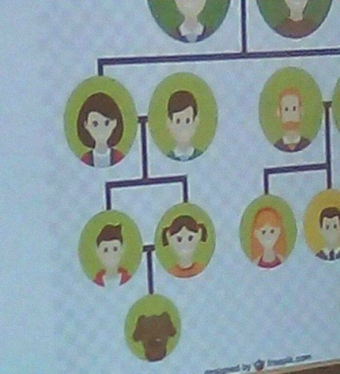
    A Good Family

    Family tree illustration with cartoon avatars showing designers working without common sense in a humorous style.

    Xpg3000 Report

    Niki
    Community Member
    5 months ago

    So, should we tell them?

    View more comments
    ADVERTISEMENT
    #5

    Ho Ho Ho!

    Santa figure hanging on bridge with "Jump for Joy" sign beneath, showcasing designers working without common sense humor.

    supermak12 Report

    Niki
    Community Member
    5 months ago

    I feel like that is the opposite of why people are up there.

    View more comments
    ADVERTISEMENT
    #6

    Virgin Mary

    Abstract stone sculpture with unusual design under blue sky, highlighting what happens when designers work without common sense.

    LeftChoux Report

    Elladine DesIsles
    Community Member
    5 months ago

    Honestly, I like this one.

    View more comments
    #7

    Medically Deceased

    Sign for Peak Medical with a red heartbeat line running into the text, showing a design lacking common sense.

    Ill_Use3086 Report

    Devin Schmitt
    Community Member
    5 months ago

    People are dying to get in.

    View more comments
    #8

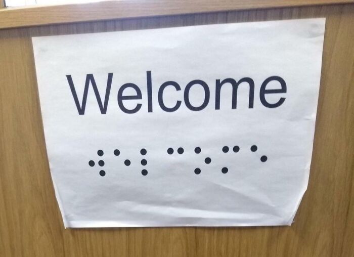
    Poor Blind People…

    Sign on wooden door says Welcome with an incorrect braille design, illustrating designers working without common sense.

    OliTheMonke Report

    Mrreoww
    Community Member
    5 months ago

    So inclusive! The blind people can just…um…read the braille! Yeah!

    View more comments
    ADVERTISEMENT
    #9

    Hmmm

    Dental clinic sign with poorly designed logo showing confusing human figures, an example of designers working without common sense.

    vegitable-oil Report

    sturmwesen
    Community Member
    5 months ago

    uhmmmmmm

    View more comments
    ADVERTISEMENT
    #10

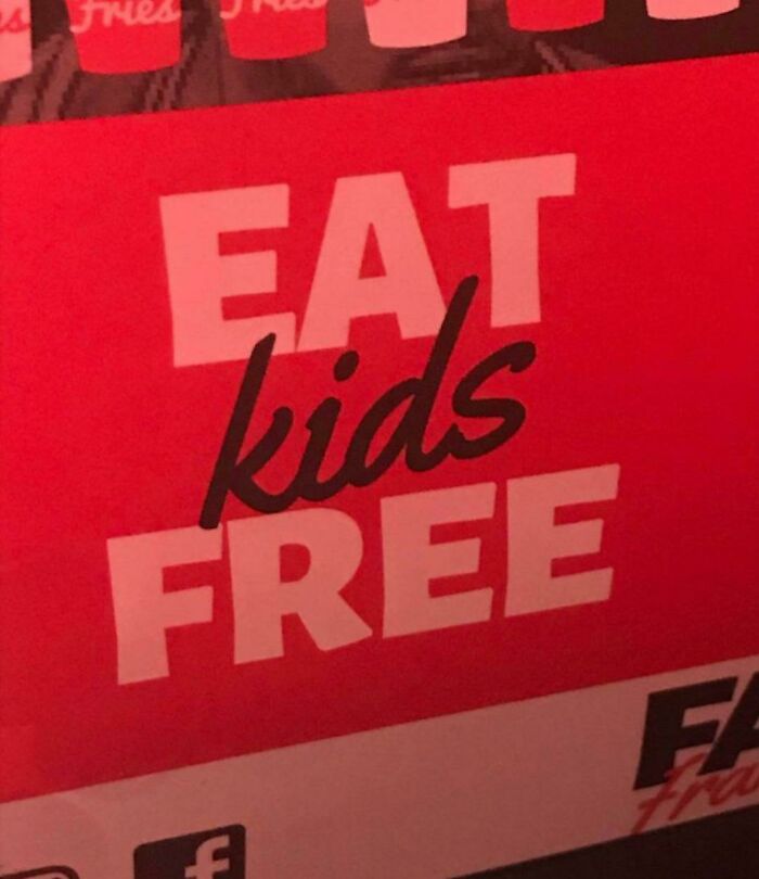
    Eat Kids

    Sign with poor design shows text eat kids free, illustrating designers working without common sense in a humorous way

    Which_Astronomer645 Report

    Luke || Kira (he/she)
    Community Member
    5 months ago

    "A Modest Proposal" by Jonathan Swift

    View more comments
    #11

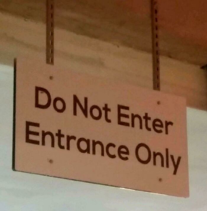
    Is It Enter Or Do Not Enter?

    Confusing sign with contradictory instructions showing common design fails without common sense in humorous scenarios.

    TheOrangeisbest Report

    Astrobloom (they/them)
    Community Member
    5 months ago

    Schrödinger's door

    View more comments
    #12

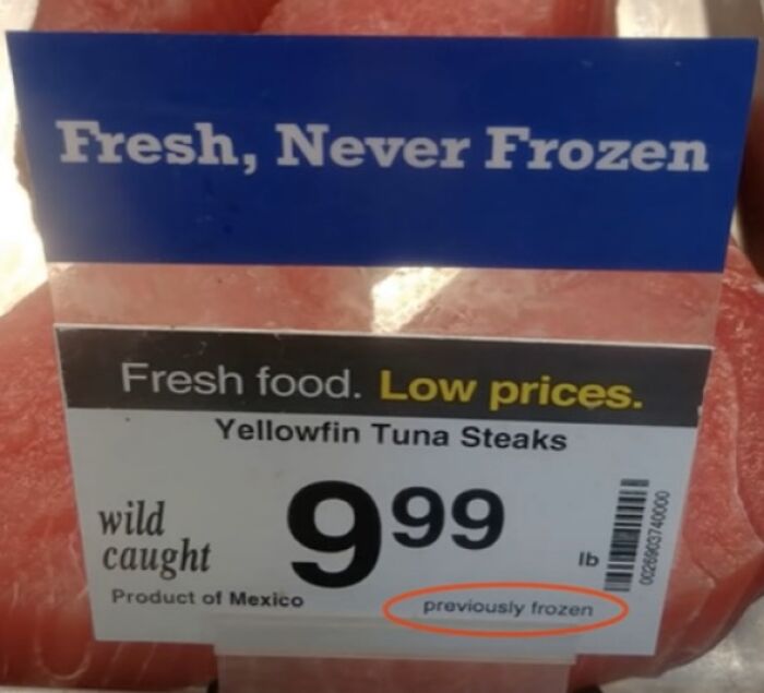
    You Liar

    Packaging label for yellowfin tuna steaks claims fresh never frozen but states previously frozen, showing a designers fail without common sense.

    Rndqrf Report

    Owen
    Community Member
    Premium
    5 months ago

    Hmmm. Most fish are flash frozen when they're caught. This one has just been defrosted.

    View more comments
    ADVERTISEMENT
    #13

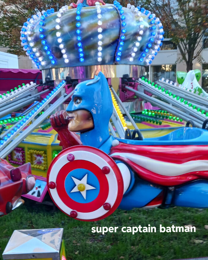
    This Is... Speacial

    Amusement park ride featuring a confusing superhero design combining elements of Batman and Captain America.

    SpiteResponsibleofm3 Report

    sbj
    Community Member
    Premium
    5 months ago

    One very confused Superhero

    View more comments
    ADVERTISEMENT
    #14

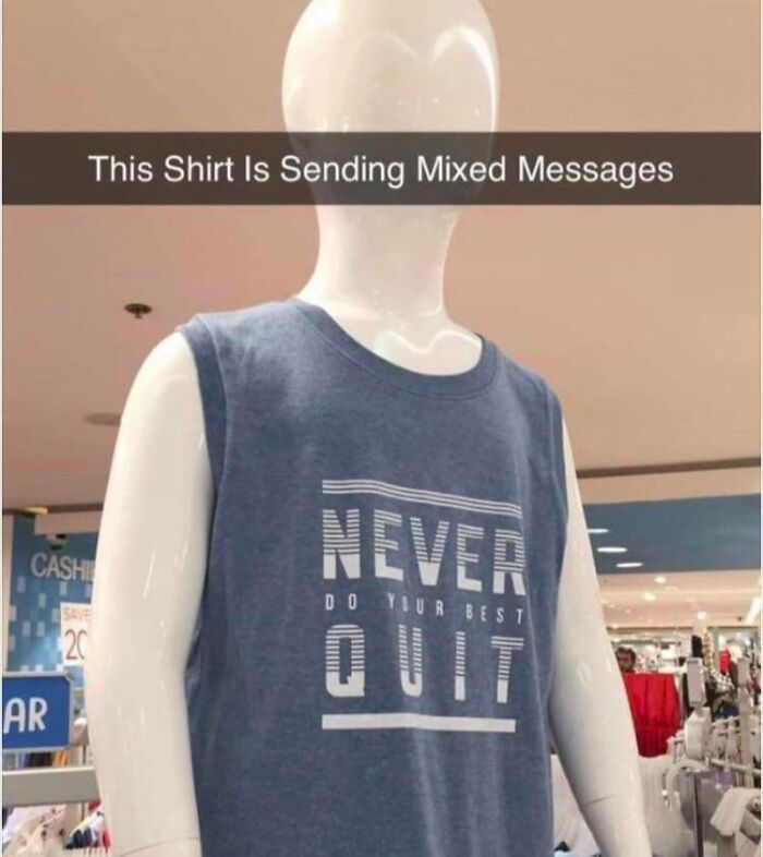
    Do Your Best To Quit! LOL

    Mannequin wearing a sleeveless shirt with confusing text design, showcasing what happens when designers work without common sense.

    Craft-Sudden Report

    Laughing Orc
    Community Member
    5 months ago

    Never do your best quit. Just do an average quality quit.

    View more comments
    #15

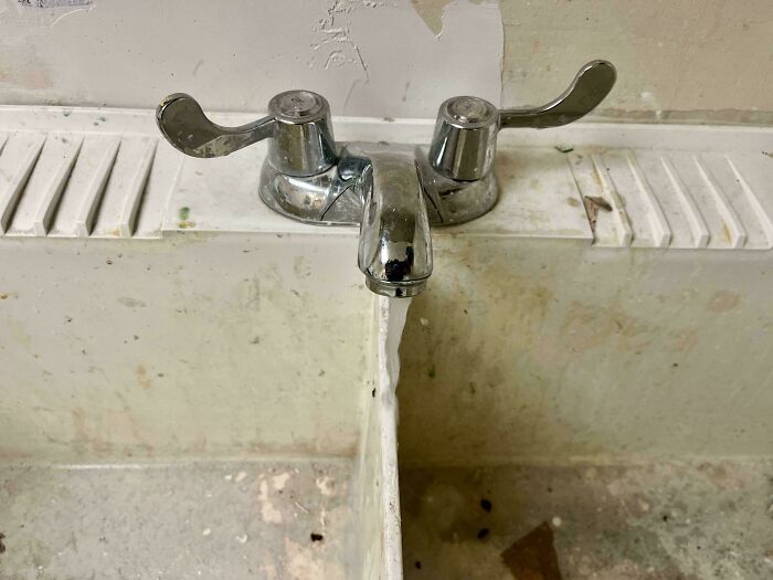
    Double Sink For Laundry With Fixed Spout

    Split faucet pouring water into divided sinks, illustrating what happens when designers work without common sense.

    PruneIIe Report

    UnclePanda
    Community Member
    Premium
    5 months ago

    Somebody cheaped out in the faucet aisle.

    View more comments

    Never miss a story that brings joy to the world. Add us on Google

    #16

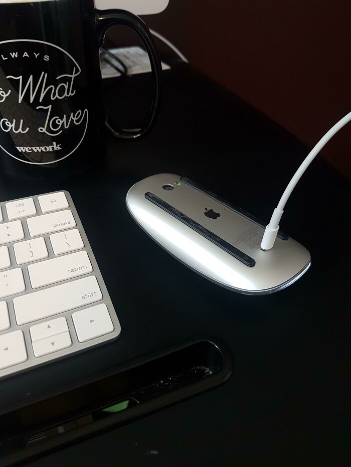
    Apple Mouse Battery Ran Out. I Guess I'll Just Go Home Now

    Apple mouse plugged in the wrong way on a desk with keyboard and coffee mug showing lack of common sense in design.

    nupods Report

    James016
    Community Member
    5 months ago

    I use a wired mouse. None of this nonsense.

    View more comments
    ADVERTISEMENT
    #17

    Wait, That's An Avocado

    Sign labeled mango flavor ice cream with an image of an avocado, showing a design fail without common sense.

    reddit.com Report

    Jerome Lenovo
    Community Member
    5 months ago

    manvocado

    View more comments
    ADVERTISEMENT
    #18

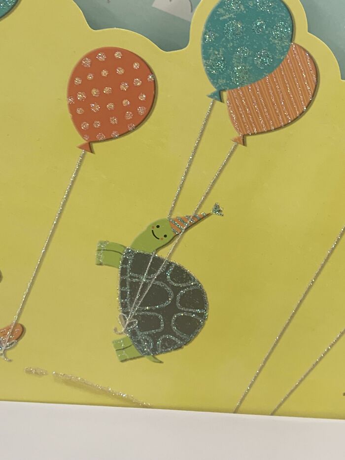
    The Balloons Are Attached To It’s What?!?

    Illustration of a turtle wearing a party hat lifted by colorful balloons, showing design without common sense humor.

    Conscious-Scheme-378 Report

    Bill Swallow
    Community Member
    5 months ago

    ... And *that* is why he smiles!

    View more comments
    #19

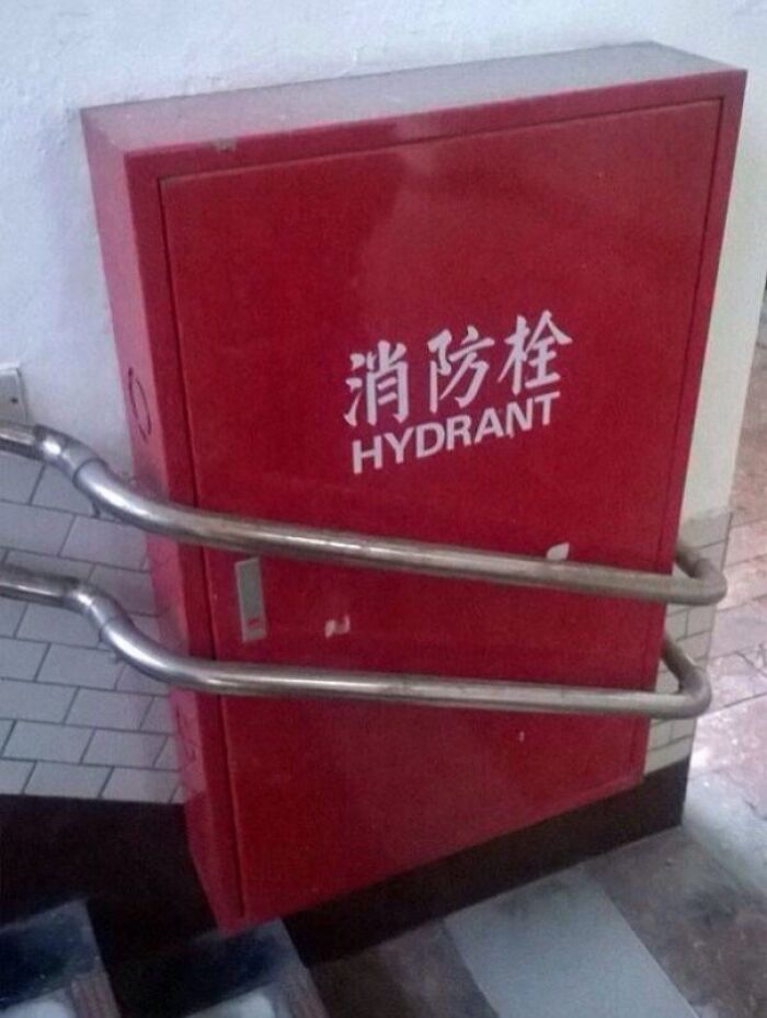
    In Case Of Fire

    Red hydrant cabinet blocked by metal handrails, illustrating designers working without common sense in a humorous way.

    PruneIIe Report

    María Violeta
    Community Member
    5 months ago

    In case of fire: d*e

    View more comments
    #20

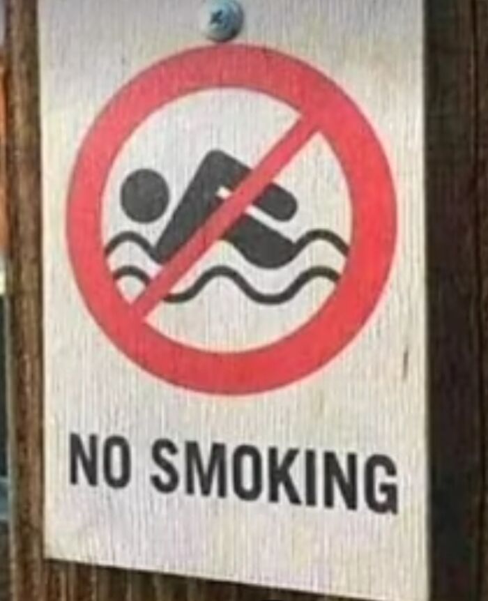
    Hmmm

    Sign with a no smoking warning featuring a swimming icon, highlighting common design mistakes without common sense.

    Canarpyllon Report

    UKGrandad
    Community Member
    5 months ago

    ...while swimming in the fuel tank.

    View more comments
    ADVERTISEMENT
    #21

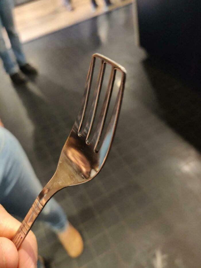
    It's For Soup Or Steak ?

    Fork with only three tines held in hand showing a design mistake without common sense in a kitchen setting

    Canarpyllon Report

    Renee Kamphuys
    Community Member
    5 months ago

    Yes

    View more comments
    ADVERTISEMENT
    #22

    Sale Sign Failed

    Sale sign with confusing designer offer showing buy 3 get 2 and buy 2 get 1 promotions without common sense.

    TheOrangeisbest Report

    Astrobloom (they/them)
    Community Member
    5 months ago

    so... get scammed?

    View more comments
    #23

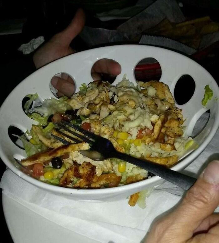
    Beautiful Plating... Wait What?

    Salad bowl with large holes making it hard to hold, illustrating what happens when designers work without common sense.

    reddit.com Report

    Liliana Spiro
    Community Member
    5 months ago

    Weight Watchers plate

    View more comments
    #24

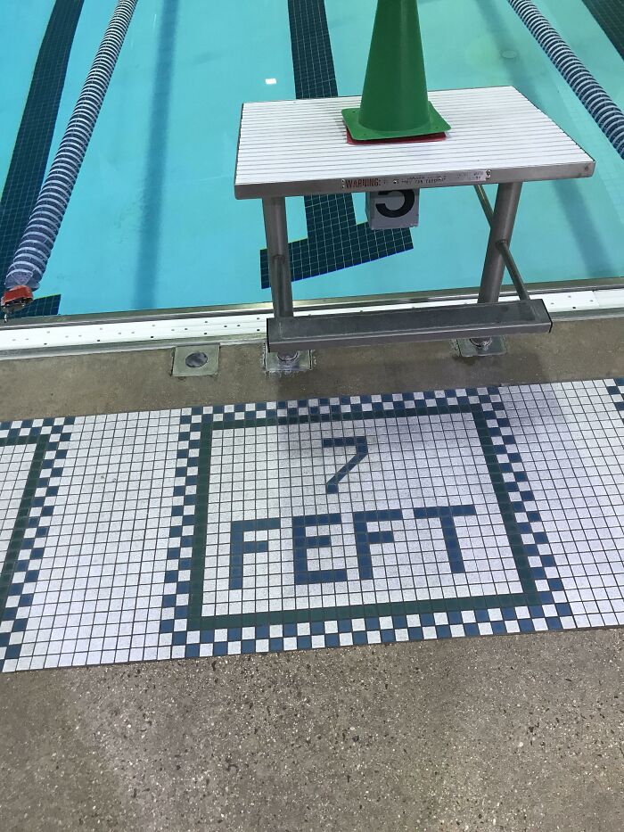
    My Pool Is 7 Feft Deep Operantly

    Swimming pool edge with a starting block marked 5 feet placed over a tile marking of 7 feet, a design fail without common sense.

    300_Black0ut Report

    Fat Harry (Oi / You)
    Community Member
    5 months ago

    Operantly...

    View more comments
    ADVERTISEMENT
    #25

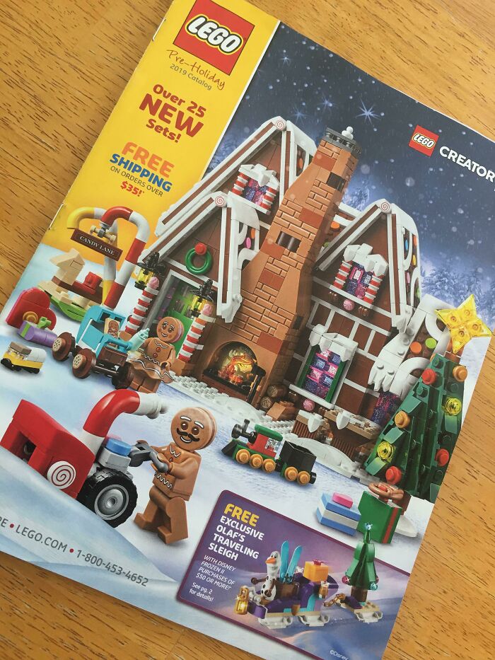
    I Too Use A Snowblower With The Pipe Pointed At My Face

    LEGO holiday catalog showing a detailed winter-themed LEGO set with gingerbread figures and a festive house, highlighting design flaws.

    reddit.com Report

    Luke || Kira (he/she)
    Community Member
    5 months ago

    Maybe it's refreshing for the Gingerbread man.

    View more comments
    ADVERTISEMENT
    #26

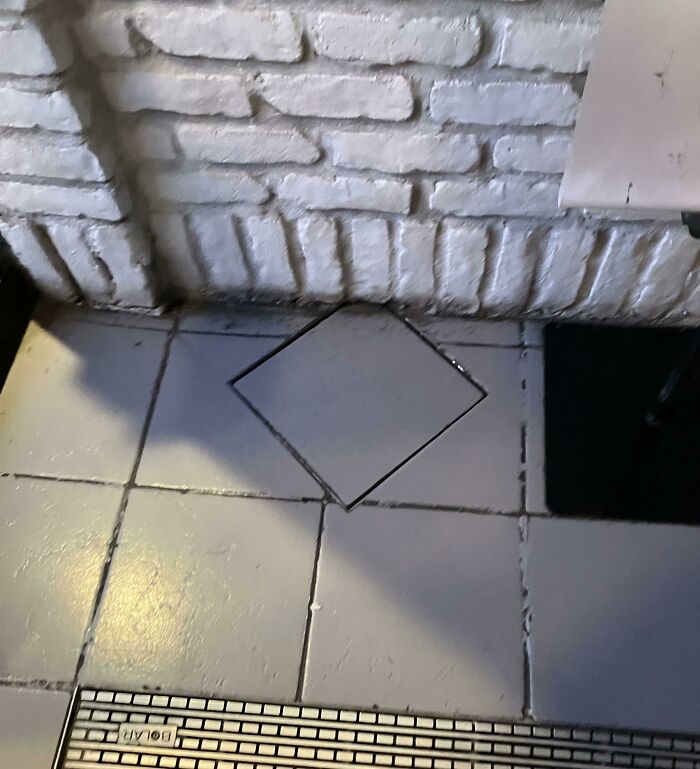
    Just, Why?

    Floor tiles with one tile oddly installed diagonally, highlighting design flaws and lack of common sense from designers.

    Intrepid-Travel2383 Report

    Linda van A.
    Community Member
    5 months ago

    The tiler was bored.

    View more comments
    #27

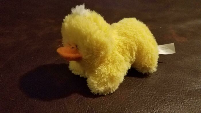
    What The Duck Is Wrong With This Thing

    Yellow plush duck with an awkwardly shaped body, illustrating what happens when designers work without common sense.

    zombiedevin Report

    Lotekguy
    Community Member
    Premium
    5 months ago

    A blonde platypus?

    View more comments
    #28

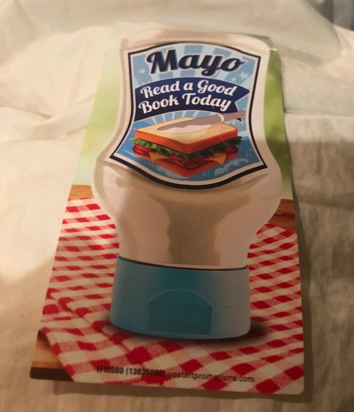
    Mayo Sandwich? Look Closely Where They Are Spreading It

    Mayo bottle label with a sandwich image and incorrect text saying Read a Good Book Today, illustrating design without common sense.

    reddit.com Report

    Wren
    Community Member
    5 months ago

    This is how I make grilled cheese sandwiches (not with lettuce though). I'm more confused by the "read a good book today."

    View more comments
    ADVERTISEMENT
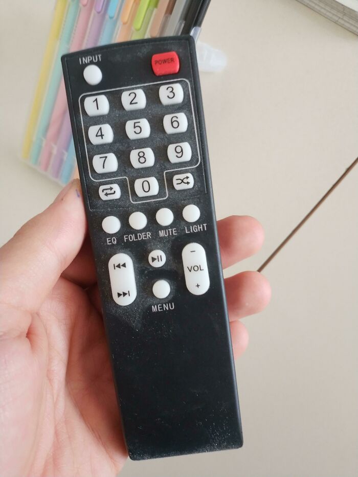
    #29

    Look At This Volume Button

    Hand holding a remote control with buttons oddly designed, showing lack of common sense in designer choices.

    alessandroias Report

    Astrobloom (they/them)
    Community Member
    5 months ago

    I assume it would be programmed that the "-" would still be volume up?

    View more comments
    ADVERTISEMENT
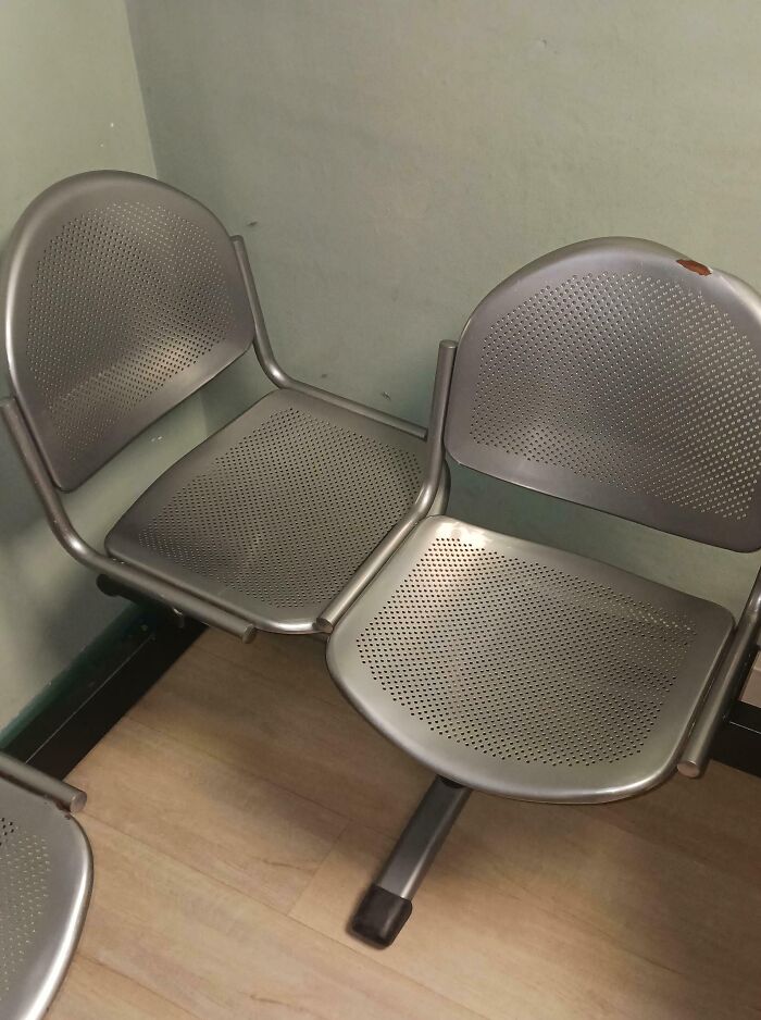
    #30

    Metal Chair

    Metal row chairs with flawed design causing seating issues, showcasing what happens when designers work without common sense.

    SpiteResponsibleofm3 Report

    spacer
    Community Member
    5 months ago

    honestly a good one! as someone who likes to have their legs on things when i sit that would be more comfortable

    View more comments
    #31

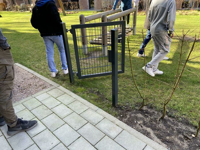
    This Is So Useless

    Small gate installed in a pathway but unable to close properly, showcasing design without common sense humor.

    Sleeevee Report

    WindySwede
    Community Member
    5 months ago

    "It's locked, from the inside!"

    View more comments
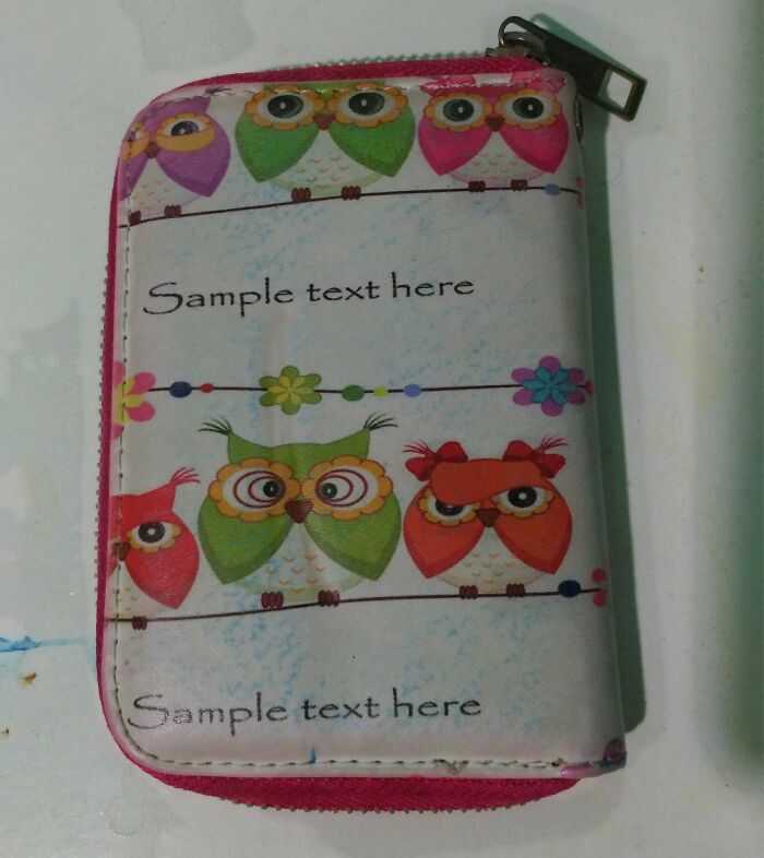
    #32

    Sample Text Here

    Wallet with colorful owl designs and placeholder text, showcasing a clear example of designers working without common sense.

    Langobse Report

    Bill The Splut
    Community Member
    5 months ago

    Blank demo text, showing placement. The final product would have the real text.

    View more comments
    ADVERTISEMENT
    #33

    Perfect Smile

    Distorted mural of a nurse on a building wall, an example of design without common sense causing visual confusion.

    Nuky111 Report

    Rick Murray
    Community Member
    5 months ago

    Ah, so this is where Dall-E (etc etc) learned how to draw people. 😂

    View more comments
    ADVERTISEMENT
    #34

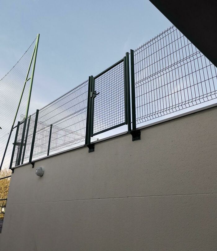
    Ah Yes The Gate

    Fence with a gate installed high above a solid wall, illustrating what happens when designers work without common sense.

    Half_pog_champ Report

    Chihuahua Mama
    Community Member
    5 months ago

    The gate to the afterlife

    View more comments
    #35

    Hmmm

    Funny Bratislava roll statue with eyes, hands, and shoes outside bakery showcasing designers working without common sense.

    thecodemachine Report

    A. Br.
    Community Member
    5 months ago

    Heidy-ho

    View more comments
    #36

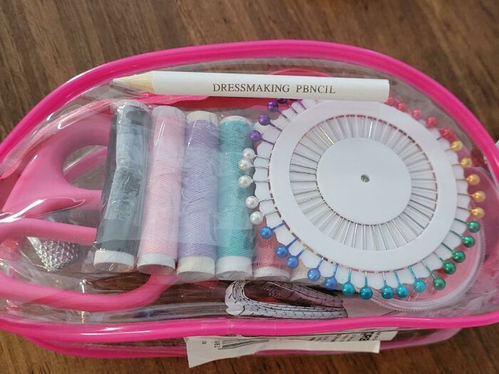
    The Pbncil That Came In A Sewing Kit

    Compact sewing kit with misspelled dressmaking pencil, colorful threads, pins, and scissors showing design without common sense.

    blond_E_locks Report

    Wren
    Community Member
    5 months ago

    A real lead pencil

    View more comments
    ADVERTISEMENT
    #37

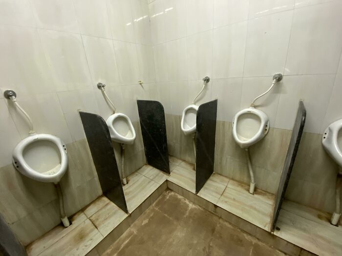
    Public restroom urinals with poorly placed partitions showing what happens when designers work without common sense.

    reddit.com Report

    Woof Yo
    Community Member
    5 months ago

    Dancing cheek to cheek

    View more comments
    ADVERTISEMENT
    #38

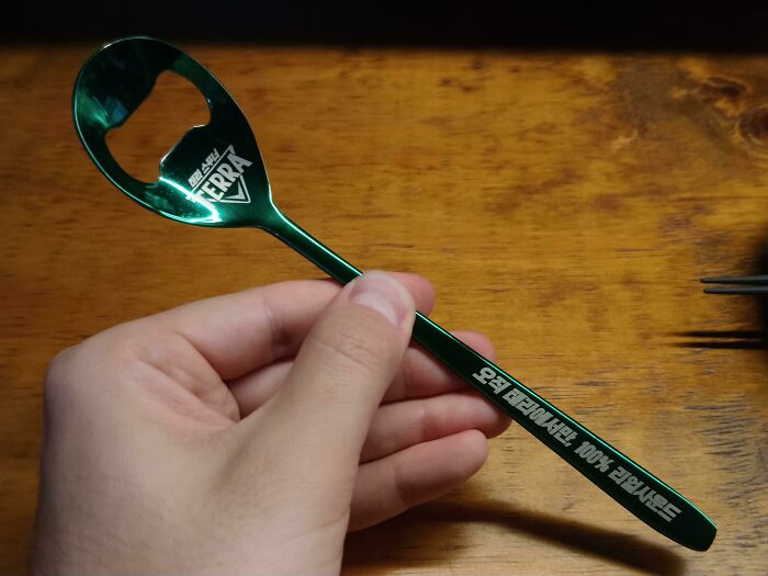
    This Spoon Is A Bottle Opener

    Hand holding a metallic green bottle opener spoon demonstrating designers working without common sense in a funny way.

    -Aone Report

    Owen
    Community Member
    Premium
    5 months ago

    And no longer a spoon.

    View more comments
    #39

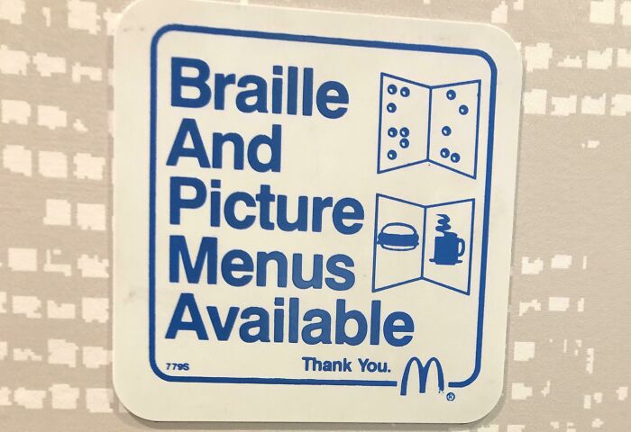
    The Sign Was Not In Braille

    Sign showing braille and picture menus available with obvious design flaws illustrating designers working without common sense.

    rasalghularz Report

    Rick Murray
    Community Member
    5 months ago

    McDo has menus? Around here it's just a big glowy screen you poke with a finger. For extra bonus points, there's a quirk that if you specify your language as 日本語, when it comes to printing the receipt, it'll say ???????? and ?????? and so on. It's amusing for messing with their minds when you go to pay and they see what's actually printed - lots of ?s. 😂

    View more comments
    #40

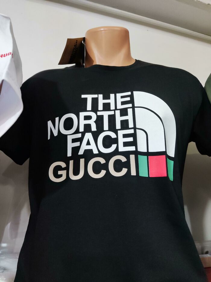
    Getting Two For The Price Of One

    Black T-shirt on mannequin showing a humorous designer fail combining The North Face and Gucci logos without common sense.

    zvxyz Report

    Astrobloom (they/them)
    Community Member
    5 months ago

    Is this legit?

    View more comments
    ADVERTISEMENT
    #41

    Should Have Rethought The Colors

    Baby clothing with a design fail highlighting what happens when designers work without common sense in product text.

    reddit.com Report

    Fat Harry (Oi / You)
    Community Member
    5 months ago

    Not really. Unwrapped, it would say "Smile" and even with the light coloured S, it still reads as "MILE".

    View more comments
    ADVERTISEMENT
    #42

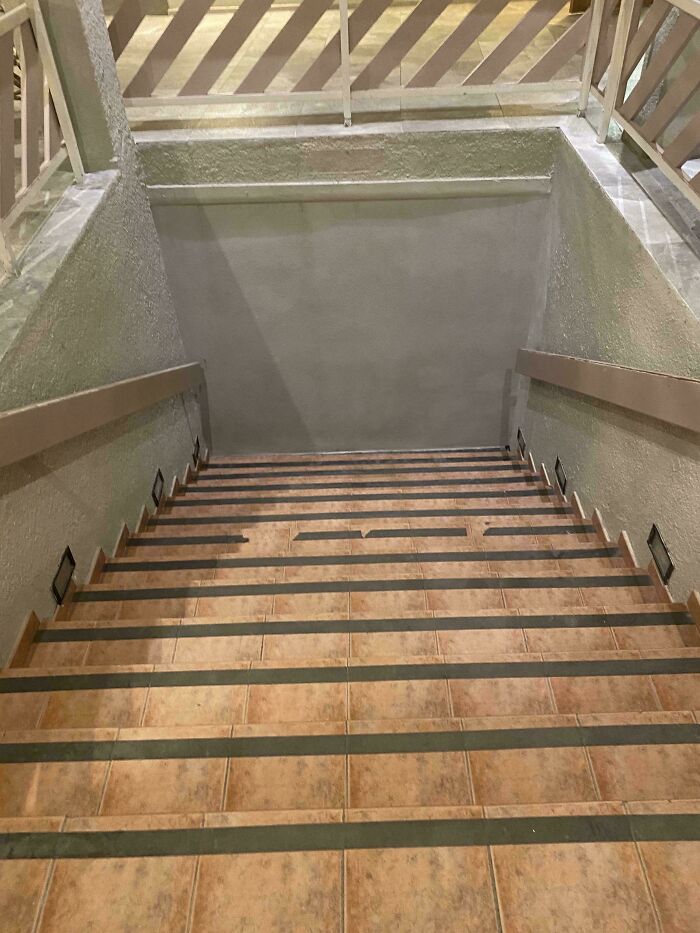
    Stairs Go No Where

    Staircase with no landing and a blank wall at the bottom, illustrating design without common sense in a humorous way.

    Zedfor29 Report

    Giraffe Sitter
    Community Member
    5 months ago

    Not true, they go down.

    View more comments
    #43

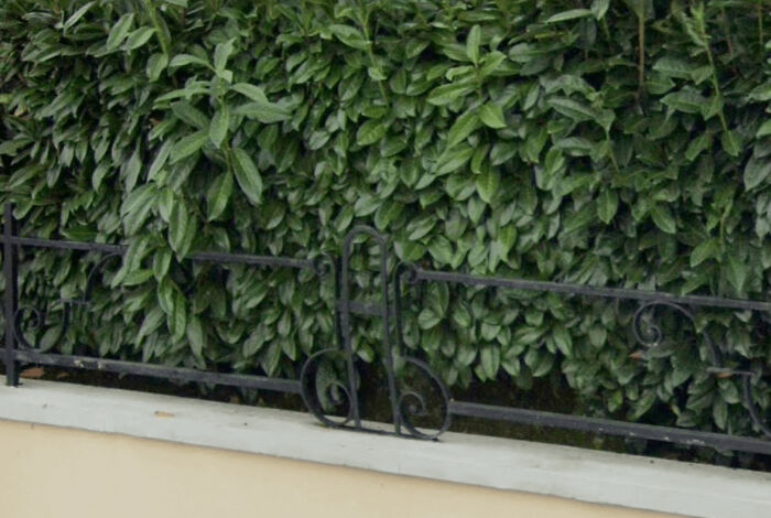
    The Fence

    Metal fence with an awkwardly shaped middle section blocking access, showing design without common sense outdoors.

    Whykioh Report

    Lotekguy
    Community Member
    Premium
    5 months ago

    I used to smoke a brand of cigarettes this picture reminds me of. The name was something like Fencin' and Hedges

    View more comments
    #44

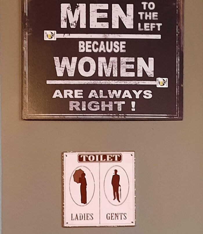
    Men Left But Gents Right Ladies Left But Woman Right

    Humorous designer sign with misplaced arrows showing poor common sense in restroom labeling and directional guidance.

    Inside-Recognition65 Report

    Owen
    Community Member
    Premium
    5 months ago (edited)

    That title is terrible. [Edit - The Bored Panda elves fixed the title.]

    View more comments
    ADVERTISEMENT
    #45

    My Friend Shirt

    Shirt with a funny design error showing misplaced text, illustrating what happens when designers work without common sense.

    crytal_augusto Report

    Luke || Kira (he/she)
    Community Member
    5 months ago

    Asking a famous movie director from Ghana why did he choose an actor named Theodore for the leading role

    View more comments
    ADVERTISEMENT
    #46

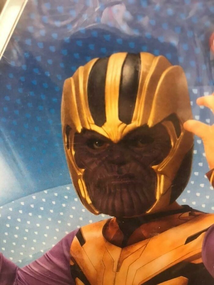
    I Found This In A Toystore

    Child wearing a poorly designed Thanos costume demonstrating what happens when designers work without common sense.

    jaime-le-jambon Report

    Chihuahua Mama
    Community Member
    5 months ago

    Teen Thanos during his rollerblading phase?

    View more comments
    #47

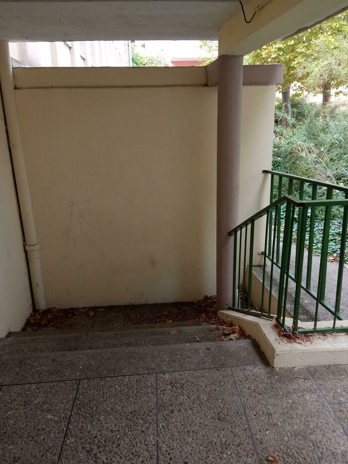
    Welcome To Poudlard

    Stairs leading to a d**d end wall, showing a design fail where designers worked without common sense.

    reddit.com Report

    C B Jones
    Community Member
    5 months ago

    (Poudlard is the French translation for Hogwarts)

    View more comments
    #48

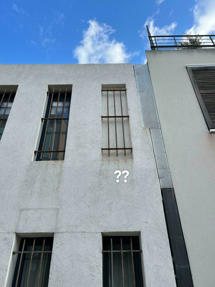
    Bro Has One Job🫩

    White building with barred windows shows a bricked-up window with bars, illustrating designers working without common sense.

    legrandgland Report

    Andy
    Community Member
    5 months ago

    That's EA hq, they didnt pay for the season pass so they didnt unlock all the windows

    View more comments
    ADVERTISEMENT
    #49

    This Barrier In Japan

    Moss-covered stairs with a handrail ending mid-step next to a tilted metal gate in an outdoor grassy area showing design without common sense.

    Matt3263827 Report

    Stephanie Did It
    Community Member
    5 months ago

    Somebody's gotta go back and get a sh!tload of dimes!

    View more comments
    ADVERTISEMENT
    #50

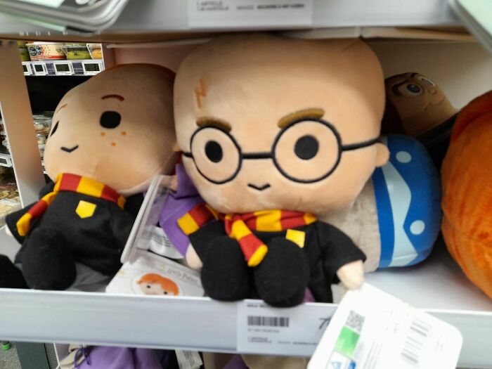
    This Guy Made My Sister Like Harry Potter

    Plush toys resembling popular characters on a store shelf, showcasing design without common sense humor.

    piTerre_xD Report

    Luke || Kira (he/she)
    Community Member
    5 months ago

    After all the $hit with JKR going on, I wouldn't be surprised if she canonically changed her characters into skinheads.

    View more comments
    #51

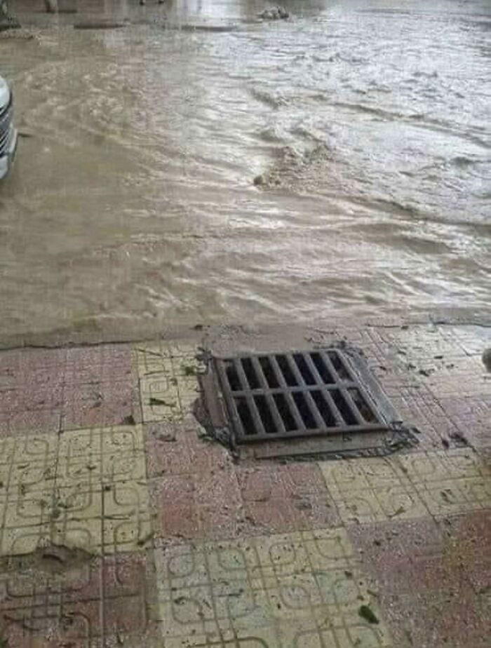
    This Drain For Rain

    Flooded street with ineffective drain placement showing poor design and lack of common sense by designers.

    M-A-R-I-O_2020 Report

    Bill Swallow
    Community Member
    5 months ago

    I'd bet at least a few of these cases started out ok, and later, the surrounding area subsided a few inches. The drain was prevented from subsiding because it is supported from underneath by the drain piping.

    View more comments
    #52

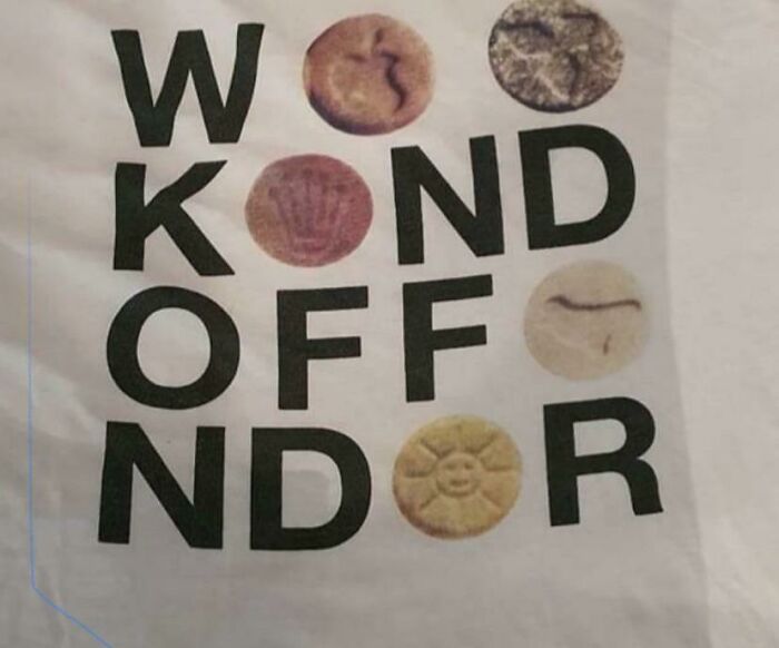
    ???

    T-shirt design with misaligned letters and cookie images, showcasing humorous design fails without common sense.

    Soviet-kirby Report

    kissmychakram
    Community Member
    5 months ago

    Weekend offender? That's all I can parse, but I don't know what the round things are (cookies, soaps?) nor why they would be representing the letter "e".

    View more comments
    ADVERTISEMENT
    #53

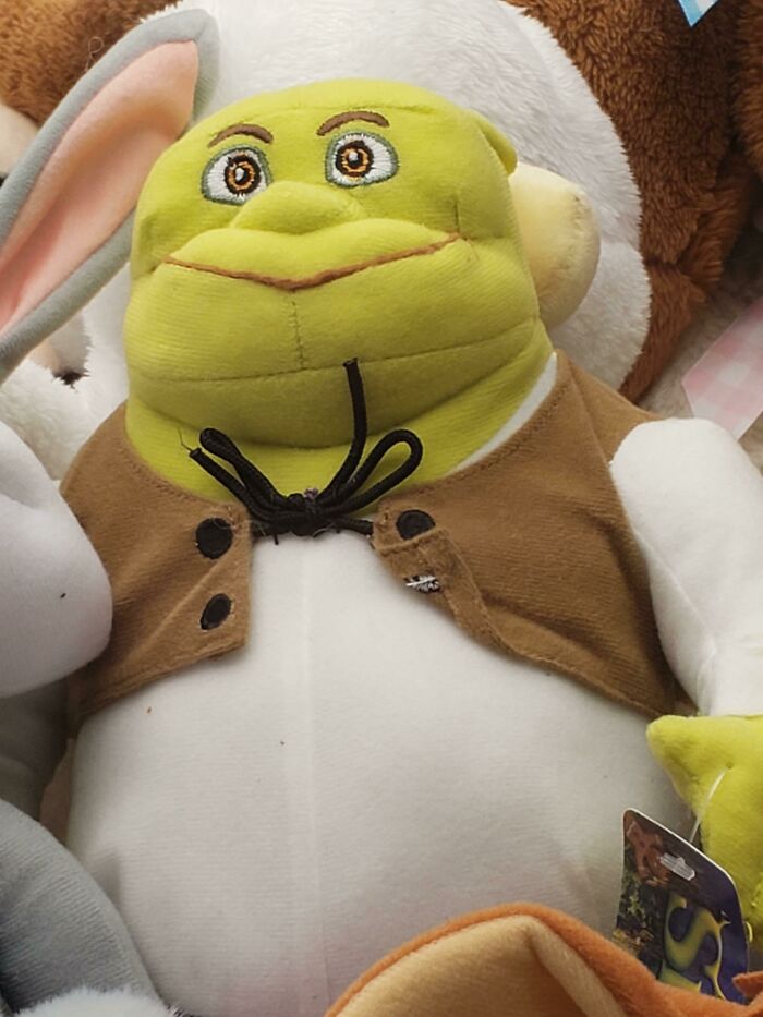
    Schreck, What Happened To You?

    Plush toy with a green face and brown vest, showing a design fail illustrating what happens when designers lack common sense.

    knottycrochetlady Report

    Charlie
    Community Member
    5 months ago

    Plastic surgery happened

    View more comments
    ADVERTISEMENT
    #54

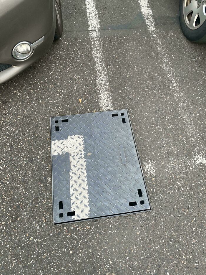
    This Parking Place…

    Metal cover painted with a misaligned parking spot number, illustrating design without common sense in a parking lot.

    PapaBoum Report

    Astrobloom (they/them)
    Community Member
    5 months ago

    not bad design, whoever last opened it forgot to rotate the cover so the lines match up

    View more comments
    #55

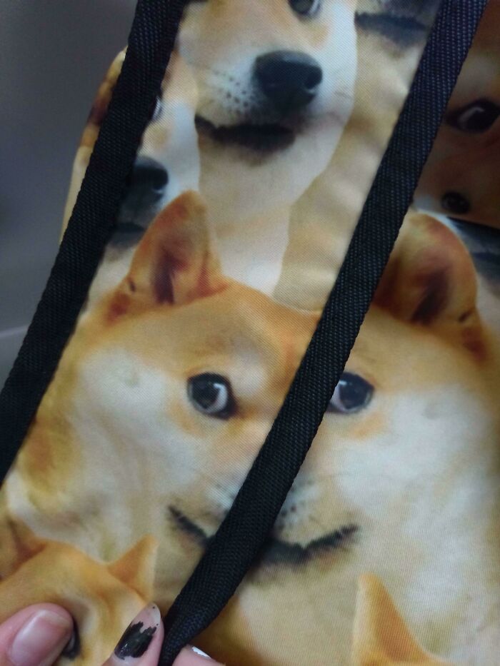
    This Doge Backpack

    Backpack with multiple dog faces printed, showing a design fail illustrating what happens when designers work without common sense.

    Le_Lucario_Boi Report

    Luke || Kira (he/she)
    Community Member
    5 months ago

    A fusion between Doge, Phteven and Moon Moon

    #56

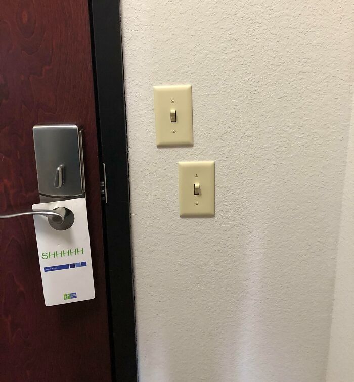
    Nice Alignment Here

    Two light switches placed unusually close together beside a door illustrating designers working without common sense.

    Travl2Much Report

    Benoît Rainville
    Community Member
    4 months ago

    At least you can tell where the 2x4 is behind the surface.

    ADVERTISEMENT
    #57

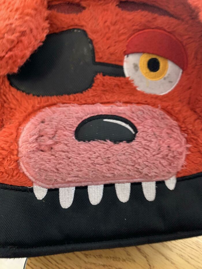
    The Strap Goes Through His Eye

    Close-up of a poorly designed toy face with uneven eyes and misaligned features showing lack of common sense in design.

    bdude1000 Report

    Mr_Hipp0
    Community Member
    5 months ago

    The strap goes through Foxy's eye in every variant with an eyepatch, except Rockstar Foxy. Same with a lot of the toys. It's just how Foxy was designed

    View more comments
    ADVERTISEMENT
    #58

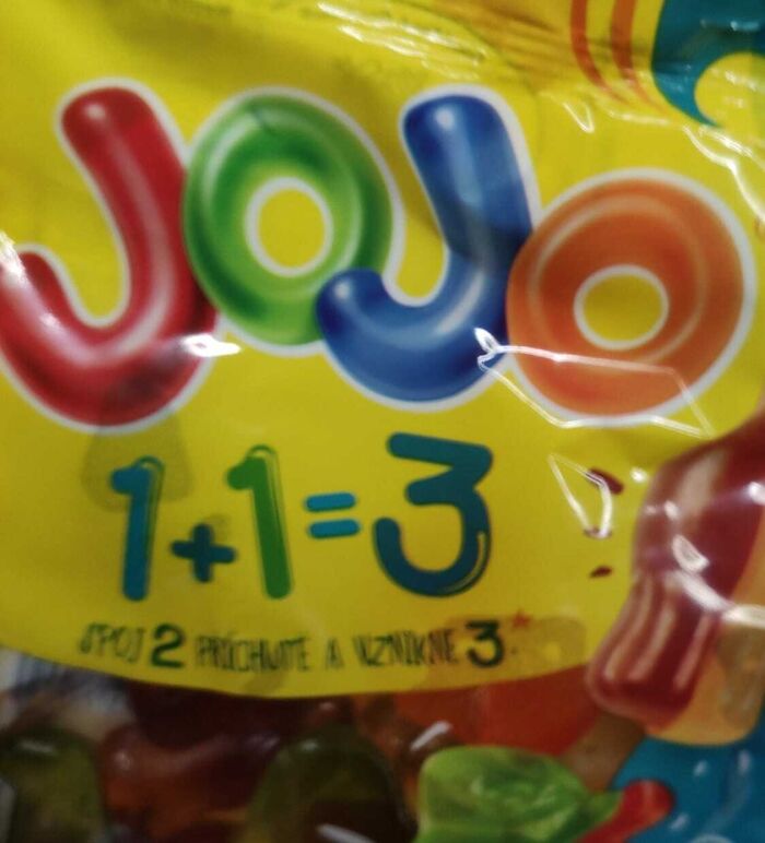
    Yeah 1+1=3

    Packaging design with a math error illustrating what happens when designers work without common sense in a humorous way.

    Nuky111 Report

    Liliana Spiro
    Community Member
    5 months ago (edited)

    Combine 2 tastes, get a 3rd. It's in Czech

    View more comments
    #59

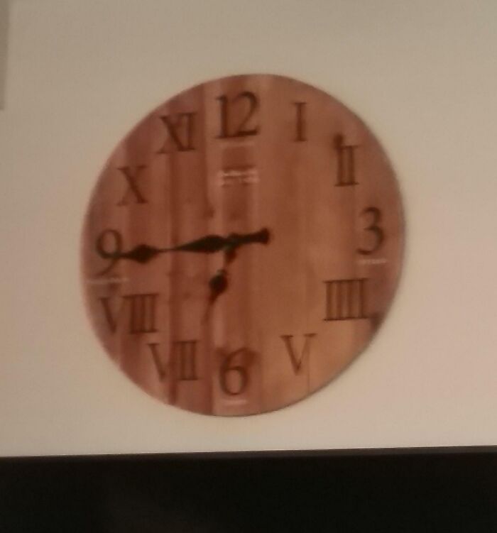
    The Clock At My Work. Not How Roman Numerals Work

    Wooden clock with Roman numerals placed incorrectly, showcasing a common sense design fail by designers in a humorous setting.

    FlamingDeadCat Report

    Fat Harry (Oi / You)
    Community Member
    5 months ago

    The mixture of Arabic and Roman numerals is odd. The use of IIII for four is not.

    View more comments
    #60

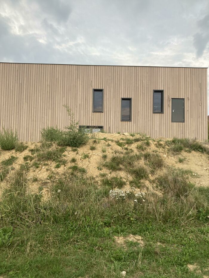
    What?

    Modern building with windows and a door placed above ground level, illustrating what happens when designers work without common sense.

    lolo_pilo Report

    spacer
    Community Member
    5 months ago

    when you place your sims windows from the inside then put the walls back up

    View more comments
    ADVERTISEMENT
    #61

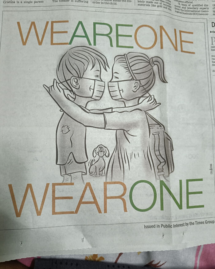
    Covid Guideline Picture

    Illustration of children wearing masks hugging, highlighting design without common sense in a public interest message on a newspaper page.

    Kwiho Report

    meow point1
    Community Member
    5 months ago

    That's what she said.

    View more comments
    ADVERTISEMENT
    #62

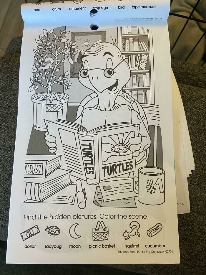
    When You Can’t Find The Moon In Your Toddler’s Activity Book. I Swear They Forgot To Add It

    Coloring book page showing a turtle reading a book with hidden objects, illustrating design without common sense humor.

    yankee_doodle_ Report

    Judes
    Community Member
    5 months ago

    Why does a book about turtles have a ladybug on the cover?

    View more comments
    #63

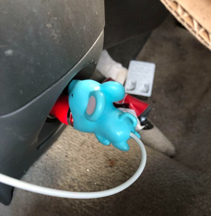
    My Sisters Wire Straightener

    Car charger outlet designed with a blue mouse figure, illustrating designers working without common sense humorously.

    phoenix_killa87 Report

    Laughing Orc
    Community Member
    5 months ago

    Intentional, methinks.

    View more comments
    #64

    Why Would You Do Him Like That?

    Clothing store display with an awkwardly distorted advertisement highlighting designers working without common sense.

    Whole_Pineapple_6322 Report

    Panda McPandaface
    Community Member
    5 months ago

    I wouldn't do him at all.

    View more comments
    ADVERTISEMENT
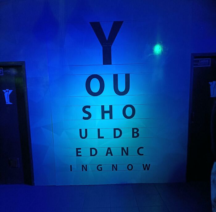
    #65

    Y Ou Sho Uldb Edanc Ingnow

    Eye chart design without common sense, with letters spelling a confusing message under blue lighting.

    The_unchosen-one Report

    Fat Harry (Oi / You)
    Community Member
    5 months ago

    I had no issue reading this, and read it as intended the first time. Good design.

    View more comments
    ADVERTISEMENT
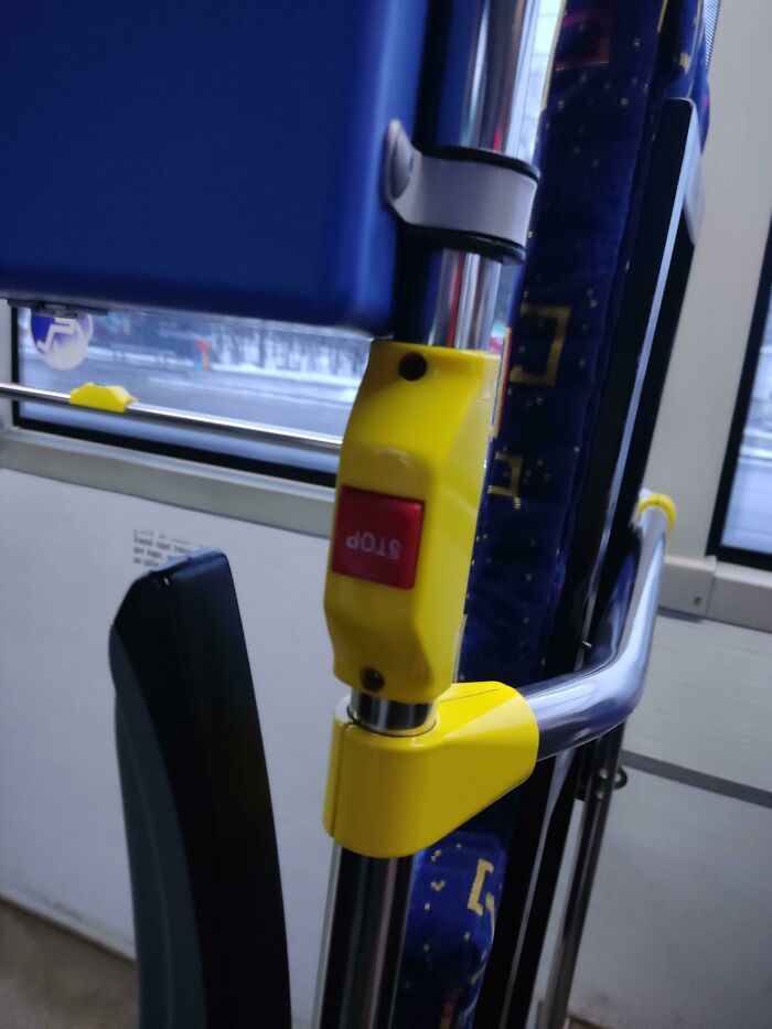
    #66

    I Serously Don't Know What To Say

    Bus stop button installed upside down on a pole, an example of designers working without common sense causing confusion.

    Few_Mix6776 Report

    Fat Harry (Oi / You)
    Community Member
    5 months ago

    "It's upside down"? That's what I'd say.

    View more comments
    #67

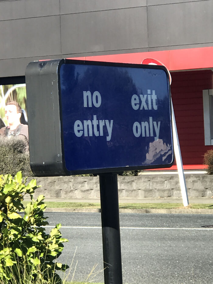
    Burger King's Drive Thru Sign

    Confusing no entry exit only sign highlighting a common sense design fail by designers in public spaces.

    Worldly-Record3185 Report

    Judes
    Community Member
    5 months ago

    What's wrong with this one? I assume this sign is telling people that they can't enter the car park from the right.

    View more comments
    #68

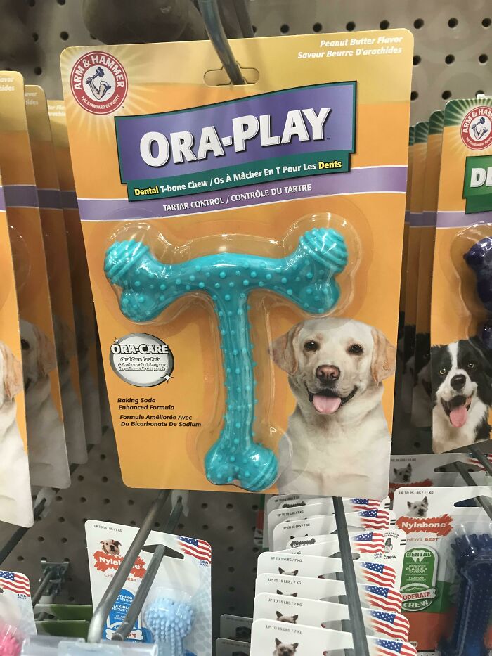
    Who Approved This After The Initial Design Pitch That It Made It To Production And Then To Market?

    Dental chew toy packaging shaped like a T-bone, showing a lack of common sense in design for dog products.

    moondance1026 Report

    Judes
    Community Member
    5 months ago

    I think the poster is being a bit precious. It's not remotely bad.

    View more comments
    ADVERTISEMENT
    #69

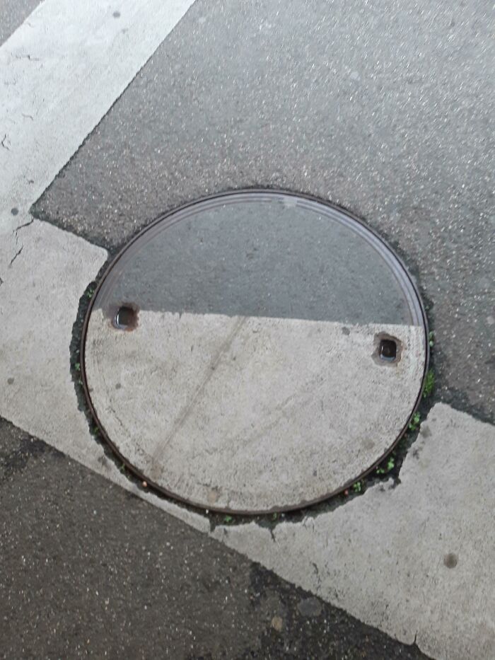
    Help

    Round manhole cover misaligned with road markings showing design without common sense on asphalt street corner.

    jaime-le-jambon Report

    Astrobloom (they/them)
    Community Member
    5 months ago

    again, just hasn't been rotated

    ADVERTISEMENT
    #70

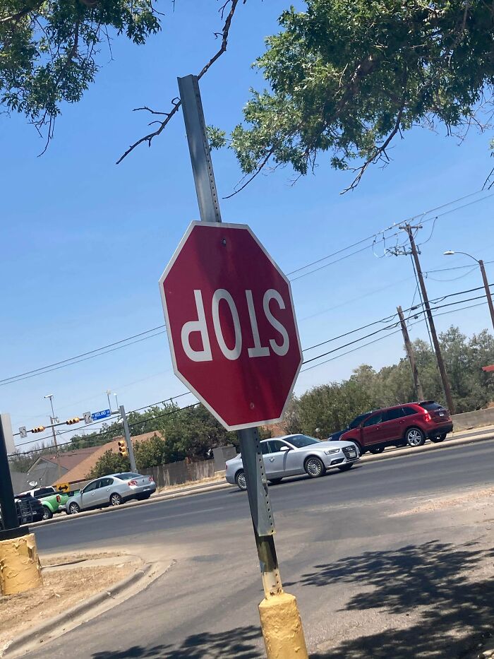
    What The Hell Walmart

    Stop sign installed upside down on a bent pole, showing lack of common sense in design outdoors by a busy street.

    Socksirsiz Report

    Fat Harry (Oi / You)
    Community Member
    5 months ago (edited)

    Top scréw has come undone. Bottom has not. Sign has pivoted around the bottom s***w. Honestly, are people really so stupid as to not have figured this out?


    View more comments
    #71

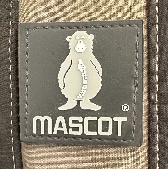
    This Logo

    Close-up of a mascot patch on fabric, illustrating a design detail relevant to designers working without common sense.

    StrongDongKong Report

    Laughing Orc
    Community Member
    5 months ago

    Well he seems happy.

    View more comments
    #72

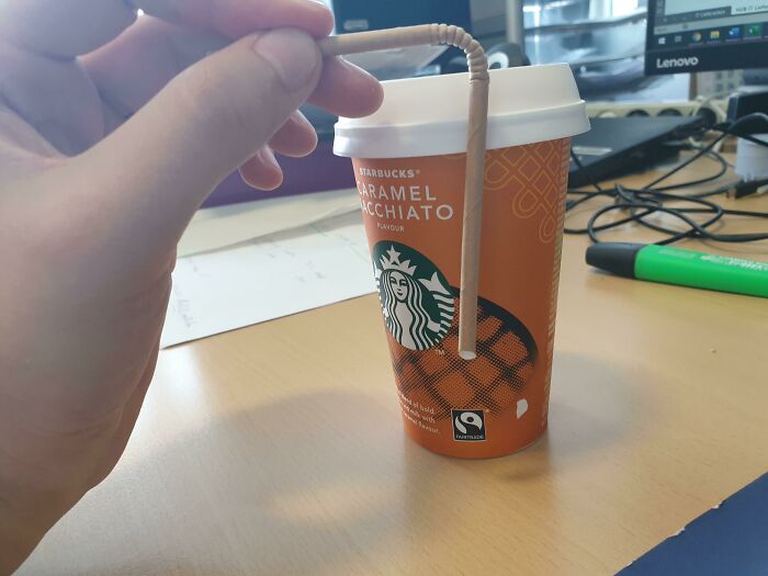
    Guess The Cup Is Half Full

    Hand holding a bent straw inserted into a Starbucks cup, showcasing a design fail without common sense by designers.

    Gumypuncher Report

    Owen
    Community Member
    Premium
    5 months ago

    Straighten the straw to reach the bottom. Try not to eat the cup while you're at it.

    View more comments
    ADVERTISEMENT
    #73

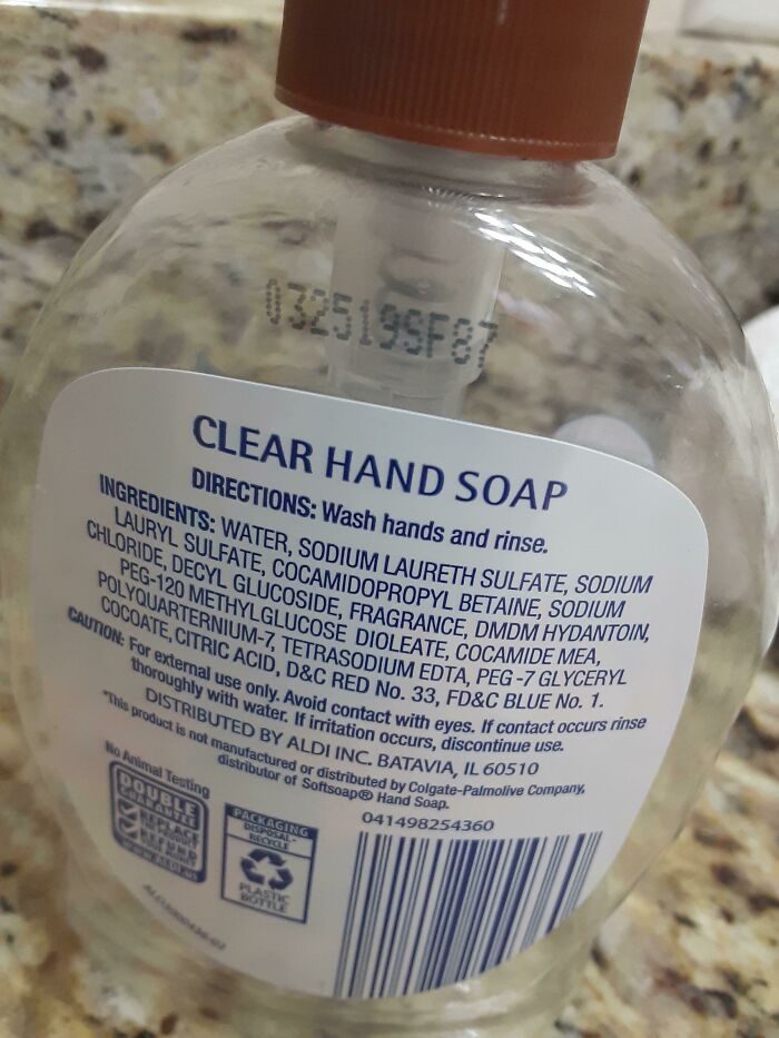
    Soap Really Out Here Explaining How To Use Something That Almost Everyone Uses

    Clear hand soap bottle with detailed ingredient list, showing a design lacking common sense in product label readability.

    Spiderkids1 Report

    spacer
    Community Member
    5 months ago

    not enough people know how to use soap, sadly

    View more comments
    ADVERTISEMENT
    #74

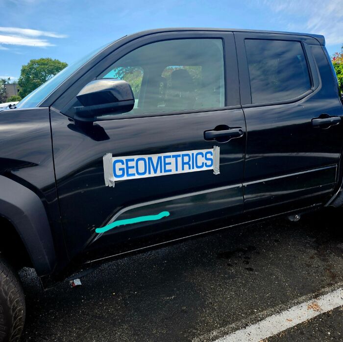
    They Were In A Hurry I Guess

    Black car with a dent and a taped sign reading geometrics illustrating designers working without common sense humorously.

    Future-Low-4781 Report

    Slapdash1
    Community Member
    5 months ago

    Huh?

    View more comments

    #75

    I Literally Found This And Have Nothing To Say Except... You Had One Job
    Packaging design fail showing a misaligned face graphic causing a distorted look in a store product display.

    unknown Report

    Whiskers
    Community Member
    5 months ago

    (You ”literally found” that!?!! Just… okei okei, I’m just leaving…)

    View more comments
    #76

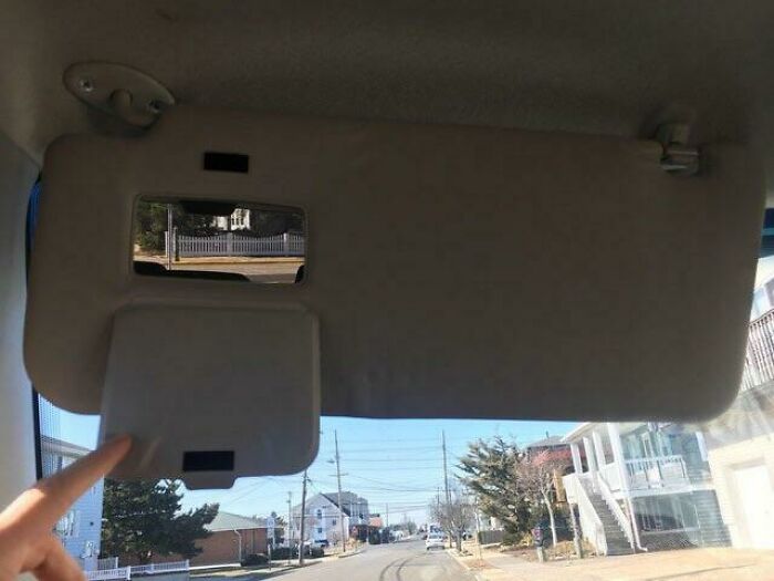
    I Can’t See Anything Through It

    Car sun visor with a misplaced mirror showing a small reflective square, illustrating designers working without common sense.

    Two_Punch_Man3 Report

    Laughing Orc
    Community Member
    5 months ago

    Don't get this one.

    View more comments
    ADVERTISEMENT
    #77

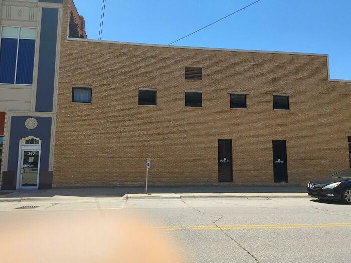
    I Don't Like That The One Window Is Further Apart From The Others And This Two Doors Right Next To Each Other And The Both Not Centered

    Brick building with windows and doors poorly designed without common sense, illustrating designer fails in a city street view.

    Level_Resolution6036 Report

    Hiram's Friend
    Community Member
    5 months ago

    Sorry you don't like it, but was probably done for reason.

    View more comments
    ADVERTISEMENT
    #78

    I Don't Get What This Say's, Help Me

    Pink t-shirt with a design showing poorly aligned text and typography errors, illustrating designers working without common sense.

    adurite_hat Report

    Did I say that out loud?
    Community Member
    5 months ago

    "We can beat this together " Breast cancer campaign.

    View more comments
    #79

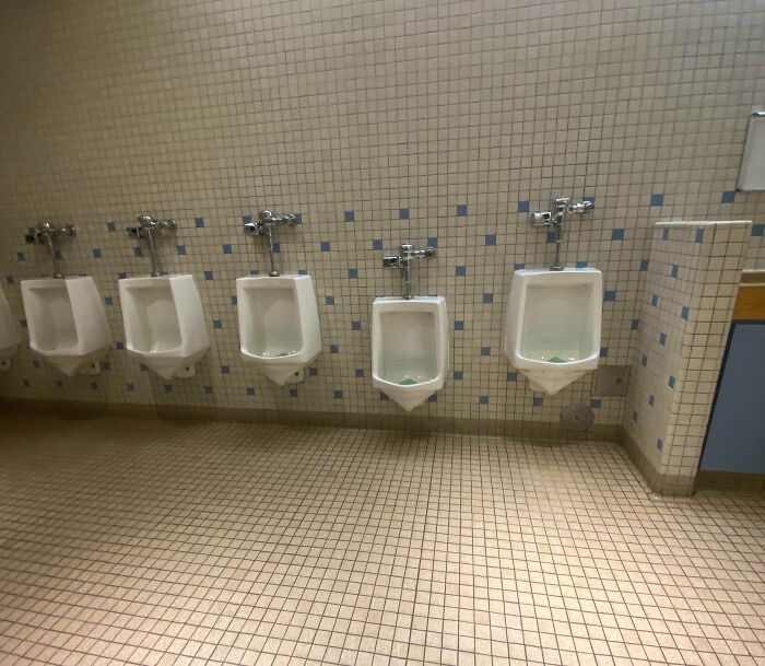
    Why

    Bathroom urinals misaligned with wall tiles showing poor design and lack of common sense by designers in a public restroom.

    an_idiotlol Report

    Becky Samuel
    Community Member
    5 months ago

    Because little boys exist.

    View more comments