Get Premium
Dark mode theme is available exclusively for premium users. Learn more about the benefits of subscribing.
No fees, cancel anytime.

 Dark Mode Ad-Free Browsing Unlimited Content

 Ad-Free Browsing Unlimited Content Dark Mode
Join 1.2 million Panda readers who get the best art, memes, and fun stories every week!
Good design is supposed to make our lives easier. Whether it’s a piece of furniture, a sign, or a kitchen gadget, the goal is usually to make things more practical and convenient. But sometimes, designers seem to forget that part of the job entirely. And instead of solving problems, their creations end up causing even more of them.
To show you what we mean, we’ve rounded up some hilarious design fails from a subreddit dedicated to spotting them. Scroll down to check them out, and don’t forget to upvote the worst offenders!
This post may include affiliate links.

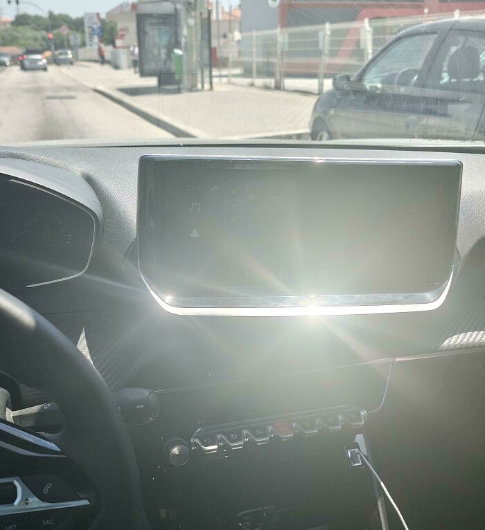
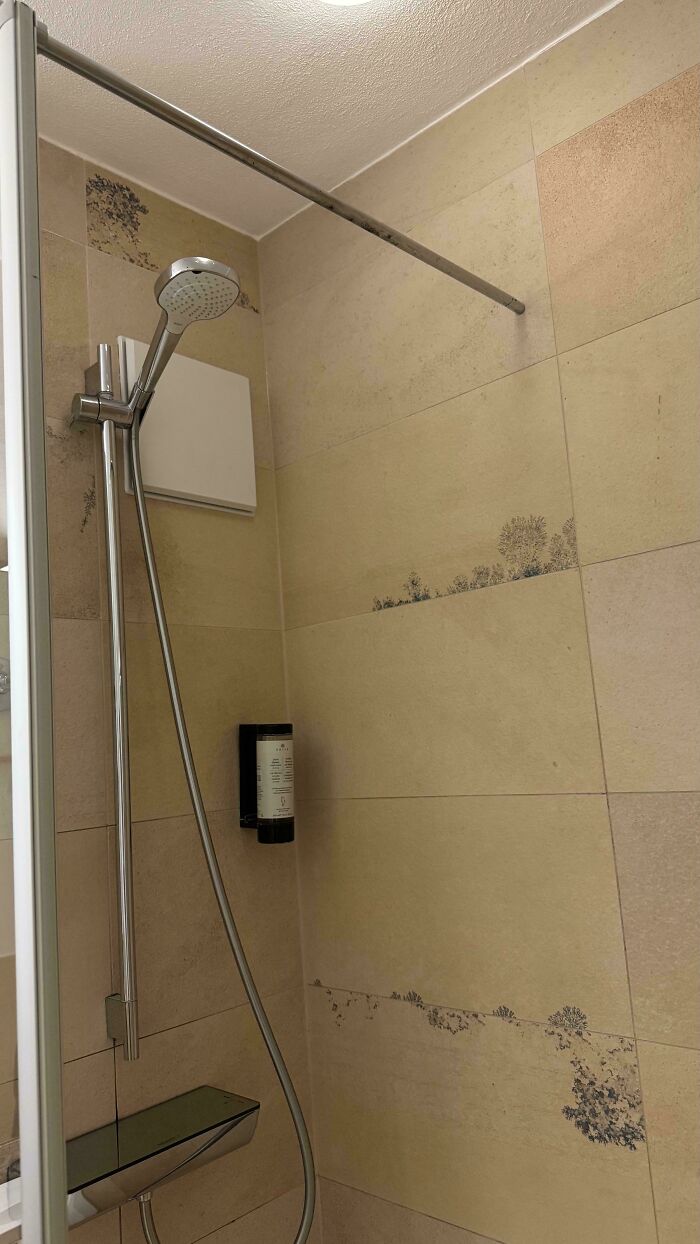
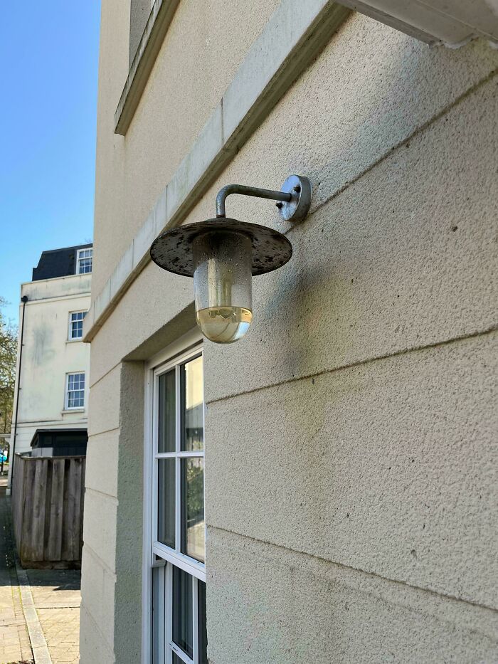
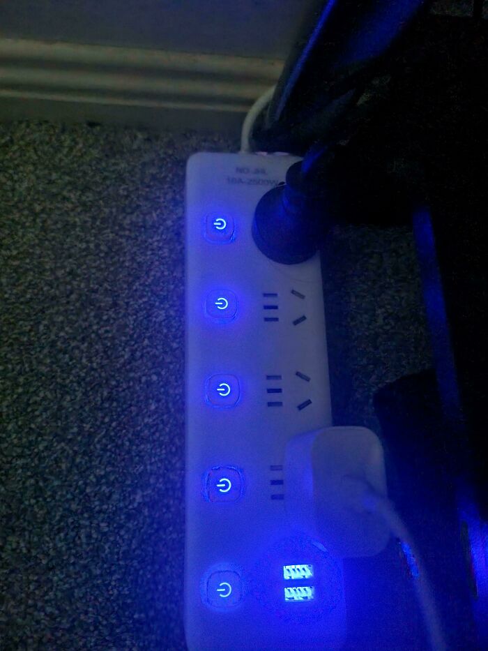
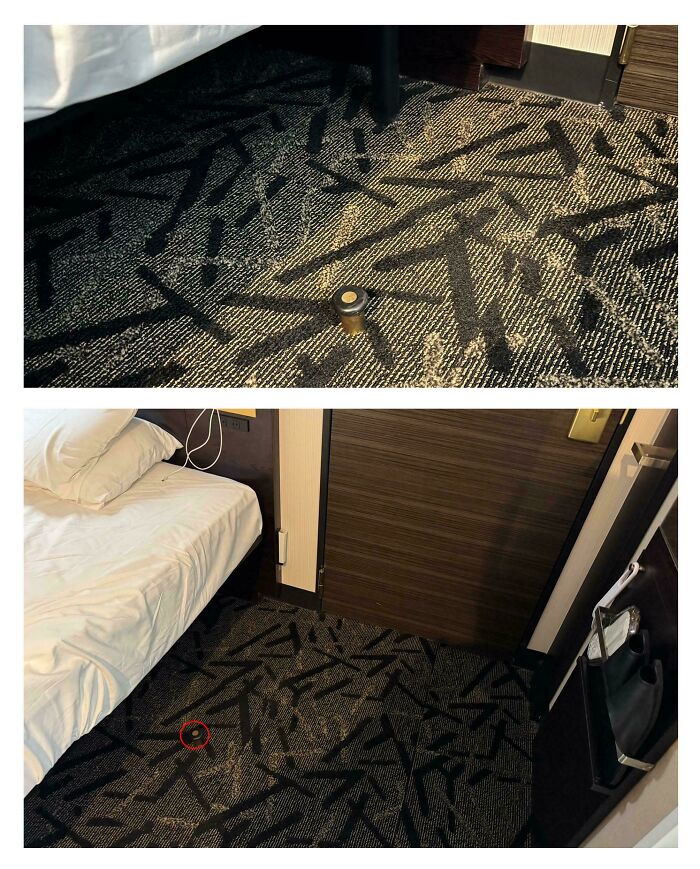
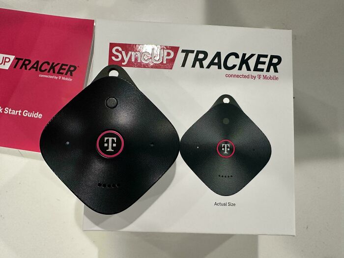
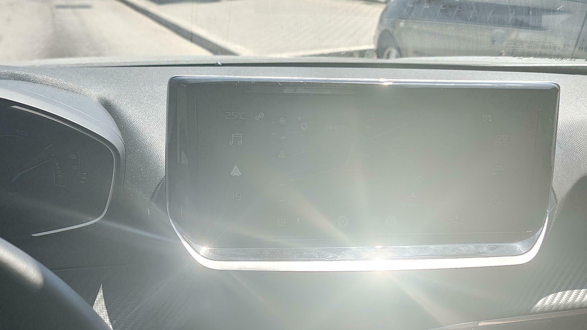
I'd have to slap electrical tape or duct tape down on that :/
If you think about it, pretty much everything around us was designed by someone who had to make all sorts of decisions about how it should look and work.
The phone or computer you’re reading this on, for example. Someone decided how big the screen should be, where to put the buttons, and even what shape the letters you’re looking at right now should have.
The same goes for the bed you slept in last night or the chair you’re sitting on. There’s a surprising amount of thought behind things we barely even notice in our everyday lives.

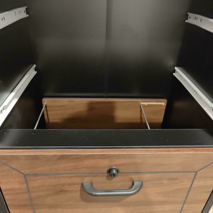
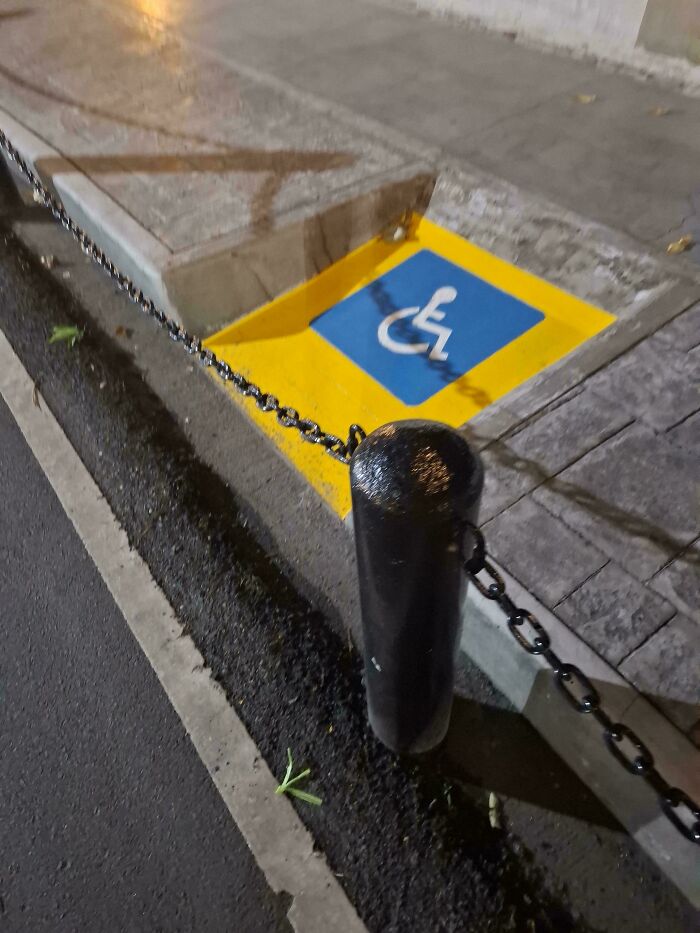
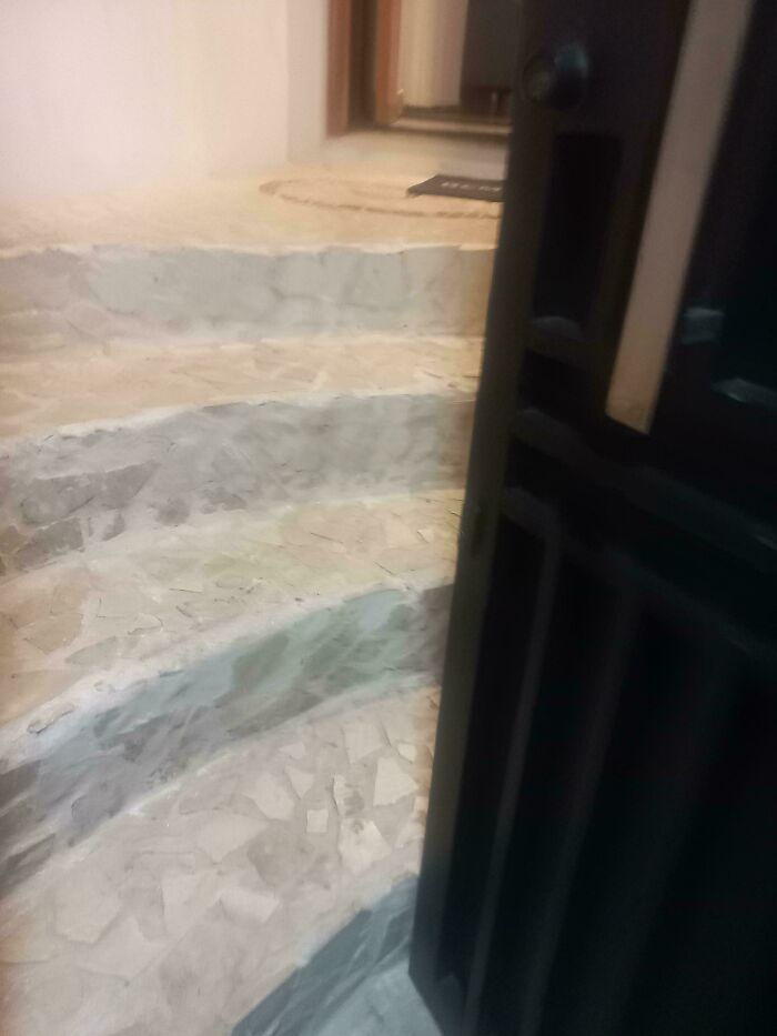
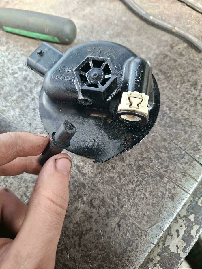
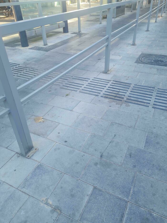
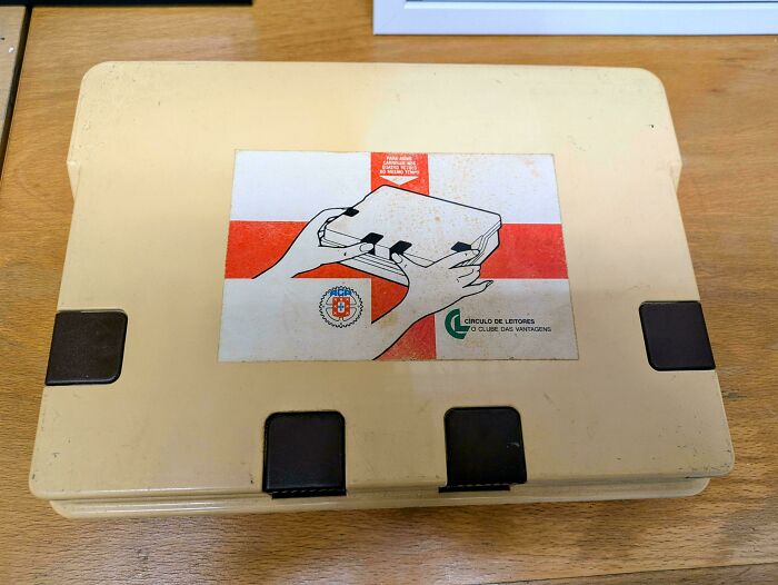
That has to be one of the most slapped together access I've seen...it's like one of those "tick a box for an inspection" but not functional.
Of course, some things are designed much better than others. We can usually tell when something works well, just as we can spot a bad design almost immediately.
In fact, a study by Gitte Lindgaard and her colleagues at Carleton University found that people can judge whether a website looks appealing in just 50 milliseconds, which is faster than the blink of an eye.
But explaining exactly what makes one design better than another can be surprisingly tricky. So, what do professional designers have to say about it?

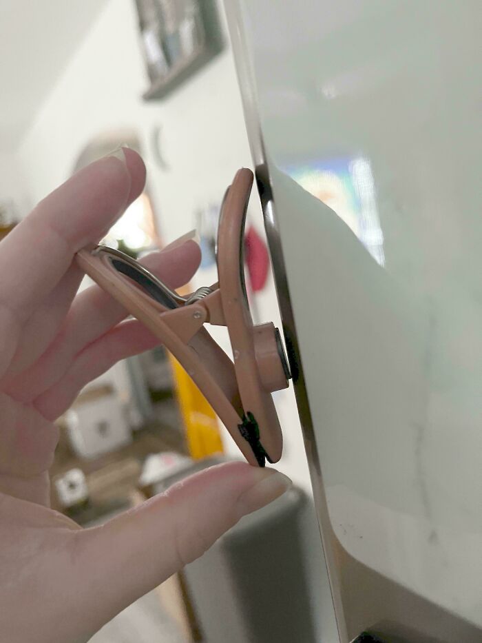
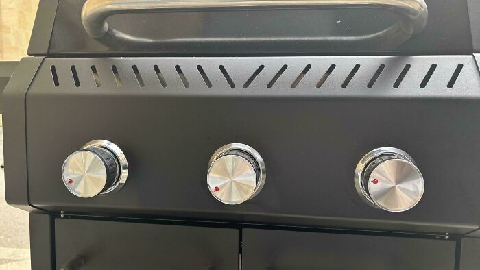
Labels, handles, buttons, switches etc that are designed to be "aesthetically pleasing" at the expense of functionality are one of my pet peeves.
German industrial designer Dieter Rams, who spent decades designing products for Braun, came up with 10 principles of good design back in the 1970s. According to him, good design should make a product useful, easy to understand, and pleasant to look at.
He also believed that products should last a long time and avoid unnecessary details. His ideas have influenced generations of designers and are still widely discussed today.

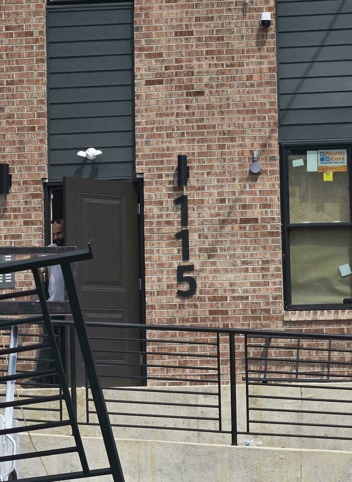
Just need a wire clothes hanger to freak out the residents in their rooms this Halloween.
There’s a good reason why simplicity matters so much. Think about how annoying it is when you spend five minutes trying to figure out which button starts your washing machine or have to click through half a dozen menus just to find something on a website.
Usability expert Jakob Nielsen has developed a set of guidelines for making digital products easier to use. One of his main points is that people shouldn’t have to remember complicated instructions when the information they need could simply be shown to them.
Another important thing designers need to consider is not just how something will work, but also who will be using it. This kind of approach is called human-centered design, and it involves putting yourself in the shoes of the people you’re designing for.
Sometimes, that means literally watching how people actually use a product, because what they do can be very different from what designers expect. After all, something that seems perfectly logical to its creator might leave everyone else scratching their heads.
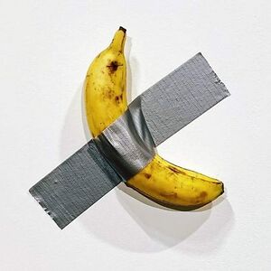
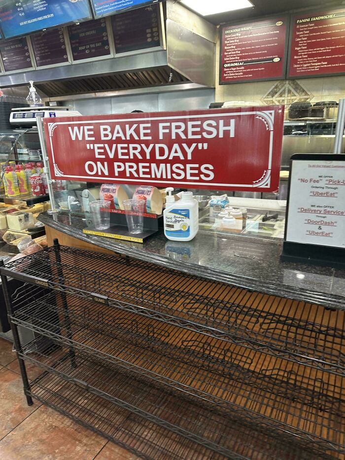
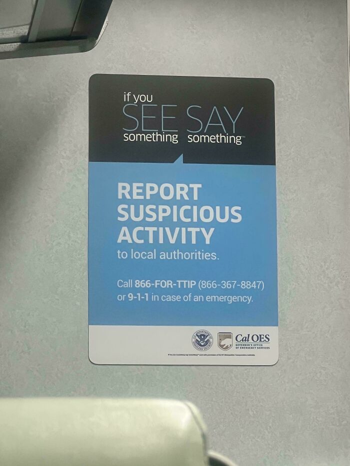
wrong use of quotes AND the word everyday in one sign. well done :)
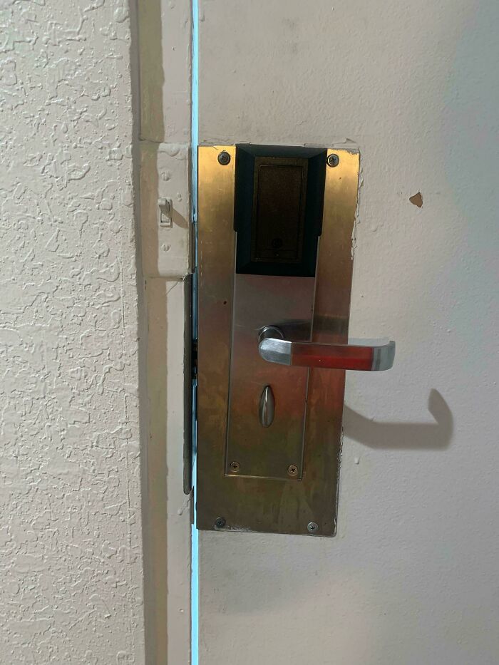
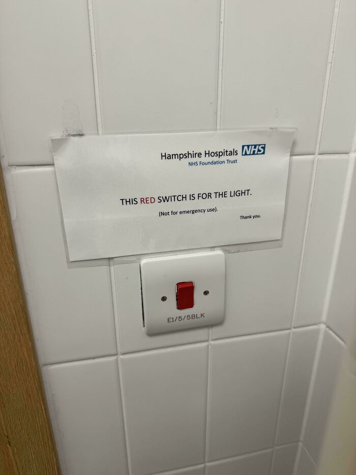
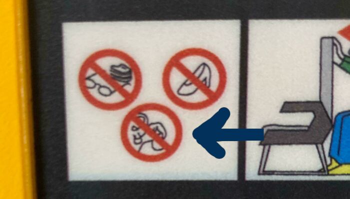
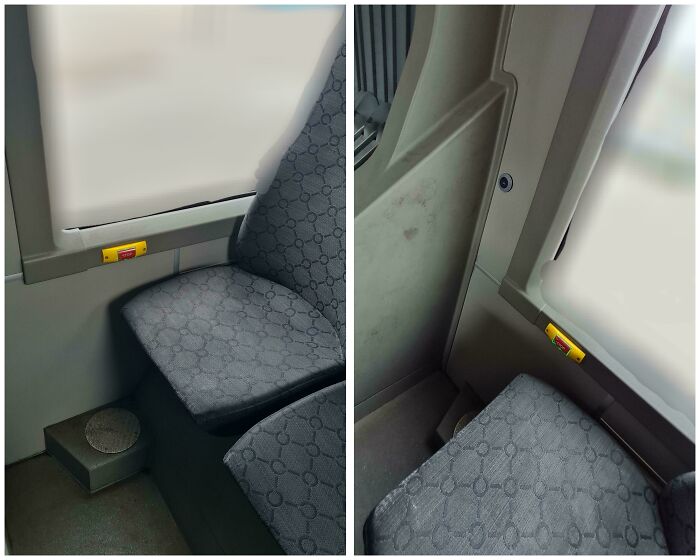
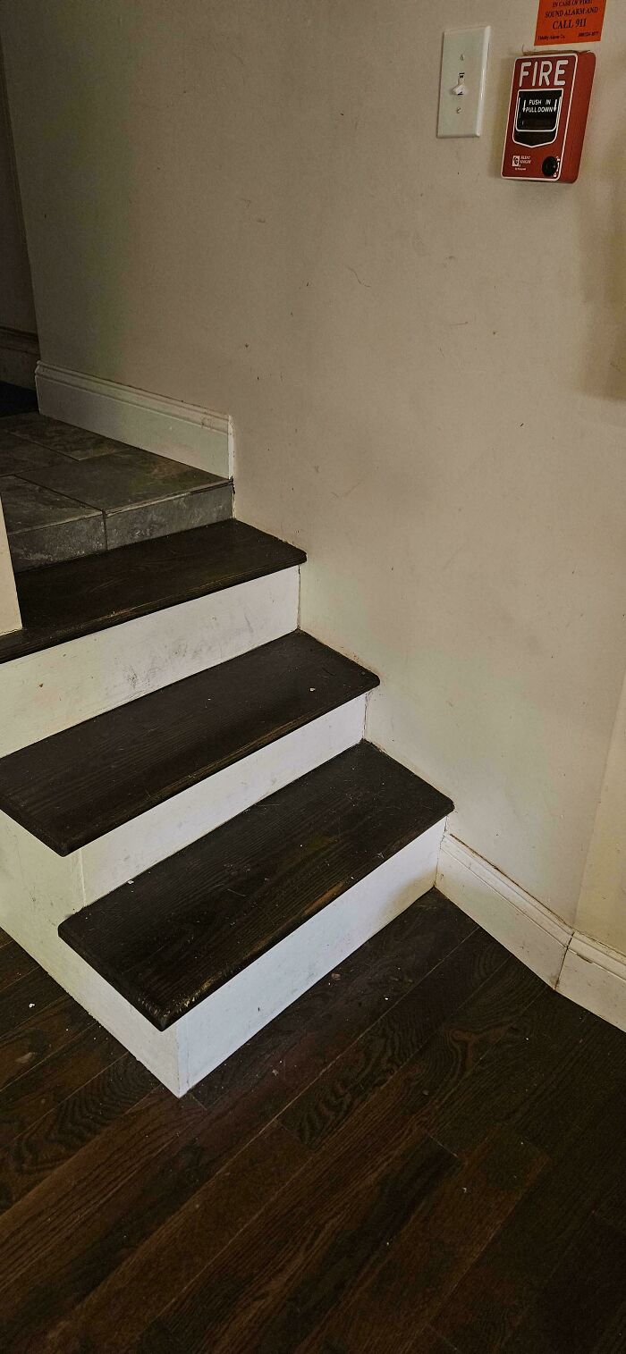
What color is the emergency buzzer? Is there an emergency buzzer? Where is the emergency buzzer? So many questions...
A great example of this is the story behind OXO’s Good Grips kitchen utensils. According to the Smithsonian, the idea came to Sam Farber after he noticed his wife, who had arthritis, struggling to use kitchen tools with metal handles.
He decided to create something more comfortable, and in 1990, the company introduced a line of utensils with soft, easy-to-hold rubber handles. The idea was simple, but it made everyday tasks easier for people with different needs.
Another famous design success is the London Underground map. Back in the 1930s, the city’s growing train network was becoming increasingly difficult to fit onto a regular map.
So designer Harry Beck came up with a completely new approach, using simple lines and colors to make the routes easier to follow. His design was initially rejected for being too radical, but it was eventually introduced in 1933 and went on to inspire subway maps around the world.
There have also been many spectacular examples of designs that didn’t work out quite so well. Remember Juicero? In 2017, the company was selling a $400 internet-connected machine designed to squeeze juice from special packets of fruits and vegetables.
The problem was that Bloomberg discovered people could squeeze the packets by hand and get almost the same amount of juice, sometimes even faster. The company shut down just a few months later, making the expensive gadget one of the more memorable product failures of its time.

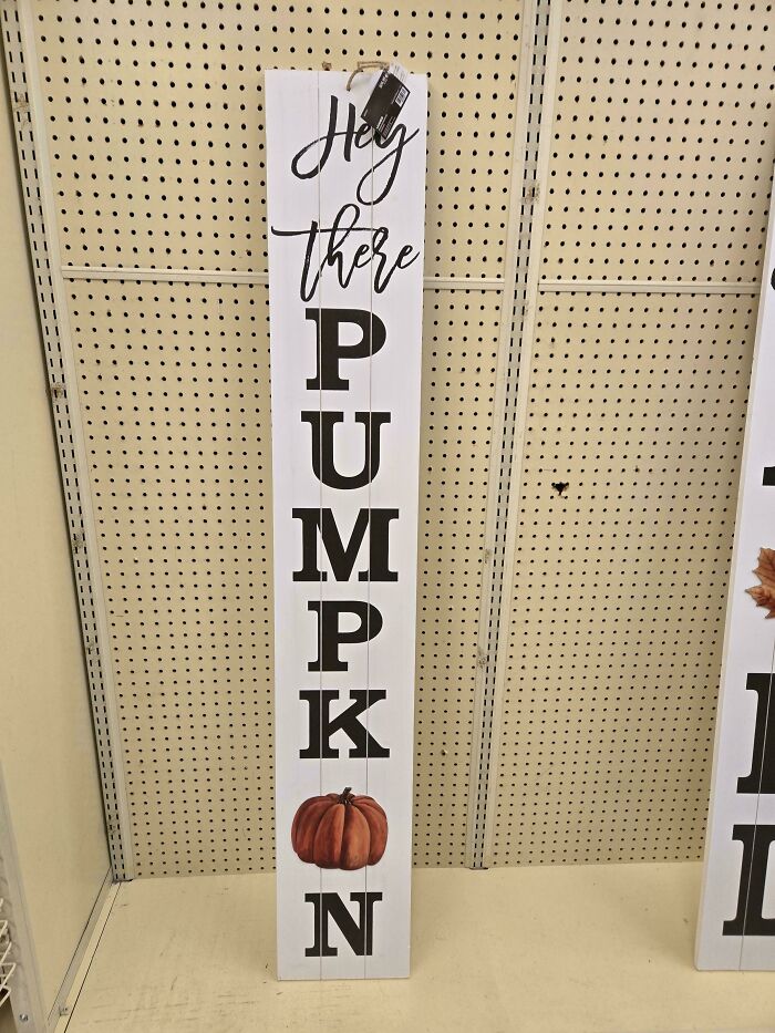
And they so easily could have made it look like an M by using the rooves of TWO houses.
And that’s perhaps the funny thing about design. When something works exactly as it should, we rarely stop to appreciate how much thought went into it. But when a door opens the wrong way or a sign leaves us more confused than before, we notice immediately.
At least these mistakes give us something to laugh about, and maybe they can even remind future designers to test their ideas before sharing them with the world.
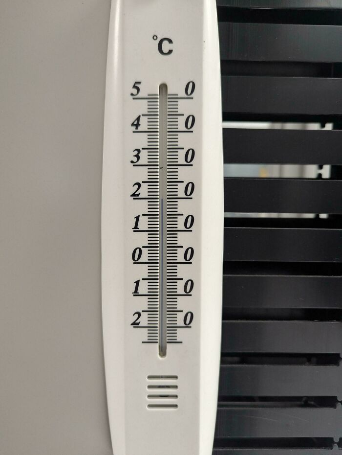
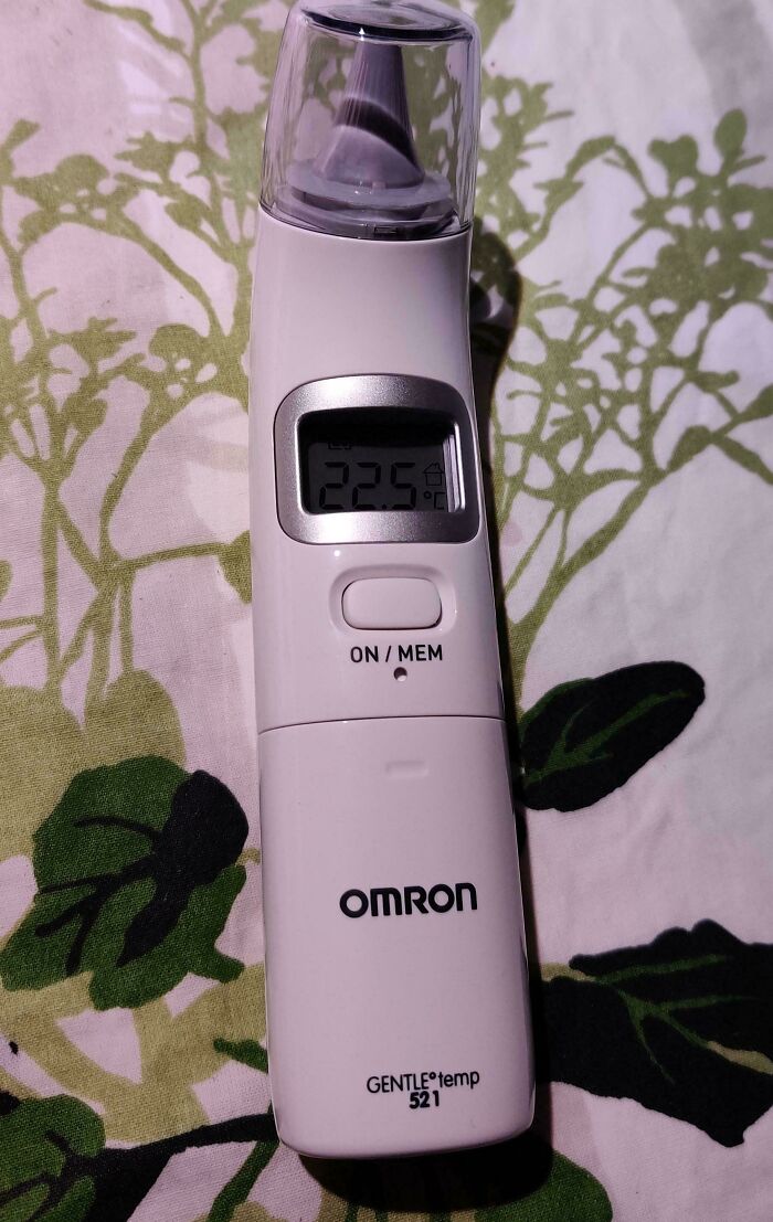
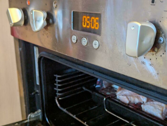
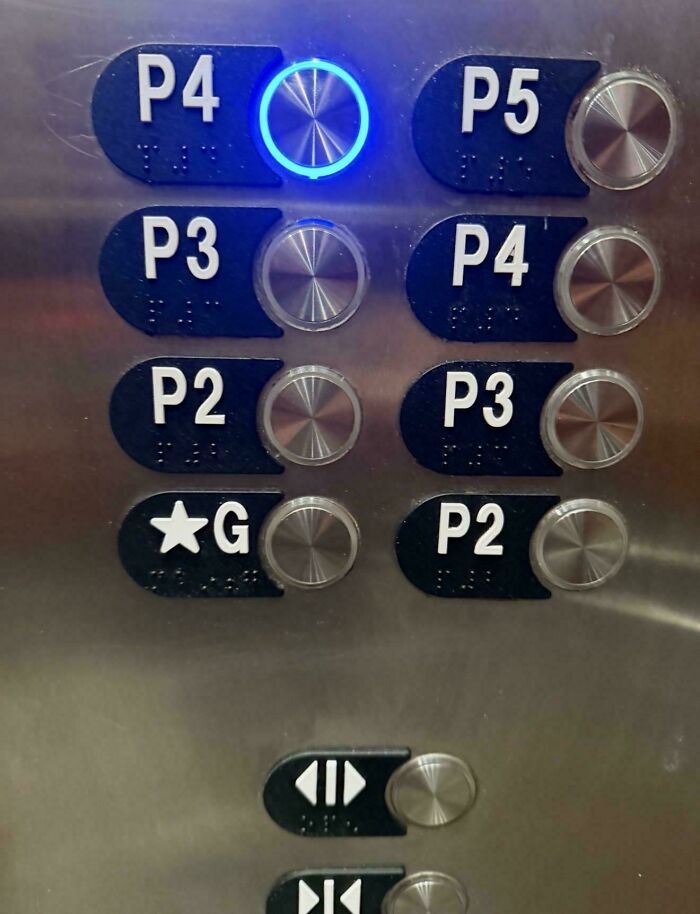
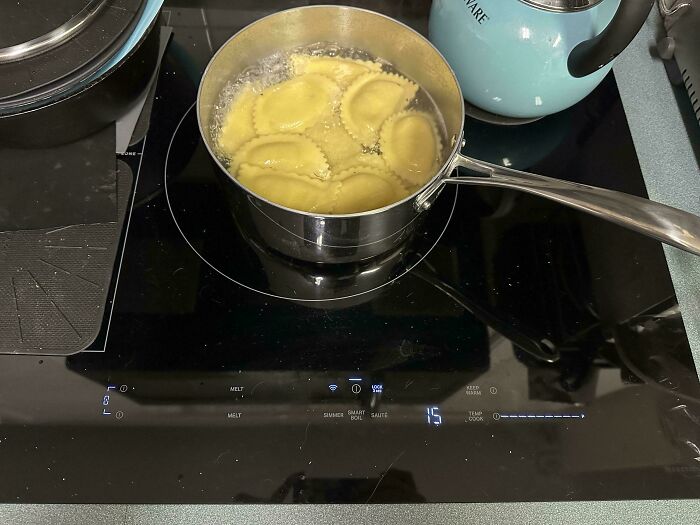
For a moment there I thought it was a fridge thermometer that only goes up to 5c.

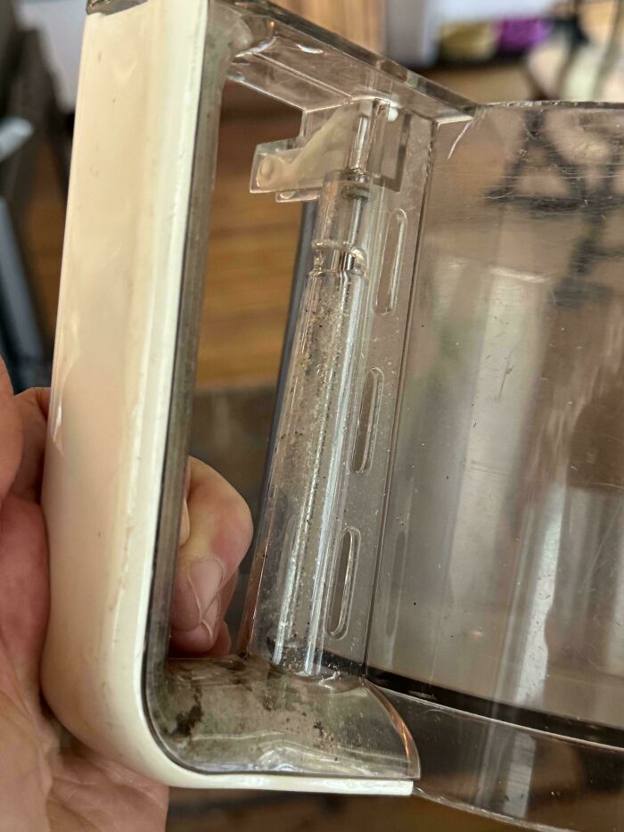
I cut grass for a lady who asked me to look at her Direct dish to see if there was a problem due to no reception. Little plastic cover over receiving wand was filled with water.
I've looked at the manual and it does seem to be a design flaw "The room temperature remains on the display while the unit is switched off". Also a line in the first page caught my eye (copy and pasted). . . . "Intended Operator: At least 11 years old (5 years in tensive reading experience), no maximum.". . . .5 years in-tensive reading experience??? okayyyy?
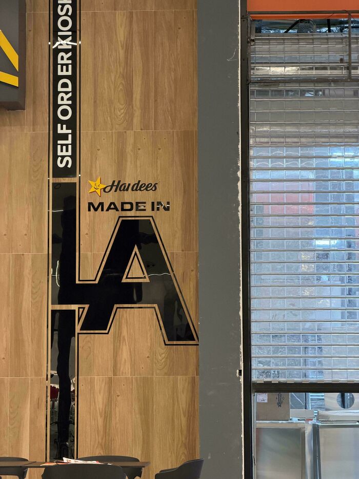
Supposed to be read as "Made In LA". That LA looks somewhat similar to the logo for the Los Angeles Dodgers baseball team, but we call Hardees "Carls Jr" here in California. So maybe it stands for Louisiana XD
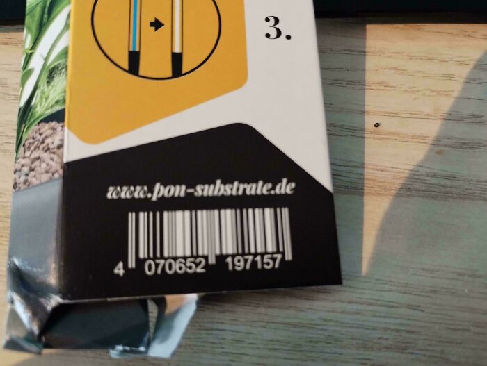
I imagine it's because the far left bar is supposed to be black (i.e. the barcode doesn't end at the leftmost two white bars)
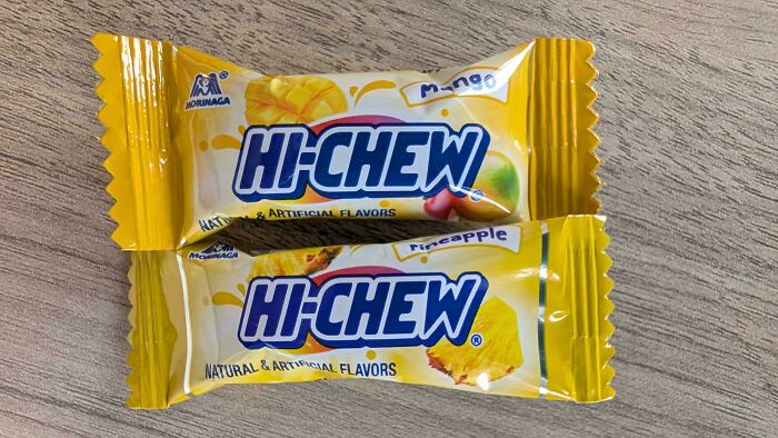
That way they can't get sued for false advertising when it turns out there are no actual strawberries in it
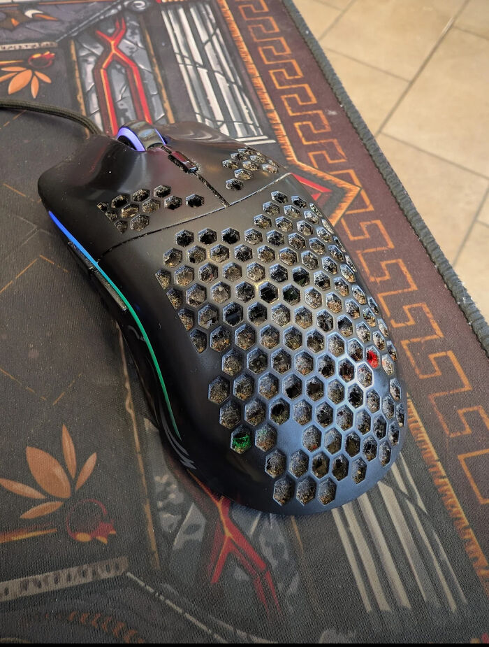
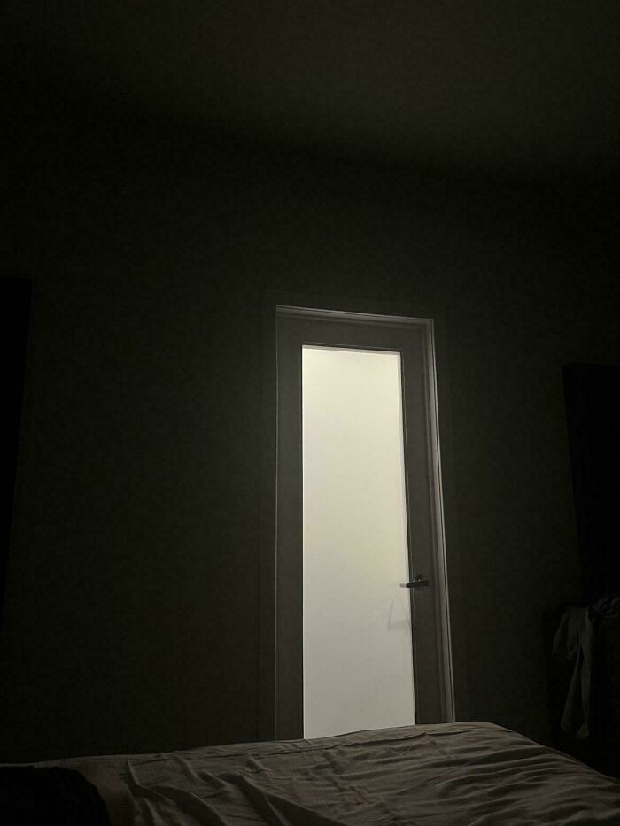
A few bits of electrical tape snipped down to the size of the lights works wonders.
Walk out, and let them know the reason why on the way to the door.





























 No fees, cancel anytime