Get Premium
Dark mode theme is available exclusively for premium users. Learn more about the benefits of subscribing.
No fees, cancel anytime.

 Dark Mode Ad-Free Browsing Unlimited Content
 Ad-Free Browsing Unlimited Content Dark Mode
Join 1.2 million Panda readers who get the best art, memes, and fun stories every week!

“To err is human, to forgive is divine.” You’ve probably heard this popular quote before, Pandas. After all, we all make mistakes, and nobody gets everything right all the time. But some mistakes are so baffling that you have to wonder what was going through someone’s mind when they made them!
And that’s especially true when it comes to design. A good design can make everyday life so much easier, but a bad one? Well, it can leave you confused, frustrated, or even wondering how anyone thought it was a good idea in the first place. From toilets that seem almost impossible to use to parking lots that make no sense and staircases that look like accidents waiting to happen, these design fails are a whole new level of questionable. We scoured the internet to find some of the most ridiculous examples. Keep scrolling, Pandas, and see which ones leave you scratching your head!
This post may include affiliate links.

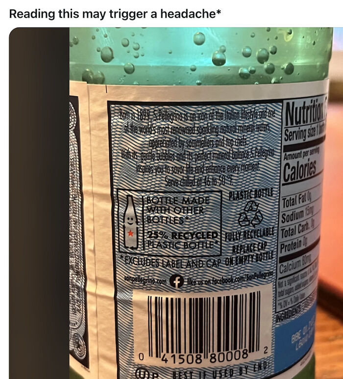
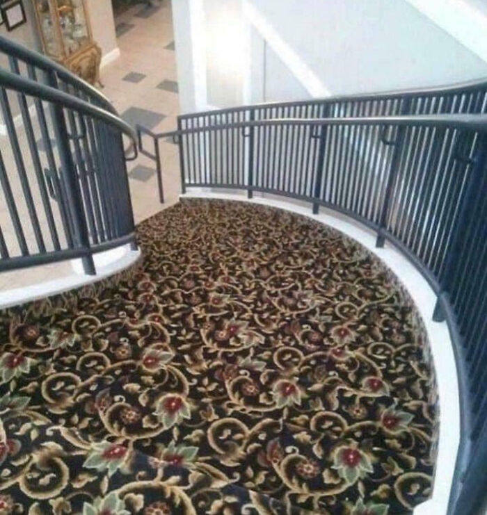
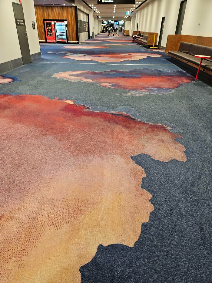
It would definitely mess with my eyes,too, but it's very well done.
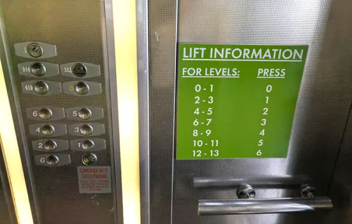
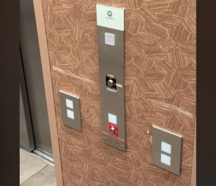
Wouldn't it have been easier to have labelled the button labels themselves?
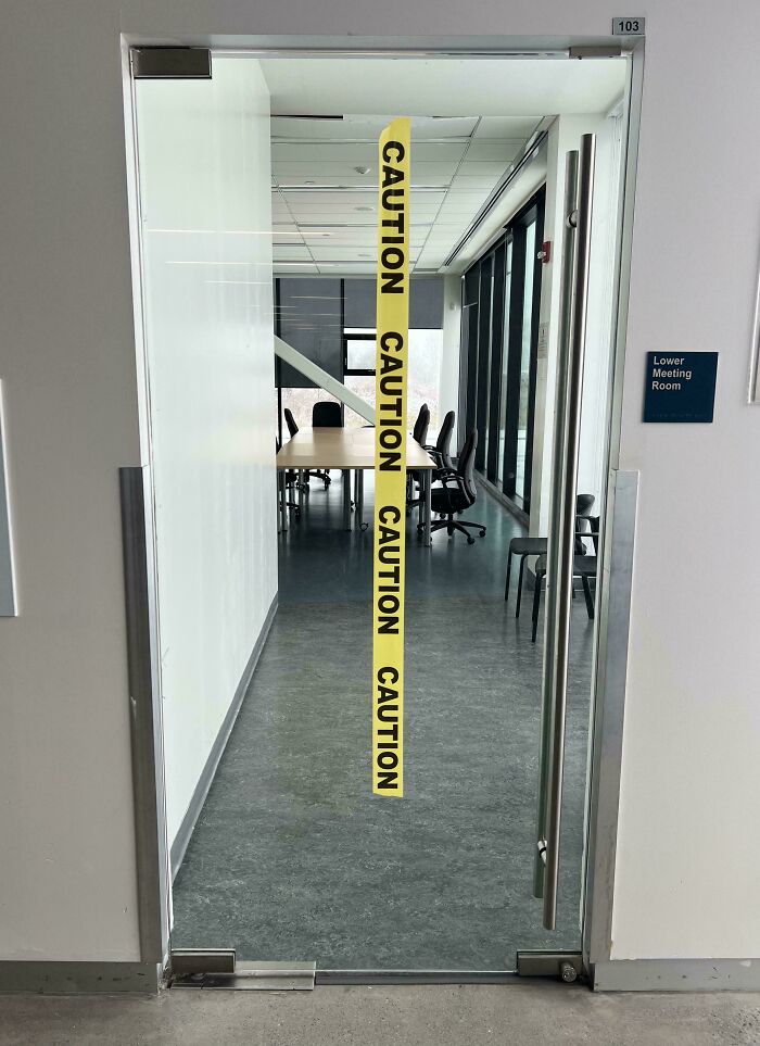
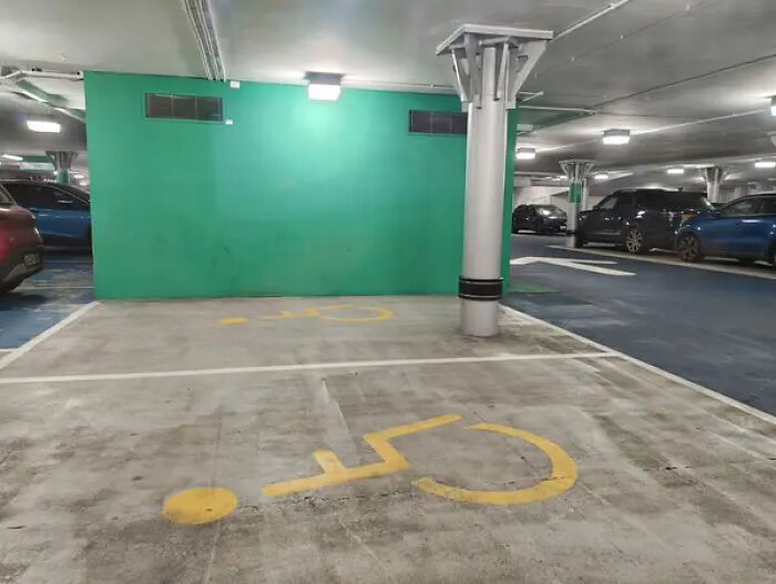
I wonder how many people got banged up noses, before the tape was put up?
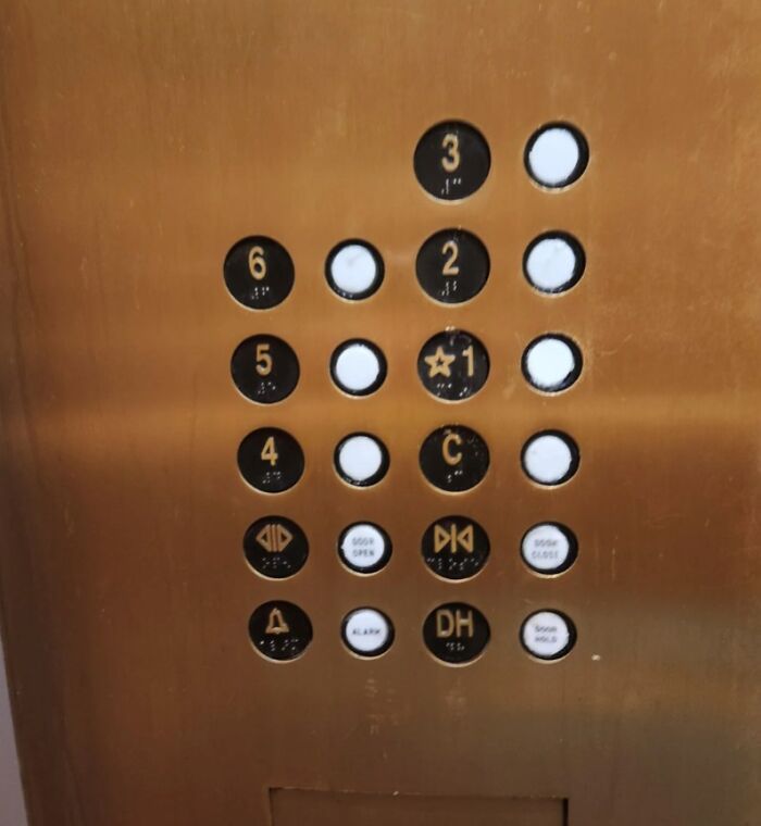
I'm definitely pressing the three possible "up" options, waiting a reasonable few minutes and then jamming the one nearest the alarm.

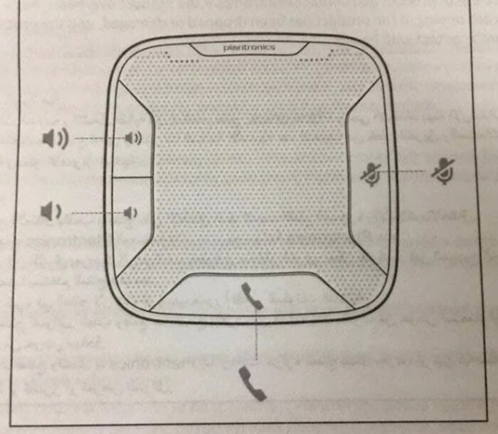
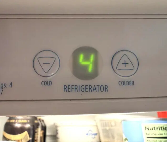
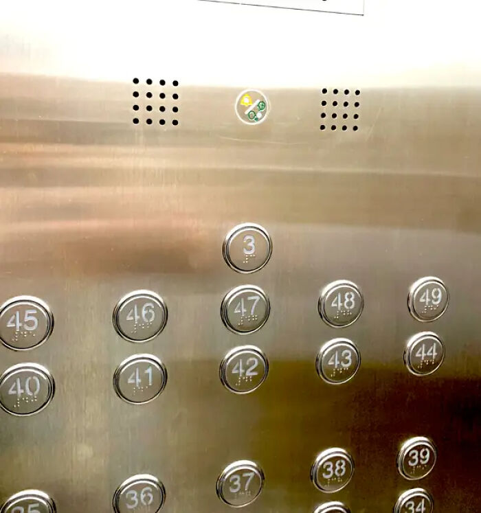
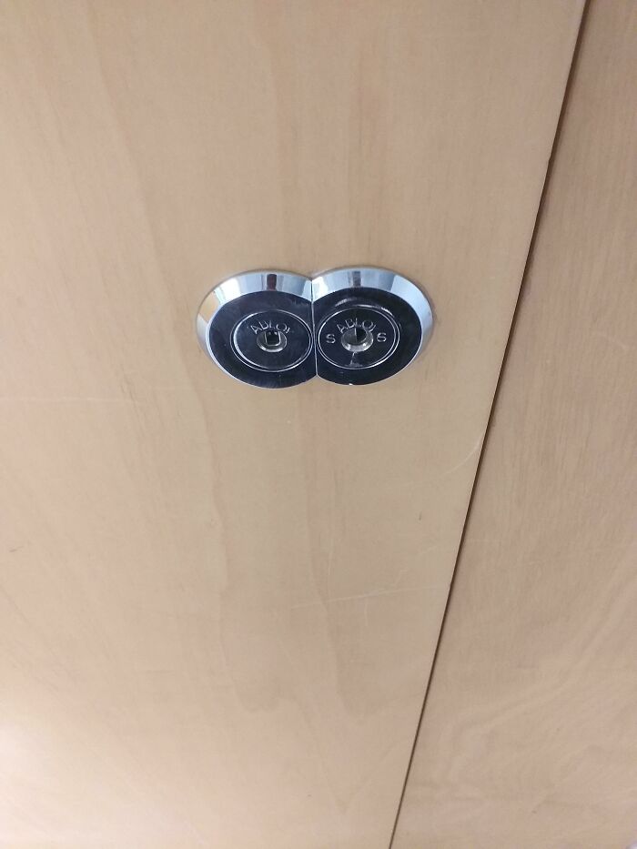
Well at least it's clear which button does what! Mine has just a dial, and it's ambiguous if a higher value means higher temperature or more cooling.
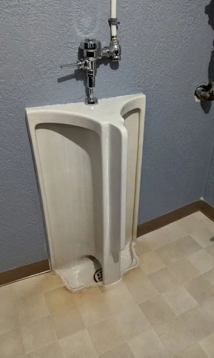
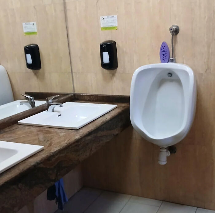
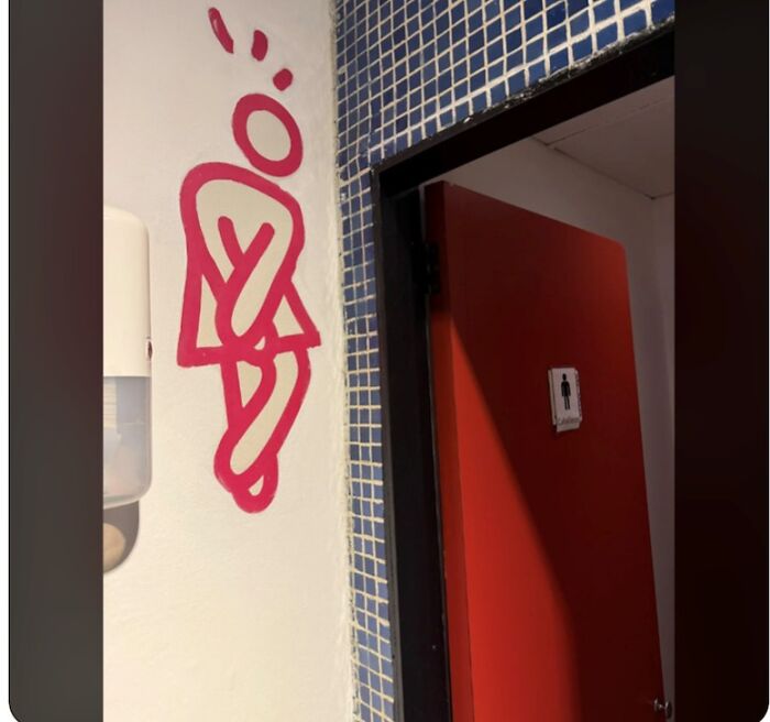
Gross. Might as well just pee on each other, some consider it a f****h, I don't understand.
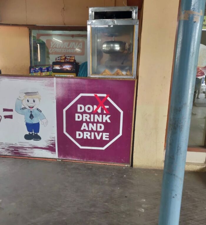
That mascot is wishing someone would burn the place down. Look at its eyes.

To quote Mr. B. Dylan Hollis: I suppose I wouldn't mind it if I were in a coal mine... but in a coal mine I'm NOT.
It adds up just fine if you spend two seconds looking at what it actually says. 25+68+7=100%. The 10-24 years category is irrelevant to the total because it overlaps with two of the other figures.
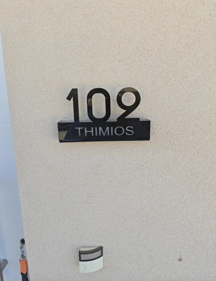
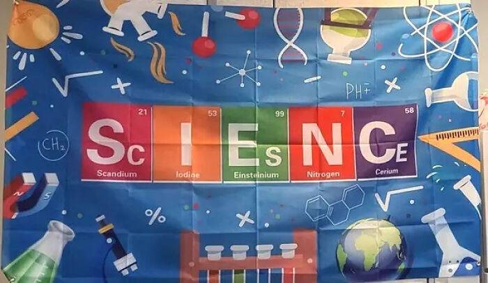
I mean... the problem is that there's no other E's on the periodic table. I just checked.

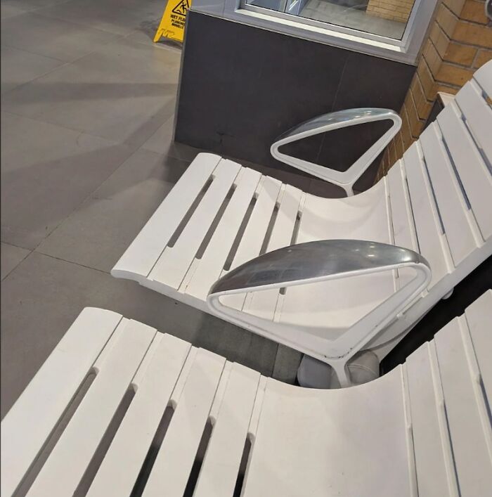
I ama a pianist. There are stands for digital pianos and keyboard where one cannot sit at them as there is no place for your legs to go.
Seagulls, seagulls everywhere, leaving presents in my hair. It gives my scalp a silky feel; who needs sham pōo when you can have real? EDIT: Really, BP? You censor the word that's IN THE PHOTO when I try to type it? There's no place for censorship in a free society. And yes, I will keep doing this.
This is not bad design, this is in a school and clearly demonstrating mitosis

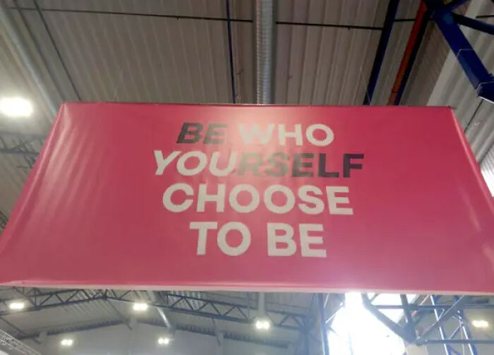
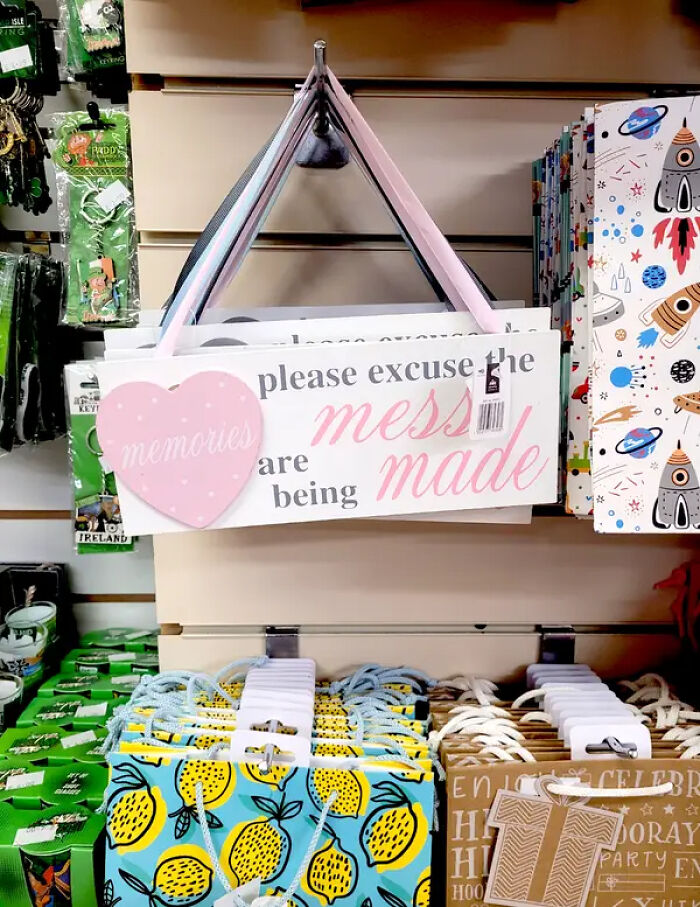
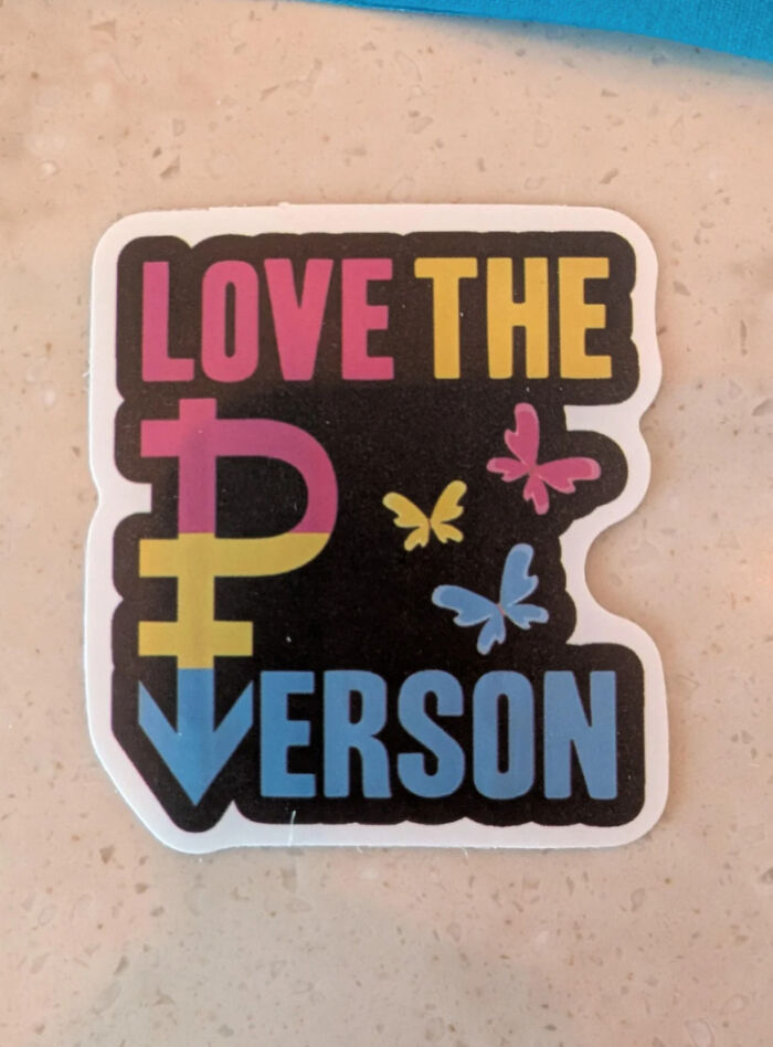
Be who you yourself choose to be. The reuse of the "you" in "yourself " is what's confusing.

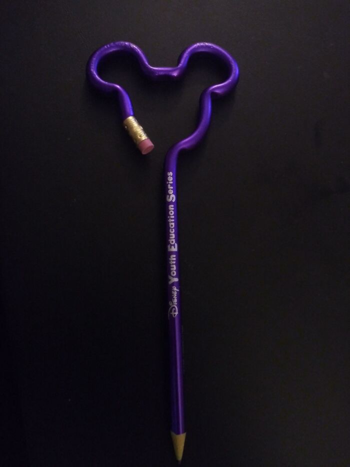
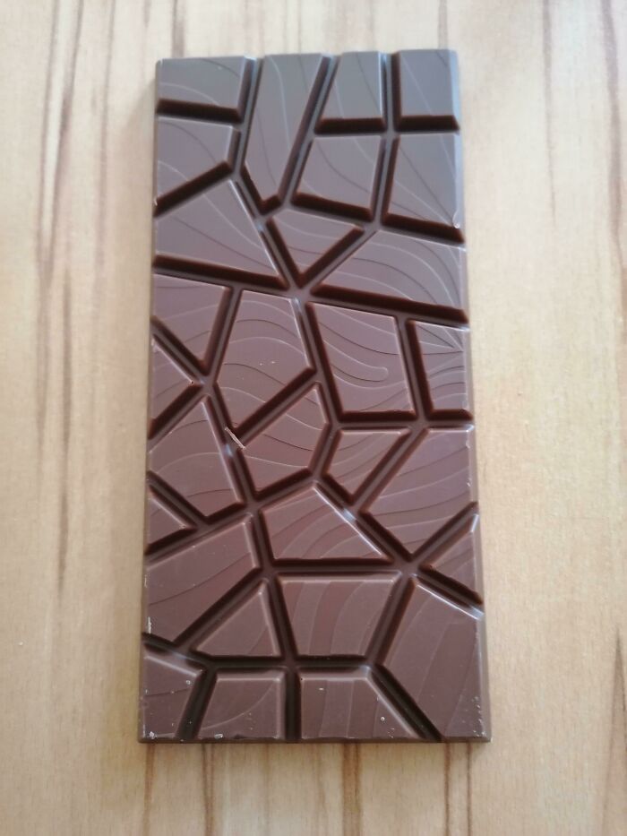
I don't think any other ridge design would do any better. And the ridges need to be there for structural stability. It allows to use far less plastic without making the container flimsy.

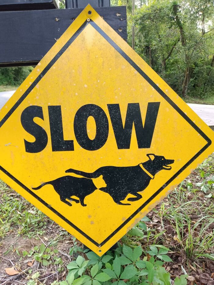
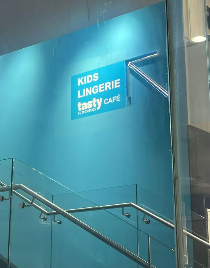
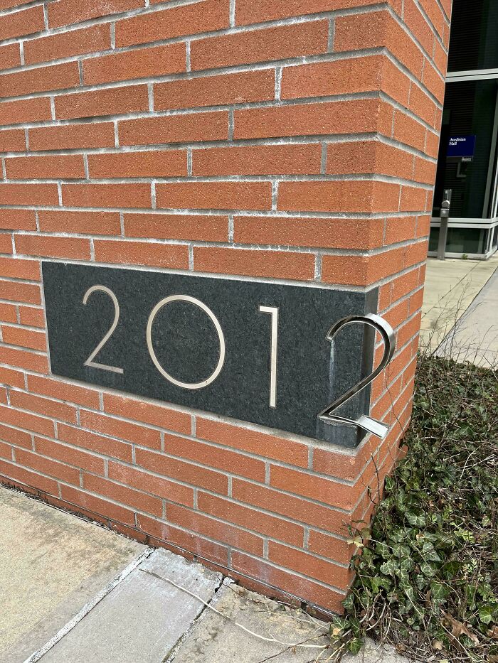
It's a reused sign. You can see studs off to the right where something else was. A lot of times, it's just cheaper to put a new sign face over an existing blanked out sign, than remove an existing one to replace it.
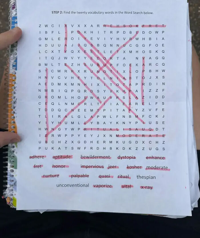
I don't think that's a design issue. That's a reader issue. There's nothing unclear or ambiguous in this one.

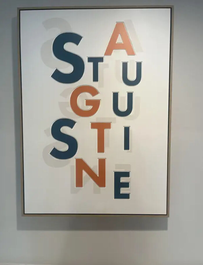
Not a designer problem. The problem starts with the “governing team of consultants” who are convinced they know better than the designer. Trust me, there’s a level of incompetence in some marketing agencies that eventually makes the designer go: “Fine. I’ll do whatever unholy thing you want. It’s bad, it’s ugly, it makes no sense, and after your seventeenth round of changes it may now accidentally spell ‘p***s’—but your budget is running out, you’ve already m******d the project, and at this point I just need your approval, my invoice paid, and this t*****e to end.”
Load More Replies... Not a designer problem. The problem starts with the “governing team of consultants” who are convinced they know better than the designer. Trust me, there’s a level of incompetence in some marketing agencies that eventually makes the designer go: “Fine. I’ll do whatever unholy thing you want. It’s bad, it’s ugly, it makes no sense, and after your seventeenth round of changes it may now accidentally spell ‘p***s’—but your budget is running out, you’ve already m******d the project, and at this point I just need your approval, my invoice paid, and this t*****e to end.”
Load More Replies...





























 No fees, cancel anytime