Get Premium
Dark mode theme is available exclusively for premium users. Learn more about the benefits of subscribing.
No fees, cancel anytime.

 Dark Mode Ad-Free Browsing Unlimited Content
 Ad-Free Browsing Unlimited Content Dark Mode
Join 1.2 million Panda readers who get the best art, memes, and fun stories every week!

“To err is human, to forgive is divine.” You’ve probably heard this popular quote before, Pandas. After all, we all make mistakes, and nobody gets everything right all the time. But some mistakes are so baffling that you have to wonder what was going through someone’s mind when they made them!
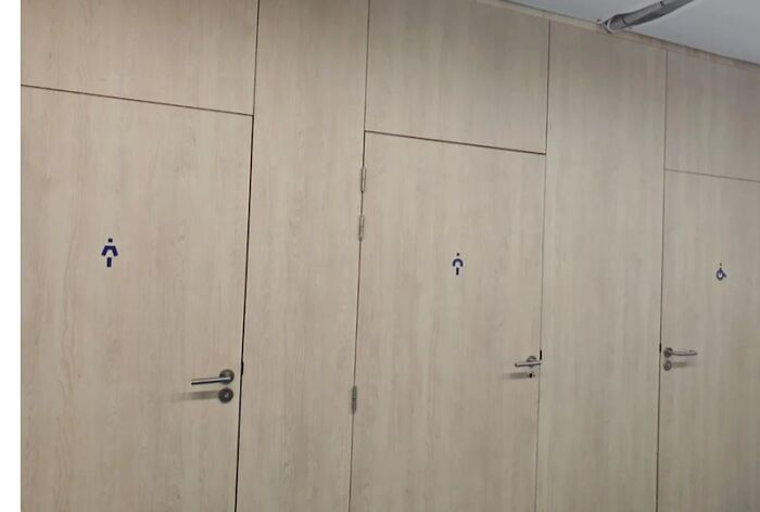
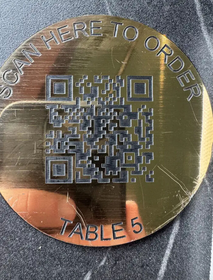
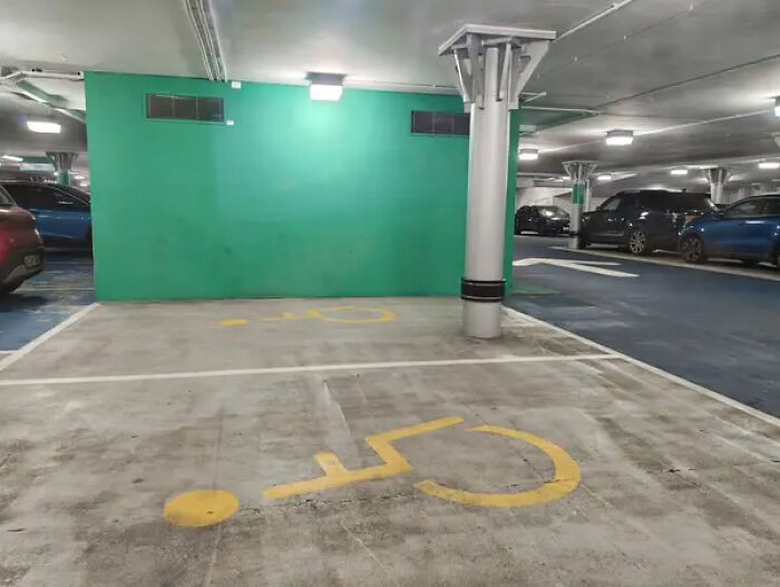
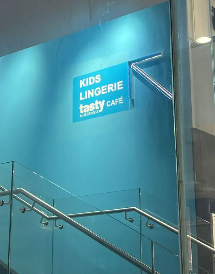
And that’s especially true when it comes to design. A good design can make everyday life so much easier, but a bad one? Well, it can leave you confused, frustrated, or even wondering how anyone thought it was a good idea in the first place. From toilets that seem almost impossible to use to parking lots that make no sense and staircases that look like accidents waiting to happen, these design fails are a whole new level of questionable. We scoured the internet to find some of the most ridiculous examples. Keep scrolling, Pandas, and see which ones leave you scratching your head!
This post may include affiliate links.
If these posts prove anything, Pandas, it’s that good design is about much more than making something look nice. A building can be stunning, a ship can look impressive, and a gadget can promise to change your life, but if the thing doesn't actually work as intended, we've got a problem! And believe it or not, history is full of expensive design blunders that prove even the most ambitious ideas can go spectacularly wrong. Let's take a look at a few famous examples!

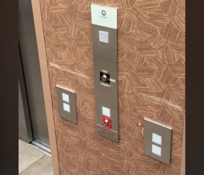
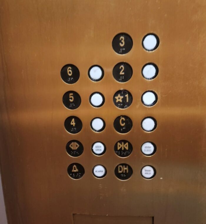
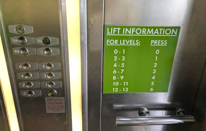
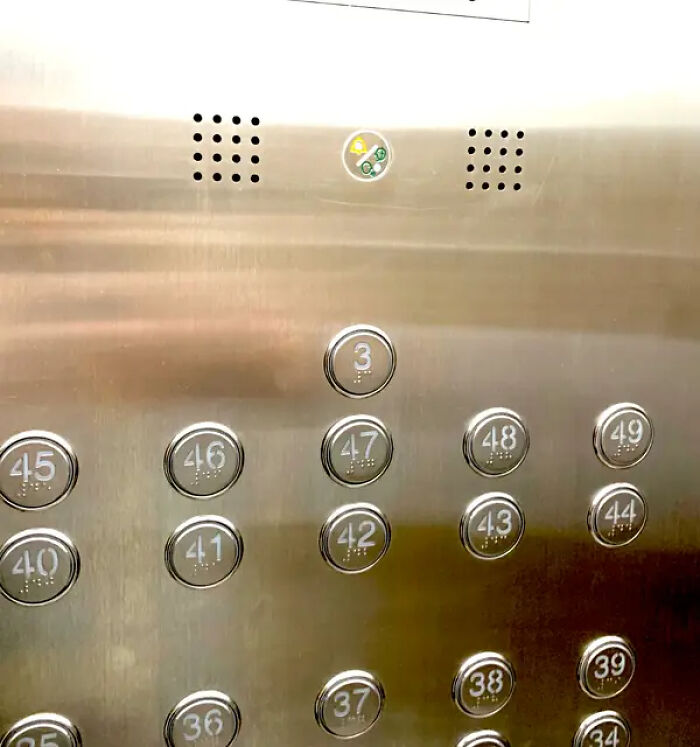
I'm definitely pressing the three possible "up" options, waiting a reasonable few minutes and then jamming the one nearest the alarm.
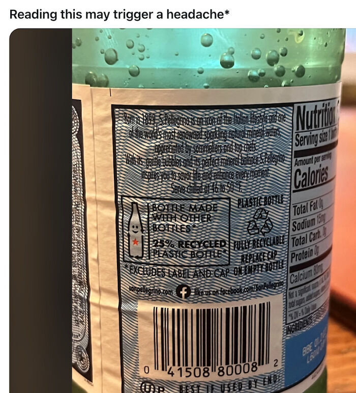
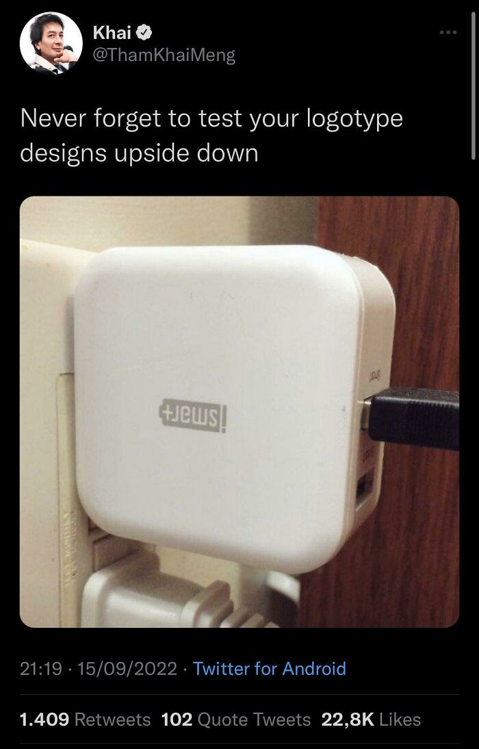
It would definitely mess with my eyes,too, but it's very well done.
You might expect a massive warship built for the Swedish Navy to be ready for battle, but the Vasa barely made it out of the harbor. The ship was designed to carry an impressive collection of cannons across two gun decks, but all that weight made it dangerously top-heavy. In August 1628, it sank less than a mile into its maiden voyage after a gust of wind caused it to heel over and take on water. As explored in The Sinking of the Vasa: A Shipwreck of Titanic Proportions, the disaster was largely caused by the ship's instability. The king had demanded a powerful warship, but the vessel's proportions couldn't safely accommodate the heavy armament. Today, the Vasa is often remembered as a cautionary tale about what can happen when ambitious plans aren't properly matched with sound engineering.
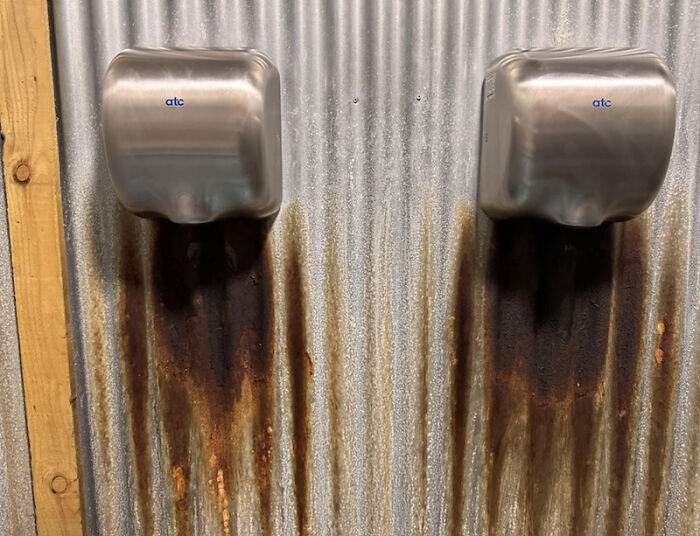
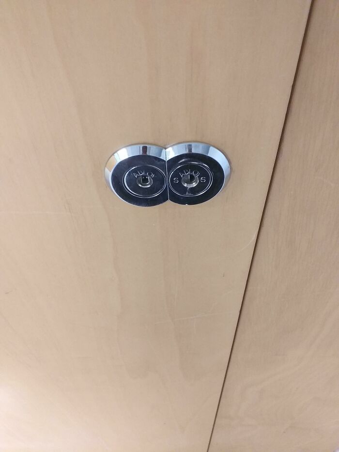
That is a major fail. Unless, of course, you don't want anyone at work to steal your food. Then, it's a major win.
A skyscraper that reflects sunlight might sound harmless enough, right, Pandas? Well, London's Walkie-Talkie building proved otherwise. Its curved, glass-covered facade reflected sunlight onto the street below, concentrating the heat so intensely that temperatures reportedly reached around 117°C (242°F) in certain spots. The result? A parked Jaguar had parts of its exterior melted, and a shopkeeper's doormat reportedly caught fire. The building had effectively turned into a giant magnifying glass, creating a problem nobody wanted to deal with on a sunny day. Developers eventually installed sunshades to help disperse the reflected light. It's a striking example of how a design can look impressive on the skyline but create some very uncomfortable surprises at street level.
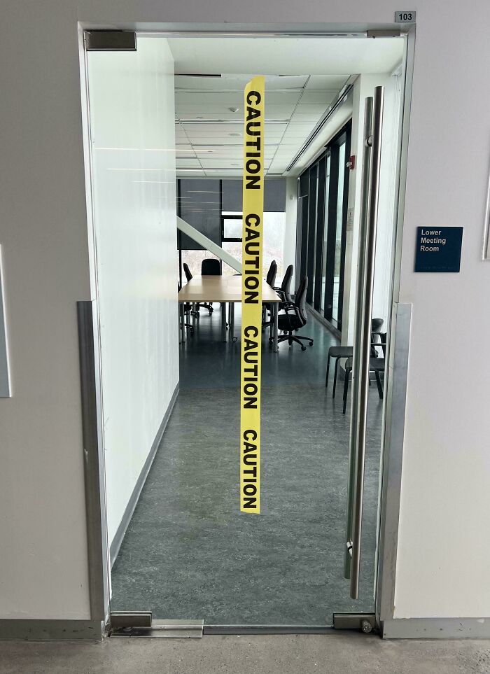
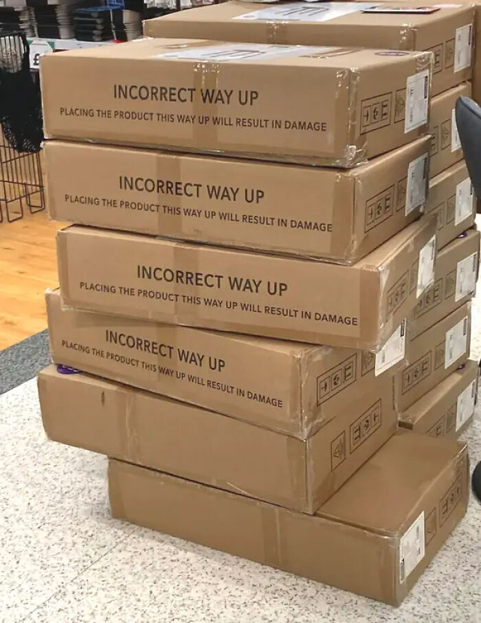
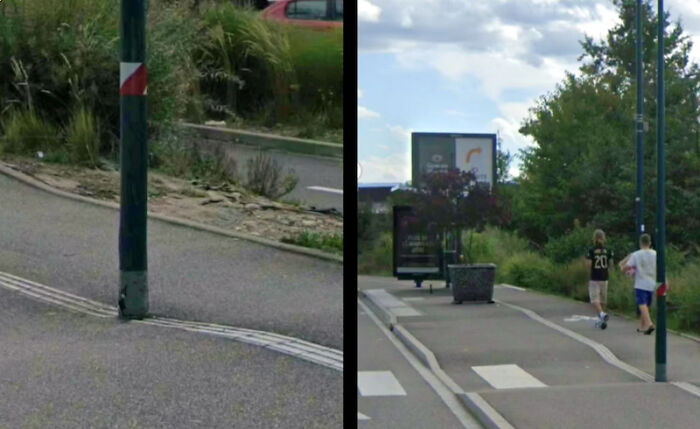
I wonder how many people got banged up noses, before the tape was put up?
Designed by renowned architect Frank Gehry, MIT's Stata Center in Cambridge, Massachusetts, looks like a collection of buildings that decided to ignore the rules of geometry. Its slanted walls, unusual angles, and playful shapes certainly make it stand out, but the building's real-world performance proved less impressive. The complex faced complaints involving leaks, drainage issues, cracks, and other construction defects. Ice accumulating on some of its unconventional rooflines also raised safety concerns during winter. In 2007, MIT sued Gehry's firm, alleging design and construction problems. The dispute is a reminder that even the most creative architectural vision needs to account for less glamorous (but essential) things like water, weather, and maintenance.
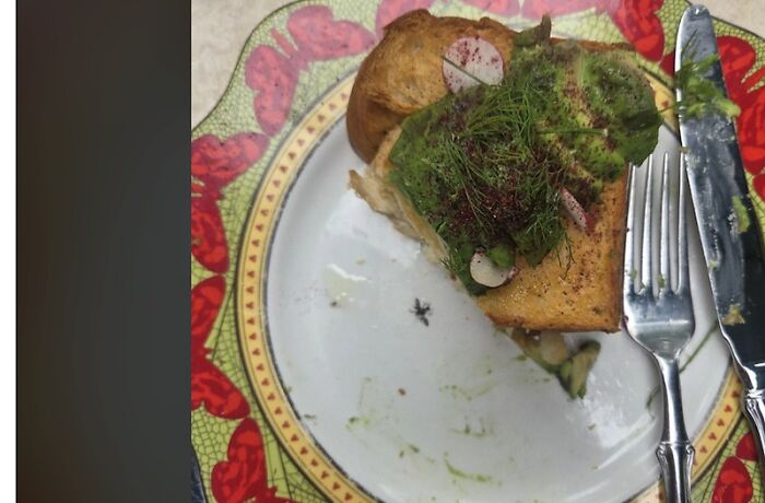
I've seen this myself - a bit of whimsy. But the, now, intrusive thought can put people off eating the meal.
The University of Massachusetts Amherst is home to several libraries, but the W.E.B. Du Bois Library is particularly hard to miss. According to CNBC, this 26-story structure is the tallest library in the United States. However, soon after it opened in the 1970s, the building began shedding small pieces of brick from its exterior, a problem known as spalling. Naturally, rumors soon followed. One popular urban legend claimed that the architects had forgotten to account for the weight of all the books that would eventually fill the library. The reality is more complicated: the building experienced problems with its brick facade, and concerns were also raised about the ground beneath it. Around 60,000 books reportedly had to be moved during the investigation. Although the story about forgetting to account for books makes for a memorable tale, the actual causes of the damage were more complex than the legend suggests.
Few architectural mishaps have become quite as famous as the Leaning Tower of Pisa. Today, tourists flock to the Italian landmark to admire its tilt and pose for those classic photos pretending to hold it upright. But when construction began in 1173, the builders probably weren't aiming to create one of the world's most recognizable tourist attractions. The tower started leaning while it was still being built, thanks to its shallow foundations and the soft, unstable ground beneath it. As construction continued, builders tried to compensate for the tilt by adjusting the heights of the upper floors, giving the tower its slightly curved appearance. The problem persisted for centuries, and engineers eventually carried out major stabilization work to prevent it from toppling over. The tower has since become an architectural icon, but imagine being one of the builders who first realized that the structure wasn't standing quite as straight as it should!
Imagine spending $700 on a fancy juicer, only to discover you could get the same result by squeezing a pouch with your own hands. That was the problem with the Juicero Press, a Wi-Fi-connected countertop machine that promised to make fresh juice from specially designed fruit and vegetable packs. As Architectural Digest India notes, the Silicon Valley startup attracted major investors and raised nearly $120 million, but its product soon became the subject of widespread ridicule. The machine didn't actually process whole fruits and vegetables. Instead, it squeezed proprietary pouches filled with pre-crushed produce—and people discovered that their hands could do the job just as well. The revelation raised an obvious question: why spend so much money on a machine when you could simply squeeze the pouch yourself? Juicero shut down in 2017, around a year and a half after launching. Sometimes, Pandas, the simplest solution really is the best one!

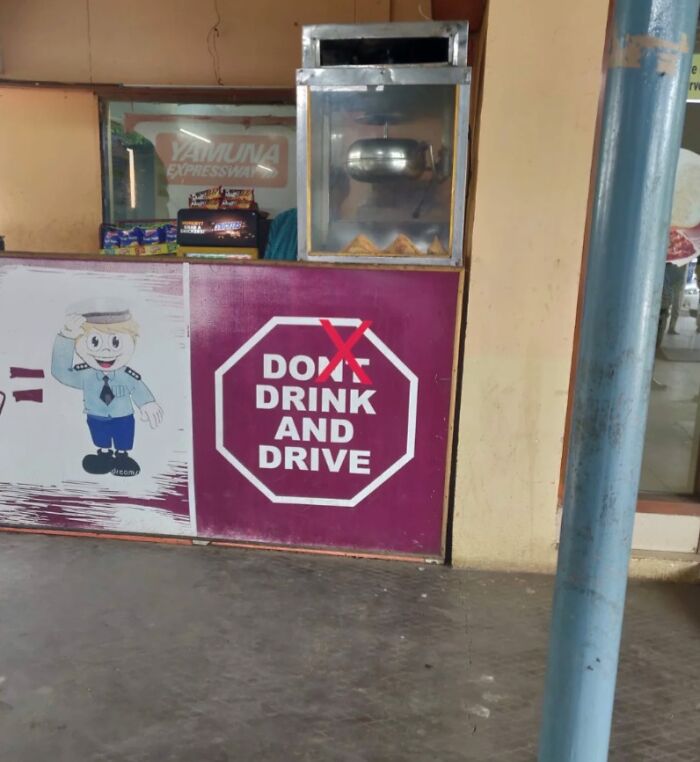
That mascot is wishing someone would burn the place down. Look at its eyes.
Well, Pandas, these examples show that even projects backed by big budgets, famous architects, or enthusiastic investors can go seriously wrong. And coming back to today’s posts, they’re proof that bad design isn’t just an eyesore—it can also create serious safety hazards, waste money, and turn everyday tasks into a real headache. Which of these design disasters left you scratching your head the most? And have you ever come across a real-life design choice that made you wonder what the creators were thinking? Tell us about it in the comments!

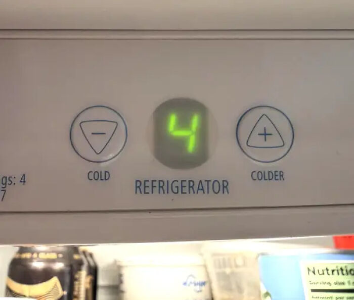
Mine has a similarly confusing control panel. The first few months I had it, I kept accidentally freezing my produce.
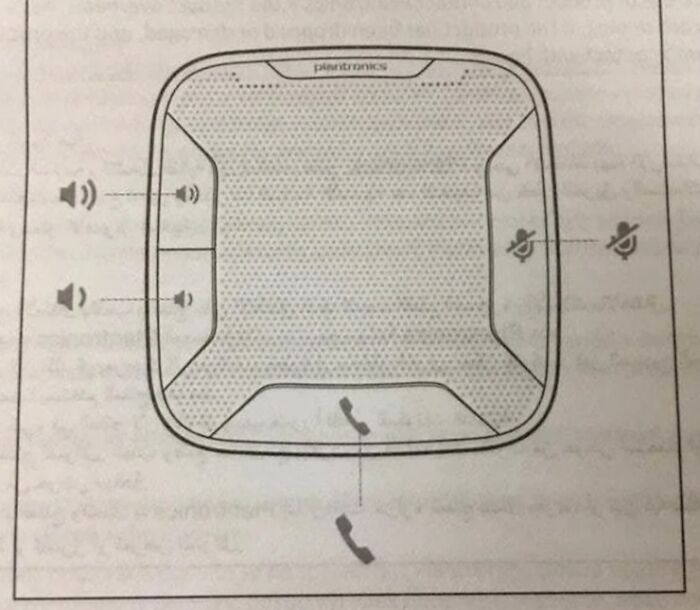
Wouldn't it have been easier to have labelled the button labels themselves?

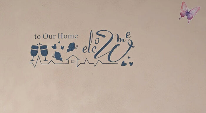
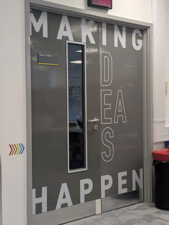
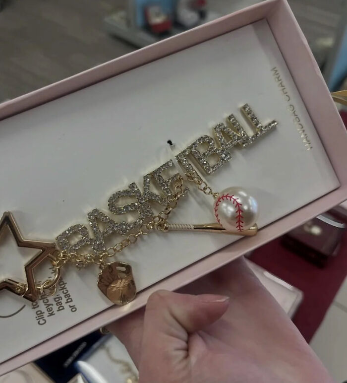
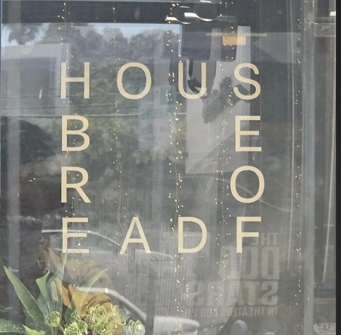
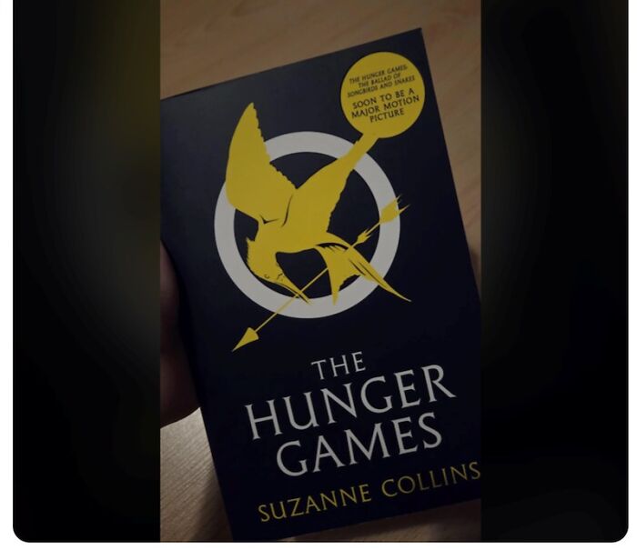
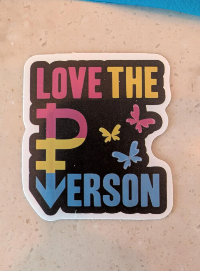
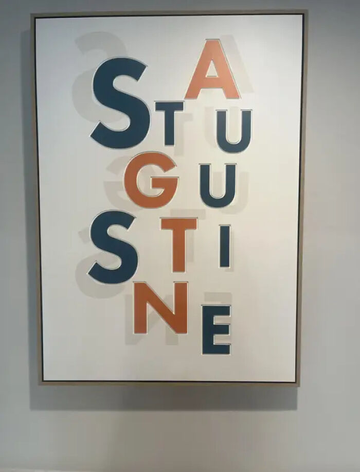
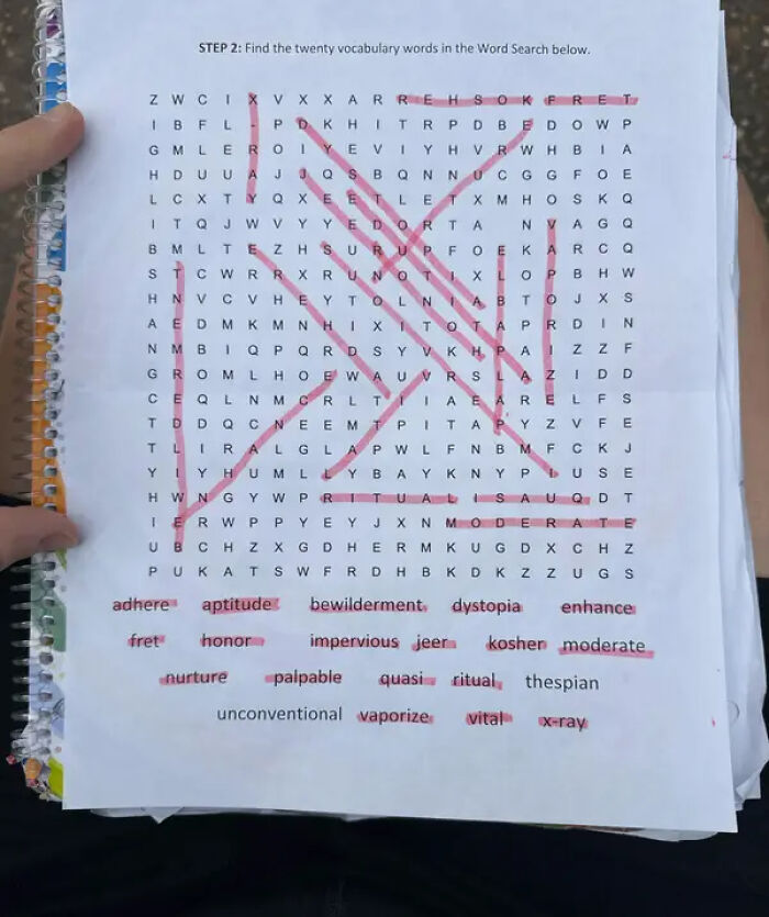
I mean... the problem is that there's no other E's on the periodic table. I just checked.
I sincerely hope that the UNFPA and World Bank didn't have anything to do with this. If they did, we have serious global problems.

Seagulls, seagulls everywhere, leaving presents in my hair. It gives my scalp a silky feel; who needs sham pōo when you can have real? EDIT: Really, BP? You censor the word that's IN THE PHOTO when I try to type it? There's no place for censorship in a free society. And yes, I will keep doing this.
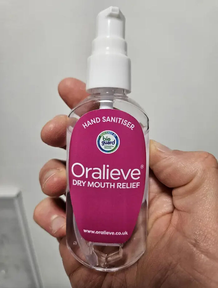
These were sold packaged in a box, which better identified the product, so at least the purpose was clear at the time of purchase (not so bad, considering it's a tiny bottle that most likely said to discard one month after breaking the seal). I believe the labels have since been redesigned.

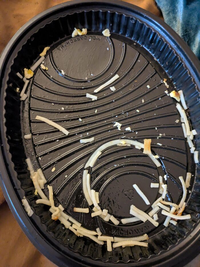
I don't think any other ridge design would do any better. And the ridges need to be there for structural stability. It allows to use far less plastic without making the container flimsy.
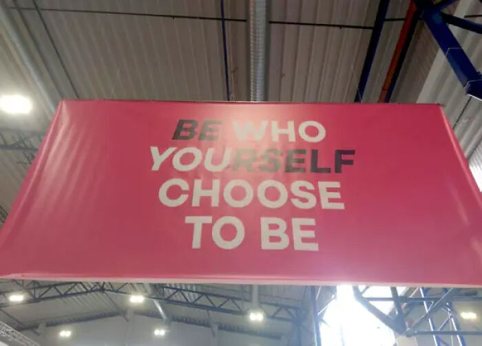
I don't think that's a design issue. That's a reader issue. There's nothing unclear or ambiguous in this one.




























 No fees, cancel anytime