ADVERTISEMENT

“To err is human, to forgive is divine.” You’ve probably heard this popular quote before, Pandas. After all, we all make mistakes, and nobody gets everything right all the time. But some mistakes are so baffling that you have to wonder what was going through someone’s mind when they made them!

And that’s especially true when it comes to design. A good design can make everyday life so much easier, but a bad one? Well, it can leave you confused, frustrated, or even wondering how anyone thought it was a good idea in the first place. From toilets that seem almost impossible to use to parking lots that make no sense and staircases that look like accidents waiting to happen, these design fails are a whole new level of questionable. We scoured the internet to find some of the most ridiculous examples. Keep scrolling, Pandas, and see which ones leave you scratching your head!

#1

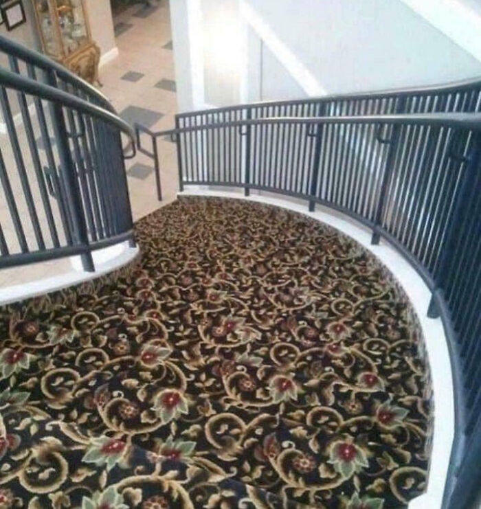
They Put New Carpet On The Stairs

Curved staircase covered with floral patterned carpet

McNasty420 Report

Mavis
Community Member
3 hours ago

I like how at the bottom there's a tiled floor and a glass case filled with precious ornaments to break your fall.

View more comments
RELATED:
    #2

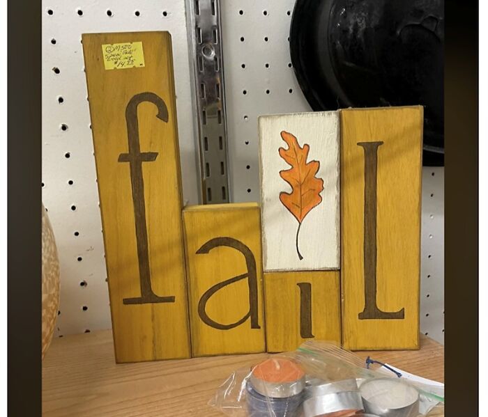
    These Blocks That Should Say "Fall" But Definitely Say "Fail"

    Wooden blocks spelling fail with misplaced letters and leaf art

    funnysigns Report

    Nicky Colohan
    Community Member
    6 hours ago

    Well it is a fail.

    View more comments
    #3

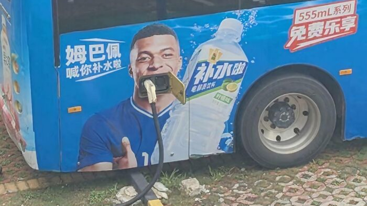
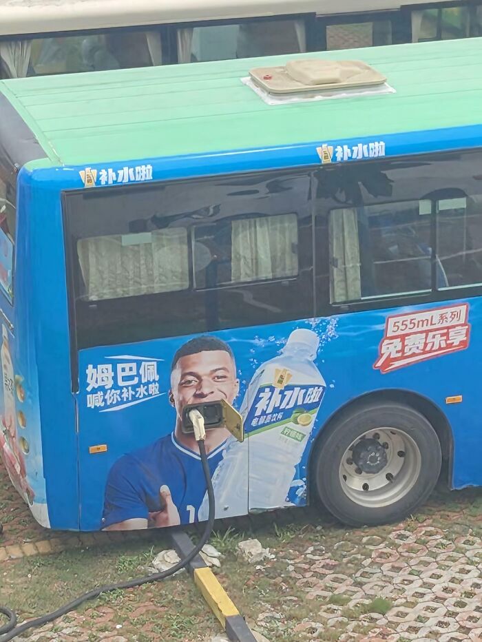
    Poor Placement Of A Ad On The Bus

    Bus charging point positioned to block advertisement design on bus side

    Impossible-Step-8691 Report

    Peter Bear
    Community Member
    5 hours ago

    Nah, that was 100% intentional, and funny.

    #4

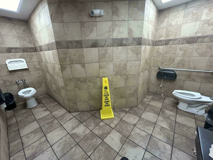
    This Horrible Bathroom I Saw At A Burger King In Oregon

    Public bathroom with two toilets facing each other and caution wet floor sign

    Available-Week5218 Report

    Chilli
    Community Member
    7 hours ago

    "You got any toilet paper over there?" "Yeah, I'll toss it over, heads up."

    View more comments
    ADVERTISEMENT
    #5

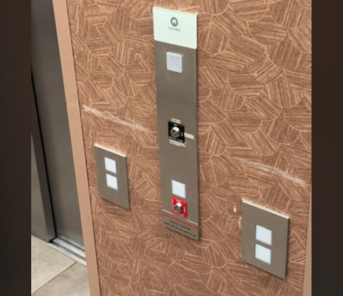
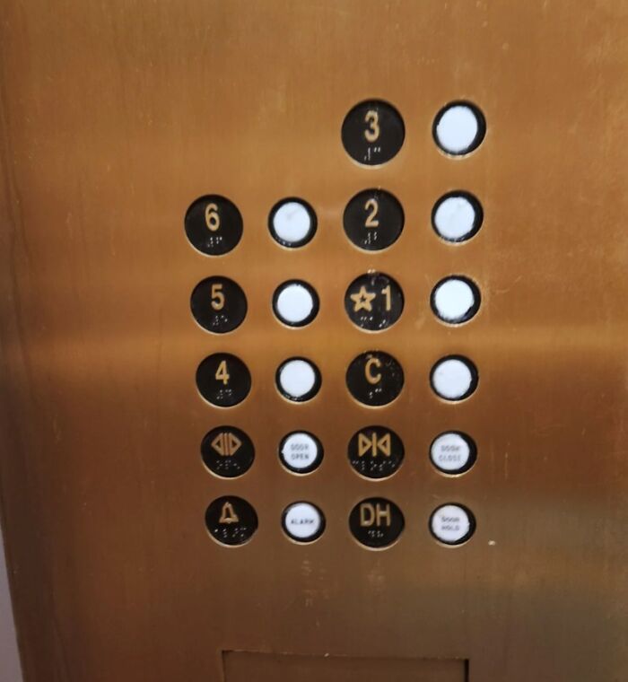
    There Is Only One Elevator Call Button In This Photo, The Rest Are Just Design Motifs.

    Elevator control panel with confusing multiple button layout

    funnysigns Report

    Lily bloom
    Community Member
    7 hours ago

    I'm definitely pressing the three possible "up" options, waiting a reasonable few minutes and then jamming the one nearest the alarm.

    ADVERTISEMENT
    #6

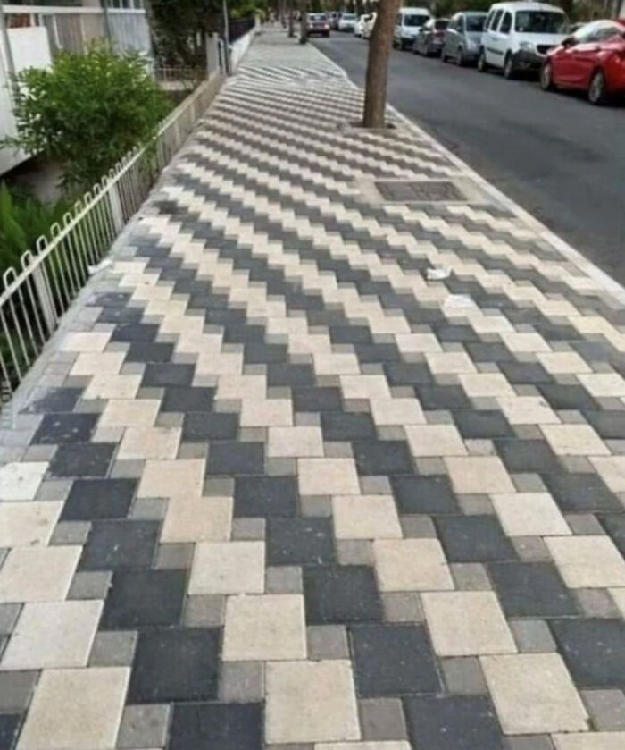
    I'm Suddenly Getting Dizzy

    Sidewalk with a confusing zigzag pattern that disrupts walking path

    CrappyDesign Report

    Did I say that out loud?
    Community Member
    6 hours ago

    It would definitely mess with my eyes,too, but it's very well done.

    #7

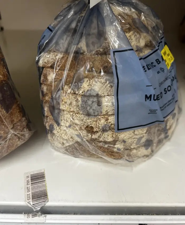
    This Awful Bread Packaging Design, Which Looks Exactly Like Mould:

    Loaf of bread in plastic bag with torn barcode underneath

    f36263 Report

    moggiemoo
    Community Member
    2 hours ago

    It's deliberate so you can't see the actual mould.

    View more comments
    #8

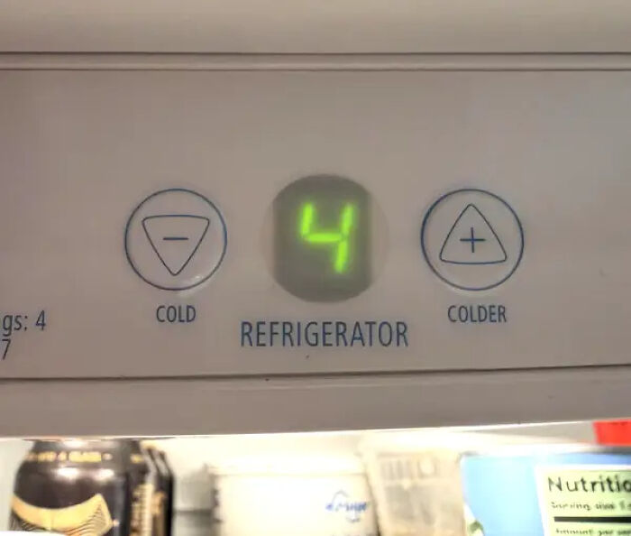
    And These Refrigerator Settings, Which Have Me Permanently Head-Scratching:

    Refrigerator temperature controls mislabeled cold and colder buttons

    MrNobodyX3 Report

    grotesqueer
    Community Member
    2 hours ago (edited)

    Well at least it's clear which button does what! Mine has just a dial, and it's ambiguous if a higher value means higher temperature or more cooling.

    View more comments
    ADVERTISEMENT
    #9

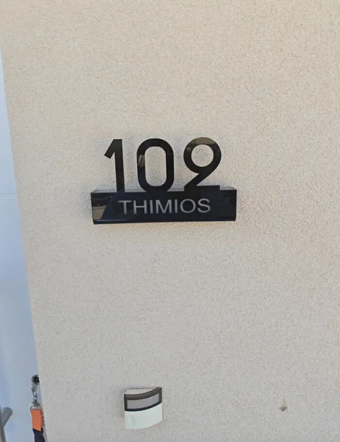
    This Apartment Sign, Which — Believe It Or Not — Is Actually Supposed To Say 102:

    House number 109 with misplaced letters for Thimios, illustrating a signage design fail

    L_Imperatore10 Report

    ADVERTISEMENT
    #10

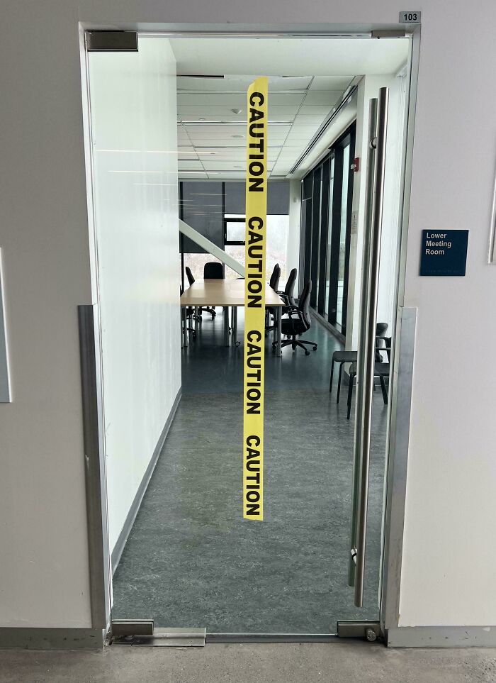
    Caution: Bad Design

    Glass door to meeting room with caution tape stuck vertically across it

    LindsayOG Report

    Hippopotamuses
    Community Member
    7 hours ago

    I wonder how many people got banged up noses, before the tape was put up?

    View more comments
    #11

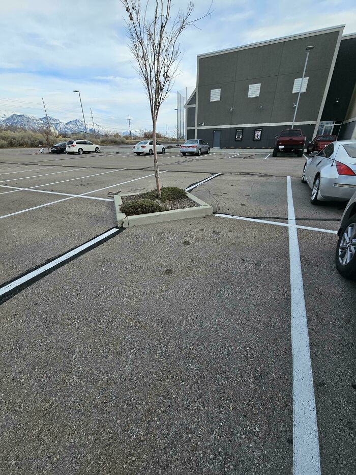
    This Is The Stupidest Design In Parking Lots. Why

    Parking lot with poorly designed lines around a tree causing awkward parking spaces

    NeoKorean Report

    Kira Okah
    Community Member
    3 hours ago

    Thought that this was to prevent a single vehicle occupying four spaces.

    View more comments
    #12

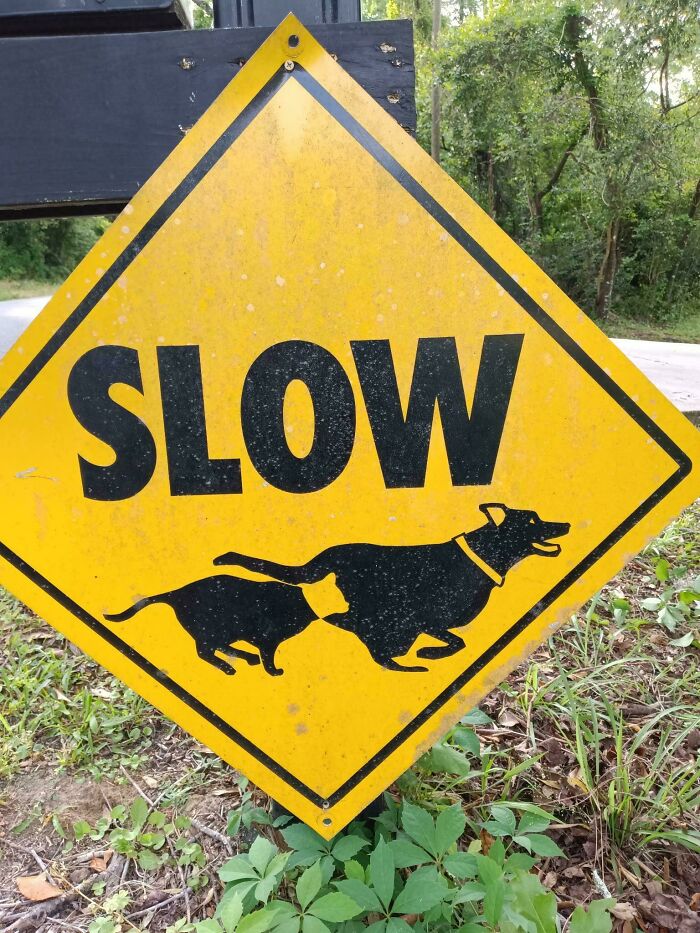
    Design Fail?

    Yellow road sign with dog and cat running under the word slow

    TJS_Art Report

    Cip IESAN
    Community Member
    1 hour ago

    The dog stopped suddenly...

    View more comments
    ADVERTISEMENT
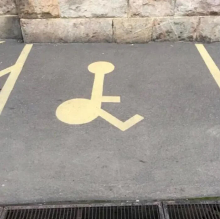
    #13

    A Lot To See Here

    incorrectly painted handicapped parking symbol on pavement

    funnysigns Report

    Wagner
    Community Member
    7 hours ago

    BBL

    View more comments
    ADVERTISEMENT
    #14

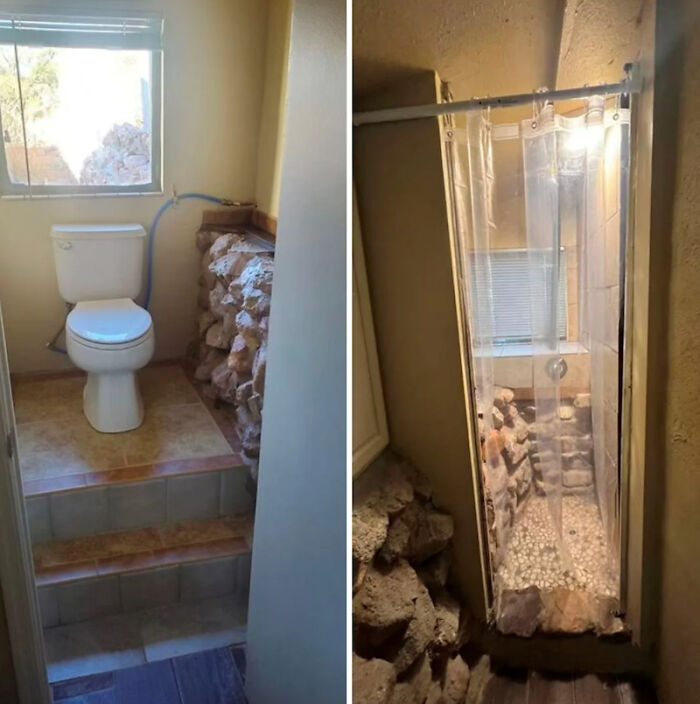
    Most Treacherous Bathroom

    Bathroom with raised toilet and rock-filled compact shower showing bad design

    CrappyDesign Report

    Dont listen to me
    Community Member
    2 hours ago

    And the floor round the toilet?!

    View more comments
    #15

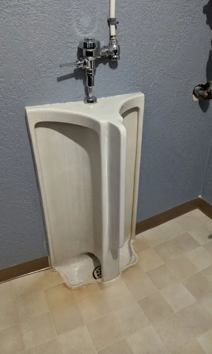
    I'm A Woman, But Even I Can Imagine How Mortifying This Urinal Is:

    urinal design separated by an awkward middle partition

    5parky Report

    Wagner
    Community Member
    7 hours ago

    There's no way I would wanna look at someone whilst doing the number 1.

    View more comments

    Never miss a story that brings joy to the world. Add us on Google

    #16

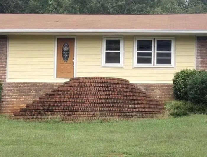
    This Absolutely Chaotic Front Entrance:

    Brick stairs leading to front door with no landing platform design error

    Catalina_whine_fixer Report

    Chilli
    Community Member
    6 hours ago

    My f*****g god, forget the other stairs, imagine walking up THESE after a night at the pub.

    View more comments
    ADVERTISEMENT
    #17

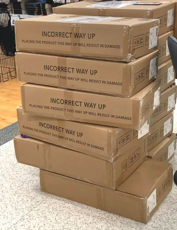
    These Box Instructions, Which Aren't Nearly Simple Enough To Prevent Issues:

    Boxes stacked incorrectly with labels stating incorrect way up causes damage

    Report

    Mavis
    Community Member
    2 hours ago

    Whatever happened to "This Way Up".

    View more comments
    ADVERTISEMENT
    #18

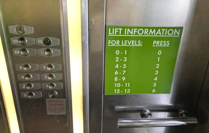
    This Elevator, Which Seriously Overestimates People's Ability To Follow Instructions:

    Confusing lift panel with inconsistent button labels and green lift information

    Report

    Hippopotamuses
    Community Member
    6 hours ago

    Wouldn't it have been easier to have labelled the button labels themselves?

    View more comments
    #19

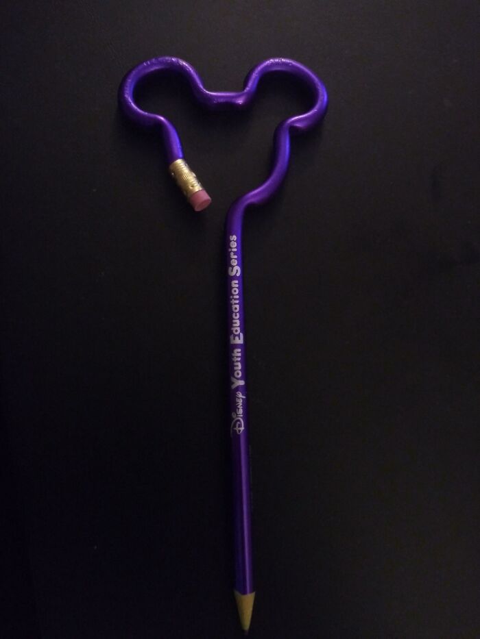
    How Do I Erase This Mistake Of A Design?

    Purple pencil bent into Mickey Mouse shape for ridiculous design choices

    ROCKWATER4556 Report

    Chilli
    Community Member
    7 hours ago

    Passive aggressive way of saying to never make mistakes

    View more comments
    #20

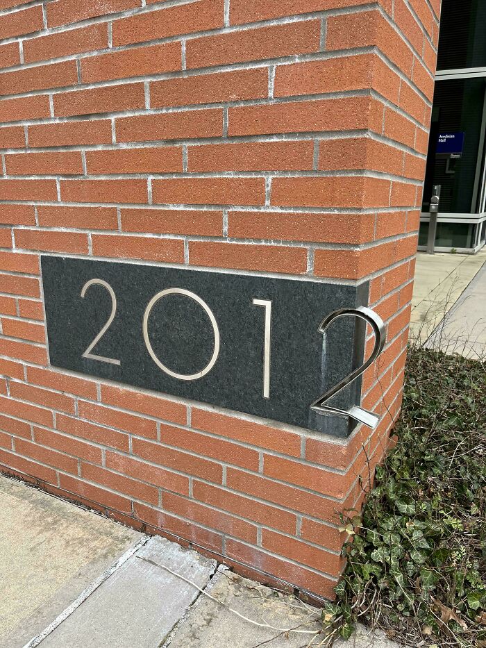
    Poor Designing

    Building number sign with 2012 where number 2 protrudes oddly from wall

    businessbub Report

    Gus
    Community Member
    2 hours ago

    Maybe they meant to have it finished in 2011 (which would have fitted the space), but, well, you know...

    ADVERTISEMENT
    #21

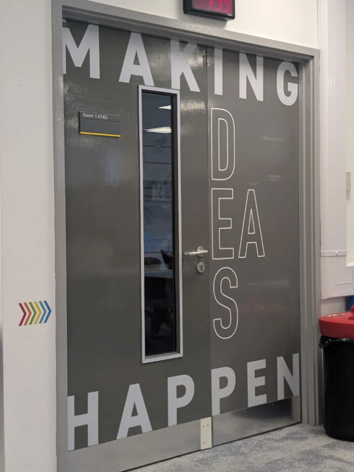
    I Genuinely Don't Know What They Were Going For

    Door with confusing text design spelling making ideas happen

    funnysigns Report

    Peter Bear
    Community Member
    5 hours ago

    Making ides a happen. Obviously they're trying to warn Caesar.

    View more comments
    ADVERTISEMENT
    #22

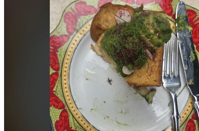
    Paused Mid-Bite When I Saw It (It's Printed On The Plate)

    Sandwich with insect on plate showing ridiculous design choices in food presentation

    funnysigns Report

    Hippopotamuses
    Community Member
    7 hours ago

    I've seen this myself - a bit of whimsy. But the, now, intrusive thought can put people off eating the meal.
    View more comments
    #23

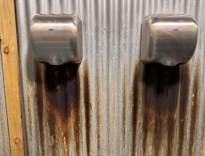
    Who Decided That Material Was A Good Idea?

    two hand dryers causing rust stains on corrugated metal wall

    funnysigns Report

    WindySwede
    Community Member
    2 hours ago

    the bacteria overlords? like to spread the bacteria?

    View more comments
    #24

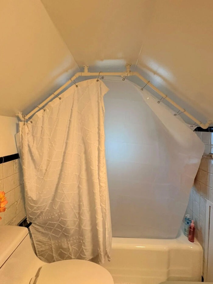
    Someone On Facebook Was Asking For Shower Curtain Advice

    Bathroom with awkwardly shaped shower curtain rod under sloped ceiling

    trigunnerd Report

    Chilli
    Community Member
    7 hours ago

    My advice is: Move.

    View more comments
    ADVERTISEMENT
    #25

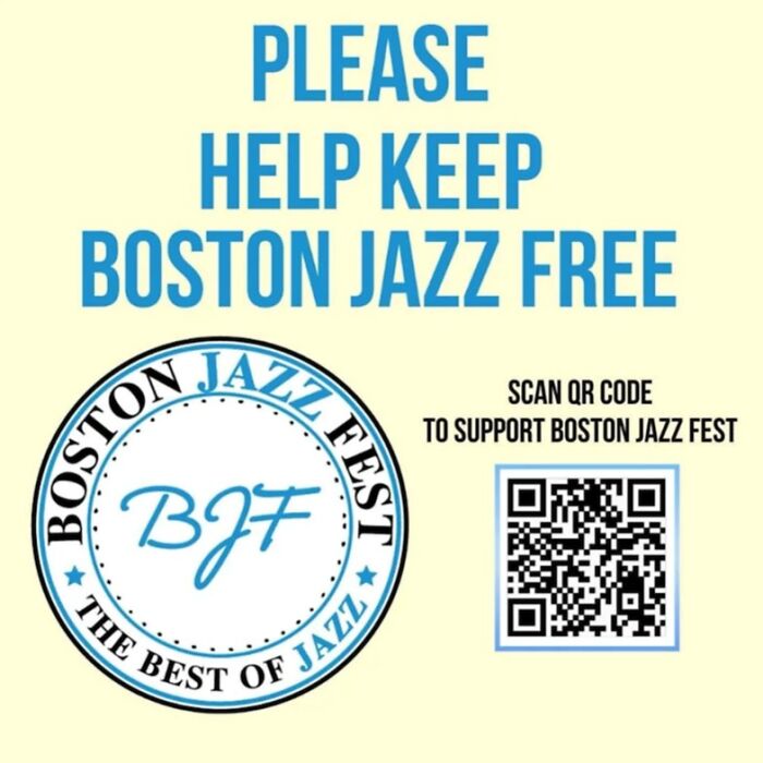
    I See What You Were Going For But

    Sign poster asking to help keep Boston Jazz free with QR code

    CrappyDesign Report

    Frank Ropen
    Community Member
    5 hours ago

    Keep Jazz free in Boston would have been the better option

    View more comments
    ADVERTISEMENT
    #26

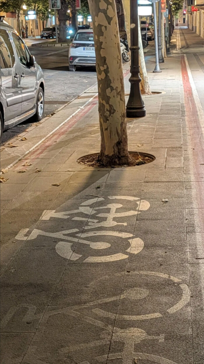
    Am I Supposed To Bike Here?

    Bike lane marking obstructed by tree in the middle of the sidewalk

    CrappyDesign Report

    Hippopotamuses
    Community Member
    6 hours ago

    A serious mistake. Plane and simple!

    View more comments
    #27

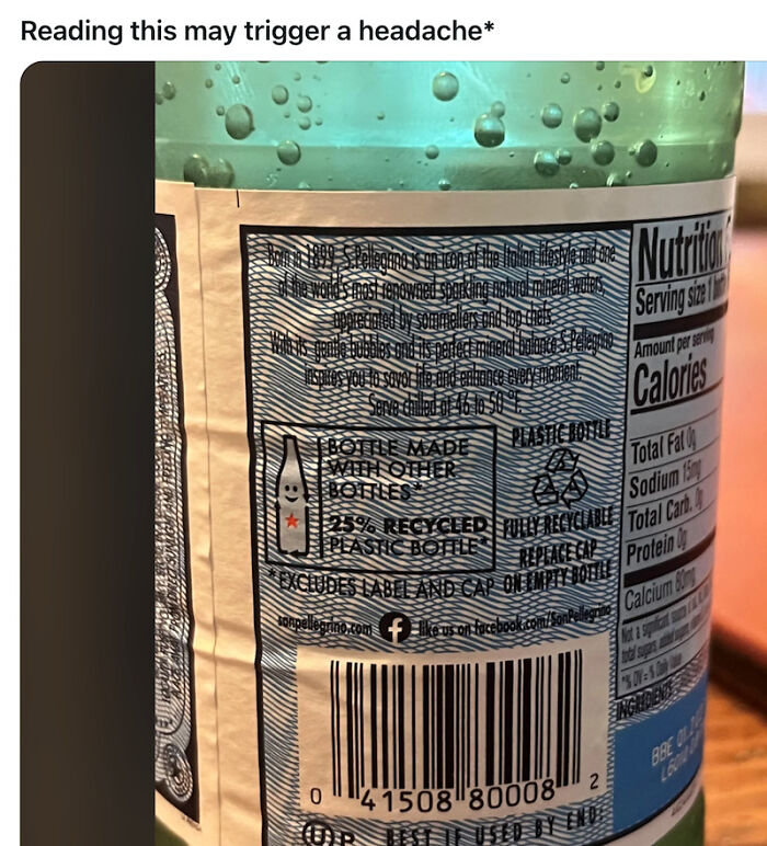
    I Can't Look At It Too Hard

    Ridiculous recycled plastic bottle label design with hard-to-read text and barcode

    CrappyDesign Report

    WindySwede
    Community Member
    2 hours ago

    well, it's nestlä, so what did you expect?

    View more comments
    #28

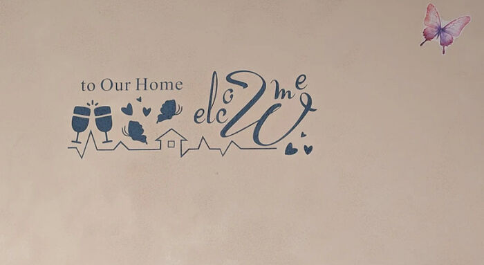
    Classic Airbnb Chic

    Wall decal with jumbled welcome home message and butterfly

    CrappyDesign Report

    Hippopotamuses
    Community Member
    6 hours ago

    Elcgwme to my home, too.

    View more comments
    ADVERTISEMENT
    #29

    Okay Who Was In Charge Of This?

    Elevator buttons with confusing layout and missing labels

    CrappyDesign Report

    Arian Kulp
    Community Member
    5 hours ago

    Maybe it auto-sorts by most recently pressed

    View more comments
    ADVERTISEMENT
    #30

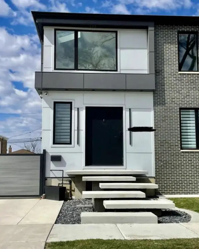
    This "Modern" Staircase, Which Would Cause Countless Injuries To Anyone Who's Clumsy (Me):

    Modern house with floating steps that lack safety and functionality

    SpringtimeInChicago Report

    Chilli
    Community Member
    6 hours ago

    Imagine walking up those after a night at the pub

    View more comments
    #31

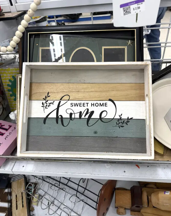
    This Beautiful Home Sign, Which Could've Used An Edit:

    Sweet home wooden tray with striped design printed text in store design choices

    Worldly-Return-9417 Report

    Hippopotamuses
    Community Member
    6 hours ago

    Temu?

    View more comments
    #32

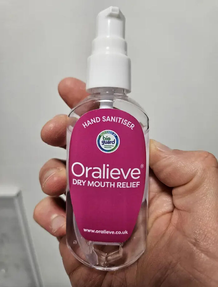
    This Hand Sanitizer, Which Genuinely Made Me Scream, "What The Heck?!":

    Hand sanitizer bottle mislabeled as dry mouth relief causing design confusion

    Report

    Zatetic
    Community Member
    20 minutes ago

    Old Saturday Night Live skit It's a dessert topping! No, it's a floor wax! Hey, hey. It's a dessert topping and a floor wax.

    ADVERTISEMENT
    #33

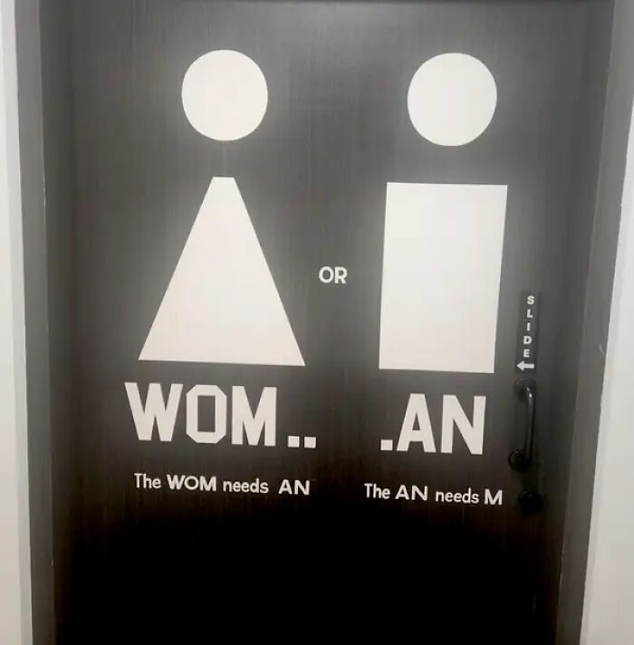
    This One, Though? No Idea What They Mean Here:

    Confusing restroom door design with incomplete words causing misinterpretation

    Report

    moggiemoo
    Community Member
    2 hours ago

    Somebody thought they were being clever but were actually just drunk.

    View more comments
    ADVERTISEMENT
    #34

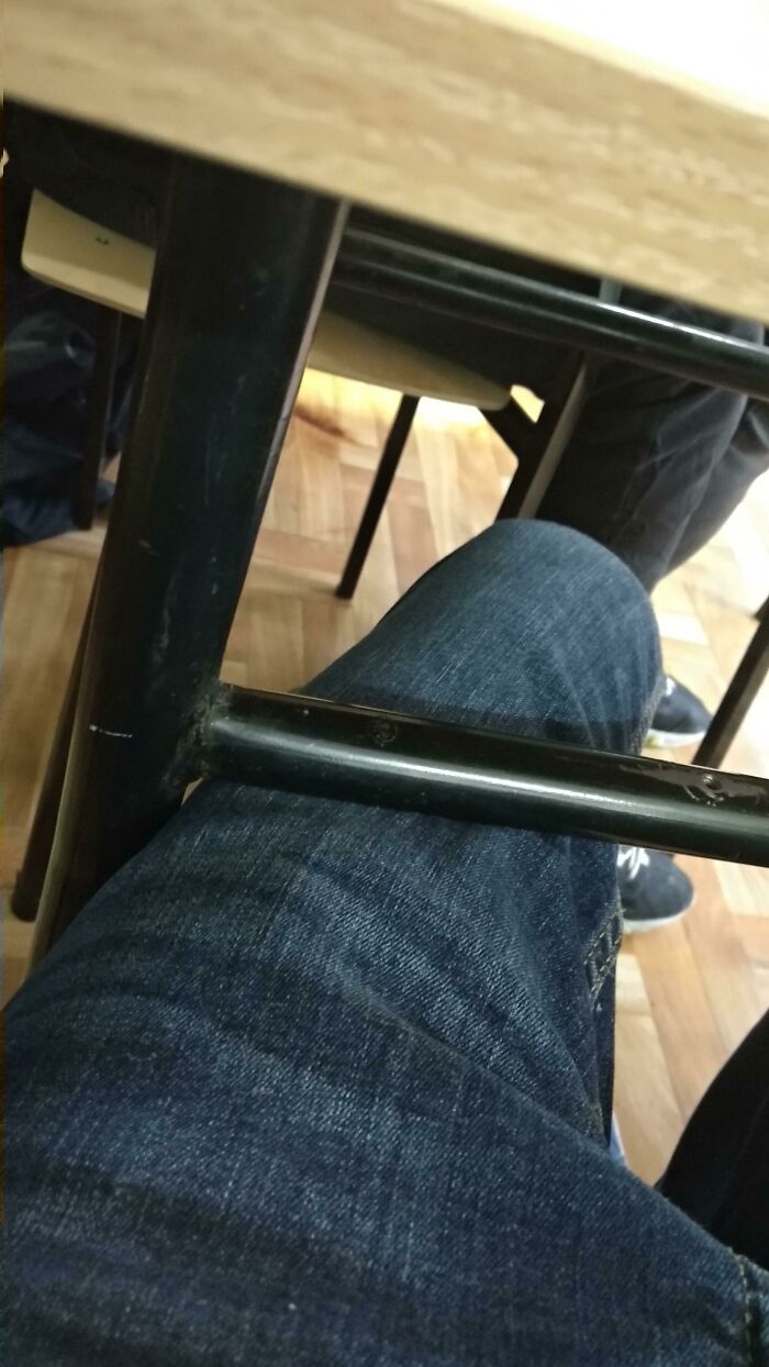
    Person That Design This Needs To Burn In Hell!!!!!!

    Ridiculous design of table bar hitting person's knee, showing poor ergonomic design choice

    Kacpirek Report

    Greenkitty
    Community Member
    7 minutes ago

    What is it?

    #35

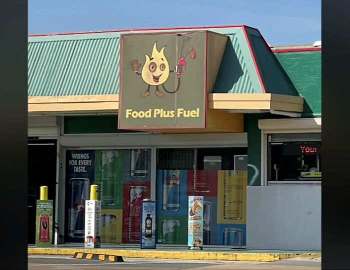
    Dunno About Having Fire As A Petrol/Gas Station Mascot..

    Food Plus Fuel convenience store sign with cartoon flame mascot design error

    funnysigns Report

    random_froggg (she/they 86/47)
    Community Member
    7 hours ago

    That mascot is wishing someone would burn the place down. Look at its eyes.

    View more comments
    #36

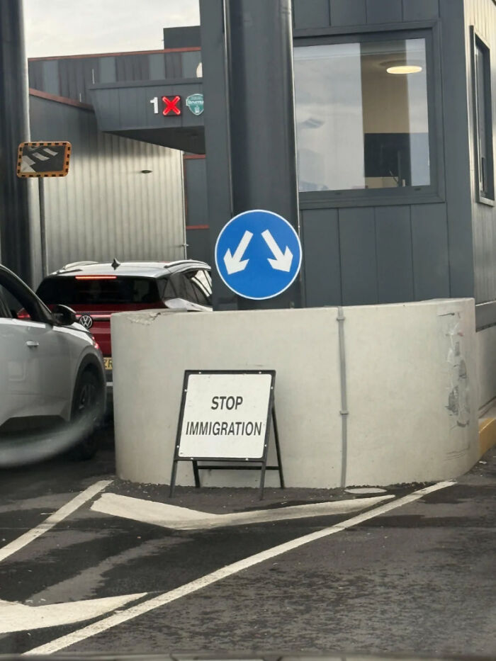
    I Don't Think You Meant It Like That

    Confusing immigration stop sign with unclear traffic directions at checkpoint

    funnysigns Report

    Chilli
    Community Member
    7 hours ago

    Not today, Pauline Hanson.

    View more comments
    ADVERTISEMENT
    ADVERTISEMENT
    #38

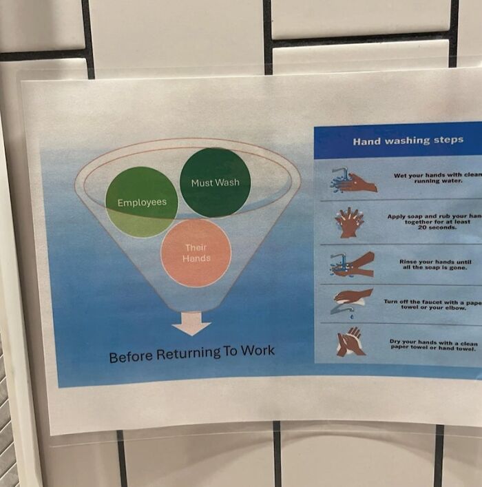
    Someone Went Crazy On Microsoft Word

    Confusing hand washing infographic for employees before work

    CrappyDesign Report

    Hippopotamuses
    Community Member
    7 hours ago

    Hand washing tornadoes are very rare.

    View more comments
    #39

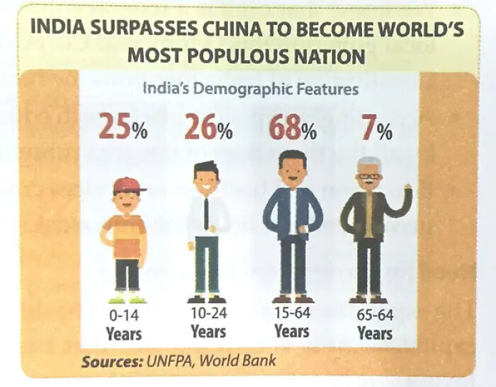
    I'm No Mathematician, But Something Just Ain't Adding Up Here:

    infographic showing India surpassing China in population

    killmetwice1234 Report

    Hippopotamuses
    Community Member
    6 hours ago (edited)

    I sincerely hope that the UNFPA and World Bank didn't have anything to do with this. If they did, we have serious global problems.

    View more comments
    #40

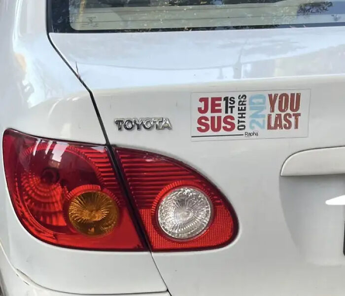
    Please, Comment Below And Tell Me What This Car Sticker Was Intending To Say:

    Car rear with sticker showing Jesus first others second and you last design choices

    RogueBagel_ Report

    shg stewart
    Community Member
    7 hours ago

    Jesus first, others second, you last.

    View more comments
    ADVERTISEMENT
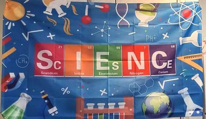
    #41

    I Understand The Intention Here, But I Can Only Imagine How Many Students Made Fun Of This:

    Science banner with element blocks spelling science with incorrect element symbols

    MicromonicsTTV Report

    Peter Bear
    Community Member
    5 hours ago

    I mean... the problem is that there's no other E's on the periodic table. I just checked.

    View more comments
    ADVERTISEMENT
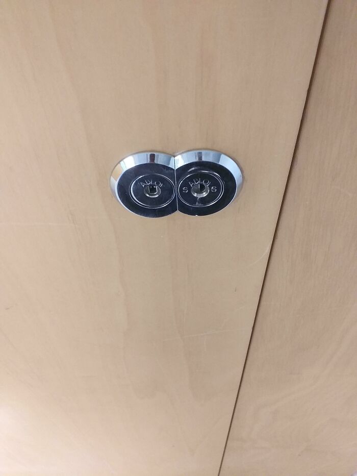
    #42

    2 Locks In A Single Door At Our School... Either Its Bad Design Or The Enterance To The Chamber Of Secrets. We Shall Never Know

    Two door locks placed so closely they almost overlap in ridiculous design

    Kokke3000 Report

    Hippopotamuses
    Community Member
    6 hours ago

    Someone went to quite a bit of trouble to do that.

    View more comments
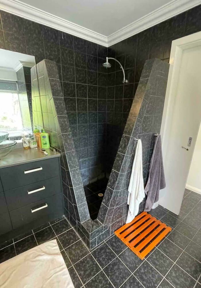
    #43

    Idk How To Feel About This

    Black tiled shower with narrow triangular entrance and odd design

    killianbones Report

    Hippopotamuses
    Community Member
    6 hours ago

    Injured!

    View more comments
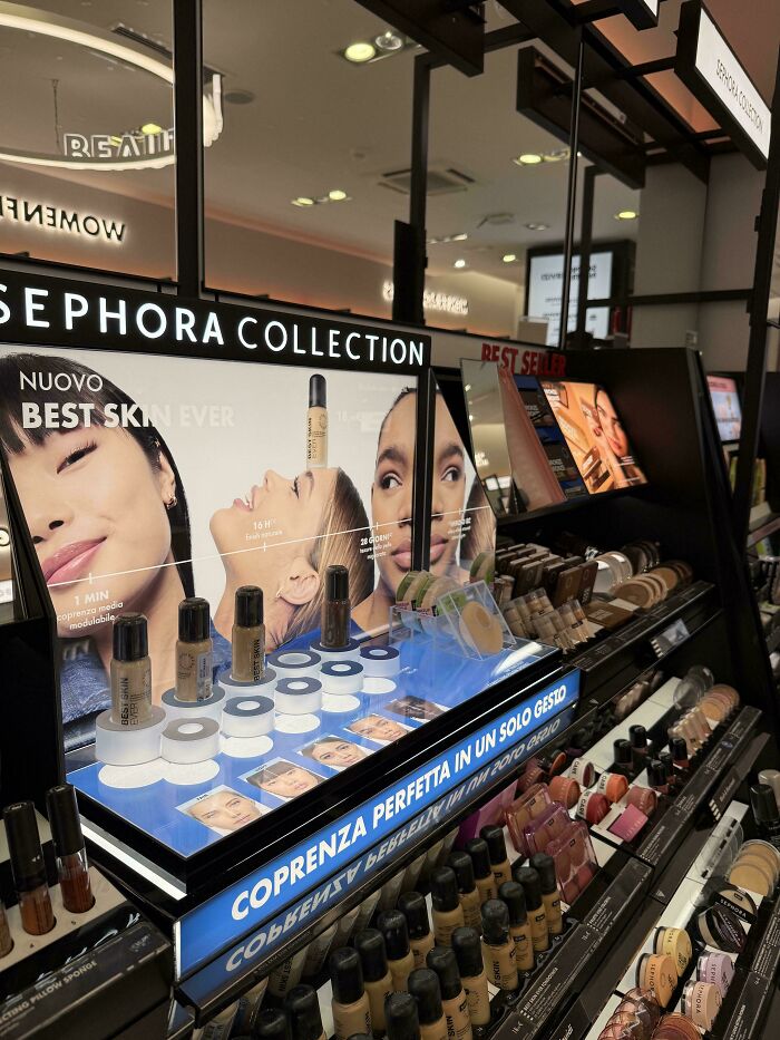
    #44

    Bad Design At Sephora

    Makeup display with foundation bottles under Sephora Collection sign

    Puzzlehead_Rich4444 Report

    Chilli
    Community Member
    7 hours ago

    why is the foundation bottle on her forehead?

    View more comments
    ADVERTISEMENT
    #45

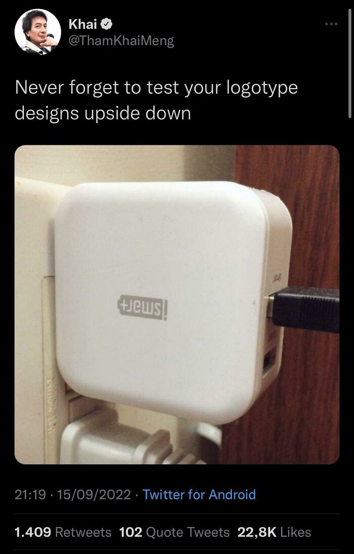
    Quite A Fail…

    Upside down logo design on a white charger illustrating testing design choice

    y3rnaux Report

    Richard Graham
    Community Member
    6 hours ago

    We found the source of the conspiracy!

    View more comments
    ADVERTISEMENT
    #46

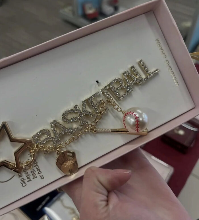
    Look Again

    basketball keychain featuring baseball glove and ball mismatch

    funnysigns Report

    Frank Ropen
    Community Member
    5 hours ago

    Baseketball. A fun movie

    View more comments
    #47

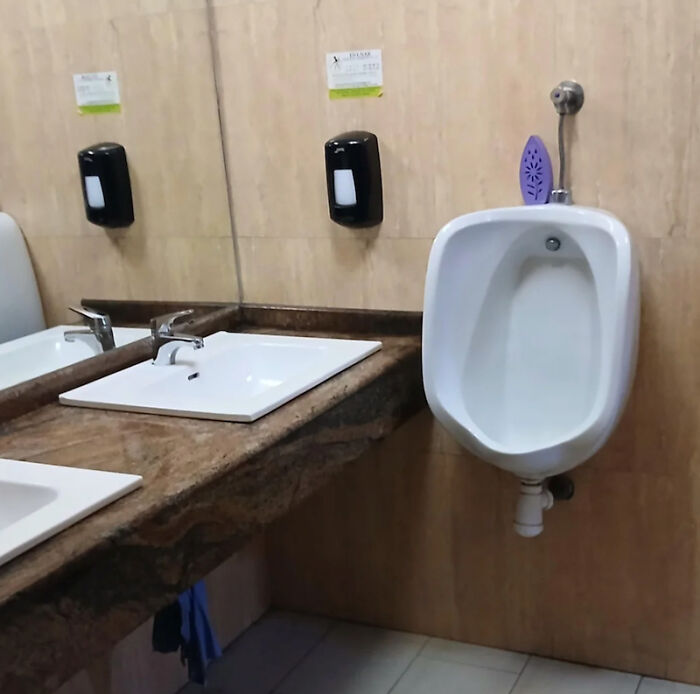
    Perfect Place For It, Thanks!

    urinal installed next to bathroom sink causing awkward design

    funnysigns Report

    Arian Kulp
    Community Member
    5 hours ago

    So you can wash your hands while peeing. Saves time.

    View more comments
    #48

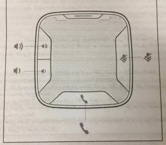
    What Did The Icon Mean? Itself, Duh!

    Diagram of a speakerphone with confusing mute and volume controls layout

    CrappyDesign Report

    David Paterson
    Community Member
    6 hours ago

    My car has like three of these on the steering wheel.

    ADVERTISEMENT
    #49

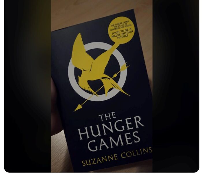
    Having A Printed On 'Sticker' That You Can't Remove Promoting A Movie That Came Out 3 Years Ago On A Book.

    Cover of The Hunger Games book with major motion picture sticker

    CrappyDesign Report

    Chilli
    Community Member
    6 hours ago

    KEEP. STICKERS. OFF. BOOKS.

    View more comments
    ADVERTISEMENT
    #50

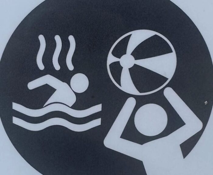
    Throwing Beach Balls At The Smelly Man

    Black and white sign with unclear hot water and ball throwing icons

    CrappyDesign Report

    Cerulean
    Community Member
    3 hours ago

    Fight off angry man with giant fan

    View more comments
    #51

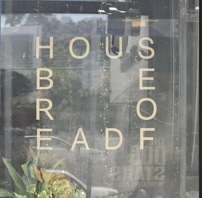
    What Are You Trying To Tell Me?

    Window sign with jumbled text creating a confusing design choice

    CrappyDesign Report

    IORN
    Community Member
    34 minutes ago

    This comment has been deleted.

    View more comments
    #52

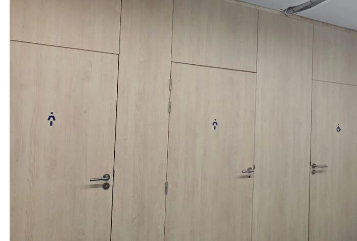
    Which Toilet Should Each Gender Go In? Found In The St. Dennis Cathedral In Paris.

    Bathroom doors with unclear and inconsistent signage for gender and accessibility

    CrappyDesign Report

    Chilli
    Community Member
    7 hours ago

    Idk dude, just wash your hands.

    View more comments
    ADVERTISEMENT
    #53

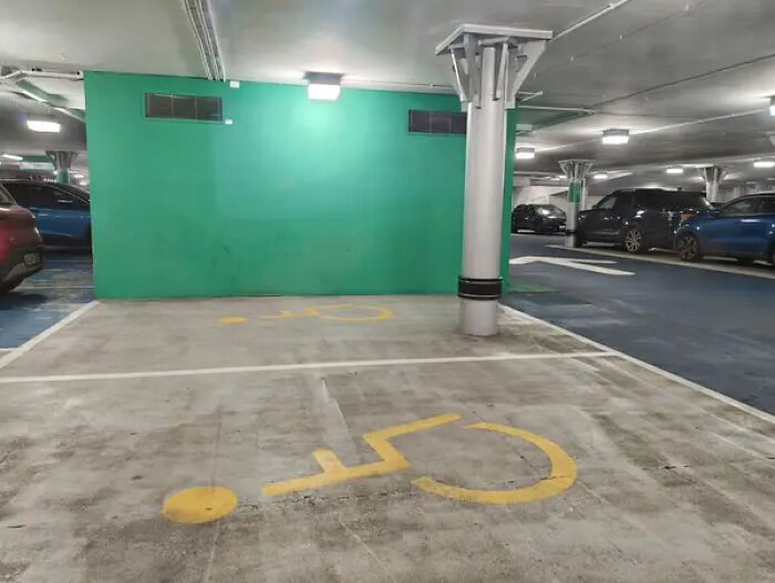
    This So-Called "Accessible" Parking Space, Which Has A Pretty Major Design Flaw:

    handicap parking space design blocked by a metal pillar

    rattieboii Report

    darknut
    Community Member
    Premium
    1 hour ago

    Nonsense. They can park their motorcycles there

    ADVERTISEMENT
    #54

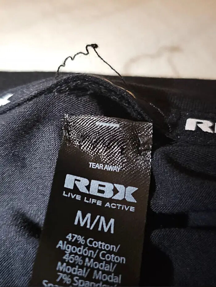
    This "Tear Away" Tag, Which Proves You Shouldn't Always Blindly Follow Instructions:

    Clothing tag with loose thread causing discomfort design flaw

    RayzTheRoof Report

    #55

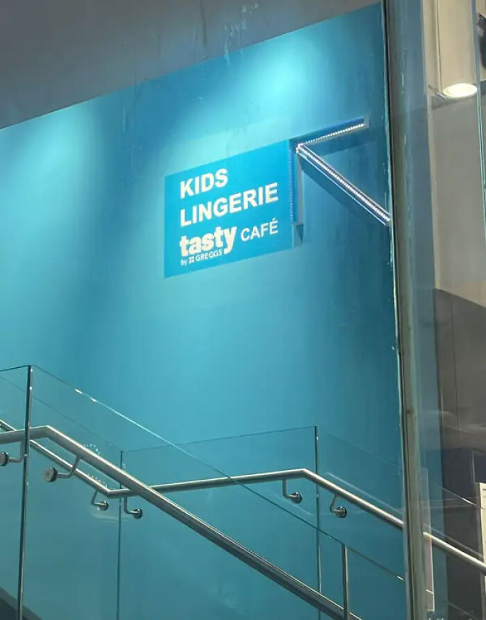
    This Simple Sign, Which Probably Seemed Innocent In Theory:

    Sign for kids lingerie above tasty café showing ridiculous design choices

    slysam69 Report

    Chilli
    Community Member
    6 hours ago

    I got three words for you: COMMAS, COMMAS, COMMAS.

    View more comments
    #56

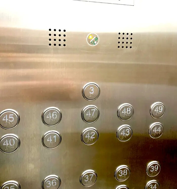
    I Guess The Person Who Made This Elevator Just Loved The Number 3:

    Elevator panel with unusual button numbering design choices close-up

    a.boredpanda.bio Report

    moggiemoo
    Community Member
    2 hours ago

    Floor 3 is where the only toilets in the building are located.

    ADVERTISEMENT
    #57

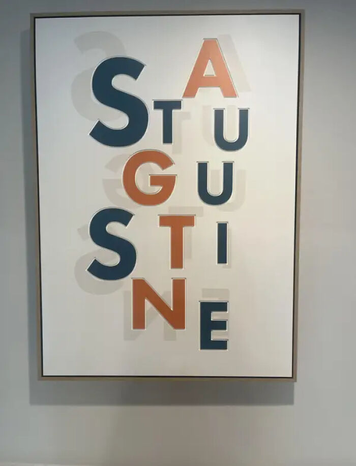
    This Sign, Which Truly Makes No Sense To My Tiny Brain:

    Ridiculous design choice of wall art spelling St Augustine with overlapping letters

    _BORK- Report

    shg stewart
    Community Member
    7 hours ago

    St. Augustine

    View more comments
    ADVERTISEMENT
    #58

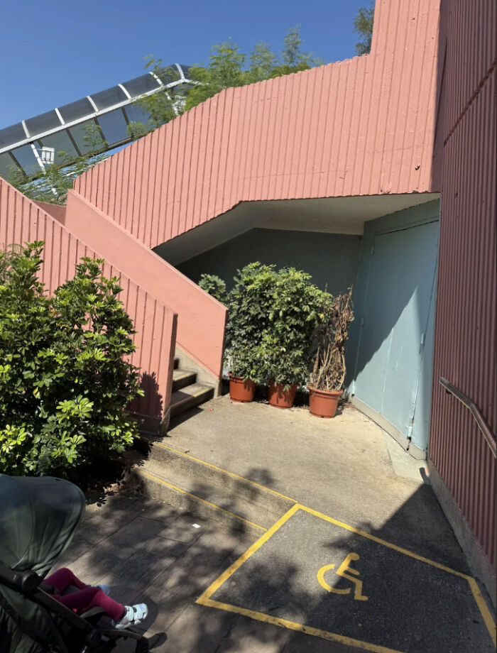
    The Longer You Look, The More You Realize

    Outdoor pink staircase blocking the accessible wheelchair ramp entrance

    funnysigns Report

    Gus
    Community Member
    2 hours ago

    Look, they said that we had to make it 'accessible', they never said that we had to make it 'easy'.

    View more comments
    #59

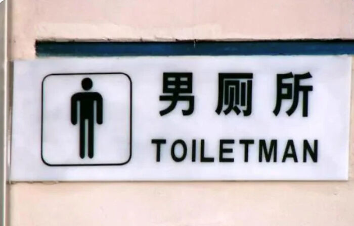
    The World's Best Superhero

    Bathroom sign incorrectly labeled as toilet man with unclear gender indication

    funnysigns Report

    Richard Graham
    Community Member
    6 hours ago

    The sequel to Billy Joel's "Pianoman".

    View more comments
    #60

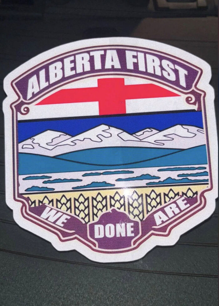
    We Are Absolutely Done

    Sticker with Alberta First design and confusing phrase we done are

    CrappyDesign Report

    shg stewart
    Community Member
    7 hours ago

    Nobody ever said they were smart.

    View more comments
    ADVERTISEMENT
    #61

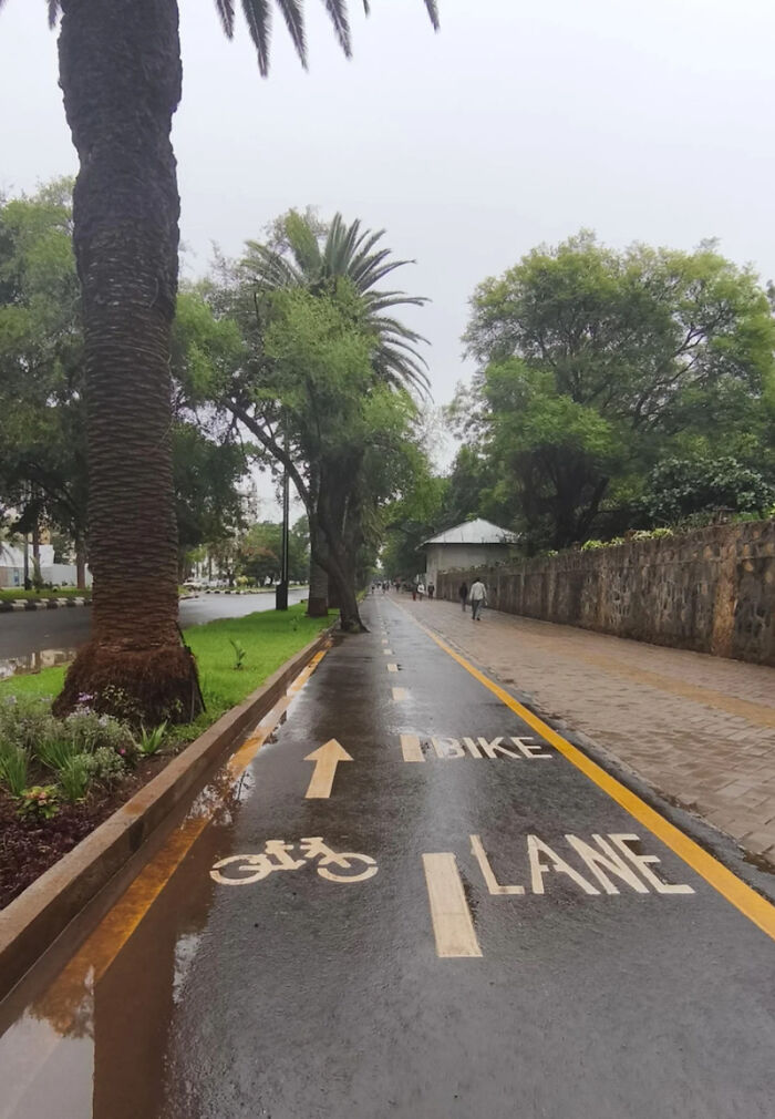
    Accidents Waiting To Happen

    Wet bike lane on a street with palm trees and pedestrians

    CrappyDesign Report

    Maya_D
    Community Member
    Premium
    1 hour ago

    It’s a two way bike lane, with plenty of space elsewhere for pedestrians.

    View more comments
    ADVERTISEMENT
    #62

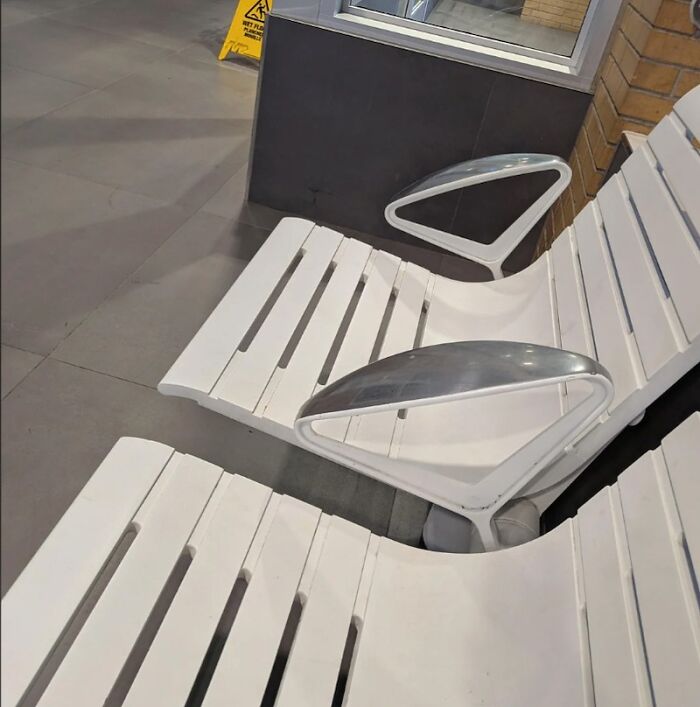
    Least Comfortable Armrests Ever

    White metal chairs with uncomfortable metal armrests

    CrappyDesign Report

    Janissary35680
    Community Member
    Premium
    3 hours ago

    I think those are more intended to prevent someone from lying down.

    #63

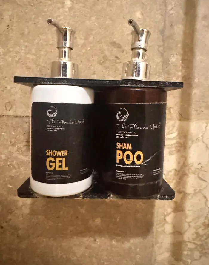
    Another Unfortunate Line Break

    shower gel and shampoo bottles with confusing label fonts

    Cheap-Menu9081 Report

    Peter Bear
    Community Member
    5 hours ago (edited)

    Seagulls, seagulls everywhere, leaving presents in my hair. It gives my scalp a silky feel; who needs sham pōo when you can have real? EDIT: Really, BP? You censor the word that's IN THE PHOTO when I try to type it? There's no place for censorship in a free society. And yes, I will keep doing this.

    View more comments
    #64

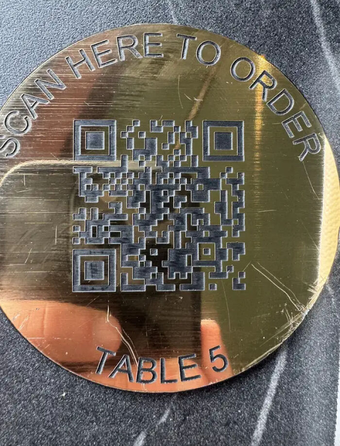
    I'm Firmly Against Qr-Code-Only Menus, But Especially If They Don't Even Work:

    metallic table QR code order sign with engraved text

    Professional_Shine97 Report

    Martin
    Community Member
    1 hour ago

    Just tried it. Didn't work.

    View more comments
    ADVERTISEMENT
    #65

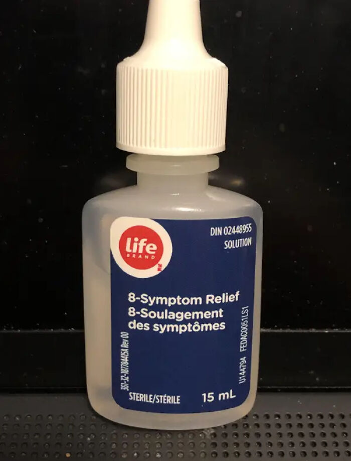
    This Eye-Drops Bottle, Which Doesn't Actually Say Anywhere That It's Eye Drops:

    Life brand 8-symptom relief solution bottle unusual design choices

    gachunt Report

    Elladine DesIsles
    Community Member
    3 hours ago

    These were sold packaged in a box, which better identified the product, so at least the purpose was clear at the time of purchase (not so bad, considering it's a tiny bottle that most likely said to discard one month after breaking the seal). I believe the labels have since been redesigned.

    ADVERTISEMENT
    #66

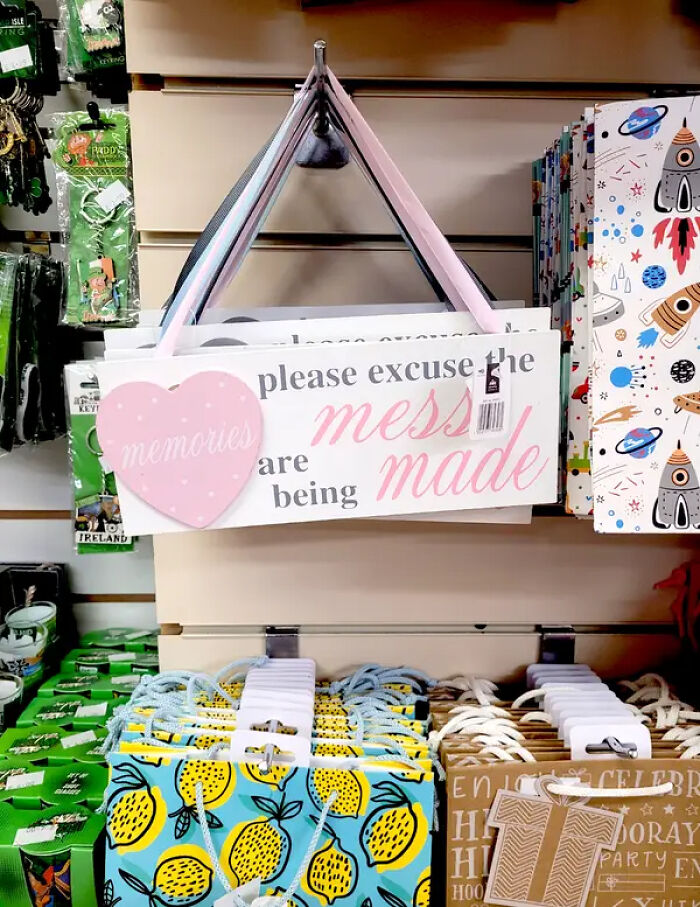
    This Confusing Gift Bag, Which I'd Definitely Hyperfixate On If I Ever Received It:

    Memories sign with pink heart stating please excuse the mess design choices store display

    Zendo7777 Report

    Chilli
    Community Member
    6 hours ago

    Please excuse the memories, mess are being made.

    #67

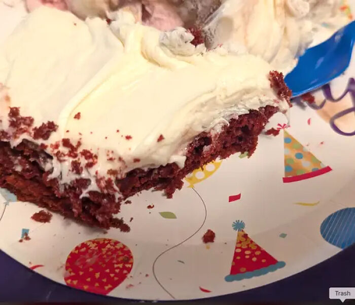
    And I'd Refuse To Eat Off These Plates, As Someone With A Fear Of Hair In My Food:

    Piece of red velvet cake on a party plate with a blue plastic fork

    Report

    Hippopotamuses
    Community Member
    6 hours ago

    Same here. Once the thought is in my head, that's it.

    #68

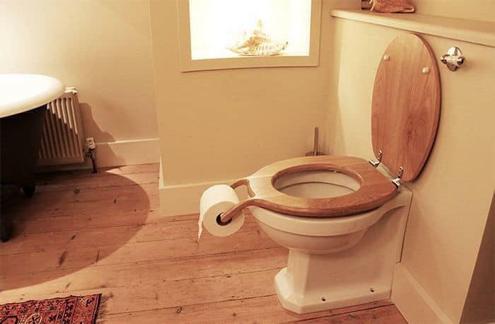
    Awful

    Ridiculous toilet design with wooden seat holding toilet paper, a bad design choice

    lxgan18 Report

    Hippopotamuses
    Community Member
    6 hours ago

    A conceptual artwork by Henry Franks, "Bog standard"

    View more comments
    ADVERTISEMENT
    #69

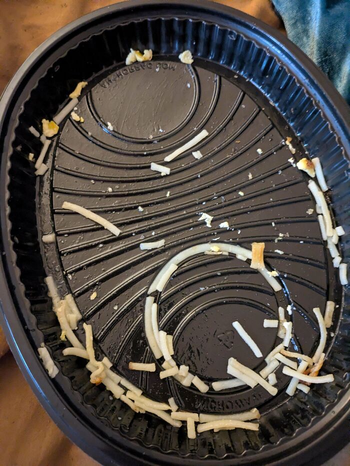
    This Bowl Design Is Kinda Bad For Eating This Type Of Cheese That It Commonly Serves

    Empty black food container with leftover shredded cheese arranged in circular pattern

    lightmare69 Report

    grotesqueer
    Community Member
    1 hour ago

    I don't think any other ridge design would do any better. And the ridges need to be there for structural stability. It allows to use far less plastic without making the container flimsy.

    ADVERTISEMENT
    #70

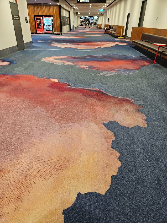
    Melbourne Airport Carpet

    Airport carpet with messy reddish stains resembling blood patches

    leroywinston Report

    Gus
    Community Member
    2 hours ago

    When the roof leaks, or there's a chemical spill, you'll hardly notice.

    View more comments
    #71

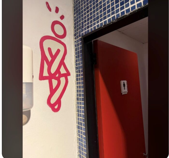
    Ran Into The Men's Restroom... The Woman's One Is Exactly The Other Way Around

    Bathroom wall art showing a person crossing legs near restroom door

    funnysigns Report

    #72

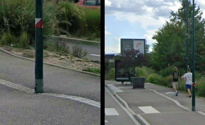
    How Many People Have Run Right Into That?

    Street design obstructed by pole in pedestrian path causing accessibility issues

    funnysigns Report

    Gus
    Community Member
    2 hours ago

    I think you mean, 'how many people absorbed in their mobile phones have run into that?'.

    View more comments
    ADVERTISEMENT
    #73

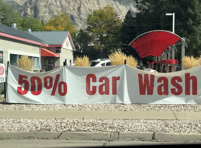
    Which End Of My Car Can I Expect To Be Washed?

    50 percent car wash banner with distorted letters outdoors

    funnysigns Report

    Zatetic
    Community Member
    10 minutes ago

    They only wash the outside of the car so it should say less than 50%

    ADVERTISEMENT
    #74

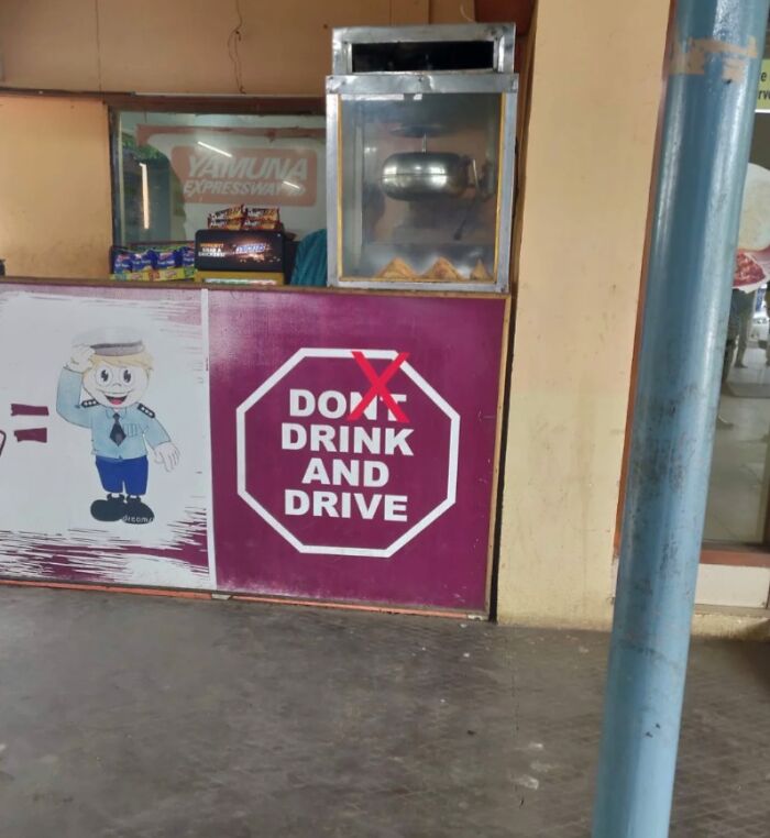
    Mixed Messages Crazy Style

    Sign with design error altering do not drink and drive message

    CrappyDesign Report

    Chilli
    Community Member
    7 hours ago

    Alright, I will. Bye.

    View more comments
    #75

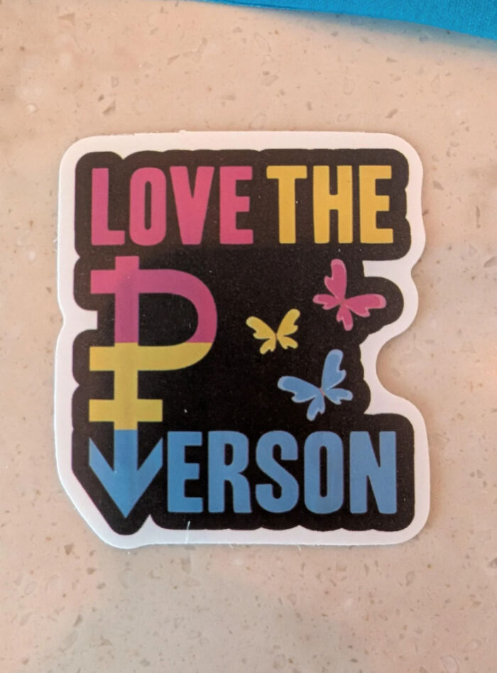
    Love The P Verson

    Sticker with colorful love the person design and butterflies

    CrappyDesign Report

    Chilli
    Community Member
    7 hours ago

    oh so THAT'S what pansexual means /j

    View more comments
    #76

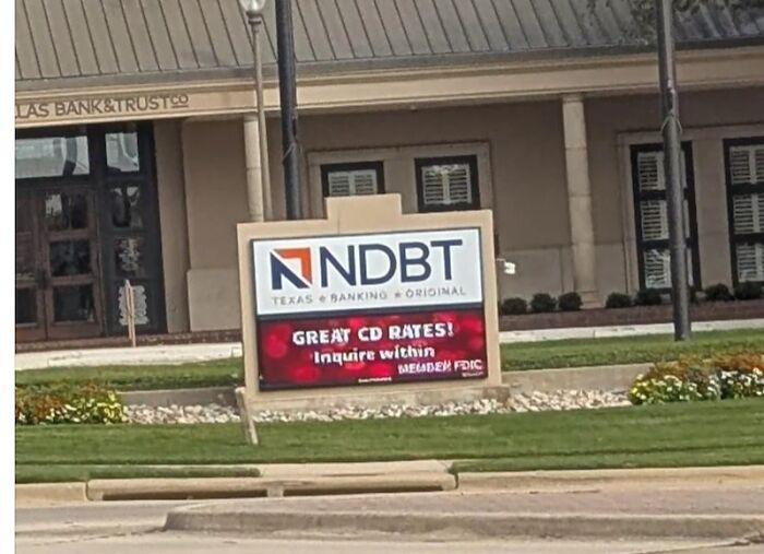
    This Local Bank's Logo Looks Like It Reads "In Debt"

    Confusing bank sign layout with unclear logo and text placement

    CrappyDesign Report

    David Paterson
    Community Member
    6 hours ago

    No Interest.

    ADVERTISEMENT
    #77

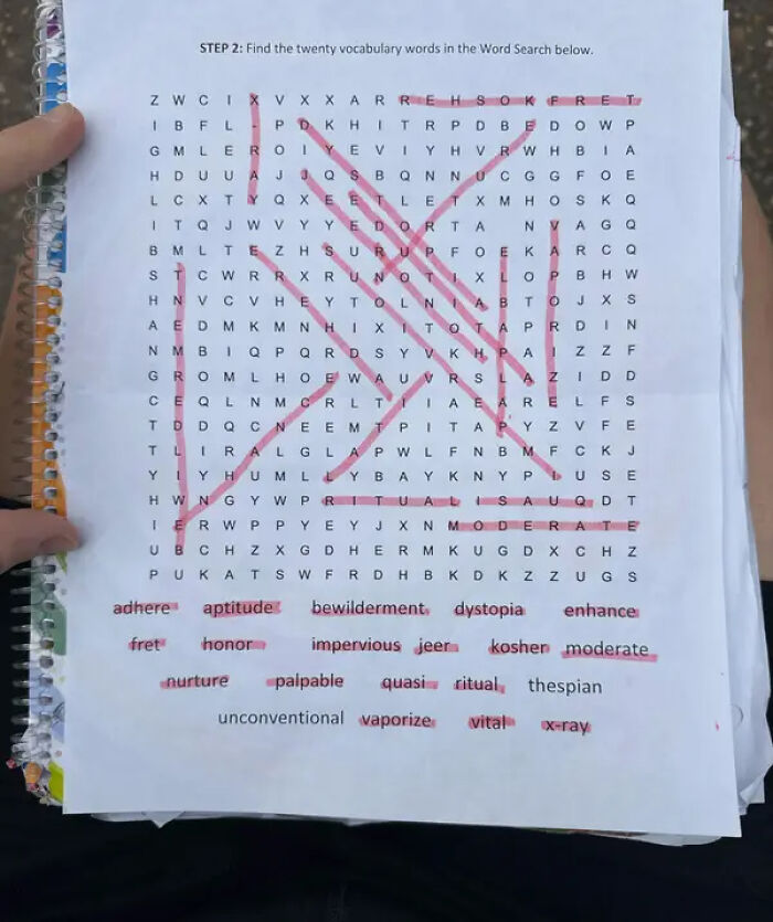
    This Impossible Word Search For Kids, That Perhaps Aims To Teach Young People A Lesson In Failure:

    Word search puzzle with twenty vocabulary words highlighted in red pen

    clear3_3 Report

    ADVERTISEMENT
    #78

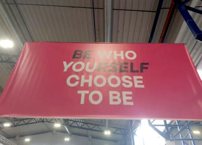
    This Seemingly Inspirational Banner, Which I Reread 10 Times And Still Don't Understand:

    Faded motivational sign with unclear text about being yourself

    Right-Dot4471 Report

    #79

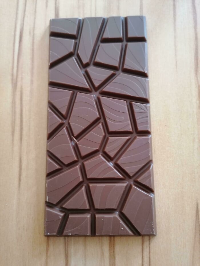
    What Was Wrong With The Original Design???

    Chocolate bar with irregular broken style design for ridiculous design choices

    [deleted] Report

    Peter Bear
    Community Member
    5 hours ago

    What's wrong with this one?

    View more comments
    #80

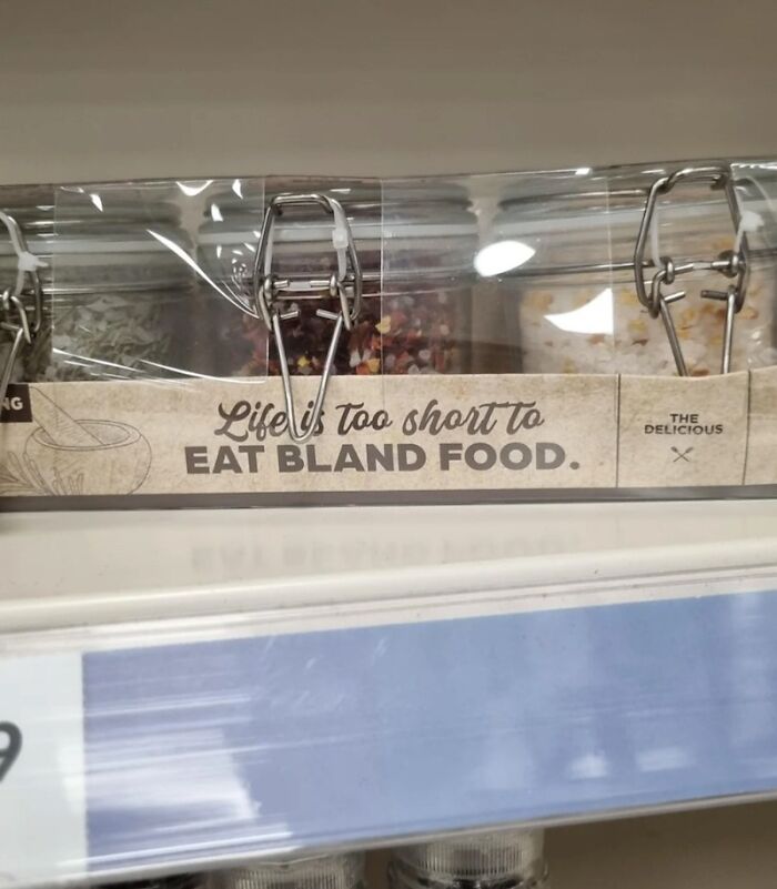
    I'm Skipping To The Bold Part Sorry

    Spice jars with label stating life is too short to eat bland food

    CrappyDesign Report

    grotesqueer
    Community Member
    1 hour ago

    I don't think that's a design issue. That's a reader issue. There's nothing unclear or ambiguous in this one.

    View more comments
    ADVERTISEMENT
    #81

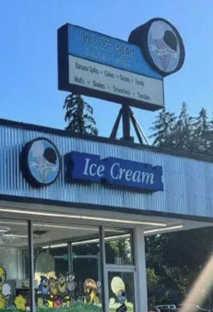
    Why Is The Outline Of The Letters Like That?
    Ice cream shop exterior with poorly designed and unreadable signage

    CrappyDesign Report

    ƒιѕн
    Community Member
    5 hours ago

    Thats an old Baskin-Robbins

    ADVERTISEMENT