Get Premium
Dark mode theme is available exclusively for premium users. Learn more about the benefits of subscribing.
No fees, cancel anytime.

 Dark Mode Ad-Free Browsing Unlimited Content
 Ad-Free Browsing Unlimited Content Dark Mode
Join 1.2 million Panda readers who get the best art, memes, and fun stories every week!
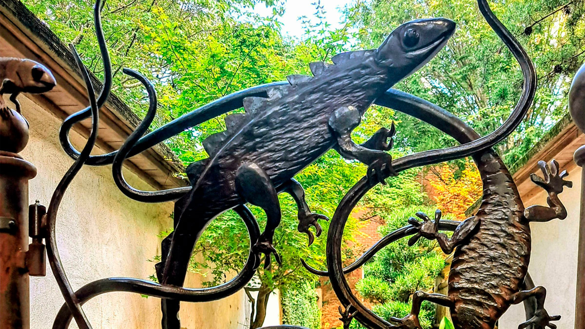
Being a designer – whether it's interior, graphic, advertising, or public space – takes a lot of creativity and skill. Sure, lots of people are good at their jobs, but only a few might be geniuses. This time, we're highlighting the best of the best in design: creations so practical and satisfying to look at that one can't help but say, "Wow."
The pics come to you from the subreddit whose name we can't really mention here, but let's just say that it rhymes with "Design Horn." It's a subreddit dedicated to amazing "architectural, graphic, industrial, furniture, & product design." So scroll down and be inspired or simply marvel at the things the human mind and hands are able to create!
More info: Reddit
This post may include affiliate links.

Found in Somerville, MA, near the Union Sq. T stop.

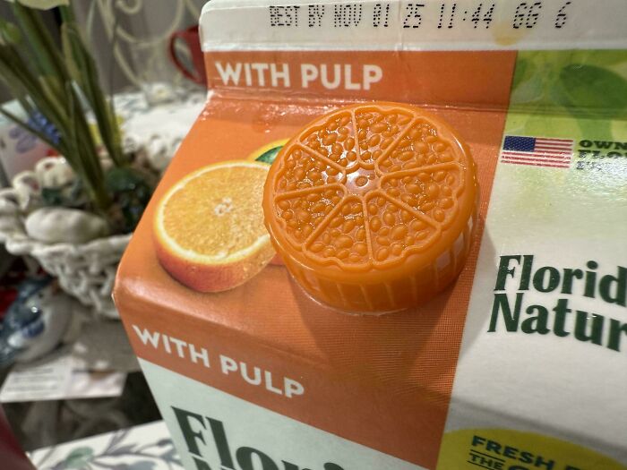
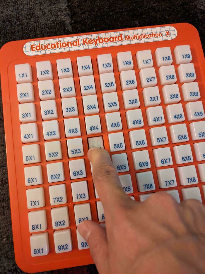
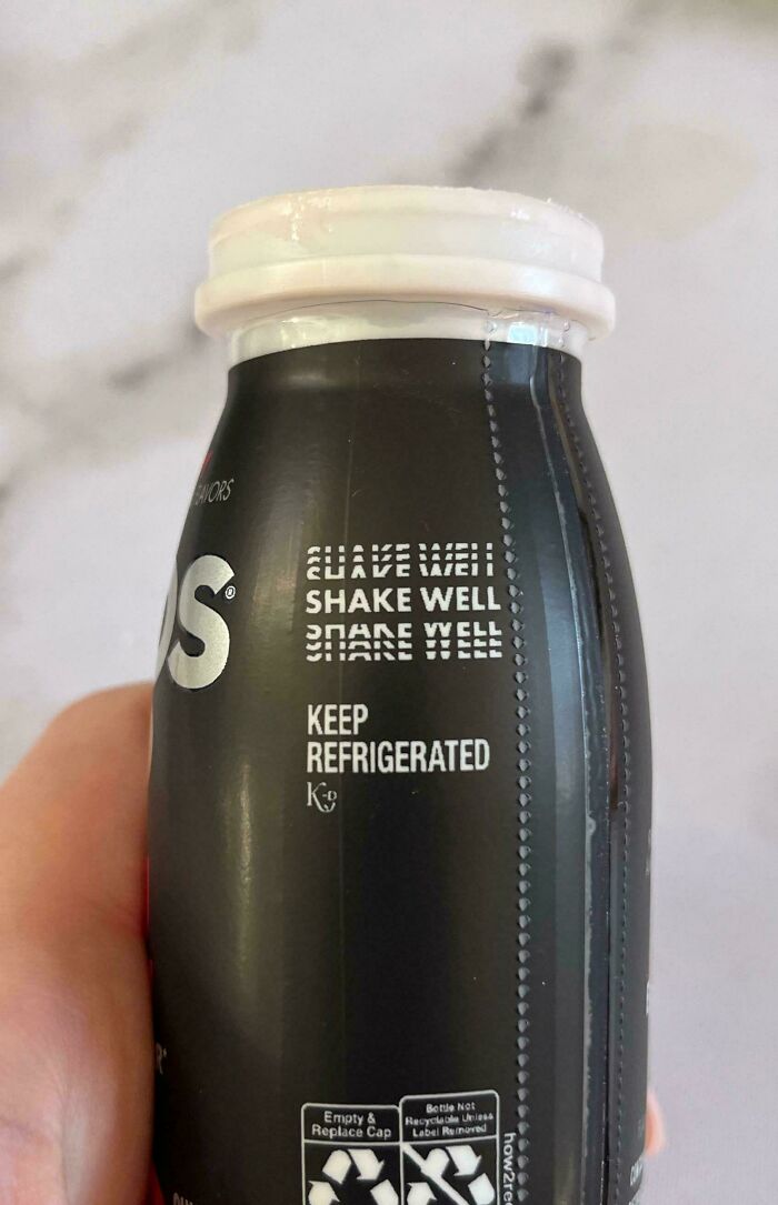
Good idea when you're in a fog getting morning coffee so don't mix it up with milk carton.

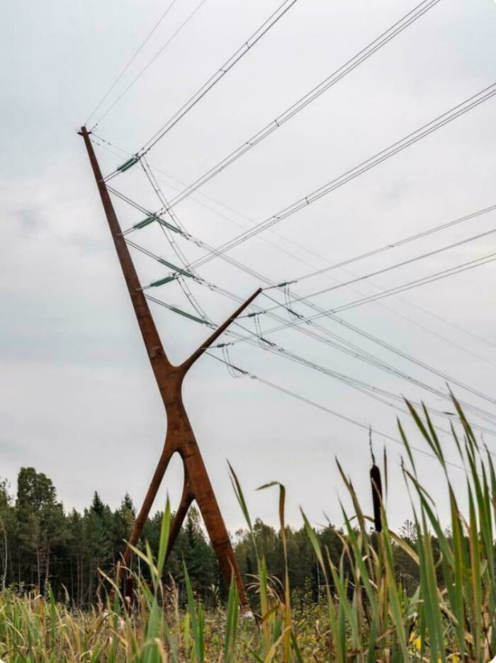
I’ve always hated the electricity pylons in this country (UK). They’ve always scared me.

I've seen enough Lets Game It Out videos to know better than to go in there

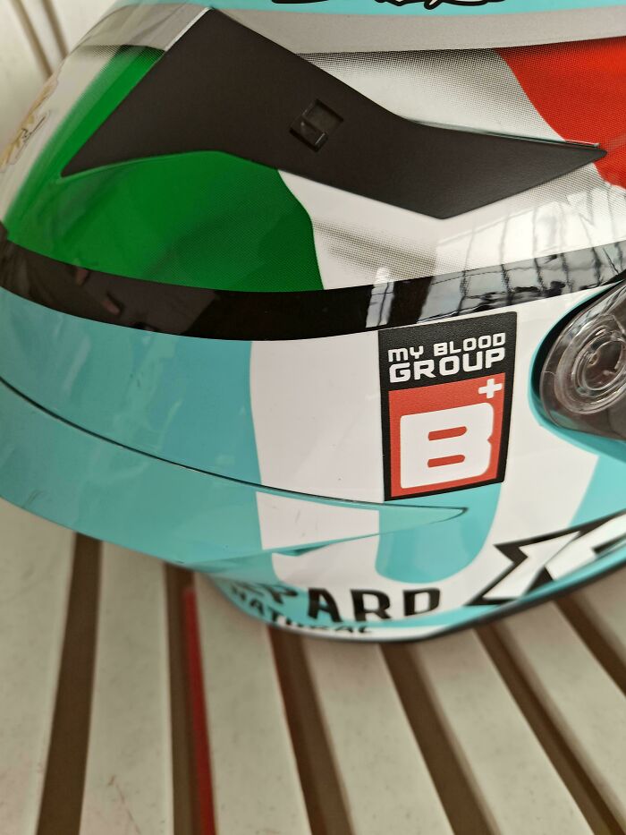
That’s a good idea, but I don’t know how closely people will be checking his helmet if he gets in an accident bad enough to warrant a transfusion!
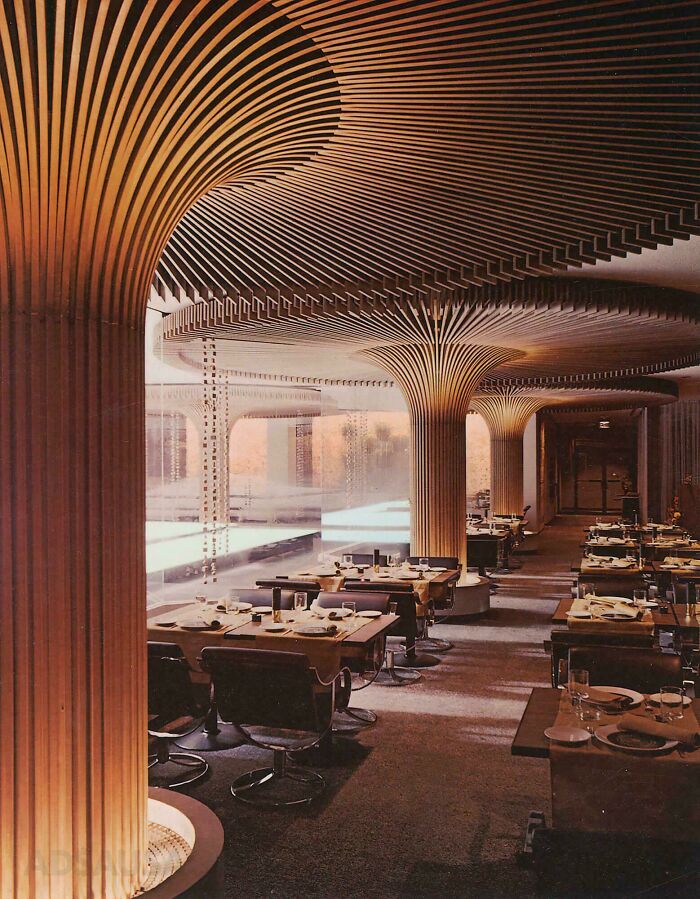
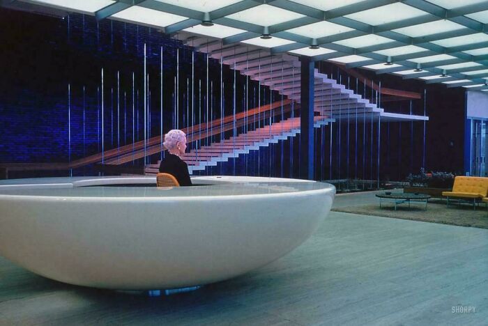
Located in Peachtree Center (originally named Garden Mall), the restaurant opened in 1968. Later, the restaurant closed in the late 1980s.

In Toronto, the shelter is a box of glass, tempered so it smashes most spectacularly, and the Advertisement is on the up-street side, so you Can't See the bus coming from inside.
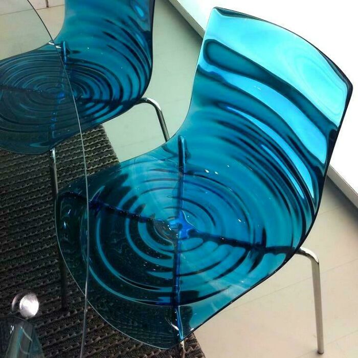
I hope those ripples are only on the underside and not on the surface of the seat

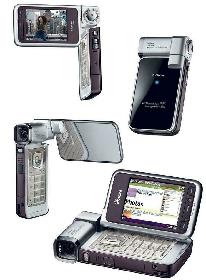
and it is huge and doent fit in small pockets or tiny bags..so unnecessary.

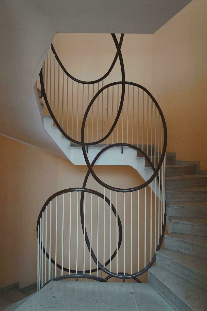
Okay, the artistic side of me loves it, but the person-with-vision-issues side of me absolutely hates it XD

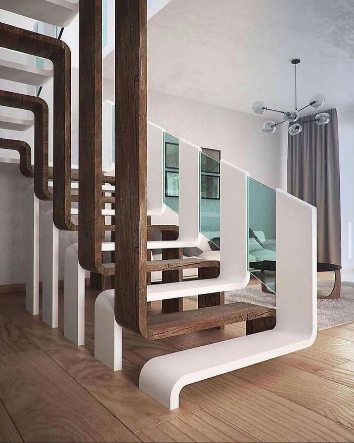
I'm a certified klutz, classic version. I would definitely trip on these stairs :P
I must be hungry. Looks like someone cut a hard-boiled egg in half.
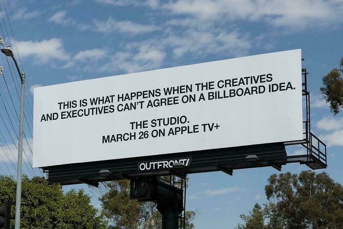
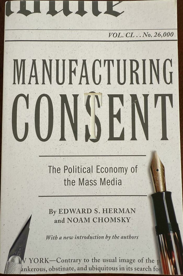
Noam Chomsky wrote a book Manufacturing Consent. So this article refers to it in a witty way?
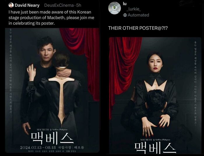
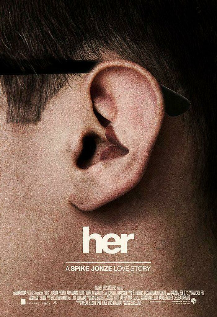
I feel as though I probably need to know something about this movie to understand the poster.
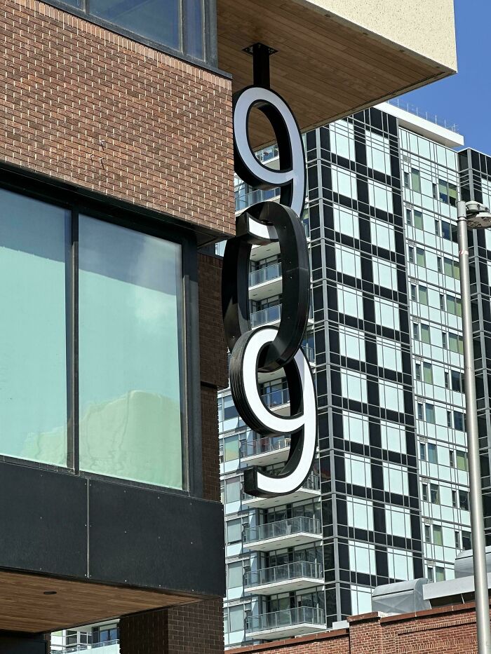
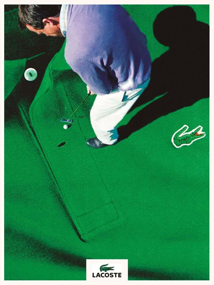
Stupid me read it as ''lactose''. Took me far too long >.< Luckily I have new glasses on the way :P
When you see spam like that below, don't just downvote it. Click on the 3 dots to the right of the username and report it as spam. It's much faster.
Load More Replies... 
When you see spam like that below, don't just downvote it. Click on the 3 dots to the right of the username and report it as spam. It's much faster.
Load More Replies... 













 No fees, cancel anytime