Get Premium
Dark mode theme is available exclusively for premium users. Learn more about the benefits of subscribing.
No fees, cancel anytime.

 Dark Mode Ad-Free Browsing Unlimited Content
 Ad-Free Browsing Unlimited Content Dark Mode
Join 1.2 million Panda readers who get the best art, memes, and fun stories every week!
Real education happens when you blend information with entertainment. It’s one thing to give someone a dusty stack of esoteric books to read for homework, it’s something else entirely to present the info in an engaging, intuitive, and accessible way. Welcome to the wonderful world of information graphics, aka infographics!
The r/Infographics subreddit is an old online community that has an enduring love for infographics. Today, we’re featuring some of the best ones the community has shared. Scroll down to check ‘em out! They won’t just amuse you, you’ll end up learning lots, too.
Bored Panda got in touch with Steven Wooding, who is part of the Omni Calculator team, the creator of the Weird Units Converter, and a member of the Institute of Physics in the UK, with a few questions about presenting data in such a way so as to connect to the audience better. Read on for his insights.
This post may include affiliate links.
Steven, the creator of the Weird Units Converter and a member of the Omni Calculator project, shared a few of his thoughts with Bored Panda on presenting data in a way that engages others better. We were interested to know how scientists can tell what data to focus on when showing others their findings if they feel like everything might potentially be worth others' attention.
"I would focus on findings that have the greatest impact on the most people in the potential audience," he said.
"If a finding is less important and only interests a niche group of people, it can be left out with little impact on the presentation," Steven told us.
Oh man, I remember seeing this one from a geography book that was published in the 80s. Although the version I saw also had an isthmus.
We were also curious in learning about why the way in which data is presented has such a different impact on the audience. Steven, from the Omni Calculator team, explained why visuals are so powerful when sharing information.
"We are visual beings and much prefer a picture to a lot of text," he said, adding that text is a relatively recent way to communicate.
"It is easier to make general conclusions from a graph or diagram without getting bogged down by the noise of too much detail," Steven said.
"Part of impacting an audience is being memorable, and images are much easier to remember than bullet point lists. Adding a bit of entertainment also helps to be memorable and generally stops people from tuning out from what you are saying."
The r/Infographics online community has a long and storied history. Founded all the way back in July 2009, the subreddit will be celebrating its 14th birthday this summer!
Over the nearly decade and a half, the community has continued to remain relevant thanks in large part due to the interesting topic it focuses on, as well as its active community. At the time of writing, there were 221k members on r/Infographics.
The sub’s moderators have even put together a handy-dandy infographic about what is and isn’t an infographic (talk about meta!). You can find it right over here. It should help you navigate the world of visual information a bit better.
In short, infographics are graphic visual representations of information, data, or knowledge. “These graphics present complex information quickly and clearly, such as in signs, maps, journalism, technical writing, and education. Do not post: brochures, flyers, posters, graphic images with swaths of text laid over them, three-page long images that simply add costs,” the mod team asks its members to focus on infographics and infographics alone.
Ok, I will change my password from "admin" to "adminadminadmin", going from "instantly" to "100 years" :)))))
If you post things other than infographics, they’ll probably end up getting removed by the mods. For instance, if your infographic is just a picture of text, it’s gonna go. The mod team running the entire show stress that the visuals have to add something to the image.
If you transcribe all the text into a text post and get the exact same content, there’s no real point in posting it on the sub. In short, the visuals have to add some sort of info! What makes infographics, well, infographics is the importance of the visual aspects of the graphic: they’re not just for show, they are integral to the entire experience.
Obviously, the subreddit is all about education and entertainment. There’s no room for self-promotion or actively promoting this or that company. Blatant promos get removed for the sake of fairness. r/Infographics isn’t a place for ads (well, aside from the ones that Reddit dumps on you in your feed, but that’s a whole other question entirely).
Now, infographics and guides aren’t necessarily one and the same, but there’s still a bit of overlap between them. Redditors are huge fans of visuals and graphics as a whole, no matter the specific category. Not long ago, Bored Panda interviewed the founder of the massively popular r/coolguides subreddit, a community of nearly 3.2 million members. The founder, u/dadschool shared how he changed his approach to having people post infographics on the sub dedicated to guides.
For those who try go guess the correct way read this graph: the higher to the top the further and older observable object is. That's why on the bottom you have current state Earth with satellites all around and on top there is Big Bang. From the sheer size of the Universe, time is inseparable from space and has to be put into "distance" equation. There's a probability some of the things on top that don't exist anymore, because the image we see of them is literally billions of years old.
The founder of r/coolguides explained to Bored Panda during an earlier interview that he had quite a tough approach toward infographics when he founded the subreddit. Nowadays, he’s far more lax and tolerant when it comes to infographics and lets the community decide what direction it wants the group to go. So there's a lot more love for infographics than just on r/Infographics!
Just curious, but wouldn't the medicine just dissolve in the water?
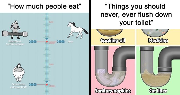
"What people eat" - first thing on the chart was a cat. That was f*cked up.
The secret to any good visual representation of info, whether it’s an infographic, guide, brochure, poster, or the unholy unity of all of the above, is clarity. You want to find the golden balance between giving your audience all the information that they need without overwhelming them or losing their attention.
Your infographics have to be as brief as possible without losing important data, and that means using the visuals to reflect a part of that info in an intuitive, accessible manner. However, what seems clear to you might be confusing to the regular Joe or Jill on the street.
So before you go order a thousand printed copies of your infographic, show it to some people: your friends, your colleagues, your family parrot even. Get some honest feedback about what works and what doesn’t. Do some editing and proofreading. Don’t be afraid to go back to the drawing table! Though try to avoid the massive trap that is perfectionism, too. Aim for creating a great infographic, not a ‘perfect’ one.
No wonder there's this rumor among Germans that the US almost had German as its primary official language.
Colored cars have all but disappeared! I googled the reason and it was basically "they don't sell." I miss color on the road!!
Which of these infographics did you find the most interesting and intriguing, dear Pandas? Which ones stood out to you the most from a purely visual perspective? What kinds of infographics would you love to see in the future? Share your thoughts in the comments.
I doubt anyone in Europe eats dinner that early. Source: I'm European, nobody here eats dinner in the morning.
It's pretty bold to claim that humans have domesticated cats. Everyone knows that the cat decided to become domesticated because people are useful.
This is really out of date. Total for COVID-19 is about 7 million at this point. Not 4700. Also it's still ongoing.
Of course. Everyone knows that it's nicer to cry in your own car than in a bus.
If it’s this simple… why isn’t this done on a much larger scale…
Regular matter is so little compared to the dark matter and energy out there. We don’t even know what dark matter really is. It doesn’t interact with light at all (hence the nme dark) but we can see its effects on the galaxies around us
Wonder if they have any more croissant ones up their sleeve, or if three is enough.
Not any more. Musk is out of the #1 spot and Arnault is in his place. Musk is currently #2. Also he is number two in a human waste sense too.
By the "one drop rule" every human being on Earth is "black". Homosapiens evolved in Africa and the entire species was "black". There was never a perfect white race divorced or above the rest of the human species. That's racist BS that makes me very angry.
Saw a similar survey recently, but they put the Weather Channel at the top.
How is Grey's Anatomy more popular than Twin Peaks? Maybe I'm just getting old.
Grew up near two primary targets. I know the routine. Bend over and kiss your a** goodbye.
This is a terrible chart. It's a prime example of how to lie with statistics. The peanut-vs-truck is correct, but the next is comparing length (1D) with 3D objects, which our brains correctly scale so you end up with a lie. So yes the whale is about 1.5M times longer than a white blood cell, but the graph makes us feel the size of a whale, which weights about 1.5M x 1.5M x 1.5M times as much as a white blood cell. So we mis-estimate by 2.25 trillion times. Same with the Toblerone, yes it's the height, but you're looking at two mountains so you automatically think volume/weight. It's a classic trick that shouldn't be around anymore.
FAIL! None of these bags contain the most important thing you should always have. Socks. I never go anywhere without a spare pair of socks. Things to to heck you are going to be walking a lot and you need to take care of your feet. End of the world you need your feet.
Why are Texan blocks so small? I thought it was supposed to be all sorts of spacious and obnoxiously big houses there?
Um… no. Breastfeeding is not even close to an effective BC method.
I remember this one from 2020 when they dovked these floating hospitals to help deal with COVID-19.
This is out of date since since then Russia has sent another 100,000 into the meat grinder.
Those numbers aren't lying, the USA out produces every other country in the world and has been doing so since a guy named Drake drilled the first well over a century ago. During the most recent "fuel crisis" the USA was still EXPORTING oil. So if you are complaining about $5/g gas, I don't want to hear it.
I found it almost impossible to read the print. I understand the limitations of putting lots of statistics in a small column, but meh.
At least the "BP is anti-American" brigade can't complain about this one. It's so US-centric it's as if the rest of the world doesn't exist.
I guess... but it sure does put a spin on "Bored Panda"... because posts like these are certainly boring to the rest of the world
Load More Replies...I found it almost impossible to read the print. I understand the limitations of putting lots of statistics in a small column, but meh.
At least the "BP is anti-American" brigade can't complain about this one. It's so US-centric it's as if the rest of the world doesn't exist.
I guess... but it sure does put a spin on "Bored Panda"... because posts like these are certainly boring to the rest of the world
Load More Replies...


 No fees, cancel anytime

")


![Mythical Beasts Of Wales [oc]](https://static.boredpanda.com/blog/wp-content/uploads/2023/02/63f86978189ab_uiym36sy2nj91__700.jpg "Mythical Beasts Of Wales [oc]")


")


")


![[oc] Updated - The Most Famous Television Show Set In Every State](https://static.boredpanda.com/blog/wp-content/uploads/2023/02/63f8674ea1eb5_gj7yc9iyzxw81-png__700.jpg "[oc] Updated - The Most Famous Television Show Set In Every State")
")


")


