ADVERTISEMENT

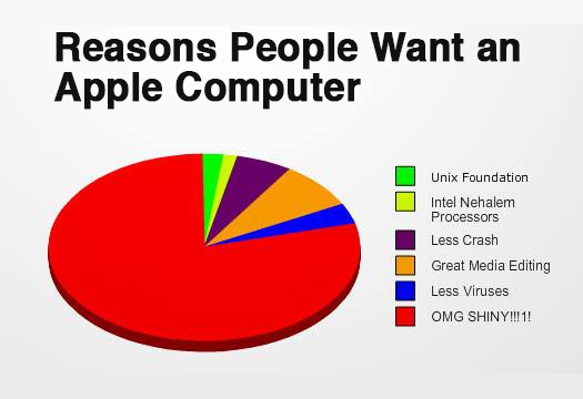
Who doesn’t love a good visual breakdown of data, neatly packaged for easy consumption? I’m talking rows, bars, tables, graphs, maps—the works. 2D, 3D, black and white, color-coded, all beautifully laid out for maximum clarity.

That’s exactly what you’ll find on r/charts—a subreddit dedicated to, well, charts. From serious and insightful to glaringly obvious and hilariously unnecessary, this place has it all. We’ve rounded up some of the best ones below. Enjoy!

#1

Hey Buddy

Venn diagram humorously comparing starting a fight, petting a dog, and consoling a child.

abbs_trakt Report

RELATED:
    #2

    Friend: "You Can't Make Genetics Easy To Understand In Just One Image". Me:

    Gummy bears arranged in a chart form, creatively summing up the world in a fun way.

    4reddityo Report

    WindySwede
    Community Member
    9 months ago Created by potrace 1.15, written by Peter Selinger 2001-2017

    Mendel should have done gummybears instead? 🙃

    View more comments
    #3

    Venn Diagram Of Strippers/Cats

    Venn diagram with humor comparing strippers and cats, highlighting their shared trait in the overlap section.

    keith2301 Report

    #4

    The Planets To Scale

    Chart showing planets to scale with different colors for each planet, illustrating interesting space facts.

    hsuboi Report

    ADVERTISEMENT
    #5

    What Do You Use Most?

    Chart comparing train, buses, and cars to transport 1,000 people efficiently.

    Gallits Report

    Kim Kermes
    Community Member
    9 months ago Created by potrace 1.15, written by Peter Selinger 2001-2017

    When busses go where and when people need to, without an hour wait for the next bus, without having to go into the city center then back out so as to reach a neighboring area, when they run late enough, they might be a viable option.

    Bob Brooce
    Community Member
    9 months ago (edited) Created by potrace 1.15, written by Peter Selinger 2001-2017

    Who's so confused that they downvoted Kim? When I travel between the Hudson Valley and Long Island I usually take the train because it fits my somewhat flexible schedule. A bus and a train could do the same thing. For most of my local travel. OTOH buses don't work well when they work at all. Buying frozen foods when I shop? There's waiting before and after shopping or I risk waiting for the next bus while stuff thaws, and then it's 1/4 mile walk home from the stop. Most of the places I want to go a bus won't get me closer than 2 to 5 miles or more. On some buses I can take a bike, but there's no bus that will let me bring my kayak.

    Load More Replies...
    Francois
    Community Member
    9 months ago Created by potrace 1.15, written by Peter Selinger 2001-2017

    But the bus and train does not go where I need to be; it takes 4x as long as with a car.

    Hiram's Friend
    Community Member
    9 months ago Created by potrace 1.15, written by Peter Selinger 2001-2017

    Light rail is particularly bad. You can always reroute a bus, but those tracks don't move easily.

    Load More Replies...
    TotallyNOTAFox
    Community Member
    9 months ago Created by potrace 1.15, written by Peter Selinger 2001-2017

    If only public transportation would be reliable enough in any way in most places...

    StumblingThroughLife
    Community Member
    9 months ago (edited) Created by potrace 1.15, written by Peter Selinger 2001-2017

    I don't have a car (don't really need one), sometimes catch a bus (one every ten minutes), but mostly, if the time-distance is within an hour, I walk. Trains are prolific in the UK. The network is massive. Sadly, the UK trains are incredibly expensive due to our Govt selling them off to private concerns (not the tracks, though, WE still have to pay for their maintenance!), and the bus services, which aren't cheap. Thatcher sold off around 90%+ of our public services, the absolute ghoul. Europe's public transport network is also massive, but theirs is publicly owned. I often think about moving over there, tbh.)

    Floeckchen
    Community Member
    9 months ago Created by potrace 1.15, written by Peter Selinger 2001-2017

    It is sad that most people in the comments seem to never have experienced a good running public transport. Our city has bus routes on dedicated tracks and some of the routes depart every 2 to 3 minutes at rush hours. If less cars would clutter the cities the busses would have an easier time to pass through traffic. But sadly many cities especially on the american continent sacrificed their infrastructure to car dependency. If no one uses public transport the situation remains dire, and because the situation is so bad no one uses public transport.

    Say No to Downvoting
    Community Member
    9 months ago Created by potrace 1.15, written by Peter Selinger 2001-2017

    I live a less than 10 minute drive from my work place. If I caught a bus it will take me more than 90 minutes. And doesn’t go past my kids school so I can drop them off on the way. I would LOVE to save the environment with a bus but unfortunately my local government can’t draw straight lines.

    Certainly not Dan
    Community Member
    9 months ago Created by potrace 1.15, written by Peter Selinger 2001-2017

    Walk? Or cycle? There are other options for such a short distance. Understand that the infrastructure might not be there for you to do so safely. In walk my son to school and then cycle to work. It takes 20 mins in the car, 30 min cycling

    Load More Replies...
    Jack Smith
    Community Member
    9 months ago Created by potrace 1.15, written by Peter Selinger 2001-2017

    A lot of valid complaints about public transportation. In Anaheim Ca. the busses are expensive and only run frequently on a few routes during specific times. But cars aren't very practical either due to the obscene traffic (I could actually walk faster than the 91 freeway moves most of the day), not to mention all the pollution. The larger the population gets (9.7 billion worldwide by 2050) the more impractical everyone owning a car becomes. My point is that we're going to have to demand public transportation solutions eventually (it's in the math) so we should probably start now.

    Cee Cee
    Community Member
    9 months ago Created by potrace 1.15, written by Peter Selinger 2001-2017

    Gave up on buses years ago. Frequently late and not cheap. We used to have 2 services running every 20 minutes. Now it's one service running hourly.

    Kathy Brooke
    Community Member
    9 months ago Created by potrace 1.15, written by Peter Selinger 2001-2017

    And then they'll tell you they reduced the service because you didn't need it.

    Load More Replies...
    Joe Bloe
    Community Member
    9 months ago Created by potrace 1.15, written by Peter Selinger 2001-2017

    66 persons per bus?? 250 in each train cars?

    WindySwede
    Community Member
    9 months ago Created by potrace 1.15, written by Peter Selinger 2001-2017

    I would say busses here holds up to 50 - 60 persons, for bosses on longer trips. In cities I'm guessing it's less. But train cars here hold up to 76 on the largest of the long distance version for SJ.

    Load More Replies...
    Kira Okah
    Community Member
    9 months ago Created by potrace 1.15, written by Peter Selinger 2001-2017

    To travel for work by car, it takes my dad 45 minutes in the morning and 30 minutes in the evening. Fr the same journey by public transport (in an area of the country that has a very well connected public transport network, second only to London), it would take him 7 hours in the morning (due to the first train of the day not getting him to work on time so he'd have to leave on the last train at midnight) and 2.5 hours in the evening. Oh, it's only a distance of 21 miles.

    Auntriarch
    Community Member
    9 months ago Created by potrace 1.15, written by Peter Selinger 2001-2017

    Before we had a car, Mr Auntriarch had to turn down a job 18 miles away because it would take three buses and wouldn't get him there before 11 o'clock.

    Load More Replies...
    Rich Black
    Community Member
    9 months ago Created by potrace 1.15, written by Peter Selinger 2001-2017

    Which one has people surrounding the access points, panhandling and urinating and selling d***s?

    B
    Community Member
    9 months ago Created by potrace 1.15, written by Peter Selinger 2001-2017

    We need a whole new system of transport. Maybe a few of the tech billionaires could get together with their think tanks and come up with something more useful than space rockets.

    Sandy Jones
    Community Member
    9 months ago Created by potrace 1.15, written by Peter Selinger 2001-2017

    How did they come up with 625 cars? That's 1.6 persons per car

    Mia Black
    Community Member
    9 months ago Created by potrace 1.15, written by Peter Selinger 2001-2017

    Because most people I see in cars sit there alone?! I've barely seen cars with more than one person in it, just a few with kids or craft mens crew.

    Load More Replies...
    WindySwede
    Community Member
    9 months ago Created by potrace 1.15, written by Peter Selinger 2001-2017

    On SJ3000 there are up to 76 seats. Then it would take minimum 13. But then there are other configured train cars, with only 44 sitting spots. So not applicable here. But runs on electric and are quite nice to ride.

    Bryan Wright
    Community Member
    9 months ago Created by potrace 1.15, written by Peter Selinger 2001-2017

    Or just one very flatulent person in a mall?

    Nathan Lewis
    Community Member
    9 months ago Created by potrace 1.15, written by Peter Selinger 2001-2017

    but you can fit 5 people in a car, so its 200

    Mark Schutz
    Community Member
    9 months ago Created by potrace 1.15, written by Peter Selinger 2001-2017

    In what world can 250 people fit into a single train carriage?

    Subaru645
    Community Member
    9 months ago Created by potrace 1.15, written by Peter Selinger 2001-2017

    Yelling bomb in a crowded location…?

    Pieter LeGrande
    Community Member
    9 months ago Created by potrace 1.15, written by Peter Selinger 2001-2017

    So what's the point? A decent football stadium holds 50,000 to 100,000 people, no-one is suggesting we all go live in football stadiums to save space.

    Lyone Fein
    Community Member
    9 months ago Created by potrace 1.15, written by Peter Selinger 2001-2017

    There is no public transportation where I live.

    Gardener of Weeden
    Community Member
    9 months ago Created by potrace 1.15, written by Peter Selinger 2001-2017

    To get to our (65yrold senior) grocery store - 1mile walk no sidewalks - 1 lane road. get the bus m-f 6am - 5pm and ride for 2 1/2 hrs 3- transfers ( the store is 3 miles from the house.)

    Lee451 Henderson
    Community Member
    9 months ago Created by potrace 1.15, written by Peter Selinger 2001-2017

    How do you fit 1,000 people on a four car train?

    Regina Holt
    Community Member
    9 months ago (edited) Created by potrace 1.15, written by Peter Selinger 2001-2017

    And, New York City enacted Congestion Pricing for the city. Those funds were to pay for upkeep and improvements in Public Transportation. Then the crybaby in the white house wants to cancel it, and said "long live the king"

    BeKind&Rewind
    Community Member
    9 months ago Created by potrace 1.15, written by Peter Selinger 2001-2017

    Public transport is difficult if it's not running on time.

    Rick Murray
    Community Member
    9 months ago Created by potrace 1.15, written by Peter Selinger 2001-2017

    Just try doing a weekly shop by public transport. With a trolley full of stuff, you're supposed to do what? Use the local shop instead? What local shop? That closed decades ago.

    Certainly not Dan
    Community Member
    9 months ago Created by potrace 1.15, written by Peter Selinger 2001-2017

    We get a monthly shop delivered, other bits we need I pick up on my bike. I only live 5 miles from work and a 15 min walk to the shops. Public transport is ok in my city, could be better, but it’s there.

    Load More Replies...
    BrunoVI
    Community Member
    9 months ago Created by potrace 1.15, written by Peter Selinger 2001-2017

    Hang on... since when does a train car hold 250 people?

    Cammy Mack
    Community Member
    9 months ago Created by potrace 1.15, written by Peter Selinger 2001-2017

    Having a car is freedom. Transit is fine when there's no parking at a city venue

    PenguinEmp
    Community Member
    9 months ago Created by potrace 1.15, written by Peter Selinger 2001-2017

    Five acres? I don't know what an acre is but in not America, it does not. Also us stats show that on average 3 people will take one car. So that would be about 333 cars. This stat is based on 1.5

    Ron Man
    Community Member
    9 months ago Created by potrace 1.15, written by Peter Selinger 2001-2017

    It's a common measure of land, dipshit. I would say go back to school but I think you're in 4th grade. Maybe just pay attention?

    Load More Replies...
    Arthur Waite
    Community Member
    Premium
    9 months ago Created by potrace 1.15, written by Peter Selinger 2001-2017

    My car has four usual seats, and a 'fifth' in the backseat. So a thousand people would fit into 200 cars, and some family cars will hold seven or eight comfortably. So, why 625?

    View more comments
    ADVERTISEMENT
    #7

    Literal And True

    Pie chart humor showing eaten vs. uneaten pie sections for a fun world summary.

    keith2301 Report

    WindySwede
    Community Member
    9 months ago Created by potrace 1.15, written by Peter Selinger 2001-2017

    I would like to eat 2π radians of that pie..

    View more comments
    #8

    Illustrated Chart Of Wild Mustard Evolution Via Artificial Selection For Specific Traits

    Chart showing the evolution of various vegetables from the wild mustard plant, illustrating interesting global agricultural insights.

    Heath-Relecovo Report

    Bored Sailor
    Community Member
    9 months ago Created by potrace 1.15, written by Peter Selinger 2001-2017

    And people say GMO is bad, but all of those are Genetically Modified Organisms.

    View more comments
    ADVERTISEMENT
    #9

    M**der Rates In The Us And Europe

    Map and chart comparing 2020/2019 m****r rates in the US and Europe in an interesting visual way.

    proce55or Report

    Corvus
    Community Member
    9 months ago Created by potrace 1.15, written by Peter Selinger 2001-2017

    Gee, it's almost as if people in the US have some sort of free access to guns... oh wait!

    View more comments
    ADVERTISEMENT
    #10

    Breakfast Is A Lot Of Work

    Pie chart humorously showing activities while waiting for toast, highlighting "stare at toaster," adding fun to the world.

    keith2301 Report

    Multa Nocte
    Community Member
    9 months ago Created by potrace 1.15, written by Peter Selinger 2001-2017

    Isn't staring at the toaster actually critical for it to toast?

    View more comments
    #11

    Feelings Chart

    Colorful emotion wheel chart, displaying different emotions in a visually engaging way.

    American_Manhood Report

    Kira Okah
    Community Member
    9 months ago Created by potrace 1.15, written by Peter Selinger 2001-2017

    I use this one in my writing quite a bit, useful. There is a chart that breaks it down even further out there, but my sleepy brain forgot to save it for reference and I haven't found it since.

    View more comments
    #12

    A Chart Of My Weight Loss For The Last 4 Months!

    Blue bar chart depicting weight distribution, illustrating an interesting data visualization.

    reddit.com Report

    Kim Kermes
    Community Member
    9 months ago Created by potrace 1.15, written by Peter Selinger 2001-2017

    Congratulations! Slow and steady wins the race!

    View more comments
    ADVERTISEMENT
    #13

    Gerrymandering Explained: How Elections Are Stolen By Redistricting

    Gerrymandering charts showing three ways to divide voters into districts, illustrating fairness and outcomes.

    Heath-Relecovo Report

    Verena
    Community Member
    9 months ago Created by potrace 1.15, written by Peter Selinger 2001-2017

    The US really need to dump that fixation on two parties. In a solid democracy there are 20 parties to choose from, every vote is counting directly for the result without filters, no winner-takes-it-all and a % bar that prevents a tunnel view. This results in a coalition of 2 to 3 parties in power of governing a coumtry and 3 to 4 i opposition = the sound of reason is always present.

    View more comments
    ADVERTISEMENT
    #14

    Shakespeare

    Chart depicting causes of death in Shakespeare plays, highlighting various interesting categories like stabbing and poison.

    Eboss19 Report

    #15

    Was Trying To Figure Out My Dogs Age, Found This Great Chart

    Chart converting dog age to human years based on dog size, providing an interesting visual representation.

    reddit.com Report

    justagirl
    Community Member
    9 months ago Created by potrace 1.15, written by Peter Selinger 2001-2017

    I was under the misconception it was multiply by seven.

    View more comments
    #16

    1996 Was Peak Year For Colourfulness Of Cars

    Chart showing car colors by year, illustrating trends with black and silver leading in popularity over time.

    reddit.com Report

    PhaseWitFact
    Community Member
    9 months ago Created by potrace 1.15, written by Peter Selinger 2001-2017

    Go back further, there's even more color. I'm so sick of looking at grayscale cars. No personality, just endless shades of grey. What free car colors we're offered are often blue-grey, green-grey, brown- grey. Like how many shades of boring are there???

    View more comments
    ADVERTISEMENT
    #17

    The UK's Political Sudivisions

    Venn diagram showing the relationships between the British Isles, Ireland, Great Britain, and the United Kingdom in a fun way.

    keith2301 Report

    ADVERTISEMENT
    #18

    Population Info Chart

    Chart depicting global birth and death rates, with 7 billion currently living, as an engaging way to visualize population data.

    keith2301 Report

    WindySwede
    Community Member
    9 months ago Created by potrace 1.15, written by Peter Selinger 2001-2017

    Must be old,the latest number I saw was 8.2B? Or the number I saw is wrong?

    View more comments
    #19

    Personal Space Guide

    Chart illustrating personal, social, and public spaces, depicting the world's social distance norms in a fun way.

    SupremoZanne Report

    #20

    Gun Control Laws Across The World (Blue = Permissive, Red = Restrictive)

    World map with countries in red and blue, illustrating interesting charts globally.

    Mental_Rooster4455 Report

    Wang Zhuang
    Community Member
    9 months ago Created by potrace 1.15, written by Peter Selinger 2001-2017

    So does the gray mean that in those areas, there are no gun laws at all?

    View more comments
    ADVERTISEMENT
    #21

    Venn Diagram Of States And Elements

    Venn diagram of interesting charts comparing chemical elements and US states using abbreviations.

    keith2301 Report

    ADVERTISEMENT
    #22

    Number Of Land Animals K**led For Meat In 2013

    Chart showing numbers of various land animals k****d for meat in 2013, highlighting chickens with over 61 billion.

    iboughtarock Report

    Min
    Community Member
    Premium
    9 months ago Created by potrace 1.15, written by Peter Selinger 2001-2017

    That's a lot more camelids than I would have guessed.

    View more comments
    #23

    5 Months Of Job Searching While Working Part Time

    Flowchart of job application outcomes: contacted, interviews, rejected, offers, highlighting world trends in an interesting way.

    TheGreatLeviathan17 Report

    Corvus
    Community Member
    9 months ago Created by potrace 1.15, written by Peter Selinger 2001-2017

    Clearly, you didn't go there in person and shake hands while looking them firmly in the eye, while wearing a tie. /s

    View more comments
    #24

    Which Animals Do Americans Think They Could Beat In A Fight?

    Chart showing survey results on which animals Americans think they could beat in a fight, highlighting fun global perspectives.

    YouGov_Official Report

    WindySwede
    Community Member
    9 months ago Created by potrace 1.15, written by Peter Selinger 2001-2017

    Housecat... are you kidding me! A cobra you could run from. But a cat fighting for its life will f**k you up completely!

    View more comments
    ADVERTISEMENT
    #25

    History Of Pandemics

    Chart showing world pandemics by death toll, including Black Death, Smallpox, and COVID-19, in a fun visual style.

    FillsYourNiche Report

    WindySwede
    Community Member
    9 months ago (edited) Created by potrace 1.15, written by Peter Selinger 2001-2017

    Again old data? A quick googling found they estimate the deaths from covid is 7M?

    View more comments
    ADVERTISEMENT
    #26

    World’s 25 Largest Lakes Side By Side

    Map showing interesting charts of the world's largest lakes labeled on a green landscape background.

    keith2301 Report

    Yayheterogeneity
    Community Member
    9 months ago Created by potrace 1.15, written by Peter Selinger 2001-2017

    The actual greatness of those lakes doesn't really show. There should be a scale at least...

    View more comments
    #27

    Fun With Data. If You Make A Graph With Log Scale Of Covid Cases In Belgium And UK, You Get This Piggy

    Chart showing daily COVID-19 cases per million in Belgium and UK from March to June 2021.

    old-wizz Report

    #28

    I Cataloged 2020 By The Quality Of Each Day

    Color-coded chart of 2020 tracking daily moods from great to awful, illustrating the year's events in a fun way.

    GuntherGGSchneck Report

    Edgar Rops
    Community Member
    9 months ago Created by potrace 1.15, written by Peter Selinger 2001-2017

    So, OP went on vacation in late July/early August?

    View more comments
    ADVERTISEMENT
    #29

    America's Favorite Thanksgiving Pie!

    Pie chart showing America's favorite Thanksgiving pies, highlighting pumpkin pie as the top choice at 35%.

    YouGov_Official Report

    WindySwede
    Community Member
    9 months ago Created by potrace 1.15, written by Peter Selinger 2001-2017

    In general, pecan pie, but no thanksgiving here 🤷‍♂️

    View more comments
    ADVERTISEMENT
    #30

    I Posted On R/Polls: Should Making Racist Comments Be Illegal? Here's The Breakdown Of Over 4,000 Responses

    Pie chart showing opinions on legality of racist comments. Majority (71.7%) view it as protected free speech.

    Familiar_Big3322 Report

    TotallyNOTAFox
    Community Member
    9 months ago (edited) Created by potrace 1.15, written by Peter Selinger 2001-2017

    I would agree on blue - Not for the racism, but it would get way easier for a government to label opinions they don't like racist and suppress an opposition that way. The discussion about immigration from the Middle East here in Germany is a good example, if the " true democrats" (self claimed term from politicians) run out of arguments they throw racism claims all around.

    View more comments
    #31

    Population Of Each Continent

    Population chart showing Asia at 4.6B, Africa 1.34B, Europe 747M, N. America 592M, S. America 430M, Oceania 43M.

    Im-Cancer69 Report

    TotallyNOTAFox
    Community Member
    9 months ago Created by potrace 1.15, written by Peter Selinger 2001-2017

    Makes sense that the biggest continent has the most inhabitants (Also India being there)

    View more comments
    #32

    I Have A Speech Impediment That People Often Interpret As An Accent. When People Ask Where I'm From, I Tell Them To Take A Guess. Here's The Result Of The Last Six Months Of That

    World map showing countries in different colors based on people's guesses of origin, illustrating interesting global perceptions.

    reddit.com Report

    Multa Nocte
    Community Member
    9 months ago Created by potrace 1.15, written by Peter Selinger 2001-2017

    And this person doesn't think that people from North Carolina have an accent?!?!?!?!?!

    View more comments
    ADVERTISEMENT
    #33

    The Queen's Corgis: A Family Tree

    Family tree chart of the Queen’s corgis, tracing descendants from Susan to Willow in a fun way.

    VaticanFromTheFuture Report

    ADVERTISEMENT
    #34

    How Couples Met In The USA

    Chart showing how U.S. couples met from 1995 to 2017, highlighting online and through friends as significant trends.

    rtgpodcast Report

    #35

    A Brief Timeline Of Animal Domestication

    A timeline chart showing the interesting domestication of animals around the world.

    Heath-Relecovo Report

    Srinivasan S
    Community Member
    9 months ago Created by potrace 1.15, written by Peter Selinger 2001-2017

    As an Indian I would like to see when elephants were domesticated

    View more comments
    #36

    Where Rats Live

    World map chart showing inhabited (red) and uninhabited (blue) areas.

    keith2301 Report

    Ladedah
    Community Member
    9 months ago Created by potrace 1.15, written by Peter Selinger 2001-2017

    And one random rat-less spot in the middle Canada... I have questions...

    View more comments
    ADVERTISEMENT
    #37

    Media Franchises

    Chart showing highest-grossing media franchises; Pokemon leads with $92.12 billion, highlighting interesting global trends.

    keith2301 Report

    PeepPeep the duck
    Community Member
    9 months ago Created by potrace 1.15, written by Peter Selinger 2001-2017

    I love how unpanman is ahead of Disney princesses 😂 his breadifull grace reigns supreme

    View more comments
    ADVERTISEMENT
    #38

    Your First Apartment

    Venn diagram humorously summarizing furniture choices: IKEA, cheap, well-made, looks good, parents' old stuff, milk crates.

    keith2301 Report

    roddy
    Community Member
    9 months ago Created by potrace 1.15, written by Peter Selinger 2001-2017

    You forgot "stuff I found on the sidewalk, and ""stuff from the 2nd hand store". Still have a lot of that.

    #39

    And In USA?

    Map showcasing most learned foreign languages in Europe by country.

    Gallits Report

    Yvonne Dauwalder Balsiger
    Community Member
    9 months ago Created by potrace 1.15, written by Peter Selinger 2001-2017

    Really disbelieve this for Switzerland. Apart from English, you also have to learn a different national language in school. The German speaking part is by far the biggest part and we learn French. The Italian part can choose if they want to learn German or French, I think? So, all the Spanish learners would either have to attended a special school or learn Spanish in their spare time.

    View more comments
    #40

    I Posted On R/Polls: Public Restrooms, Should They All Be Made Gender Neutral? Results Are From 5,642 Respondents

    Pie chart showing public opinion on making restrooms gender neutral: 30.4% yes, 69.6% no, from 5,642 responses.

    Familiar_Big3322 Report

    PhaseWitFact
    Community Member
    9 months ago Created by potrace 1.15, written by Peter Selinger 2001-2017

    Gender neutral bathrooms would be fine if they were single locking stalls and didn't have huge cracks in the doors to peek through.

    View more comments
    ADVERTISEMENT
    #41

    Us Elections 2024 Gender Gap

    Gender gap chart of 2024 election showing voter preferences between Harris and Trump among men, women, and ethnic groups.

    1BrokenPensieve Report

    Verena
    Community Member
    9 months ago Created by potrace 1.15, written by Peter Selinger 2001-2017

    The US really need to dump that fixation on two parties. In a solid democracy there are 20 parties to choose from, every vote is counting directly for the result without filters, no winner-takes-it-all and a % bar that prevents a tunnel view. This results in a coalition of 2 to 3 parties in power of governing a coumtry and 3 to 4 i opposition = the sound of reason is always present.

    View more comments
    ADVERTISEMENT
    #42

    First Org Chart Was Made For The New York & Erie Railroad In 1854, Not Only Is It Full Of Plant-Inspired Beauty, It Also Combines A Map Of The Physical Railroad & One Of Company Structure

    Intricate chart detailing the New York Erie Railroad's organization in a fun and visual way.

    High resolution picture.

    oddstellar Report

    Ron Man
    Community Member
    9 months ago Created by potrace 1.15, written by Peter Selinger 2001-2017

    Cool chart, but that's not the first org chart made.

    View more comments
    #43

    Random But Interesting Info Graphic. Any Surprises Here?

    Chart of official and ceremonial vehicles used by world leaders, representing 45 countries.

    reddit.com Report

    #44

    A Timeline Of Notable Amazon Acquisitions. Any Guesses What Will Be Next?

    Amazon's acquisitions chart illustrates major purchases like MGM and Whole Foods in a visually engaging way.

    reddit.com Report

    Multa Nocte
    Community Member
    9 months ago Created by potrace 1.15, written by Peter Selinger 2001-2017

    I keep hoping he will acquire a conscience.

    View more comments
    ADVERTISEMENT
    #45

    Percent Of Companies (Small, Medium And Large Firms) Run By Women In Different Regions Of The World

    Chart showing percentages of female and male top managers globally in 2016, highlighting only 20% female leadership.

    QuirkyEdge4428 Report

    ADVERTISEMENT
    #46

    World Population By Region/Country 2022

    Chart visualizing global population distribution in colorful regions, highlighting China and India as major segments.

    Brave_Isopod Report

    Wang Zhuang
    Community Member
    9 months ago Created by potrace 1.15, written by Peter Selinger 2001-2017

    India overtook China to become the world's largest populated country in 2023

    View more comments
    #47

    History Of World Civilization And How It All Comes Together, Worldwide, In One Snapshot

    World history timeline showcasing interesting charts in a colorful, layered format, detailing major empires and events.

    WestEst101 Report

    #48

    Population Of Each Country In South America

    Pie chart showing population distribution in South America, highlighting countries like Brazil, Colombia, and Argentina.

    Im-Cancer69 Report

    ADVERTISEMENT
    See Also on Bored Panda
    #49

    Racial Income Inequality In America

    Chart depicting racial wealth gap with income and net worth statistics by ethnicity.

    NovamoneyAI Report

    HardBoiledBlonde
    Community Member
    9 months ago (edited) Created by potrace 1.15, written by Peter Selinger 2001-2017

    Sad and enraging and would be more so if gender was factored.

    View more comments
    ADVERTISEMENT
    See Also on Bored Panda
    #50

    What The Female Reproduction System Needs During The Different Phases Of A Monthly Cycle

    Menstrual cycle wheel chart displaying nutrients for each phase with colorful sections.

    Outer ring is suggestions on how to fulfill those needs.

    Claireless21 Report

    #51

    I Created A Chart Of The First 100 Elements, Displaying The Temperature Ranges For Solid, Liquid And Gaseous. Then I Sorted It By "Solid"

    Chart of elements' states (solid, liquid, gaseous) at various temperatures, visualizing global data in a fun way.

    4_da_Lolz Report

    ADVERTISEMENT
    See Also on Bored Panda
    #52

    Real Wages And Output Per Production Worker In Manufacturing, Us, 1949 To 2019 From World In Data

    Chart showing U.S. manufacturing productivity and real wages indices from 1949 to 2019, highlighting global trends.

    reddit.com Report

    Ace
    Community Member
    9 months ago Created by potrace 1.15, written by Peter Selinger 2001-2017

    Shocking. Now work it back if the Billionaire CEO's earnings were redistributed among their workers.

    View more comments
    #53

    The Countries Most Active In The Trans-Atlantic Slave Trade

    Chart showing countries' involvement in the transatlantic s***e trade, highlighting Portugal and the UK as most active.

    reddit.com Report

    Lauren Wilder
    Community Member
    9 months ago Created by potrace 1.15, written by Peter Selinger 2001-2017

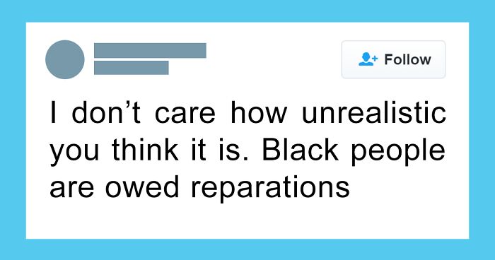
    In 1864, Black Americans were promised '40 Acres and a Mule' which included land and resources to formerly enslaved African Americans after the Civil War. It was the first major attempt to provide reparations to this population. An attempt to rectify virtually free labor for 400 years. As we all no president Andrew Johnson overturned the order and returned the land to white land owners. Effectively providing generational wealth for whites for centuries to come and cutting blacks out of their fair share.

    View more comments
    ADVERTISEMENT
    See Also on Bored Panda
    #54

    Chart Of Earths Surface Area

    Colorful chart illustrating continents and oceans; a fun way to sum up the world.

    1: Antartica 2: Europe 3: Oceania/Australia

    Im-Cancer69 Report

    Ron Man
    Community Member
    9 months ago Created by potrace 1.15, written by Peter Selinger 2001-2017

    Not going to believe a map/chart made by someone who doesn't know that it's ARCTIC and ANTARCTICA, not "Artic" and "Antartica".

    View more comments
    ADVERTISEMENT
    See Also on Bored Panda
    #55

    The Gender Ratio Of Users On Popular Dating Apps In The US

    Gender ratio chart for Hinge, Tinder, and OkCupid showing male and female percentages in 2020.

    Cat_in_the_hat113 Report

    #56

    Growth In Subscribers Of Major Music Streaming Services, 2016-2021

    Chart showing music streaming market share growth from 2016 to 2021 for Spotify, Apple Music, Amazon, and YouTube.

    giteam Report

    Susan
    Community Member
    9 months ago Created by potrace 1.15, written by Peter Selinger 2001-2017

    I wonder what this chart would look like now. I feel like Amazon would be higher now and Apple would be lower.

    View more comments
    #57

    Brand Affinity By The Generations. Ford For The Gen Z/Millennials Is A Strange One

    Infographic showing the world's beloved brands by generation. Illustrates preferences of Gen Z, Millennials, Gen X, and Baby Boomers.

    reddit.com Report

    WindySwede
    Community Member
    9 months ago Created by potrace 1.15, written by Peter Selinger 2001-2017

    The years are 10-11 years of. So don't believe you are that age when looking at the chart.. 😅

    View more comments
    ADVERTISEMENT
    See Also on Bored Panda
    #58

    Gemstone Rarity Pyramid

    Gemstone rarity chart displaying various gems like white diamond, sapphire, ruby, emerald, organized in a pyramid hierarchy.

    reddit.com Report

    ADVERTISEMENT
    See Also on Bored Panda
    #59

    Amount Of Blockbuster Stores Since 1986. (First Post, Hooray)

    Chart showing the rise and decline of Blockbuster stores from 1986 to 2019 in an interesting way.

    Specialist_Lie_6195 Report

    Divado
    Community Member
    9 months ago Created by potrace 1.15, written by Peter Selinger 2001-2017

    It was fun while it lasted. Please rewind after watching.

    #60

    Skyrocketing Food Prices

    Chart of Consumer Price Index trends for food at home from 1975 to 2022, highlighting key economic changes.

    somalley3 Report

    Carl Roberts
    Community Member
    9 months ago Created by potrace 1.15, written by Peter Selinger 2001-2017

    It's almost as if grocery stores & food companies used the pandemic as a means to increase profit. Oh wait...they did.

    View more comments
    #61

    Infographic Diagram Of The Human Eye

    Diagram of a human eye with labeled parts, showcasing an interesting chart about eye anatomy.

    Heath-Relecovo Report

    Rick Murray
    Community Member
    9 months ago Created by potrace 1.15, written by Peter Selinger 2001-2017

    Your eye has its own special immune system (because white blood cells aren't very useful in a thing that isn't full of blood) and a special immunity privilege so the body's regular immune system doesn't attack it; however severe eye trauma can put eye antibodies into the blood which will, then, get a drastic immune response: drastic as in trying to kill off the other, working, eye. It's called sympathetic ophthalmitis.

    ADVERTISEMENT
    #62

    Visualizing The Largest Producers Of Natural Gas

    Chart depicting the largest producers of natural gas, highlighting the U.S. and Russia as major contributors.

    somalley3 Report

    ADVERTISEMENT
    #63

    How Many People Are Locked Up In The United States

    Chart illustrating incarceration numbers in the United States, highlighting 2.3 million people in various facilities.

    h0lym0lar Report

    #65

    The Most And Least Livable Cities Of 2022

    Infographic of livable cities worldwide with scores and rankings, highlighting most and least livable destinations.

    somalley3 Report

    ADVERTISEMENT
    #66

    Food's Cost Per Gram Of Protein vs. Protein Density

    Chart comparing cost of protein vs. protein density for meats, legumes, nuts, and vegetables.

    James_Fortis Report

    ADVERTISEMENT
    #67

    Pie Chart Of Australian State’s Population

    Pie chart showing Australian states' population distribution, highlighting New South Wales and Victoria with vibrant colors.

    Im-Cancer69 Report

    #68

    What Age Do Baby Teeth Fall Out? Infographic From Firstgrin Via Aapd!

    Chart showing ages when baby teeth fall out, featuring fun illustrations and age labels.

    MissNeverAlone Report

    that_gay_snake
    Community Member
    9 months ago Created by potrace 1.15, written by Peter Selinger 2001-2017

    at 15, I still had half of these....

    #69

    Classic Cross-Country Road Trips

    Map of 11 classic cross-country road trips in the USA from Pacific Coast to Southern Pacific.

    keith2301 Report

    WindySwede
    Community Member
    9 months ago Created by potrace 1.15, written by Peter Selinger 2001-2017

    "Country Road ....." 🎵🎵🎵

    View more comments
    ADVERTISEMENT
    #70

    Flavor Ratio Of My Pack Of Fruit Tingles

    Colorful stacks of round candies on a wooden desk, illustrating interesting charts creatively.

    MyHarmlessSecret Report

    Mary Kelly
    Community Member
    9 months ago Created by potrace 1.15, written by Peter Selinger 2001-2017

    they are called smarties in the u.s. for ay one confused

    View more comments
    ADVERTISEMENT
    #71

    Would Be Fascinating To See This Across Other Sports/Positions

    Chart showing dementia risk in football positions; defenders at 6%, forwards 5.7%, based on research in Scotland.

    reddit.com Report

    Pernille
    Community Member
    9 months ago Created by potrace 1.15, written by Peter Selinger 2001-2017

    It's from Scotland, how many of the players were from Glasgow, and could there be other reasons for their head injuries?

    View more comments
    #72

    Interesting. 4 Victims Is The Commonly Accepted Number For A "Mass" Shooting

    Chart showing U.S. shootings by location in 2020, highlighting parties, homes, and public spaces.

    Familiar_Big3322 Report

    Verena
    Community Member
    9 months ago (edited) Created by potrace 1.15, written by Peter Selinger 2001-2017

    Schools fall under ...? Edit: I overlooked the year. Smartly chosen. Now do 2024.

    View more comments
    #73

    How Much Did Popular Cars Cost Every Year Since 1950? (Adjusted W/ Inflation)

    Chart showing car prices adjusted for inflation from 1918 to 2020, illustrating interesting data trends over the years.

    blaspheminCapn Report

    ADVERTISEMENT
    #74

    Breakdown Of Inflation By Segment

    Chart showing inflation breakdown for October 2022, highlighting various categories with notable year-over-year price changes.

    somalley3 Report

    Michael None
    Community Member
    9 months ago Created by potrace 1.15, written by Peter Selinger 2001-2017

    So bring lunch to work but make it not eggs salad and don't take a plane there.

    ADVERTISEMENT
    #75

    Global Income Distribution By World Region

    Global income distribution chart by region, showing percentages living on various income levels from under $1.90 to over $30 daily.

    LemonyLime118 Report

    #76

    Tripadvisor Reviews Of Each US Airline

    TripAdvisor chart showing US airline reviews with colored star ratings from 1 to 5.

    Sweet-Efficiency7466 Report

    #77

    Bar Chart Of How Much I Like Each Type Of Apple Sauce

    Stack of colorful yogurt cups on a kitchen counter, illustrating a fun way to understand world consumption habits.

    blarbrdorg Report

    Ace
    Community Member
    9 months ago Created by potrace 1.15, written by Peter Selinger 2001-2017

    I didn't even know there were different 'types' of apple sauce.

    View more comments
    ADVERTISEMENT
    #78

    Americans More Confident Than Brits That They Can Beat Any Animal In A Fight

    Chart comparing confidence of Americans and Britons beating animals in a fight; U.S. shows higher confidence across most categories.

    wakeupagainman Report

    Auntriarch
    Community Member
    9 months ago Created by potrace 1.15, written by Peter Selinger 2001-2017

    That's probably because we've got David Attenborough

    View more comments
    ADVERTISEMENT
    #79

    Executions vs. M*****s

    Chart illustrating the deterrence effect on murders and executions from 1979 to 2004.

    lacedemon408 Report

    Atom Bohr
    Community Member
    9 months ago Created by potrace 1.15, written by Peter Selinger 2001-2017

    Looks good as long as you don't then consider other factors such as lead exposure, parental and individual education and other socioeconomic factors. Never mind that the number of executions is graded by 10s while the number of murders is graded by 5,000s. And are they really suggesting there were essentially no executions before the 1980s, or is this range simply more convenient for the point they're trying to make?

    View more comments
    #80

    Perceived Positivity/Negativity Of Common Phrases Shown As A Frequency Distribution. Wonder How These Differ By Country

    Chart displaying positive and negative word perceptions from 0 to 10, depicting global sentiment trends visually.

    reddit.com Report

    #81

    How Do You Make A Snakebite?

    Chart showing how Brits are divided on snakebite ingredients: cider, lager, and blackcurrant combinations with percentages.

    YouGov_Official Report

    ADVERTISEMENT
    #82

    Dollar Bills In Circulation

    Chart showing US dollar bills in circulation from 2001-2021 with lines representing different denominations.

    GMapping Report

    ADVERTISEMENT
    #83

    How Much Of Spotify’s Revenue Actually Comes From Subscriptions? Answer: Almost 90%

    Chart illustrating Spotify's revenue streams, showcasing premium and ad-supported income, alongside operational costs.

    giteam Report

    Susie
    Community Member
    9 months ago Created by potrace 1.15, written by Peter Selinger 2001-2017

    Unpopular opinion (to Spotify): If one pays for Premium (ad-free), that should include podcasts.

    #84

    A Chart Of Roman Succession

    Chart visualizing historical empires and nations showcasing world evolution in a fun way, featuring Libya and Ukraine.

    ZodiacsStars Report

    Mark Wilson
    Community Member
    9 months ago Created by potrace 1.15, written by Peter Selinger 2001-2017

    I do all my charts with black type on dark blue backgrounds. Looks great!

    View more comments
    #85

    Life-Time Earnings For Various University Majors

    Chart showing projected earnings for college graduates by major, comparing different percentiles in an interesting way.

    wakeupagainman Report

    ADVERTISEMENT
    #86

    Retro Activities People Currently Still Do By Age Group

    Chart showing retro activities by age group in the U.S., highlighting interesting trends in check mailing and music listening habits.

    Square_Tea4916 Report

    Kira Okah
    Community Member
    9 months ago Created by potrace 1.15, written by Peter Selinger 2001-2017

    Printer, letters, CDs, and physical road maps here. My partner always has a physical map on them, phones can always die/lose signal, the latter especially true in the rural areas around where we live.

    View more comments
    ADVERTISEMENT
    #87

    Open Carry Gun Laws In The United States By State

    Maps showing U.S. open carry laws for handguns and long guns in various states with color-coded permissive levels.

    QuirkyEdge4428 Report

    Corvus
    Community Member
    9 months ago Created by potrace 1.15, written by Peter Selinger 2001-2017

    But the cause of school shootings is still a "mystery," isn't it? (rolls eyes)

    View more comments
    #88

    Netflix's 2022 Income Statement Visualized With A Sankey

    Chart showing Netflix's 2022 profitability breakdown with content costs exceeding half of operating revenue.

    Square_Tea4916 Report

    #89

    Ben Stiller, Owen Wilson, Vince Vaughn, And Will Ferrell Comedy Movie Venn Diagram

    Venn diagram showing movie connections of Ben Stiller, Vince Vaughn, Owen Wilson, and Will Ferrell in a fun chart.

    shnanogans Report

    ADVERTISEMENT
    #90

    Space-Time Prism

    Space-Time Prism chart illustrating time budget, activity time, and travel time, with potential path area on a city map.

    cuqedchild Report

    ADVERTISEMENT
    #91

    United States Power Outage Statistics (2000 - 2020)

    Bar chart showing weather and non-weather related power outages in the US from 2000 to 2020, for interesting charts analysis.

    stats_lover Report

    Mike F
    Community Member
    9 months ago Created by potrace 1.15, written by Peter Selinger 2001-2017

    Does a kid spilling a cup of water show up here? If not, it ought to.

    #92

    Happy September!

    Chart comparing favorite "September" songs among US age groups.

    YouGov_Official Report

    Michael Largey
    Community Member
    9 months ago Created by potrace 1.15, written by Peter Selinger 2001-2017

    "September Song" Many versions, perhaps the best by Jimmy Durante.

    View more comments