Get Premium
Dark mode theme is available exclusively for premium users. Learn more about the benefits of subscribing.
No fees, cancel anytime.

 Dark Mode Ad-Free Browsing Unlimited Content
 Ad-Free Browsing Unlimited Content Dark Mode
Join 1.2 million Panda readers who get the best art, memes, and fun stories every week!
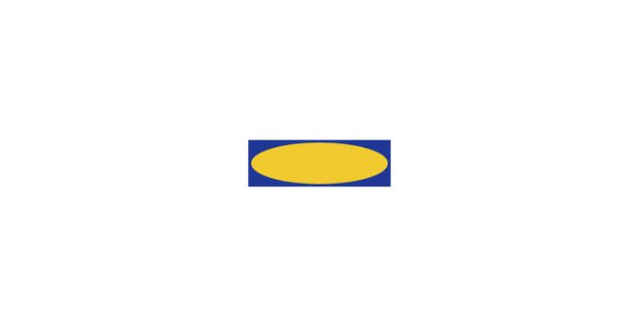
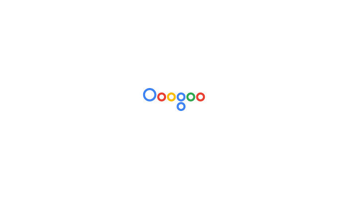
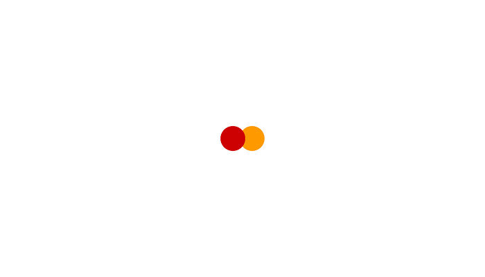
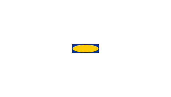
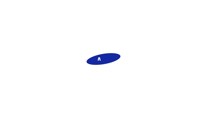
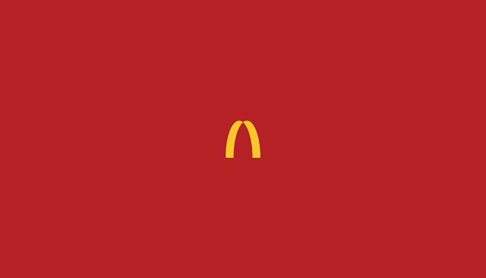
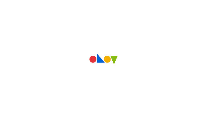
A memorable logo is one of the most crucial attributes of a successful business and Portuguese graphic designer Pedro Almeida started a personal series called “Power of Brands – Minimal Logos” just to prove it.
The 28-year-old artist strips down famous brands’ logos to basics and challenges you to try and recognize what major brand they stand for. You will be surprised how logos left with minimal shapes, outlines, and main colors are still very familiar. It goes to show how big of an impact visual communication and an effective logo have for a brand’s identity.
Can you recognize all the simplified logos? Which version do you like better? Let us know in the comments!
More info: Instagram | Facebook | pedrobrands.com | behance.net
This post may include affiliate links.

For some reason this reminds me of "I've never been to oovoo javer"

A lot of these are really good. But some of them they just took away some letters, shapes or colours. Idk. I like it though.


Sorry, but it's not for you to decide. And there wasn't word 'art' mentioned anywhere.
Load More Replies... A lot of these are really good. But some of them they just took away some letters, shapes or colours. Idk. I like it though.
Sorry, but it's not for you to decide. And there wasn't word 'art' mentioned anywhere.
Load More Replies...




















 No fees, cancel anytime