Get Premium
Dark mode theme is available exclusively for premium users. Learn more about the benefits of subscribing.
No fees, cancel anytime.

 Dark Mode Ad-Free Browsing Unlimited Content
 Ad-Free Browsing Unlimited Content Dark Mode
Join 1.2 million Panda readers who get the best art, memes, and fun stories every week!
Do you know which countries are visible on the world map? Or in which state is it illegal to carry an ice cream cone in your pocket?
If you came here looking for flawless and deeply researched maps... well, you took a wrong turn. But if you’re ready to ditch the rulebook and laugh at some beautifully chaotic cartography, you’re in for a treat.
Terrible Maps is a legend when it comes to redefining the boundaries of absurd humor. So, we’ve rounded up some of their most intentionally inaccurate maps to give you a much-needed break from a world that takes itself too seriously.
This post may include affiliate links.
According to the creator, Michael Howe, Terrible Maps was actually born out of frustration. He originally ran a social media page dedicated to amazing, beautiful maps. However, internet users constantly nitpicked minor data inaccuracies or slight border imperfections.
As a joke, he decided to give the internet exactly what it was complaining about: completely, unapologetically terrible maps. By leaning into total inaccuracy, it took the power away from the internet critics.
The page began as a social media account in 2015, and it now has over 1.7 million followers on X and about 1.3 million on Facebook. Its popularity grew so much, that the creators even came out with a full-fledged humor book.
“After posting interesting, sensible, factual maps on social media for a few years as Amazing Maps it became clear that humans inherently like to whine because every comment section was full of complaints, arguments and general negative feedback. I was struck with an idea. Why not post maps that aren’t meant to be good, that defy rational criticism, that transcend the boundaries of ‘right’ or ‘wrong’? Terrible Maps was born,” writes Michael Howe.
Around that time, my great-grandfather once flew down a flight of stairs. That should be visible on the map.
We usually think of maps as helpful tools that give us accurate facts, show us where to go, and help us make decisions. They also tell exciting stories, stir up memories, and make us think of wild adventures.
Terrible Maps subverts this by using the official, serious visual language of mapmaking such as legends, shading, and color keys to present absolute nonsense. For example, a map of train routes in Antarctica (which is completely blank) or the world depicted as a cat playing with Australia.
Research shows that funny maps “destabilize the rigid scientific basis” of geography. They offer a social commentary rather than just dry geospatial facts.
They prove that how we feel about a place — the jokes we share and the stereotypes we hold — is often a more honest reflection of our world than precise coordinates on a grid.
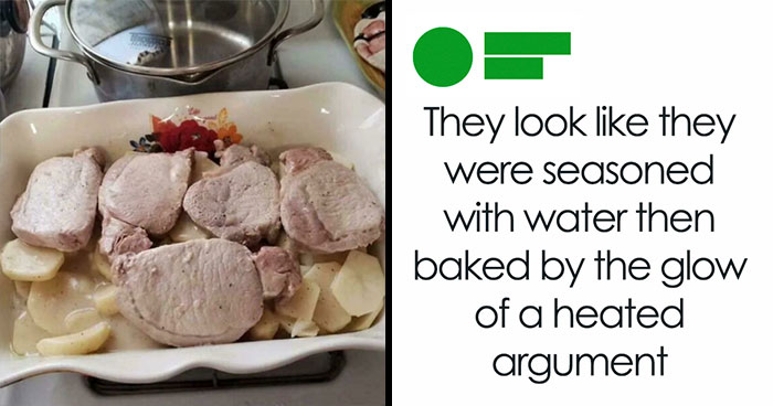
Thinking about those two "NOT APPROVED" guys from Youtube who act like the world is ending when someone uses a normal bacon for carbonara instead of some super-special Italian bacon that's only produced in one small village in south Italy from a single lineage of purebred royal pigs
Experts believe that old, funny maps, like postcard maps from the 1940s poking fun at different US states, act as historical snapshots. They show us exactly what the dominant culture, local inside jokes, and social stereotypes were at that exact moment in time.
They capture human culture in a way a boring highway map never could.
Research found that when students were handed a funny or completely ridiculous map, their critical thinking skills immediately lit up. Looking at funny maps actually trains our brains to question data and remember that all maps are constructed by people with biases.
Modern internet culture is exhausting, flooded with endless charts, data streams, and doom-scrolling. Reviewers note that these maps are a perfect “palette cleanser” for the brain. They don’t try to be smart, political, or meaningful. Instead, they offer pure, unadulterated dad-joke style silliness.
Readers of the book also point out that it makes the ultimate coffee table book because you don’t actually have to read the whole thing to enjoy it. It functions like an instant, low-stakes icebreaker — something guests can flip through for thirty seconds, laugh at, and use to spark a completely ridiculous conversation.
Let's just end this and only use bananas. We do it already on the interwebz.
Two European countries with historical horror story referencs. One being mostly fictional... and unfortunately, the other being absolutely nonfictional.
Because these maps mimic the official look of real cartography, they double as the ultimate internet bait. They regularly trigger massive, yet hilarious, controversies for one simple reason: a lot of people completely miss the satire.
Because our brains are conditioned to trust anything printed on a colorful grid, internet users constantly mistake pure nonsense for real data. When outraged users flood the page to complain or correct, the moderator’s response is usually a simple, brilliant “thank you.”
By baiting people, Terrible Maps accomplishes exactly what it sets out to do — it exposes how blindly we trust the illusion of authority on the internet.
The outraged commenters end up completely missing the joke, and in doing so, they become the joke themselves.
Geography can often feel dividing, focusing on borders, politics, and disputes. Funny maps do the exact opposite by turning it into a universal inside joke.
Whether a map is making fun of British food or American geography skills, it highlights shared human quirks. It reminds us that no matter where we live, we all share the same capacity for absurd and lighthearted humor.
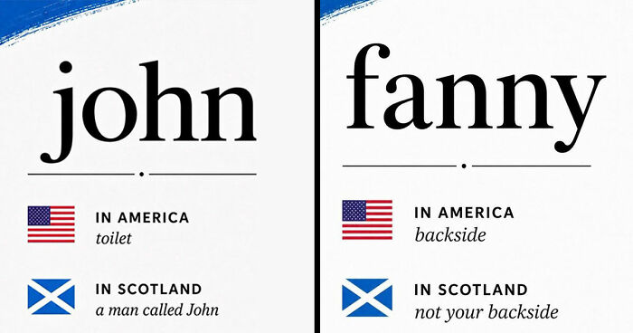
Apparently true! "This fascinating linguistic quirk dates back to the 15th and 16th centuries. Historically, Europeans were only familiar with bitter, sour oranges brought over by Arab traders. However, Portuguese maritime explorers and merchants were among the first to successfully import the delicious sweet orange from Asia into the Mediterranean." (Note that the word for "orange" in the marked countries isn't literally "Portugal", but is a different word in each language that is derived from the word "Portugal".)
4.01 limbs on average? I always knew that Germans, Finns, Danes, and Canadians were something special.
I was asked to chip in on this project but the ramifications frightened me.
I drove from Michigan to Idaho and back with three kids that claimed they didn't want to be there.
That is pretty dang accurate, especially when it comes to the latitude at which Italy is divided.
If the GOP has it's way with whitemaxxing/gerrymandering, every county will be an orange county come November... 😐
I have a longtime friend who grew up in Ohio and spent most of their life there. Can confirm Ohio's explanation/true name XD As an aside, I was born in Corn state.
And the people of Nevada and the American Southwest suffered cancer and sued the government, and still do today.
Lmao this is like a game of Yu-Gi-Oh. "I use my blockade to block your blockade! Then I set one Trap card face-down and end my turn."
And Canada looks over their shoulder, thinking about: Maybe a wall...
Yeaaaah they really pack us in here in SoCal XD Er, well, we pack ourselves in, I guess...
My part of Southern California was technically a swamp, historically. Well, a desert-y swamp, but a swamp XD
That’s just sad if true. I hate golf courses, water guzzlers they are
My ancestors go back 1663 in Quebec. Both sides so I am purlaine Quebecois
My garden has really benefited from those several inches of "no measurable rainfall".
The more northern states (like mine) typically have more hockey players.
Go to IKEA and see for yourself how good Swedish cuisine can be. Of course, they don't have Surströmming there.
Have driven IH 10 between South Central Texas and Jacksonville, FL several times as an unaccompanied woman. 100/100 do NOT recommend!
Funny, I've been to SC in the last year and found no floating mass of obese people.
I'm convinced that "New Zealand " is the High Brazil or Brigadoon of the southern hemisphere.
I'm convinced that "New Zealand " is the High Brazil or Brigadoon of the southern hemisphere.


 No fees, cancel anytime