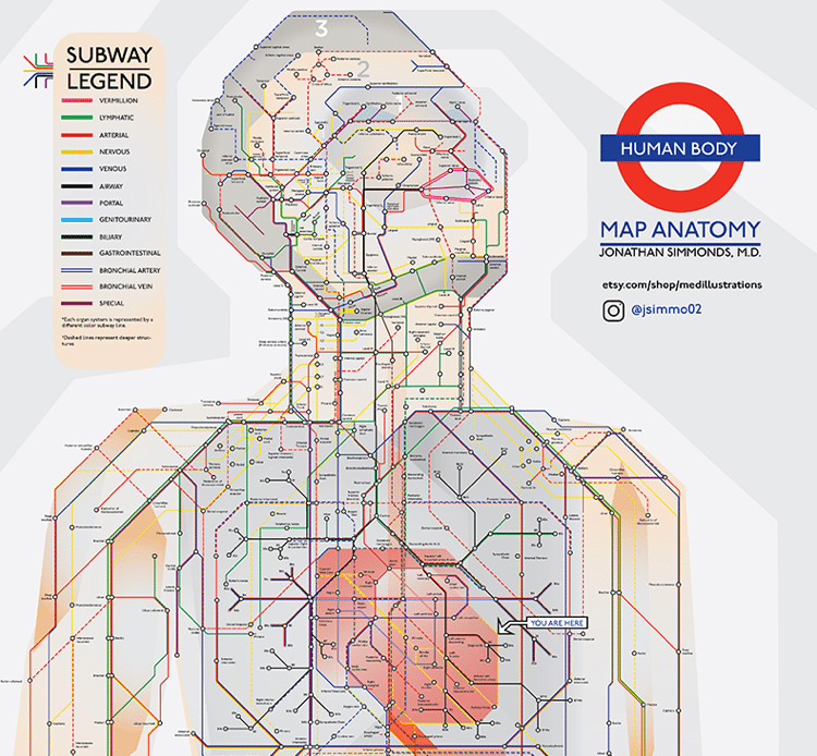
We’ve seen some creative subway maps, but nothing quite as inventive as this scientific data visualization. Created by Tufts Medical Center resident physician Jonathan Simmonds M.D., this clever subway map takes riders on a journey through the human body.
Basing his work on the traditional map of the London Underground, Simmonds has created 13 color-coded lines that move throughout the body. By synthesizing our anatomy in this clear, orderly manner it becomes easy to see how different organ systems interact. As the yellow Nervous line snakes its way up and down the body, we can see its exchanges with arteries, lymph nodes, and gastrointestinal organs.
Simmonds has also included dashed lines to represent deeper structures as well as special lines for the Bronchial Artery and Bronchial Vein. His ingenious use of the London Underground as a starting point allows medical novices to get a clear, legible view of what’s happening inside our bodies. In this way, the complexities of human anatomy—and the interconnected nature of the body—are easy to see without becoming overwhelming.
In fact, it’s incredible to “hop on” one of the lines and take it for a ride. For instance, the shorter Portal line runs through the gastrointestinal tract, gallbladder, pancreas, and spleen to the liver. Representing the portal vein, it carries 75% of the blood flowing through the river and as such, links to a vast number of other lines like the Biliary, Nervous, and Lymphatic.
More info: artistherapy.store


1
0