
Creative Communication At Its Finest, A Look At The 2025 Creative Communication Award Winners (22 Pics)
The Creative Communication Award (C2A) has announced the winners of its 2025 edition, celebrating outstanding achievements across branding, advertising, digital media, typography, photography, and more. This year brought entries from 27 countries and highlighted how creativity and communication continue to evolve in a rapidly shifting world.
An international jury of leading professionals and educators selected the winning works based on originality, craftsmanship, clarity, and the power to engage audiences in meaningful ways.
From immersive experiences and thoughtful type design to socially aware campaigns and innovative digital tools, these projects demonstrate how communication can inspire, connect, and provoke new ideas.
Scroll down to explore the Best of Best winners from the 2025 Creative Communication Award.
More info: c2award.com
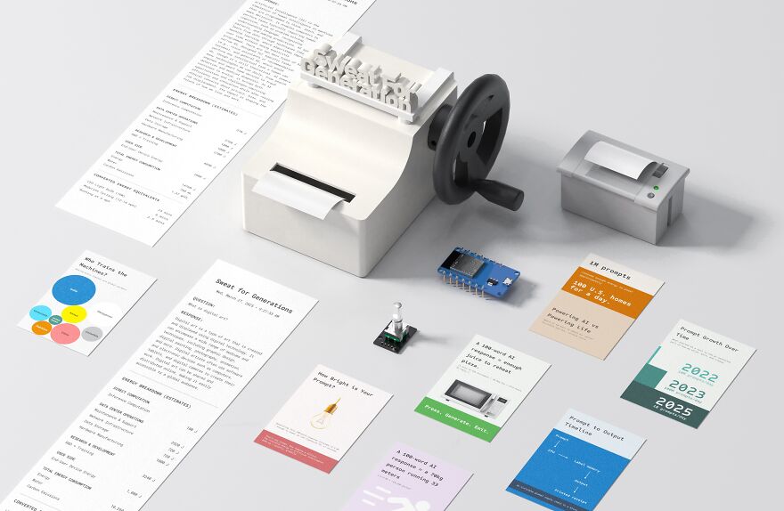
Sweat for Generation, Experiencing the Labor Unseen by Threshold Lab
This conceptual installation reveals the human cost behind easy digital interactions.
Participants must physically crank a generator to produce the energy required for a single AI query, transforming invisible power consumption into a tangible act.
By mapping bodily effort onto the energy demands of data centers, global supply chains, and mineral extraction, the work challenges viewers to reconsider the price of convenience and the impact hidden beneath clean interfaces.
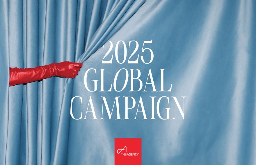
The Perfect Setting – The Agency 2025 Global Campaign
This campaign pairs people with environments that reflect who they are, capturing the idea that everyone seeks a place where they can be fully themselves.
Through vivid imagery and thoughtful storytelling, the series explores harmony between identity and setting, celebrating the moment you recognize that you have arrived at your perfect place.
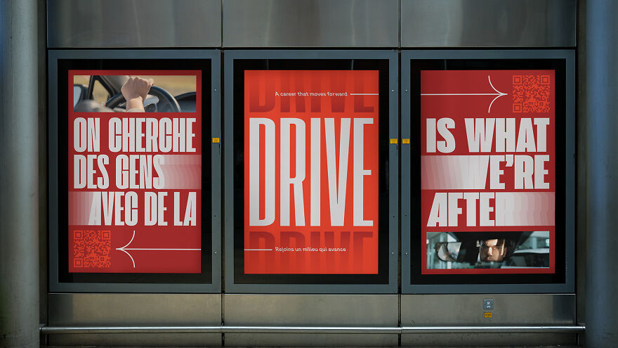
Ma carrière en concessionnaire by Récréation
A bold recruitment initiative that flips long-outdated stereotypes about dealership careers.
Developed through research and collaboration with industry leaders, the campaign declares that working in a dealership is not for everyone but is exactly right for the right person.
Striking visuals and province-wide placement helped reshape public perception and boosted interest in dealership professions across Quebec.
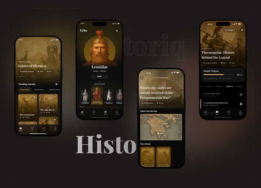
Historiq by Historia Studio
Historiq turns history learning into a vibrant, interactive journey.
With multimedia lessons, illustrated rewards, AI-driven chats with historical figures, and visually playful quizzes, the platform makes complex ideas easier to understand and more enjoyable to explore.
Learning becomes an experience filled with discovery rather than memorization.
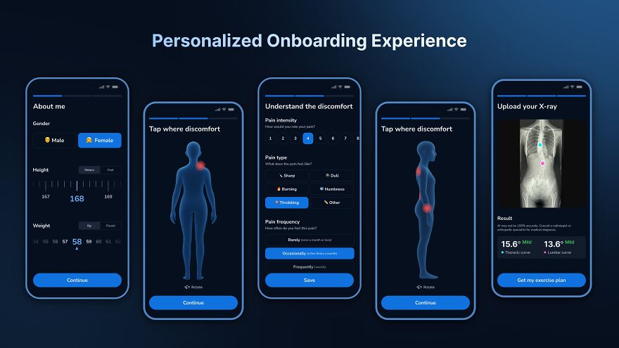
Alia, Your Virtual Physical Therapist for Scoliosis Recovery by Alia
Alia offers accessible, clinician informed scoliosis care directly from a smartphone.
Using motion tracking and AR feedback, it guides users through adaptive exercises while personalizing routines based on symptoms and progress.
For millions who lack access to specialized care, Alia brings expert-level support into the home, making rehabilitation more achievable and sustainable.
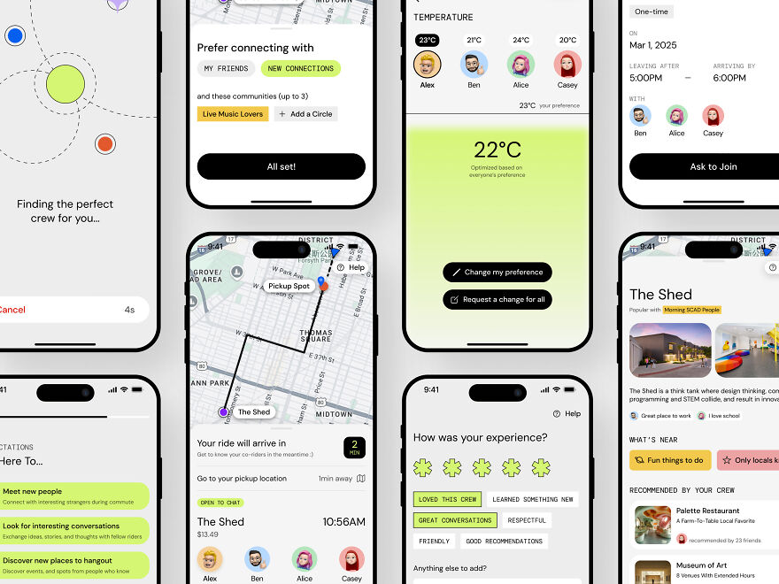
CoMove by Yifei Chen
CoMove reimagines ridesharing as a social ecosystem focused on connection rather than simple transport.
Riders are matched by shared interests and compatibility, transforming everyday trips into opportunities for conversation and community.
Interactive in-vehicle experiences and a context-aware system turn commuting into a journey centered on people, discovery, and local culture.
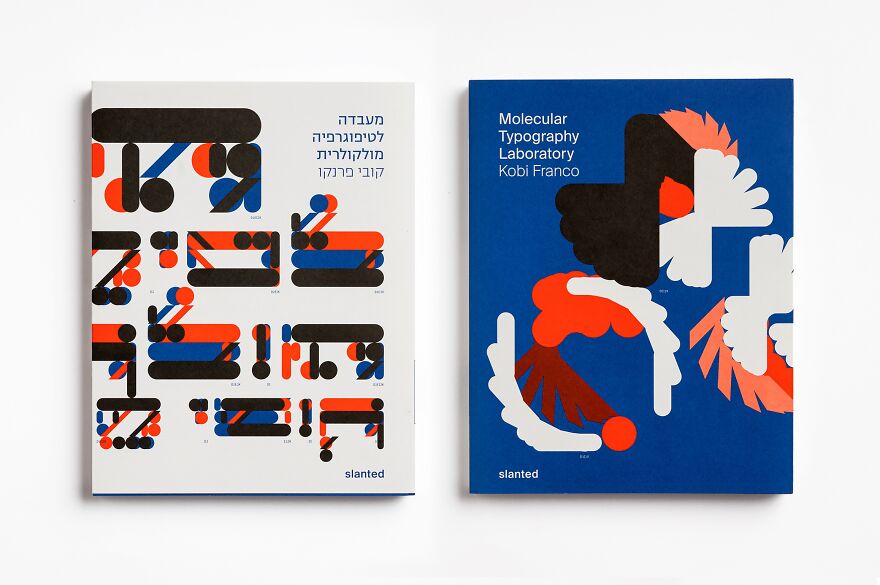
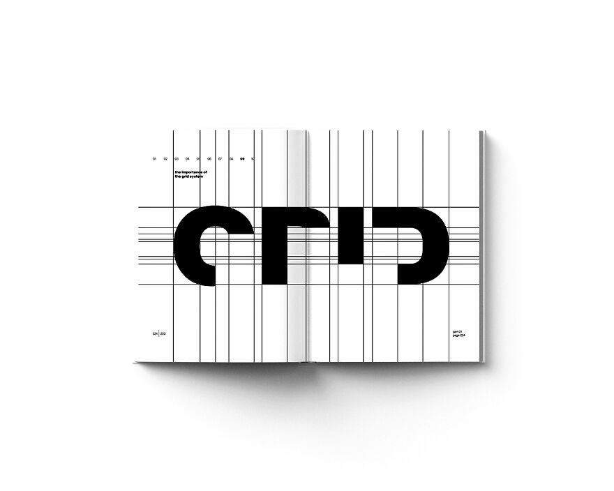
Molecular Typography Laboratory by Kobi Franco Design
A speculative research project that explores the idea of Latin and Hebrew letters having molecular structures.
This approach reframes typography as both scientific and artistic inquiry.
The project brings together design, linguistics, and cultural studies through essays and typographic experiments that question function, form, and meaning.
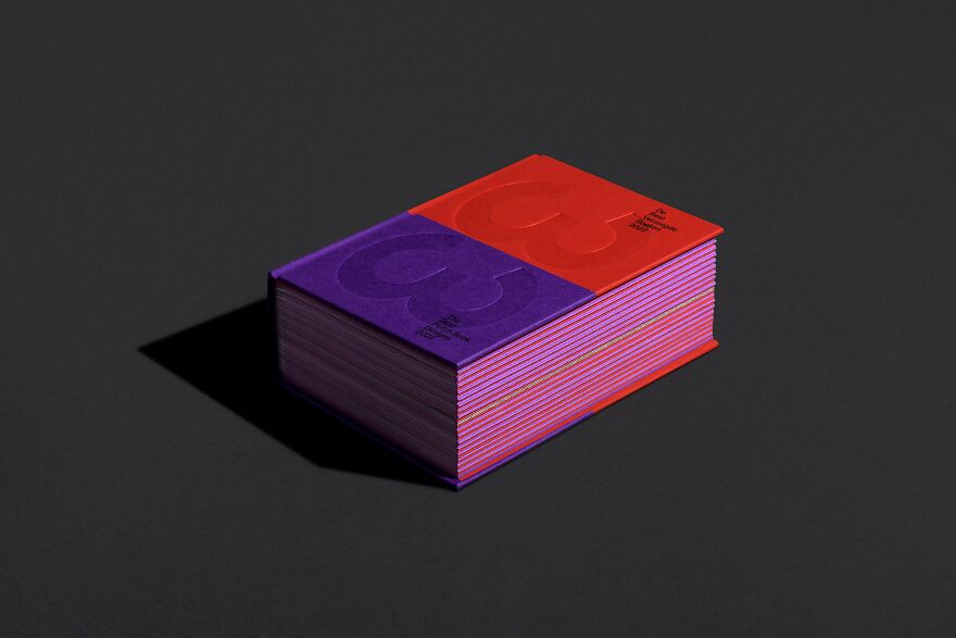
The Best Dutch Book Designs Catalog by Studio Another Day
Created as a curated exhibition in book form, this catalogue gives each of the 33 winning books its own space through a unique folding system that turns entries into small booklets.
Printed by multiple presses and crafted with varied papers, the catalogue invites tactile engagement.
A red and purple hardcover with embossing elevates the experience, while photography highlights the relationship between people and books.
Analog Kinetic Typography by Nikola Mišel Puklin
A study of how kinetic typography can exist off-screen.
By translating motion-inspired type into print, the project creates tension between stillness and implied movement.
Each chapter increases in complexity, inviting readers to interact, interpret, and explore beyond the limitations of digital animation.
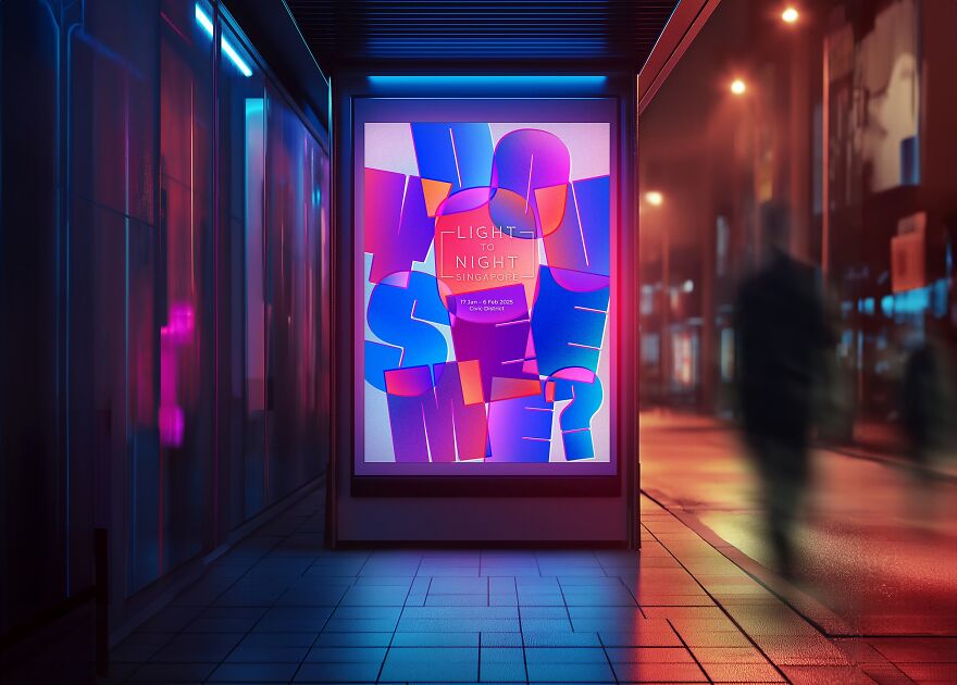
Light to Night Singapore, Do You See Me by FACTORY
The visual identity for Light to Night Singapore revolves around perception and individuality.
Overlapping typography and silhouettes encourage viewers to uncover hidden forms and discover new layers, mirroring the festival’s focus on diversity and artistic expression.
The system brings unity and curiosity to the event’s full range of programs.
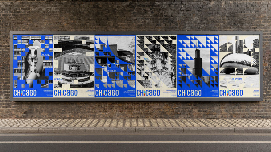
The City of Chicago Branding by Yining Xie
A reimagining of Chicago through six attributes, Grit, Innovation, Intellect, Ambition, Courage, and Loyalty, each symbolized by a landmark.
The emphasis on the letter i highlights the energy and creativity of the city’s people.
A series of TV and film posters celebrates iconic locations, connecting design with visual storytelling and the city’s cultural imprint.
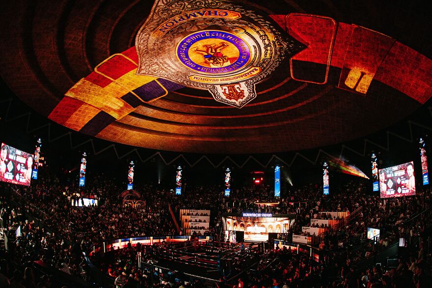
Rajadamnern Immersive Muay Thai by DecideKit
Thailand’s first full-dome projection mapping on concrete transforms the historic Muay Thai stadium into a living story.
Through motion graphics, sound, and light, audiences travel through eras of the sport.
This experience merges heritage and innovation, redefining how cultural traditions can be presented.
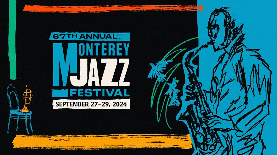
Crescendo in Blue by FINE
With a new artistic director guiding the Monterey Jazz Festival, this campaign marks a fresh chapter for the oldest continuously running jazz festival.
Vibrant visuals and bold storytelling aim to energize young audiences while honoring the festival’s legendary history.
The result is a celebration of jazz that bridges generations.
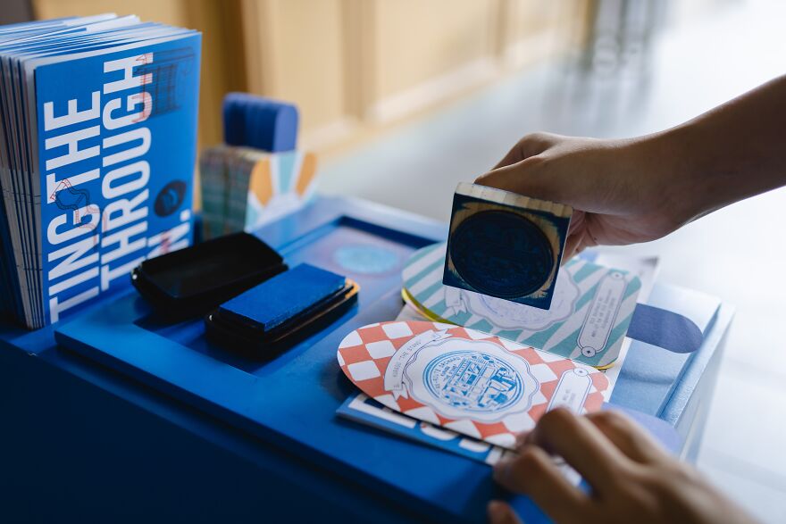
Re Route, Orchard Festival by Plus Collaboratives
This placemaking festival invited visitors to rediscover Orchard Road through interactive exhibits that revealed stories from people who live and work there.
By amplifying the area’s authentic character, the event transformed quick visits into meaningful experiences and reminded the public that familiar places can still surprise and connect.
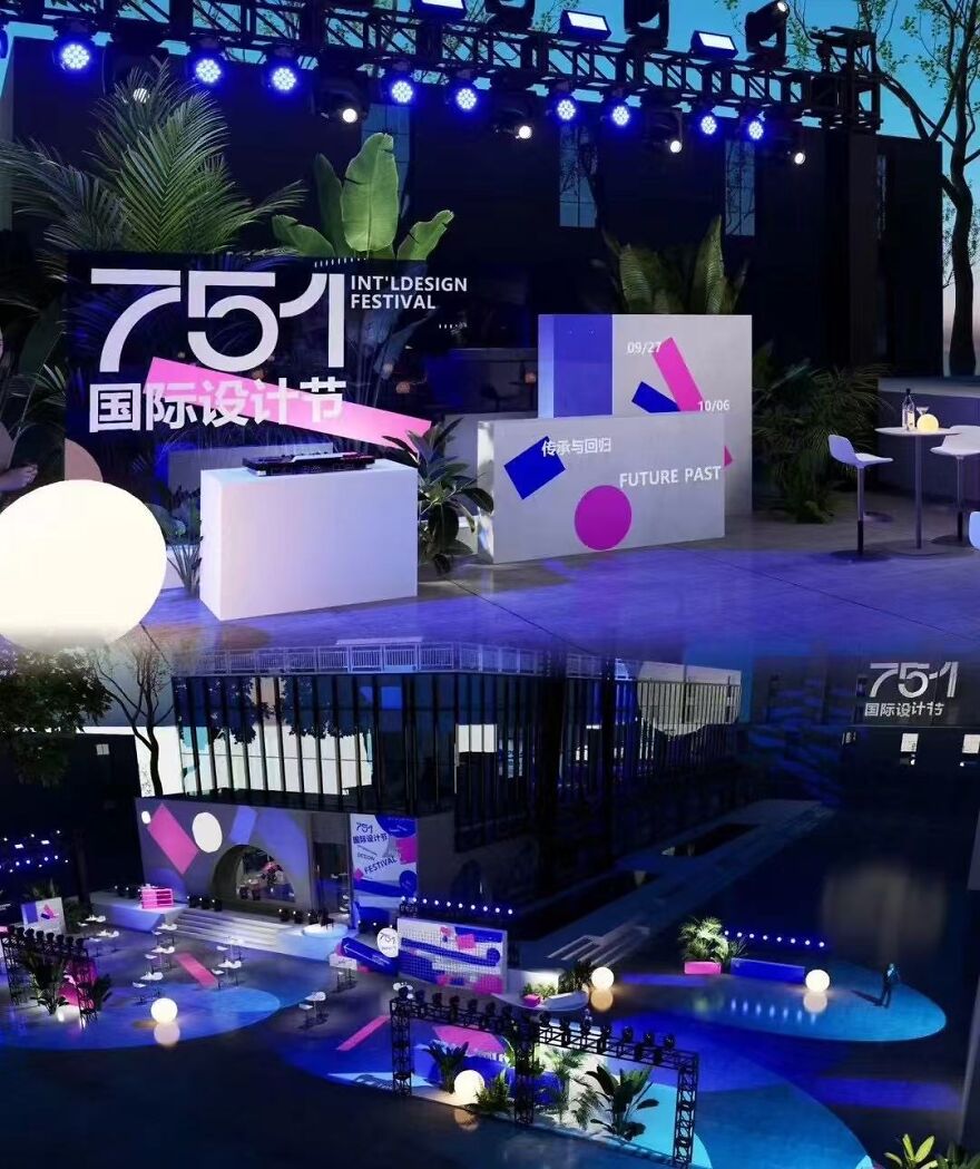
Visual Identity for 751 International Design Festival
Inspired by the theme Future and Past, the visual identity blends modular forms with vivid color and type to guide visitors through the festival’s exhibitions and events.
The system unified signage, digital displays, and printed materials, transforming the industrial venue into a lively design destination.
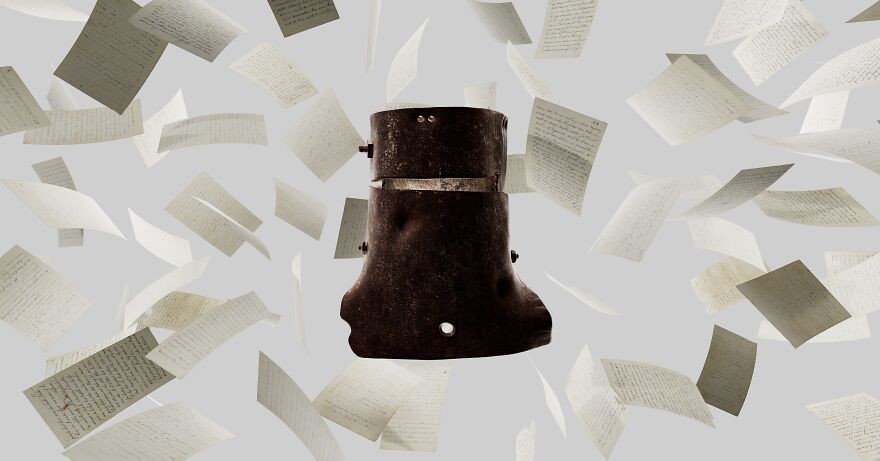
Mouthful of Dust
A cinematic web experience that pairs high-resolution 3D scans of nineteenth-century artefacts with literary storytelling.
Five Australian writers guide viewers through imaginative interpretations of the objects.
The design merges film and interactive web technology to reinvent how historical material can be explored and understood.
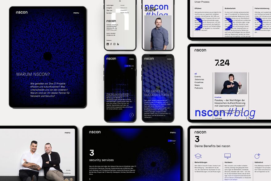
Website nscon by Jaeger and Jaeger
For this IT company’s rebrand, the website became the primary vehicle for its new identity.
Key visuals convert text into binary code orbiting in a focus ring, forming hidden messages for those able to decode them.
The result communicates expertise in automation, security, and transformation through a visually distinctive system.
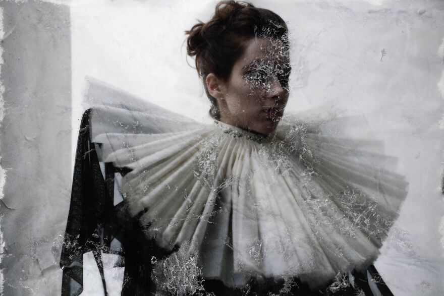
Curwen and Woodward by Cody Rasmussen
A photographic collaboration where images of wearable designs were printed on cotton paper, submerged in a water and peroxide bath, frozen, and then photographed again.
Every effect was created in camera, producing surreal, crystalline compositions that feel both sculptural and ephemeral.
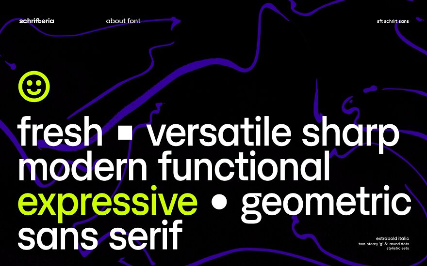
SFT Schrifted Sans by Schrifteria Foundry
A geometric sans serif inspired by Stockholm’s clean aesthetic, with generous proportions for readability and a compact version for tight layouts.
The Headline Set introduces playful curved characters that add personality without breaking cohesion.
Thoughtful detailing and versatility make the typeface suitable for branding and editorial design.
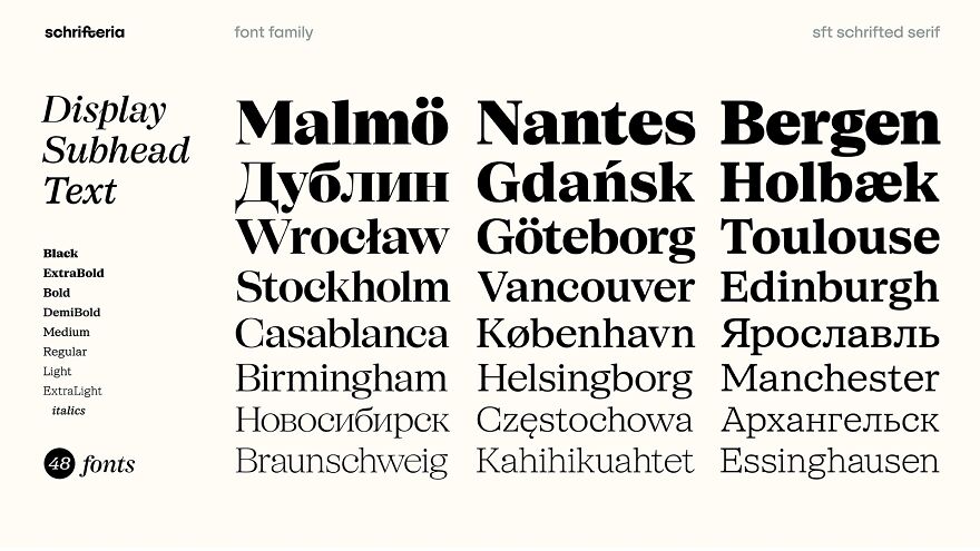
SFT Schrifted Serif by Schrifteria Foundry
The serif companion to Schrifted Sans brings soft teardrop shapes, dynamic italics, and refined contrast.
With styles for display, subhead, and text, it performs across multiple contexts while retaining its own warm, modern voice.
It complements the Schrifted family while standing strong on its own.
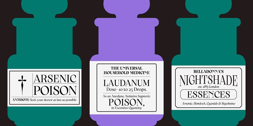
Arsenica by Zetafonts
A type superfamily inspired by early twentieth-century Italian posters and Art Nouveau details.
The collection spans Antiqua, Display, Alternate, and Text variations, offering designers 41 weights and extensive language support.
It blends historical charm with modern precision, making it suitable for expressive branding and complex editorial work.
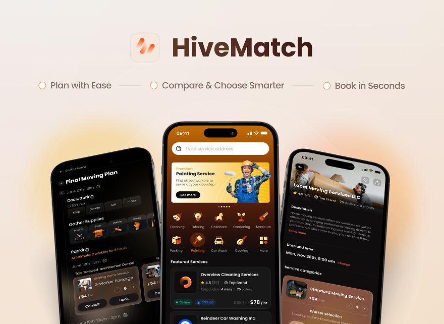
HiveMatch by Hive Collective
An AI powered gig platform that simplifies finding skilled workers.
Users share needs and preferences, and the AI agent returns a curated set of matched services.
By eliminating endless scrolling and comparison, HiveMatch saves time and increases satisfaction, offering a smoother and more personalized gig marketplace experience.

 Dark Mode

 No fees, cancel anytime














0
0