ADVERTISEMENT

With the rapid development of technology, people might easily assume that maps are gradually disappearing. However, they are still thriving in the digital age, only in a more refreshed and advanced form. Some are even transformed to keep us updated with population density or what the Earth will look like in millions of years. 

As a result, the World Wide Web is full of interesting and captivating maps that teach us something new and expand the way we see the world. Eager to share them with you, Bored Panda has collected the best ones that might make you see things from a different perspective. To find them, all you have to do is scroll down!

While you’re busy admiring them, don’t forget to check out a conversation with map enthusiast, artist, and cartographer Anton Thomas, who kindly agreed to answer some of our questions about all things maps.

#1

Occupied Bald Eagle Nests In Wisconsin. 1974 vs. 2019. Growth Credited To The Clean Water Act

Occupied Bald Eagle Nests In Wisconsin. 1974 vs. 2019. Growth Credited To The Clean Water Act

zstahowiak Report

RELATED:
    #2

    To Increase Local Tourism, Lithuania Has Made A Map With Magnets That You Can Only Find In Corresponding Cities

    To Increase Local Tourism, Lithuania Has Made A Map With Magnets That You Can Only Find In Corresponding Cities

    greycoconut Report

    #3

    This Is My Wedding Gift To My Wife

    This Is My Wedding Gift To My Wife

    We get married next Sunday. I used a woodburning kit to burn a map of all the states we have visited as a couple. We both love to travel and backpack do I want to to keep adding to it as we get older.

    Doofinx Report

    Anton Thomas’ approach to maps is one of the most unique and beautiful ones out there. The Australia-based artist hand-draws them in meticulous detail with only a pen and colored pencils. His giant map of North America took him nearly 5 years to complete and was recognized as one of the best maps of 2016 by National Geographic.

    Naturally, we were curious to know what initially sparked his interest in them. He told us, “I was born and raised in New Zealand's South Island, surrounded by beautiful landscapes. This geography influenced my love of maps. 

    The places around us were so interesting, so rich in mood, emotion, and grandeur. I would see fictional fantasy maps in books or video games, and I loved the way geography was displayed so expressively. But then I would look outside at New Zealand, and realise I was somewhere far more amazing than fantasy. And it was all real!

    ADVERTISEMENT

    From childhood, maps helped me understand reality, fall in love with the world, and instill a sense of adventure. And combining maps with illustration was a bridge between science, art, and storytelling.”

    #4

    An Image Of GPS Tracking Of Multiple Wolves In Six Different Packs Around Voyageurs National Park Shows How Much The Wolf Packs Avoid Each Other's Range

    An Image Of GPS Tracking Of Multiple Wolves In Six Different Packs Around Voyageurs National Park Shows How Much The Wolf Packs Avoid Each Other's Range

    john3806 Report

    Add photo comments
    POST
    cali-tabby-katz avatar
    LakotaWolf (she/her)
    Community Member
    1 month ago DotsCreated by potrace 1.15, written by Peter Selinger 2001-2017

    We have observed humans long enough to know that, when groups cross over, disagreements and politics happen XD

    View More Replies...
    View more commentsArrow down menu
    #5

    The Baltic Way. On 23 August 1989, Two Million People Joined Their Hands To Form A Human Chain Spanning 675.5 Km Across The Three Baltic States

    The Baltic Way. On 23 August 1989, Two Million People Joined Their Hands To Form A Human Chain Spanning 675.5 Km Across The Three Baltic States

    The protest was against the Soviet occupation, and to support the independence movements of the three States (2014).

    SteO153 Report

    What inspires his distinct method of cartography is a love for the vast planet and all the amazing places it holds. Therefore, he strives to create maps that give off the feeling of what it’s like to be at a certain location. “Maps allow you to show this at any scale, and art allows you to bring it to life,” he adds.

    Even though his maps are known for their illustrations, he’s passionate about ensuring their graphic accuracy as well. He tells us, “I want to create artistic maps that are also great educational resources. I believe art is one of the best ways to communicate science, so about 30% of my labor is pure research. When preparing a new map, I will first choose a projection - then trace that outline accurately on the drawing paper.

    ADVERTISEMENT
    #7

    Map Of Regional Rug Patterns Of Iran

    Map Of Regional Rug Patterns Of Iran

    knownothingwiseguy Report

    Add photo comments
    POST
    andrea-rusmane avatar
    OneWithRatsAndKefir
    Community Member
    1 month ago DotsCreated by potrace 1.15, written by Peter Selinger 2001-2017

    I like the bright white-ish one in the centre the most, followed the yellow one furthest to the left!

    View More Replies...
    View more commentsArrow down menu
    #8

    Hello! I Cross Stitch Earth Science Maps And Have Been Told They Belong Here. Great Lakes Bathymetry Is My Favorite So Far

    Hello! I Cross Stitch Earth Science Maps And Have Been Told They Belong Here. Great Lakes Bathymetry Is My Favorite So Far

    blondeboxshell Report

    ADVERTISEMENT
    #9

    The United States Of America: Alaskan Perspective

    The United States Of America: Alaskan Perspective

    Pariahdog119 Report

    Add photo comments
    POST
    catchat avatar
    Cat Chat
    Community Member
    1 month ago DotsCreated by potrace 1.15, written by Peter Selinger 2001-2017

    Alaskans have gotta be tired of standing in the corner. Need one for Hawaii, too.

    View More Replies...
    View more commentsArrow down menu

    Taking his ‘Wild World’ map of nature as an example (which took three years), he further shares its creation process. “I chose the Natural Earth projection, printed a high-resolution base map at the drawing size, then stapled it to the back of the art paper. I then traced all the coastlines, rivers, and mountain ranges with a light pad (a tracing tool).”

    When the framework is completed, he then goes region by region, continent by continent, researching and learning about the wildlife and physical geography of each place. “Our world is so complex, so filled with information, that a cartographer's job is often to choose what NOT to draw. What to omit. So it's helpful to have rules and conventions with each map, to help select the data and stories you wish to tell. Once you create these guidelines and filter out some of the noise, it's easier to see your creative opportunities,” Thomas says.

    ADVERTISEMENT
    #11

    My Great Grandpa Drew This Map Of Africa In The 1910’s. Thought You All Might Like It

    My Great Grandpa Drew This Map Of Africa In The 1910’s. Thought You All Might Like It

    zherper Report

    #12

    To Combat The Threat Of Desertification Of The Sahel (The Region Immediately To The South Of The Sahara)

    To Combat The Threat Of Desertification Of The Sahel (The Region Immediately To The South Of The Sahara)

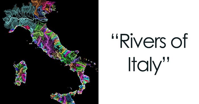
    The African Union is leading an initiative to plant the Great Green Wall, a 7,775 km (4,830 mi) belt of trees crossing the entire breadth of north Africa.

    InkyScrolls Report

    Add photo comments
    POST
    laura_ketteridge avatar
    arthbach
    Community Member
    1 month ago DotsCreated by potrace 1.15, written by Peter Selinger 2001-2017

    More information can be found at https://www.undp.org/africa/stories/great-green-wall-homegrown-solutions-accelerate-climate-action-and-development

    View More Replies...
    View more commentsArrow down menu

    We were also interested to know what he thought about the future of maps. He told us, “Maps are much more fundamental to our lives than we realise. Billions of us use map apps, daily. The entire field of health & medicine is across a map of the human anatomy. As long as there are different elements across a space that need representation, there will be maps.”

    Even in the hypothetical world where everything would be managed by AI and there would be no need for humans to create cartographies, Thomas believes that they will retain their aesthetic, historical, and storytelling value.  “We did not stop painting when the camera was invented,” he adds.

    #13

    The Earth Being Centered On Great Britain Is Arbitrary, So Here's A Map Centered On New Zealand

    The Earth Being Centered On Great Britain Is Arbitrary, So Here's A Map Centered On New Zealand

    ParadoxicalCabbage Report

    Add photo comments
    POST
    jacquibryden avatar
    LeMurierBonjour
    Community Member
    1 month ago DotsCreated by potrace 1.15, written by Peter Selinger 2001-2017

    It is arbitrary but it is also the line for Greenwich Mean Time on which longitude and World time zones are based.

    View More Replies...
    View more commentsArrow down menu
    #14

    A Map Of Finland's Bear Population, Made Up Of Bears

    A Map Of Finland's Bear Population, Made Up Of Bears

    Asmodeane Report

    #15

    Existence Of Pangaea Proven With Evidence Of Similar Fossils Across Continents

    Existence Of Pangaea Proven With Evidence Of Similar Fossils Across Continents

    No_Woodpecker259 Report

    Add photo comments
    POST
    shylabouche_1 avatar
    Bouche and Audi and Shyla, Oh My!
    Community Member
    1 month ago DotsCreated by potrace 1.15, written by Peter Selinger 2001-2017

    Now, we all know that the earth is flat, and Satan has nothing better to do with his time than hide fossils and dinosaurs and things.

    View More Replies...
    View more commentsArrow down menu
    ADVERTISEMENT

    “This has already been proven to be true,” he further explains. “Just look at the transition in recent decades: we no longer have to unfold road maps to plan a trip, running a finger along roads, trying to remember turnoffs. We simply enter an address in our phone and press Go.

    Yet the demand for wall maps has actually become stronger. Why? Because maps are not simply tools or niche curiosities, they are one of the most fundamental methods of storytelling and communication we have. We yearn for their breadth and depth and beauty. Just think: in how many art forms can you display the whole world (albeit simplified)? We love maps because they tell the story of places, and places are fundamental to who we are.”

    #16

    Tracking Of An Eagle Over A 20 Year Period

    Tracking Of An Eagle Over A 20 Year Period

    HDeo950 Report

    Add photo comments
    POST
    jiggymajiggy avatar
    African Dad
    Community Member
    1 month ago DotsCreated by potrace 1.15, written by Peter Selinger 2001-2017

    I lived in Afghanistan for a year ~ probably the eagle trying to sound interesting at a party

    View More Replies...
    View more commentsArrow down menu
    #18

    List Of Countries Mentioned Or Referred In The Bible

    List Of Countries Mentioned Or Referred In The Bible

    Erik_John09 Report

    Nowadays, with the right tools, maps can be manipulated to present any information, which makes them that much more interesting and multifunctional. The majority of the maps we see on this list are cartograms that use some statistical data, such as population, survey results, or natural phenomena, and combine it with geographical location. 

    ADVERTISEMENT

    While regular or topographical maps prioritize geographical accuracy in terms of shape, size, and location, cartograms rescale map regions to statistical data and try to maintain geographical features as far as possible. Besides, they are a powerful tool for presenting information effectively and raising awareness of important issues like substance abuse or world poverty. 

    Since they combine statistical and geographical information, they can also provide insight into patterns and trends in the world around us. Combining this with their aesthetic appeal makes them a great supplement for information in newspapers, magazines, and textbooks.

    #19

    Light Blue Is A Map As We Know It And Dark Blue Is The Actual Size Of Each Country

    Light Blue Is A Map As We Know It And Dark Blue Is The Actual Size Of Each Country

    aisbosseth Report

    #20

    When A Band Announces A World Tour

    When A Band Announces A World Tour

    esloubro Report

    #21

    No One Lives In The Green Part Of New Zealand,the Population Density There Is 0 People Per Km And That Is About 78% Of New Zealand Land

    No One Lives In The Green Part Of New Zealand,the Population Density There Is 0 People Per Km And That Is About 78% Of New Zealand Land

    Felixheifgwofbebrjwh Report

    Add photo comments
    POST
    nathbp1 avatar
    Nathaniel He/Him Cis-Het
    Community Member
    1 month ago DotsCreated by potrace 1.15, written by Peter Selinger 2001-2017

    Would not mind going to NZ but I am wary of the Orc problem they had. Has it been sorted? I dislike any racism towards Hobbits.

    View More Replies...
    View more commentsArrow down menu

    This kind of visualization has been used for many years, with the first reference to it dating back to at least 1870. The first specimen of its kind was published in 1876 by French statistician and geographer Pierre Émile Levasseur, who created a series of maps representing European countries as squares. They were sized and arranged in order according to their area, population, and even national budget. 

    He created them as teaching aids, helping children realize the size of countries and their certain characteristics. However, his technique wasn’t able to catch on, and only a few similar maps appeared in many years. The following notable development was made by Hermann Haack and Hugo Weichel, who presented election results for the German Reichstag in 1988. This time, creations alike soon emerged in the US, where they were introduced in the popular media after 1911. 

    #22

    Countries Which Offer Paid Maternity Leave And The Time They Provide For Expecting Mothers

    Countries Which Offer Paid Maternity Leave And The Time They Provide For Expecting Mothers

    No_Negotiation_7176 Report

    #23

    Concentration Of Castles In Europe

    Concentration Of Castles In Europe

    MardukSyria Report

    Add photo comments
    POST
    paulfarrington-douglas avatar
    PFD
    Community Member
    1 month ago DotsCreated by potrace 1.15, written by Peter Selinger 2001-2017

    Could do with some kind of context/ definitions here. It's usually said that Germany has the greatest number and Wales the highest concentration of castles in Europe.

    View More Replies...
    View more commentsArrow down menu
    #24

    Japan, How Big It Is In Reality?

    Japan, How Big It Is In Reality?

    c0urso Report

    The biggest challenge in producing them has always been drawing distorted shapes, which encouraged people to develop computer software to automate this process. Waldo R. Tobler invented one of the first algorithms in 1963, and since then, a wide variety of them has emerged. Before his work, cartograms were created by hand.

    #25

    Rivers Of Italy

    Rivers Of Italy

    JoeFalchetto Report

    See Also on Bored Panda
    #26

    Size Comparison Between Australia And The United States

    Size Comparison Between Australia And The United States

    AJgloe Report

    Add photo comments
    POST
    kedgley68 avatar
    K- THULU
    Community Member
    1 month ago DotsCreated by potrace 1.15, written by Peter Selinger 2001-2017

    And people in Melbourne get annoyed they're not on the map.... or Adelaide, but we don't care....

    View More Replies...
    View more commentsArrow down menu
    #27

    Wolf Distribution In Italy From 1900 To 2020

    Wolf Distribution In Italy From 1900 To 2020

    Risingmagpie Report

    While a geographical map is helpful when you want to find your way around the world, a cartogram allows us to take a closer look at the inhabitants, natural phenomena, or language of a place—a side of it we might easily miss. 

    Eager for more magnificent maps? Make sure to check out our previous publications featuring informative and unusual maps as well as maps that portray lesser-known facts about America

    #29

    After Tokyo 2020 This Map Remains The Same. All Men’s Water Polo Gold Medal Winners Since 2000 Were Born Inside This Circle

    After Tokyo 2020 This Map Remains The Same. All Men’s Water Polo Gold Medal Winners Since 2000 Were Born Inside This Circle

    ASR004 Report

    Add photo comments
    POST
    wloginw avatar
    Donkeywheel
    Community Member
    1 month ago DotsCreated by potrace 1.15, written by Peter Selinger 2001-2017

    That proves just one thing: this sport is unpopular in 99% of the world and only a few (if not one) countries really play it. The same could be done for other sports (american handegg..)

    View More Replies...
    View more commentsArrow down menu
    #30

    World Map Cantered On Antarctica

    World Map Cantered On Antarctica

    axeman_05 Report

    Add photo comments
    POST
    nathbp1 avatar
    Nathaniel He/Him Cis-Het
    Community Member
    1 month ago DotsCreated by potrace 1.15, written by Peter Selinger 2001-2017

    Don't be silly! Antarctica is a giant ice wall that surrounds our Flat Earth! Praise the Lizard overlords!

    View More Replies...
    View more commentsArrow down menu
    #31

    Each Section Has 10% Of The World's Population

    Each Section Has 10% Of The World's Population

    AppleBiryani Report

    Add photo comments
    POST
    gabriel_24 avatar
    Gabriel
    Community Member
    1 month ago DotsCreated by potrace 1.15, written by Peter Selinger 2001-2017

    For those confused, because I was for a hot minute, the smaller the sliver, the denser the population. I think?

    View More Replies...
    View more commentsArrow down menu
    #32

    The Longest Possible Train Travel In The World

    The Longest Possible Train Travel In The World

    matias90 Report

    Add photo comments
    POST
    andrea-rusmane avatar
    OneWithRatsAndKefir
    Community Member
    1 month ago DotsCreated by potrace 1.15, written by Peter Selinger 2001-2017

    I like train rides as much as anybody (maybe more), but I’d need supplies for this. Phone, laptop, comics, a teddy…

    View More Replies...
    View more commentsArrow down menu
    #33

    Cheese Map Of Europe

    Cheese Map Of Europe

    dazzledvulture Report

    Add photo comments
    POST
    grahamchapman avatar
    Graham Chapman (He/He)
    Community Member
    1 month ago DotsCreated by potrace 1.15, written by Peter Selinger 2001-2017

    They missed out, Red Leicester, Double Gloucester, Oxford blue, Cornish Yarg, Wensleydale, Black Bomber, Blue Cheese, Cheshire Cheese, Shropshire blue, from the UK and many more!

    View More Replies...
    View more commentsArrow down menu
    #34

    Where Penguins Are Found Naturally In The World

    Where Penguins Are Found Naturally In The World

    cheeseface35 Report

    Add photo comments
    POST
    nathbp1 avatar
    Nathaniel He/Him Cis-Het
    Community Member
    1 month ago DotsCreated by potrace 1.15, written by Peter Selinger 2001-2017

    Not true. There are plenty of penguins in most corner shops and supermarkets here in the UK.

    View More Replies...
    View more commentsArrow down menu
    #35

    Map Of Most Photographed Places In The World

    Map Of Most Photographed Places In The World

    the-70s-kid Report

    Add photo comments
    POST
    i-buckland16 avatar
    HI, I'M A SHOUTY MAN
    Community Member
    1 month ago DotsCreated by potrace 1.15, written by Peter Selinger 2001-2017

    I love how there's this little hotspot in the middle of Aus for Uluru! Like the rest of it is just mainly empty and then bam that's cool. My area also looks pretty hot

    View More Replies...
    View more commentsArrow down menu
    See Also on Bored Panda
    #36

    United States Elevation Map

    United States Elevation Map

    blntdfam Report

    #38

    Land Reclamation In The Netherlands

    Land Reclamation In The Netherlands

    Wrub229 Report

    #39

    Most Commonly Spoken Language In The Us After English And Spanish

    Most Commonly Spoken Language In The Us After English And Spanish

    AlpineEsel Report

    #42

    50 Percent Of Canadians Live South Of The Red Line

    50 Percent Of Canadians Live South Of The Red Line

    midlleeastcelts Report

    Add photo comments
    POST
    laura_ketteridge avatar
    arthbach
    Community Member
    1 month ago (edited) DotsCreated by potrace 1.15, written by Peter Selinger 2001-2017

    And 100% of residents in the Ireland and UK live above this line. As does every resident of continental Netherlands, Belgium, Germany, Czechia, Slovakia, Norway, Denmark, Sweden, Finland, Belarus, Latvia, Lituania, Poland, Switzerland and Austria.

    View More Replies...
    View more commentsArrow down menu
    #43

    Europe Used To Look Like This, Before It United

    Europe Used To Look Like This, Before It United

    Over9000Holland Report

    Add photo comments
    POST
    jacintafinn avatar
    I_imagine_even_worse_w***s
    Community Member
    1 month ago DotsCreated by potrace 1.15, written by Peter Selinger 2001-2017

    That heading is misleading. Its not that Europe United it's that countries were formed instead of independent regions.

    View More Replies...
    View more commentsArrow down menu
    #44

    The Topography Of The Roman Empire, Ad 117

    The Topography Of The Roman Empire, Ad 117

    boytutoy Report

    Add photo comments
    POST
    laura_ketteridge avatar
    arthbach
    Community Member
    1 month ago DotsCreated by potrace 1.15, written by Peter Selinger 2001-2017

    The little island at the top left of the map is the Isle of Man. There are no archaeological records of Romans visiting, let alone annexing the island. There's no contemporary written records showing the Romans visited either.

    View More Replies...
    View more commentsArrow down menu
    #45

    Tree Cover Map Of The Us

    Tree Cover Map Of The Us

    DrWendigo Report

    Note: this post originally had 55 images. It’s been shortened to the top 45 images based on user votes.

    See Also on Bored Panda