Get Premium
Dark mode theme is available exclusively for premium users. Learn more about the benefits of subscribing.
No fees, cancel anytime.

 Dark Mode Ad-Free Browsing Unlimited Content
 Ad-Free Browsing Unlimited Content Dark Mode
Join 1.2 million Panda readers who get the best art, memes, and fun stories every week!
We all deserve quality. Well-designed products, environments, and advertisements should be the baseline for everyone. But that’s naive. The upside of less-than-perfect design decisions—as frustrating and icky as they are—is that they create a lot of room for unintentional comedy. And they help you see what your sense of taste is like, too!
Today, we’re featuring some of the most hilariously bad design fails ever, and you have to wonder how they ever got approved. These are the things that should never have left brainstorming sessions, blueprints, and blackboard drafts!
This post may include affiliate links.

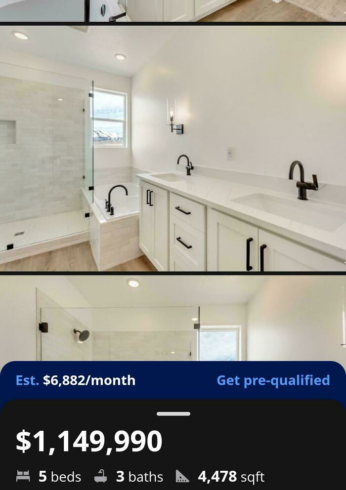
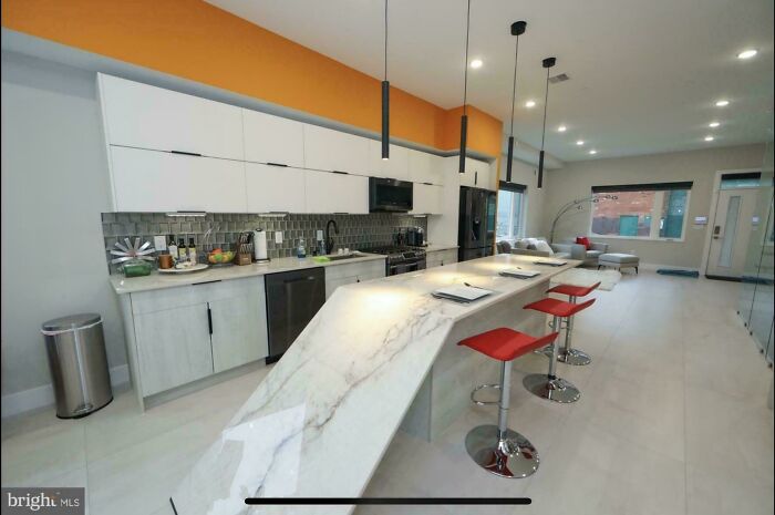
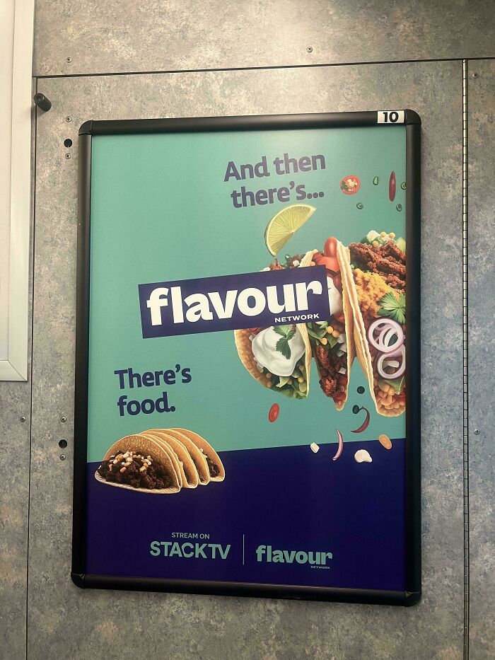
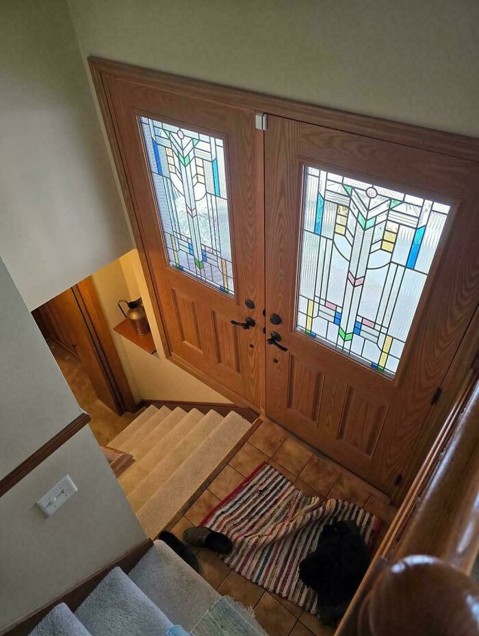
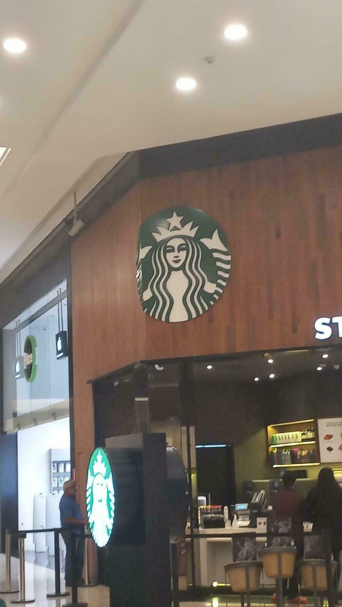
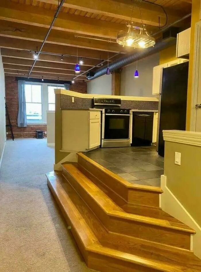
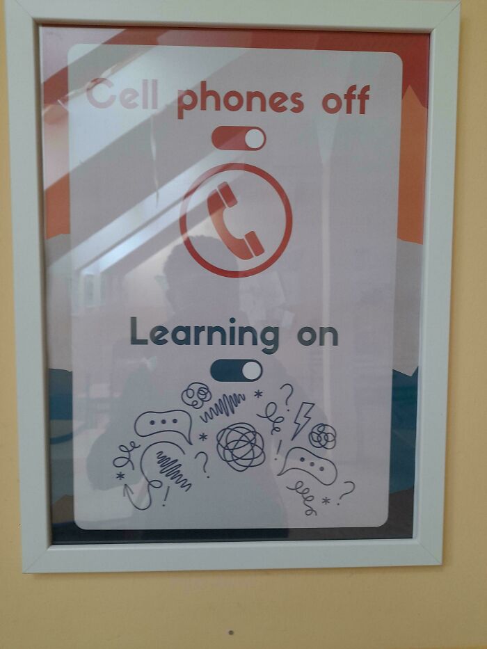
I may have been in this one at some point. Ridiculous use of space
The question of ‘good’ and ‘bad’ taste is a complex one. Often, you can intuitively tell whether something is designed well or not, even if you don’t quite have the vocabulary to explain why you think so. No matter your subjective preferences, there are objective factors that improve a product’s quality or detract from it.
Legendary designer Dieter Rams argued that good design has 10 core principles. From his perspective, good design is innovative, aesthetic, unobtrusive, honest, long-lasting, thorough to the last detail, environmentally friendly, and not overdesigned. What’s more, good design makes a product useful and understandable.

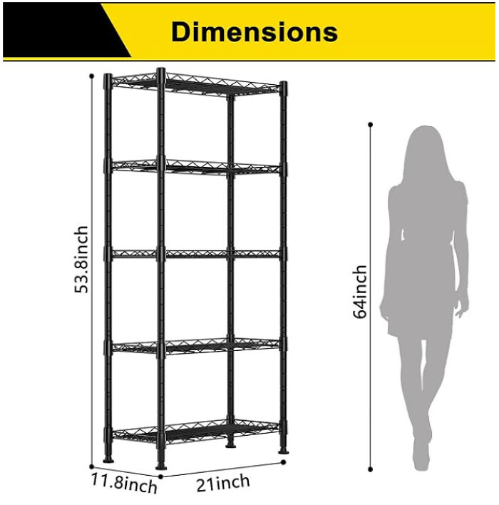
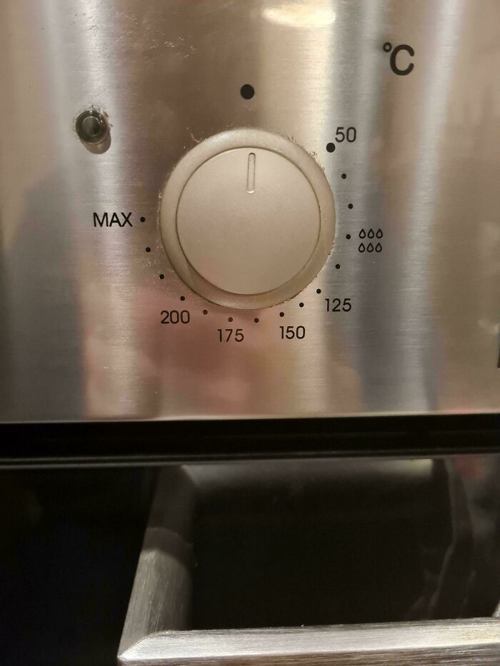
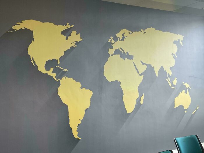
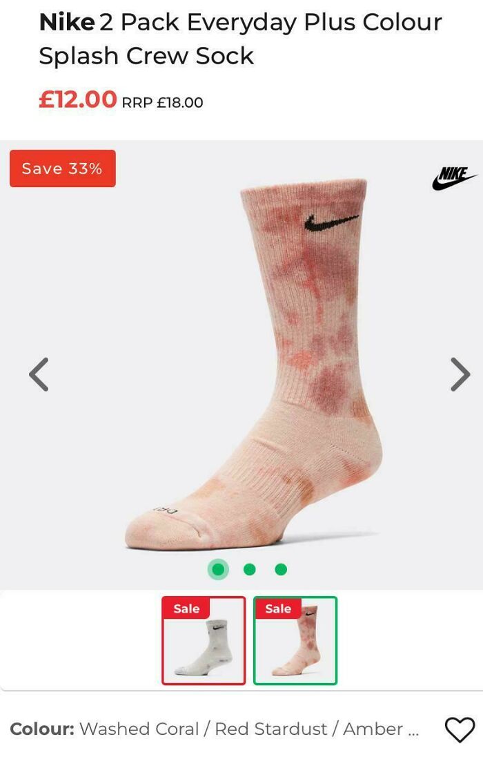
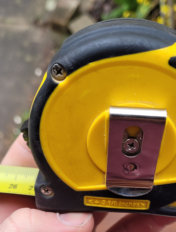
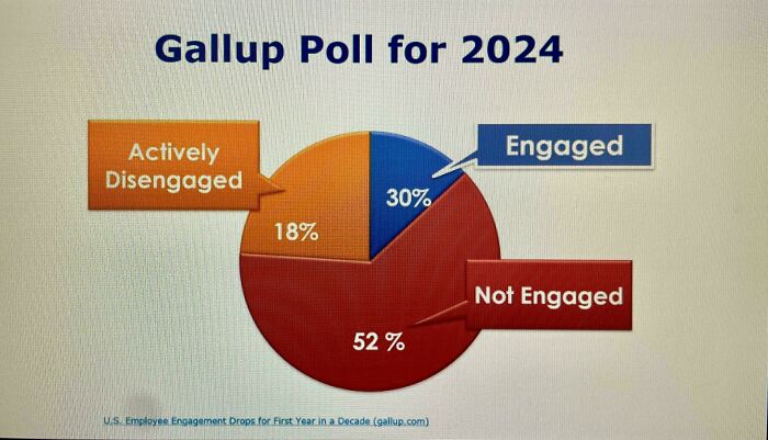
Can we have these measurements in bananas please?
According to Sterlin L. Mosley, Ph.D., a professor of human relations at the University of Oklahoma, there is no “clean answer” as to whether or not taste is objective or subjective.
From his perspective, the question itself is “malformed.” He argues that Western design’s idea of good taste “reflects cultural institutionalization, not universal truth.”
“Taste is both [objective and subjective], and the relationship between the dimensions is dialectical rather than hierarchical, always contextual, always relational, always in conversation with who is doing the designing and who or what they are designing for,” Mosley writes in a post on Psychology Today.
He emphasizes that coherence, rather than something “too variable and too culturally embedded” as beauty, should be the standard.
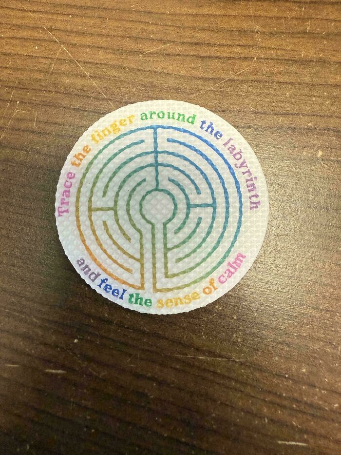
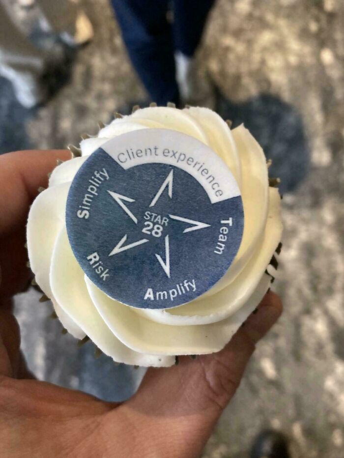
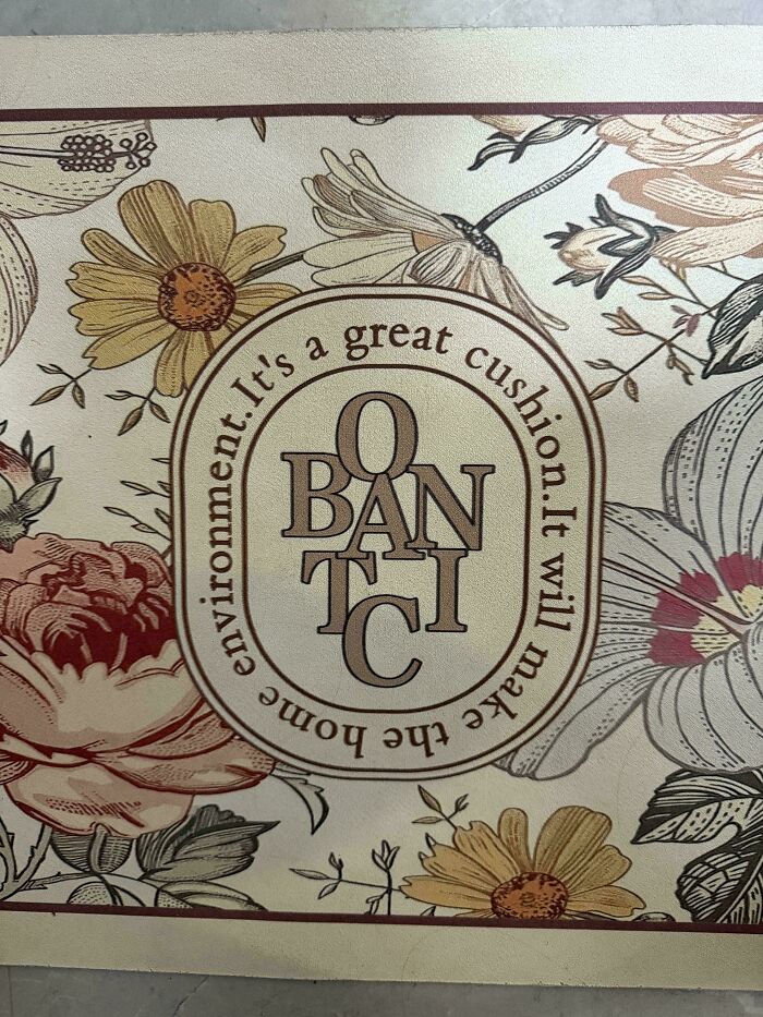
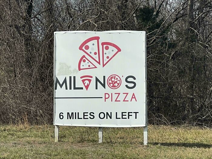
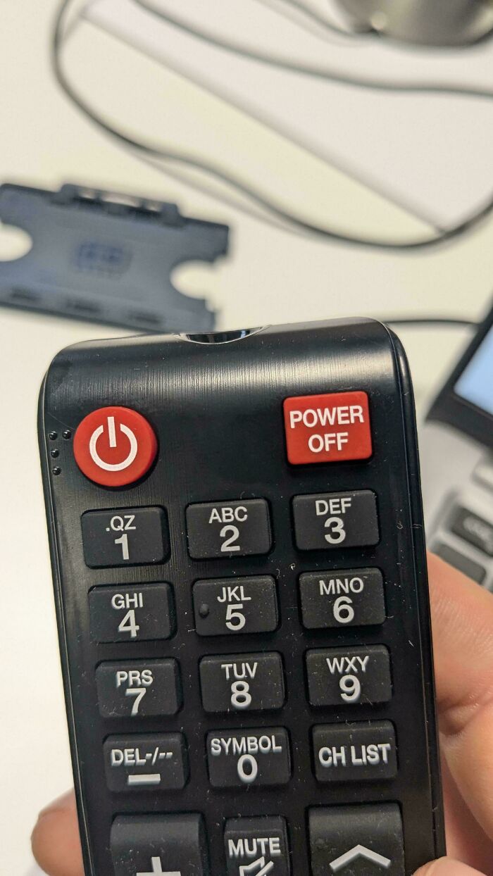
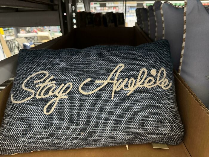
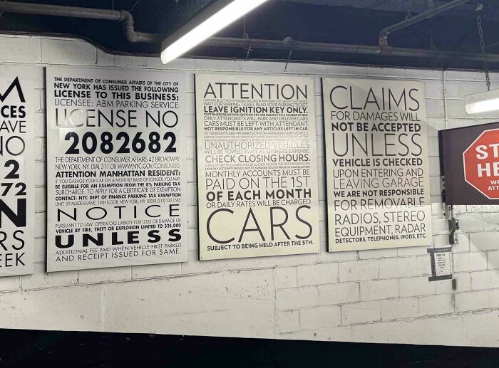
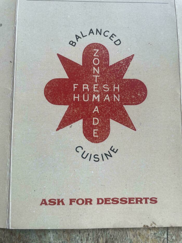
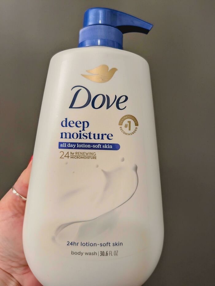
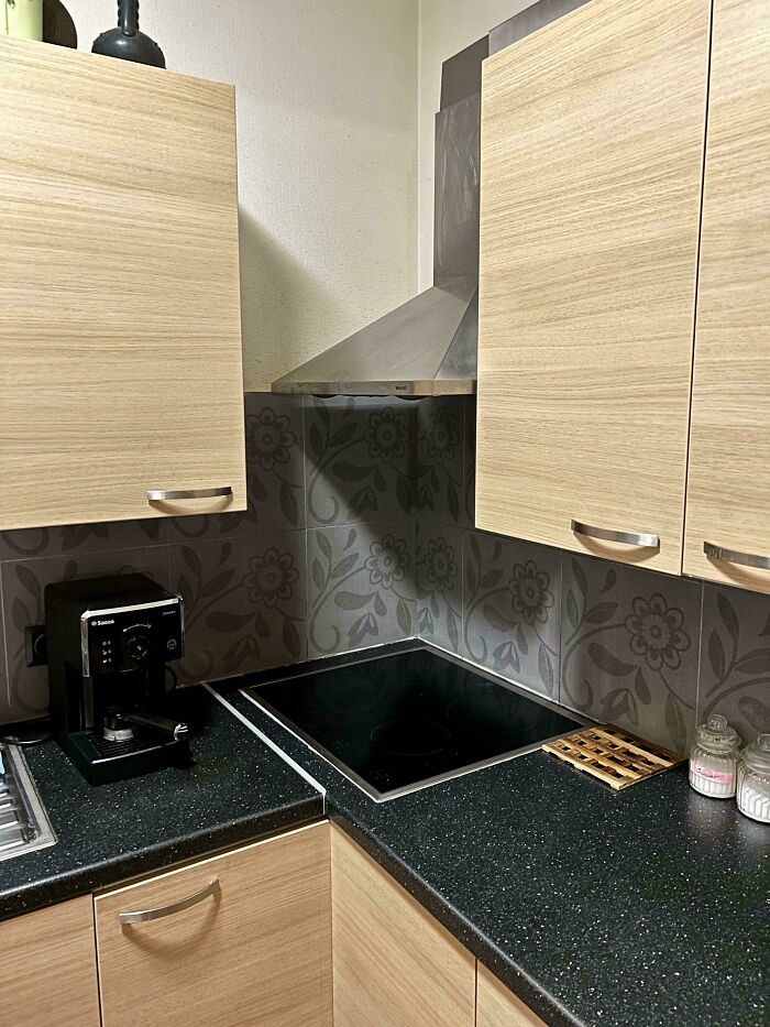
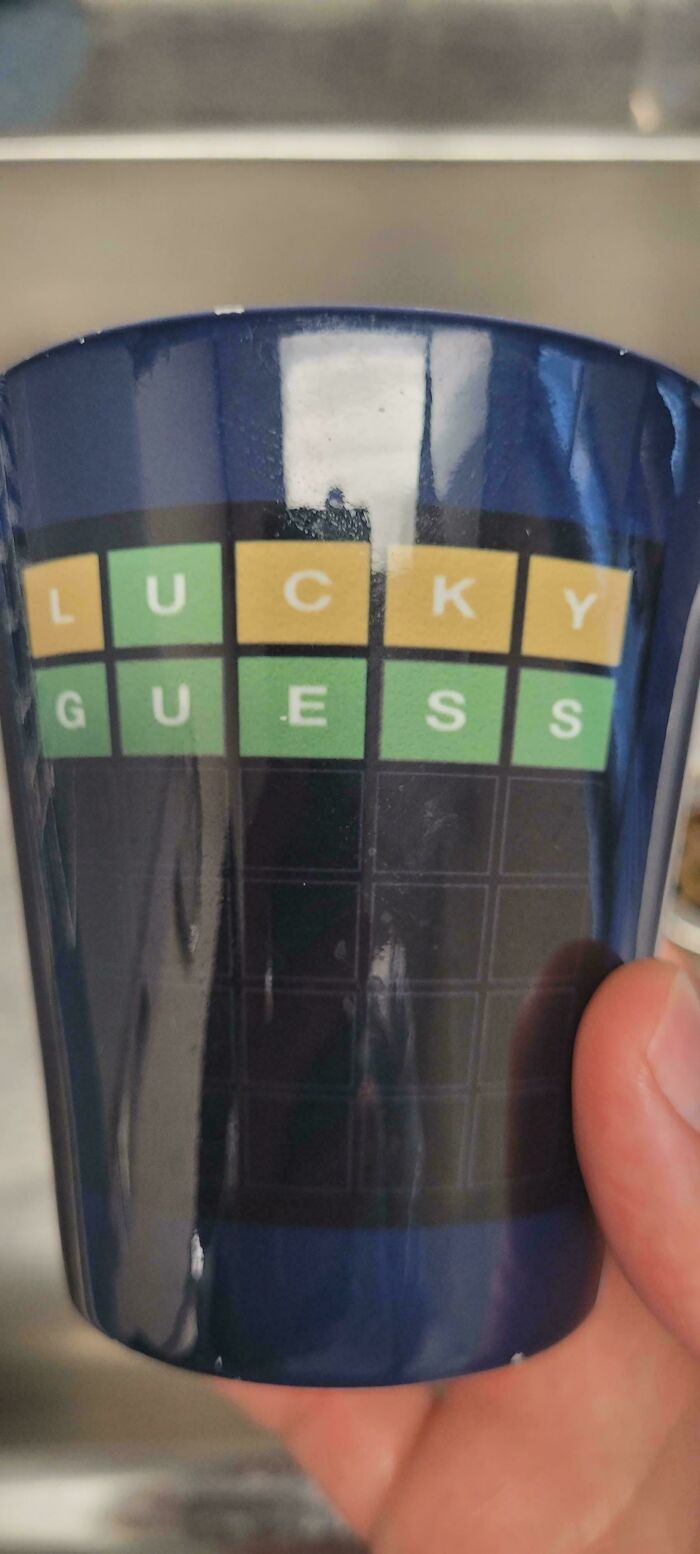
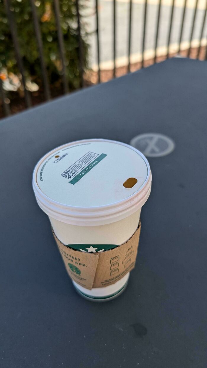
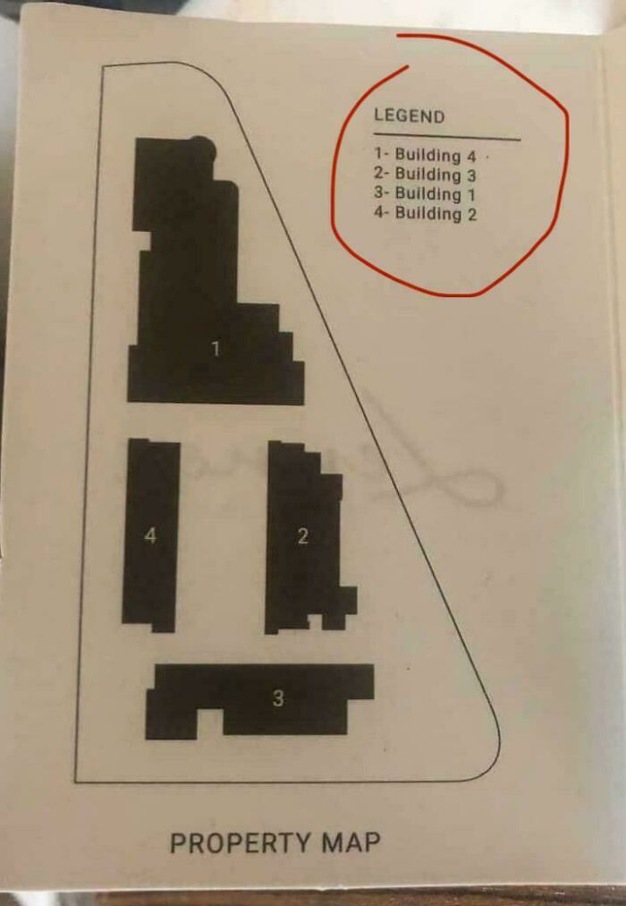
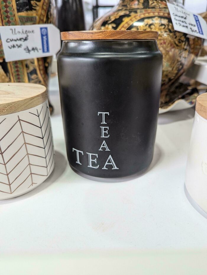
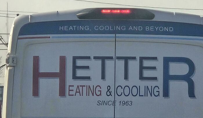
This would give me a game of hangman in my head every time I look at it. At least until I’ve come up with every combination
Mosley explains that, for him, coherence is “the degree to which a visual environment accurately externalizes the inner logic of the person or community to which it belongs.”
“It cannot be used as a bludgeon the way ‘good taste’ has historically been used, but it is also not arbitrary; most people can feel the difference between a space coherent with their inner experience and one that isn't, even when they lack the vocabulary to say why,” he states.
“That level of attunement with the self is what I mean by taste, if I mean anything precise by the word at all. Not a ranking of objects according to an inherited hierarchy of refinement, but a sensitivity, both to oneself and to the world being made, and the ongoing dialectical conversation between the two.”
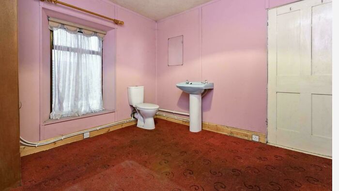
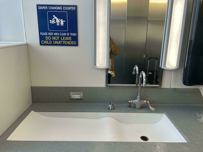
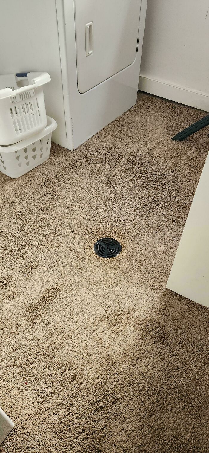
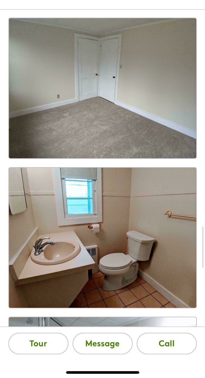
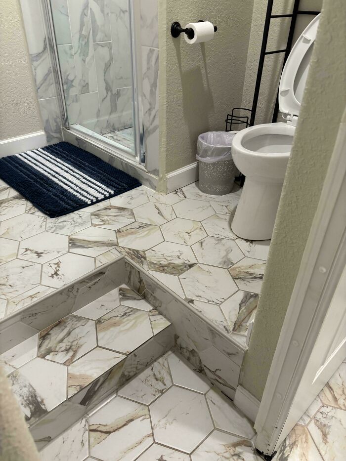
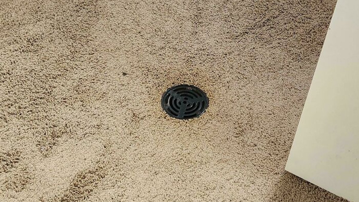
I always wanted a drain in the middle of my bathroom and in the middle of my kitchen. But I’ll be d****d if someone carpets those rooms. I’ve had family with carpets in both places and even as a kid it always gave me the ick.
Objectivity and subjectivity aside, professionals disagree about core things, such as whether you can learn and teach good taste. For some, it is a question of acquiring new ideas. For others, taste is something deeply personal, something that you’re born with.
Meanwhile, Emmanuel Platt, the director of merchandising at MoMA, explained to House Beautiful that everyone can learn taste. It is a question of studying, research, exposure, and experience.
“You learn from different people, different travels… You meet with artists, designers, manufacturers.”
On the other hand, Omar Nobil, creative director of Design Within Reach, sees things differently than Platt.
“I don’t think you can teach taste. Our job is to expose and educate people to what we think is important and to explain to them why. What they take from that is up to them and how that evolves their perspectives.”
From Nobil’s perspective, taste is individual. “If you’re lucky, you're exposed and connected to the people who will bring out the best of that.”

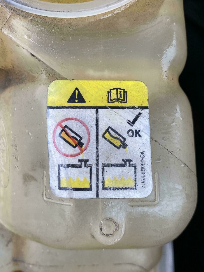
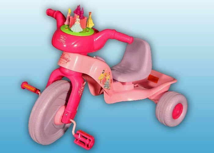
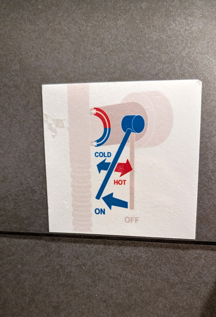
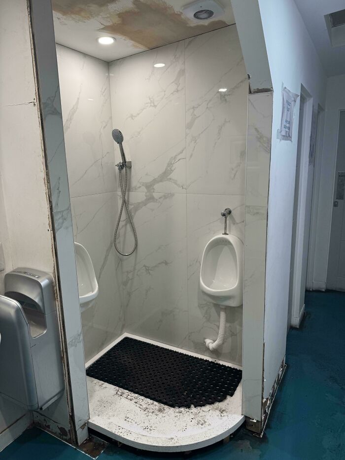
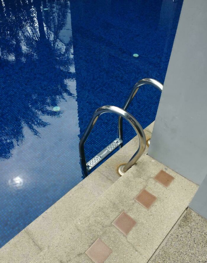
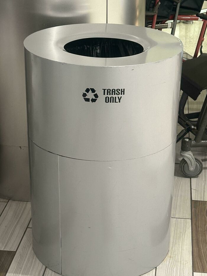
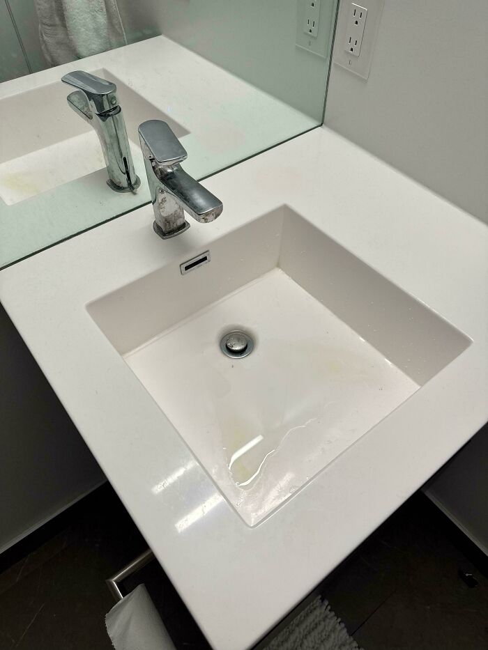
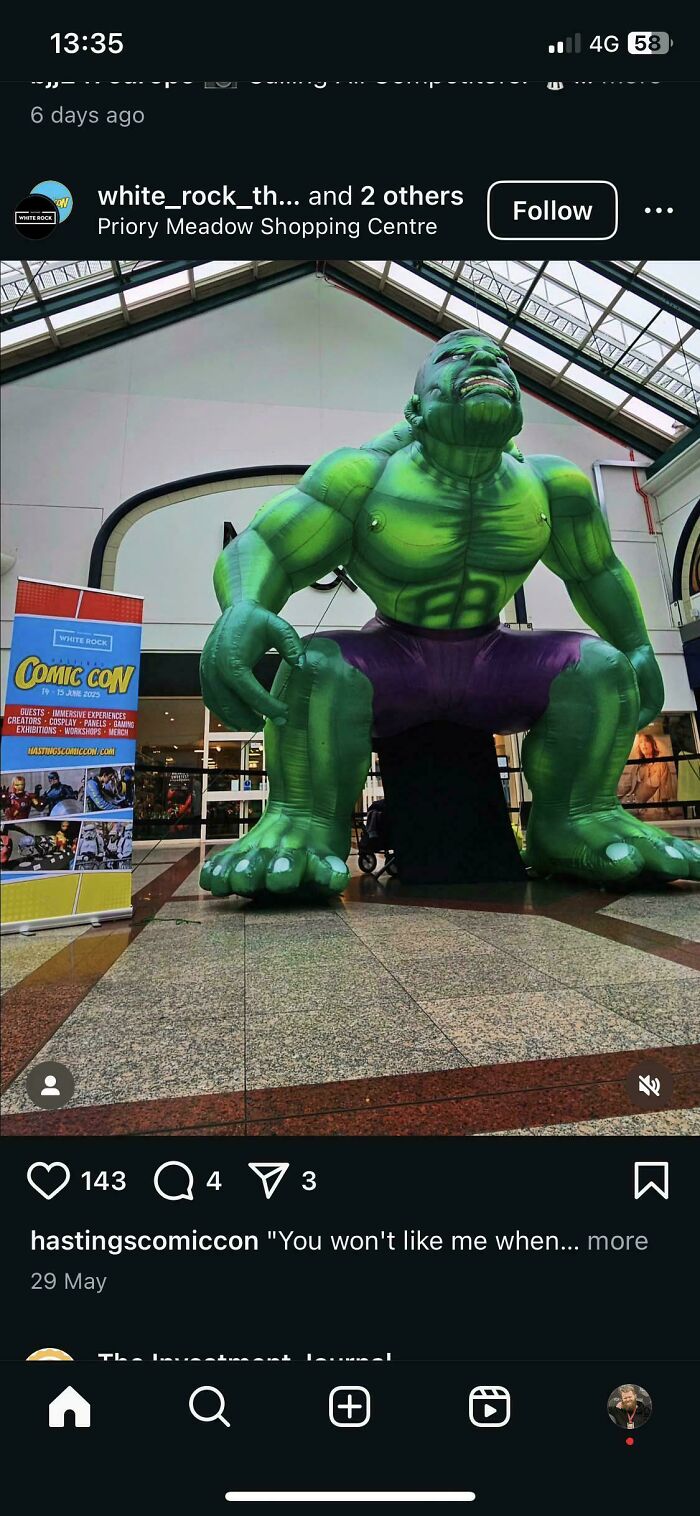
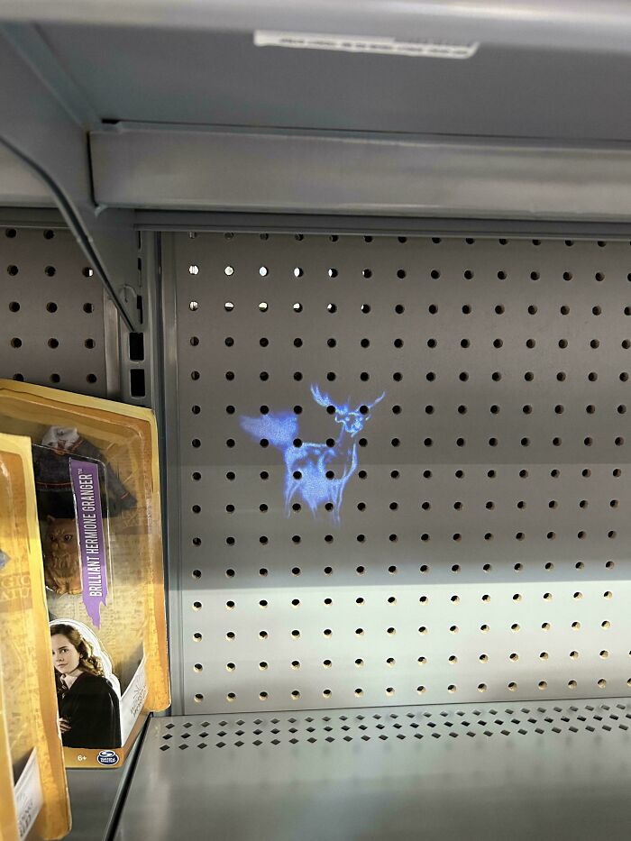
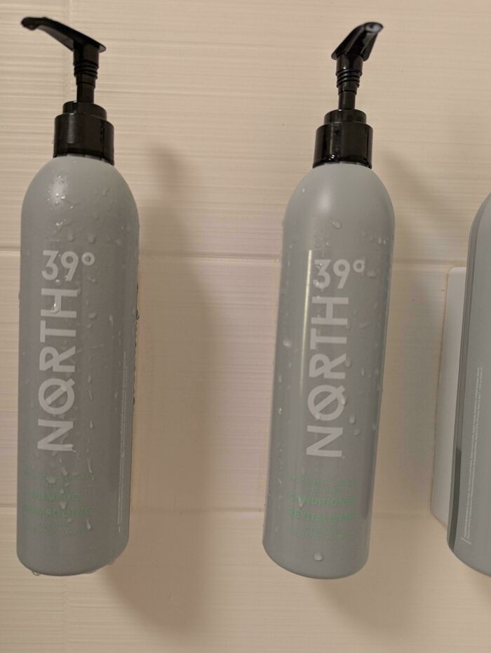
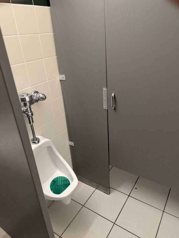
Which direction for the golden shower? (Ask for someone I didn’t vote for)
Meanwhile, interior designer Jeremiah Brent noted that taste isn’t something that you’re born with, like your genetics. For him, it is a question of being curious and imaginative, and expanding your horizons through exploration.
“The most beautiful taste is just when you see the curiosity of someone's spirit through their work or what they're gravitating towards,” Brent told House Beautiful.
The ‘[Bad] Design’ online group we’re featuring is a legend on the internet and one of the best-known communities in its niche. It was first created in 2011 and has been entertaining netizens and shaming bad designs for more than a decade and a half.
According to the moderators, not everything that feels like bad design at first glance actually belongs on the sub. For instance, amateur artwork and signs aren’t considered worthy of posting. Neither is anything that’s broken, cursive handwriting or fonts, clocks with the Roman numeral IIII instead of IV for 4, novelty items, off-brand products, satire, typos, grammar errors, or bad translations.
Previously, one of the friendly moderators who helps keep the online community running smoothly told us about the idea behind the project.
“The original motivation for the subreddit was to point out [bad] designs. Nowadays, most subscribers probably come here for entertainment. However, it is common to have meaningful discussion here on why or why not something is [bad] design,” they told Bored Panda earlier.
They stressed that the group is incredibly popular online.
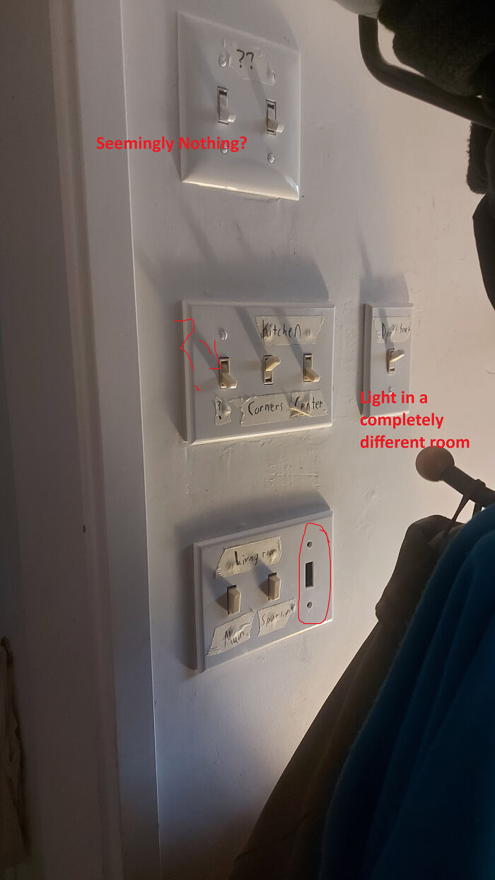
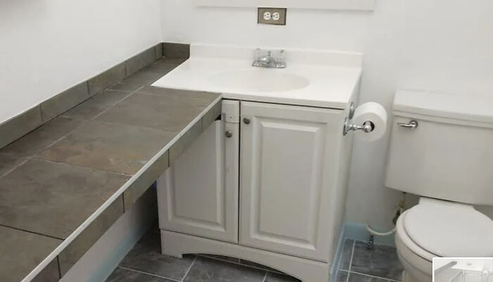
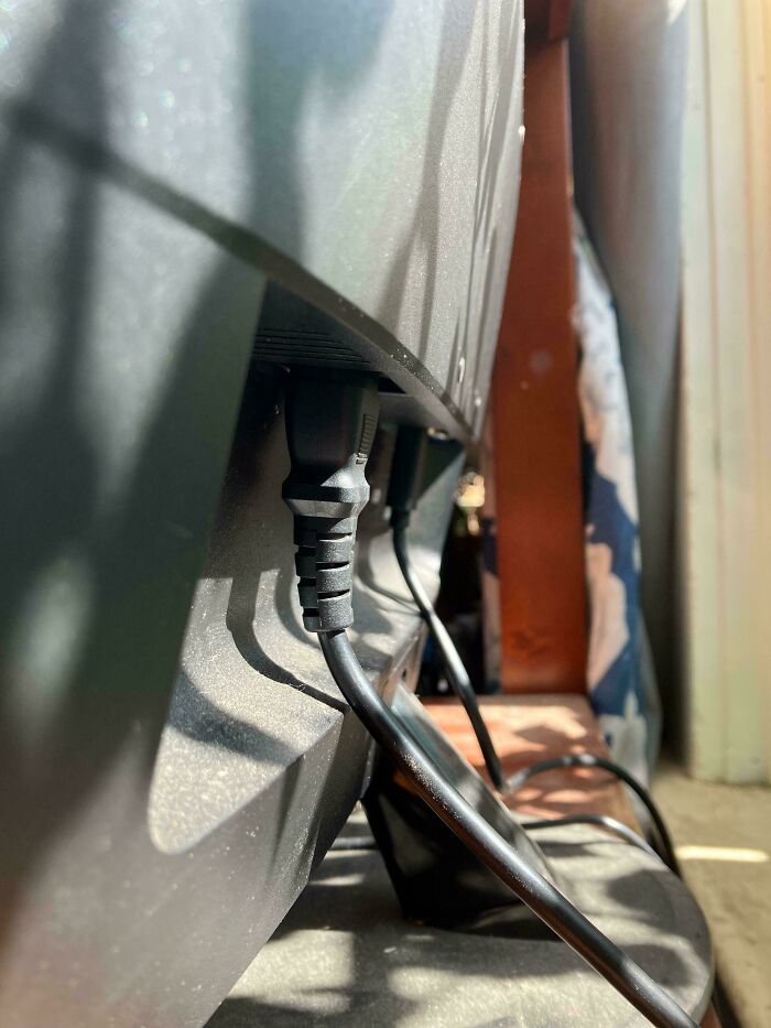
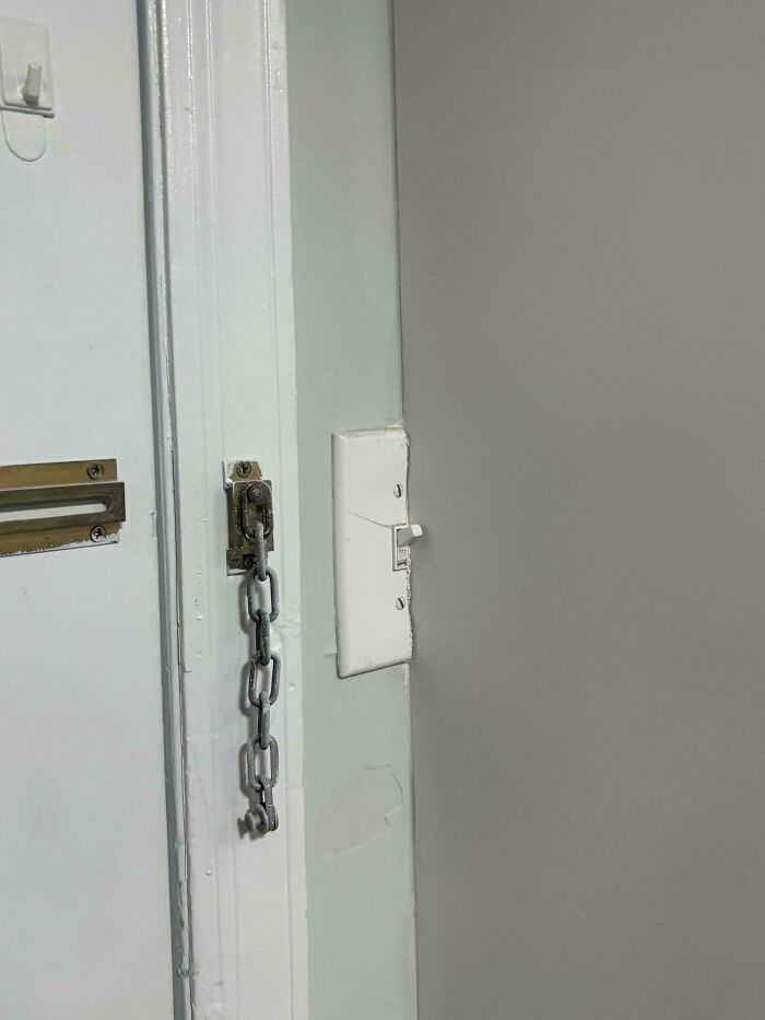
My parents house is similar. And they have electric outlets that are connected to nothing.
We want to know which of these horrendously hilarious and hilariously horrendous designs offended you the most. On the other hand, maybe there were some designs that you genuinely thought were (kind of) good?
Personally, what do you look for in terms of great design? On the flip side, what are the biggest red flags for you as a customer and consumer?
Tell us what you think in the comments under the pics or at the bottom of this list!
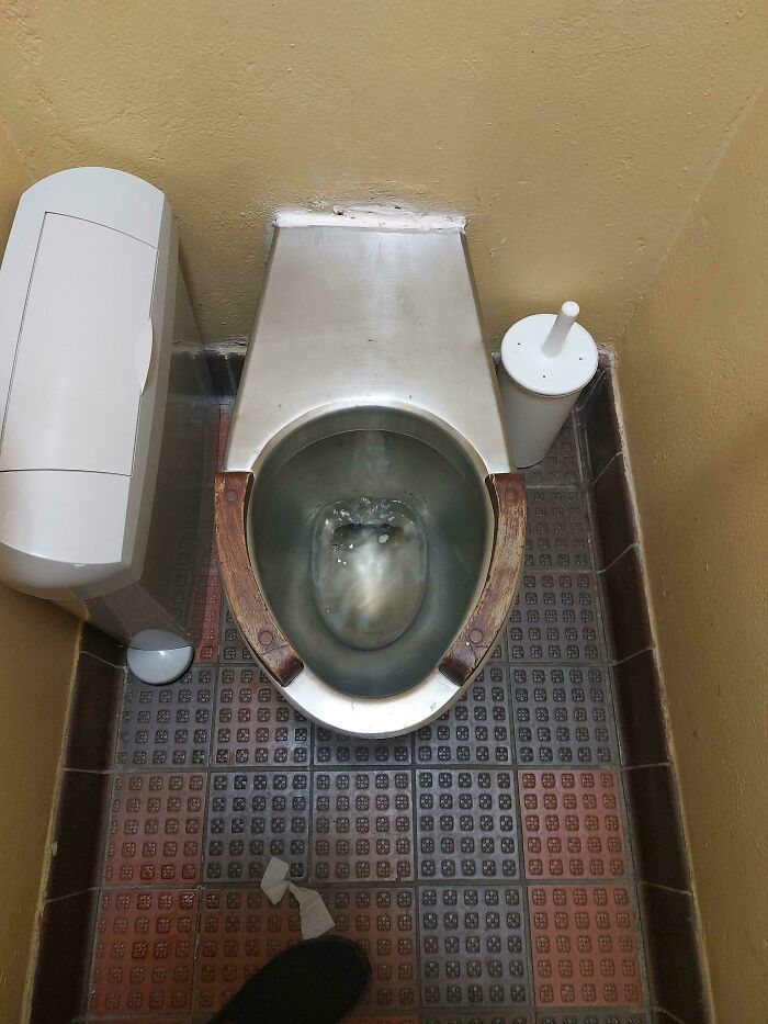
Oh…..in Costa Rica we got caught on a narrow mountain road with traffic backed up for hours, flare up hits when we are about 30 minutes from the nearest place to turn off and use the bathroom. Picture this toilet without the wood. And the toilet paper was across the room and unreachable from the toilet. Add in I have a serious germ phobia and the toilet paper can’t be flushed in that country. Looked like it hadn’t been cleaned in years but it’s literally the only toilet for a couple of hours and there is no way you can wait that long. I thought I would d*e. Then I wished I would d*e.

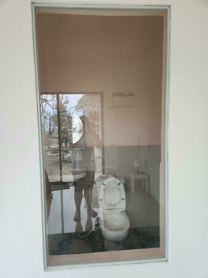
Is this a bathroom at aldi? Looks like you could go straight into bagging your groceries

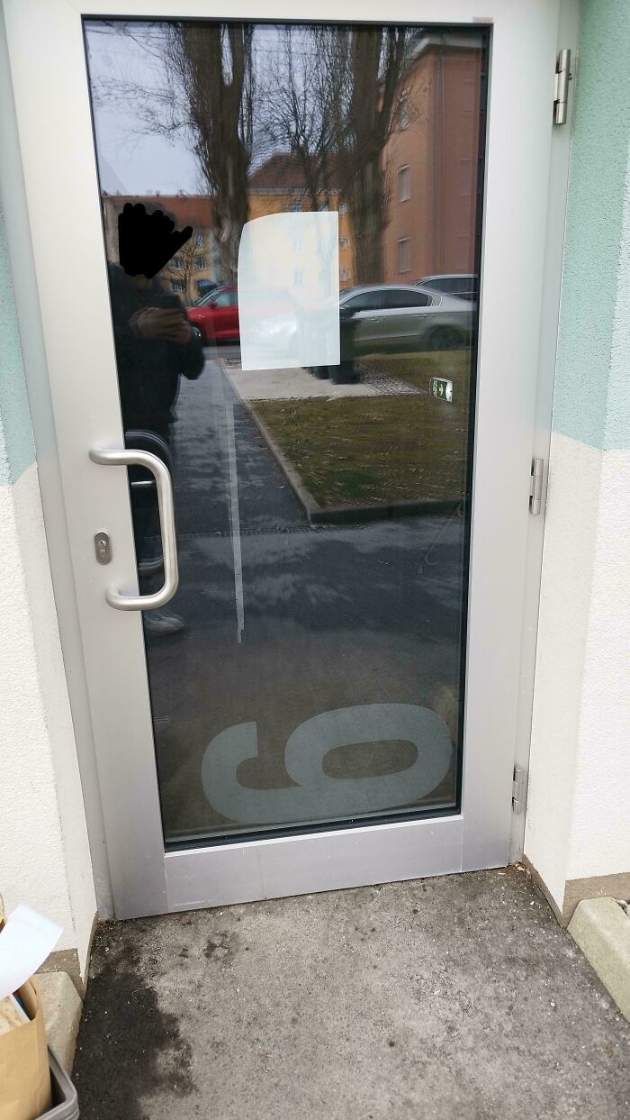
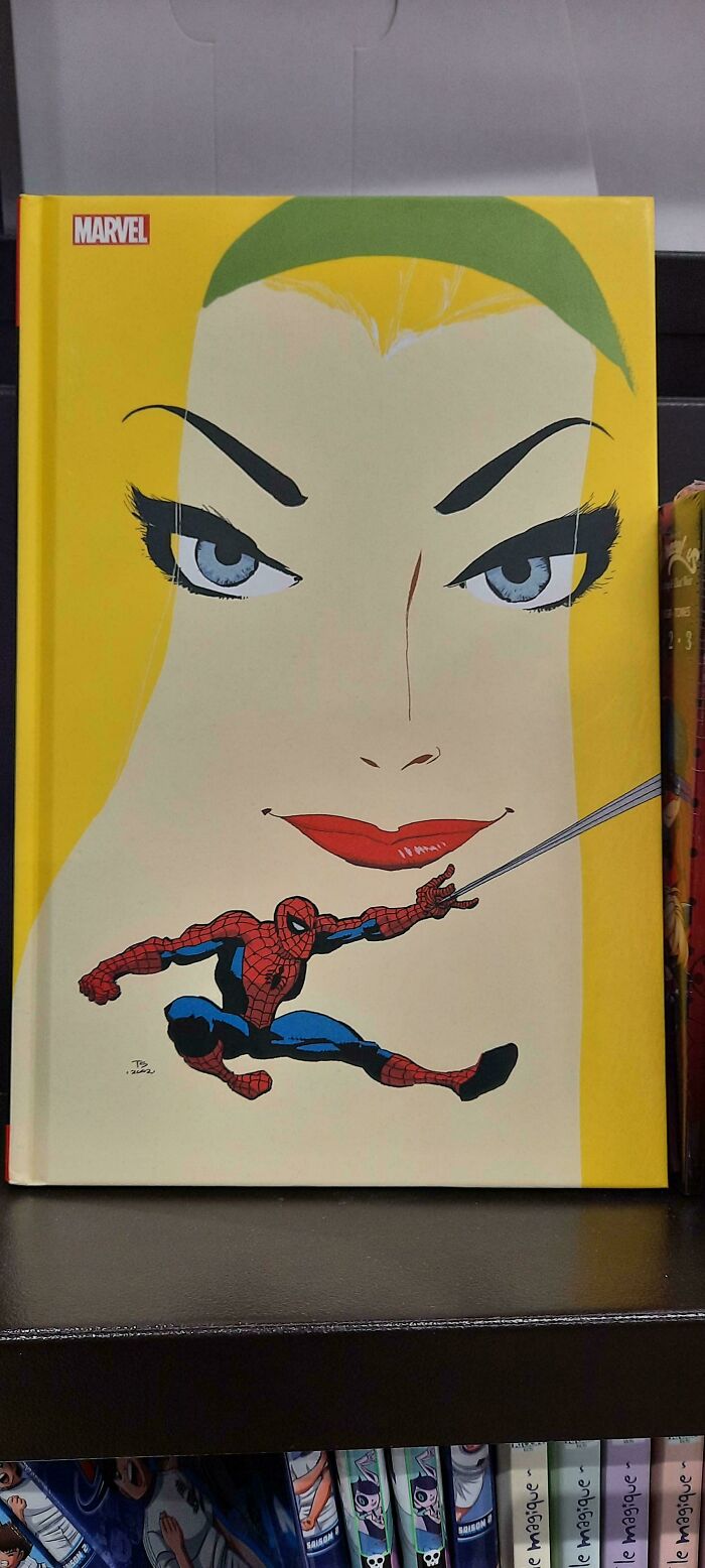
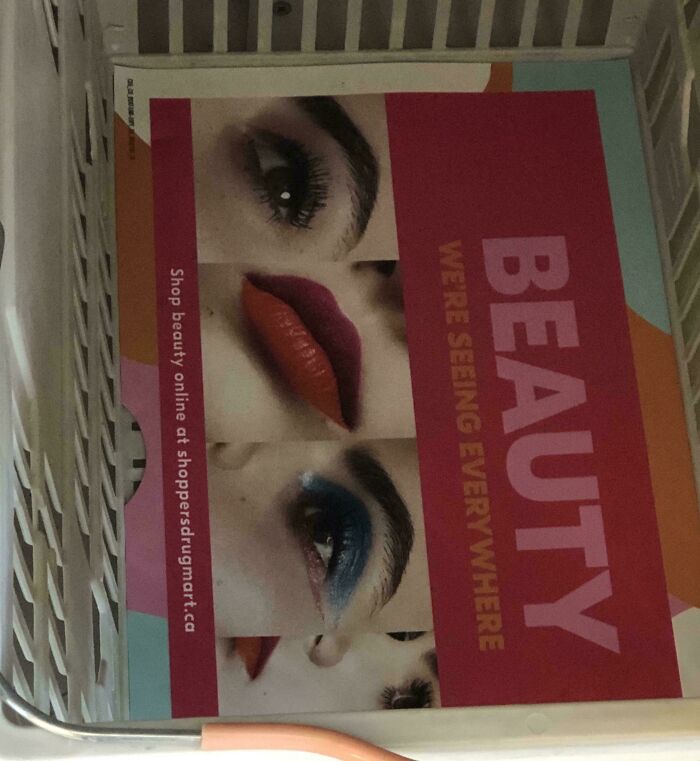
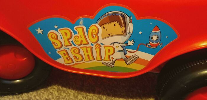
The real question is, was there a good reason not to shift the whole thing 10% to the right, leaving it in one piece?























 No fees, cancel anytime