Get Premium
Dark mode theme is available exclusively for premium users. Learn more about the benefits of subscribing.
No fees, cancel anytime.

 Dark Mode Ad-Free Browsing Unlimited Content

 Ad-Free Browsing Unlimited Content Dark Mode
Join 1.2 million Panda readers who get the best art, memes, and fun stories every week!
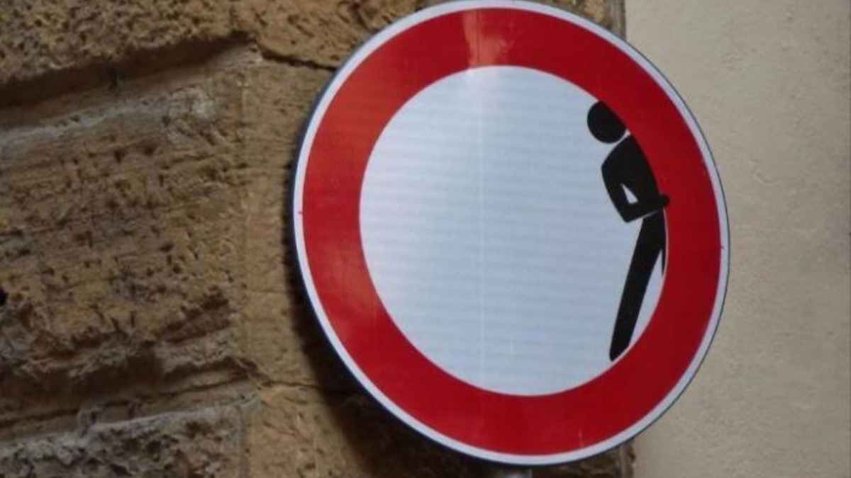
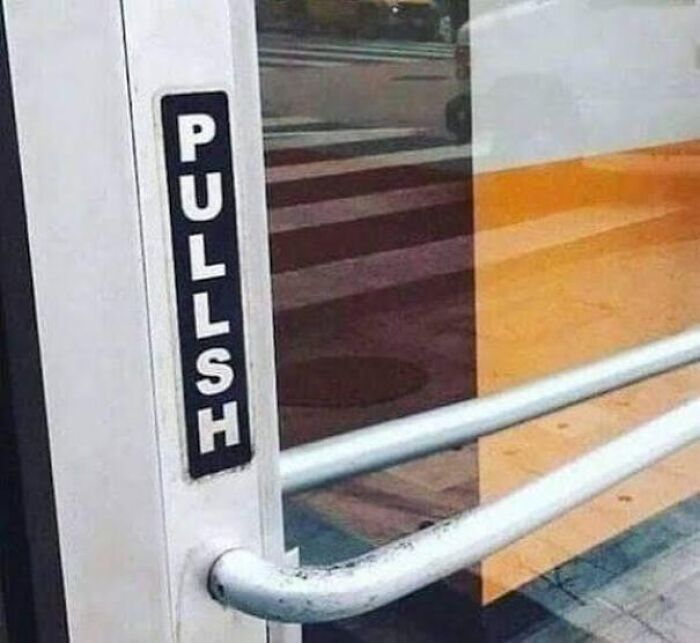
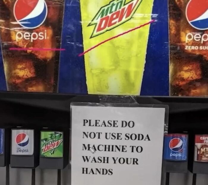
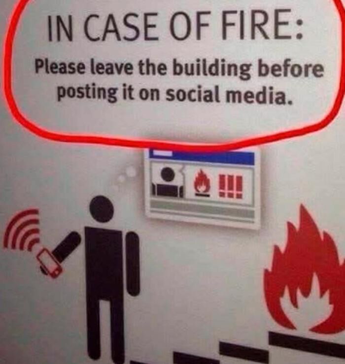
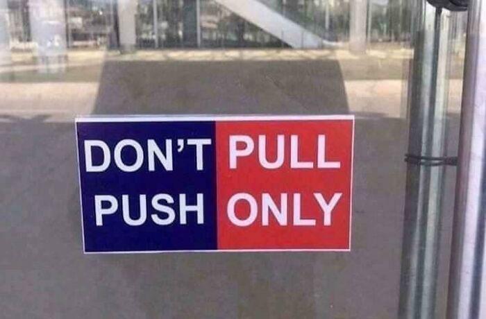
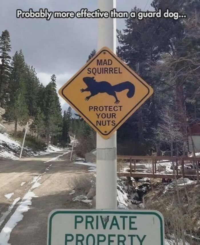
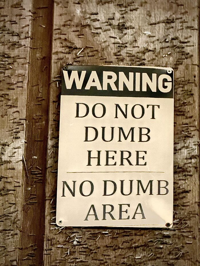
Most signs are designed to make life easier, because they give directions, explain rules, point out warnings, and tell us what we should or shouldn't be doing. At least, that's the idea. Every now and then, though, someone comes across a sign that seems to have missed the memo entirely.
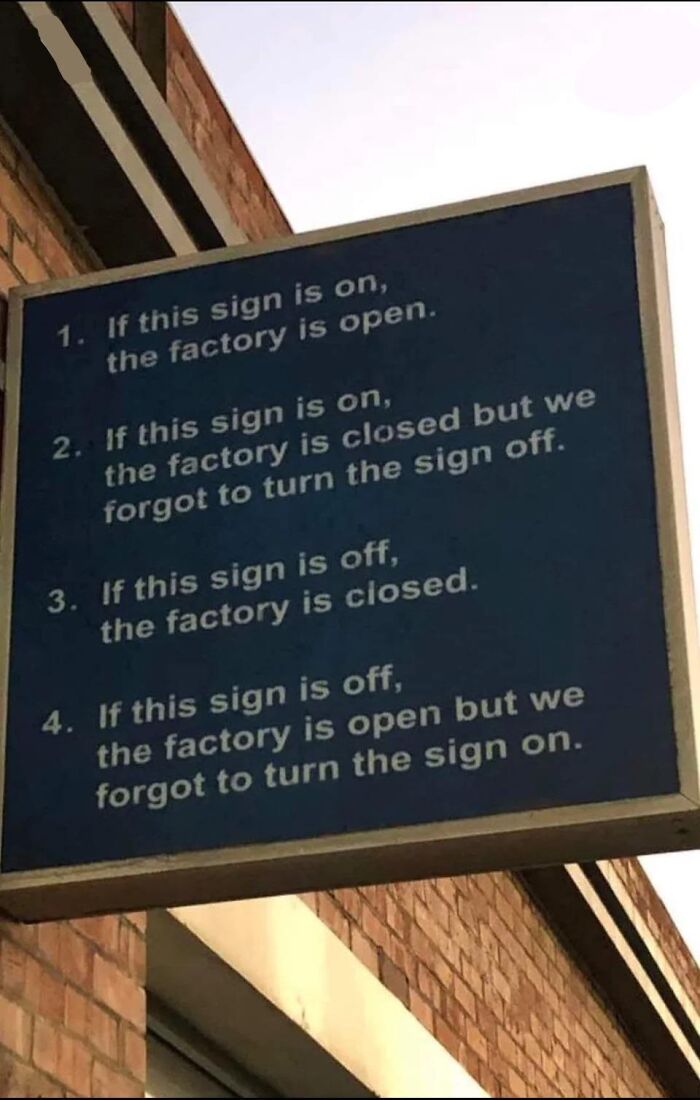
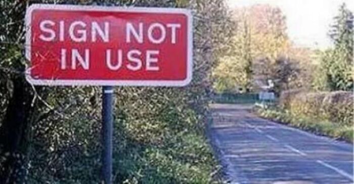
Maybe the wording is hilariously confusing, the instructions contradict themselves, or the message is so confusing and contradictory that you have to stop and read it again just to make sure you got it right.
A Reddit page dedicated to these curious discoveries has been collecting some of the funniest, most bewildering examples spotted around the world. From poorly worded notices to signs that raise far more questions than they answer, these finds prove that even the simplest messages can take a spectacularly unexpected turn. So, get ready for a collection that might leave you more confused than informed!
This post may include affiliate links.
Signs are an important part of everyday communication because they allow people to exchange information quickly, often without having to speak the same language. As Psychology Today explains, they serve several purposes, from warning people about potential hazards to helping them navigate unfamiliar places and understand public rules.
Road signs, emergency exit symbols, parking notices, and other visual messages help coordinate people's behavior and make shared spaces easier to use. Their effectiveness largely comes from their simplicity. Recognizable colors, shapes, arrows, and symbols can communicate information at a glance, even in busy or noisy environments where spoken instructions might be missed.
However, for a sign to serve its purpose, people need to understand what it is telling them. When its message is unclear, the very thing designed to make everyday life easier can become an additional source of frustration. This is partly because people have limited mental capacity for processing information at any given moment.
They should be able to look at a sign, understand its meaning, and decide what to do. If they instead have to reread it, guess what certain words mean, or figure out which instruction takes priority, the process becomes unnecessarily demanding. Even a relatively simple message can become difficult to follow when its wording or presentation gets in the way.
InnerDrive explores this problem through the psychological concept of cognitive load, which describes the mental effort required to process information. Working memory can only hold a limited amount of information at once, so unclear instructions force people to use some of that capacity to figure out what they are supposed to do.
Ambiguous wording, missing context, unfamiliar terminology, and poorly arranged steps can all contribute to this problem. Contradictory instructions are particularly unhelpful because readers must first work out which message to trust before they can take action.
This unnecessary mental effort is known as extraneous cognitive load, and research into workplace instructions has linked poorly designed guidance to greater mental demands and reduced efficiency.
The wording itself can also make a considerable difference. According to the Stanford Encyclopedia of Philosophy, people do not interpret messages based solely on the literal meanings of individual words. They also rely on context, shared knowledge, expectations, and their own perspectives to understand what someone is trying to communicate.
This means that a sentence can seem perfectly straightforward to the person who wrote it while leaving plenty of room for someone else to interpret it differently. A misplaced word, unclear reference, or missing detail can change the meaning of an entire instruction, sometimes with unintentionally amusing results.
Interestingly, the person creating the message may not recognize these problems before it reaches the public. People tend to assume that others will understand their words in the same way they intended them, overlooking the possibility that readers might interpret them differently.
Research discussed in the encyclopedia found that speakers often overestimate how successfully they communicate their intended meaning. In one experiment involving ambiguous sentences, listeners misunderstood the intended meaning in nearly half of the cases.
This highlights why reviewing written instructions from another person's perspective is so important, particularly when the message needs to be understood quickly without anyone available to explain it.
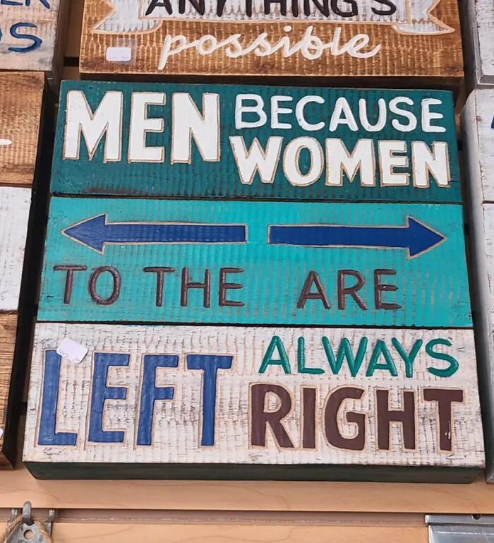
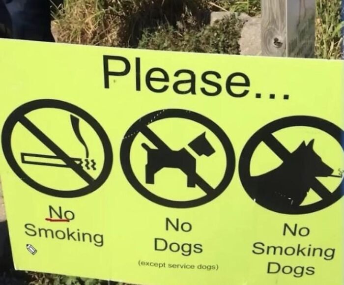
Of course, not every confusing sign is necessarily the result of complicated language. Sometimes, the problem comes from the way different elements are arranged or presented. Colors, symbols, arrows, font sizes, and spacing all influence how people understand visual information.
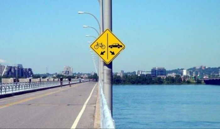
A sign might contain perfectly reasonable wording but still leave people scratching their heads if its arrows point in the wrong direction or its symbols appear to contradict the written instructions. Good visual communication depends on these elements working together, rather than competing for attention. When they fail to complement one another, the intended message can become much harder to recognize.
There is also an interesting reason why these communication mishaps can be so entertaining. FASTSIGNS explains that humor often comes from incongruity, a psychological concept describing the mismatch between what people expect and what they actually encounter.
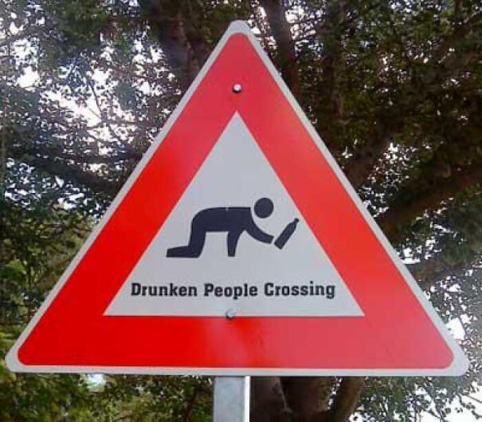
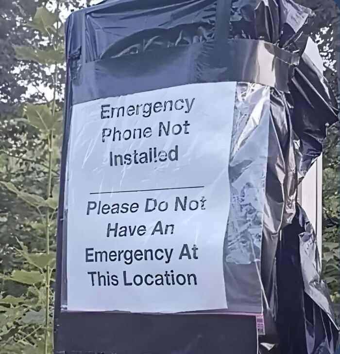
Signs are generally expected to provide clear, straightforward information, so an accidental double meaning or contradictory instruction creates an unexpected twist. A notice might appear perfectly ordinary at first glance, only for its wording to suggest something completely ridiculous when read more carefully.
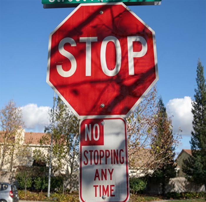
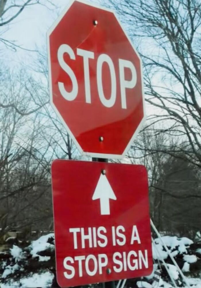
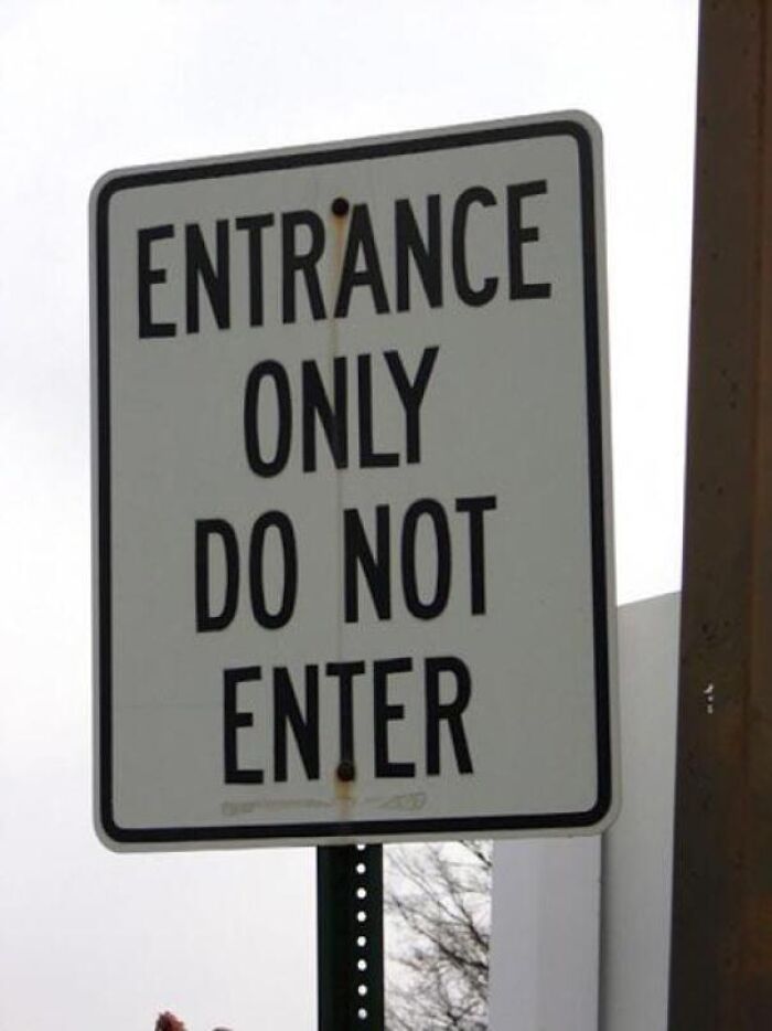
The same applies when two nearby signs communicate opposite instructions or when an arrow and a written message seem to disagree. The contrast between what a sign is supposed to accomplish and what it actually communicates can make the result surprisingly funny.
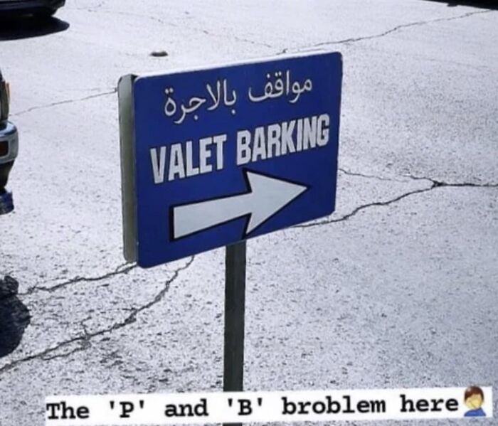
These contradictions can also happen when different people or departments create notices independently without considering how they will look or sound together. One sign might be intended to enforce a particular rule, while another nearby notice gives instructions that seem to undermine it. Translation mistakes, rushed proofreading, and poorly planned layouts can make matters even worse.
Ideally, every part of a sign should be reviewed as a complete message, taking into account how people will interpret its wording, symbols, and placement. After all, public signage is supposed to remove uncertainty, not introduce another puzzle for passersby to solve. When that basic purpose gets lost, an ordinary notice can become an accidental source of confusion and amusement.
At the end of the day, a good sign should make life a little easier, not leave people wondering whether they have understood it correctly. While some of these unusual examples might have been the result of simple mistakes, others make you wonder how they ever made it past the planning and proofreading stages. Either way, they offer a good reminder that even the shortest messages deserve a little thought before being displayed for everyone to see.
Which of these signs made you do a double take, and have you ever come across a public notice that was so confusing or ridiculous you had to take a picture of it? We'd love to hear about your own baffling sign encounters in the comments!

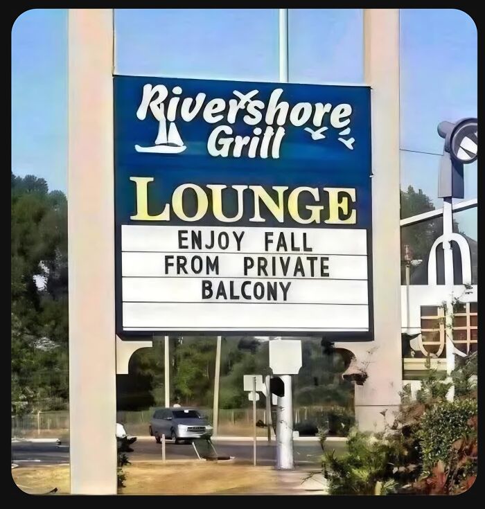
If only there were a synonym for fall that doesn't have an alternate (and in this case unfortunate) meaning...

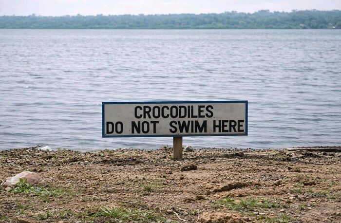
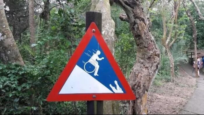
Just like in Mac and Me! Except the annoying kid didn't get eaten by alligators.
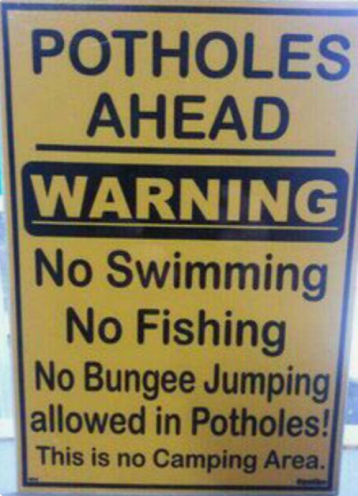
This is meant to refer to the landform "potholes" rather than the infrastructure defect "potholes," right? It makes perfect sense if one is familiar with that use of the word, but it isn't commonly used in this way through much of North America.

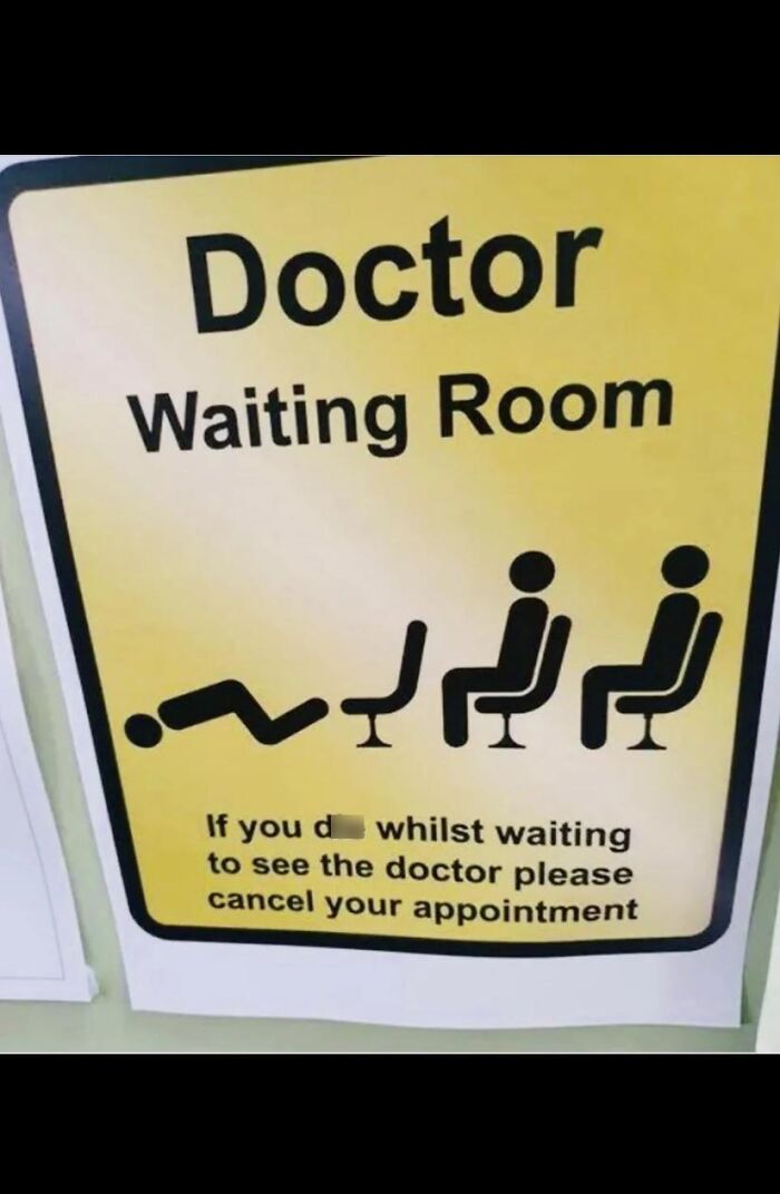
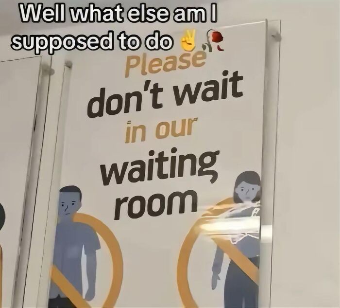
You can sit here in the waiting room, or you can wait here in the sitting room.

































 No fees, cancel anytime