Get Premium
Dark mode theme is available exclusively for premium users. Learn more about the benefits of subscribing.
No fees, cancel anytime.

 Dark Mode Ad-Free Browsing Unlimited Content
 Ad-Free Browsing Unlimited Content Dark Mode
Join 1.2 million Panda readers who get the best art, memes, and fun stories every week!
Maps are our passion. We like looking at them. We enjoy drawing them. But most of all, we love seeing a map that gives us a wholly new perspective on the world—something we can share with our friends and blow their minds as well. Or something we can refer to during a fancy dinner party to sound super up-to-date with what’s happening in the world.
The ‘I [Effing] Love Maps’ online project is one of the best niches on the internet for cartographers and map lovers—veteran and amateur—alike. They share maps that are unusual, unique, and (in some cases) a little bit out there. All for the sake of informing and entertaining us and keeping our spark of curiosity burning bright. We promise you, after this list, you won’t see Planet Earth the same ever again.
Put on your safari hats and check out some of their best maps below, dear Pandas. While you’re scrolling down, upvote your faves and share why you liked them. And if you’d like to continue the adventure, be sure to plot a course to Bored Panda’s previous feature about ‘I [Effing] Love Maps’ right over here.
More info: Facebook | Instagram | Twitter | Mapographics.shop
This post may include affiliate links.
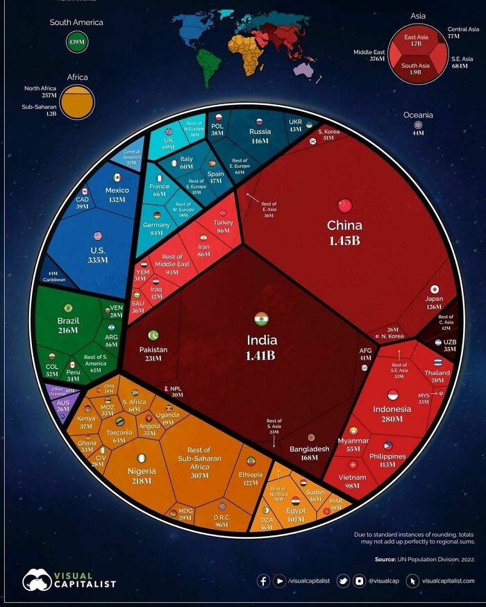
The eight billionth human being will enter the world, ushering in a new milestone for humanity. In just 48 years, the world population has doubled in size, jumping from four to eight billion. Of course, humans are not equally spread throughout the planet, and countries take all shapes and sizes. This visualizations aim to build context on how the eight billion people are distributed around the world


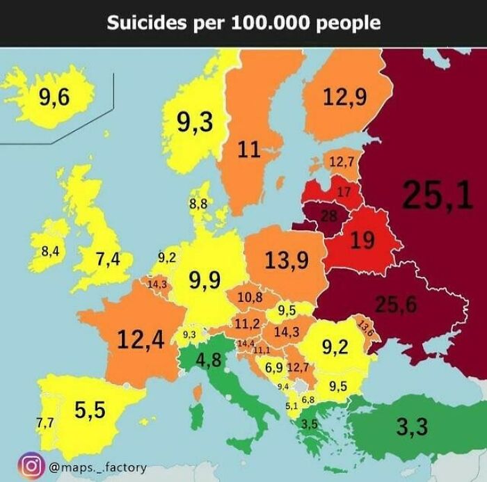
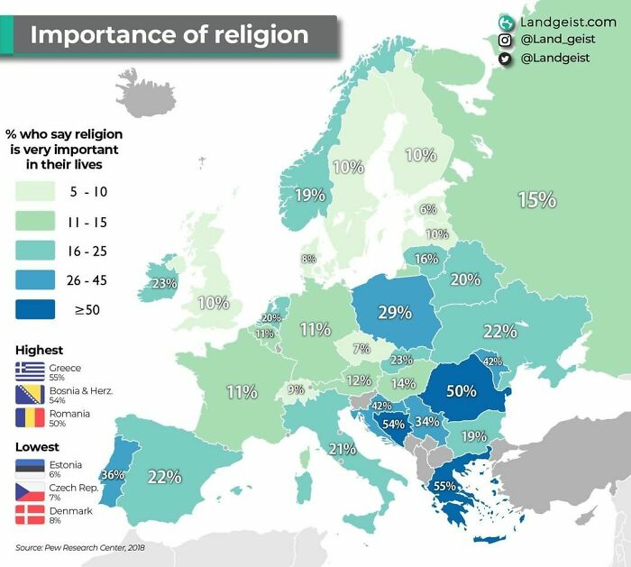
So Denmark is on renewable resources and low on religion....you all looking for an extra citizen? I can be of help.

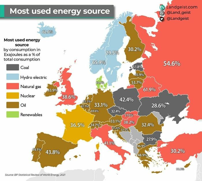
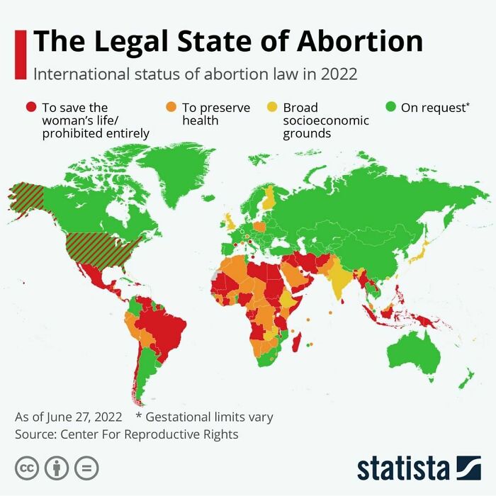
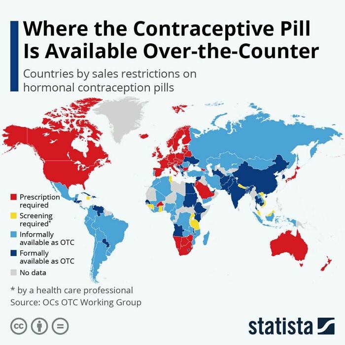
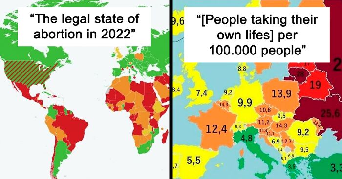
This chart is wildly inaccurate. A few examples: Abortion is generally legal in much of Mexico. Abortion is illegal under the German constitution, but exempt from criminal prosecution early in the pregnancy or with many social grounds later; this keeps the German abortion rate at a small percentage of that of nations like China, the U.S., etc. HELP ME! I've been cancelled because I expressed astonishment so much of Europe relies so heavily on oil for electricity. Please upvote me here: https://www.boredpanda.com/maps-keep-you-updated/?comment_id=12766073 (A net of 10 downvotes results in an account suspension.)
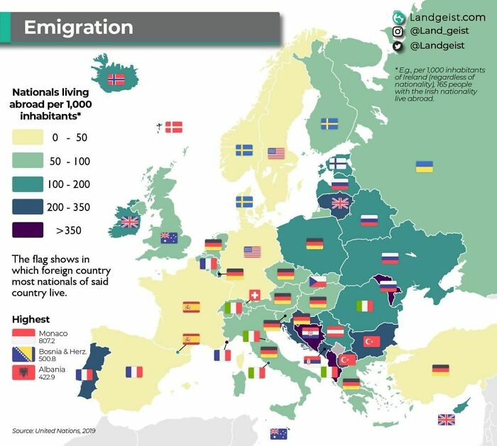
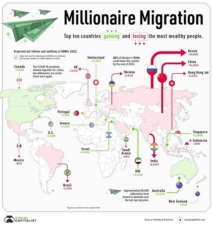
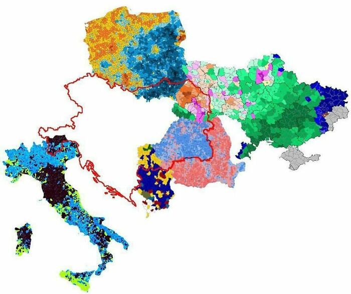
Interesting fact - I am Ukrainian (Southern East region) who migrated firstly to Poland, and than to Albania. Don't know how most of Ukrainians are migrating to Russia, if when I was in PL (before war times), more than 2mln Ukrainians were living there and around 400,000 Ukrainians were granted PL residence permit YEARLY. Just in my university percentage of Ukrainian students was over 30%. Through my life I knew only several people who migrated to Russia (all of them are my distant relatives), and dozens of those who migrated to Poland, some of them have even got the citizenship already. Considering the fact that I am from a region not far away from RUS border, it's curious.
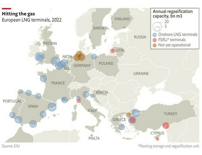
So, we're all just pranking Charles? EDIT: HELP ME!!! I've been censored from BoredPanda because I expressed astonishment that much of Europe still relies heavily on oil! It's post #2 right now!

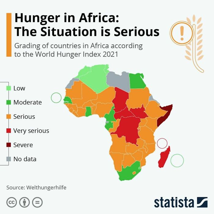
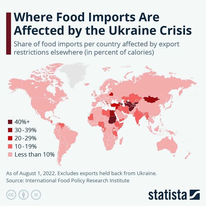
Food and aid should not be an item involved in war. Sadly it's one of the first to be effected.

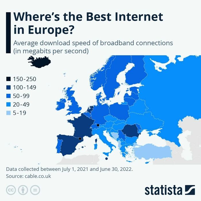
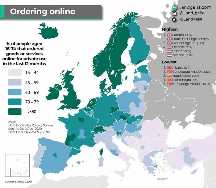
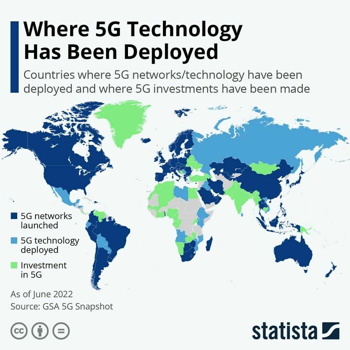
I live in Budapest, Hungary, having 1000Mbps (1GBps). It could be upgraded to 2GBps but for what? Netflix in 4K needs 15MBps (0.015GBps). We have 1-2ms ping time to the service provider. Everything is lightning fast.

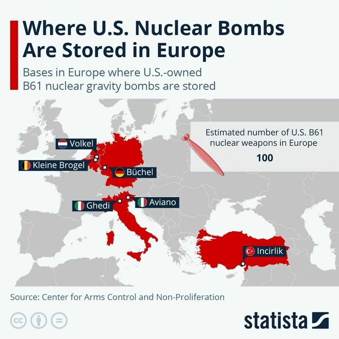
Allegedly Russia has always kept nuclear weapons in Kaliningrad, too. Not US-owned, but still ready to party. All too many everywhere

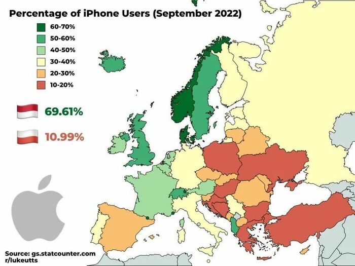
I want to see a map of the percentage of broken IPhone users 😄

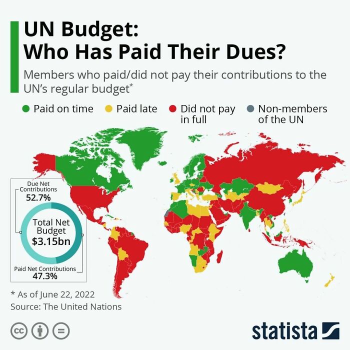
The fact that Russia and China are both still part of the UN is an atrocity. Both countries commit constant human rights violations.
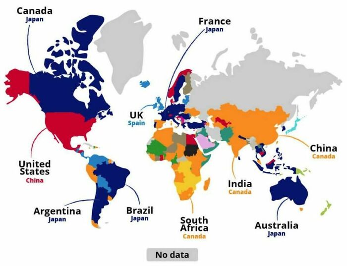
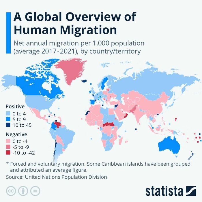
1. Canada – most popular relocation destination for 50 countries 2. Japan – most popular relocation destination for 31 countries 3. Spain – most popular relocation destination for 19 countries

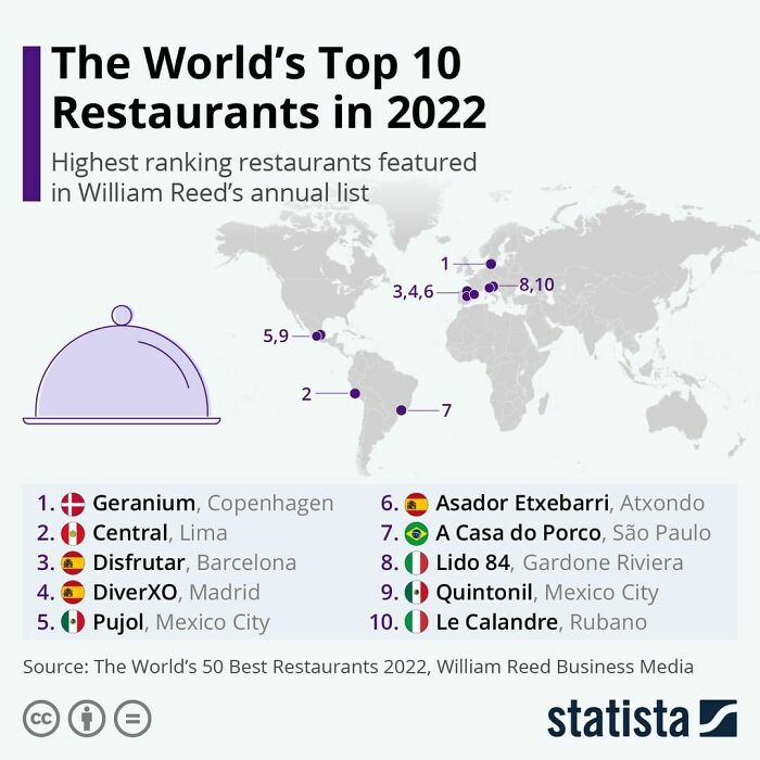
So none from France or Japan, the two countries with the most top of the line restaurants in the world (with Italy and Spain just behind). How serious is that… Any dumbass can make a ridiculous list but it shouldn’t be relayed.
The time period makes it meaningless. Many counties had closed borders for covid for 2/4 years covered by the graph.

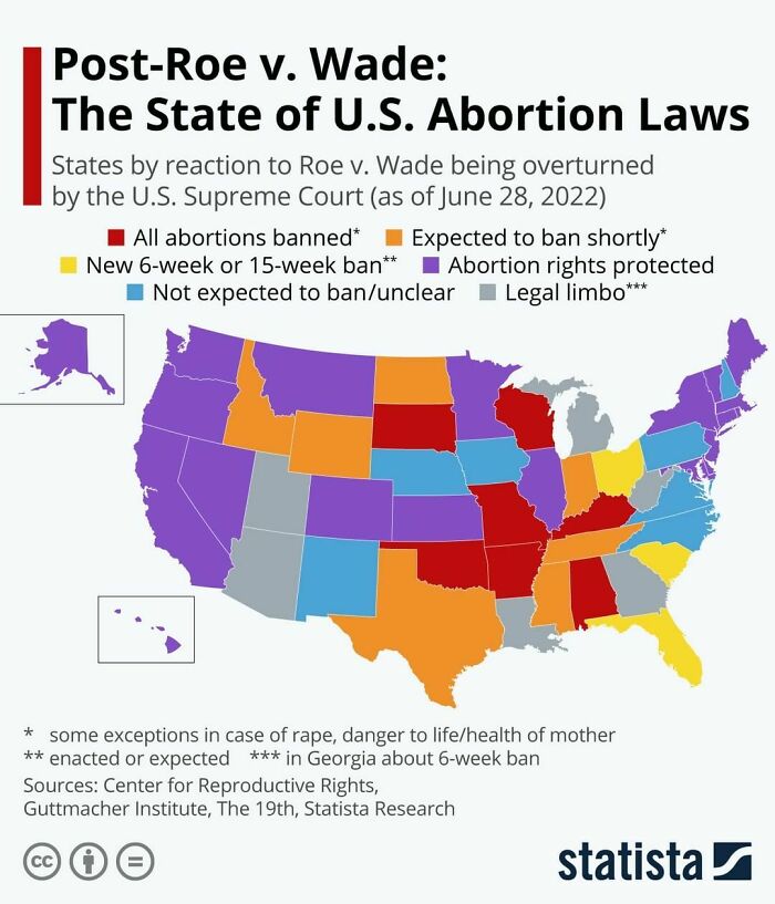
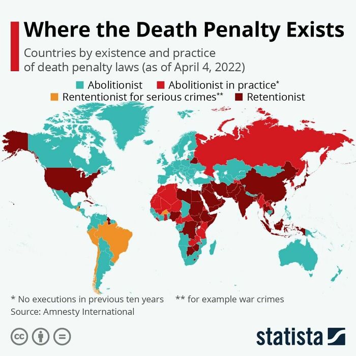
I guess the US doesn't appreciate the irony of abortions being illegal while the death penalty is legal.
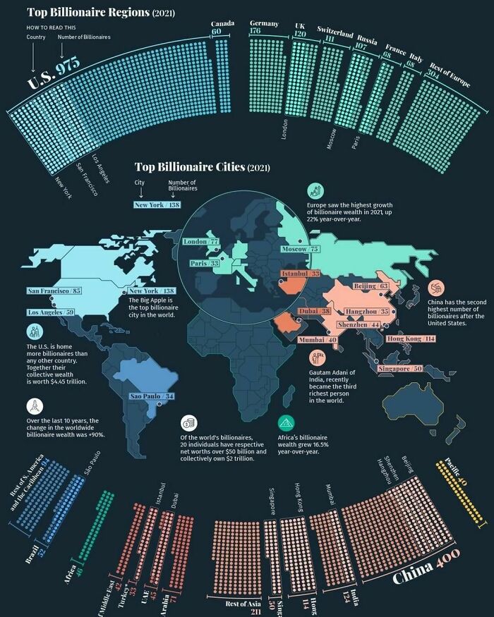
only 3,311 individuals—represent almost $11.8 trillion in wealth. The global billionaire population continued to grow in 2021, increasing by 3%. Over the same period, billionaire wealth also increased by 18%. This map uses data from the Wealth-X Billionaire Census to visualize where the world’s billionaires live and breaks down their collective wealth.
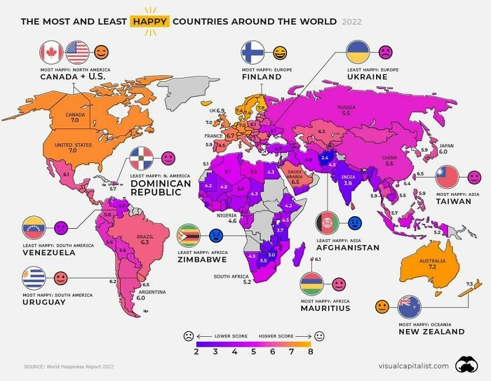
While countless academic researchers have tried to get to the bottom of this, the truth is, it’s a complicated question to answer. Happiness levels depend on a number of factors, including one’s financial security, perceptions of social support, feelings of personal freedom, and much more. This map pulls data from the World Happiness Report to uncover the average happiness scores of 146 countries. It shows average scores from 2019 to 2021, and highlights which countries are the happiest—or unhappiest—and why
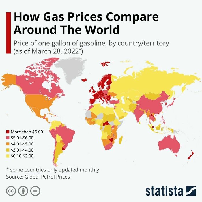
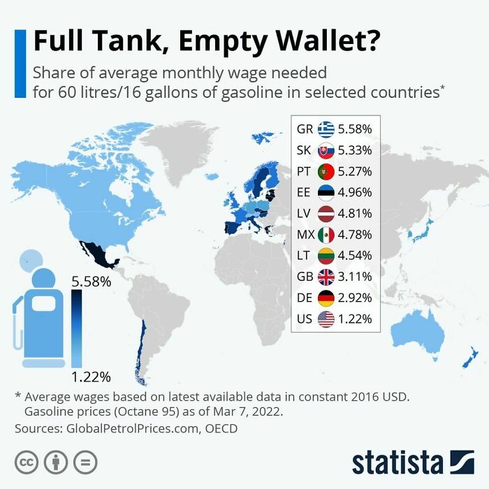
So they're measuring prices in gallons because one country out of 192 uses this measurement?
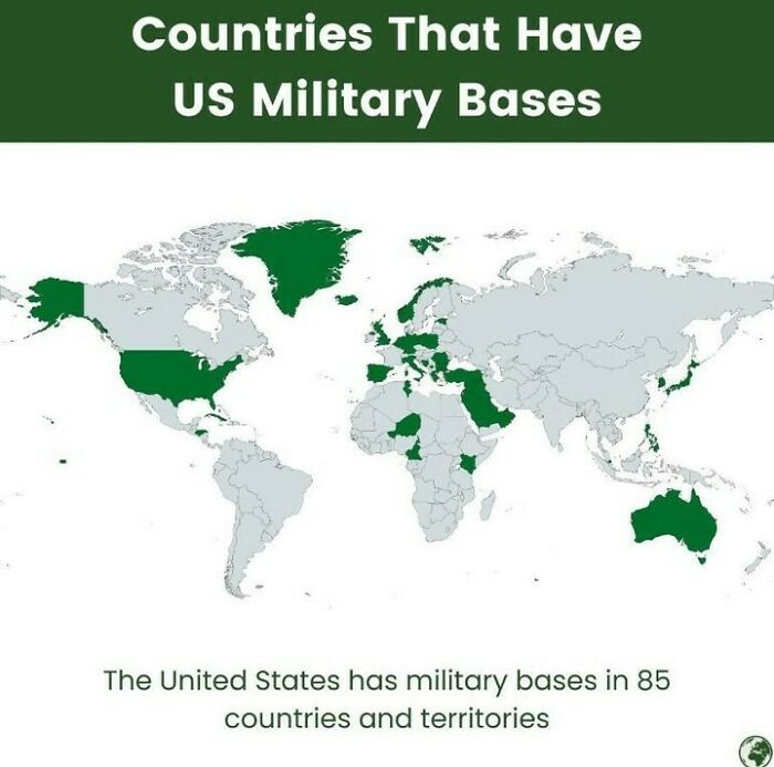
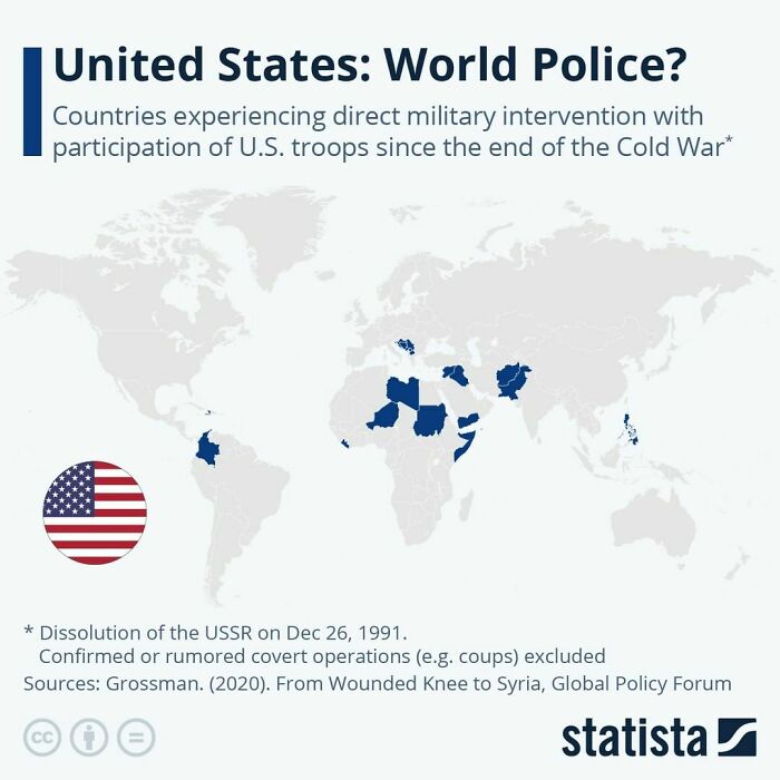
The US is like that nosy neighbour down the street who thinks they're the boss of everyone.

Would love to see this side by side with a map of the same data for 50 or 100 years ago, etc.
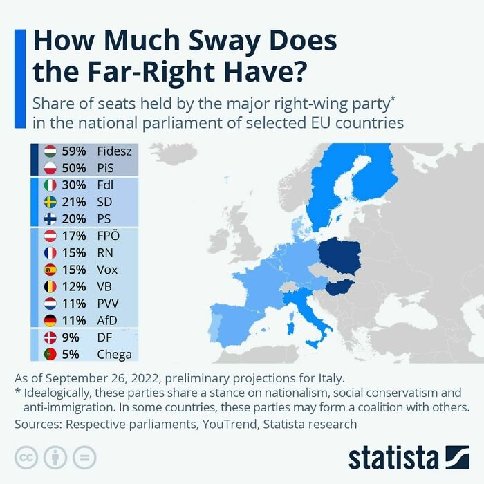
And out of the woodworks come all the little neonazis that are to chicken to admit what they are. Claiming the European far right is "moderate"
A once in a lifetime opportunity to live in Canada. Hell, I'll take it.

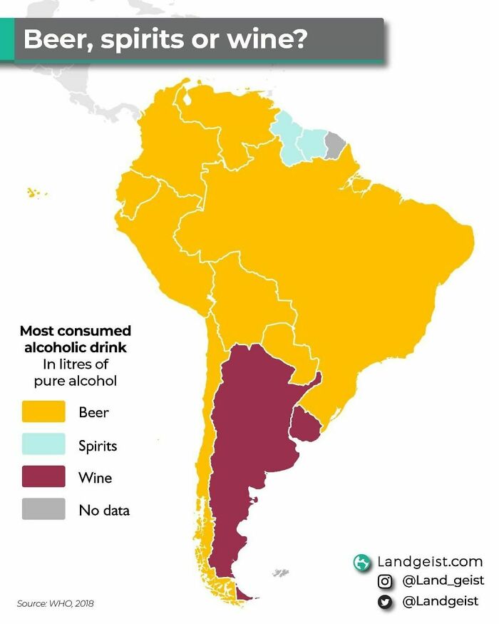
No surprise for Argentinia drinking mostly wine, they produce very good wines there

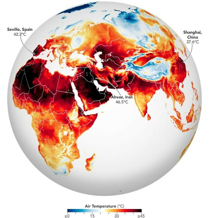
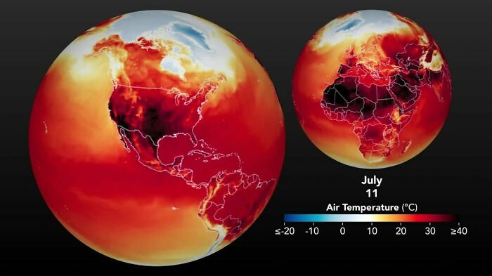
Yep. I live in Oklahoma and we had like 10 heat advisories (When the temp reaches 100 or above) in July
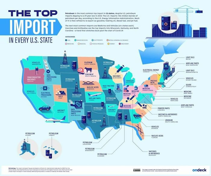
But what types of goods are most commonly imported throughout different parts of US? This graphic by OnDeck shows the top import in every U.S. state, using January 2022 data from the U.S.
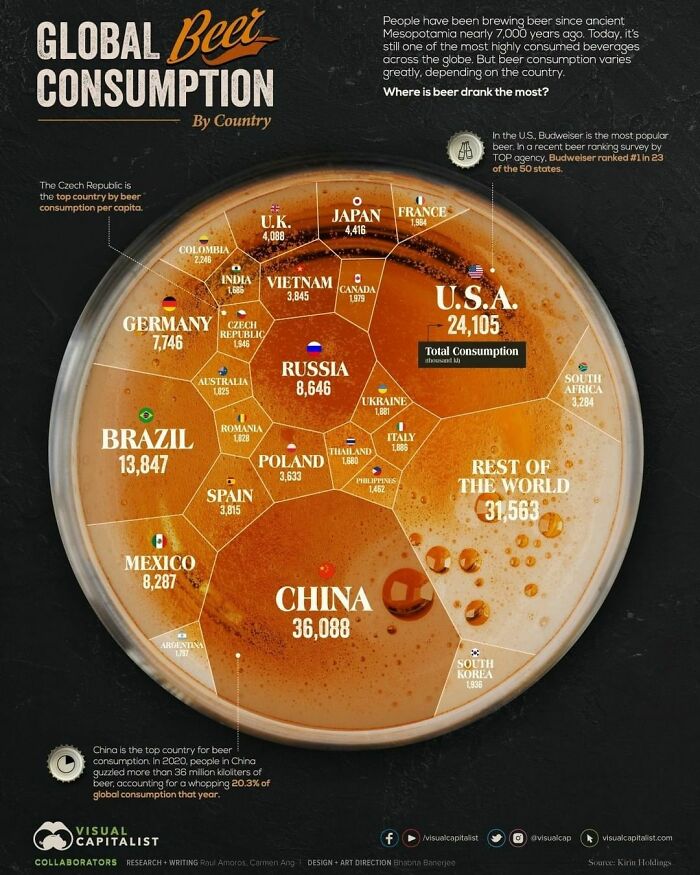
And since it’s still one of the most popular beverages worldwide, it seems we haven’t gotten sick of it yet. The latest available data shows that beer consumption exceeded 177 million kiloliters around the world in 2020. Beer consumption occurs all over the world, but the amount varies greatly depending on the location. So, which countries drink the most beer? This graphic by @visualcap uses data from Kirin Holdings to compare global beer consumption by country. Kirin is a Japanese company that has been tracking beer consumption around the world since 1975
Isn't total consumption a bad measurement? China has over 15 times more people than Germany but the consumption is only 5 times higher
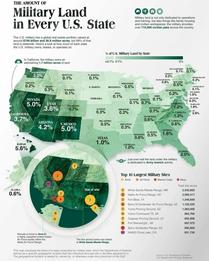
Via Visual Capitalist The United States spends an unparalleled amount of money on its military—about $778 billion each year to be precise. Additionally, the U.S. military also owns, leases, or operates an impressive real estate portfolio with buildings valued at $749 billion and a land area of 26.9 million acres, of which around 98% is located within the United States. This visual, using data from the Department of Defense (DoD) reveals how much of each state the U.S. military owns, leases, or operates on. This map visualizes the share of a state comprised by military sites, which the Department of Defense defines as a specific geographic location that has individual land parcels or facilities assigned to it. The geographical location is leased to, owned by, or otherwise under the jurisdiction of the DoD.
So no military bases in South Dakota, Nebraska, Minnesota, Michigan and West Virginia? ☮
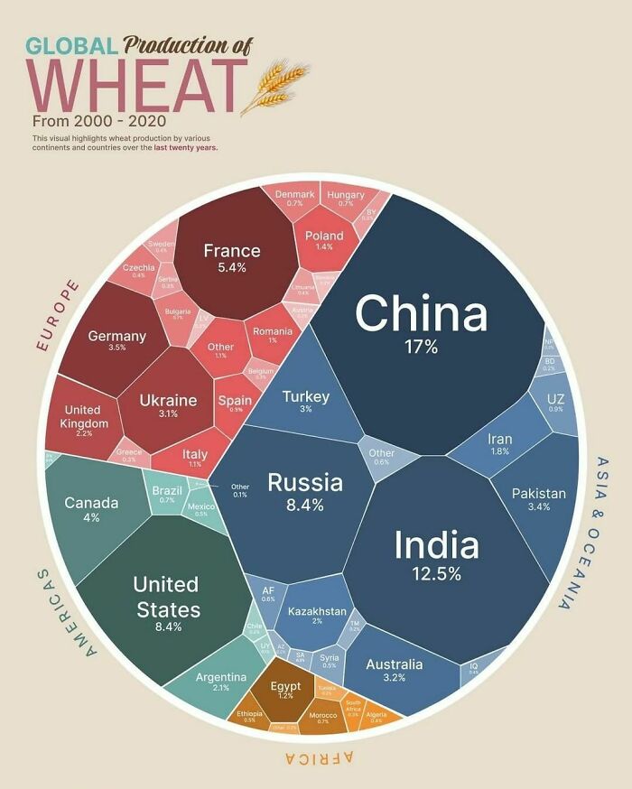
After rice and corn (maize), wheat is the third most-produced cereal worldwide, and the second-most-produced for human consumption. And considering wheat’s importance in the global food system, any impact on major producers such as droughts, wars, or other events, can impact the entire world. Which countries are the largest producers of wheat? This graphic by Kashish Rastogi visualizes the breakdown of 20 years of global wheat production by country
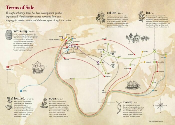
When exotic goods traveled to new regions, their native names sometimes hitchhiked along with them. Naturally, the Germans have a term – Wanderwörter – for these extraordinary loanwords that journey around the globe, mutating subtly along the way. This map, produced by Haisam Hussein for Lapham’s Quarterly, charts the flow of Wanderwörter along global trade routes.
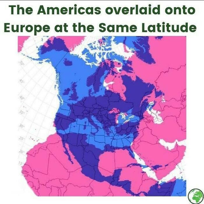
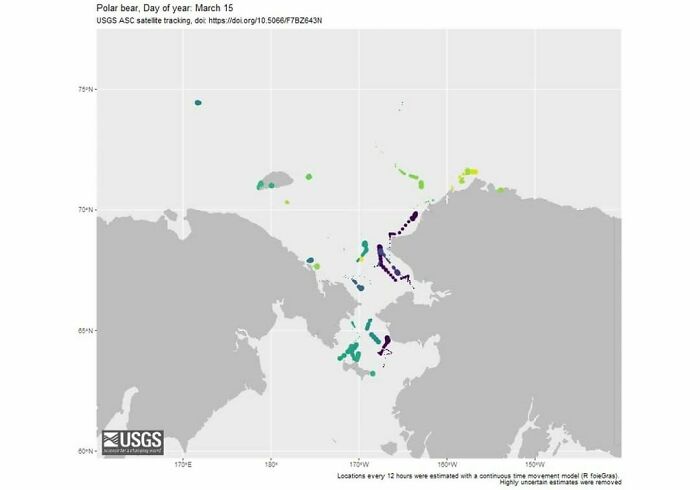
So if people don't recognize these land masses, Chukchi Sea is the north sea between Russia and Alaska. The island in the lower middle with a lot of blue-green is St. Lawrence Island. The area between the two countries is the Bering Strait, leading to the southern Bering Sea.

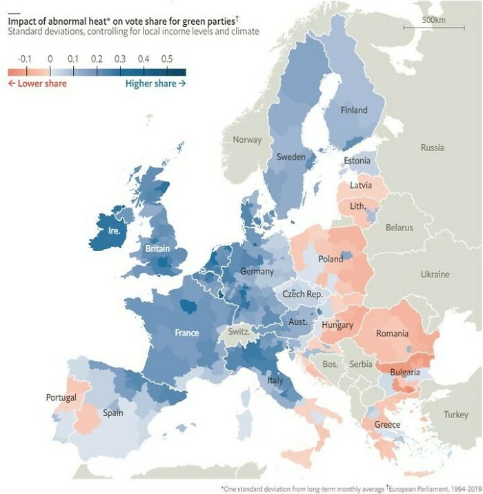
Bulgaria & Romania: More of that, please! I like to be able to cook eggs on the pavement.

I didn't even knew Saxonia (the dark green part of Germany) had that big of an Internet culture. There live mostly old people I thought... Every day you learn something new!

So, if the UK is losing them already - why are governments so worried about taxing the wealthy? I'm joking of course! It's obvious why. The government IS the wealthy.

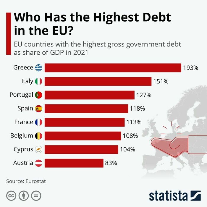
Your screen isn't wide enough to show where the USA would fit on this chart. The last time we were below 100% was when Bill Clinton was president. It's only gotten worse since.
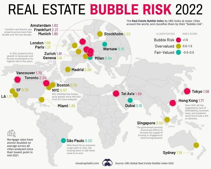
Housing bubbles are a tricky phenomenon. As a market gathers steam and prices increase, it remains a matter of debate whether that market is overvalued and flooded with speculation, or it’s simply experiencing robust demand.
Of course, once a bubble bursts, it’s all obvious in hindsight.
One common red flag is when prices decouple from local incomes and rents. As well, imbalances in the real economy, such as excessive construction activity and lending can signal a bubble in the making.
Based on data from the Real Estate Bubble Index by UBS, examines 25 global cities, scoring them based on their bubble risk.
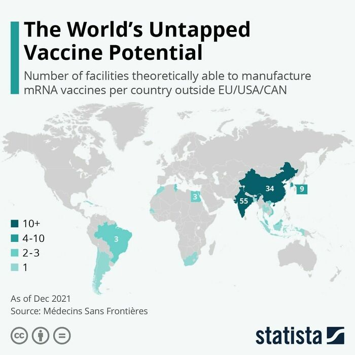
A bit useless. China have facilities but don't want foreign tech and still rely on they uneficient vaccine formula. So, youmay have production capacity, but political choice are more important. Let's do a map of coutries that want this pandemic to stop instead.

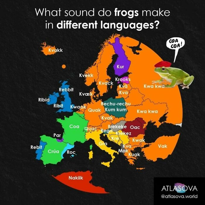
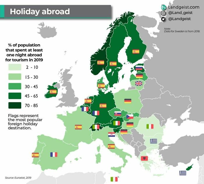
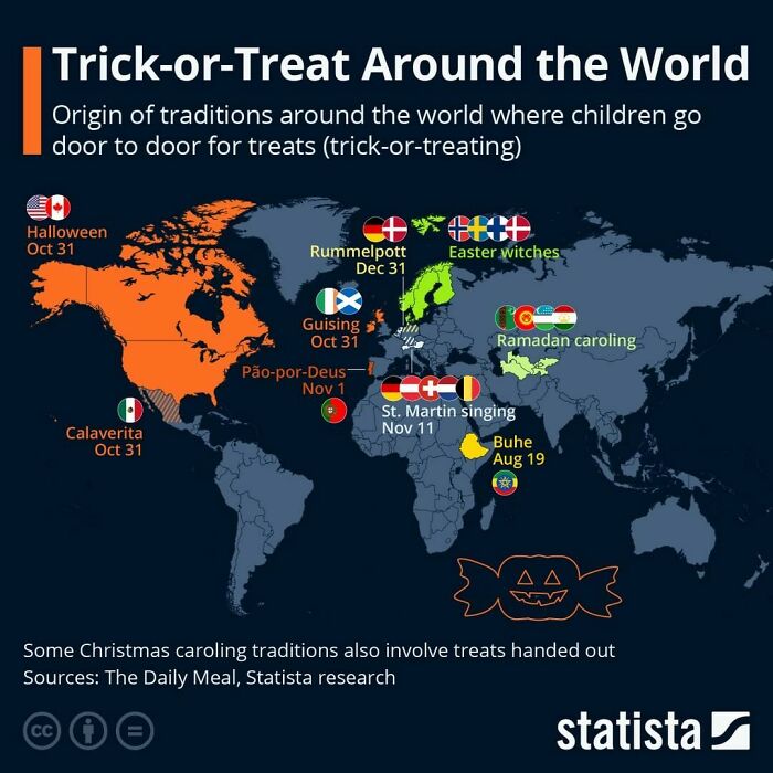
Danish person here and I've never heard of Rummelpot. We go on Fastelavn in the spring.
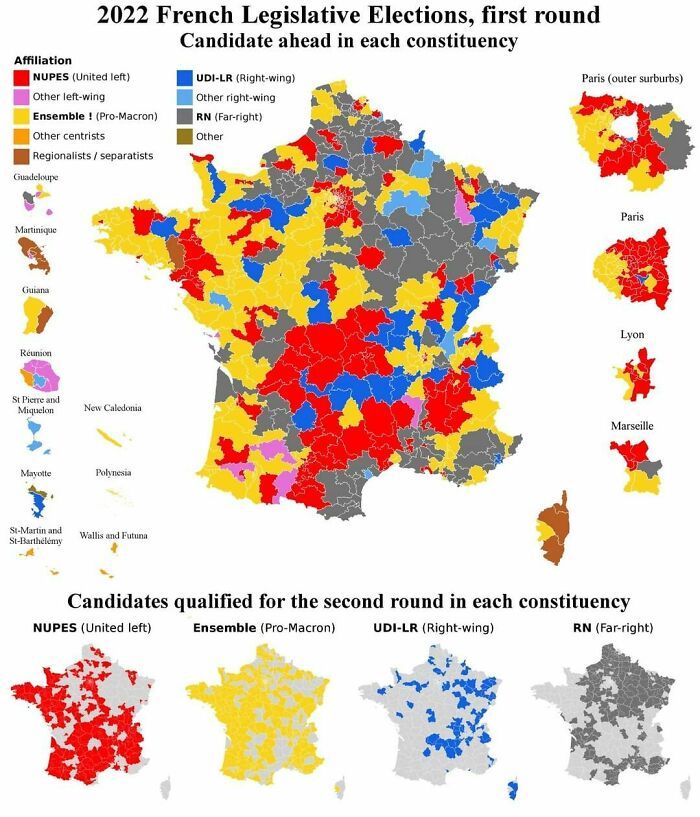
It must be nice to live in a country that has more than two parties... SIGH...

As a color blind person I found some of these kinda hard to figure out.I'm looking for an offended color blind peoples group to boycott color coded maps.
Most computers and mobile devices have settings to adjust for red-green and blue-yellow color blindness. I'm an app developer. Apple has been educating and pushing developers to use their growing list of accessibility features. So more software should be accommodating a variety of visual and auditory needs.
Load More Replies...
I'd like to point out something about these color-coded maps/graphics: "Green = good" and "red = bad" will instill a bias against those things coded in that way (or light blue vs dark blue in case of European religiosity). So that you do not see any other map without thinking of this. This is how political divides grow wider and prejudices grow. It's the psychology of statistics (AKA lies or damned lies or at least very misleading).
Also note that certain colors have triggers, both culturally and inherently. Ergo, red in the West is "dangerous", but green is "soothing"; blue is "weak"; and so forth. Lots of studies on how people react to color, and if you apply it to these graphics, you start re-thinking your own reactions. Fun thought experiment for you on Monday morning :-)
Load More Replies... As a color blind person I found some of these kinda hard to figure out.I'm looking for an offended color blind peoples group to boycott color coded maps.
Most computers and mobile devices have settings to adjust for red-green and blue-yellow color blindness. I'm an app developer. Apple has been educating and pushing developers to use their growing list of accessibility features. So more software should be accommodating a variety of visual and auditory needs.
Load More Replies... I'd like to point out something about these color-coded maps/graphics: "Green = good" and "red = bad" will instill a bias against those things coded in that way (or light blue vs dark blue in case of European religiosity). So that you do not see any other map without thinking of this. This is how political divides grow wider and prejudices grow. It's the psychology of statistics (AKA lies or damned lies or at least very misleading).
Also note that certain colors have triggers, both culturally and inherently. Ergo, red in the West is "dangerous", but green is "soothing"; blue is "weak"; and so forth. Lots of studies on how people react to color, and if you apply it to these graphics, you start re-thinking your own reactions. Fun thought experiment for you on Monday morning :-)
Load More Replies...
































 No fees, cancel anytime