ADVERTISEMENT

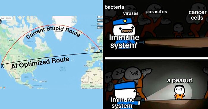
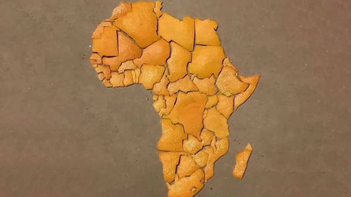
A good map should help you find your way around, teach you something about geography or give you a sense of place. But some maps do none of that... Instead, they leave you questioning everything you thought you knew about the world. Part cartography, part chaos.

Some maps are masters of misdirection, others are accidental works of comedy. And the internet is full of these useless gems. Many can be found in a little corner aptly called Terrible Maps. The Facebook page has 1.2 million followers, all getting lost together down a rabbit-hole of nonsensical maps.

Bored Panda has put together a list of our favorites from the page for you to scroll through while you plan your next trip. Be warned, many of these might teach you nothing about geography but everything about human imagination, confidence and our ability to slap a label on something and call it a day. These hilarious maps gone south are reminders that not every visual aid is actually aiding anything. Sometimes “it's geography, but make it entertainment...”

#1

Now It Makes Sense

Slices of ham labeled West Ham, East Ham, Fulham, and an empty plate labeled Nottingham in a funny bad map style.

Terrible Maps Report

RELATED:
    #2

    The Purr-Fect Map

    Two cats labeled Chile and Argentina positioned to humorously resemble a badly drawn map of South America.

    TerribleMaps Report

    #3

    No One Trolls With Street Names Quite Like Prague

    Map of Prague highlighting the Russian Embassy and surrounding streets with humorous and unusual labels.

    TerribleMaps Report

    #4

    Fun Fact: The Baltic Sea Is A Crocodile Eating Finland

    Map of the Baltic Sea region with an unusual red outline, showcasing a funny and bad geography mistake.

    TerribleMaps Report

    ADVERTISEMENT
    #5

    Map Of Africa Made From Orange Peel

    Orange peel pieces arranged to form a humorous and inaccurate map of Africa, showcasing funny map distortions.

    TerribleMaps Report

    ADVERTISEMENT
    #6

    The Earth Before And After Your Opinion

    Comparison of two Earth images humorously showing before and after opinions in a funny and poorly drawn map style.

    Terrible Maps Report

    #7

    The United States Drawn Entirely From Memory

    United States map creatively made using computer memory chips, a funny and bad map representation.

    TerribleMaps Report

    #8

    Map Of Tingham, UK

    Map showing the United Kingdom with a humorous label confusion between Nottingham and Tingham.

    TerribleMaps Report

    ADVERTISEMENT
    #9

    A Very Serious Dog Map

    Funny map of a dog labeled with playful zones like treat detector, belly rubs area, and destruction zone.

    TerribleMaps Report

    ADVERTISEMENT
    #10

    When Mobile Connections To Russian Networks Revealed Troop Positions

    Heatmap showing clustered data points across Ukraine in a map from 89 maps that are bad yet funny.

    TerribleMaps Report

    #11

    How To Be A Terrible Neighbour

    Map showing a French nuclear powerplant located near the Belgium border, illustrating a funny bad neighbor map.

    TerribleMaps Report

    #12

    This Weather Map Perfectly Sums Up How Most Finns Feel

    Weather map showing a humorous face pattern, illustrating one of the funny bad maps from the collection of maps.

    TerribleMaps Report

    ADVERTISEMENT
    #13

    Really Pleased With My New IKEA Globe That Shows Earth At Night Time

    Black globe with no visible map details sitting on a tray, illustrating funny bad maps concept.

    Terrible Maps Report

    ADVERTISEMENT
    #14

    When You Try To Draw A Straight Line With A Ruler But Your Finger Has Other Pla

    Map showing Papua New Guinea with a mislabeled border splitting the island into two countries incorrectly.

    TerribleMaps Report

    #15

    A Pizza Map Of Italy

    Map of Italy creatively made as a pizza with toppings over a dark red background, illustrating funny and bad maps.

    Terrible Maps Report

    Never miss a story that brings joy to the world. Follow on Google News

    #16

    Countries That Declared War On Birds… And Lost

    World map showing countries that declared war on birds and lost, a funny and bad map example.

    TerribleMaps Report

    ADVERTISEMENT
    #17

    Cyclist Recreates Nirvana’s Iconic Nevermind Album Cover

    Map showing a funny and poorly drawn outline of Adelaide resembling a face in a humorous map collection.

    TerribleMaps Report

    ADVERTISEMENT
    #18

    Colossal Squid Sightings Around The World

    Polar map showing clustered fish icons around Antarctica in a humorous and inaccurate map style.

    TerribleMaps Report

    #19

    What Earth Will Look Like In 250 Million Years, With Today’s Borders

    Inverted and distorted world map with countries oddly placed, showcasing a funny and poorly designed map illustration.

    TerribleMaps Report

    #20

    U.S. States With More Cows Than People

    US map showing states with more cows versus more people, highlighting a humorous and bad map design from a funny maps collection.

    TerribleMaps Report

    ADVERTISEMENT
    #21

    New Zealand’s Snake Population Density

    Map showing snake population density in New Zealand with color scale from 0 to 100 snakes per hectare, funny maps SEO keyword.

    TerribleMaps Report

    ADVERTISEMENT
    #22

    Where Johnny Cash Claims To Have Traveled In “I’ve Been Everywhere”

    Funny map of the United States showing multiple identical faces humorously marking locations across many states.

    TerribleMaps Report

    #23

    Can You Legally Hunt Unicorns In Your State?

    Map showing states where hunting unicorns is legal, highlighting the humorous and bad map from funny maps collection.

    TerribleMaps Report

    #24

    Map Showing Which Countries Are The Hairiest

    World map displaying male androgenic hair distribution by region with color-coded percentages and a legend for reference.

    TerribleMaps Report

    ADVERTISEMENT
    #25

    A Proposed Two-State Solution

    Map of the United States with red and blue sections and a labeled land bridge, featured in funny bad maps.

    TerribleMaps Report

    ADVERTISEMENT
    #26

    Australians When Surprised

    Simplified map of Norway in green, highlighting unusual or funny aspects of poorly drawn maps.

    Terrible Maps Report

    #27

    Average Sneeze Speed Across Europe

    Map of Europe showing average speed limits by country with color coding from under 40 km/h to over 180 km/h, a funny bad map example.

    TerribleMaps Report

    #28

    Countries In Europe Whose National Animals Are Extinct Or Mythical

    Map of Europe showing mythical creatures associated with specific countries, part of a funny and bad map series.

    TerribleMaps Report

    ADVERTISEMENT
    #29

    Kanawyers And Independence Are 20 Miles Apart, But The Road Trip Takes 300 Miles And Six Hours

    Map showing a long, unusual driving route through California near Sequoia and Death Valley National Parks.

    TerribleMaps Report

    ADVERTISEMENT
    #30

    When You Set Out To Map The World But Remember You’re A Chap From 1930s Britain

    Vintage world map from 1934 showing tea trade routes, highlighting major countries involved in historic tea commerce.

    TerribleMaps Report

    #31

    The World After An 8,800m Sea Rise

    Map showing an island labeled No Data and a small green dot named L’ile de Everest in a humorous bad maps style.

    TerribleMaps Report

    #32

    Did You Know?

    Map showing Iceland and Ireland with a red arrow, highlighting the funny and bad map fact about their close distance.

    TerribleMaps Report

    ADVERTISEMENT
    #33

    U.S. States With The Highest Number Of Venomous Animals

    US map with states color-coded by a numerical range, illustrating a funny and poorly designed map with unclear data representation.

    TerribleMaps Report

    ADVERTISEMENT
    #34

    Tiger Ownership Legality By U.S. State

    US map showing states with no regulations, permit requirements, or private ownership bans, a funny and bad map example.

    TerribleMaps Report

    #35

    The Most Commonly Used Word In Each State’s Wikipedia Page

    Map of the United States with each state incorrectly labeled as "The," showing a funny and bad map error.

    TerribleMaps Report

    #36

    States Where You Can Get Arrested For Wrestling A Bear

    Map of US states where you can get arrested for wrestling a bear, highlighted with humorous bear illustrations.

    TerribleMaps Report

    ADVERTISEMENT
    #37

    A Topographic Map Of Africa

    Breaded fried food resembling a distorted map shape served with a lemon wedge on a white plate, humorous map fail.

    Terrible Maps Report

    ADVERTISEMENT
    #38

    How European Explorers Saw America In 1492

    Map showing distorted geography of Europe, Africa, and Greenland with missing and misplaced landmasses, highlighting funny bad maps.

    TerribleMaps Report

    #39

    The Great Italian Divide

    Map of Italy divided into butter and olive oil regions, illustrating a funny and bad food-themed map.

    TerribleMaps Report

    #40

    The Earth, But Just Islands

    World map focusing on islands and regions with an unusual or funny representation in an ocean-dominated layout

    TerribleMaps Report

    ADVERTISEMENT
    #41

    US States By Paid Sick Leave Laws In 2025

    US map showing states with paid sick leave laws, time off for any reason laws, and states without paid sick leave laws.

    TerribleMaps Report

    ADVERTISEMENT
    #42

    Is It Possible To Walk To Australia From Your Country?

    World map showing countries color-coded by whether you can walk to Australia, a funny and bad map example.

    TerribleMaps Report

    #43

    Where You Can Own A Monkey In The USA

    Map showing where owning a monkey is legal, illegal, or partially banned across the United States with humorous colors.

    TerribleMaps Report

    #44

    Really Makes You Think

    Twitter post questioning tsunami caused by earthquake, overlaid on a funny bad world map with inaccurate geography markings.

    TerribleMaps Report

    ADVERTISEMENT
    #45

    Countries Googling Google On Google In The Last Day

    World map with countries colored in various shades of blue and one country in red, illustrating funny bad maps.

    TerribleMaps Report

    ADVERTISEMENT
    #46

    Fun Fact: Switzerland Is 18 The Gambias Away From Mongolia

    Map showing a colorful, inaccurate path crossing Europe and Asia, illustrating funny and bad map errors.

    TerribleMaps Report

    #47

    This Map Shows How Zealandia Might Look Today If It Had Stayed Above Sea Level

    Map of Australia and New Zealand with geographical labels, showcasing a humorous and inaccurate map design.

    TerribleMaps Report

    #48

    The Most Likely Colour Of Your House In Europe

    Map of Europe with countries shaded in different colors, highlighting funny and bad map inaccuracies and distortions.

    TerribleMaps Report

    ADVERTISEMENT
    #49

    Countries That Have Fined Google $20,000,000,000,000,000,000,000,000,000,000,000

    World map highlighting countries with yes, no, and no data categories in a humorous and inaccurate style.

    TerribleMaps Report

    ADVERTISEMENT
    #50

    Can The Name Of This European Country Be Spelled Using Only Periodic Table Elements?

    Map of Europe highlighting countries that can have their names spelled using only periodic table elements, color-coded for accuracy.

    TerribleMaps Report

    #51

    Americans Were Asked To Identify The UK On A World Map

    World map showing inaccurate locations of the United Kingdom from a survey, illustrating funny and bad map errors.

    TerribleMaps Report

    #52

    Exactly

    Tweet with a distorted map of Michigan showing a giant thumb and fingers, highlighting funny maps that are bad yet humorous.

    Terrible Maps Report

    ADVERTISEMENT
    #53

    Prisons vs. Colleges By US State

    Map of US states showing more prisons or more colleges, highlighting differences in education and incarceration rates.

    TerribleMaps Report

    ADVERTISEMENT
    #54

    Am I The Only One Who Sees An Elephant Doing The Front Crawl When I Look At The Mediterranean?

    Map with humorously inaccurate borders drawn over the Mediterranean region showing funny and bad map distortions.

    TerribleMaps Report

    #55

    Present-Day Ghana vs. Where The Ghana Empire Actually Was

    Map of Africa showing modern Ghana and the Ghana empire territories in red, green, and blue, a funny inaccurate map example.

    TerribleMaps Report

    #56

    Historical And Present Distribution Of Lions

    Map showing historic and present distribution across Africa and the Middle East with inaccurate and funny color coding.

    TerribleMaps Report

    ADVERTISEMENT
    #57

    Rule Brie-Tannia: God Save The Cream

    Map showing lactose digestion percentage in the Old World indigenous population with color-coded regions and data points.

    TerribleMaps Report

    ADVERTISEMENT
    #58

    The Drive So Dull Only Midwesterners Survive It

    Map showing inconsistent travel times and routes between Denver and Kansas City, illustrating funny and bad map errors.

    TerribleMaps Report

    #59

    Density Of Pig Farms Across Europe

    Map of Europe with black dots showing data points, illustrating an example of maps that are bad yet funny.

    TerribleMaps Report

    #60

    States Where Lassoing Fish Is Illegal

    US map highlighting Tennessee in orange as a state where it's illegal to lasso a fish, showcasing funny map facts.

    TerribleMaps Report

    ADVERTISEMENT
    #61

    Countries Featured In Poland’s Anthem

    Map of Europe showing countries color-coded by negative, positive, and neutral mentions, highlighting bad yet funny maps.

    TerribleMaps Report

    ADVERTISEMENT
    #62

    I Mean, I’ve Seen Worse Ideas

    Side-by-side comparison of maps showing Italy shaped like Florida, illustrating funny bad map designs.

    TerribleMaps Report

    #63

    The Shortest Route From Santiago, Chile To Ulaanbaatar, Mongolia

    Satellite view of a world map showing a curved distance line from South America to Asia, part of funny bad maps collection.

    TerribleMaps Report

    #64

    Berlin Is Approximately 7 Belgiums Away From Moscow

    Map highlighting an oddly shaped route through Poland, Belarus, and Russia, showcasing funny and bad map design.

    TerribleMaps Report

    ADVERTISEMENT
    #65

    The Neighborhoods Of New York City

    Color-coded map of Manhattan neighborhoods with humorous and confusing labels highlighting bad yet funny map design.

    TerribleMaps Report

    ADVERTISEMENT
    #66

    Stereotype Map Of New England

    Humorous and inaccurate maps highlighting New England stereotypes and funny regional misconceptions.

    TerribleMaps Report

    #67

    The Size Of Texas Compared To The Moon And Dwarf Planets

    Map showing the size comparison of dwarf planets Ceres, Pluto, and Moon relative to Texas in a funny bad map style.

    TerribleMaps Report

    #68

    You Can Sail In A Straight Line From Georgia To Georgia

    Map showing the confusion between Georgia in the USA and Georgia the country, highlighting funny and bad map errors.

    TerribleMaps Report

    ADVERTISEMENT
    #69

    First To Open In Each State: Target Or Walmart

    US map showing states where Walmart or Target opened first, illustrating a funny and bad map example from 89 maps.

    TerribleMaps Report

    ADVERTISEMENT
    #70

    A Useful Map For New Yorkers In La

    Map humorously mislabeling Los Angeles areas as New York boroughs, showcasing funny bad maps with inaccurate geography.

    TerribleMaps Report

    #71

    Countries Where The Local Name Is Extremely Different From The English Version

    Map showing country names in their native languages across Europe, Africa, and Asia for humorous map SEO content.

    TerribleMaps Report

    #72

    Pluto vs. The State Of Alaska

    Map of Alaska outlined in red over the surface of a planet, illustrating one of the funny and bad maps.

    TerribleMaps Report

    ADVERTISEMENT
    #73

    Every State’s Most Disturbing Sports Mascot

    Map of the United States showing each state's most disturbing sports mascot in a funny and bad design style.

    TerribleMaps Report

    ADVERTISEMENT
    #74

    The Top “Why Is [state] So…” Question For Each Aussie State

    Humorous map of Australia with states color-coded as big, conservative, hot, populated, bad, small, famous, and sparsely populated.

    TerribleMaps Report

    #75

    U.S. States With The Most (And Least) Attractive People

    Map showing the ranking of most attractive states in the US with color gradients from most to least attractive.

    TerribleMaps Report

    #76

    The Legality Of Flamethrower Ownership In The United States

    Map of US states showing legality status with color codes, an example of a funny and bad map from terrible maps collection.

    TerribleMaps Report

    ADVERTISEMENT
    #77

    What A Masterpiece. Absolute Chaos - Couldn't Have Designed It Better Myself. If You’re English, You Know

    Confusing road interchange map showing overlapping highways with labels M6 and A38(M) near Aston Expressway.

    TerribleMaps Report

    ADVERTISEMENT
    #78

    Wyoming Has A Lower Population Than The Other 49 States Combined

    Map of the United States with Wyoming highlighted in red among blue states, illustrating funny and bad map design examples.

    TerribleMaps Report

    #79

    How Many New Mexicos Fit Inside Mexico

    Humorous and misleading maps showing inaccurate and funny geographic boundaries in Mexico and surrounding regions.

    TerribleMaps Report

    #80

    Map Of The Donbas Region Putin Proposed Ukraine Should Cede In Exchange For Ending The Fighting

    Map showing recent Russian advances and control in eastern Ukraine, highlighting Donbas region and surrounding oblasts.

    TerribleMaps Report

    ADVERTISEMENT
    #81

    What France’s Borders Looked Like Briefly In 1866

    Outline of France and an incorrectly large map area overlapping parts of Italy and Switzerland, a funny map error.

    TerribleMaps Report

    ADVERTISEMENT
    #82

    How Many Brazils Fit Into Switzerland

    Map overlay comparing the size of France stretched across multiple European and North African countries, showing a funny bad map.

    TerribleMaps Report

    #83

    Map Of What Europeans Think Is The ‘South’ In The USA

    Map of the United States highlighting southern states in red, showcasing a humorous take on regional boundaries.

    TerribleMaps Report

    #84

    A Map Of Every Country That Starts With A Capital Letter

    World map showing countries colored by whether their names begin with a capital letter, illustrating funny bad map errors.

    TerribleMaps Report

    ADVERTISEMENT
    #85

    States Most Likely To Survive An Alien Invasion

    Map highlighting US states most likely to survive an alien invasion, featuring a humorous and poorly designed map layout.

    TerribleMaps Report

    ADVERTISEMENT
    #86

    Does Your State Or Province Share Its Name With A Street In Chicago?

    Map of North America highlighting states and provinces that share a name with a Chicago street in green.

    TerribleMaps Report

    #87

    The EU, But Every Country Is The UK

    Abstract black and white map with scattered shapes, illustrating a humorous and poorly drawn map concept.

    TerribleMaps Report

    #88

    Which State Has The Worst License Plate?

    US map made of various license plates showing humorous and poorly designed geography in funny maps.

    TerribleMaps Report

    ADVERTISEMENT
    #89

    A Flag Map Of Europe Where Each Country Is Shown With The Flag Of The Nation It Shares Its Shortest Land Border With

    Europe map filled with country flags, showcasing a humorous and bad cartography style for funny maps SEO keyword.

    TerribleMaps Report

    ADVERTISEMENT