It’s a shame to admit it, but it wasn’t until last week that I first read ‘A Clockwork Orange’. I spent a whole week, day and night, trying to find what the essence of the story is so I could design a new cover for it. So I made this one with paint and pastels.
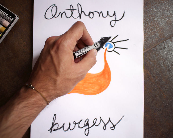
I chose pastels to express the roughness and violence of Alex’s world, yet used cursive writing because despite it all, Alex seems to retain a piece of his childhood innocence.
The image shows a dead body, with blood flowing from its head. The blood is orange due to the fact that the narrator shows us violence in a way that is almost acceptable. All of it also represents Alex’s sly face smiling in front of this bloodshed.
My decision to design book covers came after ending my brief career as an Art Director in advertising in order to do something more meaningful to me for a living.
I was walking through the aisles of a bookshop, hoping to find a book to read during my trip to the south of France, when I came across what some may call ‘fate’. As I opened the door, I found myself in front of an ultra-cluttered shelf full of terrible book covers, hiding lovely stories beneath them. Most of them looked the same, and none of them made me want to read the story inside. It was nothing more than stock photos put together with a bit of Photoshop. What a shame!
It was at that particular moment that I decided to try to design book covers. So, I bought ‘A Clockwork Orange’, read it, and gave it a go.
I would love to make covers that stand out from the others and make people want to read them. I want it to be fair for amazing authors who suffer from people like me, who often judge a book by its cover.
More info: Instagram
Oil pastels for the violence

Cursive writing shows Alex’s childhood innocence

Orange blood, as if violence were acceptable

The final cover. I would love to hear your feedback!

128views
Share on Facebook


3
0