Get Premium
Dark mode theme is available exclusively for premium users. Learn more about the benefits of subscribing.
No fees, cancel anytime.

 Dark Mode Ad-Free Browsing Unlimited Content
 Ad-Free Browsing Unlimited Content Dark Mode
Join 1.2 million Panda readers who get the best art, memes, and fun stories every week!
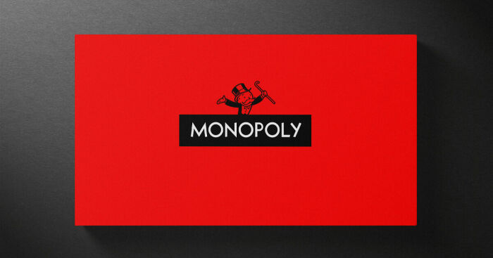
Classic board games have a distinct graphic style. They’re typically full of color, energy, drop shadows, lively renders, and things generally ‘pop’ to try and entice young kids and parents to pick them up.
But, what if a different design discipline was applied?
Could you take a more minimalist approach and still retain the brand essence? This was the question I posed myself for this self-initiated project, attempting to strip back the design of these classic games in order to test the visual strength of the respective brands, logotypes, and graphic assets.
It’s been a fun and challenging project, testing out different levels of minimalism to try and arrive at a design that is striking yet unmistakably on brand.
More info: allgood.tv
36Kviews
Share on FacebookThe title here is quite misleading: the board games themselves have not been redesigned.
The issue is these design work for those who already know the game name and content. The original designs work better, as they give a hint about what type of games they are and a glomps of what the content might be, therefore better marketing and higher chance of being picked up by its target audience.
The target audience for these games are people who grew up playing them with their friends and family. I'd love to have this minimalist style on my shelf.
Load More Replies...The title here is quite misleading: the board games themselves have not been redesigned.
The issue is these design work for those who already know the game name and content. The original designs work better, as they give a hint about what type of games they are and a glomps of what the content might be, therefore better marketing and higher chance of being picked up by its target audience.
The target audience for these games are people who grew up playing them with their friends and family. I'd love to have this minimalist style on my shelf.
Load More Replies...


 No fees, cancel anytime


13
16