Get Premium
Dark mode theme is available exclusively for premium users. Learn more about the benefits of subscribing.
No fees, cancel anytime.

 Dark Mode Ad-Free Browsing Unlimited Content
 Ad-Free Browsing Unlimited Content Dark Mode
Join 1.2 million Panda readers who get the best art, memes, and fun stories every week!
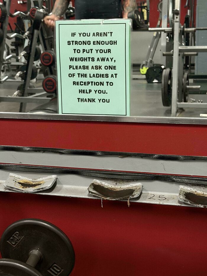
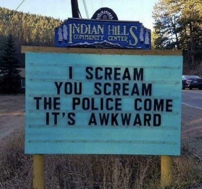
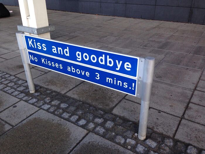
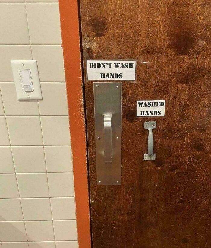
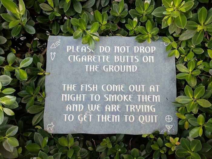
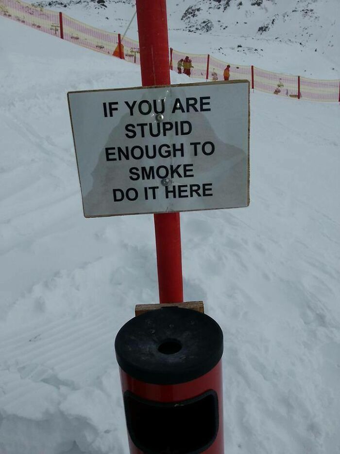
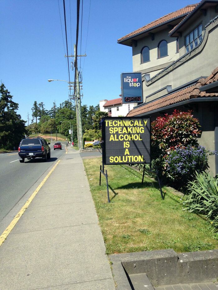
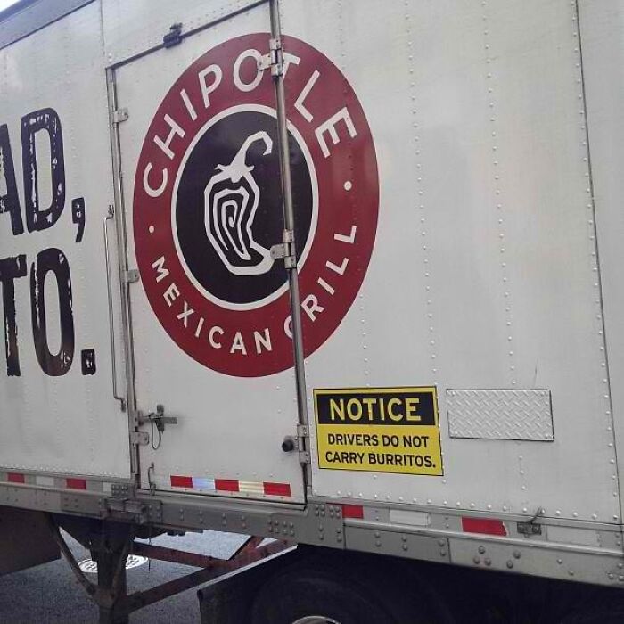
You might not be consciously aware of it, but every single day, you pass dozens—if not hundreds—of signs. Professional adverts, informative notices, colorful warnings, and (not so) friendly sticky notes from your colleagues are peppered throughout your environment. But some of these verbal and design gems are a cut above the rest!
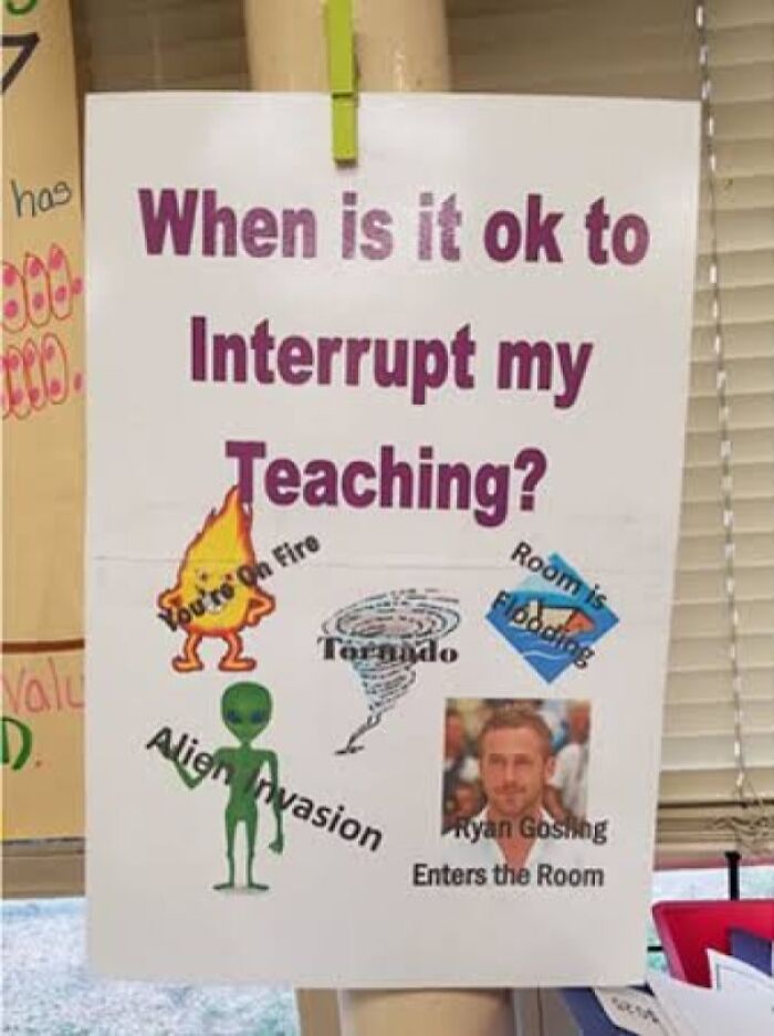
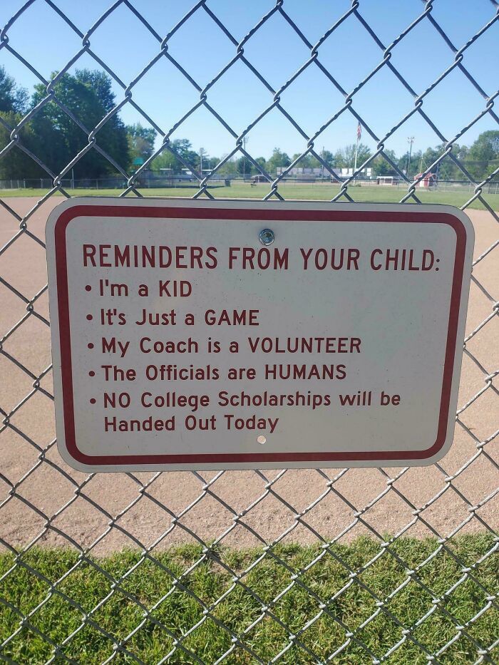
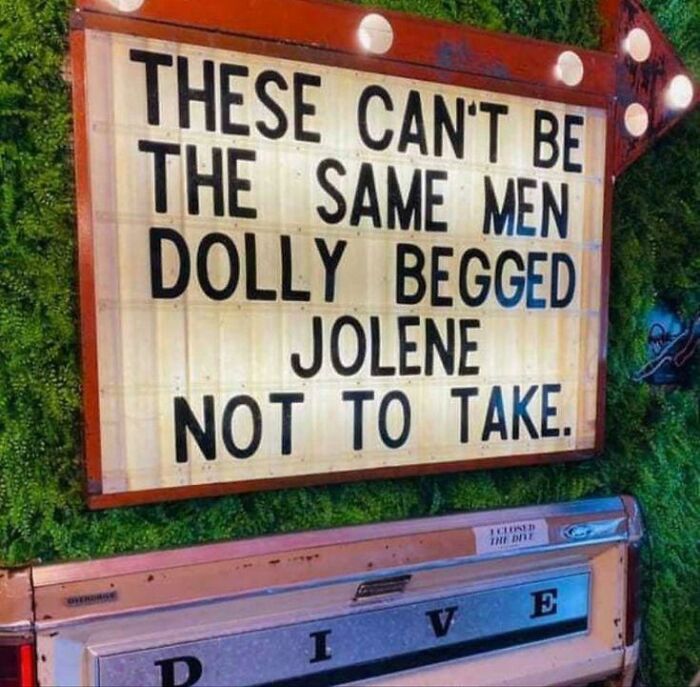
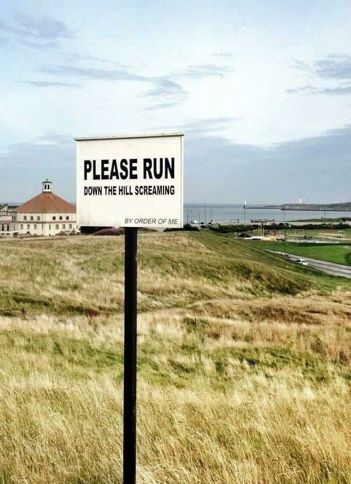
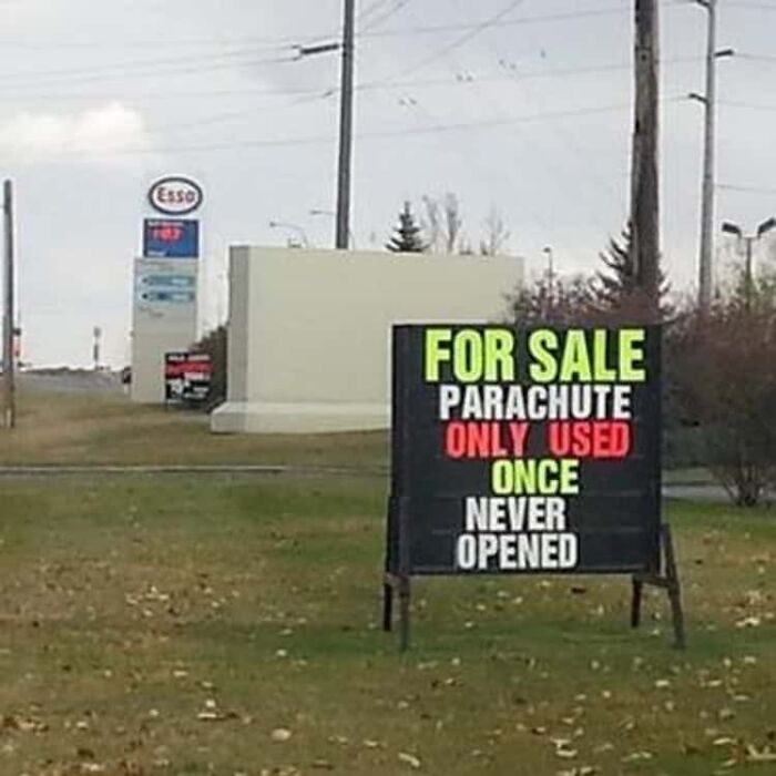
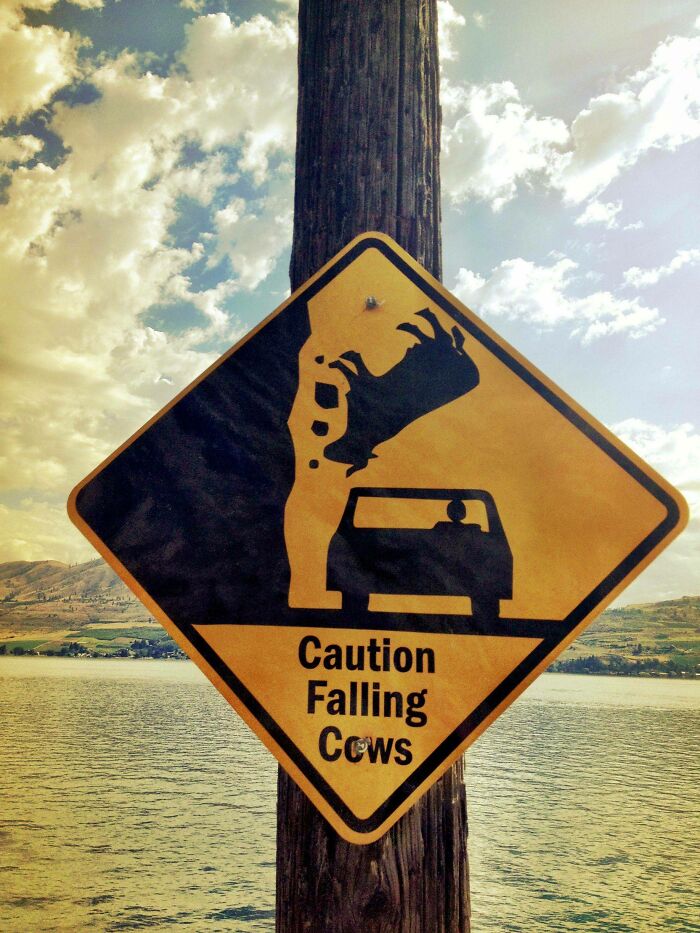
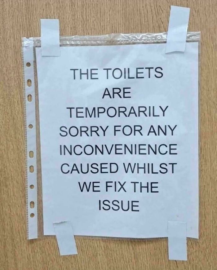
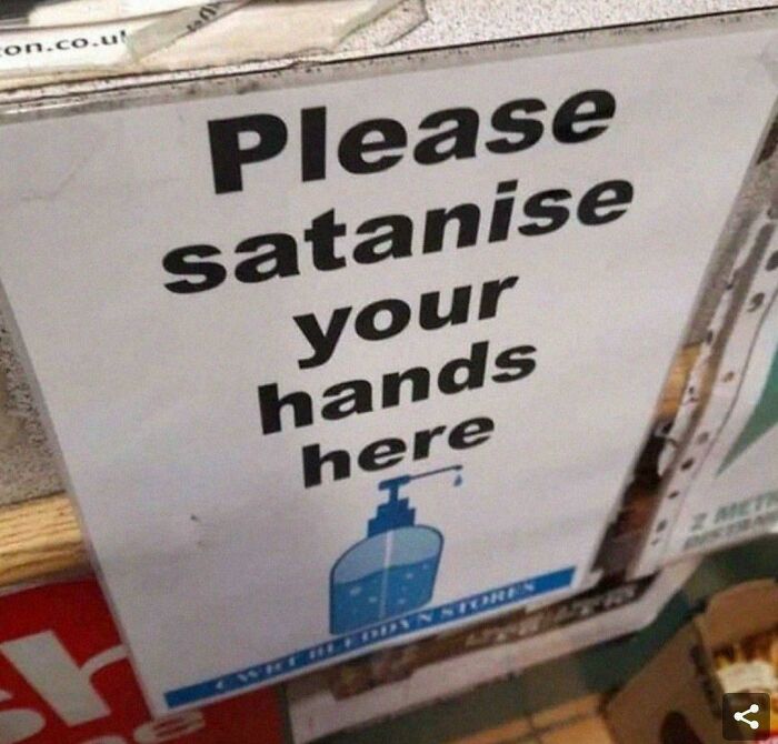
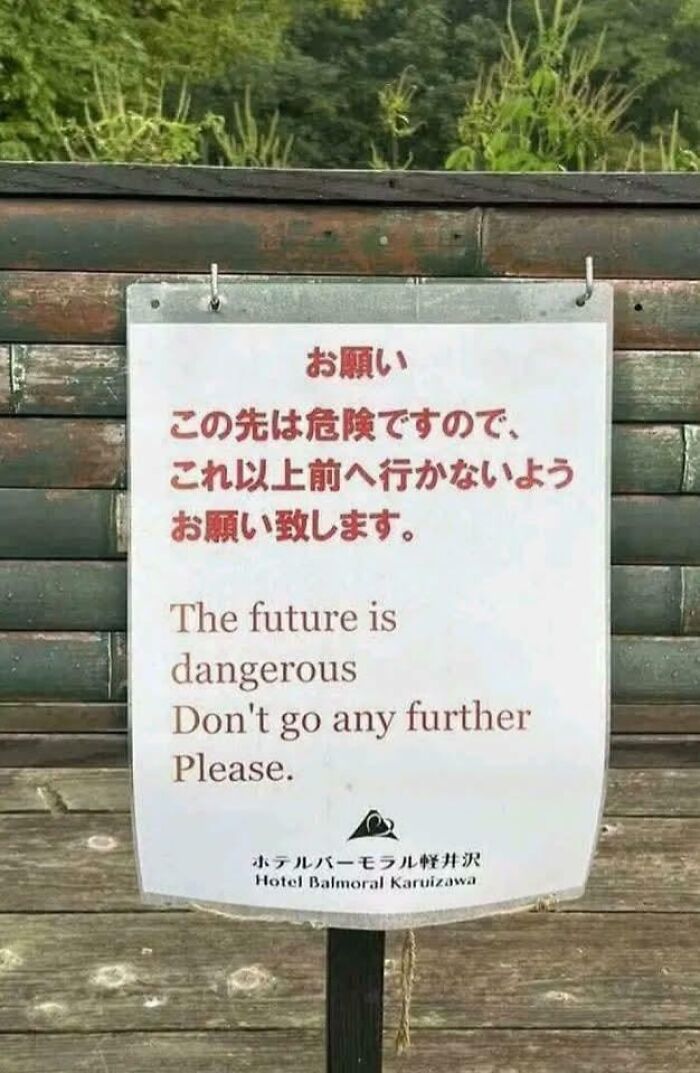
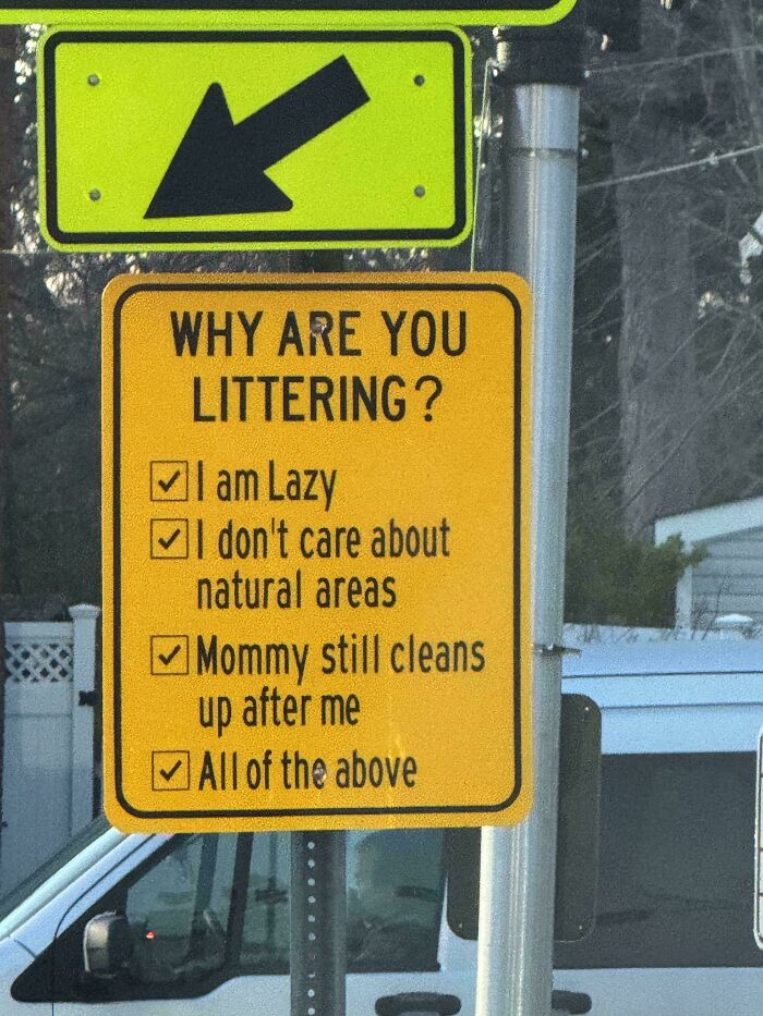
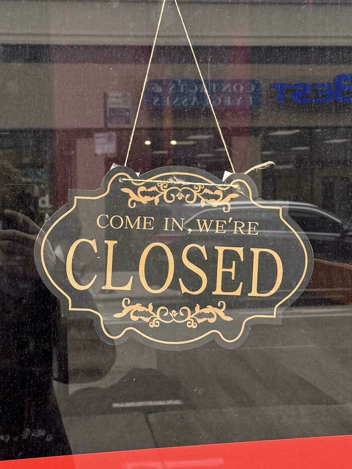
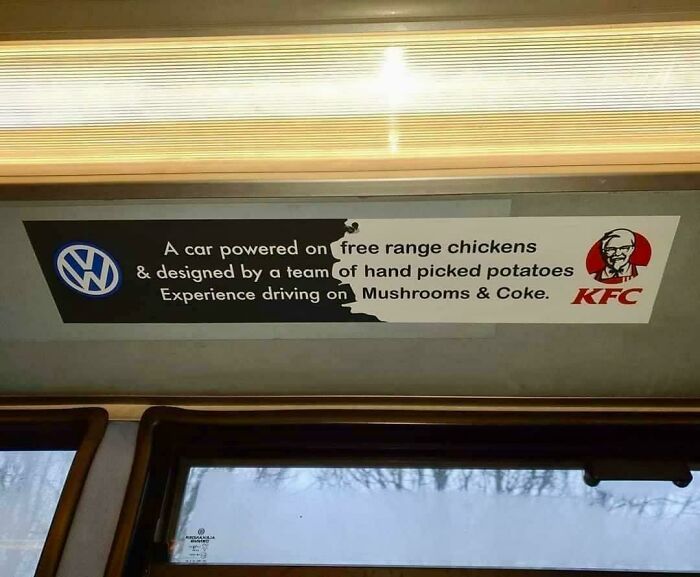
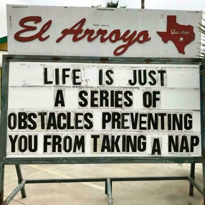
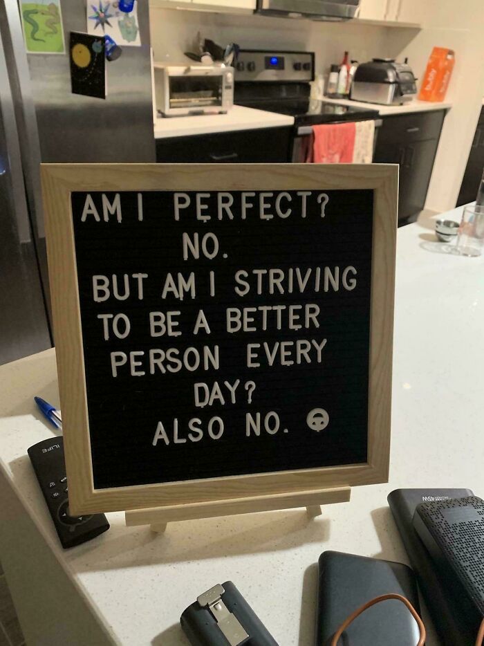
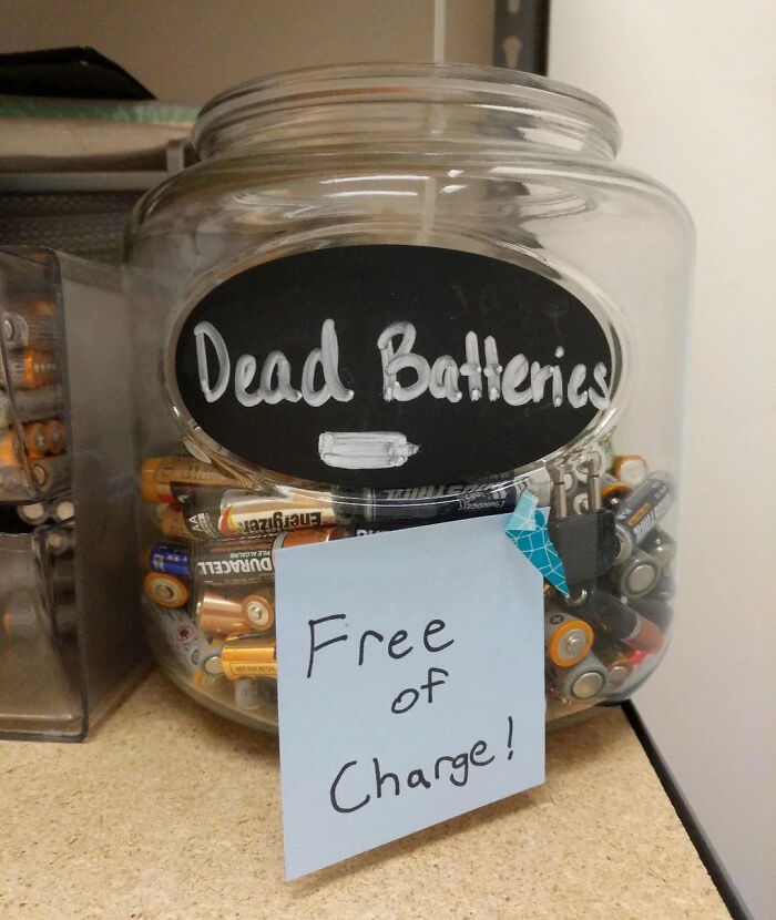
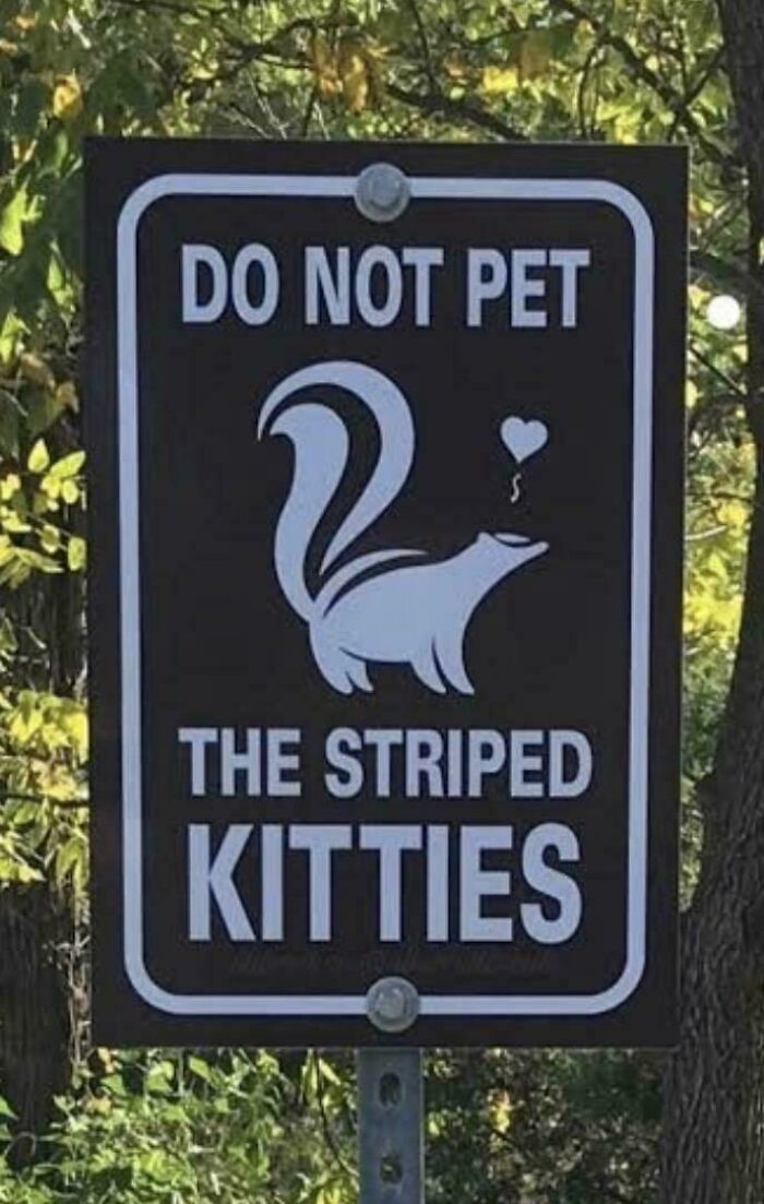
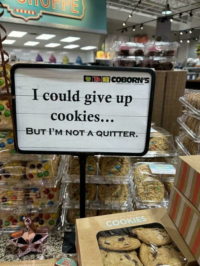
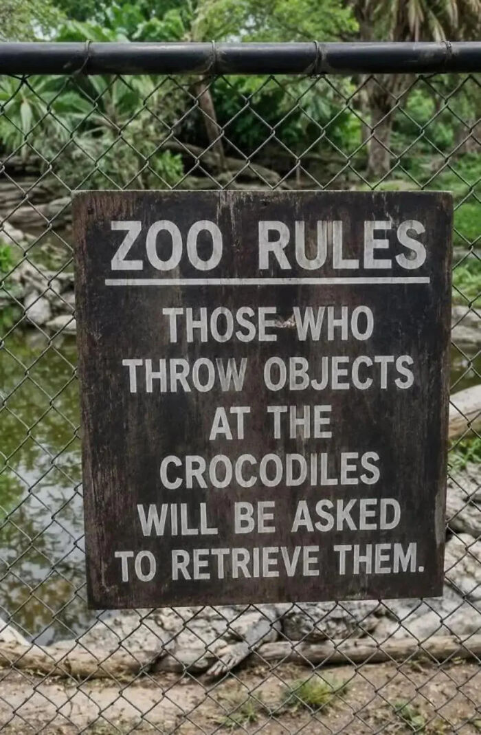
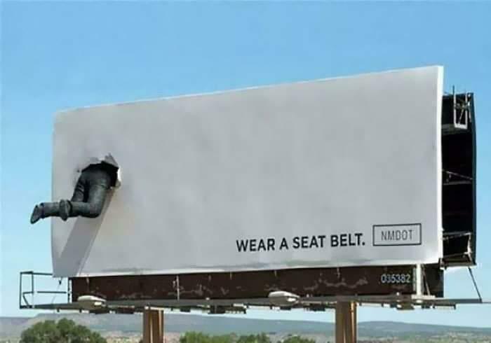
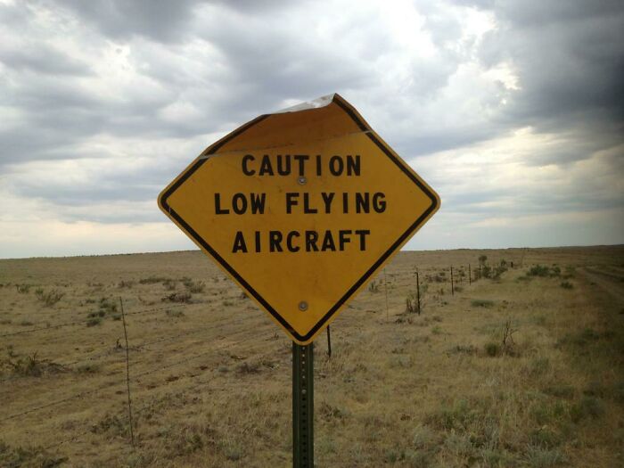
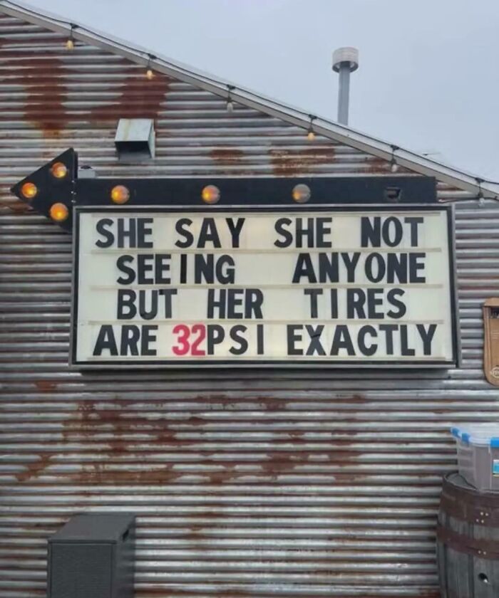
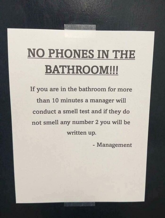
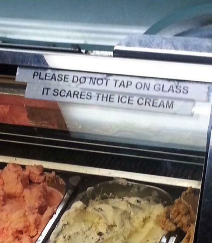
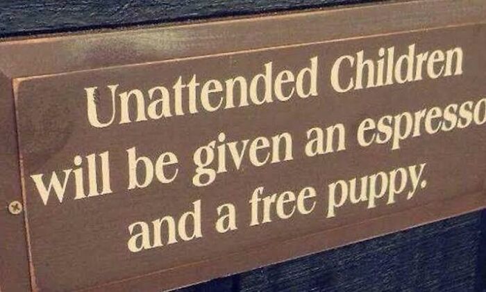
Bored Panda has collected the wittiest, funniest, and most creative signs that people have ever seen and felt like they just had to snap a photo. Check out our collection of the most hilarious signage, and we hope it inspires you to unleash your inner comedian the next time you have to write something for the public.
This post may include affiliate links.

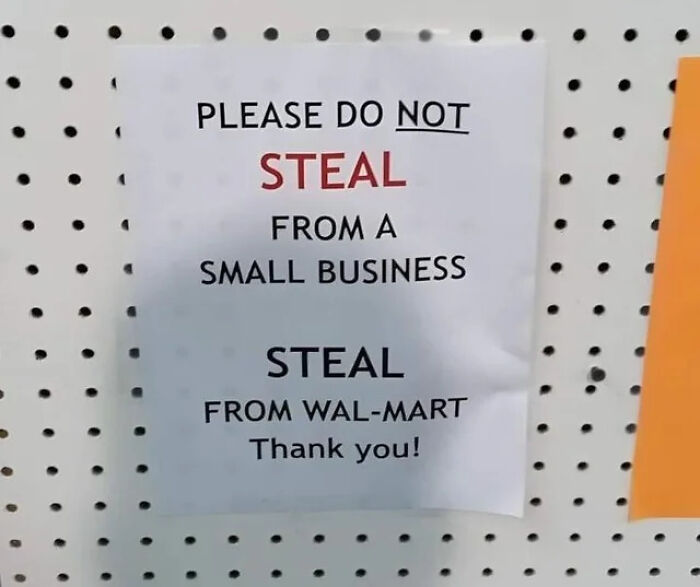
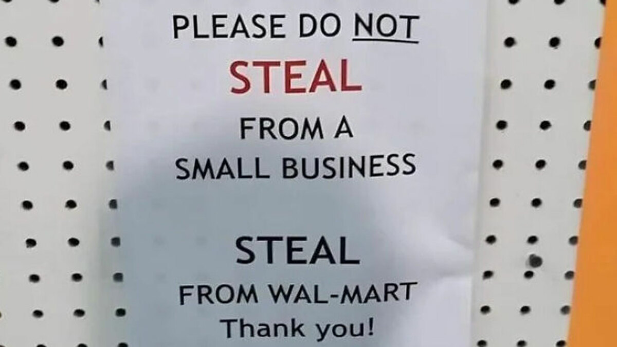
Only steal as much from Walmart as it has stolen from its workers, not a billion more.
Good signage is vital for your brand, business, and goals.
According to a survey conducted by ‘Custom Neon,’ good signage is absolutely essential. A whopping 77% of respondents revealed that they have had issues finding businesses either due to poor signage or no signage at all.
Furthermore, 76% said that they have visited a store or business simply due to how attractive its signage was.
Meanwhile, 66% of respondents spilled the tea that they had a poor opinion of a business because of its signage.
And a whopping 72.2% said that, in their opinion, good signage is more important for a business than its social media presence or newspaper ads.
So, what does a good sign actually look like? Well, that depends entirely on your brand identity and what you aim to achieve.
If you want your signage to be memorable or attract a certain type of customer, you might go for something humorous or punny. Meanwhile, if you want to leave a professional impression, you might go for a bit more subtlety and refinement.
But no matter the specifics of your brand or goals, there are several main design decisions that you want to embrace if you want your sign to function well.
At the end of the day, you want your sign to stand out from the crowd. What’s more, you want to get your message across as quickly as possible, with as little friction as possible.
If your potential customers or target audience spend precious seconds scratching their heads, trying to make out what you’ve written, you’ve already failed.
What you want to aim for is clarity and simplicity.
Integrate these two things, clarity and simplicity, into the very core of your signage.
In the meantime, avoid the rookie mistake of overdesigning your signs. Visual clutter wastes time because your audience has no clue where they ‘should’ be looking.
Unless your goal is to be chaotic and distracting, try to adopt a ‘less is more’ approach.
“The hallmark of an outstanding sign is its ability to convey information swiftly and unambiguously. Clarity reigns supreme,” explains ‘Twilight Signs.’
“Your message should be easily digestible at a glance. This involves selecting a legible font, ensuring ample contrast between text and background, and using concise language. Remember, signs are often viewed while on the move, so every second counts.”
Setting your particular aesthetic tastes aside for a moment, whatever art direction route you choose to go down, you should absolutely ensure that you stay consistent.
Keep the signage visuals consistent with the identity of your brand. Think about whether the style, colors, and font match the effect and atmosphere that you’re going for.
Meanwhile, you should also think about the environmental context of your sign. Your designs don’t exist in isolation!
What do the surroundings actually look like?
Where should you place your sign so that it gets seen by your target audience?
What do your competitors’ signs look like, and how do you make sure that yours doesn’t get lost among them?
“Whether indoors or outdoors, your signs should be in locations where they naturally attract attention. Consider the viewing angle, lighting conditions, and potential obstructions to maximize visibility,” ‘Twilight Signs’ emphasizes.
In the meantime, ‘Surrey Signs’ also stresses the fact that if your sign is not visible, “it is not worth it.”
Lighting is also important to consider. Can your customers or target audience actually see your signage when it gets dark outside or someone changes the indoor lighting?
“You can use LED lights to illuminate the information during the daytime and special night lights help highlight the information during the night.”
We want to hear your perspectives, Pandas—preferably in a witty format if you’re feeling particularly creative.
Which of these signs impressed you the most? Which ones did you think were the funniest?
Meanwhile, let’s switch back to your daily life. What’s the most hilarious or impressive signage you pass by every day on your commute? What’s the worst one you’ve recently seen?
Let us know in the comments!
































 No fees, cancel anytime