Get Premium
Dark mode theme is available exclusively for premium users. Learn more about the benefits of subscribing.
No fees, cancel anytime.

 Dark Mode Ad-Free Browsing Unlimited Content
 Ad-Free Browsing Unlimited Content Dark Mode
Join 1.2 million Panda readers who get the best art, memes, and fun stories every week!
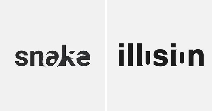
Design as a discipline in itself is one that requires a huge amount of creativity to pull off. Most of the time, it is used to draw attention and you only have a handful of elements at your disposal—basically, color, style, form, and idea—to make the perfect impression.
Well, you don't really need complexity in the logo for them to be impressive if you’re creative enough, as exemplified by graphic designer Sander of san.designs_ on Instagram.
Sander, with whom Bored Panda got in touch for an interview, has created a number of wordmarks that make use of negative space in creative ways to reveal pictures of the things that the words represent. In the general sense, wordmarks are marks or logos that strictly use words to represent brands.
Sander did however note that he is approaching wordmarks differently—he made these marks in a particular way for creative exploration and entertainment. Though in some cases elements like negative spaces could work, but it depends on the company and its brand, and it is not necessarily characteristic of a true wordmark
Bored Panda has collected some of their best wordmarks and compiled the list below. Take a look at the collection of wordmarks and why not vote and comment on the ones you liked the most!
This post may include affiliate links.
"The first wordmark I designed was the watch. I was experimenting—I still am—with ways to explore my creativity and to entertain my audience," explained Sander the inspiration behind his series of wordmarks. "Later, when I started to incorporate negative spaces into the designs, I noticed that people really like clever designs that take a moment to discover the 'hidden' message and started a series where I try to create a new one every other post."
As it turns out, Sander does not plan wordmarks, but it rather just comes to him naturally: "It's often just a word that pops into my head or I sit down and generate a lot of random words using an online tool. The thing is that you never know if a word and the space between its letters will allow you to create a nice recognisable picture inside."
Sander continued: "What I just mentioned is probably the hardest part. I try so many different words before I arrive at something that I know for sure would be a success. I don't want to create something that is just mediocre. Some words are simply not suitable for what I'm trying to achieve."
"What makes this difficult is keeping balance between the positive space (the typography in this case) and the negative space. While it's not hard to incorporate a negative space element, it's actually maintaining the right font weight and readability of the word what makes is hard."
We've asked Sander if he has a favorite in this series and he had this to say:
"I would say the second dragon wordmark is still my favourite. This was an actual challenge compared to popular wordmarks like 'four' which wasn't difficult to execute. It was incredibly satisfying to come up with something that I didn't expect to work at first. An example is how the negative space under the r finished the design because it's almost like its spitting fire. You get these nice and lucky discoveries sometimes."
We've also asked Sander if he has anything planned for the upcoming designs, but as stated previously, he doesn't plan these things. "Now is a rather busy time for me and I'm finishing a client project soon that I plan to post next. Then, I will see whatever pops into my head to create a wordmark with."
Be sure to follow Sander on his Instagram page for more creative wordmark goodness. But this list doesn't end here so be sure to check out the rest of his designs below and to vote on the ones you loved the most!
I like these as they are very simple and effective. It does look like they were all done by the same person/company. Either way, very cool.
Yup. And posted by the artist as well. It's a nice promo of himself. Talented!
Load More Replies...I like these as they are very simple and effective. It does look like they were all done by the same person/company. Either way, very cool.
Yup. And posted by the artist as well. It's a nice promo of himself. Talented!
Load More Replies...


 No fees, cancel anytime