Get Premium
Dark mode theme is available exclusively for premium users. Learn more about the benefits of subscribing.
No fees, cancel anytime.

 Dark Mode Ad-Free Browsing Unlimited Content
 Ad-Free Browsing Unlimited Content Dark Mode
Join 1.2 million Panda readers who get the best art, memes, and fun stories every week!
Making a sign is a great way to share your thoughts with the world. Well, at least most of the time. Anyone who engages in creative writing knows that there are many ways to mess up your text. Whether it's grammar mistakes, overly complicated words or nonsensical sentences, getting the message across might be harder than you think.
There's an online community dedicated to specific phrases that just don't make any sense. The subreddit is called Don't Dead Open Inside and according to the moderators, it's a place for "signs/media that read as nonsense if read normally: from left to right".
Bored Panda has collected the most ridiculous examples on this subreddit that will make you scratch your head. Scroll below and check them out yourself! And if you still feel the unexplainable desire for more, you can read our previous posts here and here.
This post may include affiliate links.
In order to find out a bit more about the subreddit, we decided to take a look at the origin of its name. The internet database Know Your Meme describes "Don't Dead Open Inside" as a trope that involves incorrectly reading different signs and labels "which include two or more lines of text and have no clear way to tell the order in which the words should be read".
Sounds confusing, right? In short, it's about signs being misread due to the words being misplaced. People in the West are used to words going from left to right, so doing it any other way leads to confusion.
The meme originates from a promotional poster for The Walking Dead TV series. Since its reveal in 2010, it stands as one of the best-recognized examples of this trope in popular culture. The poster featured a photo of a double door with the words "Don't Open" written on the left side and "Dead Inside" on the right. The idea was to read it as "Don't open, dead inside". However, if read line by line, the phrase ends up as "Don't dead open inside."
It's no secret that ridiculous things spread on the internet like a virus, so in a few days following the reveal of the poster, people started discussing the design flaws. Many were pointing out that they read it the wrong way before realizing what it actually meant to say. A few users shared their interpretations on Twitter and more similar posts followed.
A few years later, the subreddit /r/dontdeadopeninside was created with the purpose of collecting examples of the trope in advertising, design, and popular culture. As of today, the community has over 630K members who follow a strict set of rules in order to share their posts.
First, all pictures need to follow the format of DDOI. The moderators explain this rule further, saying that "signs must be read correctly top to bottom, and incorrectly left to right, like any text usually." And even though it does not matter how easily you can read the signs or posters, it is highly encouraged to post images with little separation or spacing between the words.
sounds like something a grizzled 1860s prospector would say to someone who was being annoying
Another highly encouraged rule would be to caption posts with the "correctly read" way in the title. For example, "You Don't Matter Give Up”. Also, posts should not be forced or easily staged. Pages of magazines, spines of books, or pillows with text that are put next to each other do not belong in the sub.
If you look closely enough, you will find many such examples around you. Design as a whole might seem like a simple thing at first, but actually, a lot of work and knowledge goes into creating something clever. No wonder that when people think something like "Oh, it's just a logo" and don't put much thought into its creation, the results can be quite disappointing.
Bad text design usually comes in all shapes and sizes. So first of all, we should define what "bad" signage means. If an ad, a billboard or anything else related to advertising your business lacks clarity, it may leave your customers feeling puzzled. A simple easily understood and logical message creates trust which can have a big impact on your brand in the future.
Then, there's the issue of a poorly designed or placed board. If it is hard to read, most of your clients will not bother to stay long enough to understand what you are trying to say. It might be a wrong choice of location, an unreadable font, poor contrast or maybe lack of light; there are so many ways where this can go wrong.
Perhaps in a way this illustrates the point - if you cant read this you're probably not sober enough to get behind the wheel!
Bad signage sends the wrong message to your future customers and all that work put into thinking of ideas and designing will be for nothing. If you want your business to succeed and your customers to trust the quality of your products, clever and clear communication is the way. And to help you with that, here are a few things you should know.
This sign doesn't make any sense whatsoever--- just like anti-vaxxers
According to Lektron Branding Solutions, signage is one of the most important marketing investments any business can make because of its "ability to immediately communicate with customers, demonstrate your brand’s style and tone, and win both attention and foot traffic." So if you miss important details in the design, placement, or the message itself, you end up wasting effort and money and still fail to reach the desired result.
There are four main effects that bad signage has on your business. First, it affects how your target audience sees your presence. Sometimes your brand might even lose presence-of-mind among customers if you don't consider their needs. Second, overly complicated signs can even frustrate your customers. "Even if the placement and positioning of your sign is spot on, signage that’s hard to read isn’t going to help further your reach into target markets," Lektron Branding Solutions suggested.
I don't think this belongs here. This is brilliant. You can read the white side and it makes sense, you can read the black side and it makes sense, you can read both together and it makes sense. Sure it's not 100%, but the concept is genius and the execution is not terrible at all.
And imagine if there's an embarrassing grammatical error in your poster or ad. A typo can suggest to the customer that your business is unprofessional or that the employees are careless, even if everything else written and designed is spotless. Your clients' first impression counts and if your sign leaves them annoyed, it will make winning them over even harder later on.
The bathroom is on the right, but be careful because the floor is slippery
Then there's the known fact that your advertising choices reflect your business and its ideas. Billboards and signs should communicate the way you think, so if it's dirty or even broken, your clients will think that your services are also poorly handled. This results in your business being seen as of lower quality than it actually is.
Is it supposed to be Say no to racism respect? It made sense up until they tacked the last word on there.
Lastly, there's a big chance that you will lose foot traffic and sales. The FedEx Office "What’s Your Sign?" survey asked American consumers how signage can impact their intent to visit a store, make a purchase and more. The study found out that "poor signage can deter consumers from entering a store, with over half (52 percent) saying they are less willing to enter a store with misspelled or poorly-made signs."
With such massive consequences, you simply cannot ignore the readability of your posters, boards and ads. Ryan Brady, president at Brady Signs, said that you should consider your target audience before choosing the colors and style of your sign. What appeals to the people you want to market? How can you get their attention? "It might not be the best idea to put a giant, flashing sign out in front of your business, but you still want to make sure that people are seeing your sign and your storefront," he wrote.
Another thing to have in mind, less is more. Overcomplicating your brand will result in people losing attention. "Make sure that your sign is conveying the right information too, customers will turn right back around if they come in with incorrect knowledge about your business," Brady explained.
"Your sign is a direct reflection of your business. People will judge your business based on your sign without even coming in, so it’s key that you don’t skimp out when you make a signage purchase. Cheap signs often cause more problems than they solve, whether it’s because they can’t withstand the test of time or they just don’t look like you planned. All things considered, your sign is worth the investment."
This is entirely fine. Go watch the scene this comes from. Data went a little overboard.
What I can't figure out is why the rest of it is in Japanese.
As one of the moderators of /r/dontdeadopeninside told Bored Panda earlier on, people make such text design mistakes because "they're either not thinking or they want to be original. Our main mission statement is to show them that they are wrong." It's important to remember that people in the West read left-to-right: "Do not "liven up" your text by making it "quirky". Hard to read means lost attention which translates to lost revenue."
Bad design comes in all shapes and sizes. Some products are irrelevant, apps—overly complicated, and posters or signs can be just simply... unreadable. But even though this results badly for the business, it's definitely hilarious for us.
It’s two different plaques pushed together, so doesn’t entirely count.
This is just an instruction manual for torturing someone with unwanted soup.
Check it in, check it out, Or the sun will never shine. They're a long way away, In the subways of your mind.
I give up. I must be too old, too uncool or too English to decipher this
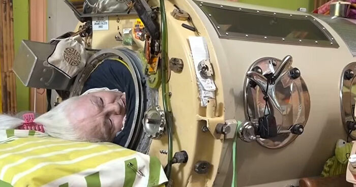
I'm going to ignore the writing and avoid this thing because it's hot and dangerous
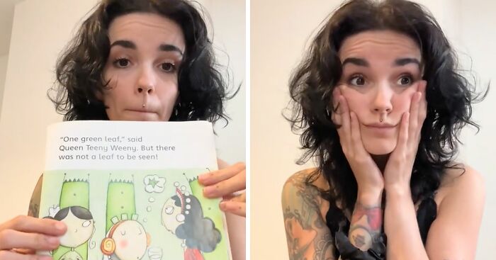
Thanks to everyone for answering my question, apparently it says “Grandpa’s are dads without rules” (Probably)


 No fees, cancel anytime


")


")


")