Get Premium
Dark mode theme is available exclusively for premium users. Learn more about the benefits of subscribing.
No fees, cancel anytime.

 Dark Mode Ad-Free Browsing Unlimited Content

 Ad-Free Browsing Unlimited Content Dark Mode

Join 1.2 million Panda readers who get the best art, memes, and fun stories every week!
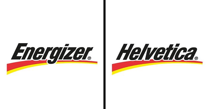
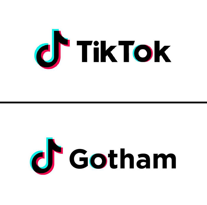
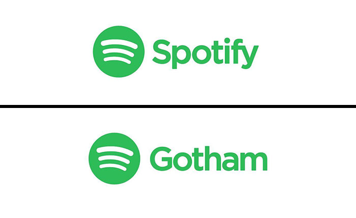
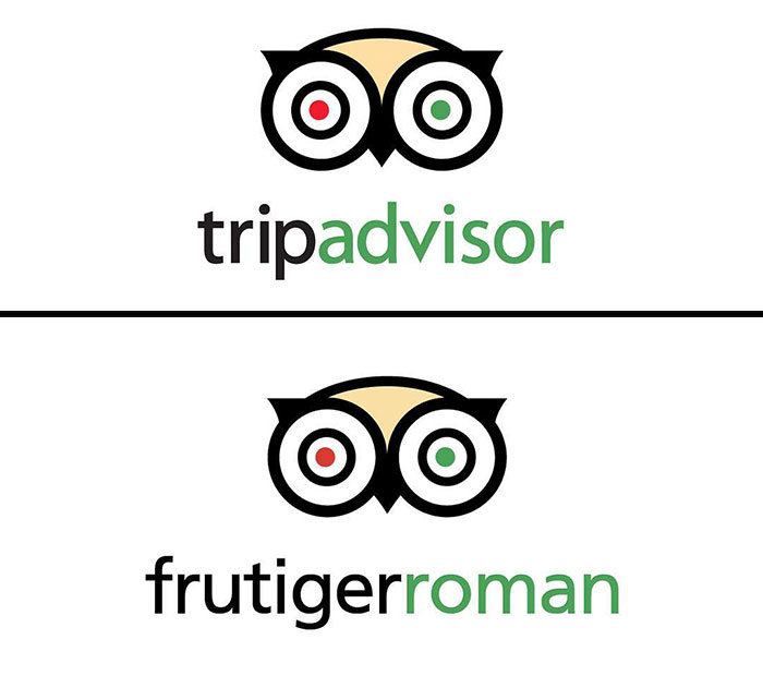
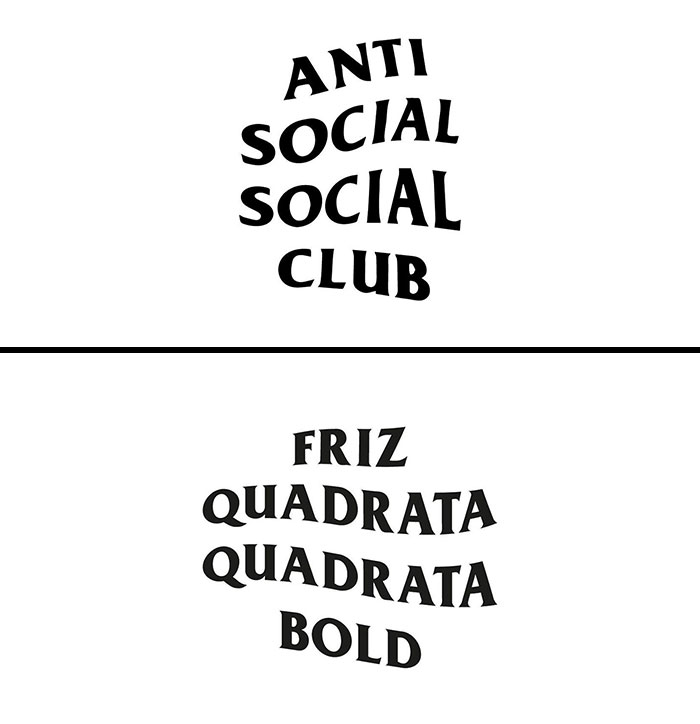
There is no doubt that a logotype is the face of the company; that‘s why each element of some of the most iconic and well-recognizable logos is carefully thought out, even though they might seem simple. Often, simplicity is the key. Selecting the right typeface and font for a logo is crucial and combined with size, color, and graphic elements can help you stand out in a competitive environment. Each font can communicate a specific personality and tone—this is why it‘s particularly important to go with something that perfectly represents the brand‘s identity. Some brands use well-known and time-approved fonts such as Helvetica, Arial, and Gotham, while others create their custom designs often based on or inspired by classic fonts.
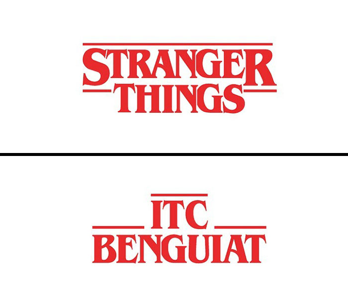
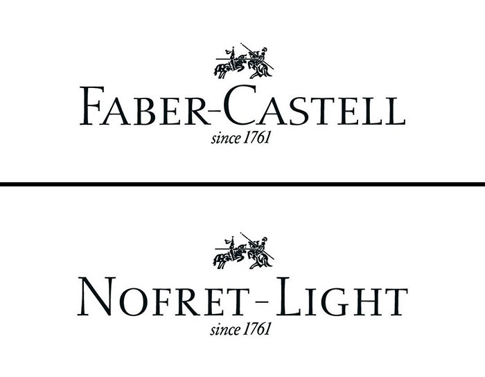
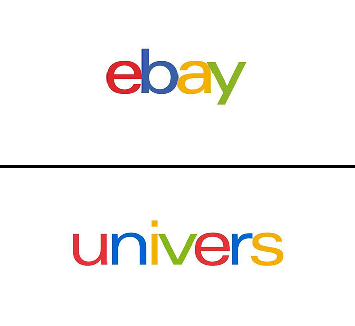
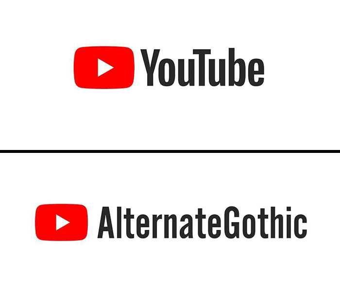
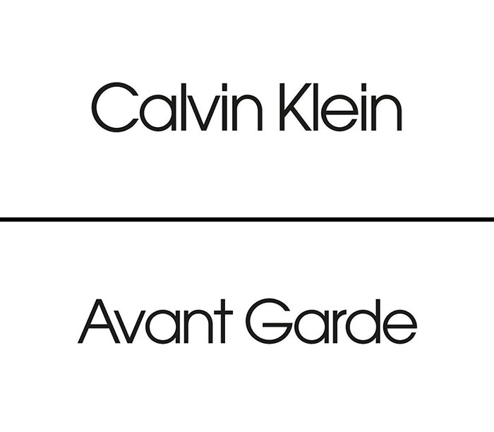
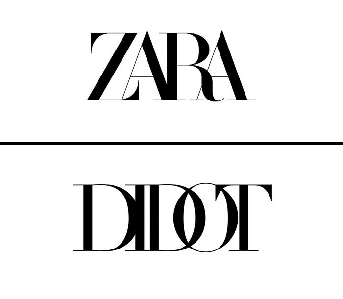
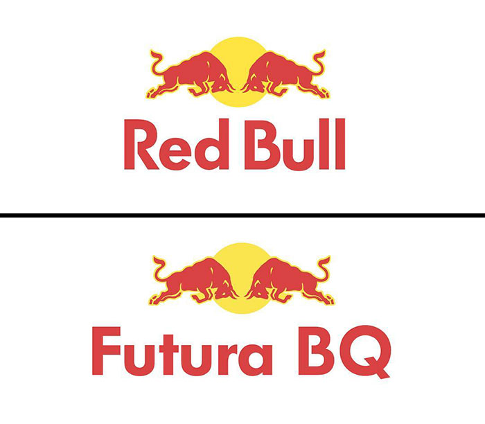
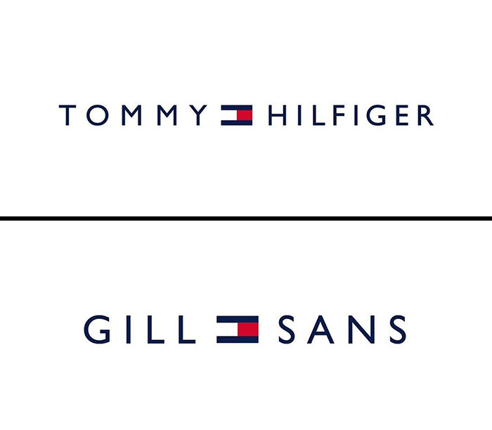
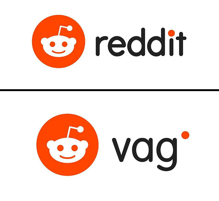
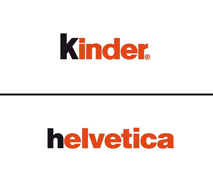
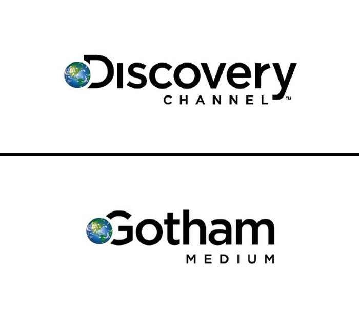
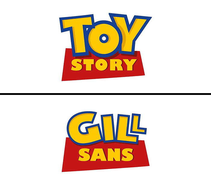
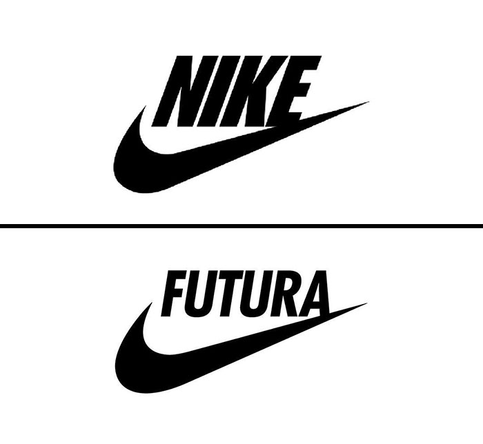
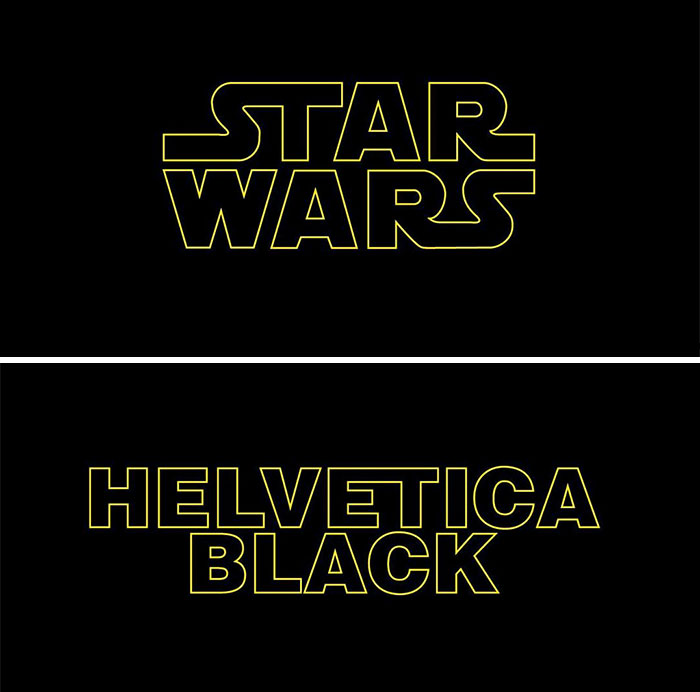
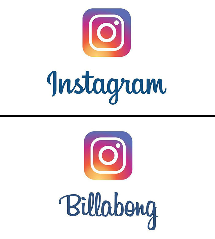
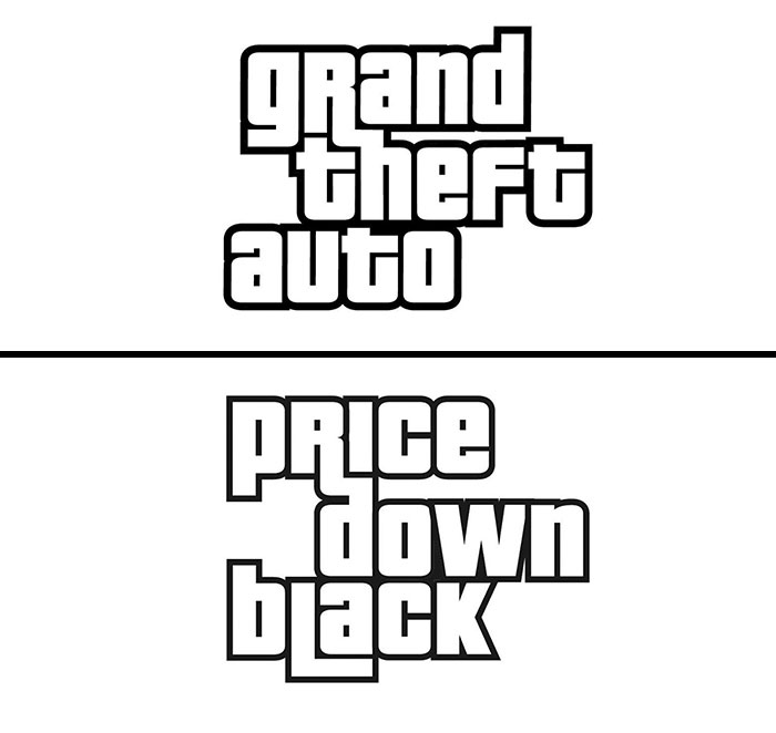
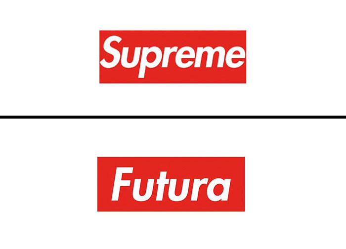
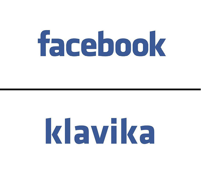
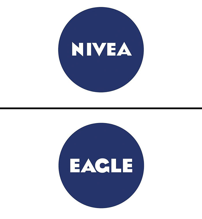
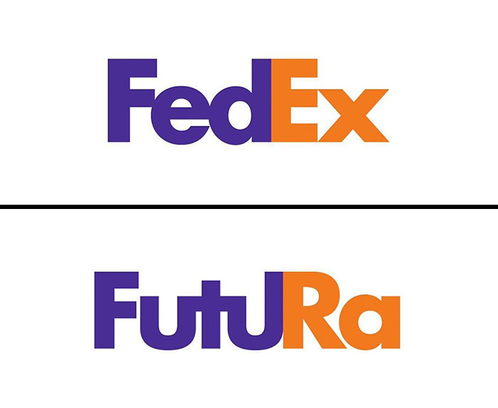
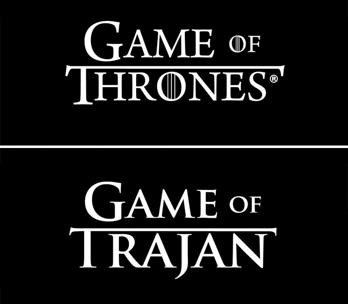
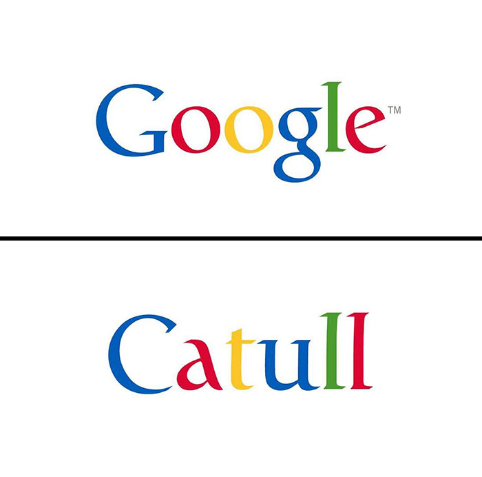
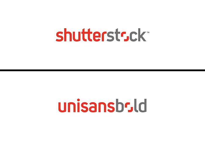
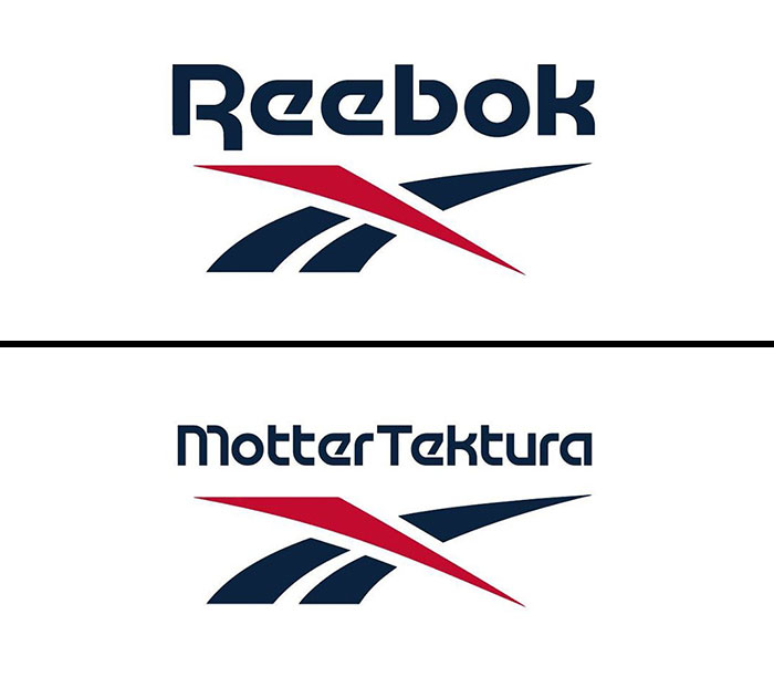
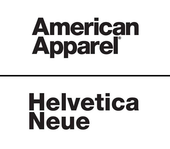
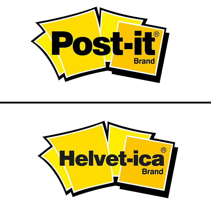
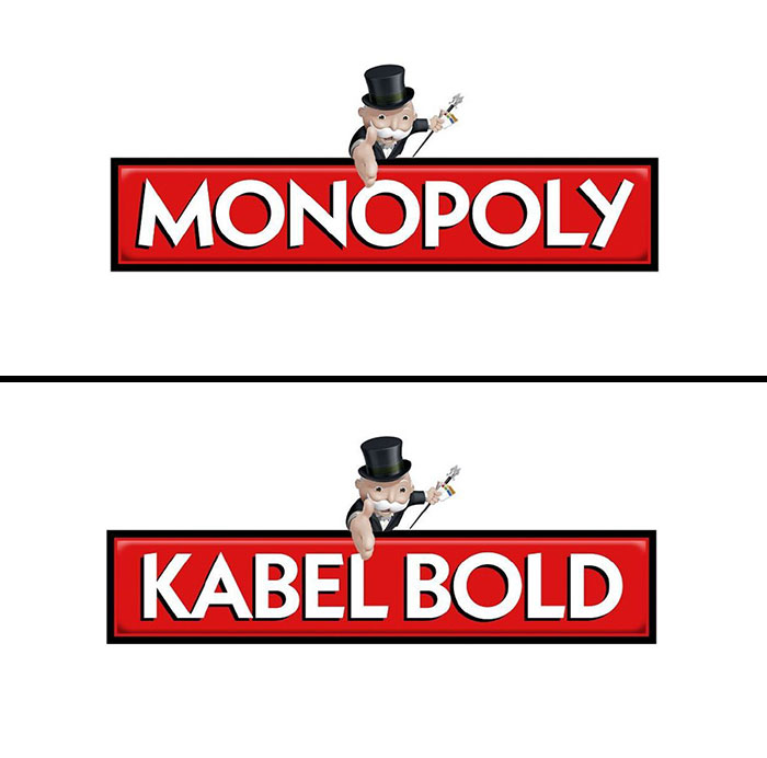
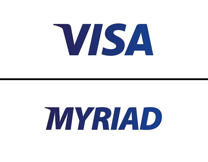
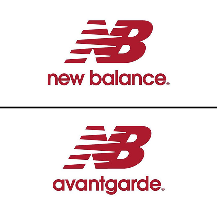
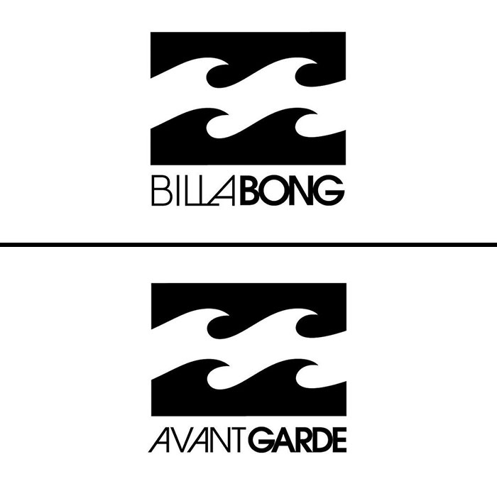
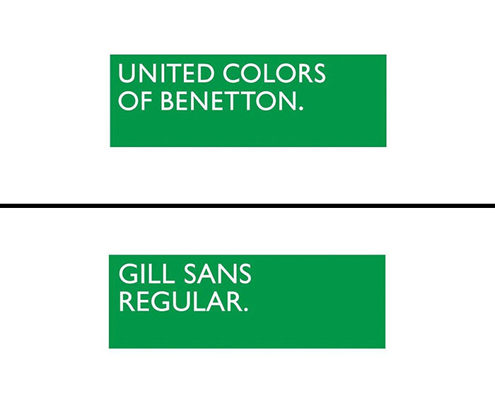
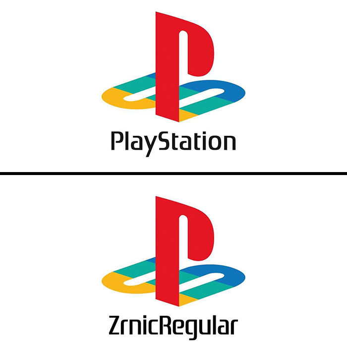
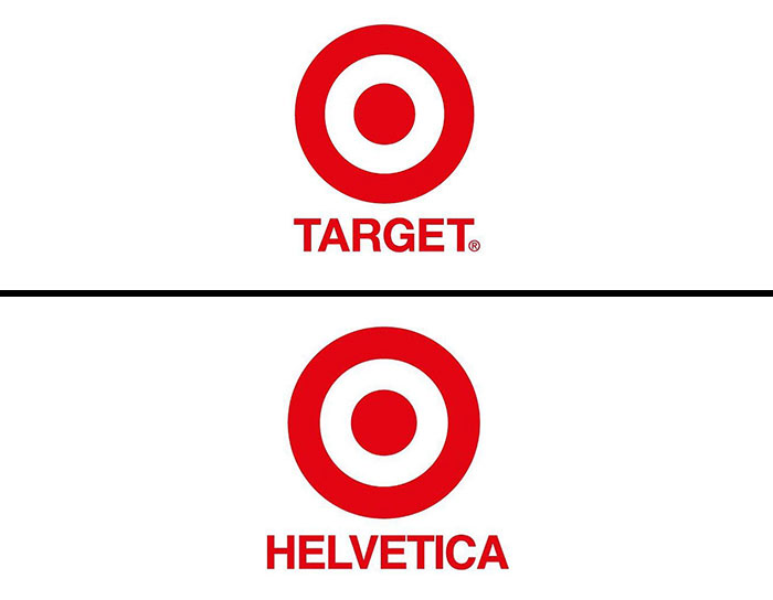
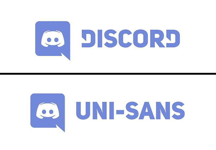
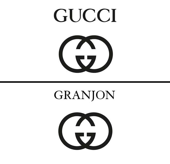
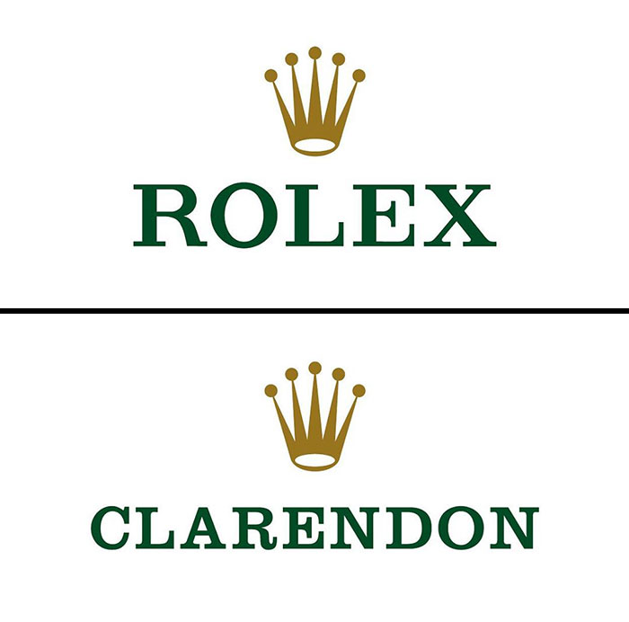
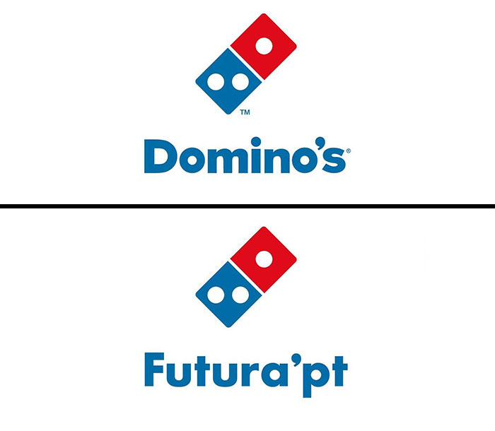
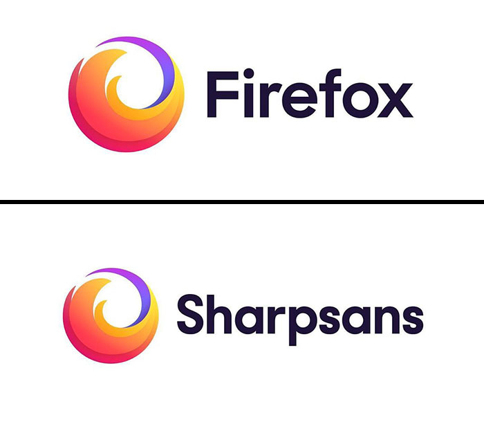
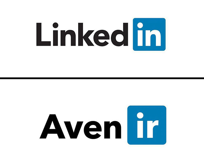
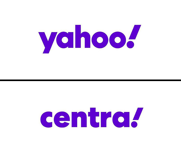
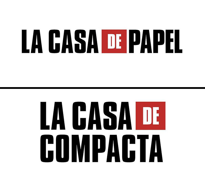
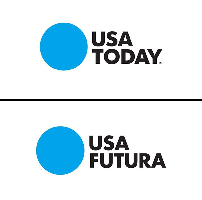
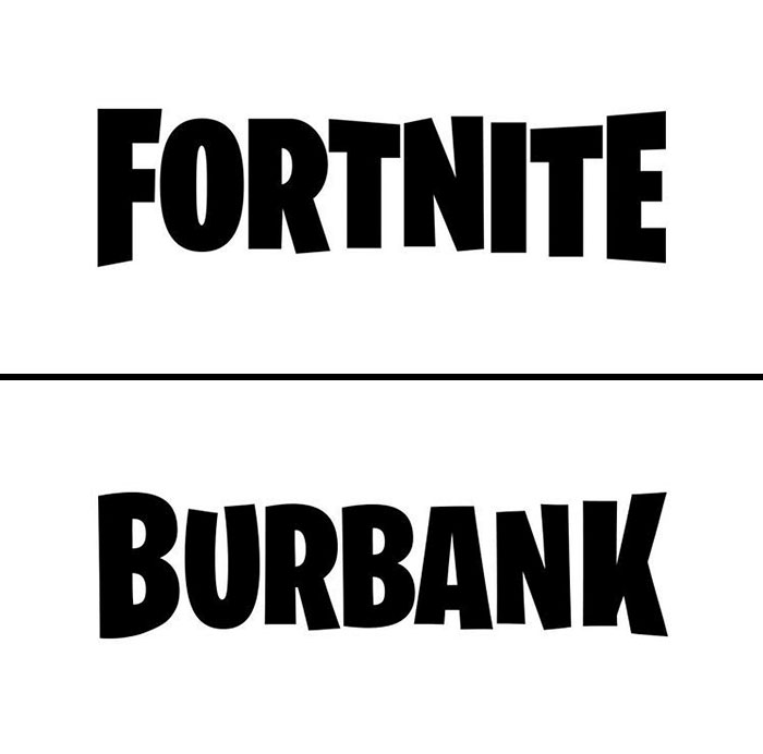
The Italian graphic designer, or logo guru, as one might say, Emanuele Abrate, runs an Instagram account all about logotypes. Last time we featured the artist on Bored Panda, he fixed the "World’s Worst Logos" (disclaimer: some of them are pretty ambiguous) by redesigning them in a more appropriate and sleek way. This time, he shows what fonts some of the most popular brands chose to represent them by replacing names in logos with logo fonts.
More info: Instagram | behance.net | Facebook | emanueleabrate.com
This post may include affiliate links.

Always wondered why Adidas had the chimneys of the sinking Titanic as their logo.

Ha! What an appropriate font name! (Pico in Spanish means "beak", among other stuff. If you ask a Chilean you may have a faaar different translation, haha!)

And is this the same font that was used on the cover of Needful Things as well?


This designer is wrong... It looks like Knockout HTF-49 Lightweight. Look at the weight on the lowercase e and o...

My current favorite font. I think the Obama presidential campaign used this font. It symbolizes modernity, clarity.

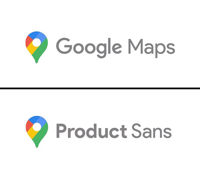
Google created product Sans, so does that really count? Also it was based off Futura with a few minor tweaks.

The kerning is made so all the letters are the same width apart. but how much incline?

Not exactly. Klavika a top curves downward, k shows daylight between strokes.

Um... no its not. I feel like FedEx is pointed to as one of the best examples of Helvetica in logo usage.

No, it's not. The GoT logo has heavier serifs, with serifs at the top of the M and N.

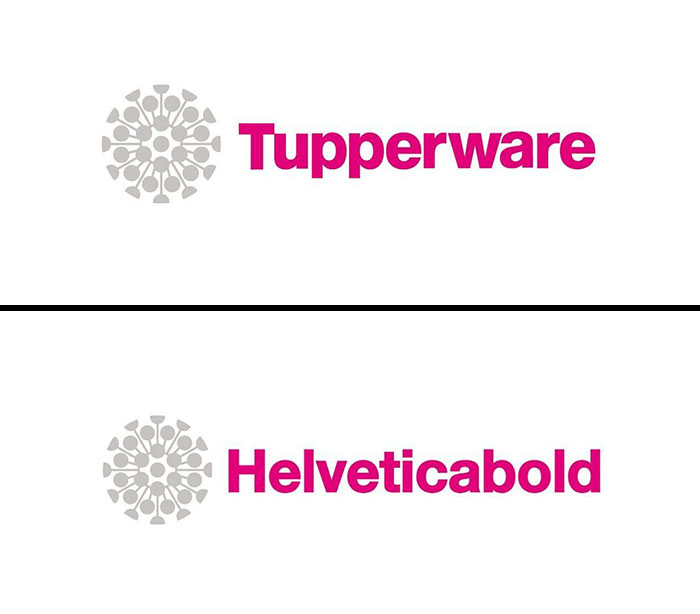
Tupperware's logo now reminds of something else... I wonder if they'll change it due to bad rep.
However, the logo uses round dots on the i's and the v has been customized to make the bottom pointy rather than flat like the standard font.


Hi! Graphic Designer here. I DO enjoy this piece. I wish I was still teaching college, this would be perfect for the intro to design kids.
Load More Replies... Wow. A lot of work. The ones that are not perfect have been customized. How anyone could criticize is beyond me. Have worked with fonts. You have a lot of patience to do all this research. Thanks. Very interesting.

"how anyone could criticize"? 🤣 Look where we are! But I agree with you -- good research and interesting.
Load More Replies... Hi! Graphic Designer here. I DO enjoy this piece. I wish I was still teaching college, this would be perfect for the intro to design kids.
Load More Replies... Wow. A lot of work. The ones that are not perfect have been customized. How anyone could criticize is beyond me. Have worked with fonts. You have a lot of patience to do all this research. Thanks. Very interesting.
"how anyone could criticize"? 🤣 Look where we are! But I agree with you -- good research and interesting.
Load More Replies...













 No fees, cancel anytime