ADVERTISEMENT

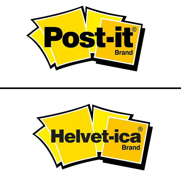
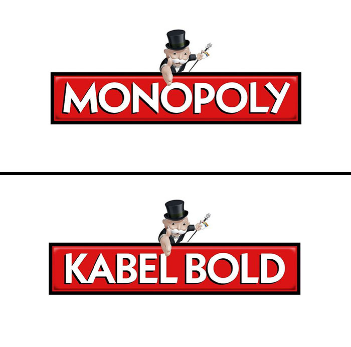
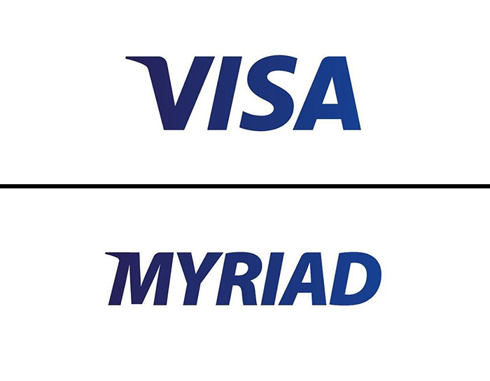
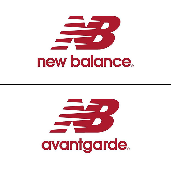
There is no doubt that a logotype is the face of the company; that‘s why each element of some of the most iconic and well-recognizable logos is carefully thought out, even though they might seem simple. Often, simplicity is the key. Selecting the right typeface and font for a logo is crucial and combined with size, color, and graphic elements can help you stand out in a competitive environment. Each font can communicate a specific personality and tone—this is why it‘s particularly important to go with something that perfectly represents the brand‘s identity. Some brands use well-known and time-approved fonts such as Helvetica, Arial, and Gotham, while others create their custom designs often based on or inspired by classic fonts.

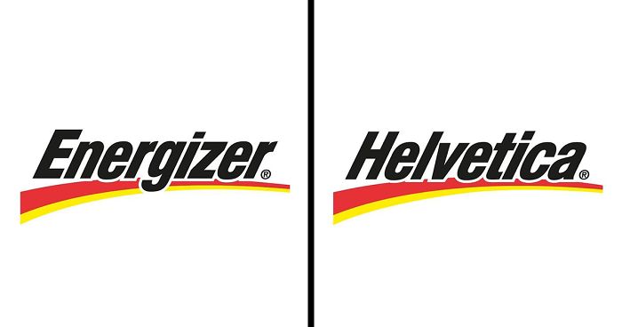
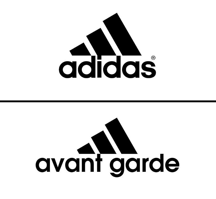
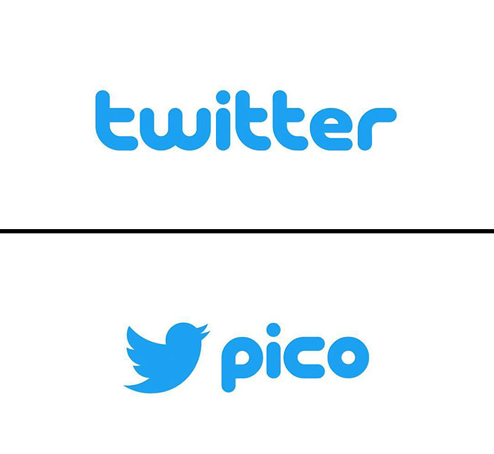
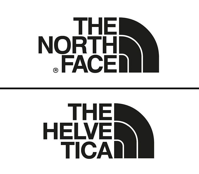
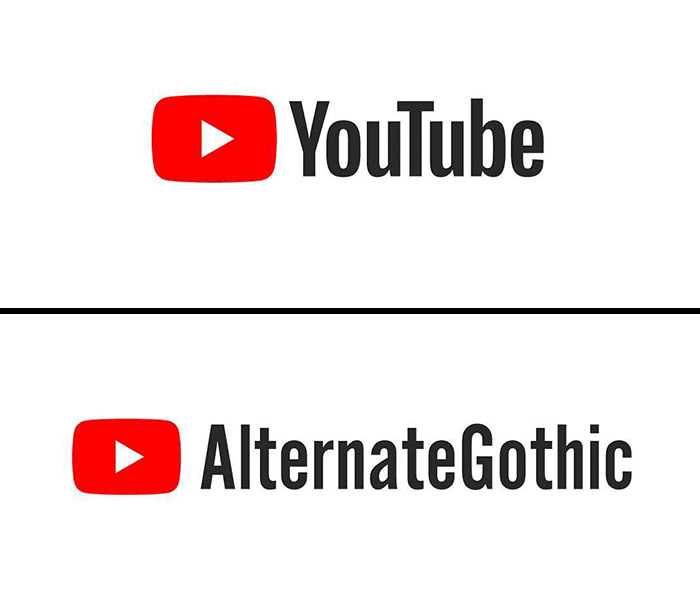
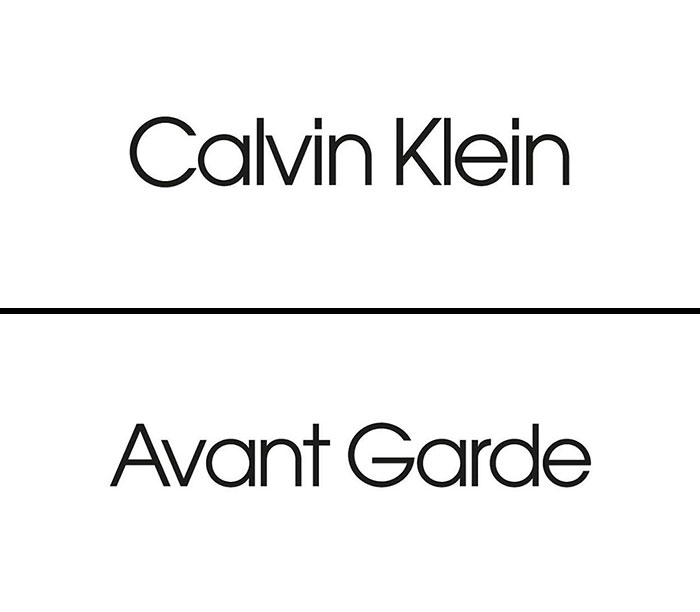
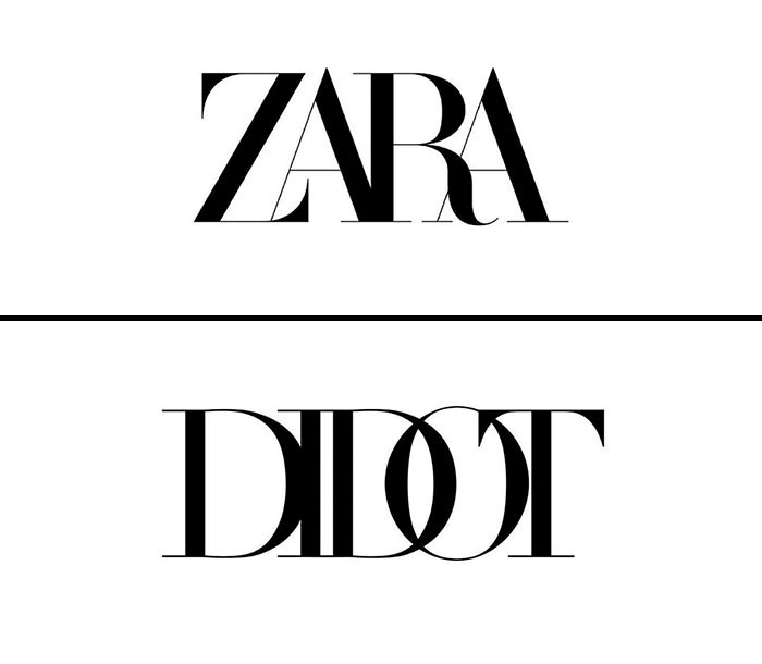
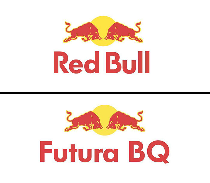
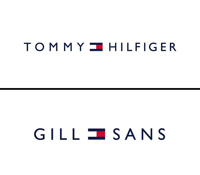
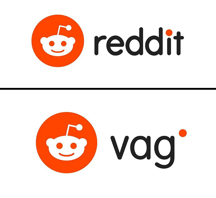
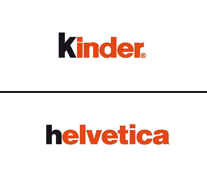
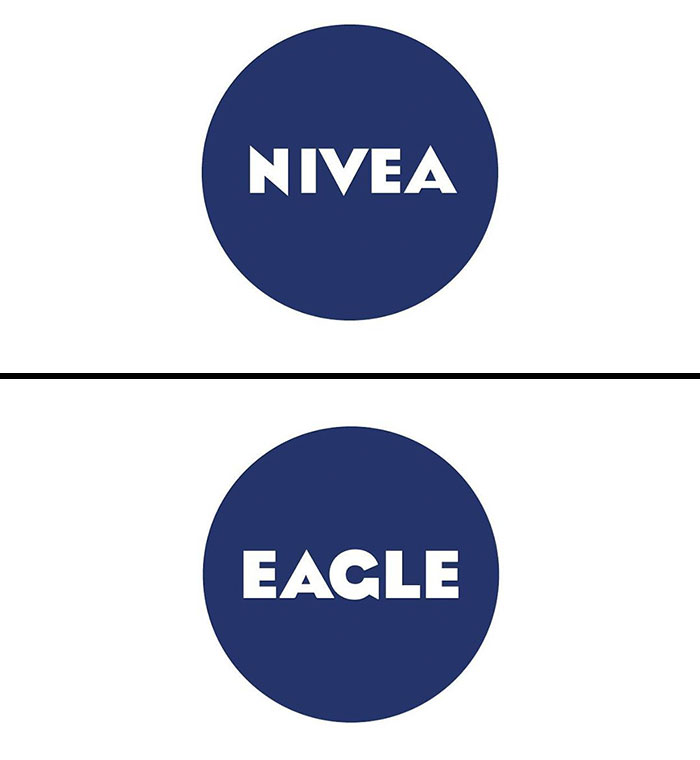
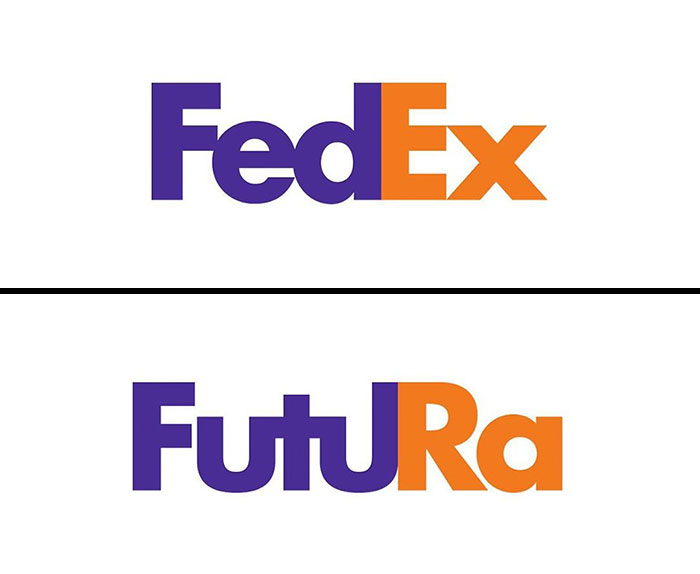
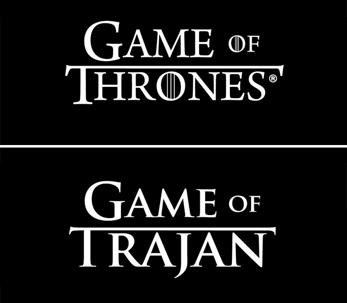
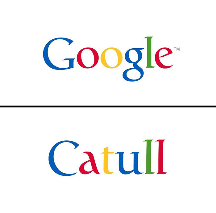
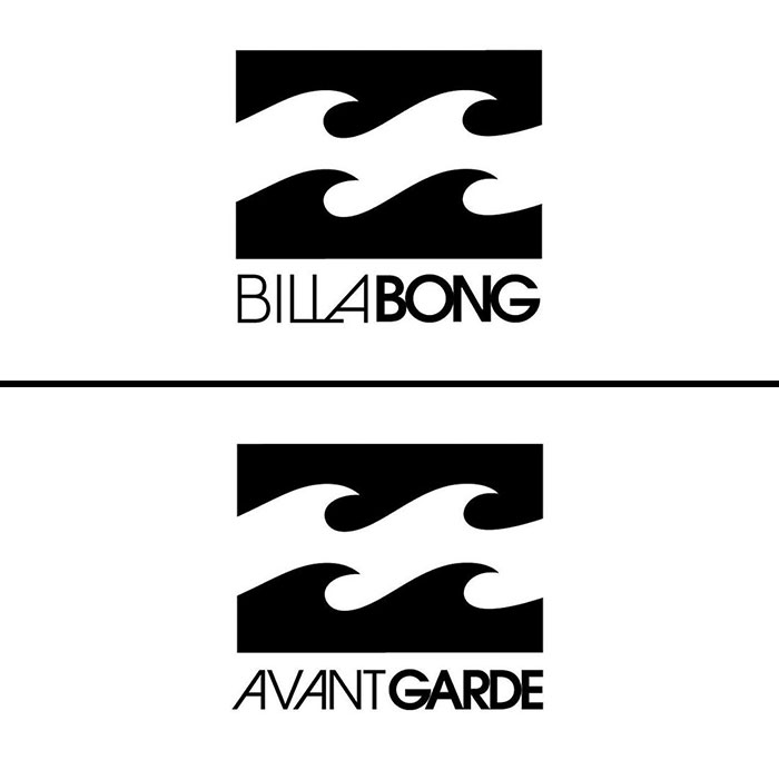
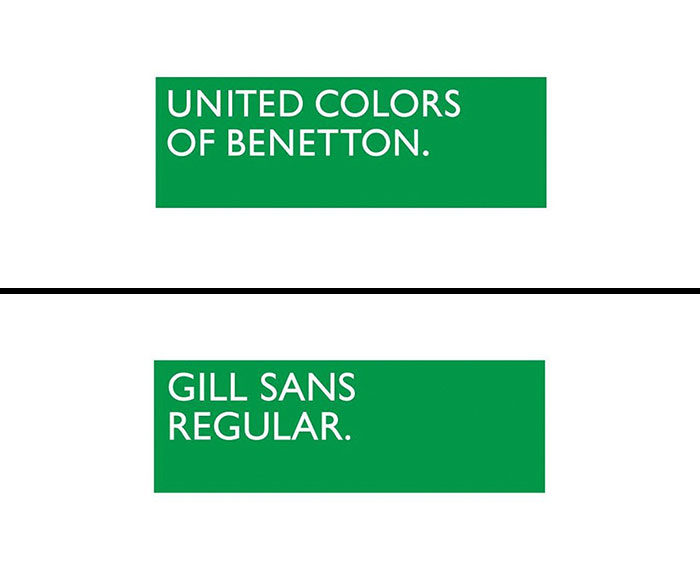
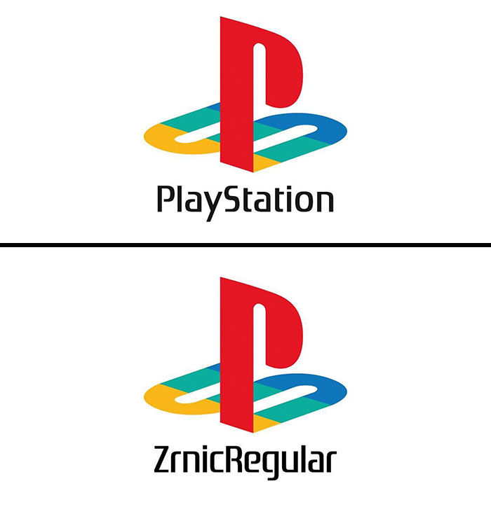
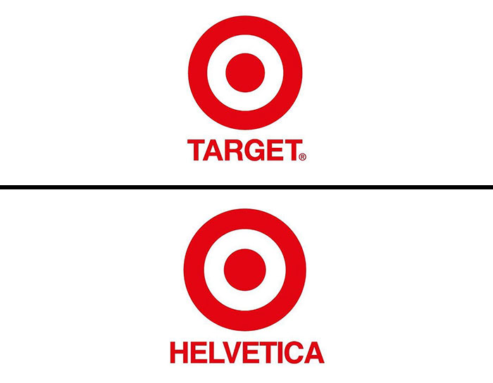
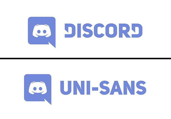
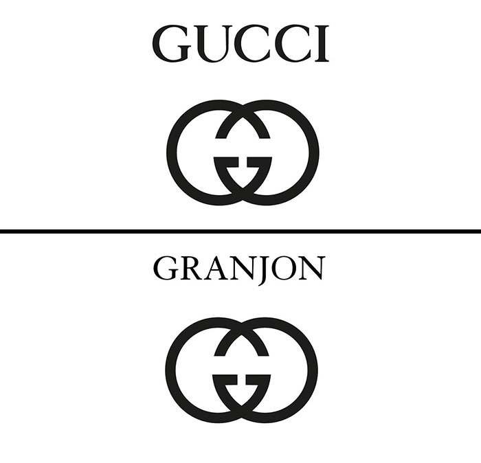
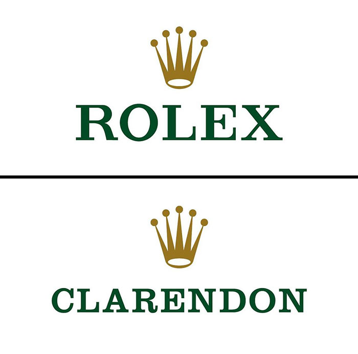
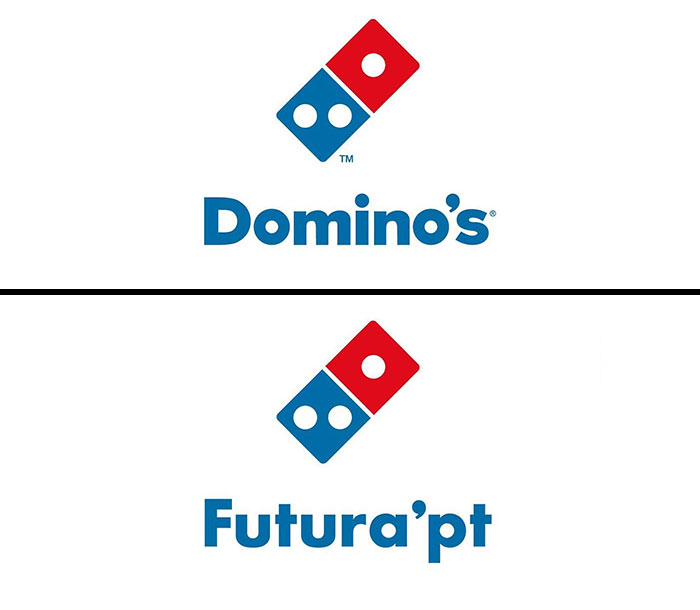
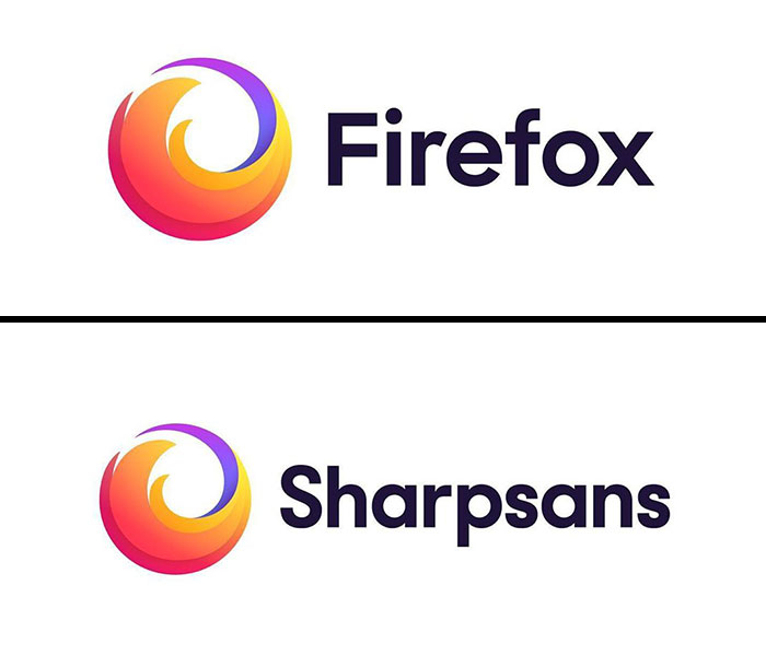
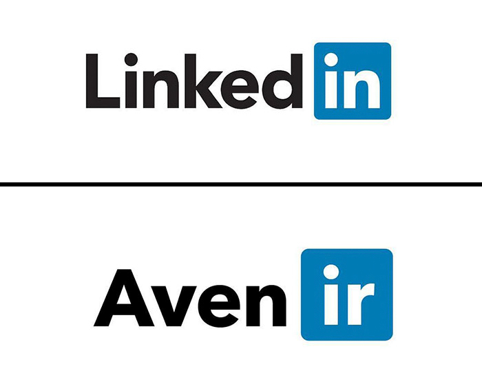
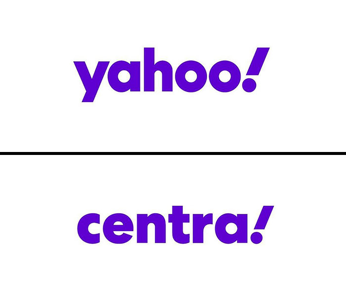
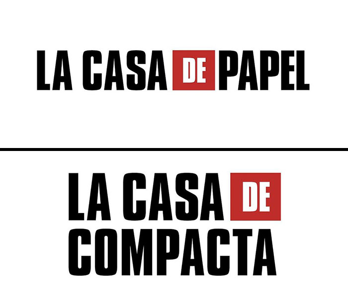
The Italian graphic designer, or logo guru, as one might say, Emanuele Abrate, runs an Instagram account all about logotypes. Last time we featured the artist on Bored Panda, he fixed the "World’s Worst Logos" (disclaimer: some of them are pretty ambiguous) by redesigning them in a more appropriate and sleek way. This time, he shows what fonts some of the most popular brands chose to represent them by replacing names in logos with logo fonts.

More info: Instagram | behance.net | Facebook | emanueleabrate.com

#1

Famous-Brands-Logotype-Fonts-Emanuele-Abrate

logo_fonts Report

Pan Narrans
Community Member
6 years ago

Always wondered why Adidas had the chimneys of the sinking Titanic as their logo.

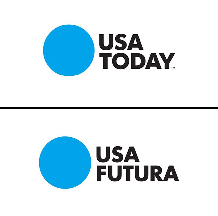
View more comments
RELATED:
    #2

    Famous-Brands-Logotype-Fonts-Emanuele-Abrate

    logo_fonts Report

    Martz Migraña
    Community Member
    6 years ago

    Ha! What an appropriate font name! (Pico in Spanish means "beak", among other stuff. If you ask a Chilean you may have a faaar different translation, haha!)
    View more comments
    #3

    Famous-Brands-Logotype-Fonts-Emanuele-Abrate

    logo_fonts Report

    Randy Klefbeck
    Community Member
    6 years ago

    Of Half Dome in Yosemite Nat'l Park California.

    View more comments
    #4

    Famous-Brands-Logotype-Fonts-Emanuele-Abrate

    logo_fonts Report

    tima
    Community Member
    6 years ago

    helvetica is one of the most used fonts in the design industry

    View more comments
    ADVERTISEMENT
    #5

    Famous-Brands-Logotype-Fonts-Emanuele-Abrate

    logo_fonts Report

    Caroline Driver
    Community Member
    6 years ago

    And is this the same font that was used on the cover of Needful Things as well?

    View more comments
    ADVERTISEMENT
    #6

    Famous-Brands-Logotype-Fonts-Emanuele-Abrate

    logo_fonts Report

    Anders Öhman
    Community Member
    6 years ago

    Not the same font. The logo pre-dates the font with 80 years.

    View more comments
    #7

    Famous-Brands-Logotype-Fonts-Emanuele-Abrate

    logo_fonts Report

    MIKAYLAH DIAZ
    Community Member
    6 years ago

    i like this name better

    View more comments
    #8

    Famous-Brands-Logotype-Fonts-Emanuele-Abrate

    logo_fonts Report

    Kyoshi Becker
    Community Member
    6 years ago

    This designer is wrong... It looks like Knockout HTF-49 Lightweight. Look at the weight on the lowercase e and o...

    View more comments
    ADVERTISEMENT
    #9

    Famous-Brands-Logotype-Fonts-Emanuele-Abrate

    logo_fonts Report

    Alyssa Fry
    Community Member
    6 years ago

    Again!

    View more comments
    ADVERTISEMENT
    #10

    Famous-Brands-Logotype-Fonts-Emanuele-Abrate

    logo_fonts Report

    Al Christensen
    Community Member
    6 years ago

    Customized to make the thins even thinner.

    View more comments
    #11

    Famous-Brands-Logotype-Fonts-Emanuele-Abrate

    logo_fonts Report

    Graham Heaton
    Community Member
    6 years ago

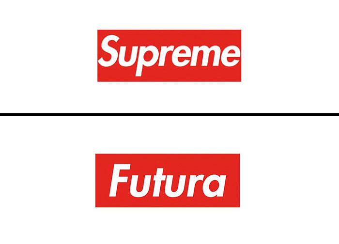
    Future BBQ?

    #12

    Famous-Brands-Logotype-Fonts-Emanuele-Abrate

    logo_fonts Report

    ADVERTISEMENT
    #13

    Famous-Brands-Logotype-Fonts-Emanuele-Abrate

    logo_fonts Report

    The Wasp
    Community Member
    6 years ago

    This s**t writes itself.

    View more comments
    ADVERTISEMENT
    #14

    Famous-Brands-Logotype-Fonts-Emanuele-Abrate

    logo_fonts Report

    Pamela24
    Community Member
    6 years ago

    Very original.

    View more comments
    #15

    Famous-Brands-Logotype-Fonts-Emanuele-Abrate

    logo_fonts Report

    Stewie'sTalented
    Community Member
    6 years ago

    My current favorite font. I think the Obama presidential campaign used this font. It symbolizes modernity, clarity.

    View more comments

    Never miss a story that brings joy to the world. Add us on Google

    #16

    Famous-Brands-Logotype-Fonts-Emanuele-Abrate

    logo_fonts Report

    אולגה פורמן
    Community Member
    6 years ago

    How is this and the Hilfeger logo are the same font?

    View more comments
    ADVERTISEMENT
    #17

    Famous-Brands-Logotype-Fonts-Emanuele-Abrate

    logo_fonts Report

    Daniel Buckland
    Community Member
    6 years ago

    Google created product Sans, so does that really count? Also it was based off Futura with a few minor tweaks.

    View more comments
    ADVERTISEMENT
    #18

    Famous-Brands-Logotype-Fonts-Emanuele-Abrate

    logo_fonts Report

    KatHat
    Community Member
    6 years ago

    Arial Rounded, I would say.

    View more comments
    #19

    Famous-Brands-Logotype-Fonts-Emanuele-Abrate

    logo_fonts Report

    Valquerys
    Community Member
    6 years ago

    Tik Tok deserves to be banned.

    View more comments
    #20

    Famous-Brands-Logotype-Fonts-Emanuele-Abrate

    logo_fonts Report

    Al Christensen
    Community Member
    6 years ago

    Need to tighten the kerning a little.

    View more comments
    ADVERTISEMENT
    #21

    Famous-Brands-Logotype-Fonts-Emanuele-Abrate

    logo_fonts Report

    Kate Melvin
    Community Member
    6 years ago

    I believe it's Avenir

    View more comments
    ADVERTISEMENT
    #22

    Famous-Brands-Logotype-Fonts-Emanuele-Abrate

    logo_fonts Report

    Daniele Ribolla
    Community Member
    6 years ago

    with a little help...

    View more comments
    #23

    Famous-Brands-Logotype-Fonts-Emanuele-Abrate

    logo_fonts Report

    b l a n c
    Community Member
    6 years ago

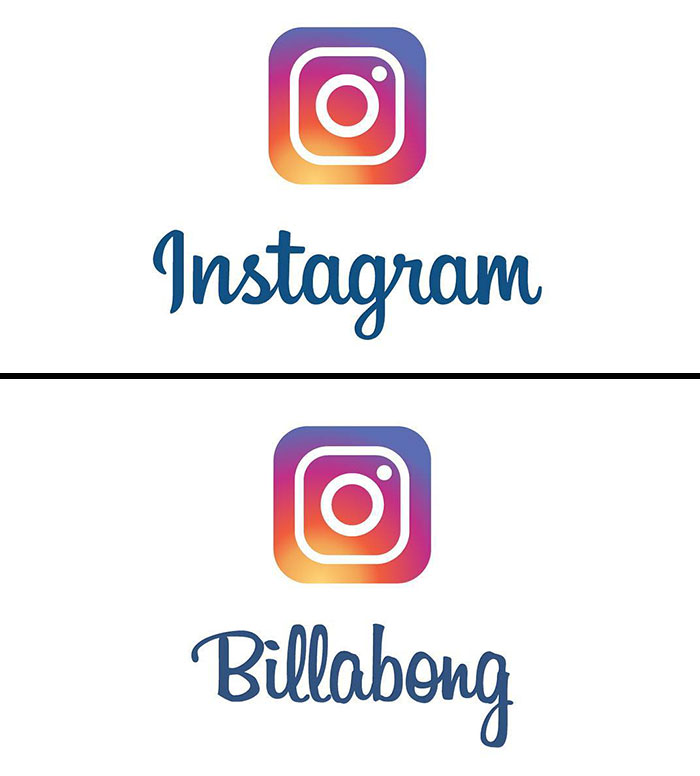
    interesting enough, billabong ISN'T actually the font used in instagram. if you search it up, you'll find that it's actually a handwritten script SIMILAR to billabong. but of course here you can easily see they are not the same

    View more comments
    #24

    Famous-Brands-Logotype-Fonts-Emanuele-Abrate

    logo_fonts Report

    Ronald Clay
    Community Member
    6 years ago

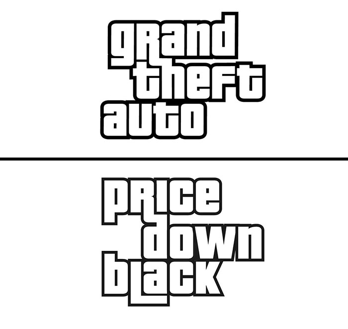
    Same font as The Price Is Right.

    View more comments
    ADVERTISEMENT
    #25

    Famous-Brands-Logotype-Fonts-Emanuele-Abrate

    logo_fonts Report

    James Mills
    Community Member
    6 years ago (edited)

    The kerning is made so all the letters are the same width apart. but how much incline?

    View more comments
    ADVERTISEMENT
    #26

    Famous-Brands-Logotype-Fonts-Emanuele-Abrate

    logo_fonts Report

    Kris Bunda
    Community Member
    6 years ago

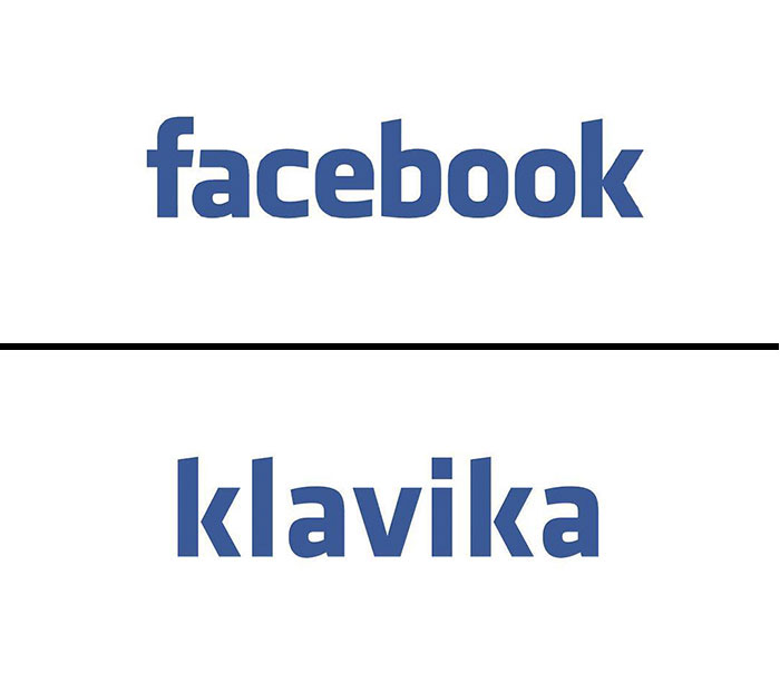
    Not exactly. Klavika a top curves downward, k shows daylight between strokes.

    View more comments
    #27

    Famous-Brands-Logotype-Fonts-Emanuele-Abrate

    logo_fonts Report

    Gonzalo Terán
    Community Member
    6 years ago

    Close, but not. Check the A and the E.

    View more comments
    #28

    Famous-Brands-Logotype-Fonts-Emanuele-Abrate

    logo_fonts Report

    Zack Bartlett
    Community Member
    6 years ago

    Um... no its not. I feel like FedEx is pointed to as one of the best examples of Helvetica in logo usage.

    View more comments
    ADVERTISEMENT
    #29

    Famous-Brands-Logotype-Fonts-Emanuele-Abrate

    logo_fonts Report

    Al Christensen
    Community Member
    6 years ago

    No, it's not. The GoT logo has heavier serifs, with serifs at the top of the M and N.

    View more comments
    ADVERTISEMENT
    #30

    Famous-Brands-Logotype-Fonts-Emanuele-Abrate

    logo_fonts Report

    #31

    Famous-Brands-Logotype-Fonts-Emanuele-Abrate

    logo_fonts Report

    #32

    Famous-Brands-Logotype-Fonts-Emanuele-Abrate

    logo_fonts Report

    ADVERTISEMENT
    #33

    Famous-Brands-Logotype-Fonts-Emanuele-Abrate

    logo_fonts Report

    ADVERTISEMENT
    #34

    Famous-Brands-Logotype-Fonts-Emanuele-Abrate

    logo_fonts Report

    Al Christensen
    Community Member
    6 years ago

    Again, tighten your kerning.

    #35

    Famous-Brands-Logotype-Fonts-Emanuele-Abrate

    logo_fonts Report

    #36

    Famous-Brands-Logotype-Fonts-Emanuele-Abrate

    logo_fonts Report

    ADVERTISEMENT
    #37

    Famous-Brands-Logotype-Fonts-Emanuele-Abrate

    logo_fonts Report

    ADVERTISEMENT
    #38

    Famous-Brands-Logotype-Fonts-Emanuele-Abrate

    logo_fonts Report

    #39

    Famous-Brands-Logotype-Fonts-Emanuele-Abrate

    logo_fonts Report

    b l a n c
    Community Member
    6 years ago

    ironic that it's not in the billabong fonr

    View more comments
    #40

    Famous-Brands-Logotype-Fonts-Emanuele-Abrate

    logo_fonts Report

    ADVERTISEMENT
    #41

    Famous-Brands-Logotype-Fonts-Emanuele-Abrate

    logo_fonts Report

    ADVERTISEMENT
    #42

    Famous-Brands-Logotype-Fonts-Emanuele-Abrate

    logo_fonts Report

    #43

    Famous-Brands-Logotype-Fonts-Emanuele-Abrate

    logo_fonts Report

    #44

    Famous-Brands-Logotype-Fonts-Emanuele-Abrate

    logo_fonts Report

    ADVERTISEMENT
    #45

    Famous-Brands-Logotype-Fonts-Emanuele-Abrate

    logo_fonts Report

    tima
    Community Member
    6 years ago

    no it's not the same at all: see the R, the weight of the serifs..

    View more comments
    ADVERTISEMENT
    #46

    Famous-Brands-Logotype-Fonts-Emanuele-Abrate

    logo_fonts Report

    #47

    Famous-Brands-Logotype-Fonts-Emanuele-Abrate

    logo_fonts Report

    Al Christensen
    Community Member
    6 years ago

    Notice the difference in the curve of the R.

    View more comments
    #48

    Famous-Brands-Logotype-Fonts-Emanuele-Abrate

    logo_fonts Report

    ADVERTISEMENT
    #49

    Famous-Brands-Logotype-Fonts-Emanuele-Abrate

    logo_fonts Report

    ADVERTISEMENT
    #50

    Famous-Brands-Logotype-Fonts-Emanuele-Abrate

    logo_fonts Report

    #51

    Famous-Brands-Logotype-Fonts-Emanuele-Abrate

    logo_fonts Report

    b l a n c
    Community Member
    6 years ago

    okay i like the pun in this one

    #52

    Famous-Brands-Logotype-Fonts-Emanuele-Abrate

    logo_fonts Report

    ADVERTISEMENT
    #53

    Famous-Brands-Logotype-Fonts-Emanuele-Abrate

    logo_fonts Report

    Titas Burinskas
    BoredPanda Staff
    6 years ago

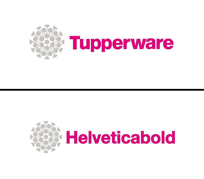
    Tupperware's logo now reminds of something else... I wonder if they'll change it due to bad rep.

    View more comments
    ADVERTISEMENT
    #54

    Famous-Brands-Logotype-Fonts-Emanuele-Abrate

    logo_fonts Report

    #55

    Famous-Brands-Logotype-Fonts-Emanuele-Abrate

    logo_fonts Report

    Al Christensen
    Community Member
    6 years ago

    Ah, you do know how to kern.

    #56

    Famous-Brands-Logotype-Fonts-Emanuele-Abrate

    logo_fonts Report

    Al Christensen
    Community Member
    6 years ago

    Notice the flat top of Toyota's A is wider than the one in Avenir.

    ADVERTISEMENT
    #57

    Famous-Brands-Logotype-Fonts-Emanuele-Abrate

    logo_fonts Report

    Al Christensen
    Community Member
    6 years ago

    However, the logo uses round dots on the i's and the v has been customized to make the bottom pointy rather than flat like the standard font.

    View more comments
    ADVERTISEMENT
    #58

    Famous-Brands-Logotype-Fonts-Emanuele-Abrate

    logo_fonts Report