Get Premium
Dark mode theme is available exclusively for premium users. Learn more about the benefits of subscribing.
No fees, cancel anytime.

 Dark Mode Ad-Free Browsing Unlimited Content
 Ad-Free Browsing Unlimited Content Dark Mode
Join 1.2 million Panda readers who get the best art, memes, and fun stories every week!
Have you ever thought about how famous artists like Leonardo Da Vinci or Salvador Dali would create in the modern world? What if these famous painters had their own modern logo designs?
After working as a branding design for a long time, Brazilian artist Milton Omena challenged himself to expand his design boundaries and get out of his comfort zone and fulfill his idea of creating visual identities for famous painters. He carefully thought of painting styles, painters’ personalities, habits, and lifestyles and how each of them would have a unique logo, brand, or product.
“For example, I have never made freehand logos or proportion calculus. I have never used pastels or more than 3 colors. Using the inspiration from painters who already had their strong styles established was a way of exercising my versatility,” the digital artist told Bored Panda.
Go down the page and check out the creative logos of famous painters!
More info: behance.net | orbestudios.com
As a reference, the designer used Leonardo Da Vinci’s sketches, notebooks, and classical artworks. Even though this artist is known
for his brilliant use of perspective and depth in backgrounds and amazingly expressive portraits, Milton figured
that his inventor side used in a cool logo would reflect more his personality.
Result:
Vincent Van Gogh is said to be a very reserved and thoughtful person and a very meticulous artist, therefore, Milton was inspired by his iconic brush pattern. The designer explained that the logo idea became the only logical way to encompass his enormous influence.
Result:
Monet was the most influential Impressionist artist, and the name of the artistic movement came from his work “Impression: Sunrise”. The designer was inspired by his famous series of paintings depicting the bridge over the lake of water lilies.
Result:
Dali was an amazingly weird man who became a symbol of Surrealism and was known for his glorious mustache and irreverence. The designer says that he really enjoyed the process of creating logos for this artist as he just let his inspiration flow.
Result:
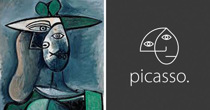
Pablo Picasso’s paintings are considered to be one of the most expensive art pieces ever auctioned. He is also repeatedly
referenced as a multi-talented artist is not only a painter but also a sculptor.
Result:
Mondrian was a Dutch painter who is regarded as one of the greatest artists of the 20th century. His geometric
and mathematical use of primary colors created neoplasticism and left a mark in history. His remarkable
style influenced not only art but also architecture and graphic design for the remaining years.
Result:
Pollock was a rebellious man known for his unusual method of paintings and considered to be a major figure of
the abstract expressionist movement. He was a painter who used to paint on the floor and sometimes leave accidental
cigarette burns on his canvas due to his chainsmoking.
Result:
The biggest name in the pop-art movement. His contrasting bright colors were a symbol of the allure of fame and commercialism. In this logo, the designer sought to follow the colors used in the famous painting portraying Marilyn Monroe.
Result:
125Kviews
Share on Facebook
I'm glad I got to see this. Very please to the eye and VERY tasteful for that said artist in mind.
hm. Mondraan is written with two 'a's and the chair is from Rietveld. I am not so convinced by most of the logo's. I try to teach my students to make something unique and superb for their clients. Which means also paying attention to typography, and create a wordmark rather than just throwing a typeface under a visual... Nice project though, but rather amusing, not really top notch. Am I too harsch?
I don't think you are too harsch. I do very agree with you. "Hm" sums it nicely up. But for the name of Modria(a)n you probably oversaw that he is known everywhere in the world (but in the Netherlands) as Mondrian. He himself changed his name in 1911 by dropping the second "a. Even on his gravestone in NCY it reads this way.
Load More Replies...I'm glad I got to see this. Very please to the eye and VERY tasteful for that said artist in mind.
hm. Mondraan is written with two 'a's and the chair is from Rietveld. I am not so convinced by most of the logo's. I try to teach my students to make something unique and superb for their clients. Which means also paying attention to typography, and create a wordmark rather than just throwing a typeface under a visual... Nice project though, but rather amusing, not really top notch. Am I too harsch?
I don't think you are too harsch. I do very agree with you. "Hm" sums it nicely up. But for the name of Modria(a)n you probably oversaw that he is known everywhere in the world (but in the Netherlands) as Mondrian. He himself changed his name in 1911 by dropping the second "a. Even on his gravestone in NCY it reads this way.
Load More Replies...


 No fees, cancel anytime


459
42