Get Premium
Dark mode theme is available exclusively for premium users. Learn more about the benefits of subscribing.
No fees, cancel anytime.

 Dark Mode Ad-Free Browsing Unlimited Content
 Ad-Free Browsing Unlimited Content Dark Mode
Join 1.2 million Panda readers who get the best art, memes, and fun stories every week!
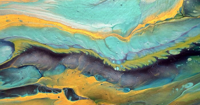
This is the second Split cup pour with a wild start and calm ending for fine details. Pouring paint fast and from up high creates beautiful depth with colour mixing and the slower up-close pour makes gorgeous details.
The top part of this painting feels like standing on a cliff above a liquid planet.
Those turquoise rivers look like memory itself—slow, deep, ancient—while the gold cuts through them like sunlight breaking open a storm. There’s tension here: calm water vs molten fire, serenity flirting with danger. Like an ocean that knows it was once lava and hasn’t quite forgotten.
The lower part?
That’s where it gets juicy. Those dark, layered cells feel like tectonic plates sliding, secrets pushing up through skin.
For my eyes, It’s not just pretty — it’s alive, breathing, ..
A little wild.
A little holy.
A little “don’t touch me, I bite.”
Just like me! 😈
List of colors used for this Chaos Split Cup Acrylic Pour:
Amsterdam Prussian Blue
Custom mixed Metallic green
Amsterdam Greenish blue
DecoArt Extreme sheen Aquamarine
Amsterdam Turquise green
DecoArt Extreme sheen 24K Gold
Pearl white mix
👉 You can get the Modular Split Cup here: www.fluid-art.co
🎨 *MIXING PAINTS – Learn My Favorite Recipes!*
🇪🇺 *EU Products: • (208) My pouring medium recipe – Products …
🇺🇸 *USA Products: • Master the Reverse Flower Dip Technique: P…
✨ *JOIN my YouTube Membership* for exclusive behind-the-scenes content, early access, and other artful perks:
🔗 Click here to join / @fiona-art
🖼️ *WANT TO OWN A PIECE OF MY ART?*
If you see a painting you love, it might be available!
💌 Email me at *zemljicr@gmail.com* for pricing and details.
📱 *LET’S CONNECT!*
👤 Facebook: Fiona’s Art Box / fionas-art-box-479552109242554
📸 Instagram: @fionaacrylic / fionaacrylic
☕ *WANT TO SUPPORT MY ART EXPERIMENTS?*
If you enjoy my videos and want to help me keep exploring new techniques, you can support me here:
💖 https://paypal.me/mi2sva
Or simply *like, comment, and subscribe* – it truly means the world to me!
More info: youtu.be


 No fees, cancel anytime


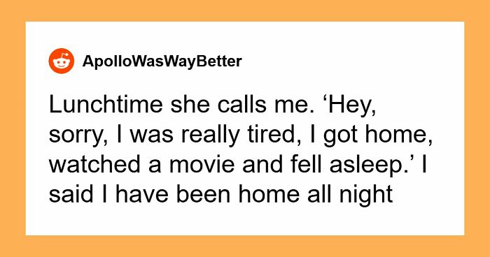
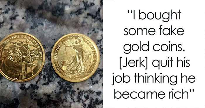
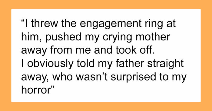
10
0