Get Premium
Dark mode theme is available exclusively for premium users. Learn more about the benefits of subscribing.
No fees, cancel anytime.

 Dark Mode Ad-Free Browsing Unlimited Content
 Ad-Free Browsing Unlimited Content Dark Mode
Join 1.2 million Panda readers who get the best art, memes, and fun stories every week!
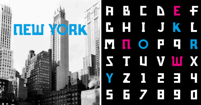
Here our new typo-graphic project based on the study of a particular class of font. Analyzing google maps, we realized that every city possesses its own font. Hidden in plain sight. A unique and special font linked directly to the territory, directly to the city, to the buildings. All you need is to take a look from the sky.
The project is called CAPITAL, because we started from capital cities and because the font will be provided all in capital letters. The first city we analyzed is NewYork (ok, ok…Albany is the Capital of New York State…but NY is probably the capital of the world). And you will find at the bottom of the project the freely downloadable file, with letters and numbers.
We do not claim the font is a perfect product or it’s perfectly usable in publishing, not at this time at least. But it’s free… we hope you understand.
Right now, we want to create something closely inspired from the territory and from urban planning we live in.
We think that the first result is not bad at all and we think that we can open up new interpretations to the concept of “font”.
In our next steps, we’ll analyze Tokyo and Paris in order to discover similarities and differences and to see if we can talk about “Typocity”, a typographic style of a city.
Here the project and some pics! Hope you like it!!
More info: behance.net


 No fees, cancel anytime


15
1