“Opposite Of Bad Design”: 66 Brilliant Design Ideas That Went Viral And Totally Deserved It (New Pics)
Being a designer – whether it's interior, graphic, advertising, or public space – takes a lot of creativity and skill. Sure, lots of people are good at their jobs, but only a few might be geniuses. This time, we're highlighting the best of the best in design: creations so practical and satisfying to look at that one can't help but say, "Wow."
The pics come to you from the subreddit whose name we can't really mention here, but let's just say that it rhymes with "Design Horn." It's a subreddit dedicated to amazing "architectural, graphic, industrial, furniture, & product design." So scroll down and be inspired or simply marvel at the things the human mind and hands are able to create!
More info: Reddit
This post may include affiliate links.
Poster About Reproductive Choice In The US With Stitches As President's Signature
That signature is interesting. Look at how small and closed in it is, like there's something that needs to be hidden. And so tightly controlled.
Lol does your name describe what your brains were replaced with
Load More Replies...Fountains That Look Like Dandelions
A Very Clever Ad For The World Wildlife Fund
If there's one thing Mad Men taught us (aside from how to cheat on your wife with multiple women), it's that working in advertising takes a lot of creativity and pizzazz. Some of the awesome design examples you see on this list are from advertisements, and their genius often lies in a perfectly executed idea through beautiful graphic design.
Take the WWF campaign urging people to protect wildlife. The Twitter bird turning into an X is a clever representation of what happens when we ignore conservation efforts, but in the animal kingdom. The campaign was created by a German chapter of WWF in 2023 together with the advertising agency McCann Germany.
"The whole world mourns the loss of the Twitter bird," the caption of the ad reads. "Around 1 million real animal species are threatened with extinction. Today we are in the midst of the greatest extinction of species since the end of the dinosaur era. A quarter of mammal species, one in eight bird species, more than 30 percent of sharks and rays, and 40 percent of amphibian species are threatened. Help us save the animals. An initiative of WWF Germany & us!"
[ad Campaign] Sea's Biggest Predator- Plastic
A Wooden Door From The 1930s With An Owl Design In Copenhagen, The Beak Being The Door Knock 📸frans De Waal
Macbeth Advert Poster
Fountains shaped like dandelions sure look pretty. Many cities know that; that's why they've built similar versions of the one you see in this list. Our example is from Baku, Azerbaijan, aptly named Fountains Square. There's also one in Houston, a small version in Dresden, and one along 6th Avenue in Manhattan.
Sydney, Australia, also has one. It was built in 1961 as a commemoration of the Battle of El Alamein in Egypt during WWII. It has 211 "stalks," but it's the hundreds of saucer-shaped films that extrude water, making it look like a giant thistledown. The fountain's artist, architect Robert (Bob) Woodward AM, became so famous after designing this piece that he gained prominence internationally.
Save Driving Awareness Ad
I'm watching a slasher flick as I go through this list, so the safety message of this picture is on a back burner to seeing other ways that a spine gets severed. Merry Christmas, everyone!
I think it's time to stop telling people to buckle up. It's 2025. This way nature will just take its course with the people who don't want to.
Creative Wording
I feel like an idiot, but for this I require an explanation, if someone happens to know what this means.
Fvck Elon (Musk) and the felon (convicted felon Donald Trump)
Load More Replies...Brickwork On Sidewalk Which Turns Into A Public Bench In Shiraz, Iran
The "Less Plastic" campaign in the UK that depicts plastic knife heads as shark fins was created by a U.S. ad agency, Project Worldwide, in 2018. Other posters included in the campaign used other plastic cutlery as symbols. Forks resembled the hands and arms of a possibly drowning person. A plastic straw looked like the Loch Ness monster. And a plastic bag formed a wave, reminding people that there might soon be more plastic in the oceans than water.
My Power Went Out And I Realised This Fridge Magnet Glows In The Dark
"The Swimmers", Bathroom Floor Mosaic Tiles By French Atelier Suzanne Manufacture
A Gate At The Atlanta Botanical Gardens
The "One click could change your future. Belt up. Drive safe. Arrive safe" poster you see on this list is one of three that Western Australia's Road Safety Council made for its road safety campaign in 2008. It was the creative baby of the Perth-based agency Marketforce, and the other two posters depicted X-rays of a brain and a skull detached from the cervical spine.
The Rear Elevation Of This Architect’s Office
Batman Cover Showing The Villain Penguin When Flipped
Akhavan Historical House In Kashan, Iran
The incredible posters for the Korean stage production of Macbeth are the creation of the Japanese photographer Yuni Yoshida. Many experts praised Yoshida's use of negative space and incorporation of the play's themes into the artwork. The director of the play, Yang Jung-woong, described how his staging is still relevant to modern audiences. "It vividly portrays the inescapable downfall that follows ambition, along with the sense of loss, guilt and moral conflict that come afterward."
Storm Drain Covers Designed To Look Like Rain Hitting Water
Found in Somerville, MA, near the Union Sq. T stop.
Japanese Designer Yasuhiro Suzuki Created A Giant Zipper-Shaped Boat That Gives The Illusion Of Unzipping The Water As It Moves
BP automatically hides comments with URLs in them, so I will reply to my own comment with the video links ;)
Load More Replies...A Preschool In My Neighbourhood
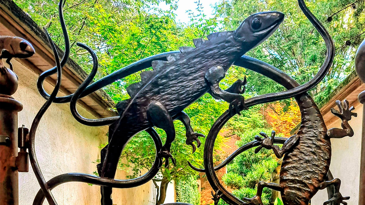
The lizard gate at the Atlanta Botanical Garden looks cool and fits its location perfectly. Created by blacksmith Andrew Crawford, it was installed at the Gardens' entrance to the Japanese Garden in 2012. That year, an Atlanta Blooms event took place, and the gate was the addition to the Gardens for that occasion. Crawford has also designed another gate for the Atlanta Botanical Gardens, the "Herb Garden Gate."
Staircase, Apartment Building, Rome, 1977. Designed By Gaetano Rebecchini And Julio Lafuente
Looks great and stylish but not so useful if you're someone who needs to use a handrail to get up and down
I was going to say the same thing. It's beautiful but I'd rather not risk the fall.
Load More Replies...Norway’s Powerlifting Logo Is A Barbell That Looks Like Their Flag
Ad Against Drive Drunk In India
Very effective. I've never seen a drunk driver anywhere in India. That's either due to the poster, or the fact that I've never been there.
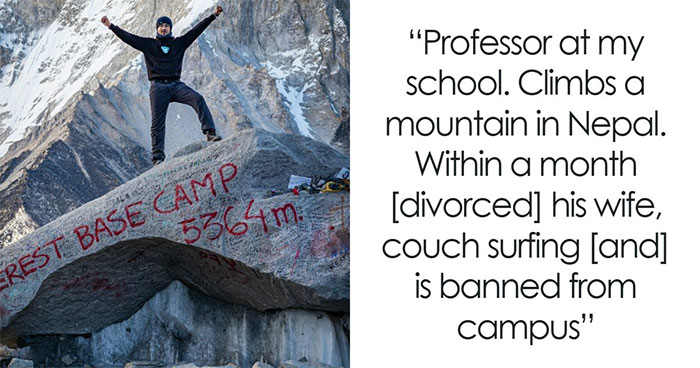
Which of these showcases of excellent design impressed you the most, Pandas? Rank your favorites in the comment section below! And while you're here, don't forget to visit our previous design appreciation posts featuring pics from the very risqué-titled subreddit here and here!
A Nature Inspired Electrical Pylon In Estonia
I’ve always hated the electricity pylons in this country (UK). They’ve always scared me.
I always thought they were like big aliens stomping through the landscape
Load More Replies...My Friend's Helmet Comes With A Tag For His Blood Group In Case An Accident Happens
That’s a good idea, but I don’t know how closely people will be checking his helmet if he gets in an accident bad enough to warrant a transfusion!
I imagine at least one of the EMS workers would notice. Even if they do not, it does no harm to have the sticker on there. Perhaps this has become a common-enough practice that EMS would check the helmet. I've heard stories from my dad (he was in the Vietnam War) about how soldiers would write their blood types on their helmets or their boots, and medics knew to check those places first. I have a small medical/personal info ID tag clipped to my wallet that gives my blood type and also notes that I have no known allergies and no medical conditions. It also lists phone numbers for my next of kin. I don't know if EMS workers would check that tag, but it's reassuring to have it there just in case.
Load More Replies...Was on a hwy rescue for years. We did not care about blood type or med alert bracelets, DNRs etc. Our main focus was getting you out, stabilized as much as possible and into an ambulance with the medics and on the way to the hospital, although if time and conditions allowed we would start to collect info beyond vitals. It might be of use in the hospital but why trust a helmet that for all they know you borrowed from a friend?
This Graphic From The Atlantic. *chef's Kiss*
The better one was the Time Magazine cover from his first incumbency, where his image was positioned so the spikes of the 'M' in 'TIME' looked like horns coming out of his head. If memory serves, the editor claimed it was 'accidental', but I think he had his fingers crossed behind his back when he said it 🤞🏼
This Orange Juice Cap Didn’t Need To Be So Designed As Such But They Did It Anyway
Good idea when you're in a fog getting morning coffee so don't mix it up with milk carton.
I have creamer and egg whites in blue and white containers. Yeah one is round and the other square but I have started to make scrambled creamer on at least one 'firing on 3 cylinders' morning.
Load More Replies...Hide Restaurant Sign From UK
Ogilvy Singapore Created This Brain Themed Design For The Economist In 2004
Gamecube Logo
Samurai Vodka (First Place In The Dieline's 50 Favorite Liquor Package Designs World Competition)
Japanese Restaurant Ad Leading The Way To The Place
"It Was This High." Yahoo Japan's Banner For Remembering The 2011 Tōhoku Earthquake And Tsunami
Building Number 909
Good point - from straight on, it could look like it actually read "919"!
Load More Replies...Non-Electronic Study Aid Shows Answers When You Push Its Translucent Buttons
I just used the multiplication table printed on the inside of my PeeChee, but this is funner
Umbrella Stand
Chair Designed Like Water Ripples
I hope those ripples are only on the underside and not on the surface of the seat
Lined Paper Blanket !
This Opticians Advertisement
They're very well known in the UK, so much so that a lot of residents will recognise the company even when it's this blurred. Their TV adverts are funny, worth a look on YouTube!
Load More Replies...The Midnight Sun Restaurant - Atlanta, Georgia - 1968
Located in Peachtree Center (originally named Garden Mall), the restaurant opened in 1968. Later, the restaurant closed in the late 1980s.
Love This One
Great shape, but if you really want to make the point, they should be all gray and black.
they will be, after a few days use.
Load More Replies...1983 Araldite Glue Print Ad ‘It Also Sticks Handles To Teapots.’
Amazing Bench(S) Bratislava, Slovakia
The Entrance To A Furniture Store In The USA
This McDonald's Ad/Poster
It's a Polish ad, so presumably they mean recipe. All ingredients are grown locally. In some languages translations for receipt, recipe and prescription are mixed up. In Dutch for example 'recept' means 'recipe'. not 'receipt'. A prescription is also called a 'recept'.
Load More Replies...Logo For Local Kuhar Family Farm
WWII Lithograph By Abram Games At Philadelphia Museum Of Art
The Key Fob For The Hyundai Is The Brand Logo
and it is huge and doent fit in small pockets or tiny bags..so unnecessary.
Canberra (Australia) Bus Stops Are Angled Towards The Direction The Bus Is Coming So You Can See It Approaching
In Toronto, the shelter is a box of glass, tempered so it smashes most spectacularly, and the Advertisement is on the up-street side, so you Can't See the bus coming from inside.
This Cassette Design
A Signature Designed Like A Sailing Ship (Early 19th Century)
Aston Martin Lagonda (1982)
Oikos Yogurt Drinks “Shake Well”
A Captcha-Inspired Mirror Design
So useful for vampires there is the option to 'skip' if you don't show up in any of the squares.
Did you know modern vampires can see themselves? We now use aluminum instead of silver as mirror backing.
Load More Replies...The Florida Aquarium's Sea Change Logo
Impressive Poster For Her By @messypandas
I feel as though I probably need to know something about this movie to understand the poster.
You can see her lips (dark) in his ear, maybe?
Load More Replies...This tells me precisely nothing about the movie. Nice but utterly useless.
Manufacturing Consent
Noam Chomsky wrote a book Manufacturing Consent. So this article refers to it in a witty way?
It's a play on words and the visuals - the message is supposed to be that mass media is manufacturing consent by manufacturing content. That basically means that when media publishes stories about something that have a certain spin on the story (say Fox News and how they are incredibly conservative and right-leaning) - they produce tons of content with that "spin" on it. So the people who consume that media start to believe that it's actually reality and not a politically-spun lie. Thus, the "consent" of the consumers changes to match what the media outlet is creating. Basically they are saying that mass media is a propaganda machine that can literally change peoples' minds and their opinions.
Load More Replies...This Billboard Ad For The Studio On Apple TV+
Movie Tickets Look In South Korea
The Reception Desk At General Motors Technical Center, 1965
It looks more like a giant bowl of soup to me. The whole picture looks like something from a "futuristic" dystopian movie.
Load More Replies...Notice the lack of phone switchboard. I'm guessing this person greeted visitors and directed them to locations
Local Burger Place’s Graphic Menu
Okay, the artistic side of me loves it, but the person-with-vision-issues side of me absolutely hates it XD
I was gonna say, "Great art, lousy menu design."
Load More Replies...The Interesting Design Of This Staircase
I'm a certified klutz, classic version. I would definitely trip on these stairs :P
A few years ago, i had to use crutch for mobility and went to orthopedic doctor who moved his office into new multifunctional building. It had stairs like this and there was only one lift, that was out of service :D Doctor's office was on third floor. I appreaciated the irony.
Open risers are such a tripping hazard, and I'd rather have a proper handrail. It's pretty, but definitely a case of form over function.
Don't the steps look quite shallow? Like you need to take a million steps to get upstairs
You can always just stick with one color and skip over the other
Load More Replies...At least I would fall to my d3ath in a stylish environment. Yay?
Nokia N93i. One Of My Favourite 2000's Era 'Smart'phones
Apple Graphic To Celebrate 20 Years Of Podcasts
I'm proud to say I've never listened to a podcast of any sort.The concept, the medium, not feelin it.
Load More Replies...Lacoste Ad
Stupid me read it as ''lactose''. Took me far too long >.< Luckily I have new glasses on the way :P
Mercedes Ad
Portrait Of A Lady On Fire Poster
“American Policies Remain The Same, Only Their Faces Change” — Iranian Poster (2018) Showing Presidents Trump And Obama As One
The current term that Trump is serving is completely different than his first term.
The message on ads should be clear and legible. Some of the designs on this post were visually appealing, but the message was lost. Took a graphic design class years ago and they always said, if you are designing for a billboard, you have limited time to get your message across to someone driving by. Great advice
