Get Premium
Dark mode theme is available exclusively for premium users. Learn more about the benefits of subscribing.
No fees, cancel anytime.

 Dark Mode Ad-Free Browsing Unlimited Content
 Ad-Free Browsing Unlimited Content Dark Mode
Join 1.2 million Panda readers who get the best art, memes, and fun stories every week!
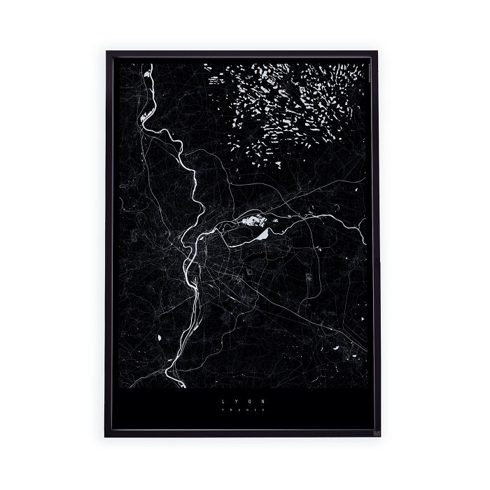
How to get there? Where is the nearest pharmacy? Where exactly is Dubrovnik?
Maps, especially their online or app versions, are a constant feature of our everyday lives. When going to work or relaxing at home, together with wifi they are becoming our daily necessities.
When using a map we focus on the information, precision and swiftness with which they deliver the necessary info. If they are inaccurate or gapped they annoy us more than we would like to admit an inanimate object should. Our obsession with functionality and detail perhaps stops us from seeing the beauty of maps. But maps are also beautiful and colourful arrangements of lines and shapes that overwhelm with the intricacies and the amount of information collected in such a simple, one-dimensional object.
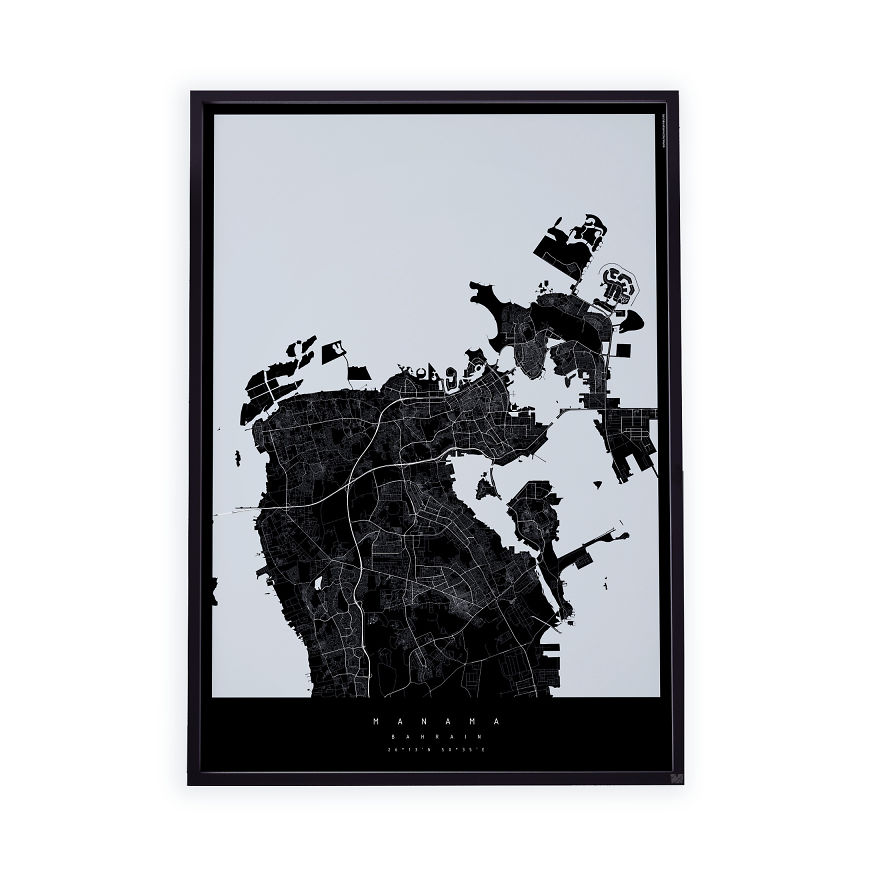
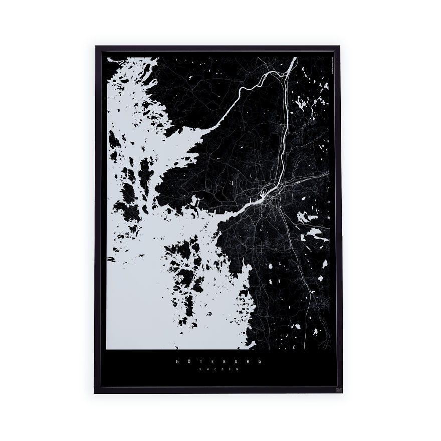
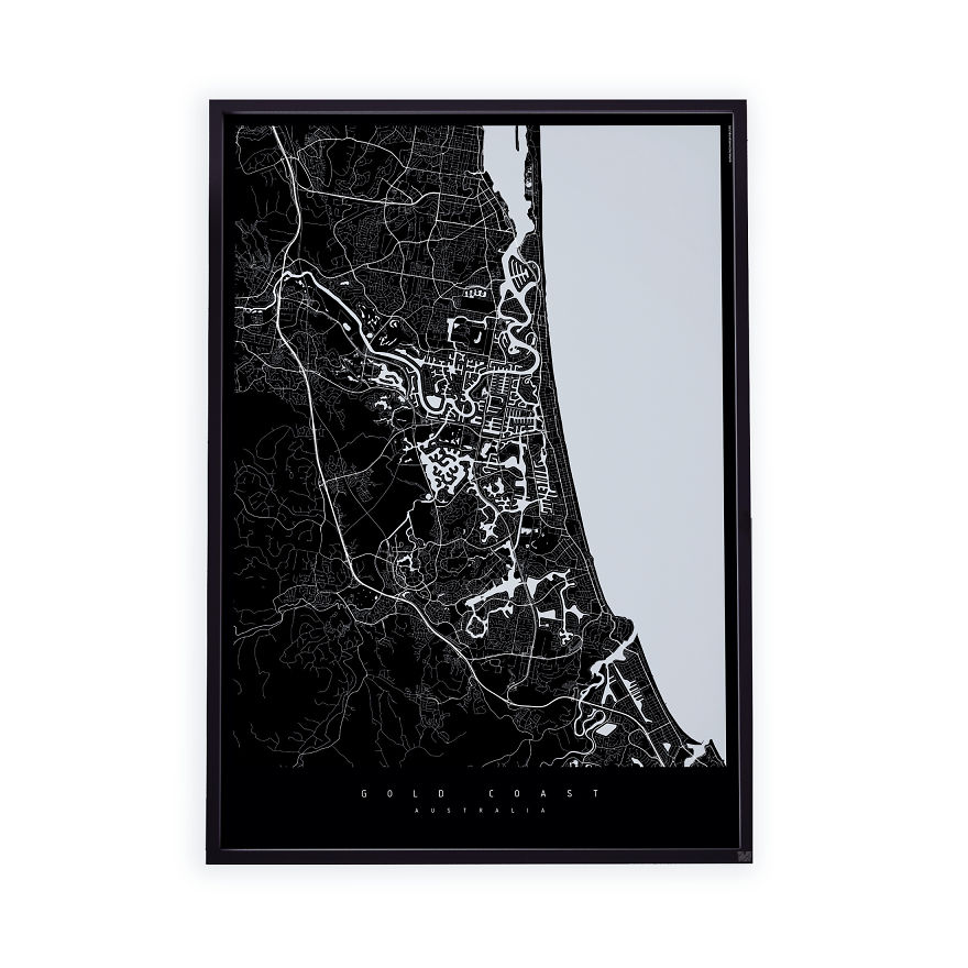
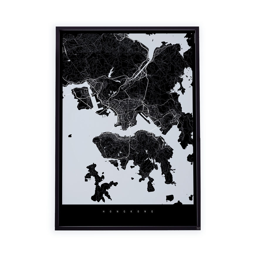
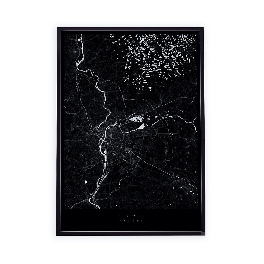
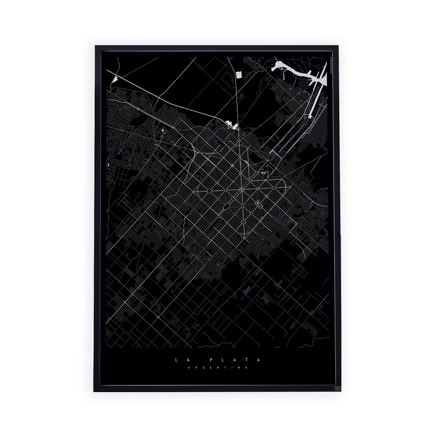
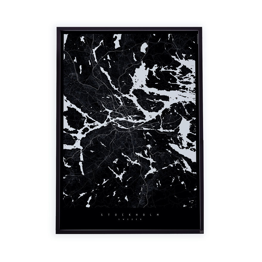
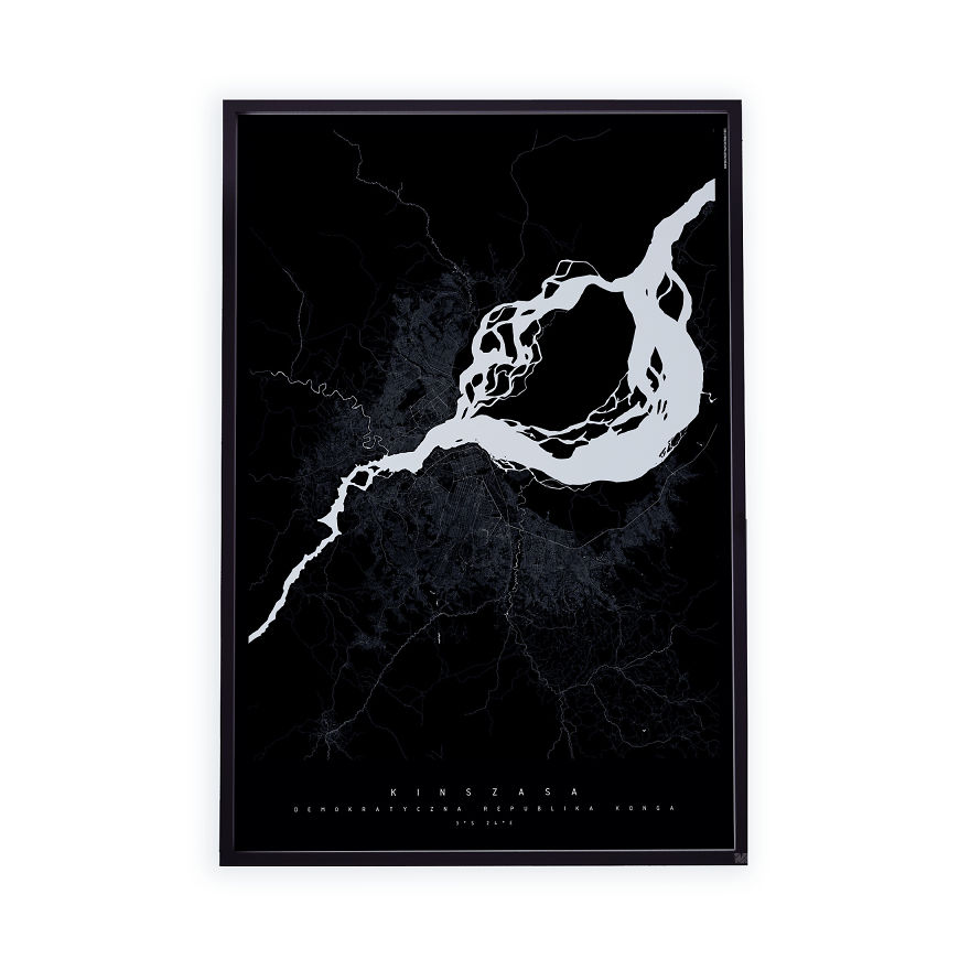
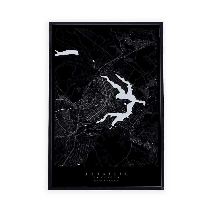
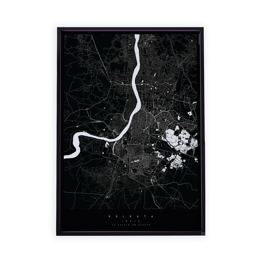
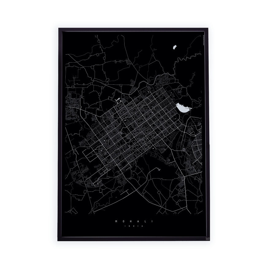
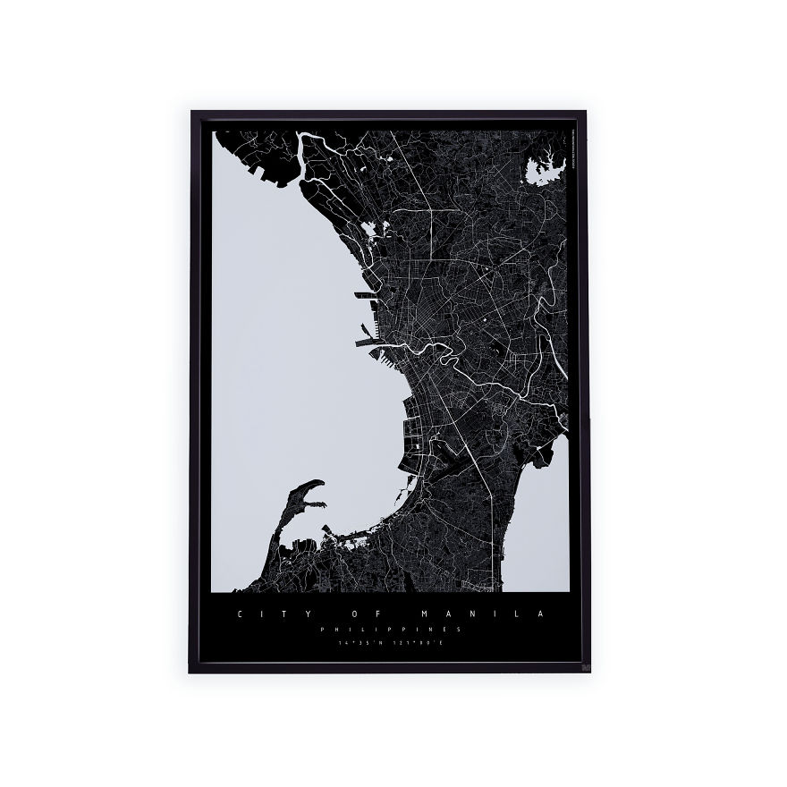
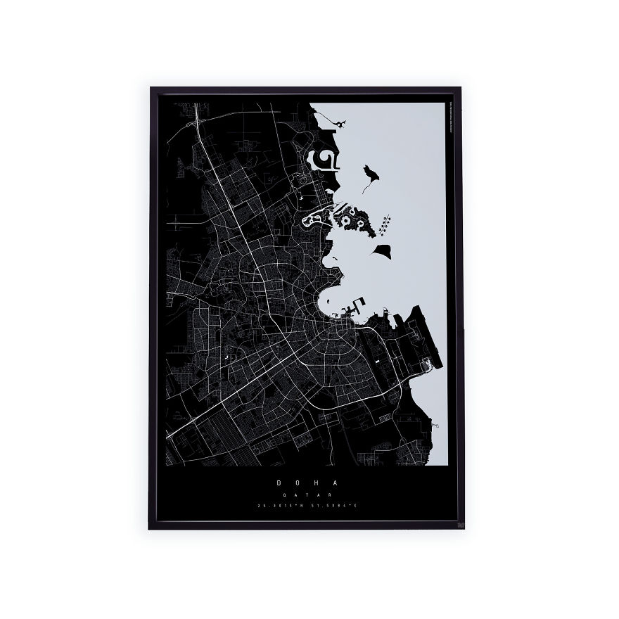
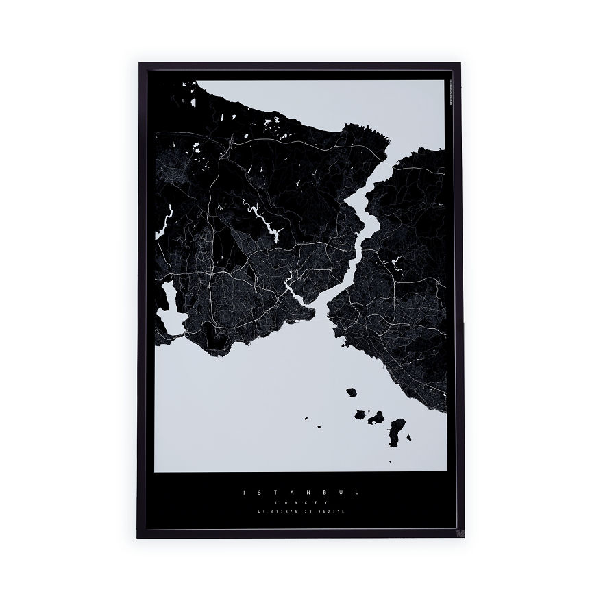
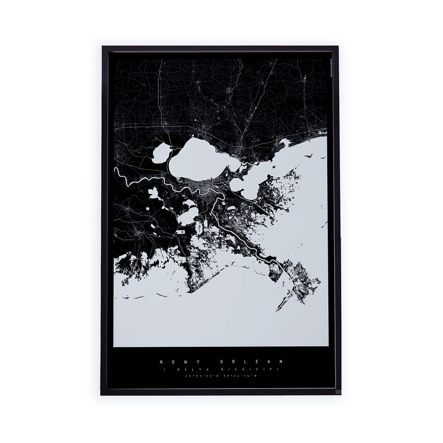
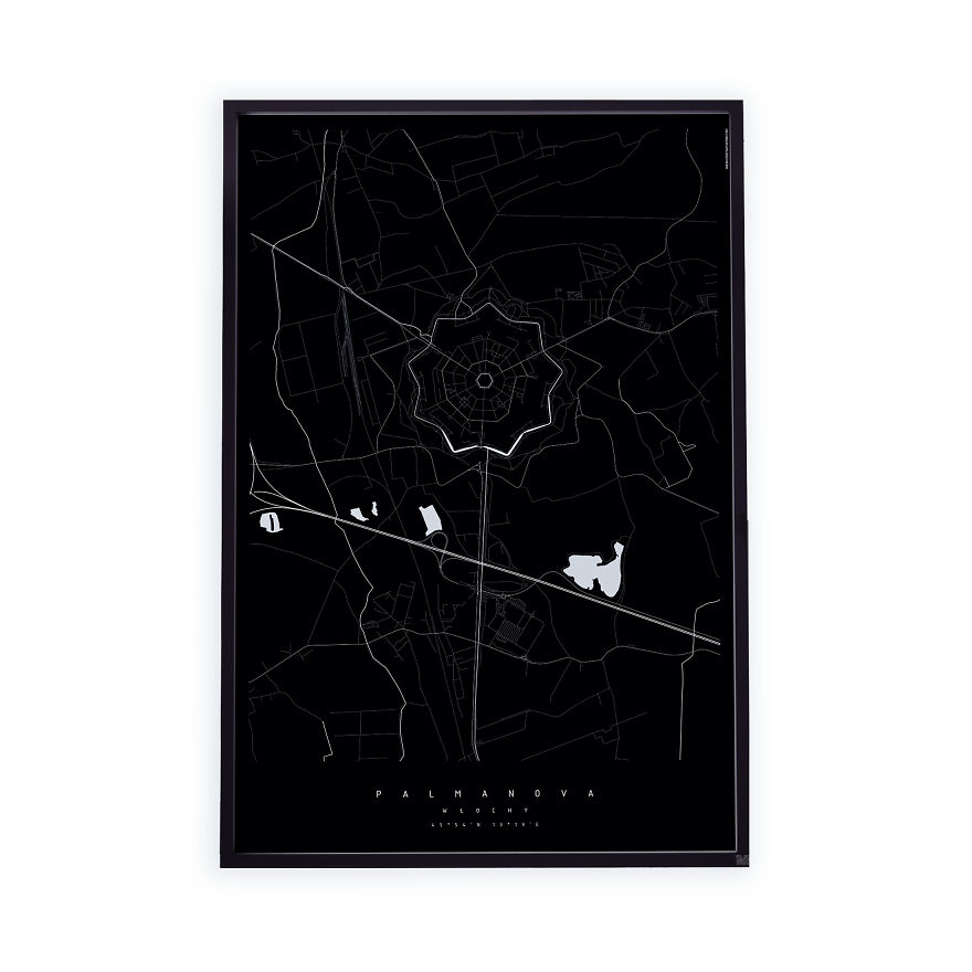
So let’s look at a map again: appreciate the beauty of cartography in its lines, intersections, meandering roads and straight lines of railways or bridges. All of these located between the vast blues of lakes, seas, rivers existing in all shapes and sizes. Together they create a billion pictures, abstract pieces of art, which I then use to make my MAPTU posters. Interestingly, the connection that I have with a map does not necessarily suggest an intimate knowledge of the place it depicts. My favourite MAPTU city map is that of Kinshasa, where I have never been. I like the black and white of the minimalist design because it is elegant and unique, soothing to the eye, yet never boring. You can check it out for yourself below:
More info: maptumaps.com
314views
Share on Facebook

























 No fees, cancel anytime




10
0