Get Premium
Dark mode theme is available exclusively for premium users. Learn more about the benefits of subscribing.
No fees, cancel anytime.

 Dark Mode Ad-Free Browsing Unlimited Content
 Ad-Free Browsing Unlimited Content Dark Mode
Join 1.2 million Panda readers who get the best art, memes, and fun stories every week!
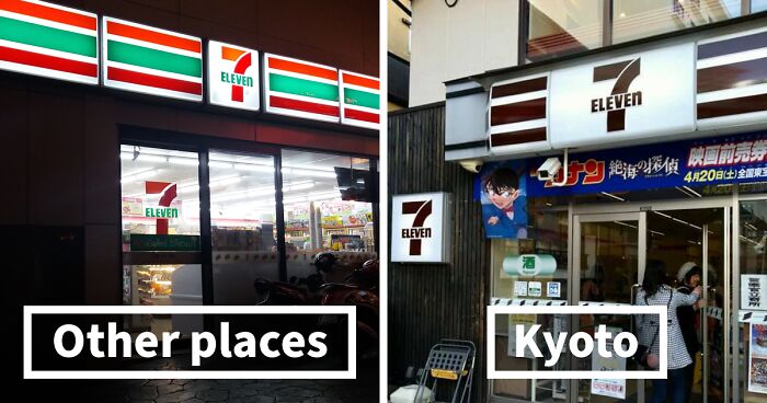
Image credits: Victor Gusukuma
The city of Kyoto is planned so as to preserve its historical scenery. For this reason, in 2007, the Miyako Landscape Guidelines were created that set strict rules and regulations regarding the height, color, and design of buildings, including even their outdoor advertisements. The set of rules basically prevent buildings, signs, etc. from clashing with the original image of Kyoto and its rich heritage.
Image credits: Victor Gusukuma
Image credits: Victor Gusukuma
Tsunagu Japan has outlined some of the regulations for the city: “Roof tiles are to be silver-colored,” “Metal sheets other than copper sheets must be dark gray or black with no gloss,” and, “Walls with R hues [on the Munsell system] may not exceed 6 in value.” This the reason why logos of businesses and enterprises look slightly different in Kyoto than elsewhere in the world.
Image credits: Victor Gusukuma
Image credits: Victor Gusukuma
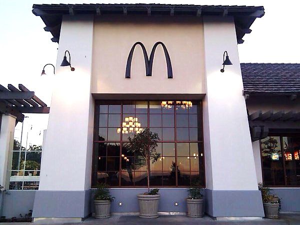
One of the world’s most popular fast food chains—McDonald’s—is known for its yellow letter M on a red background. In Kyoto, however, while the logo is yellow, the overall design is sepia-colored and blends in with the rest of the surrounding buildings. Like most stores in the city, McDonald’s used a brown color for the background in order to maintain Kyoto’s overall style.
Image credits: Victor Gusukuma
Image credits: Victor Gusukuma
Lawson is yet another majorly popular convenience store in Japan that recently branched out to Indonesia, China, the Philippines, and Thailand. The original design of the store features light blue and pink colors. In Kyoto, the logo design is toned down, and the light blue color is used only as an accent.
Image credits: Victor Gusukuma
Image credits: Victor Gusukuma
Starbucks—which is known for its white and green-colored logo—also altered its sign in Kyoto to blend in with traditional Kyoto-style houses. Same goes for 7-Eleven, a chain of convenience stores with 20,000 branches in Japan and 60,000 worldwide. All around the world, it has a bright logo with orange, red, and green stripes. In Kyoto, the logo features a calm combination of brown and white. Tsunagu Japan writes that while some branches have maintained the original colorful logo, they made the white stripes transparent to make them blend in more with the surroundings.
Image credits: Victor Gusukuma
Image credits: Victor Gusukuma
Japanese clothing brand Uniqlo, which is known for its affordable yet high-quality clothes, has over 2,000 branches all around the world. Its logo features white text in a square bright red logo. Some branches of the store in Kyoto have framed the logo with a white border to make it look more elegant.
Image credits: Victor Gusukuma
Image credits: buraburakyoto
However, the style guidelines are applied not only to buildings. In Kyoto, vending machines, street cones, mailboxes, and telephone booths are dyed in a brown-ish color to fit the overall chic vibe of the city.
Image credits: buraburakyoto
Image credits: buraburakyoto
Image credits: buraburakyoto
Image credits: buraburakyoto
96Kviews
Share on FacebookI don't know about those brown traffic cones, though... They're supposed to be highly visible and I feel like I wouldn't see brown cones and would just run them over...
There is a turquoise McDonalds (the only one in the world) in Sedona Arizona for the same reason. Their color scheme was denied because it would clash with the natural beauty of their red rocks.
This is highly unusual but shouldn't be. There are countless streets, neighborhoods and even entire cities with noise ordinances - why not address the visual noise as well? To me it makes a city just as jarring and disorientating as car horns and blaring music that gets fined.
I don't know about those brown traffic cones, though... They're supposed to be highly visible and I feel like I wouldn't see brown cones and would just run them over...
There is a turquoise McDonalds (the only one in the world) in Sedona Arizona for the same reason. Their color scheme was denied because it would clash with the natural beauty of their red rocks.
This is highly unusual but shouldn't be. There are countless streets, neighborhoods and even entire cities with noise ordinances - why not address the visual noise as well? To me it makes a city just as jarring and disorientating as car horns and blaring music that gets fined.


 No fees, cancel anytime

")
")
")
")
")
")
")
")
")
")
")
")
")
")
")
")
")


241
92