ADVERTISEMENT

Data analysts are a true gem in society. They gather data that’s available for all of us to see and compare. After all, humans are naturally curious, and we all love learning more and more about the world around us.

Like, which social media app is the most used around the world? What would the Netherlands look like if they hadn’t built dikes? Or what did Manhattan look like in the 1900s? Well, if these are all questions you never thought about but would love to know the answers to, we’ve compiled a list of some of the coolest and most interesting data maps for your inner nerd to appreciate.

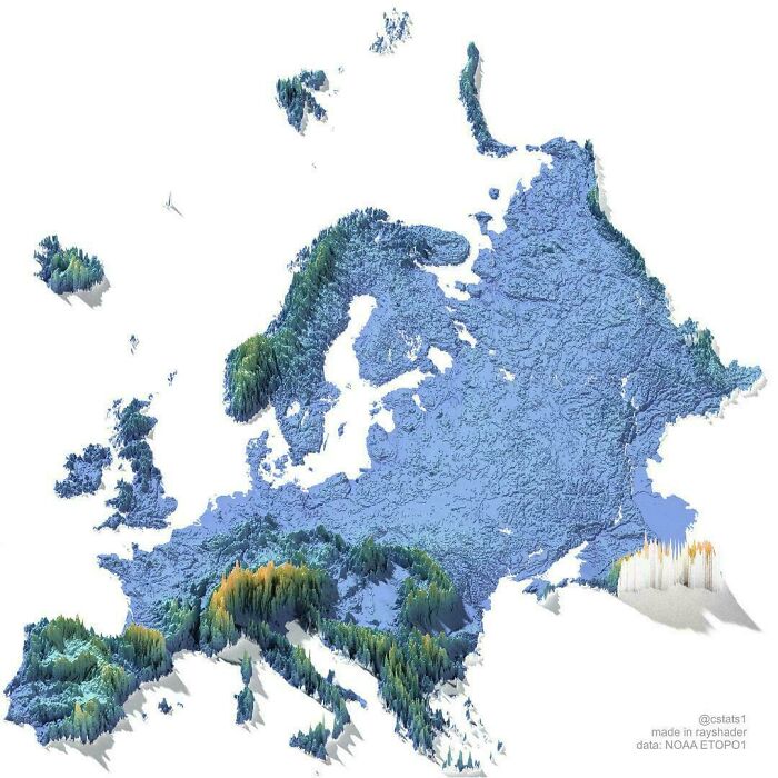
#1

Elevation Map Of Europe

Topographic 3D map of Europe showcasing interesting maps terrain features

vladgrinch Report

RELATED:
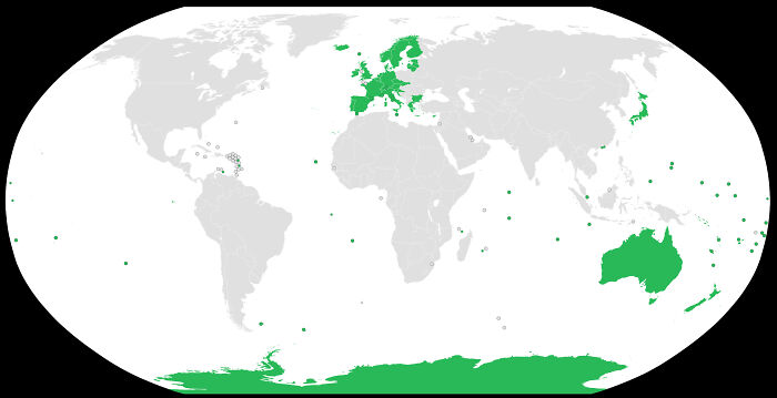
    #2

    Countries That Are "Rabies Free"

    A unique map of the world showing specific regions highlighted in green, ideal for geography class

    NeedleworkerAway5912 Report

    David Paterson
    Community Member
    5 hours ago (edited) Created by potrace 1.15, written by Peter Selinger 2001-2017

    Oh sh**. Not too many decades ago I read that "rabies is the rarest of the once common diseases". Back then it was endemic in India, Pakistan and Nigeria, and was starting to make inroads into Eastern Europe. All of the Americas, all of East Asia and North Asia was rabies-free. Even about half of Africa was rabies-free.

    View more comments
    #3

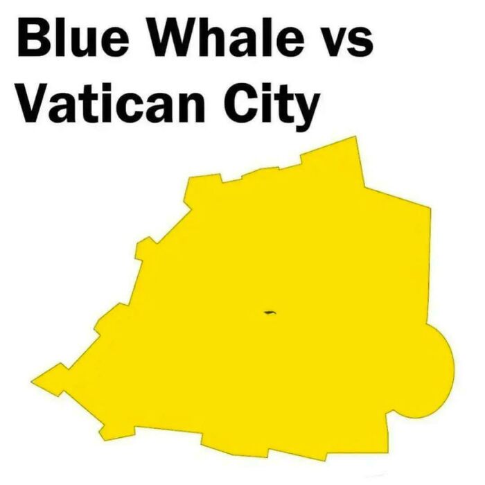
    Blue Whale vs. Vatican City

    An interesting size comparison map showing a tiny blue whale icon inside the borders of Vatican City.

    eat_ass_FXCKDRAKE69 Report

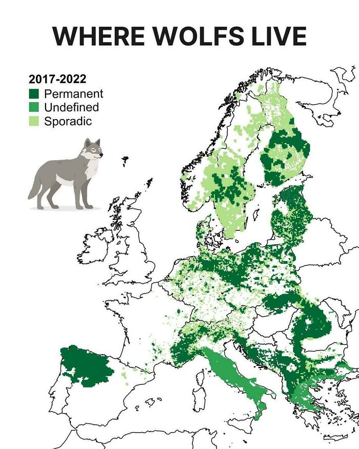
    These maps weren’t just created out of sheer curiosity. Sure, they’re made by people who are fascinated by fun facts, but gathering the necessary data is a real job with some important rules behind it. For a map that tracks the presence of wolves, for instance, wildlife tracking and biological sampling create these thematic maps.

    ADVERTISEMENT

    In Europe, the LCIE, or the Large Carnivore Initiative for Europe, analyzes DNA samples and camera-trap logs for its data. EU member states must also report on the conservation status of protected species every six years, adding to the available statistics and numbers. All of this is public information that netizens can access and use to create their own maps and data visualizations.

    #5

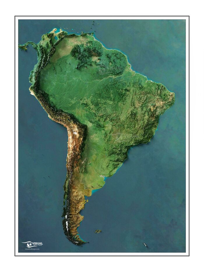
    South America

    A detailed 3D relief map of South America displaying the continent's diverse geography

    Outside_Carob3327 Report

    OneWithRatsAndKefir
    Community Member
    4 hours ago Created by potrace 1.15, written by Peter Selinger 2001-2017

    Looks like a weirdly misshapen pizza with the crust on the long side! Mmm, pizza.

    ADVERTISEMENT
    #6

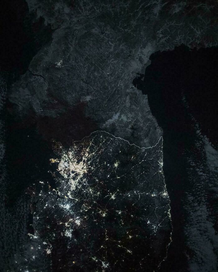
    An Astronaut Captured This Image Of North And South Korea At Night, With The Border Visible From Space

    Satellite image showing South Korea lit up at night next to a dark North Korea

    vladgrinch Report

    David Paterson
    Community Member
    5 hours ago Created by potrace 1.15, written by Peter Selinger 2001-2017

    Not by "an astronaut". Almost certainly by the unmanned Suomi NPP satellite. The project involving the removal of artefacts such as clouds is known as the "black marble" project. The difference in night lighting between North and South Korea is real, I noticed it about 20 years ago. A direct consequence is that North Korea is a haven for nocturnal animals, South Korea isn't.

    View more comments
    ADVERTISEMENT
    #7

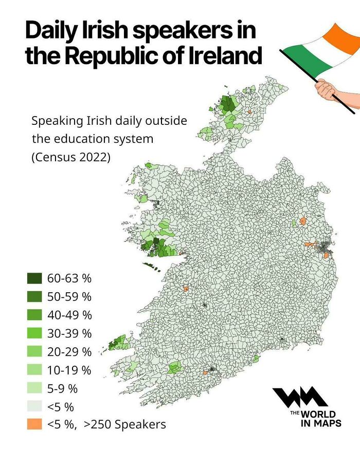
    Daily Irish Speakers In The Republic Of Ireland

    Interesting maps of Ireland showing the percentage of daily Irish speakers by region.

    vladgrinch Report

    But why do people create these maps in the first place? Well, according to psychologists, it all comes down to mild anxiety. No joke. The human brain is constantly trying to reduce uncertainty. This means the unknown and the unpredictable can be daunting for most people, so seeing aggregated data is a way for your brain to organize information and feel more comfortable.

    Charles Berger and Richard Calabrese developed this theory in 1975. In their book, they detail how humans actively search for information to eliminate ambiguity. This way, they can gain a sense of control over unpredictable environments and organize facts that would otherwise trigger anxiety.

    #8

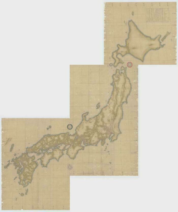
    An Elderly Man Measured Distances On Foot To Create This Japanese Map, Completed In 1821

    An ancient, detailed survey map of Japan, representing interesting maps from history.

    auchinleck917 Report

    David Paterson
    Community Member
    4 hours ago (edited) Created by potrace 1.15, written by Peter Selinger 2001-2017

    The Wikipedia entry on Inō Tadatak is worth reading. He used (then) modern surveying techniques over a period of 17 years. The map of the entire coastline of Japan was completed 3 years after his deadening, by his surveying team.

    ADVERTISEMENT
    #9

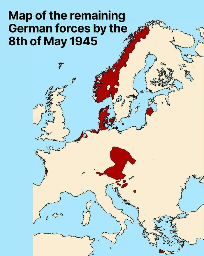
    Map Of The Remaining German Forces By The 8th Of May In 1945

    Historical map of Europe depicting the remaining German forces on May 8th 1945, among other interesting maps.

    vladgrinch Report

    Francois
    Community Member
    6 hours ago Created by potrace 1.15, written by Peter Selinger 2001-2017

    Oh, I thought Netherlands was liberated on the 5th. That is when we celebrate it.

    View more comments
    ADVERTISEMENT
    #10

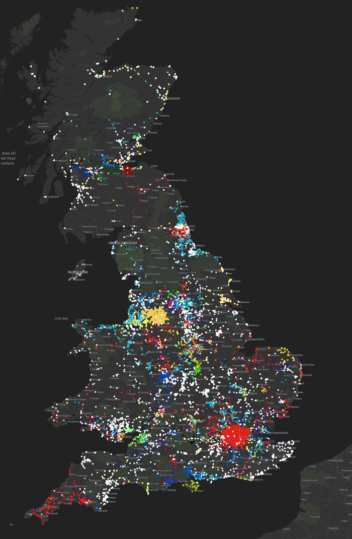
    The Colour Of Buses Across Great Britain

    A dark map of the United Kingdom showing colorful data points, perfect for interesting maps in geography

    Gavalar_ Report

    #11

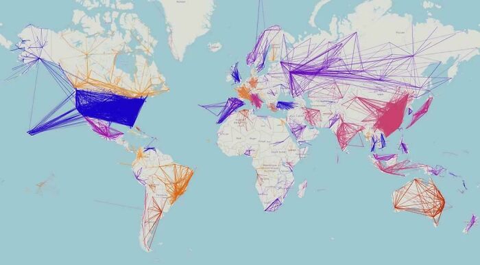
    Map Showing Only Domestic Flights Within Countries

    A world map showing global flight paths and networks in various colors, showcasing interesting maps

    vladgrinch Report

    sbj
    Community Member
    Premium
    7 hours ago Created by potrace 1.15, written by Peter Selinger 2001-2017

    This map looks like a child has been scribbling with some crayons

    View more comments
    ADVERTISEMENT

    Curiously, though, map creation can almost be seen as a tool for human safety. In 1948, Edward C. Tolman developed the theory that both people and animals build internal spatial representations of the environments they live in. By creating these “cognitive maps,” as he called them, they can navigate threats and rewards.

    This doesn’t necessarily mean it’s a map to follow or a way to pinpoint where a threat is. The reward can simply be the feeling of security that comes from knowing where you are going and what to expect along the way. Ultimately, it’s a tool designed to make information visually intuitive.

    #13

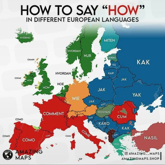
    How To Say "How" In European Languages

    An interesting map of Europe showing how to say how in different European languages.

    vladgrinch Report

    ADVERTISEMENT
    #14

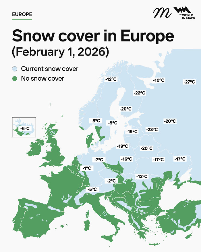
    Snow Cover In Europe (February 1, 2026)

    An interesting map showing snow cover in Europe and corresponding temperatures on February 1 2026

    maven_mapping Report

    JinxBox
    Community Member
    8 hours ago Created by potrace 1.15, written by Peter Selinger 2001-2017

    SOS, Rescue me from Finland before winter, thank you.

    ADVERTISEMENT
    #15

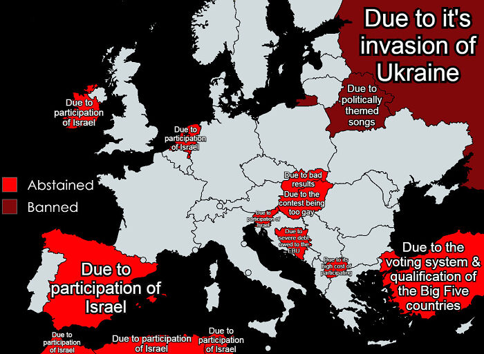
    Countries That Won't Participate In Eurovision 2026 & Their Reasoning

    An interesting map highlighting countries that abstained or were banned from Eurovision

    YourLocalMoroccan Report

    JinxBox
    Community Member
    9 hours ago Created by potrace 1.15, written by Peter Selinger 2001-2017

    Contest being too gay 😆🤦‍♀️

    View more comments

    Never miss a story that brings joy to the world. Add us on Google

    #16

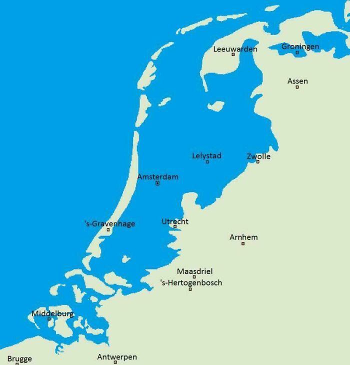
    What The Netherlands Would Naturally Look Like If They Hadn't Built Any Dikes To Prevent Flooding

    An interesting maps visual showing a hypothetical flooded Netherlands without its dykes.

    NastyNice1 Report

    sbj
    Community Member
    Premium
    7 hours ago Created by potrace 1.15, written by Peter Selinger 2001-2017

    AAAARRRGGGHHHH! It's official I live in a house under the sea

    View more comments
    #17

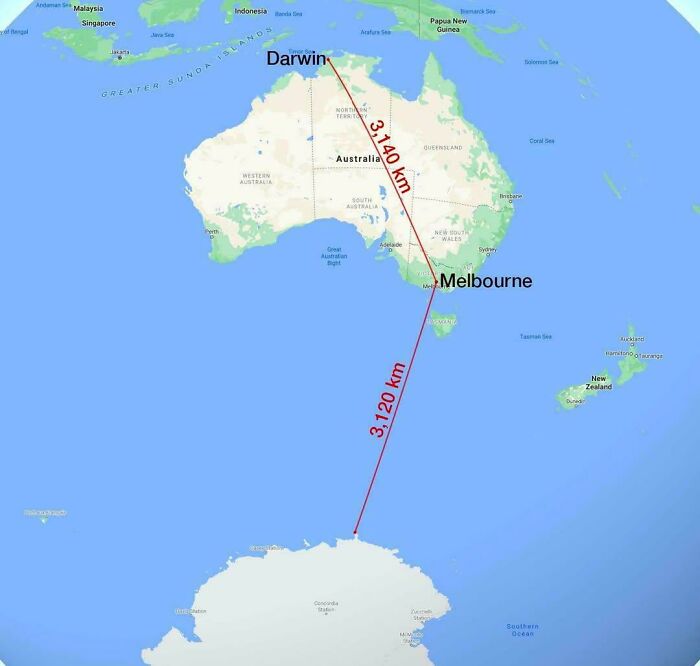
    Melbourne Is Closer To Antarctica Than To Darwin

    A map comparing distances in Australia with the distance to Antarctica, illustrating interesting maps

    vladgrinch Report

    Leebo13
    Community Member
    11 hours ago (edited) Created by potrace 1.15, written by Peter Selinger 2001-2017

    We're closer to Wellington as well.

    View more comments
    ADVERTISEMENT

    While we can now access any and every map, this navigation tool actually dates back to prehistoric times, showing how important they were for mental orientation. Historians believe the earliest surviving depiction of the known world as a geographical map is the Babylonian Map of the World, often called the Imago Mundi.

    ADVERTISEMENT

    It was originally discovered in Sippar, Iraq, and etched onto a small clay tablet. Granted, it doesn’t necessarily look like our standard map, though. It places Babylon right at the center of a circle, with triangles beyond the river that are thought to represent mythical lands or islands that people didn’t recognize or know much about at the time.

    #18

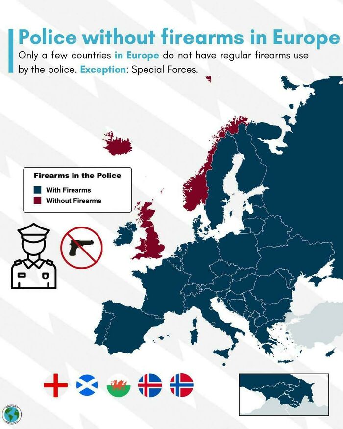
    Police Without Firearms In Europe

    An interesting map of Europe highlighting which countries have police forces that do not carry firearms.

    vladgrinch Report

    JinxBox
    Community Member
    8 hours ago Created by potrace 1.15, written by Peter Selinger 2001-2017

    Dear Norway that's so cute. There are many countries where you don't have to worry about the police or random people shooting at you. Then there's US where stepping on your lawn is a reason to whip out a riffle 🤨

    View more comments
    #19

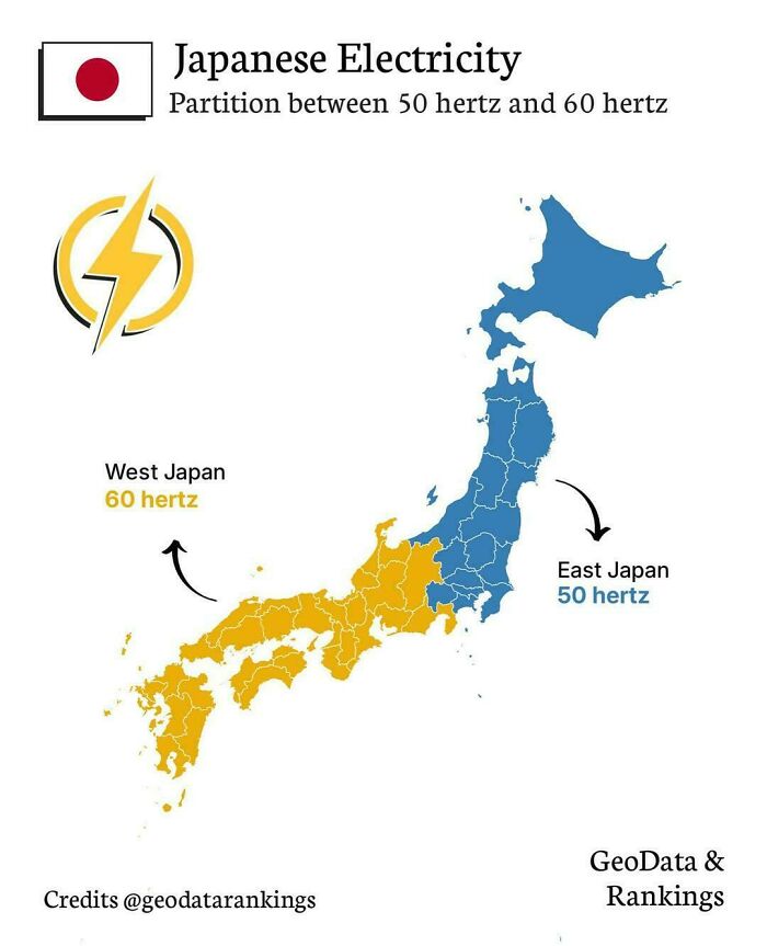
    Japanese Electricity : Partition Between 50 Hertz And 60 Hertz

    An interesting map of Japan showing the electrical grid division between 50 and 60 Hertz frequencies.

    vladgrinch Report

    #20

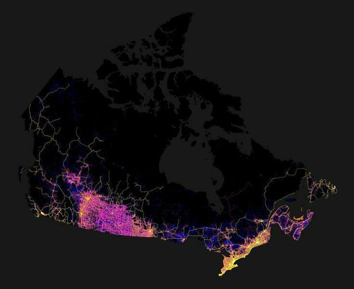
    Road Map Of Canada

    An interesting map of Canada at night, highlighting population density along the southern border.

    Rosemarry_40 Report

    MushroomHead22
    Community Member
    29 minutes ago Created by potrace 1.15, written by Peter Selinger 2001-2017

    one day there will be a road to Kuujjuaq in Quebec, just when...?

    ADVERTISEMENT
    #21

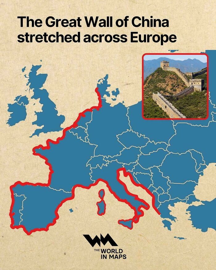
    Map Showing The Length Of The Great Wall Of China In Comparison To The Coastline Of Mainland Europe

    An interesting map comparing the Great Wall of China length stretched across Europe

    SatoruGojo232 Report

    Glix Drap
    Community Member
    Premium
    6 hours ago Created by potrace 1.15, written by Peter Selinger 2001-2017

    Adolf's plan for his Atlantic and Mediteranian walls once completed.

    View more comments
    ADVERTISEMENT

    But of course, when we think of maps, we think of pirates. And perhaps many of us believe maps were a pirate thing, created only in those centuries. After all, when you think of maps, you might immediately picture burnt edges and a giant “X marks the spot” pointing to buried treasure, right? But experts say that’s only a myth.

    Historians say the only pirate known to have buried treasure was Captain William Kidd, and that was only because he was set to be executed. Aside from that, 17th- and 18th-century pirates didn’t create treasure maps at all. Who knew?

    But well, after looking at all this data and all these maps, which one surprised you most? Which one did you find the most interesting? Let us know in the comments!

    #22

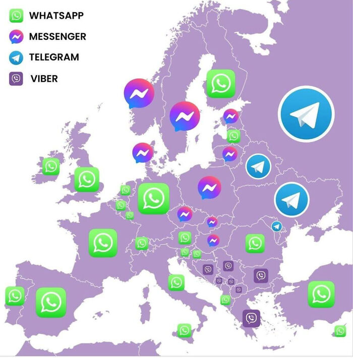
    Most Popular Messenger In Europe Countries

    Interesting maps of Europe showing the most popular messaging apps by country.

    Ur_Senpaiii Report

    OneHappyPuppy
    Community Member
    7 hours ago Created by potrace 1.15, written by Peter Selinger 2001-2017

    Telegram? Russians I deal with prefer WhatsApp (Serbian-based business owners from Russia)

    View more comments
    ADVERTISEMENT
    #23

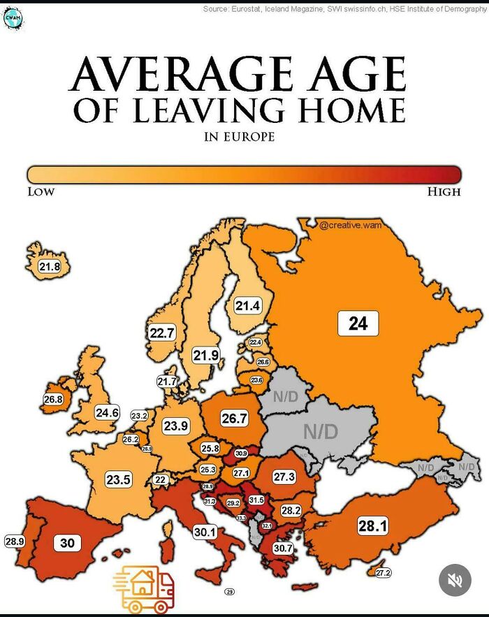
    Leaving Home In Europe

    Colorful map of Europe showing the average age of leaving home in different countries as part of interesting maps.

    Puzzleheaded-Can5325 Report

    #24

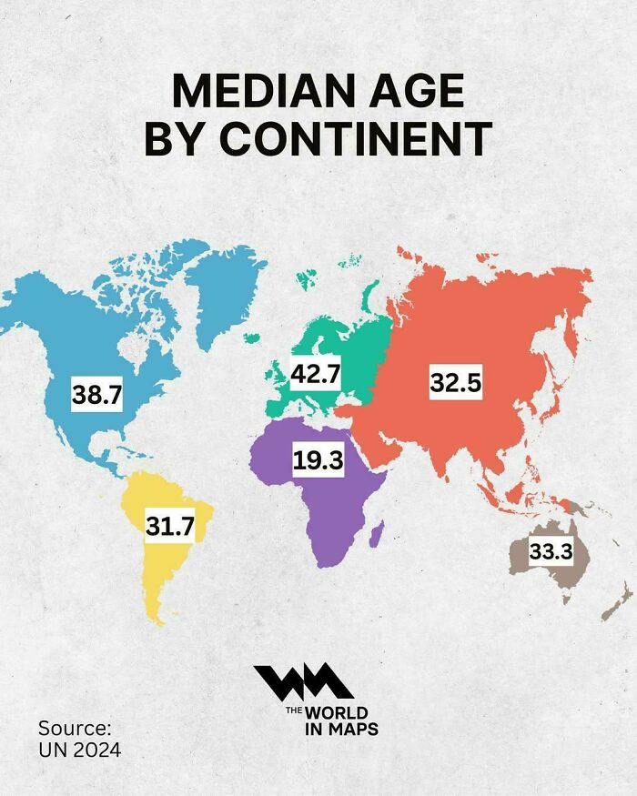
    Median Age By Continent

    Interesting maps illustrating the median age by continent according to UN 2024 data

    vladgrinch Report

    #25

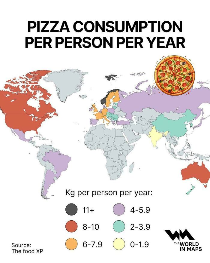
    Pizza Consumption Per Person Per Year

    Interesting maps showcasing global pizza consumption per person per year

    vladgrinch Report

    ADVERTISEMENT
    #26

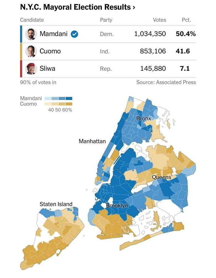
    NYC Mayoral Election Results

    N.Y.C. mayoral election results shown on a regional map, highlighting interesting maps and political data

    Small_Performance368 Report

    JinxBox
    Community Member
    8 hours ago Created by potrace 1.15, written by Peter Selinger 2001-2017

    A bit too spesific for an international audience...

    View more comments
    ADVERTISEMENT
    #27

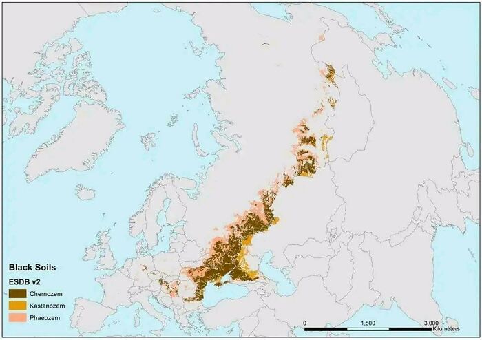
    The Most Valuable Soil On Earth

    A map highlighting black soils and chernozem distribution across Europe and Russia, demonstrating interesting maps

    Homesanto Report

    David Paterson
    Community Member
    4 hours ago Created by potrace 1.15, written by Peter Selinger 2001-2017

    "Chernozem", geez that brings back memories. I see now why people have been fighting over Ukraine and the Crimea since the 1850s.

    View more comments
    #28

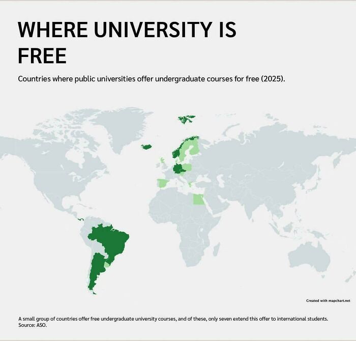
    Free Universities

    An interesting world map highlighting countries where public university is free, from geography class

    Pampa_of_Argentina Report

    JoNo
    Community Member
    4 hours ago Created by potrace 1.15, written by Peter Selinger 2001-2017

    My three older siblings all went through university in Australia for free. As a result that's what I thought was normal. I was wrong. It was free for 15 years, from 1974 to 1989. They were tertiary students at the right time! I would have been too but I went straight into the workforce.

    View more comments
    #29

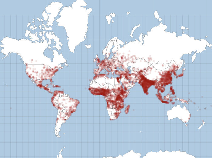
    16,591 Babies Were Born In The Last 1 Hour

    World map with red dots depicting population density or global data, representing interesting maps.

    Senior-Foot-5316 Report

    ADVERTISEMENT
    #30

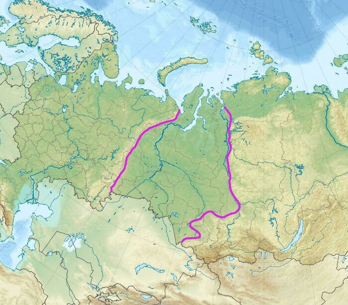
    West Siberian Plain. In An Area Of ​​2,600,000 Km2 There Are No Elevations Higher Than 200 Meters

    An interesting maps graphic highlighting specific borders and regions across the Russian territory

    denn23rus Report

    David Paterson
    Community Member
    4 hours ago Created by potrace 1.15, written by Peter Selinger 2001-2017

    What rivers are those (check web). The Ob and Irtysh rivers.

    View more comments
    ADVERTISEMENT
    #31

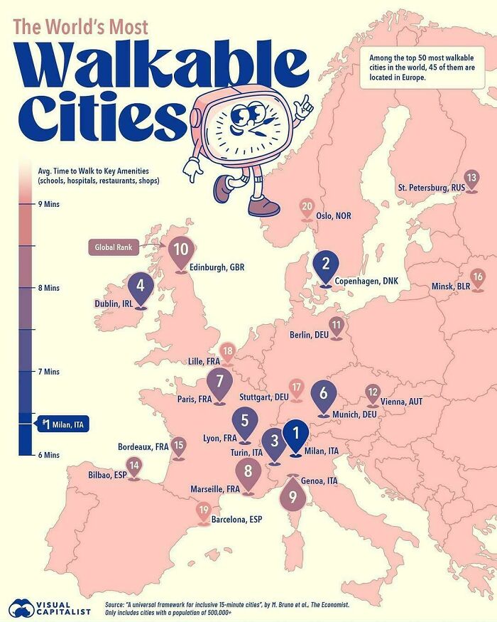
    The World Most Walkable Cities

    An interesting map highlighting the world's most walkable cities within Europe

    AdIcy4323 Report

    sbj
    Community Member
    Premium
    7 hours ago Created by potrace 1.15, written by Peter Selinger 2001-2017

    I'm surprised that The Netherlands has none ranked in the Top 50, I've lived there for 20y now and the ability to be able to do these things was something I noticed first

    View more comments
    #32

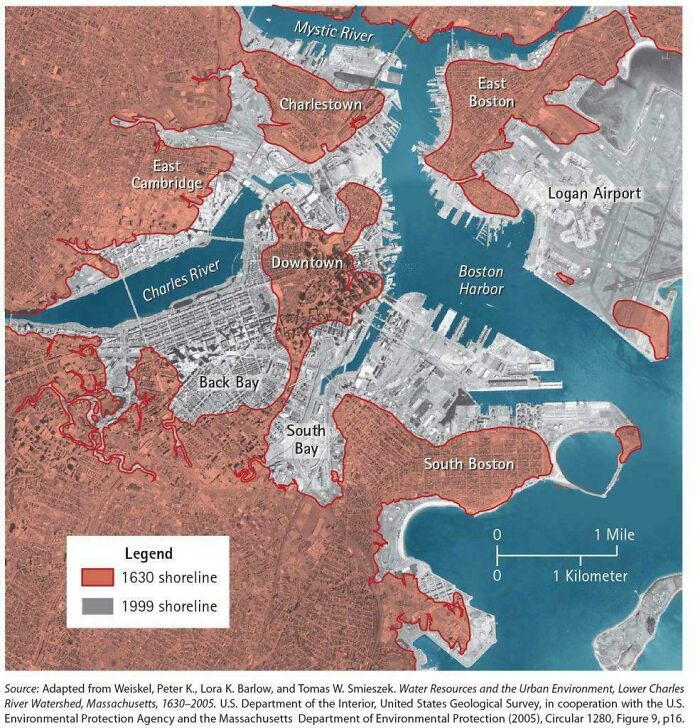
    Since 1630, Land Reclamation Has Made Boston Over 10 Times Larger

    Historical vs modern shoreline map of Boston in red and grey, showing interesting maps details of the city coast.

    vladgrinch Report

    Purple light
    Community Member
    Premium
    7 hours ago Created by potrace 1.15, written by Peter Selinger 2001-2017

    Lots of Dutch immigrants there? 😂

    #33

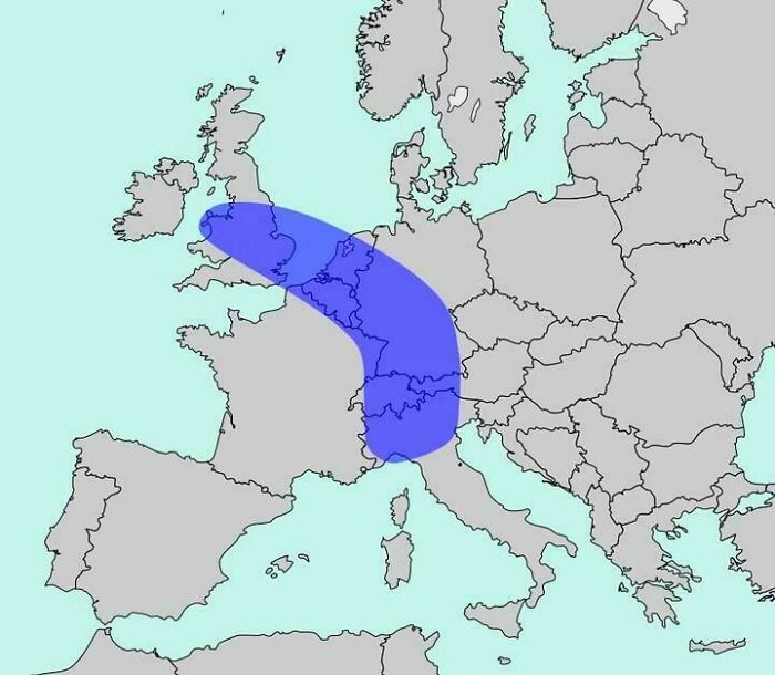
    The Blue Banana: Europe’s Most Densely Populated Corridor With Around 111 Million People

    Blue banana-shaped region highlighted on a map of Europe, presenting interesting maps of demographic corridors.

    vladgrinch Report

    Rusty’scate
    Community Member
    Premium
    7 hours ago Created by potrace 1.15, written by Peter Selinger 2001-2017

    Is that what the kids are calling it theses days?

    View more comments
    ADVERTISEMENT
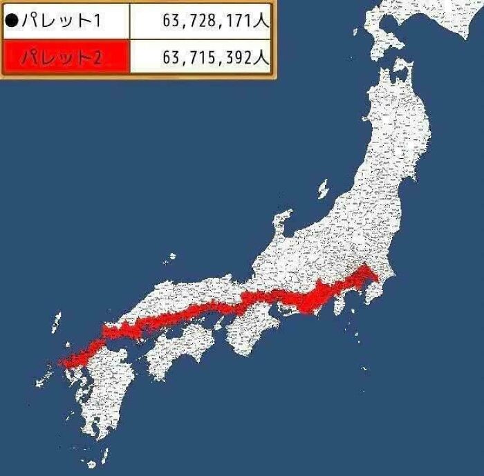
    #34

    Half Of The Japanese Population Lives In The Red Line

    Map of Japan divided into two equal population zones, showcasing interesting maps of population density

    sh0tgunben Report

    MushroomHead22
    Community Member
    24 minutes ago Created by potrace 1.15, written by Peter Selinger 2001-2017

    why are people shocked that a majority of a population lives near the water? anywhere that people immigrated, or "discovered" they mostly established themselves nearest the water. look at the most populated cities in canada/usa; all along the coast or a riverbed.. it made no sense to travel further up without the means, and to remain close to your boat.

    ADVERTISEMENT
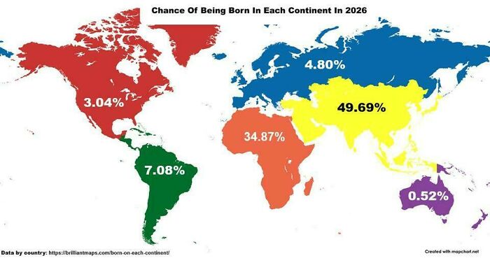
    #35

    Chances Of Being Born On Each Continent In 2026

    An interesting world map depicting the statistical chance of being born in each continent in 2026

    vladgrinch Report

    Marianne
    Community Member
    1 hour ago Created by potrace 1.15, written by Peter Selinger 2001-2017

    Interesting how they divided Europe and Asia. Alomst as if they wanted to create an artificially high difference.

    View more comments
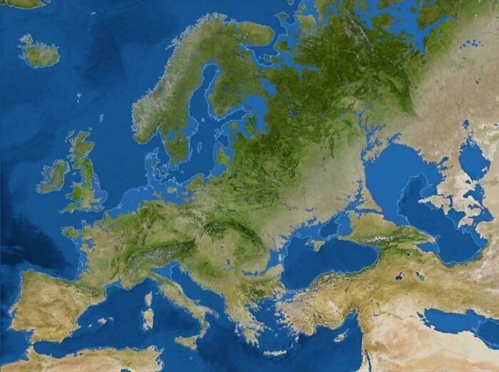
    #36

    Map Of Europe If All The Glaciers Melted

    A detailed physical map of Europe showing land and sea borders, perfect for geography class

    Electronic_Week8536 Report

    David Paterson
    Community Member
    5 hours ago Created by potrace 1.15, written by Peter Selinger 2001-2017

    Nope. Isostatic rebound (the slow rise of land after the end of the last ice age) would change this significantly.

    View more comments
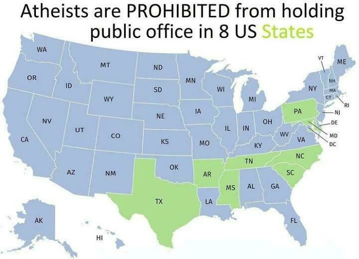
    #37

    8 Us States Have Laws That Prohibit Atheists From Holding Public Office

    A US map highlighted with interesting maps indicating eight states prohibiting atheists from holding public office

    vladgrinch Report

    D Bearman
    Community Member
    9 hours ago Created by potrace 1.15, written by Peter Selinger 2001-2017

    How is this legal? And why is my home state one of the eight?

    View more comments
    ADVERTISEMENT
    #38

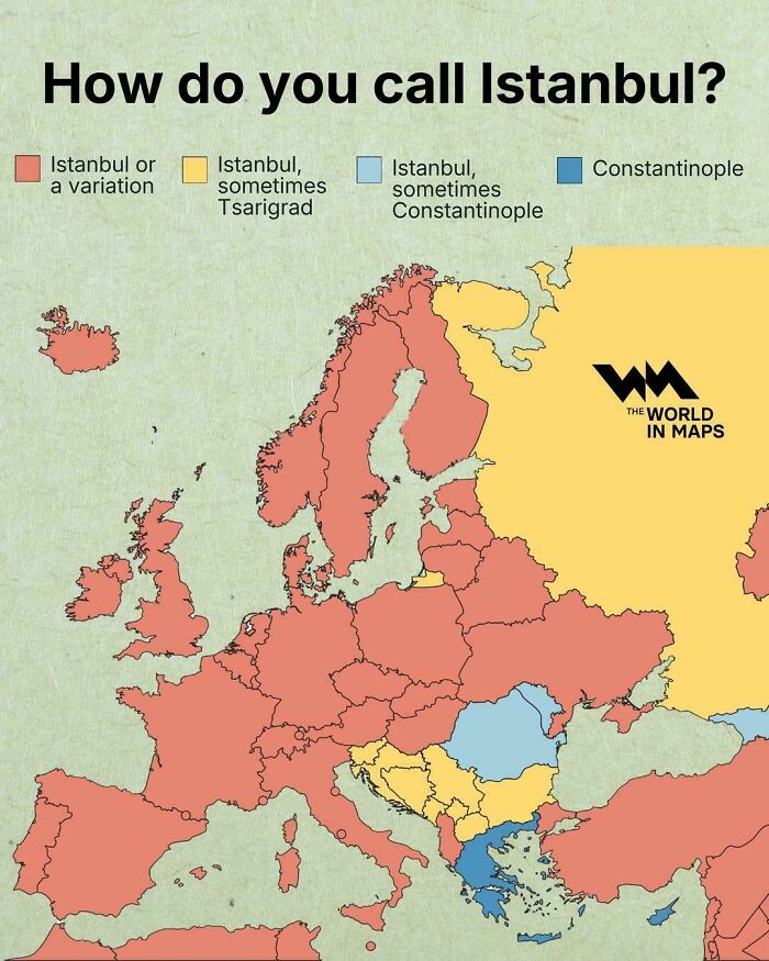
    How Do You Call Istanbul?

    An interesting map of Europe depicting how different regions name the city of Istanbul.

    vladgrinch Report

    ADVERTISEMENT
    #39

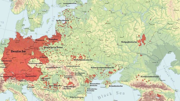
    The Regions Where The Germans Have Lived Throughout History

    An interesting historical map showing German settlements across Eastern Europe.

    Battlefleet_Sol Report

    Ace
    Community Member
    Premium
    6 hours ago Created by potrace 1.15, written by Peter Selinger 2001-2017

    Define "the Germans", and over what time period? Meaningless without that information.

    View more comments
    #40

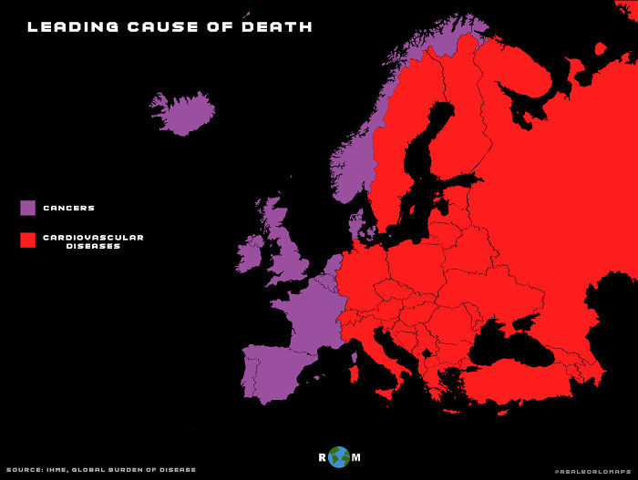
    Leading Cause Of Death In Europe

    A demographic map of Europe showing the leading cause of d***h by country

    Realworldmaps Report

    ADVERTISEMENT
    #42

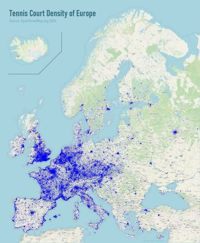
    Tennis Court Density In Europe

    An interesting map showcasing tennis court density across Europe

    SatoruGojo232 Report

    ADVERTISEMENT
    #43

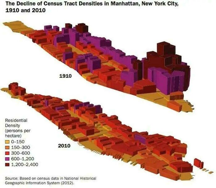
    Manhattan Today Has 600k Fewer People Living On It Than It Did In 1910

    Interesting maps comparing the decline of residential census tract densities in Manhattan between 1910 and 2010.

    Tight-Cucumber-2469 Report

    David
    Community Member
    20 minutes ago Created by potrace 1.15, written by Peter Selinger 2001-2017

    thats bc they built up the other boroughs, connected bridges, and made Manhattan more offices and better housing that overvcrowded slums. My grandmother grew up in a 1 bedroom apartment in the 1920s with her parents, siblings, and a boarder they took in to make rent, all crammed in (until they saved enough money to move to a 2 bedroom larger apartment in a poor but not slum area)

    #44

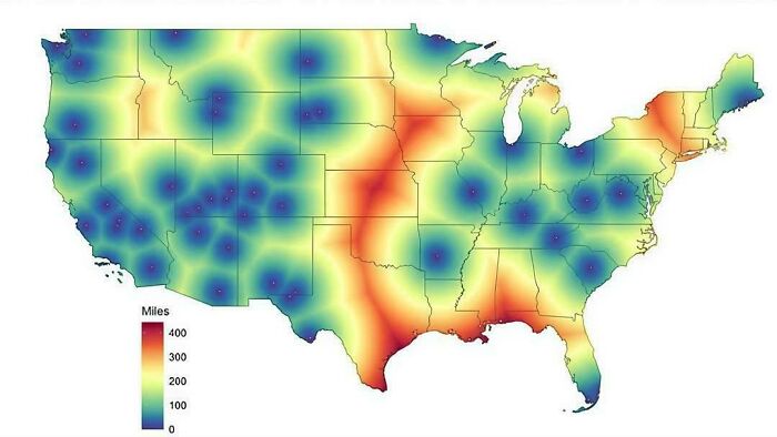
    Proximity To The Nearest National Park

    Interesting maps showing US distances measured in miles in a heatmap format

    Negative-Swan7993 Report

    #45

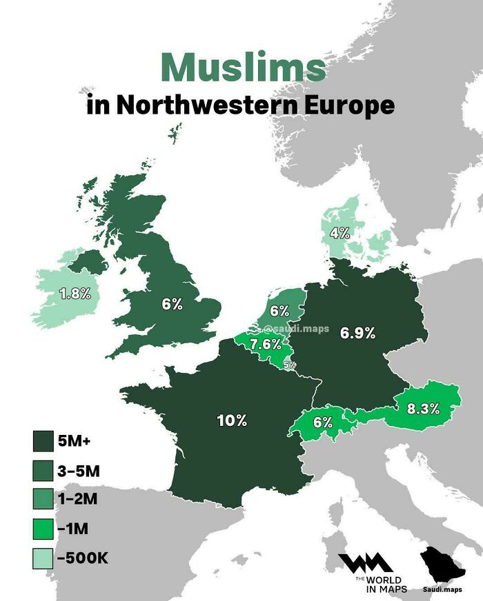
    Muslims In Northwestern Europe

    An interesting demographic map showing the percentage of Muslims in Northwestern Europe

    Cultural-Diet6933 Report

    Jan Rosier
    Community Member
    7 hours ago (edited) Created by potrace 1.15, written by Peter Selinger 2001-2017

    7.6 %, yet laws in order to ban hijab from being worn by teachers o any officials... ashamed for my country

    View more comments
    ADVERTISEMENT
    #46

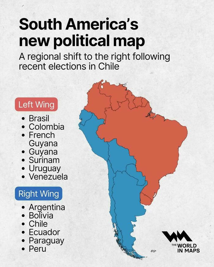
    South America's New Political Map

    Political map of South America showing left-wing and right-wing countries, representing interesting maps of the world.

    vladgrinch Report

    Tim Fawcett
    Community Member
    5 hours ago Created by potrace 1.15, written by Peter Selinger 2001-2017

    So let me get this straight....the right are on the left and the left are on the right. Pretty much sums up politics thee days

    View more comments
    ADVERTISEMENT
    #47

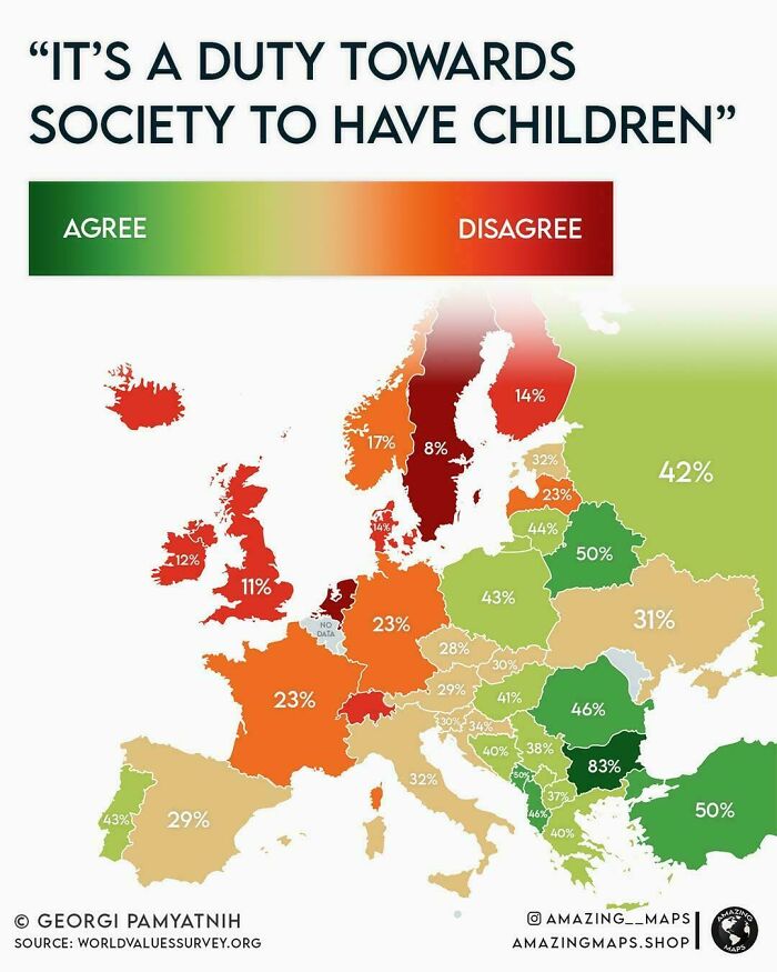
    Percentage Of People Who Believe That Having Children Is A Moral Duty

    Interesting maps showcasing the percentage of agreement on the societal duty of having children across Europe

    vladgrinch Report

    Jan Rosier
    Community Member
    7 hours ago Created by potrace 1.15, written by Peter Selinger 2001-2017

    I concur with the findings for my home-country, Belgium : 'none of yous business'

    View more comments
    #48

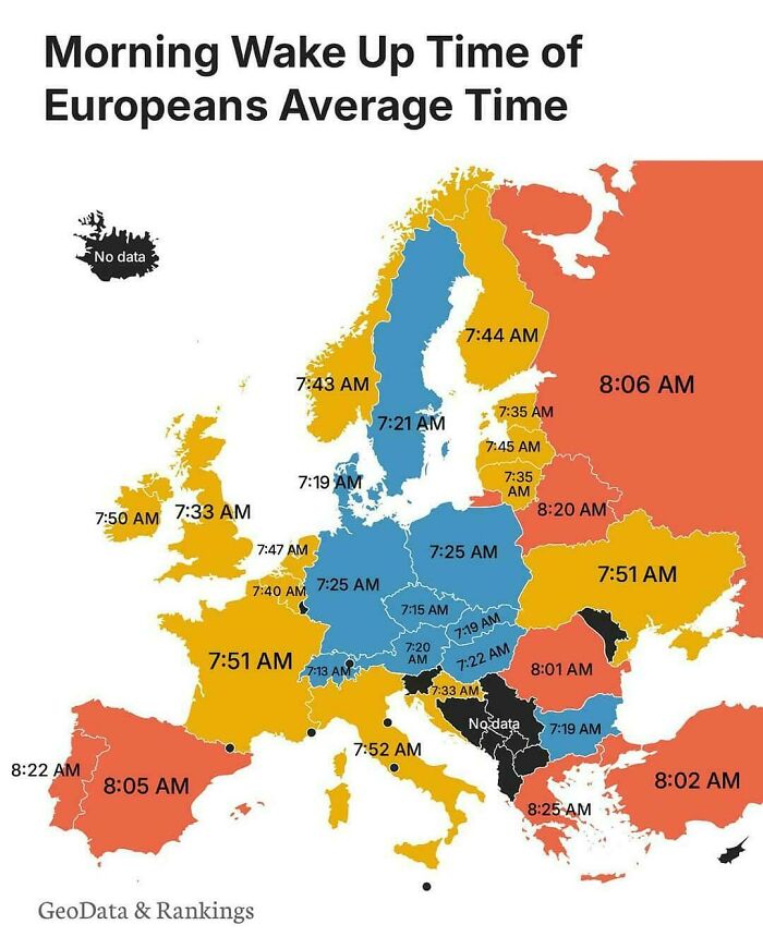
    Morning Wake Up Time Of Europeans Average Time

    Interesting maps detailing the average morning wake up time for citizens across different European countries

    AdIcy4323 Report

    Fat Harry (Oi / You)
    Community Member
    4 hours ago (edited) Created by potrace 1.15, written by Peter Selinger 2001-2017

    5.30 here (UK). I have lots of animals to tend to before work.

    View more comments
    #49

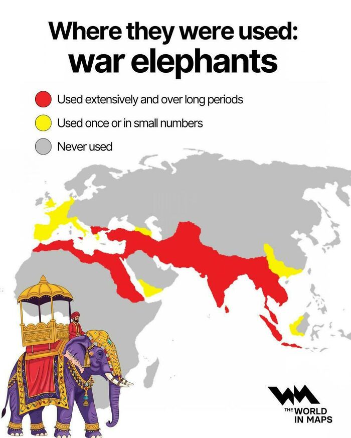
    Where War Elephants Were Once Used

    An interesting maps visual displaying the historical usage and distribution regions of war elephants

    vladgrinch Report

    Ace
    Community Member
    Premium
    6 hours ago Created by potrace 1.15, written by Peter Selinger 2001-2017

    Their use in Britain is very much disputed, just a couple of mentions of them, and not by the people (e.g. Caesar) who were claimed to have used them.

    View more comments
    ADVERTISEMENT
    #50

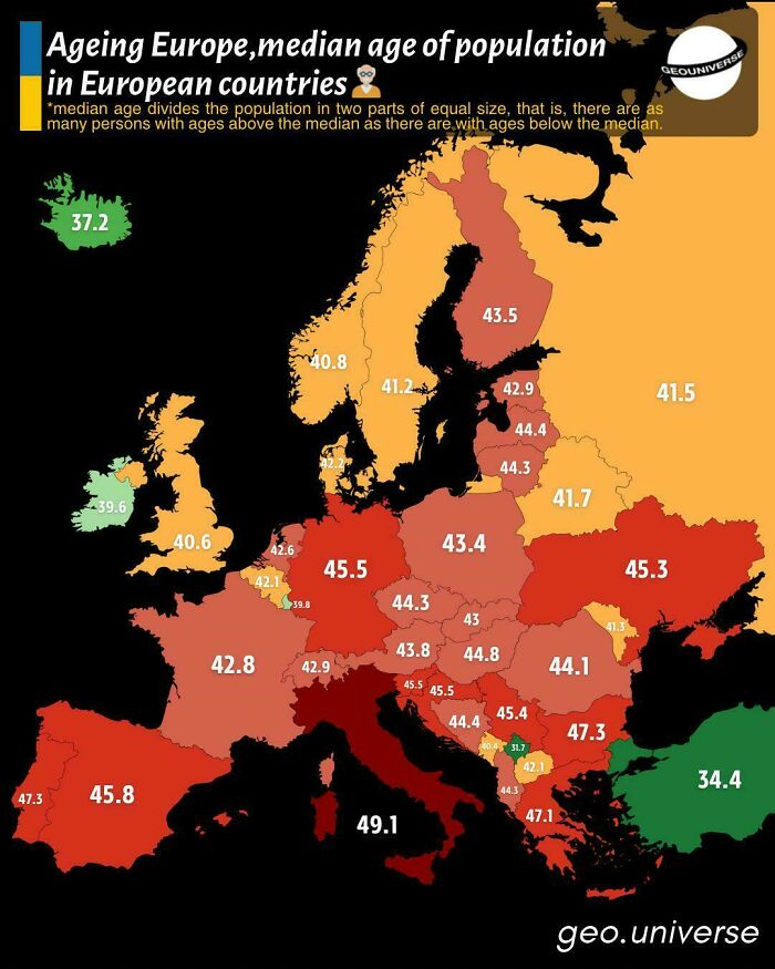
    Median Age Of Population In European Countries

    An interesting map of Europe illustrating the median age of the population in different countries

    vladgrinch Report

    ADVERTISEMENT
    #51

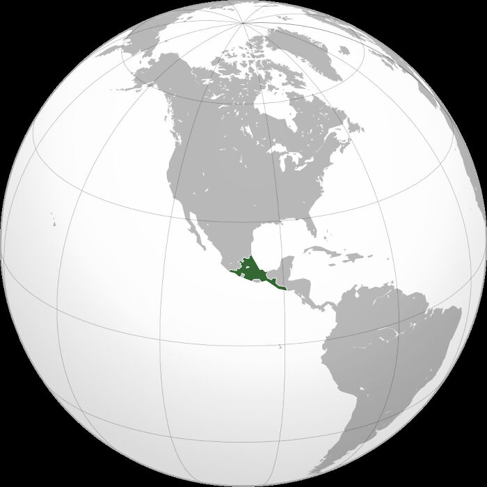
    Aztec Empire At Its Greatest Territorial Extent In The Early 16th Century

    A globe highlight map showing the geographical region of Mesoamerica in green

    Solid-Move-1411 Report

    28YrArmyVet
    Community Member
    3 hours ago Created by potrace 1.15, written by Peter Selinger 2001-2017

    And the useful idiots in America claim that much of the SW US was once Aztec land.

    #52

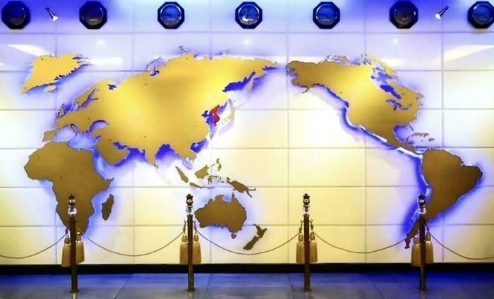
    The World Map Used In North Korea 🇰🇵

    A wall map showing an interesting world perspective with Korea highlighted

    rarerealm Report

    Glix Drap
    Community Member
    Premium
    6 hours ago Created by potrace 1.15, written by Peter Selinger 2001-2017

    At least it shows New Zealand.

    View more comments
    #53

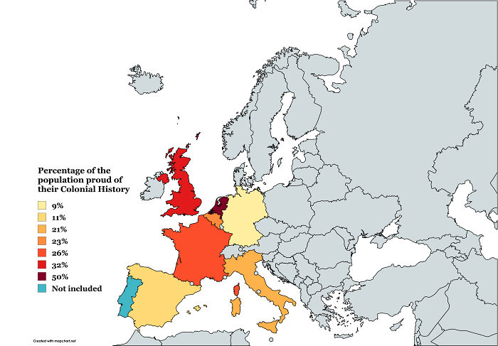
    Percentage Of Population Proud Of Their Colonial History In Selected Countries In Europe

    An interesting map showing the percentage of the population proud of their colonial history in Europe.

    Choice_Sandwich2182 Report

    Francois
    Community Member
    5 hours ago Created by potrace 1.15, written by Peter Selinger 2001-2017

    In some country people link colonialism to the s***e trade whereas in some countries they link it to the spice trade.

    View more comments
    ADVERTISEMENT
    #54

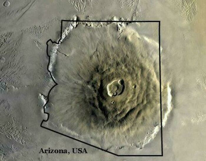
    The Largest Volcano In The Solar System Compared To Arizona

    An interesting map comparison overlay of Olympus Mons in Mars compared to the state of Arizona

    Senior-Foot-5316 Report

    ADVERTISEMENT
    #55

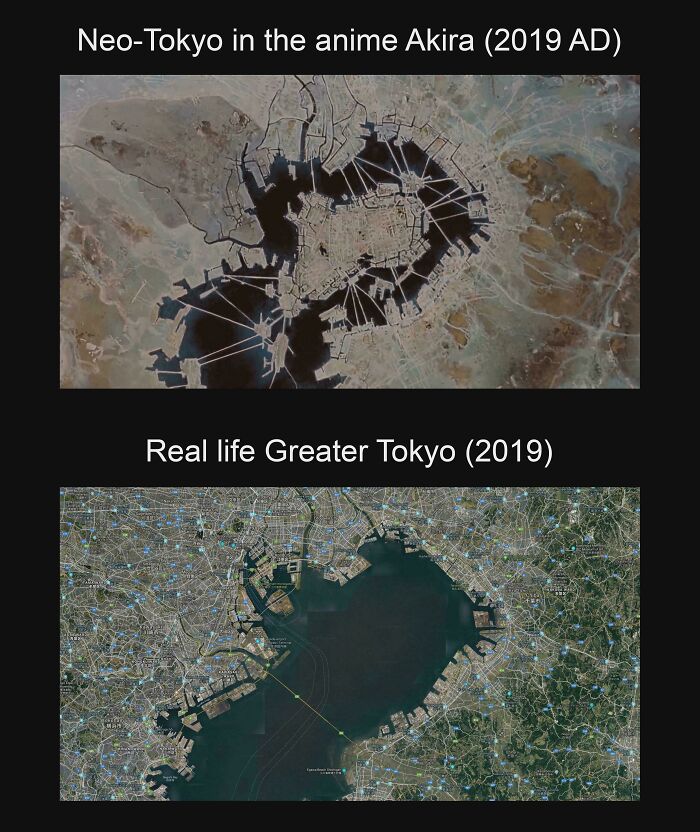
    Neo-Tokyo's Artificial Islands In Akira Compared To The Real Life Tokyo Bay

    Side by side interesting maps showing fictional Neo-Tokyo from Akira versus real life Greater Tokyo in 2019.

    Idle_Redditing Report

    #56

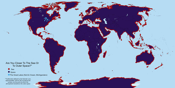
    Space Is A Lot Closer Than Most People Realize

    World map illustrating proximity to sea vs outer space, an example of interesting maps not shown in class

    Many-Excitement3246 Report

    David Paterson
    Community Member
    1 hour ago Created by potrace 1.15, written by Peter Selinger 2001-2017

    A more useful map would be distance to nearest city vs distance to space.

    View more comments
    #57

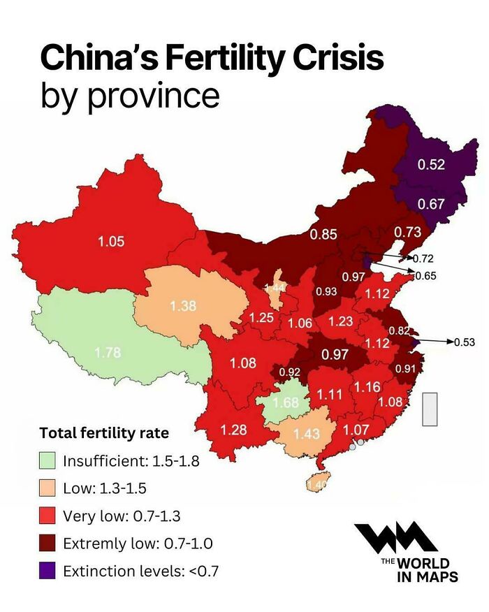
    China's Fertility Crisis By Province

    China fertility rate crisis shown by province on a color-coded map, displaying interesting maps of demographics

    vladgrinch Report

    FreeTheUnicorn
    Community Member
    7 hours ago Created by potrace 1.15, written by Peter Selinger 2001-2017

    Humans can't have a fertility crisis, there are billions of us.

    View more comments
    ADVERTISEMENT
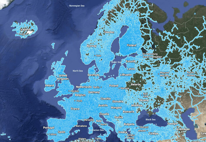
    #58

    Google Street View Coverage Worldwide

    A map showing Google Street View coverage across Europe highlighted in bright blue, representing interesting maps

    Cautious_Ad_3918 Report

    ADVERTISEMENT
    #59

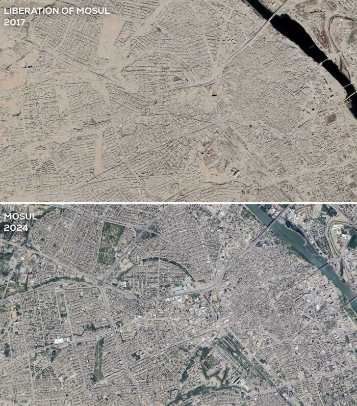
    8 Years Since The Liberation Of Mosul

    An interesting comparison map showing satellite views of Mosul, Iraq in 2017 versus 2024.

    Assyrian_Nation Report

    28YrArmyVet
    Community Member
    3 hours ago Created by potrace 1.15, written by Peter Selinger 2001-2017

    What month was each photo taken? Summer in the first and spring in the second?

    #60

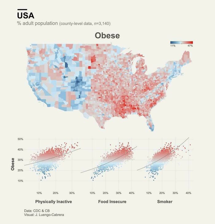
    America Obesity Map

    An interesting map of the USA showing adult obesity rates alongside lifestyle scatter plots.

    AdIcy4323 Report

    #61

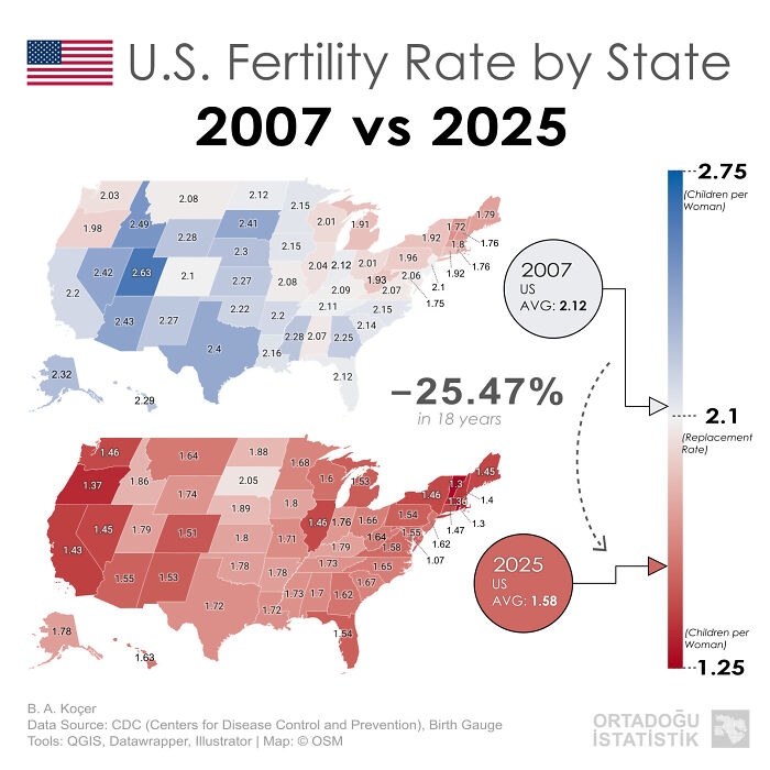
    U.S. Fertility Rate By State 2007 vs. 2025

    An interesting map comparison of US fertility rates between 2007 and 2025 by state

    Accomplished_Gur4368 Report

    ADVERTISEMENT
    #62

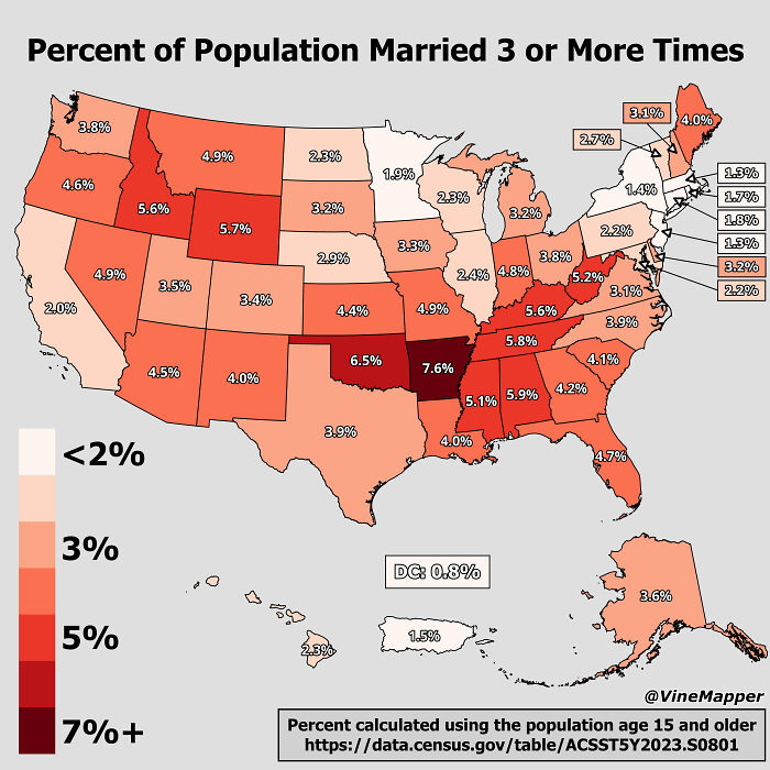
    Percent Of Population Married 3 Or More Times

    A US map showing the percent of population married 3 or more times, depicting interesting maps

    VineMapper Report

    D Bearman
    Community Member
    8 hours ago (edited) Created by potrace 1.15, written by Peter Selinger 2001-2017

    California 2%, Really? And the bible belt with the highest averages? Things that make you go hmmmm.

    View more comments
    ADVERTISEMENT
    #63

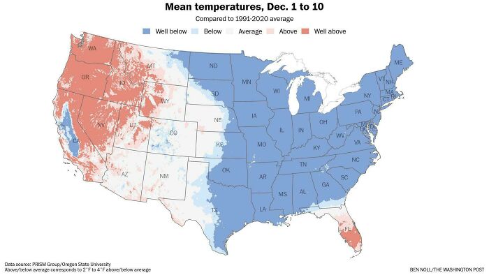
    Temperature Averages So Far This December Across The U.S

    US mean temperatures map from December 1 to 10 showing above and below average regions as interesting maps.

    Ecstatic-Compote-399 Report

    #64

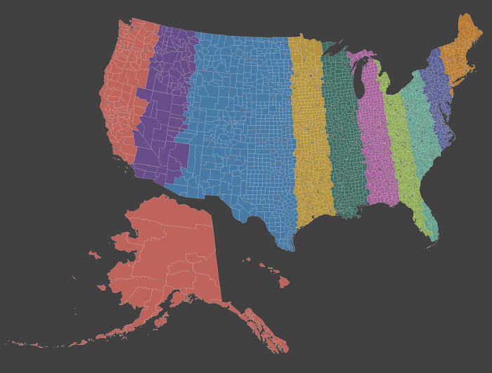
    America Split Into 10 Regions With Equal Population

    A colorful map of the United States divided into vertical slices, demonstrating interesting maps concepts.

    Senior-Foot-5316 Report

    #65

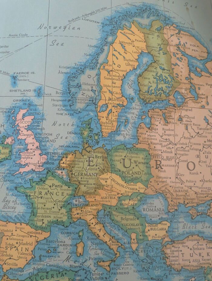
    World Map From Grandparents' House. Date Unknown

    An interesting map of Europe showing detailed countries and cities on a vintage globes style

    regiinmontana Report

    Ace
    Community Member
    Premium
    6 hours ago Created by potrace 1.15, written by Peter Selinger 2001-2017

    Best guess any time between 1918 (because Yugoslavia) and 1940 (Alsace/Lorraine being reincorporated as Germany).
    View more comments
    ADVERTISEMENT