
15 Design Tips Every Graphic Designer Should See
Through subtle adjustments, graphic designers can make simple images beautiful and memorable. Poppie Pack, a senior graphic designer at Canva, created 50 excellent graphic design tips communicated with beautiful images that show exactly why those tips work so well. We’ve selected 14 of our favorites to share with you.
For the layman, these images will throw some light on how graphic design decisions are made and how imperceptible some of them may be to the untrained eye.
More info: canva.com | Facebook | Twitter | Instagram (h/t: designtaxi, demilked)
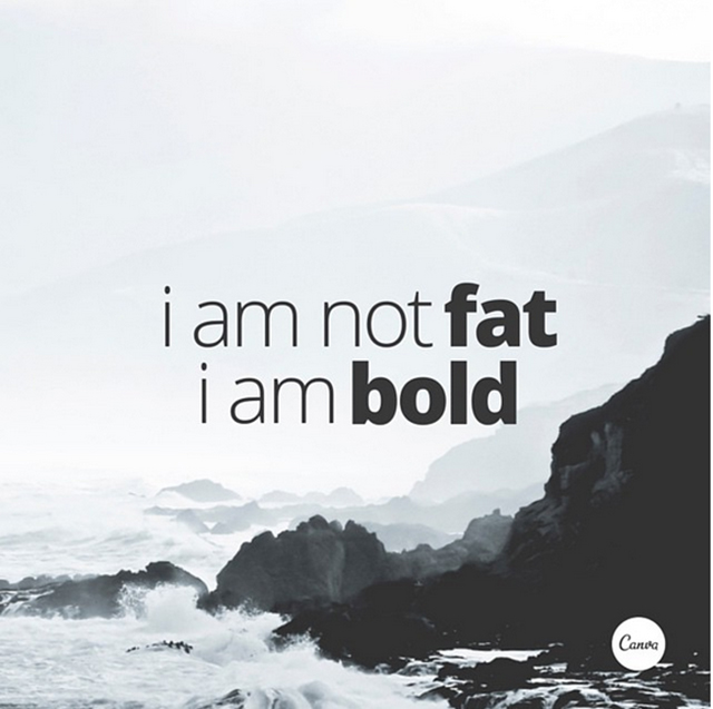
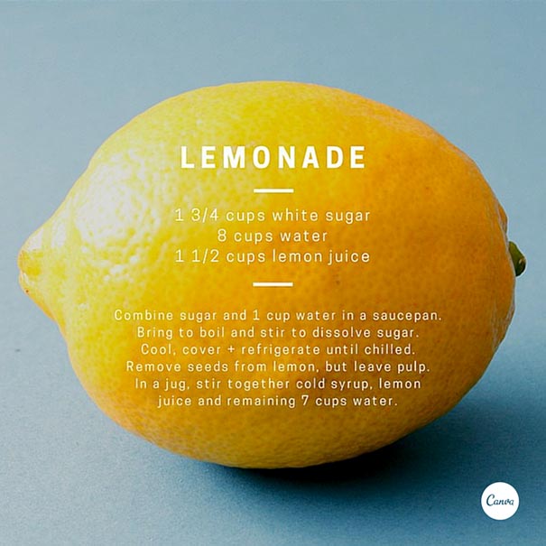
Use Light And Bold Font Variants For Emphasis And Impact
Crop Images To Let Them Act As Background Textures
Typefaces Have Personalities Too. Make Sure You Represent Your Message With The Right Fonts
Choose A Geometric Typeface Teamed With An Elegant Serif For A Happy Pairing
Apply A Grid To Create A Clean Composition, Using One Of The Photo Holders As A Text Box
Contrasting Typefaces Make A Great Duo
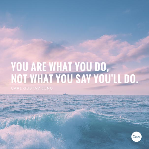
The Placement Of Text Is A Crucial Element. Make Sure To Break Your Lines Up The Way It Should Be Read
Create Clever Compositions By Letting The Features Within Images Guide Where To Place Your Type
Use Shapes To Create Contrast And Offset Your Text From Your Background Image
Make Beautiful Collages With Your Favorite Photos Using Grids, Ensure To Apply The Same Filter To Each Image For Consistency
Apply A Tint To Your Image The Same As Any Block Color In Your Design For Consistency
Aesthetics! Composition! Adjust All The Elements In Your Graphic So They Are On Corresponding Angles
Use The Combination Of A Tint And X-process To Create Two-tone Filter Effects
Use Areas With Clear Space In Your Images For Creative Ways To Include Text
Use Strong, Geometric Typefaces To Amplify Your Message.
139Kviews
Share on FacebookDesigners do not have to read these tips, they already know ... I hope !
Do Not Start Every Word In A Sentence With A Capital Character.
“Let’s go & explore” does not have an apostrophe, it has a prime mark in Let's. Ick. Otherwise, beautiful type examples for the uninitiated.
Designers do not have to read these tips, they already know ... I hope !
Do Not Start Every Word In A Sentence With A Capital Character.
“Let’s go & explore” does not have an apostrophe, it has a prime mark in Let's. Ick. Otherwise, beautiful type examples for the uninitiated.

 Dark Mode

 No fees, cancel anytime





























182
24