Bored Panda works better on our iPhone app
Continue in app Continue in browser

The Bored Panda iOS app is live! Fight boredom with iPhones and iPads here.

Designer Fixes The ‘World’s Worst Logos’ (9 Pics)
User submission
200.6K

Designer Fixes The ‘World’s Worst Logos’ (9 Pics)

Interview With Artist

557

ADVERTISEMENT

A brand logo can make it or break it in the big game. Just look at the most iconic logo designs—from Apple to Nike, there’s something genius, yet so simple about them. But that’s an exception rather than a rule.

Italian graphic designer Emanuele Abrate knows very well how bad logos can be. From unclear messages and typography gone wrong to designs that are just too far to be saved altogether, these are some of the problems Emanuele is targeting in his new project. And “The worst logos ever, redesigned” does exactly what it says. Emanuele has picked 9, in his opinion, of the worst company logo faux pas that could be saved from a distasteful limbo. He interpreted them in his own ways and the results are down below.

Bored Panda contacted Emanuele based in Cherasco, Northern Italy to find out more about the idea behind his project. “I had the idea of redesigning the worst logos ever for a long time. I’ve been coming across the articles about bad design logos with unclear messages from all over the world for several years (one of these articles I think I read on Bored Panda,)” he told us. Scroll down to read the full interview below and check the new logos!

More info: EmanueleAbrate.com | Behance.net | Facebook | Instagram

RELATED:

    Instituto de Estudos Orientais

    ADVERTISEMENT

    Image credits: emanueleabrate.com

    Image credits: emanueleabrate.com

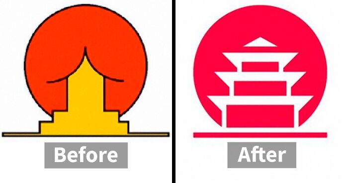
    This particular case is a great example of a logo with ambiguous message. “I wanted to keep the concept unchanged, working on the negative space and enhancing the figure of the pagoda,” he writes on Behance. Emanuele eliminated the outline for a fresh and modern look. He also aligned the typography with the pictogram and converted the font to sans serif, which “matches the symbol better.”

    Emanuele selected 9 of what he thought were the worst logos and rolled up his sleeves. “I was trying to figure out how I would approach them if they were really commissioned to me.” The result is not only fun but also “educational and helps to understand that design is not only aesthetic but, above all, it’s about problem solving.”

    The designer believes that the best logos are those “that manage to indelibly enter people’s minds through simplicity and that manage to create an effective and coherent visual ecosystem with the brand they represent.”

    ADVERTISEMENT

    Kudawara Pharmacy

    Image credits: emanueleabrate.com

    Image credits: emanueleabrate.com

    ADVERTISEMENT

    Image credits: emanueleabrate.com

    Emanuele believes there are many different problems with this logo. He names a couple of them: “a poor use of typography, disproportionate elements, and the defective use of shapes that creates an ambiguous message.” He said he was ready to delete the whole thing and keep the K as a lettermark only. “I used simple shapes to build the letter K and give a sense of trust linked to nature.” Plus, “In the negative space you can also see a cross (a distinctive element in the pharmaceutical field).”

    ADVERTISEMENT

    Fire Prevention Products

    Image credits: emanueleabrate.com

    Image credits: emanueleabrate.com

    “This logo suggests that something ‘down there’ is on fire, uh là là!” joked the Italian designer. Of course, it doesn’t hold the sense of safety one would expect. “That’s why I decided to develop a new concept starting from circular shapes that enclose the figure of a flame in the negative space.” The name has been shortened to the acronym “FPP,” which gives the logo great recognition even if the full text isn’t present.

    ADVERTISEMENT

    Emanuele said he’s “a big fan of the work of Chermayeff & Geismar & Haviv and I fully agree with their philosophy” because “their logo design projects are the ones that best resist the ‘test of time.'” Such logos should be both simple and unusual enough to look appealing. A good logo should also always “have an interesting concept and be in line with the company identity which it represents,” he commented.

    ADVERTISEMENT

    Mama’s Baking

    Image credits: emanueleabrate.com

    Image credits: emanueleabrate.com

    Emanuele has given this logo a whole new concept. The idea was inspired by “the figure of the mother who cooks with passion.” Imagine her taking the hot pan out of the oven. “I started from the oven mitt as an iconic symbol, and tied it with a heart for the message of love and passion.”

    The Computer Doctors

    Image credits: emanueleabrate.com

    ADVERTISEMENT

    Image credits: emanueleabrate.com

    ADVERTISEMENT

    Emanuele dubbed this design so bad that “nothing could be saved of it.” Thus he came up with a new concept that combines the worlds of technology and health care. “The idea behind the new logo was to start from the shape of a monitor to insert a cross in the negative space and at the same time enhance the initial letters C and D​​​​,” he explained.

    Clinica Dental San Marcelino

    Image credits: emanueleabrate.com

    Image credits: emanueleabrate.com

    ADVERTISEMENT

    “A dentist or a seducer?” That’s what came to Emanuele’s mind when he saw this one. “The logo is so unclear that I came up with a simpler and less descriptive solution.” Thus, he arranged the letters C and D so that they form a smiling face. “The clean, rounded lines and the blue color are intended to convey a sense of confidence and cleanliness,” he commented.

    Emanuele currently teaches a course called “Logo Hero” that provides all the education you’d need about logo and brand designs. He also manages “Logofonts” on Instagram, where he reveals what kind of fonts famous logos are using. In fact, “the idea for this page was inspired by the success of my project on Behance.”

    OGC (Office of Government Commerce)

    Image credits: emanueleabrate.com

    ADVERTISEMENT

    Image credits: emanueleabrate.com

    ADVERTISEMENT

    Image credits: emanueleabrate.com

    At first, it seems like the original OGC logo has nothing wrong with it. “But by rotating the logo, you can see a rather embarrassing figure (definitely not a good move for a government agency),” explains Emanuele. That’s why he restyled the logo by enhancing the letters, eliminating the outline and giving it a modern look.

    Safe Place

    Image credits: emanueleabrate.com

    Image credits: emanueleabrate.com

    ADVERTISEMENT
    ADVERTISEMENT

    Image credits: emanueleabrate.com

    This case has just too much going on: “It’s all shapes inside shapes inside other shapes.” Emanuele rolled up his sleeves: “Ok, let’s do some tidying up, let’s take away everything that is superfluous: the house is the only really evocative element of this logo and so, let’s enhance it!”

    Arlington Pediatric Center

    Image credits: emanueleabrate.com

    Image credits: emanueleabrate.com

    ADVERTISEMENT

    The new logo starts with the same concept, but it’s more confident. “The simple and circular shapes make the pictogram friendly and warm. I also replaced the typography with more modern but still institutional sans serif.”

    3.9Mviews

    Share on Facebook
    Hidrėlėy

    Hidrėlėy

    Author, Approved Contributor

    Read more »

    Fascinated by music, movies and sitcoms, I'm passionate about social media and can't live without the internet, especially for all the cute dog and cat pictures out there. I wish the day had about 40 hours to be able to do everything I want.

    Read less »
    Hidrėlėy

    Hidrėlėy

    Author, Approved Contributor

    Fascinated by music, movies and sitcoms, I'm passionate about social media and can't live without the internet, especially for all the cute dog and cat pictures out there. I wish the day had about 40 hours to be able to do everything I want.

    Julius St

    Julius St

    Moderator, Community member

    Read more »

    This lazy panda forgot to write something about itself.

    Read less »

    Julius St

    Julius St

    Moderator, Community member

    This lazy panda forgot to write something about itself.

    Liucija Adomaite

    Liucija Adomaite

    Author, Community member

    Read more »

    Liucija Adomaite is a creative mind with years of experience in copywriting. She has a dynamic set of experiences from advertising, academia, and journalism. This time, she has set out on a journey to investigate the ways in which we communicate ideas on a large scale. Her current mission is to find a magic formula for how to make ideas, news, and other such things spread like a virus.

    Read less »

    Liucija Adomaite

    Liucija Adomaite

    Author, Community member

    Liucija Adomaite is a creative mind with years of experience in copywriting. She has a dynamic set of experiences from advertising, academia, and journalism. This time, she has set out on a journey to investigate the ways in which we communicate ideas on a large scale. Her current mission is to find a magic formula for how to make ideas, news, and other such things spread like a virus.

    What do you think ?
    Francis
    Community Member
    5 years ago Created by potrace 1.15, written by Peter Selinger 2001-2017

    the last one is not that much better tbh...

    M DR
    Community Member
    5 years ago Created by potrace 1.15, written by Peter Selinger 2001-2017

    Well, at least the big figure isn't forcing the little figure into fellatio anymore...

    Load More Replies...
    Charlotte A.
    Community Member
    5 years ago Created by potrace 1.15, written by Peter Selinger 2001-2017

    All but a few of the originals takes my mind in the way wrong direction. I can't help but wonder what the original designers were thinking, or the people who approved of those designs and decided to make use of them...

    Rex the Rat
    Community Member
    5 years ago Created by potrace 1.15, written by Peter Selinger 2001-2017

    I think the original safe place is the worst...

    Load More Replies...
    loading...
    Community Member
    5 years ago Created by potrace 1.15, written by Peter Selinger 2001-2017

    I agree that pretty much all the originals were terrible, but some of the redesigns are pretty flat too.

    Luca
    Community Member
    5 years ago Created by potrace 1.15, written by Peter Selinger 2001-2017

    Look at world's most famous logos. Aren't they simple if not just stylish brand names sometimes even without any or just very simple graphic elements? (gucci, armani, vuitton, apple, nike, adidas, google, microsoft, audi, bmw, etc). Many people thinks logo should be something elaborated but actually a logo should be able to communicate an idea in the simplest and immediate way is possible

    Load More Replies...
    HempFairy
    Community Member
    5 years ago Created by potrace 1.15, written by Peter Selinger 2001-2017

    Funny how most of them has a sexual/phallic resemblance! Guess we all have penises and vaginas planted in our subconscious and it shows whether we want it or not.

    earringnut
    Community Member
    5 years ago Created by potrace 1.15, written by Peter Selinger 2001-2017

    Blame it on evolution. We "look" for sex everywhere so we can pass down our DNA.

    Load More Replies...
    Mike O
    Community Member
    5 years ago Created by potrace 1.15, written by Peter Selinger 2001-2017

    These are some of the best unintentionally dirty logos and you ruined them!!

    Evil Little Thing
    Community Member
    5 years ago Created by potrace 1.15, written by Peter Selinger 2001-2017

    🎵No no don't touch me there. That's my no no square.🎵

    Hoppinger
    Community Member
    5 years ago Created by potrace 1.15, written by Peter Selinger 2001-2017

    Who designed the original logos? As a former graphic designer, I can guarantee that some of those were designed by the company owners / family members / friends etc. in order to save a few bucks. It takes talent to design a successful logo and company brand. I never understood why people give so little thought to the one thing everyone will see and remember.

    LittleMissLotus
    Community Member
    5 years ago Created by potrace 1.15, written by Peter Selinger 2001-2017

    Who designed the originals?!?! Sex offenders?!?

    Jon S.
    Community Member
    5 years ago Created by potrace 1.15, written by Peter Selinger 2001-2017

    I like most of these redesigns, but I prefer the original Mama's Baking logo. It may be slightly sexually suggestive, but it is also memorable and has strong domestic quality. People like the idea of big woman with a big family who is good with an oven and unashamed in bed. To me it goes all the way back to palaeolithic venus statues.

    Lynda Momalo
    Community Member
    5 years ago Created by potrace 1.15, written by Peter Selinger 2001-2017

    IDK, the first thing I thought of was a woman whose crotch was on fire -- made me think yeast infection!

    Load More Replies...
    Wendy Boustani
    Community Member
    5 years ago Created by potrace 1.15, written by Peter Selinger 2001-2017

    I like the safe place logo. It needs to show you can surrender your child without legal repercussions (if you feel you are unfit; these signs are usually at hospitals).. That's why there are hands holding out a baby. The house is *not* the important element. I think he considers it inelegant design because he doesn't understand its purpose. I myself think it's very clear and simple in conveying complicated messaging.

    Up All Night
    Community Member
    5 years ago Created by potrace 1.15, written by Peter Selinger 2001-2017

    To me, it's not someone "holding out a baby", it's someone grabbing a bigger child from behind (notice the zero distance between the two figures). Everything is simplified, but the grabby fingers are detailed, signalling that this is the main element in the logo. Very predatory looking, sorry.

    Load More Replies...
    Guy MacGregor
    Community Member
    5 years ago Created by potrace 1.15, written by Peter Selinger 2001-2017

    I don't see what was wrong with the OGC one

    JessRS
    Community Member
    5 years ago Created by potrace 1.15, written by Peter Selinger 2001-2017

    All of the original ones made me chuckle.

    Scott Miller
    Community Member
    5 years ago Created by potrace 1.15, written by Peter Selinger 2001-2017

    I like that the solution to the Arlington Pediatric Care is to make it look almost exactly like the original Safe Space logo.

    fainasKeturatis
    Community Member
    5 years ago (edited) Created by potrace 1.15, written by Peter Selinger 2001-2017

    what's wrong with original OGC? edit: penis, as always... it's always penises.

    Wei Kang Hu
    Community Member
    5 years ago Created by potrace 1.15, written by Peter Selinger 2001-2017

    the APC one is not fixed yet, they just changed position.

    Iapetos
    Community Member
    5 years ago Created by potrace 1.15, written by Peter Selinger 2001-2017

    I still see the OGC in the O G C

    lonk owo
    Community Member
    4 years ago (edited) Created by potrace 1.15, written by Peter Selinger 2001-2017

    all of them look very wrong 1. it looks like there goes something in his a*s 2. this one is not that bad bud itlooks like love making 3. shame lips 4. shame hair 5. d**k 6. everyone sees this one 7. less obvious but a man (head to the left) holding his **** but it was hard to find 8. well...... 9. men holding child in a strange way..... I hope i'm not the only one who sees all these things

    comment girl
    Community Member
    5 years ago Created by potrace 1.15, written by Peter Selinger 2001-2017

    tbh i didn't like the "clinic dental's'' original...

    Thunder
    Community Member
    5 years ago Created by potrace 1.15, written by Peter Selinger 2001-2017

    What was wrong with the OCG logo

    Mateusz Kolanek
    Community Member
    5 years ago Created by potrace 1.15, written by Peter Selinger 2001-2017

    Half of those are "I literally force myself to see something wrong here". Kudawara Pharmacy for example. NOTHING looks wrong here. Only some real perverts see what they want to see. The FPP too. And some others. But yeah, there are few that really looks weird.

    Carl Bennett
    Community Member
    5 years ago Created by potrace 1.15, written by Peter Selinger 2001-2017

    What were they even thinking with the first designs? How did they get through any committee? Unless...o.I get it. The boss's wife did them, and she did Art at A Level back in 1985 "so that's the one we're going with."

    David Jeu
    Community Member
    5 years ago Created by potrace 1.15, written by Peter Selinger 2001-2017

    I believe they are a bit too different of the original. The ogc is good but i don't see where was the issue to start with.

    Nicole Blomkamp
    Community Member
    5 years ago Created by potrace 1.15, written by Peter Selinger 2001-2017

    Someone pls tell me what's wrong with the OGC one?

    Marek Yanchurak
    Community Member
    5 years ago Created by potrace 1.15, written by Peter Selinger 2001-2017

    Guy MacGregor 1 day ago "When you turn you head 90° to the left, the logo looks like soleone masturbating. The "O" become a head, the "G" is the torso with a penis and the "C" are the legs."

    Load More Replies...
    Ann O'Riley
    Community Member
    5 years ago Created by potrace 1.15, written by Peter Selinger 2001-2017

    All that sex in advertising. Was it from the warped mind of the designers? Deliberate manipulation (sex sells!)? Or just a bunch of Freudian slips?

    Jakki Wetherall
    Community Member
    5 years ago Created by potrace 1.15, written by Peter Selinger 2001-2017

    All the redesigns are better than the originals except the last one, Arlington Pediatric Center, which is still a bit 'off' in my opinion. Some of the new designs need to be taken up by the companies concerned!

    Wei Kang Hu
    Community Member
    5 years ago Created by potrace 1.15, written by Peter Selinger 2001-2017

    that APC one is not fixed yet, they just changed position.

    Erasmo Garcia
    Community Member
    5 years ago Created by potrace 1.15, written by Peter Selinger 2001-2017

    I like the first one with the building going into the giant red butt.

    elia 84631
    Community Member
    5 years ago (edited) Created by potrace 1.15, written by Peter Selinger 2001-2017

    I love it your job to transform awful logos into something modern and happy looking. Do more, please I want to transform that Nickelodeon logo. Also check out https://m.facebook.com/mamasbakingofficial/?locale2=el_GR

    Mateus PLISZKA
    Community Member
    8 months ago Created by potrace 1.15, written by Peter Selinger 2001-2017

    the first one makes me think of a needle going into a red b******e

    Daniel Greene
    Community Member
    2 years ago Created by potrace 1.15, written by Peter Selinger 2001-2017

    the OGC still looks like a guy jerking it.

    Lilly ORourke
    Community Member
    4 years ago Created by potrace 1.15, written by Peter Selinger 2001-2017

    How did they not see that. I mean come on.

    Άρης Παπαδόπουλος
    Community Member
    5 years ago Created by potrace 1.15, written by Peter Selinger 2001-2017

    A couple of these (i.e. the first one) are revenge-designs from unpaid designers.

    John Doe
    Community Member
    5 years ago Created by potrace 1.15, written by Peter Selinger 2001-2017

    Can someone explain the ogc logo?

    F. H.
    Community Member
    5 years ago Created by potrace 1.15, written by Peter Selinger 2001-2017

    Those are really good. I would hire the designer if that was his portfolio.

    SirPatTheCat
    Community Member
    5 years ago Created by potrace 1.15, written by Peter Selinger 2001-2017

    I couldn't stop laughing at the computer doctors one - what were they thinking?? Also I liked the safe place one much much better because the normal one looks like a child who's rib cage is sticking out/ has been eaten like an apple

    bob foormanek
    Community Member
    5 years ago Created by potrace 1.15, written by Peter Selinger 2001-2017

    I like the originals. Redesigns are blunt and uninteresting. We would not know they ever existed.

    Wendy Emlinger (ManyTotems)
    Community Member
    5 years ago Created by potrace 1.15, written by Peter Selinger 2001-2017

    Is my imagination running off with me or do many of the logos that he reworked all tend to be erotic or extremely suggestive in nature? I do much prefer the new logos he designed which removed those elements and made them much more business-like and attractive.

    Gloria Polis
    Community Member
    5 years ago Created by potrace 1.15, written by Peter Selinger 2001-2017

    Am I alone in thinking that some of these original logos are inappropriate for the company they're representing? (Safe Place, Clinica Dental and Arlington Pediatric Center)

    Cookie
    Community Member
    5 years ago Created by potrace 1.15, written by Peter Selinger 2001-2017

    All are excellent except the last one. After the Safe Place horror, this was not good.

    Michael Vicente
    Community Member
    5 years ago Created by potrace 1.15, written by Peter Selinger 2001-2017

    I think he did an awesome job on the redesigns, very simple, yet readable and clever

    bill marsano
    Community Member
    5 years ago Created by potrace 1.15, written by Peter Selinger 2001-2017

    I prefer the original logos--at least they're unintentionally funny. The new logos are without exception mundane and boring.

    Jon Smith
    Community Member
    5 years ago Created by potrace 1.15, written by Peter Selinger 2001-2017

    The new Mama's Baking logo looks like the old Dunkin Donuts logo.

    Eglė Bukauskaitė
    Community Member
    5 years ago Created by potrace 1.15, written by Peter Selinger 2001-2017

    Cool but a) designer probably wouldn't get paid; b) no watermark and it's on the internet (as you see i have no hope for humanity)

    Bacony
    Community Member
    5 years ago Created by potrace 1.15, written by Peter Selinger 2001-2017

    Now M.B. looks like a patient in Dr. Ben's clinic.

    weatherwitch
    Community Member
    5 years ago Created by potrace 1.15, written by Peter Selinger 2001-2017

    Either I missed it or all but one of the original designs were also exceedingly rude yet the writer never once mentioned that!!! Seriously improved on most though the final bakery one didn't much appeal to me. But I don't buy from a bakery because of their logo, I buy because of their products!

    Chris DiFonso
    Community Member
    5 years ago Created by potrace 1.15, written by Peter Selinger 2001-2017

    A lot of the original are very suggestive, in a bad way.

    B S
    Community Member
    5 years ago Created by potrace 1.15, written by Peter Selinger 2001-2017

    I don't know if it's a good thing or a clueless thing that people are commenting on the artistic qualities of the first logos, rather than the obvious sexual interpretations.

    B S
    Community Member
    5 years ago Created by potrace 1.15, written by Peter Selinger 2001-2017

    Amusing to see how many people are just commenting on the lack of originality or creativity in the original design, rather than the obvious sexual interpretation.

    Max Calderon
    Community Member
    5 years ago Created by potrace 1.15, written by Peter Selinger 2001-2017

    As a former Creative Director, Art Director (in Advertising Agency) and now as a Freelance Graphic Designer, as we said: there are still room for improvements, not all, a few.

    Vlad Harsan
    Community Member
    5 years ago Created by potrace 1.15, written by Peter Selinger 2001-2017

    curious how much do you charge for one logo?

    Vlad Harsan
    Community Member
    5 years ago Created by potrace 1.15, written by Peter Selinger 2001-2017

    how much do you charge for a logo design?

    Joanne Hudson
    Community Member
    5 years ago Created by potrace 1.15, written by Peter Selinger 2001-2017

    Oh my oh my oh my. Definitely improved.

    Jessica Cifelli
    Community Member
    5 years ago Created by potrace 1.15, written by Peter Selinger 2001-2017

    Anyone else rotate the OGC logo to see what the designer was talking about?

    kobra
    Community Member
    5 years ago Created by potrace 1.15, written by Peter Selinger 2001-2017

    Is this whole post a huge troll? Take a closer look at some of those before logos

    Id row
    Community Member
    5 years ago Created by potrace 1.15, written by Peter Selinger 2001-2017

    I was pretty impressed until that last one, lol. That may need some rethinking.

    X KawaiiDemon X
    Community Member
    5 years ago Created by potrace 1.15, written by Peter Selinger 2001-2017

    Some of the before pictures looked so wrong! 😂😂😂

    Julie Hanford
    Community Member
    5 years ago (edited) Created by potrace 1.15, written by Peter Selinger 2001-2017

    i like the Computer Doctors original better than the redesign

    Candy Tallent
    Community Member
    5 years ago Created by potrace 1.15, written by Peter Selinger 2001-2017

    Logos used in car dashboards are the WORST. I still have no idea what some of them allude to. Maybe he could have a go at redesigning them.

    Dawn K
    Community Member
    5 years ago Created by potrace 1.15, written by Peter Selinger 2001-2017

    These designers have to know what their logos appear to look like to the consumer. Especially the ones that appear to look sexual in some way. They can't be that naive or stupid. Could they? Sometimes I think they do it on purpose because, after all, sex sells. But it's just disgusting what they try to get away with.

    Ilyas Mohammed
    Community Member
    5 years ago Created by potrace 1.15, written by Peter Selinger 2001-2017

    OGC still the same and last one was bad and now worse so better change again

    Ilyas Mohammed
    Community Member
    5 years ago Created by potrace 1.15, written by Peter Selinger 2001-2017

    OGC still same and last one still worst, better change it

    Emma Fry
    Community Member
    5 years ago Created by potrace 1.15, written by Peter Selinger 2001-2017

    Am I missing something here I don’t quite see the problem ...

    Steve Cruz
    Community Member
    5 years ago Created by potrace 1.15, written by Peter Selinger 2001-2017

    Several of the "bad" logos are more memorable.

    Hamish Joy
    Community Member
    5 years ago Created by potrace 1.15, written by Peter Selinger 2001-2017

    The OGC logo isn't exactly fixed. The original logo was problematic when you look at it sideways... That exact problem is still there when you look at it sideways too. In pretty much the same way.

    Quffaz Alaswad
    Community Member
    5 years ago Created by potrace 1.15, written by Peter Selinger 2001-2017

    To be honest the redesign of the OGC logo isn't all that better. I would've tilted the G at least 30 degrees to fully break the... you know... image

    Emi A.
    Community Member
    5 years ago (edited) Created by potrace 1.15, written by Peter Selinger 2001-2017

    Personally I like most of the originals better. New ones looks pretty much the same in style - sort of in trend now, but lacking originality.

    Madeline Shafer
    Community Member
    5 years ago Created by potrace 1.15, written by Peter Selinger 2001-2017

    took me a minute to get what was wrong with the OGC original

    Arturo Carter
    Community Member
    5 years ago Created by potrace 1.15, written by Peter Selinger 2001-2017

    need tbis artist to take a look at my logo

    Thalia Lovering
    Community Member
    5 years ago Created by potrace 1.15, written by Peter Selinger 2001-2017

    I don't get the OGC one. What's the problem with the original?

    Jenica Thomas
    Community Member
    5 years ago Created by potrace 1.15, written by Peter Selinger 2001-2017

    Turn it sideways and imagine the O as a head... once you see it, it cannot be unseen. Lol

    Load More Replies...
    Amelia Bee
    Community Member
    5 years ago Created by potrace 1.15, written by Peter Selinger 2001-2017

    Uhh...he made the last one ten times more inadvertently hilarious, tbh 🤦🏼‍♀️

    Mshauri Mazuri
    Community Member
    5 years ago Created by potrace 1.15, written by Peter Selinger 2001-2017

    You have much better logos than those double meaning old logos.

    Seabeast
    Community Member
    5 years ago Created by potrace 1.15, written by Peter Selinger 2001-2017

    I just about split a gut laughing at this post. I love the tactful restrained explanations of the need for the redesigns. (Is it a coincidence that so many of the "before" graphics look like genitals?)

    Laana
    Community Member
    5 years ago Created by potrace 1.15, written by Peter Selinger 2001-2017

    Ooh,come on! It has to be on purpose all these sex logos 😁

    john doe
    Community Member
    5 years ago Created by potrace 1.15, written by Peter Selinger 2001-2017

    These days you can see whatever you want to see (if you see harder or simply stare at something long enough) Looking at the logo that emanuele created for himself (https://emanueleabrate.com/) , call me old fashioned but I see an european person sitting on top of an american toilet. Staring long enough part I was referring to earlier .... imagine you are looking up from inside the toilet bowl.

    DC
    Community Member
    5 years ago Created by potrace 1.15, written by Peter Selinger 2001-2017

    ... I don't get how all those blowjobs and vaginas and d***s have come through in the first place - if they were not intended, someone must be really really blind towards all this...

    troufaki13
    Community Member
    5 years ago Created by potrace 1.15, written by Peter Selinger 2001-2017

    Everything is about branding and marketing. From the way you sell a product to the way you "sell" yourself.

    Mavi Hava
    Community Member
    5 years ago Created by potrace 1.15, written by Peter Selinger 2001-2017

    I'm not sure if everyone could see this, but literally the first one looks like a butt sitting on something. I mean, how can you mess that up?

    Martin Whitestream
    Community Member
    5 years ago Created by potrace 1.15, written by Peter Selinger 2001-2017

    I think he didn't improve anything. The first is a fail and whatever you do to it is an improvement. But all he did was turning each of them into some generic bubbly s**t, i.e. the Mama's Baking logo looks just like Dunkin Donuts now. Was way cooler before. He is not creative at all, just another big mouth.

    Rollin Rayce
    Community Member
    5 years ago Created by potrace 1.15, written by Peter Selinger 2001-2017

    I did the same for a Nigerian DJ also but mine is a website cause I'm a web developer . Check the tweet out https://twitter.com/RayceRollin/status/1261647072979288064?s=19 Check the website out : http://godigitalinc.org/demo/gelato/ The original website: https://djcuppy.com/

    Mewton’s Third Paw
    Community Member
    5 years ago Created by potrace 1.15, written by Peter Selinger 2001-2017

    I like the redesigns. People are just complaining for no reason.

    Ellie Ragsdale
    Community Member
    5 years ago Created by potrace 1.15, written by Peter Selinger 2001-2017

    Why did the commentary even ACT like there was a problem bigger than the dirty- minded interpretation?

    Weareall Stars
    Community Member
    5 years ago Created by potrace 1.15, written by Peter Selinger 2001-2017

    The originals are all phallic and sexualised! Wtf?!

    •DepoCatoes
    Community Member
    5 years ago Created by potrace 1.15, written by Peter Selinger 2001-2017

    agree on all of these, OGC is good, the rest isn't obvious :D

    Amy Grant
    Community Member
    5 years ago Created by potrace 1.15, written by Peter Selinger 2001-2017

    Logos are not bad. Our mind is polluted and conditioned :) I am amazed to see the reaction of americans, seeing old soviet photos and posters. Guys holding hands - gay, small girls without bikini top - paedophile material. It is just scary to see this different reaction to totally innocent pics!

    ERIN W.
    Community Member
    5 years ago Created by potrace 1.15, written by Peter Selinger 2001-2017

    I TOTALLY agree Charlotte!

    Astrid M.
    Community Member
    5 years ago Created by potrace 1.15, written by Peter Selinger 2001-2017

    the last one is still wrong lol

    Celeste Grant
    Community Member
    5 years ago Created by potrace 1.15, written by Peter Selinger 2001-2017

    These are great. I love the explanations too. Informative and interesting. Great post

    Matthew Collins
    Community Member
    5 years ago Created by potrace 1.15, written by Peter Selinger 2001-2017

    Why is Joe Biden the new logo for the Arlington Pediatric Center?

    Matthew Collins
    Community Member
    5 years ago

    This comment is hidden. Click here to view.

    Why is Joe Biden the new logo of the Arlington Pediatric Center?

    Disabled Black Lesbian Tranny
    Community Member
    5 years ago

    This comment is hidden. Click here to view.

    The Arlington Pediatric Centre redesign just looks like he's a**e-f*****g the child after the blowjob from the original design.

    Akula971
    Community Member
    5 years ago

    This comment is hidden. Click here to view.

    The originals are much better. They make people smile. Trust some puritan to remove the fun in life.

    jiriw
    Community Member
    5 years ago

    This comment is hidden. Click here to view.

    The first one is like small a*s girl riding on big d**k...

    Hans
    Community Member
    5 years ago

    This comment is hidden. Click here to view.

    Frankly, that all these logos trigger a dirt mind has been discovered years ago. The re-design of them really is a re-posting only.

    Dave In MD
    Community Member
    5 years ago

    This comment is hidden. Click here to view.

    Just one more example of people revealing how their mind works when they see this stuff.

    M DR
    Community Member
    5 years ago Created by potrace 1.15, written by Peter Selinger 2001-2017

    Lol or how their mind works when they create it.

    Load More Replies...
    Slinkman
    Community Member
    5 years ago

    This comment is hidden. Click here to view.

    I think this is a shame... The logo's were great, now they are stale.

    You May Like
    Related on Bored Panda
    Popular on Bored Panda
    Trending on Bored Panda
    Also on Bored Panda
    ADVERTISEMENT