Typography is not just picking out a letter font and typing away; there is a whole system and a bunch of specific terms behind it. For example, a professional working with typography might use such terms as leading, kerning, foot, vertex, crotch and swash on a daily basis. Now, we are not going to drown you in stiff scientific language explaining all that, but rather show you what one of these words, kerning, means.
If you'd to check a dictionary, you'd find that kern might mean a yokel, but that's not the meaning used in typography. Kerning basically describes the horizontal spacing between two consecutive characters used in a font. When type was printed using cast metal, parts that needed to overlap adjacent letters hung off the edge. Computer typefaces might have manual, automatic, or no kerning whatsoever for every different font styles; no kerning can make it appear that there is a space between letters, while automatic kerning produces mixed results.
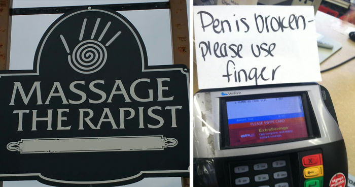
Still wondering why letter spacing is so important? Well, typography design fails can ruin (or make hilarious) even the best thought-out text, as the examples below demonstrate. It turns out that there is only a few millimeters difference between 'clicks' and 'dicks,' 'therapist' and 'the rapist.'
Scroll down below to see these funny fails and more for yourself!
This post may include affiliate links.
What Style Of Massage Is This?
Another Reminder That Yes, Fonts And Kerning Matter
Looking at the logo, it comes to my mind that they might have made this mistake on purpose. ;-) Nice combination of logo and spacing failure. xD
I'm Sorry, What's Broken?
f**k yeah, u r gretest. and yes I know i spelled those wrong.
Load More Replies...Good they said to use a finger! Imagine someone took out their Unbroken pen..is
Badly Misspelled Name
I wonder how the worker would call him after the beverage is ready to serve.
Maybe he'll get his/her a*s fired after yelling the order out!
Load More Replies...That's not a misspelling. Yeah, that's some douchetwat's bad penmanship spacing.
My name is Lisa and when they filled out the paperwork at the dealership, apparently they wrote this way. My truck was registered to Usa.
It would have helped if they'd at least dotted the "i" in Clint, lol.
I spelled my name out for the Starbucks cashier today. He still got it wrong. R a n i = Arni.
Spacing Is Important
Hi, yes... I'd like to return this 1 yr old male model and get the 2 yr old female instead... is that on sale this week?
The level of stupidity that you have hurts my brain, have you heard of angles and position of the sun before?
Load More Replies...My Math Teacher Also Taught Us The Importance Of Kerning
I literally read that as "a**l" the first time, and wondered what the heck the teacher was trying to say, lol.
Bull Titan Us
It took a moment but I see what happened here. They started with Bull Titan (US), then they took away the brackets, put it in capitals and then made a total disaster of spacing, seems they were going by sounds rather than English meaning.
What is this even supposed to be?? I think this is a translation fail..
Space Bar, You Had One Job
Why was Donald Trump the first person I thought of when I read that sign?
Was it a penis wearing a wig? Or Donald Trump? lol
Load More Replies...Hey Walmart... Kerning Is Important
Worst Tart Ever
California plates have max 7 letters? Anustar - still hilarious ;-)
Load More Replies...This is Tobias's license plate on the TV show Arrested Development & his character is King of Kerning mistakes!!!
Bad Kerning, Good 'shrooms
Well, if you think about where mushrooms grow, it's not that far off.
A large supermarket near my house has a shelf tab for "S**t-Ta-Ke" Mushrooms. It's been there for a YEAR.
err, I believe that's maybe "shiitake" ..In the Japanese, it is a double "i" sound, and not a double "t" ... :) https://en.wikipedia.org/wiki/Shiitake
Load More Replies...My Aunt In The Philippines Made A Nice Birthday Cake For My Relative Curt
That's a cursive lowercase "r", sorry kids, doesn't look like an "n" ... do they even teach cursive anymore (some one called it old font, lmao, cute) ?
She made a very pretty cake..but next time, she may want to use block lettering for the name, lol.
Our elem. teachers used to force us writing in cursive and in Philippines cursive is formal to look at. hahahhah but still i laughed at this. :)
'Curt' looks like a slightly different dirty word. (C U Next Tuesday)
Load More Replies...It doesn't. Look at the 'r' in Birthday. She wrote it in an old font which makes the 'r' look like an 'n'.
Load More Replies...Sign Above The Megaflicks Store
LOL I lived 15 miles from that store. It's been gone for years now. Too bad this pic was taken during the day, because when it was lit up at night it was awesome!! XD
If someone were to spray paint the word "one" between that sign and the next, it would be even more interesting... "Megaf**ks"... One.... Dollar ;)
Maybe They Should Pick A Different Font Next Time
This one is pushing it, I had to actually think of bad words to see it here
Lego Click Brick
Is this d is based on the shape and size of the c ?
Load More Replies...there are alphabets that utilize a true circle and therefore do look that way,... but more importantly, I'm reading " d**k brjck " .... must be from Norvay.
there are alphabets that use a true circle and make larger letters... though, what I'm seeing is d**k brjck.... must be in Norvay.
Ooh Errr
so confusing.... they have an American flag.... their name is New York New York Ltd. and they charge British Pounds.....
Lightpost In The Way = Very Awkward Abbreviation!
In the Commonwealth, "a*s." is association, "a**e" is the posterior. So this is only funny to Americans and some Canadians.
Fast Food
Somehow I'm Not Surprised They Went Out Of Business
The branch closed but the business is still around. I've used them a few times.
Falmouth Based Company Pendennis... Getting In Wrong
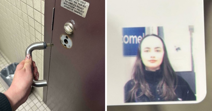
It's not the "I" photoshopped, as Marcia says, but part of the "D"
It's a sliding door the rest of the D is at the front it's just when it life's back it lave all its letters ENNI and part of the D are behind the door no photoshop people.
Load More Replies...A Traditional Barber Shop
Letter Spacing Can Make All The Difference
think the employee that posted the letters for this sign was trying to pull a "fhritp"?
What the hell is that supposed to mean? Acronym's don't have to be for everything.
Load More Replies...Do you Americans not have spotted d**k? This is a genuine food here guys haha
Erm? No Thanks..
Wtf? What Does This Asian Restaurant In Germany Offer?
An Asian Restaurant supposedly in Germany........... that writes in American /English
it was in Paderborn, Germany, I took the picture myself
Load More Replies...looks like they forgot spelling midway.. kinda like I some time was struggling with "coockies"
For Those Whose Needs Go Beyond Justice Cream Alone
I'm thinking it's more the angle the photo was taken at than anything.
Load More Replies...They Pay You To Buy Them!
The whole thing is that it looks like it says 150% off. It doesn't.
Load More Replies...A Test Image
I think the web developer literally left in the test image from when they were creating this list.
It appears you are going to get a 150% discount instead of 50%. I think it said Buy 1 get 1 fifty percent off. but the 50% was too close to the 1. so not only was it free they were going to pay you half more to take it. haha.
Load More Replies...Yes, keening can make all the difference, especially with wider fonts.
