The month of June is a time when the world puts its focus on the LGBTQIA community, its a chance for people to talk about sexuality, gender, equality, discrimination, its a chance to teach, understand and relate. Increasingly companies have embraced it, sometimes for the right cause other times it seems like a cash grab – regardless it gets the conversation happening which can only be a good thing.
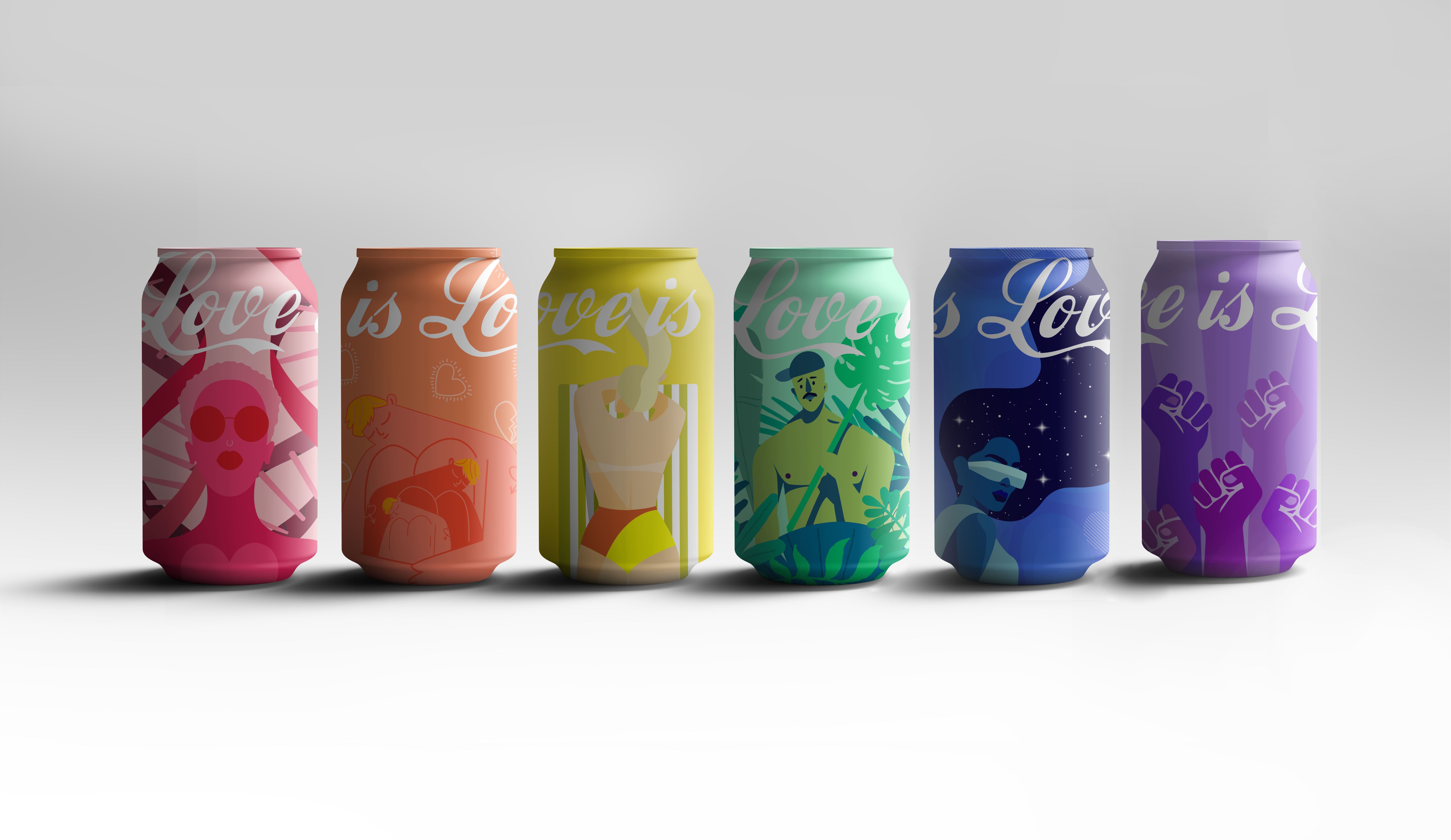
I wanted to put my graphic design skills to use and do something for Pride month as a proud gay man myself. I work in packaging design and have always envied the beautiful work that goes on some drinks cans artwork, so I thought why not give it a go! Coca-cola is truly iconic, from its Classic red, the typeface, the swirl its instantly recognisable, it seemed like the perfect candidate to have a PRIDE TAKEOVER. I used the pride flag as my inspiration and what each stripe represents. Each colour has a different illustration with the tagline of “LOVE IS LOVE” running across the top as a reminder that we all have much more in common than in difference.
I have never shared my work on a blog before but was proud in many ways and Bored Panda has opened my eyes to many amazing things over the years so I thought I would join in.
For more information on LGBTQIA issues go to https://www.stonewall.org.uk
Or well you know google it, we all know how to use the internet :-)
More info: andytharagonnet.com
LOVE IS LOVE IS LOVE

RED – Life

ORANGE – Healing

YELLOW – Sunshine

GREEN – Nature

BLUE – Magic/Serenity

PURPLE – Spirit


0
0