I’m A Newbie Digital Artist, Here Are Some Of My Artworks! (List Of Personal Pros And Cons! 11 Pics!)
I’m fourteen years old and a newbie digital artist, While these artworks are better than my physical drawings…spoiler alert, they’re still EXTREMELY bad, so I’ll be showing them online for millions of strangers to critique. I will also be critiquing myself, and I am extremely self-critical, so this should be fun. Continue at your own risk. I am not at fault for any bleeding of the eyes after looking at these artworks.
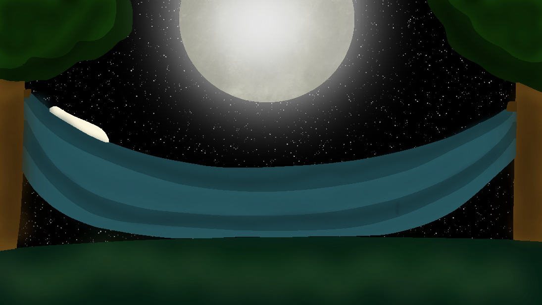
Moon-light Hammock
")
-Pros and Cons!-
Pro: I like how I drew the moon and shaded the grass, it’s some of my best shading work.
Con: It’s poorly shaded in some areas and over-shaded in others, the tree leaves are terribly over-shaded, the bark isn’t shaded enough to look like bark, and the cloth fabric of the hammock doesn’t look like fabric.
Con: The stars are so stagnant, they don’t provide light and look like they’re just sitting there.
Pro: I love how the moon lights up the picture, I wish I could’ve done it with the stars as well.
Pop-Art Llama
")
-Pros and Cons-
Pro: To be honest, I am so proud of this piece, I love the colors, and the edges and it’s one of my best works.
Con: Ugly Cactuses…Cacti?…Cactus? Whatever, I forgot to draw the spikes so they just look like green blobs.
Pro: I love the way I drew the clouds, they just look cute to me for some reason.
Con: Lack of background, I wish I had drawn a house or some tumbleweeds…it just looks so lifeless.
Pro: I didn’t have to use a reference photo for the llama, so I’m proud of that.
Starry Moon-Flowers
")
-Pros and Cons-
Pro: I LOVE the flowers, they just look SO cute to me!
Con: The flowers look blended together, I wish that I had outlined them so they didn’t look so blobby.
Pro: Once again, I love the moonlight, It’s so pretty.
Con: Too many stars, I never thought I’d say it, but it’s just too much for me.
Pro: I’m extremely proud of this piece.
Kite Festival
")
-Pros and Cons-
Con: I HATE THIS! I hate it so much! It’s just so ugly.
Con: The kite strings look like an afterthought like they weren’t even supposed to be a part of the picture.
Con: Moon kite looks like a banana.
Con: The watermelon hot air balloon kite is so..so ugly. It’s too bright, it’s..it’s just bad.
Pro: The sky is a pretty shade of blue. I just needed at least one good thing to say about this piece.
Queen Piggy
")
-Pros and Cons-
Pro: I love it, it’s just a cute little doodle, nothing too big about it, it’s just so cutely simple.
Pro: The nose wrinkles are so cute!
Con: Snout’s a little too big for me.
Pro: I love the little crown on her head. It brings me joy.
Pro: The closed eyes are cute. It’s just like she’s at peace with her life.
Dark-side of the moon
")
Pro: I love astrology, so this piece makes me happy.
Con: The lack of craters makes me a bit hesitant to call this a moon drawing, I wish I added more depth to it.
Con: The stars! AGAIN! So stagnant, no light produced, and just SITTING THERE.
Pro: I love the shadow on it. Not much to say about that.
Neptune..?
")
-Pros and Cons-
Possible Con: I didn’t use a reference photo for this and just went off of the fact that I know Neptune is blue, so it could look completely different.
Pro: THE SHADING! It’s soooo good! I love it, it makes me happy.
Con: The stars, just gonna leave it at that because you all know why by now.
Pro: The shades of blue blend so perfectly together, it brings me mass amounts of joy.
Fairy Cove
")
-Pros and Cons-
Con: Lack of fairies, I wish I’d drawn them, but I suck at drawing people so tiny people would be even worse.
Con: Visible linage, You can see the outline on the vines and I wish you couldn’t.
Pro: Cute little mushrooms! They make me so happy, the way they just sit there, being cute. I love them.
Con: Stars.
Pro: Moon-light is gorgeous, but not as strong as in other pictures, I blame that on the fairy magic.
My Logo!
")
-Pros and Cons-
Con: I wish I’d just not added a nose instead of adding one that looked like that.
Con: So much avoidance, Can’t draw arms so I gave myself a puff-jacket, can’t draw mouths so I gave myself a mask, can’t draw the little…inner ear things, so I gave myself earrings. I just avoided so much in this piece.
Pro: I love the way I drew my hair, it looks just as fluffy as it is in real life.
Pro: I love my outfit (It’s for sale at my web-store but it’s hidden, If you wanna buy it, I’ll unlock it, just comment!)
Pro: I love the earrings, I wish I had all those earrings, but just the bottom part of my ears are pierced.
Con: My penmanship is similar to that of a very talented four-year-old.
Pro: Can be bought on a t-shirt and hoodies on my web store! https://www.kykreates.click/listing/new-creator-shirt?product=227
Swan Love
")
-Pros and Cons-
Con: Ugh, that palm tree. It doesn’t even look like a palm tree! Please don’t be mad at this if you live in Florida/California :<
Pro: The swans look cute! I love them.
Con: Technically the swan on the right is a duck, but we won't talk about that any further.
Con: FIREWORKS GIVE OFF NO LIGHT! That's the whole point of fireworks! The WHOLE point!
Con: I'm pretty sure the sky is redder at sunset.
Pro: You can buy it on a pillow, a water bottle, and masks at my web store! https://www.kykreates.click/listing/swan-love-august-2022?product=585
Octopus!
")
-Pros and Cons-
Con: Visible Linage, again…
Pro: I love the bubbles, I’m so proud of them so I made sure to put a lot of them in the drawing.
Pro: The coral and seaweed are cute, I love drawing plants.
Con: The tentacles look stuck together and I should’ve spaced them out better.
Pro: I love how derpy the eyes on the octopus look. Octopi scare me in real life, so I tried to make them look less terrifying.
Con: That starfish…it..why is it there? What was the purpose?
Pro: I love the colors in this picture, they make me happy with their vibrancy. I draw with my brightness low (because my brightness is always low) so it makes me glad that it isn’t TOO bright when on full brightness.


ik I'm a bit late to comment, but I really love all of your artwork! also, what app do you use to draw?
I actually use a website called Kleki, it's a simple website, but it fills my needs.
Load More Replies...Your artwork is lovely, but I'm a little disturbed by how much you seem to dislike it. Why do you warn about bleeding eyeballs and list all the minor flaws you see in your own work? By your own description, you're fourteen and a newbie. There is plenty of time to learn any finesse or new techniques you want. You have a good eye for light and interesting ideas; anything else is just a matter of practice.
I know, it's probably not the best thing for my growth..but I know that I can do better than this, there are NINE-YEAR OLDS with their own art galleries and my work is still so mediocre, I do like my art, I really do..but if I want to make this a career it isn't about what I like, it's about what other people like, what other people want to buy....and nobody really seems interested in my work so far. I've made two sales and one was a family member so I can't really count that. Art will always be my passion, but it's also my job.
Load More Replies...Thank you! While i'm most likely gonna regret posting this online, it's nice to know that at least somebody likes my art!
Load More Replies...ik I'm a bit late to comment, but I really love all of your artwork! also, what app do you use to draw?
I actually use a website called Kleki, it's a simple website, but it fills my needs.
Load More Replies...Your artwork is lovely, but I'm a little disturbed by how much you seem to dislike it. Why do you warn about bleeding eyeballs and list all the minor flaws you see in your own work? By your own description, you're fourteen and a newbie. There is plenty of time to learn any finesse or new techniques you want. You have a good eye for light and interesting ideas; anything else is just a matter of practice.
I know, it's probably not the best thing for my growth..but I know that I can do better than this, there are NINE-YEAR OLDS with their own art galleries and my work is still so mediocre, I do like my art, I really do..but if I want to make this a career it isn't about what I like, it's about what other people like, what other people want to buy....and nobody really seems interested in my work so far. I've made two sales and one was a family member so I can't really count that. Art will always be my passion, but it's also my job.
Load More Replies...Thank you! While i'm most likely gonna regret posting this online, it's nice to know that at least somebody likes my art!
Load More Replies...
3
7