Get Premium
Dark mode theme is available exclusively for premium users. Learn more about the benefits of subscribing.
No fees, cancel anytime.

 Dark Mode Ad-Free Browsing Unlimited Content
 Ad-Free Browsing Unlimited Content Dark Mode
Join 1.2 million Panda readers who get the best art, memes, and fun stories every week!
The Oscars of 2017 went down in history not only because of a single movie (‘La La Land’) receiving the record amount of nominations but also because the same movie was falsely awarded the Best Movie award when the actual winner was ‘Moonlight’.
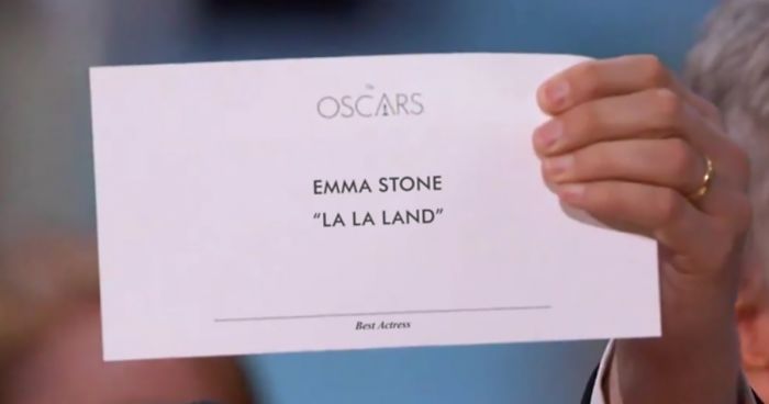
There was a lot of speculation about what went wrong during the announcement but now it’s clear that there was a mix-up of envelopes. And instead of the best picture, the presenters Warren Beatty and Faye Dunaway received an envelope with the best actress category winner Emma Stone from ‘La La Land.’
Now to make things even worse, the announcers had little-to-no indication that they received the wrong envelope because of the lousy typography used on the card. Even though it said Emma Stone on top, it clearly said ‘La La Land’ below, with only the small indication at the very bottom that it’s the best actress award.
Take a look at how Benjamin Bannister has explained step-by-step, how bad typography has allowed this to escalate into one of the most embarrassing moments in Oscars history. (h/t: demilked)
Image source: abc
‘That’s horrible typography. I will emphasize horrible again. Horrible. Or to be nicer, not good. Look at it again. Of course, anyone could’ve made the same honest error.’
‘It may not seem like much to a regular person, but changing the sizing, positioning, and weight of the text makes a big difference. A big enough difference that this embarrassing mistake could’ve been prevented.’
35Kviews
Share on Facebook
Its pretty obvious - The Award brand is more important than the award. Corporate Ego vs Practicality
Its pretty obvious - The Award brand is more important than the award. Corporate Ego vs Practicality


 No fees, cancel anytime


188
24