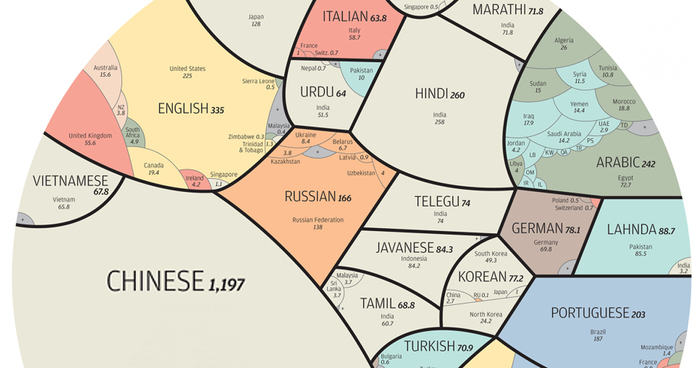
This fascinating infographic elegantly breaks down the world’s most popular languages and the countries in which they are spoken. Specifically, the circle represents the 4.1 billion people around the world who speak one of 23 of the world’s most-spoken languages as their native tongue – the numbers of people speaking an actual language in any given country may actually be higher. It was created for the South China Morning Post by Alberto Lucas Lopez, an infographic journalist. Be sure to view the full-sized version to get all the details!
More info: lucasinfographic.com | Twitter | scmp.com (h/t: designtaxi)

Click here for the full-sized image.
711Kviews
Share on Facebook

I think Alberto Lucas Lopez haven't done his research well. Is he, at all credible? lol There are a lot of ancient and dead languages which most of this modern languages came from. Latin, for example, is a mother language of a lot of languages; a lot of English words are derived from it actually. And a lot of countries are in the wrong categories. The author of this post is merely copy and pasting things which SEEMED valid in his own eyes; not doing any further research on what he is posting.
Like the fact Spain s 47 million instead of 38 million at the moment. small mistake right? just 9 million down is nothing. On the other hand, Latin while a mother language is already dead unless we think of scientific research naming conventions. Even my own language is missing in the graph. (Catalan= 11 million speakers)
Load More Replies...Not well done :-( The real number of native german speakers: Germany: 81 Mio. Austria: 8 Mio. Switzerland: 5,6 Mio Makes a total of 94,6 Mio!
This totally left out the 2nd largest English speaking country in the world- India with 150 million English speakers. Also the Philippines- at least 60 million English speakers there! Not accurate chart. If you're going to include USA under Spanish you have to do the same with other countries that speak English. Total English speakers in the world is 1.2 billion.
The same could be said about french, about half of Africa is speaking french...
Load More Replies...Please delete this, you are speading wrong information, theres not even one true thing in this infographic..
Actually, some things are true, such as English being the most popular language.
Load More Replies...Some stuff can't be summed up that easely. What about the country with several native tongues? What about the native english/french speaker from Africa? Sorry, but I don't have a very good feeling looking at that infographic...
I must admit , in Latvia lot of people understand and speaks russian, but latvian language is far, far away from russian language. We (Latvians) have latin alphabet, but Russians are using cyrillic alphabet. Of course we have some simmilar words, but we also have some with german, english as well.
Neuztraucieties, grafika rāda tikai pasaules lielakās valodas, un Latvija ir iekļauta tikai tāpēc, ka tur dzīvo krievvalogīgi cilvēki. Neviens neapgalvo, ka latviešu valoda un krievu valoda ir vienādas! Pats esmu no Lielbritanijas, un iemācījos latviešu valodu, dzīvojot Rīgā. Es labi zinu, ka tās valodas ir ļoti dažādas!
Load More Replies...In Azerbaycan Ozbekistan Turkmenistan Kırgızistan Kazakistan China Russia; millions of people speaks Turkish!
I beg your pardon. French is not spoken and written in Africa? Please get your facts right. Africa has several countries where French is taught at school. Look it up on the net. TV, radio, news papers, road signs, menus at the restaurants, road signs are in French. Look up the ex- colonies of France.
Load More Replies...French is natively spoken by over 270 million people around the world. Get your facts straight please.
Also, there are 65 million people in France, not 60. This chart is so much b******t it hurts.
Load More Replies...Don't u research before posting an article? It's "TELUGU" not "TELEGU"
It irks me every time someone refers Indonesian/Malay as Bahasa. "Bahasa" means "language". You'd either call it Indonesian/Malay or Bahasa Indonesia/Bahasa Melayu.
In Azerbaijcan Kazakistan Kyrgyzistan Turkmenistan Uzbekistan Iran Irak Syria China Russia, millions of people speaks Turkish.
Russian language? It's CYRILLIC and almost every country in East Europe speak it. So please, that infographic is just wrong.
No even cares about most of these other languages, particularly the ones that can't even make it onto a misleading, ill-formed map.
Load More Replies...Two things come into question for me as a bulgarian - where is the bulgarian language and why is my country presented just by the turkish speaking population? In this line of thought - where are the other Balkan countries?
Български език го няма, защото картата показва само найголемите езици на свете. Но турски е дост голям език, затова картата показва броя на туркоговорещи хора в България.
Load More Replies...I wish those languages that were forced into the "Chinese" group had their own group. You don't call Urdu, Hindi, Bengali, Tamil, Marathi, Lanhda the "Indian" language group do you?
Just what I was thinking, Venti Chiau! A number of other inaccuracies or questionable things, but a very fun graphic to look at and think about. Was wondering why I see very few AFrican countries mentioned under English and French, among other things.
Load More Replies...Wtf c**p being dished as info. There are 370 million hindi speakers as 1st language and 120 million as second language so 470 million or so Hindi speakers 40 % of India speaks hindi. Big states like UP Rajasthan MP Bihar infact whole of North & Central India barring J&K & Punjab speaks hindi
English is one of the most popular language in India, Its missing
austria is missing, we speak german and as you might have heard, we are not a part of germany anymore since quite a long time
Bahasa Indonesia is the national languange of 230 Millions Indonesian citizen. 44 Millions? Really?
I don't get it: Javanese has 84.3M speaker while Malay/Bahasa has only 60.5M! Indonesia (who speaks Bahasa) has 250M people and I would say about >90% can speak the language! Javanese is one of Indonesia's ethnic language but has more speakers?!
There are more than 3,8 million russian spoken people in Kazakhstan and 8 million in Ukraine.In my opinion the whole Ukraine and approximately 90 percent Kazakh people can speak Russian.Author has counted only ethnic Russian. I think that more than 225-240 million people who can speak and understand Russian in the world.
For French Language, many African countries are forgotten. Like Mali, Senegal. Ivory Coast (only these three sum up to 55 millions)
http://www.vistawide.com/languages/top_30_languages.htm this one is more accurate...
Ridiculous, kannada language spoken by 44 million ppl around the world id not even mentioned.....
Ridiculous , kannada language is spoken by 44 million people around the world and is not mentioned here...
Quite ridiculous to have separate sections for different language families in India, but then to put Cantonese and Mandarin together, when they are clearly unintelligible to each other!
I think it must be pretty old because it mentions world population of 4.1 billion whereas "...The United States Census Bureau estimates that the world population exceeded 7 billion on March 12, 2012. According to a separate estimate by the United Nations Population Fund, it reached this milestone on October 31, 2011..." and Australia is shown as 15.6 million which has grown to "...23.13 million (2013)..."
A magyar egyáltalán nem szerepel, pedig beszélt nyelv. Ezért is hiányos.
So you seem to be missing the 67 million people in Thailand that speak Thai, yeah this is brilliant...good job!
Doesn't take into account English as a 2nd language for some reason. Since the article doesn't even mention this is only primary language, it comes across as false.
This is an interesting analysis. Urdu and Hindi are very close in nature and it is a fact that what is called Hidi in India is not Hindi but it is Urdu. Indian movies are produced in Urdu, not in Hindi. If a film is produced in Hindi, it will never get the popularity in India or elsewhere. Urdu is the top anguage that spreading around the world despite all hindrances.
Dont know for other languages, but French is way underestimated ! here: http://www.francophonie.org/IMG/pdf/pays-plus-1-million-locuteurs.pdf or here: http://fr.wikipedia.org/wiki/Liste_des_pays_ayant_le_fran%C3%A7ais_pour_langue_officielle#cite_note-OIF_estimation_janvier_2015-2 estimated total is 181 480 000 ! what a HUGE difference !
I don't know for other languages but, regarding french it's soooo underestimated ! here: http://www.francophonie.org/IMG/pdf/pays-plus-1-million-locuteurs.pdf total estimated is 181 480 000 ! what a HUGE difference !
I think Patricia Hankins is right .....I am not sure with that.....It's very approximativeresearch. repeat Patricia is righ!!!!!!!!!!!!
Graphic's good but the infos are uncompleted so wrong... Form AND substance
uhm...where is Hungary..., ??? I'm hungarian..., and there are lots of hungarian in the world.... everybody forget this language, and this country....always... there are more language than 23...hm...
I think there is a problem here with Turkish. If Chinese is taken as a macrolanguage, which is correct, then Turkish.. or Turkic languages should also be grouped and included in this infographic. If this were done, whole countries, semi-autonomous states in Russia and large Turkic/Turkish communities in other countries would also be included. For example, almost all the Central Asian states (excluding Tadjikistan), 2+ million Turks in Europe (Germany has 2 million alone), Azerbaijan, Cyprus, Iraq, Iran, Syria, Tatarstan in Russia as well as many small communities and regions in Siberia, and many more I do not know or remember.
This is very fascinating. Vietnamese is in the list but not Filipino. The Philippines is 100 million-strong nation, larger than Vietnam, and add to that the Filipinos living overseas (also millions). The Philippines is also not among the top English-speaking countries while Singapore, a much smaller country, is there. How strange.
Interesting... but where is French speaking Africa in your graphic ? According to OIF 274 million of people speak French in the world : http://www.francophonie.org/Estimation-des-francophones.html
Why all languages in China are listed as 'Chinese' but Indian languages are split? No English in India either. Lazy research and flawed methodology.
0.7m German speakers in Swizerland? LOL, looks more like a shifted decimal - 80% of all swiss identify as German, so thats more like 5+m.
I think Azeri Turkish and Turkmen language should have been included in Turkish language numbers. Azeri Turkish spoken by 10 million Azeri people and Turkmen language spoken by 5 million people in Turkmenistan as well as by around 1,400,000 people in northeastern Iran, 700,000 people in northwestern Afghanistan, and Turkmen communities abroad.
one can't take this graph at face value. A further in depth study has to be done. however the notion of perceived numbers should light inquisitiveness.
Tagal oh is talk by over 100millions people however is still missing .... All the french speaking country In Africa aren't count (same w English, excepted SA) ..... Not so good, but such an interesting project, I hope soon it's will be well done :D
There are lots of mistakes in this infographic (mostly in terms of number of speakers), but obviously a lot of people aren't able to read it properly, either. For instance, it doesn't say that the Bulgarian language is a Turkic language, it simply states that there are a number of Turkish speakers in Bulgaria. The same goes for Russian in Latvia and Malay in Thailand. It's pretty obvious, people. Also, Cyrillic is the name of the alphabet, not the language family. Russian belongs to the Slavic family, along with Bulgarian, for instance.
Well well well ... Where is Africa? Thailand? Laos? Cambodia? Oh! Thailand is in the Malay group! But if I remember, Thai people speak thai, and there are more than 50 millions... Ok boy, redo from start, and don't publish before checking the truth about this small word...
There are much more Portuguese speakers, Mozambique has 25 million people, Guinea-Bissau and Angola are missing, and much more regions like Macau are missing, also the number of french people speaking portuguese is much bigger. The Portuguese language has at least 280M native speakers, not counting the number of people who have it as a secondary language, or that number would go much higher. In conclusion, this infographic is a complete b******t, in all languages as it seems, i would suggest this to be deleted, it is a lie and you are speading wrong information.
Mistakes about Canada : French is the language of Québec province and part of other provinces. And Canada have TWO official languages : English and French !
Very, VERY approximative "research". One example out of many, I wonder why the ex British colonies are counted as "English spaking" (like India, Zimbabwe, etc...) but the ex French colonies like DRCongo, Cameroun, Ivory Coast, Senegal, Mali, Guinea etc are not counted as French speaking? Makes a HUGE difference, as it more than doubles the number of French speakers taking those into accounts. If you don't use the same methodology for all languages, the comparison and therefore the graphic become totally useless, or worst, misleading!
this ist bul schit map Bulgaria ist Cirilic not Turkisch stupid liers!!!
There is no such Language as Chinese. Its either Cantonese or Mandarin!
There are many more languages in China than just Mandarin or Cantonese.
Load More Replies...I think Alberto Lucas Lopez haven't done his research well. Is he, at all credible? lol There are a lot of ancient and dead languages which most of this modern languages came from. Latin, for example, is a mother language of a lot of languages; a lot of English words are derived from it actually. And a lot of countries are in the wrong categories. The author of this post is merely copy and pasting things which SEEMED valid in his own eyes; not doing any further research on what he is posting.
Like the fact Spain s 47 million instead of 38 million at the moment. small mistake right? just 9 million down is nothing. On the other hand, Latin while a mother language is already dead unless we think of scientific research naming conventions. Even my own language is missing in the graph. (Catalan= 11 million speakers)
Load More Replies...Not well done :-( The real number of native german speakers: Germany: 81 Mio. Austria: 8 Mio. Switzerland: 5,6 Mio Makes a total of 94,6 Mio!
This totally left out the 2nd largest English speaking country in the world- India with 150 million English speakers. Also the Philippines- at least 60 million English speakers there! Not accurate chart. If you're going to include USA under Spanish you have to do the same with other countries that speak English. Total English speakers in the world is 1.2 billion.
The same could be said about french, about half of Africa is speaking french...
Load More Replies...Please delete this, you are speading wrong information, theres not even one true thing in this infographic..
Actually, some things are true, such as English being the most popular language.
Load More Replies...Some stuff can't be summed up that easely. What about the country with several native tongues? What about the native english/french speaker from Africa? Sorry, but I don't have a very good feeling looking at that infographic...
I must admit , in Latvia lot of people understand and speaks russian, but latvian language is far, far away from russian language. We (Latvians) have latin alphabet, but Russians are using cyrillic alphabet. Of course we have some simmilar words, but we also have some with german, english as well.
Neuztraucieties, grafika rāda tikai pasaules lielakās valodas, un Latvija ir iekļauta tikai tāpēc, ka tur dzīvo krievvalogīgi cilvēki. Neviens neapgalvo, ka latviešu valoda un krievu valoda ir vienādas! Pats esmu no Lielbritanijas, un iemācījos latviešu valodu, dzīvojot Rīgā. Es labi zinu, ka tās valodas ir ļoti dažādas!
Load More Replies...In Azerbaycan Ozbekistan Turkmenistan Kırgızistan Kazakistan China Russia; millions of people speaks Turkish!
I beg your pardon. French is not spoken and written in Africa? Please get your facts right. Africa has several countries where French is taught at school. Look it up on the net. TV, radio, news papers, road signs, menus at the restaurants, road signs are in French. Look up the ex- colonies of France.
Load More Replies...French is natively spoken by over 270 million people around the world. Get your facts straight please.
Also, there are 65 million people in France, not 60. This chart is so much b******t it hurts.
Load More Replies...Don't u research before posting an article? It's "TELUGU" not "TELEGU"
It irks me every time someone refers Indonesian/Malay as Bahasa. "Bahasa" means "language". You'd either call it Indonesian/Malay or Bahasa Indonesia/Bahasa Melayu.
In Azerbaijcan Kazakistan Kyrgyzistan Turkmenistan Uzbekistan Iran Irak Syria China Russia, millions of people speaks Turkish.
Russian language? It's CYRILLIC and almost every country in East Europe speak it. So please, that infographic is just wrong.
No even cares about most of these other languages, particularly the ones that can't even make it onto a misleading, ill-formed map.
Load More Replies...Two things come into question for me as a bulgarian - where is the bulgarian language and why is my country presented just by the turkish speaking population? In this line of thought - where are the other Balkan countries?
Български език го няма, защото картата показва само найголемите езици на свете. Но турски е дост голям език, затова картата показва броя на туркоговорещи хора в България.
Load More Replies...I wish those languages that were forced into the "Chinese" group had their own group. You don't call Urdu, Hindi, Bengali, Tamil, Marathi, Lanhda the "Indian" language group do you?
Just what I was thinking, Venti Chiau! A number of other inaccuracies or questionable things, but a very fun graphic to look at and think about. Was wondering why I see very few AFrican countries mentioned under English and French, among other things.
Load More Replies...Wtf c**p being dished as info. There are 370 million hindi speakers as 1st language and 120 million as second language so 470 million or so Hindi speakers 40 % of India speaks hindi. Big states like UP Rajasthan MP Bihar infact whole of North & Central India barring J&K & Punjab speaks hindi
English is one of the most popular language in India, Its missing
austria is missing, we speak german and as you might have heard, we are not a part of germany anymore since quite a long time
Bahasa Indonesia is the national languange of 230 Millions Indonesian citizen. 44 Millions? Really?
I don't get it: Javanese has 84.3M speaker while Malay/Bahasa has only 60.5M! Indonesia (who speaks Bahasa) has 250M people and I would say about >90% can speak the language! Javanese is one of Indonesia's ethnic language but has more speakers?!
There are more than 3,8 million russian spoken people in Kazakhstan and 8 million in Ukraine.In my opinion the whole Ukraine and approximately 90 percent Kazakh people can speak Russian.Author has counted only ethnic Russian. I think that more than 225-240 million people who can speak and understand Russian in the world.
For French Language, many African countries are forgotten. Like Mali, Senegal. Ivory Coast (only these three sum up to 55 millions)
http://www.vistawide.com/languages/top_30_languages.htm this one is more accurate...
Ridiculous, kannada language spoken by 44 million ppl around the world id not even mentioned.....
Ridiculous , kannada language is spoken by 44 million people around the world and is not mentioned here...
Quite ridiculous to have separate sections for different language families in India, but then to put Cantonese and Mandarin together, when they are clearly unintelligible to each other!
I think it must be pretty old because it mentions world population of 4.1 billion whereas "...The United States Census Bureau estimates that the world population exceeded 7 billion on March 12, 2012. According to a separate estimate by the United Nations Population Fund, it reached this milestone on October 31, 2011..." and Australia is shown as 15.6 million which has grown to "...23.13 million (2013)..."
A magyar egyáltalán nem szerepel, pedig beszélt nyelv. Ezért is hiányos.
So you seem to be missing the 67 million people in Thailand that speak Thai, yeah this is brilliant...good job!
Doesn't take into account English as a 2nd language for some reason. Since the article doesn't even mention this is only primary language, it comes across as false.
This is an interesting analysis. Urdu and Hindi are very close in nature and it is a fact that what is called Hidi in India is not Hindi but it is Urdu. Indian movies are produced in Urdu, not in Hindi. If a film is produced in Hindi, it will never get the popularity in India or elsewhere. Urdu is the top anguage that spreading around the world despite all hindrances.
Dont know for other languages, but French is way underestimated ! here: http://www.francophonie.org/IMG/pdf/pays-plus-1-million-locuteurs.pdf or here: http://fr.wikipedia.org/wiki/Liste_des_pays_ayant_le_fran%C3%A7ais_pour_langue_officielle#cite_note-OIF_estimation_janvier_2015-2 estimated total is 181 480 000 ! what a HUGE difference !
I don't know for other languages but, regarding french it's soooo underestimated ! here: http://www.francophonie.org/IMG/pdf/pays-plus-1-million-locuteurs.pdf total estimated is 181 480 000 ! what a HUGE difference !
I think Patricia Hankins is right .....I am not sure with that.....It's very approximativeresearch. repeat Patricia is righ!!!!!!!!!!!!
Graphic's good but the infos are uncompleted so wrong... Form AND substance
uhm...where is Hungary..., ??? I'm hungarian..., and there are lots of hungarian in the world.... everybody forget this language, and this country....always... there are more language than 23...hm...
I think there is a problem here with Turkish. If Chinese is taken as a macrolanguage, which is correct, then Turkish.. or Turkic languages should also be grouped and included in this infographic. If this were done, whole countries, semi-autonomous states in Russia and large Turkic/Turkish communities in other countries would also be included. For example, almost all the Central Asian states (excluding Tadjikistan), 2+ million Turks in Europe (Germany has 2 million alone), Azerbaijan, Cyprus, Iraq, Iran, Syria, Tatarstan in Russia as well as many small communities and regions in Siberia, and many more I do not know or remember.
This is very fascinating. Vietnamese is in the list but not Filipino. The Philippines is 100 million-strong nation, larger than Vietnam, and add to that the Filipinos living overseas (also millions). The Philippines is also not among the top English-speaking countries while Singapore, a much smaller country, is there. How strange.
Interesting... but where is French speaking Africa in your graphic ? According to OIF 274 million of people speak French in the world : http://www.francophonie.org/Estimation-des-francophones.html
Why all languages in China are listed as 'Chinese' but Indian languages are split? No English in India either. Lazy research and flawed methodology.
0.7m German speakers in Swizerland? LOL, looks more like a shifted decimal - 80% of all swiss identify as German, so thats more like 5+m.
I think Azeri Turkish and Turkmen language should have been included in Turkish language numbers. Azeri Turkish spoken by 10 million Azeri people and Turkmen language spoken by 5 million people in Turkmenistan as well as by around 1,400,000 people in northeastern Iran, 700,000 people in northwestern Afghanistan, and Turkmen communities abroad.
one can't take this graph at face value. A further in depth study has to be done. however the notion of perceived numbers should light inquisitiveness.
Tagal oh is talk by over 100millions people however is still missing .... All the french speaking country In Africa aren't count (same w English, excepted SA) ..... Not so good, but such an interesting project, I hope soon it's will be well done :D
There are lots of mistakes in this infographic (mostly in terms of number of speakers), but obviously a lot of people aren't able to read it properly, either. For instance, it doesn't say that the Bulgarian language is a Turkic language, it simply states that there are a number of Turkish speakers in Bulgaria. The same goes for Russian in Latvia and Malay in Thailand. It's pretty obvious, people. Also, Cyrillic is the name of the alphabet, not the language family. Russian belongs to the Slavic family, along with Bulgarian, for instance.
Well well well ... Where is Africa? Thailand? Laos? Cambodia? Oh! Thailand is in the Malay group! But if I remember, Thai people speak thai, and there are more than 50 millions... Ok boy, redo from start, and don't publish before checking the truth about this small word...
There are much more Portuguese speakers, Mozambique has 25 million people, Guinea-Bissau and Angola are missing, and much more regions like Macau are missing, also the number of french people speaking portuguese is much bigger. The Portuguese language has at least 280M native speakers, not counting the number of people who have it as a secondary language, or that number would go much higher. In conclusion, this infographic is a complete b******t, in all languages as it seems, i would suggest this to be deleted, it is a lie and you are speading wrong information.
Mistakes about Canada : French is the language of Québec province and part of other provinces. And Canada have TWO official languages : English and French !
Very, VERY approximative "research". One example out of many, I wonder why the ex British colonies are counted as "English spaking" (like India, Zimbabwe, etc...) but the ex French colonies like DRCongo, Cameroun, Ivory Coast, Senegal, Mali, Guinea etc are not counted as French speaking? Makes a HUGE difference, as it more than doubles the number of French speakers taking those into accounts. If you don't use the same methodology for all languages, the comparison and therefore the graphic become totally useless, or worst, misleading!
this ist bul schit map Bulgaria ist Cirilic not Turkisch stupid liers!!!
There is no such Language as Chinese. Its either Cantonese or Mandarin!
There are many more languages in China than just Mandarin or Cantonese.
Load More Replies...
112
96