Artist Puts A New Spin On Famous Logo Designs To Make Them More Fun
Designer De2s decided to spend his time in quarantine redesigning popular logos. He puts an interesting twist on designs we probably all know. He chose Dunkin’ Donuts, Apple, FedEx, and other companies with easily recognizable logos. The new designs are creative and some even feature popular characters like Homer Simpson and Yoshi.
The designer told Bored Panda: “As a freelance brand designer, the coronavirus lockdown had a very negative impact on my business. I had so much free time all of a sudden that I was looking for a way to stay creative in these uncertain times. So I decided to redesign the logos of multinational companies, keeping in mind that these brands are recognizable by everyone thanks to their colors or their shapes.”
More info: Instagram | de2s.fr | Facebook
Starbucks original logo

The artist shared what is the whole point of this project: “The goal: to offer disruptive alternatives by merging two brands, giving them a more illustrative, more minimalist, more fun, more geek, more rock, or more engaging aspect.”
Recreations

Image credits: de2s

Image credits: de2s
De2s is a brand designer, illustrator, motion freelance. He creates many different designs and adds. De2s also accepts commissions, so if you need a cool artist, you can contact him through his social media.

Image credits: de2s

Image credits: de2s
He uses different stylistics to recreate logos and every design has a unique feel to it. Some have nature fragments, some more simplistic, some very detailed. The artist even incorporates street art and humor into the new logos.

Image credits: de2s

Image credits: de2s
Which design is your favorite? Maybe there’s a logo you would like to see recreated next? Tell us in the comments!

Image credits: de2s
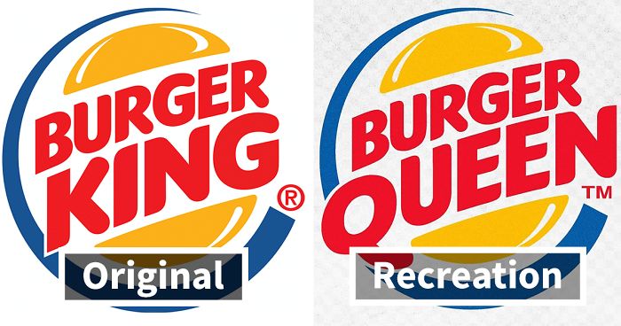
Burger King original logo

Recreations

Image credits: de2s

Image credits: de2s

Image credits: de2s

Image credits: de2s

Image credits: de2s

Image credits: de2s

Image credits: de2s
FedEx original logo

Recreations

Image credits: de2s

Image credits: de2s

Image credits: de2s

Image credits: de2s

Image credits: de2s

Image credits: de2s

Image credits: de2s
Ikea original logo

Recreations

Image credits: de2s

Image credits: de2s

Image credits: de2s

Image credits: de2s

Image credits: de2s

Image credits: de2s

Image credits: de2s
Apple original logo

Recreation

Image credits: de2s

Image credits: de2s

Image credits: de2s

Image credits: de2s

Image credits: de2s

Image credits: de2s

Image credits: de2s

Image credits: de2s
Dunkin’ Donuts original logo

Recreations

Image credits: de2s

Image credits: de2s

Image credits: de2s

Image credits: de2s

Image credits: de2s

Image credits: de2s

Image credits: de2s
Lacoste original logo

Recreations

Image credits: de2s

Image credits: de2s

Image credits: de2s

Image credits: de2s

Image credits: de2s

Image credits: de2s

Image credits: de2s
37Kviews
Share on Facebook


From a commercial point of view there's a lot of creativity but a lot of illegible letters. And forgive me for if I'm being negative and critical but if something serves a purpose(say a commercial purpose) it's not art and detracts from the term artist. This is graphic designing rather than artistry but some good work all the same.
I agree. A lot of great ideas that work like art pieces, but not in a commercial setting. Logos are designed to be easy to read and instantly recognised. Too many added details works the opposite way.
Load More Replies...I THOUGHT the apple logos looked like they had words hidden in them, but I only recognized the pattern when I'd reached the vigilance version.
I thought for sure at least onr of the Apple variations would have a worm. 😉
Load More Replies...I prefer the original logos. The modified ones just added unnecessary complexities and in some cases make them hard to read.
The reason people are saying they like the originals is because they are the ones they are most familiar with and any deviation from a well known image is jarring of a little uncomfortable.
The Burger King logo with the fries is best, IMHO. How about "Crunkin' Donuts", and have a dancing doughnut?
Apple: our main weapon is surprise. Surprise and fear. Two! Our TWO main weapons are surprise and fear. And a ruthless vigilance against third party repairs. Our three main weapons are surprise, fear, and a ruthless vigilence against third party repairers.
Why some of them look have a reminiscent of modern Cartoon Network shows. I like it
Check out Robot Chicken behind the scene on the Starbucks logo. ( https://youtu.be/L4DiZHWlZJM )

112
22