After Seeing This Map With The Actual Size Of Every Country, You’ll Never Look At The World The Same
Probably most of us are familiar with the famous saying ‘my whole life was a lie,’ and we hate to tell you that, but it most likely was when it comes to the world map as we know it. Let’s just jump ahead and say there are no conspiracy theories here. It’s just not that simple laying out a globe on a flat piece of paper as in the Mercator map that we are all so familiar with. Good thing this climate data scientist took up the task of educating the masses on country size comparison and put up a map projection that shows real sizes together with those shown in regular maps. Even though his usual routines consist of analyzing various climate data and tracking climate change, geography is something tied closely together with his field of work. And if you follow him on social media, you will notice he has a genuine concern for environment and education, constantly filling his feed with various informational posts and interesting facts. In this particular map, he marked the true objects in the darker color and put them against a regular map so you can see the difference. Take a look at each continent on the planet and one extra treat – a supposedly huge island. Scroll down to see the true sized world map for yourself!
More info: Neil Kaye
World Map With True Country Size And Shape

Image credits: Neil Kaye
North America

Image credits: Neil Kaye
Russia

Image credits: Neil Kaye
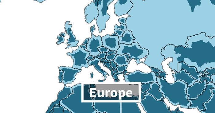
Europe And Asia

Image credits: Neil Kaye
Africa

Image credits: Neil Kaye
Antarctica

Image credits: Neil Kaye
South America

Image credits: Neil Kaye
Greenland

Image credits: Neil Kaye
Australia

Image credits: Neil Kaye
161Kviews
Share on Facebook

What a weird and uninformative article. There are many map projections, and this is just the most common one, called the Mercator projection. There is no correct way to turn a sphere into a rectangle.
Exactly. I really don't see the point of this post. It's like having discovered hot water, as we say in Italy.
Load More Replies...
When I was a kid in about the 3rd grade (1960-61) one of the cardboard globes in our classroom got damaged and was going to be discarded. I took it home and cut out the countries as best I could (thick cardboard, kids' scissors) and learned the same thing. I find it hard to fathom that anyone who has completed elementary school would be surprised to learn that the Mercator Projection grossly distorted the dimensions of nations.
Well, I know people of higher education actually believing the earth is flat!
Load More Replies...Am I missing some obvious information. Which colour is the true representation and which colour is the commonly understood representation. Is it saying they are bigger or smaller? It's not clear at all!
The darker colour shows the true proportions, the pale colour shows how they're represented on our world maps.
Load More Replies...I found this to be fascinating. Intellectually, I knew Mercator projection distorted perceived size, but I was not aware that the distortion was so dramatic as one neared the poles. Greenland is 1/10 the size it appears on maps!
Agreed! Also, I don't remember satellite images being that much different. Course the Earth being flat it's all immaterial.
Load More Replies...Real question, not snark. Isn't this just the exact same land masses scaled up to fit a globe rather than laying a map flat?
It's the other way round I think, landmasses are scaled up to fit a flat map.
Load More Replies...Waaaaaw, I got a lot wiser from this article. I will definately no longer look at a map in the same way. Not only is the earth flat, but countries have clearly shrunk too!!! I am utterly amazed.
Great. Now I'll always think of Russia as an angry penguin dive bombing Europe.
Because Africa hugs the equator, it experiences the least distortion. The distortion increases towards the poles.
Load More Replies...So the USA is the exact same size as CANADA? Because this is making it look like that
If you want to see the actual size of countries....buy a globe. Of course a flat map of a ball is distorted.
If you want to see the best (correct) view of the size relationships between countries... look at a globe.
Dark blue. The light just shows how distorted they are from the map trying to flatten a globe.
Load More Replies...I feel like using Mercator projection for the map is cheating. Mercator is useful for wayfinding, hence why Google Maps uses it. But zooming out gives a weirdly distorted map. Most overview maps use different projections. I'm not used to seeing a Greenland thát big on a map, or such a large Antarctica. This makes the difference way bigger
Google maps uses a globe these days. Try zooming out.
Load More Replies...Fascinating. I knew of the distortion, but this is a great way to bring it home.
This is totally inaccurate. Alaska is not that small at all. It literally covers almost half of the USA.
This makes me nervous 😬, seeing how much land is left and retreating... Scary as fk
Maps distort for a reason. Different projections serve different purposes. The Mercator projection is fabulous for navigation by sea.
it is hard to stretch a cut-out from a sphere and put it flat on a 2 dimensional surface...interesting article & perspectives...
I was going to upvote this, but noticed they completely left New Zealand off the individual section bits. They showed it in the main map, but it should have been with Australia as "Oceania". Y'all -- New Zealand is a thing. It's really there. Stop leaving it off your maps. (On the other hand, maybe they enjoy being left alone down there at the bottom of the world to live their own lives ... hmm, one more reason to want to move there!)
It might be the single most amazing secret of New Zealand, it's insane disappearing tricks 😁👍
Load More Replies...Google does. It's a Mercator projection that preserves direction but not area. The dark blue is an equal-area projection but it doesn't work well for maps of the whole world because the meridians aren't parallel. All map projections are a compromise (this is a day-one lesson in geography undergraduate programs).
Load More Replies...Finally found the place for comments...WHAT THE HECK ARE WE LOOKING AT?? Which is supposed to be the actual and which the false? And how ate they then supposed to fit together in a map or globe?? ..Let's see THAT! Where is the starting point of dimension that was measured? By what? (The space station?
Even the "correct" sized ones aren't correct. They're 2D projections of a 3D surface, and they're just using two different kinds of projections. A globe is the most accurate, except that the elevation is always scaled up on a globe, otherwise the globe would appear essentially flat.
what is with BP, another article that doesn't make any sense. this panda is going to give them time to get their act together. it's getting rather confusing. Signing out until you get your act together.
What doesn't make any sense about it? It made perfect sense to me
Load More Replies...The last boring bs straw. This site isn’t interesting or funny as it once was.
Dummys, dummys, dummys. How do you take a sphere and project it on a plane?......With imperfections. Various projections are used for different purposes...it is not a plot idiots It is geography morons!!!!!
Where's Washington state I wonder and what happened to all the people living there?
USA=2,800 miles east to west coast. Canada=5,500 miles. How is this new map accurate?
I suppose you could reference each countries miles against the miles of the circumference of the globe. And yes while it would be hard to get an accurate map of the globe you could make additional spaces or slits to account for the rised portions of the globe. Imagine you cut the skin off of a base ball and lay it flat on the table, you would still have raised portions but if you made additional slits then it would lay flat. Or you could do the old one long orange peal trick and lay them in u shapes next to each other with slits on the raised portions to account for any unrepresented rises on a 2d medium.
Load More Replies...These kind of posts and the falt earthers should stop. First nothing in this post is useful, second it's not even true, third.. stop, just stop.
Wait, how is Russia so small? Isn't Russia the largest country by land mass? This article is just odd and seems borderline flat earther or something.
Because in the first place, 'The whitest' the places are the more they were blown up in the Mercator projection. Get smart and don't bring your racist s**t here. If you are dumb to understand the article, then check out some fashion blogs instead. And guess what, f**k you pig!
Load More Replies...What a weird and uninformative article. There are many map projections, and this is just the most common one, called the Mercator projection. There is no correct way to turn a sphere into a rectangle.
Exactly. I really don't see the point of this post. It's like having discovered hot water, as we say in Italy.
Load More Replies...When I was a kid in about the 3rd grade (1960-61) one of the cardboard globes in our classroom got damaged and was going to be discarded. I took it home and cut out the countries as best I could (thick cardboard, kids' scissors) and learned the same thing. I find it hard to fathom that anyone who has completed elementary school would be surprised to learn that the Mercator Projection grossly distorted the dimensions of nations.
Well, I know people of higher education actually believing the earth is flat!
Load More Replies...Am I missing some obvious information. Which colour is the true representation and which colour is the commonly understood representation. Is it saying they are bigger or smaller? It's not clear at all!
The darker colour shows the true proportions, the pale colour shows how they're represented on our world maps.
Load More Replies...I found this to be fascinating. Intellectually, I knew Mercator projection distorted perceived size, but I was not aware that the distortion was so dramatic as one neared the poles. Greenland is 1/10 the size it appears on maps!
Agreed! Also, I don't remember satellite images being that much different. Course the Earth being flat it's all immaterial.
Load More Replies...Real question, not snark. Isn't this just the exact same land masses scaled up to fit a globe rather than laying a map flat?
It's the other way round I think, landmasses are scaled up to fit a flat map.
Load More Replies...Waaaaaw, I got a lot wiser from this article. I will definately no longer look at a map in the same way. Not only is the earth flat, but countries have clearly shrunk too!!! I am utterly amazed.
Great. Now I'll always think of Russia as an angry penguin dive bombing Europe.
Because Africa hugs the equator, it experiences the least distortion. The distortion increases towards the poles.
Load More Replies...So the USA is the exact same size as CANADA? Because this is making it look like that
If you want to see the actual size of countries....buy a globe. Of course a flat map of a ball is distorted.
If you want to see the best (correct) view of the size relationships between countries... look at a globe.
Dark blue. The light just shows how distorted they are from the map trying to flatten a globe.
Load More Replies...I feel like using Mercator projection for the map is cheating. Mercator is useful for wayfinding, hence why Google Maps uses it. But zooming out gives a weirdly distorted map. Most overview maps use different projections. I'm not used to seeing a Greenland thát big on a map, or such a large Antarctica. This makes the difference way bigger
Google maps uses a globe these days. Try zooming out.
Load More Replies...Fascinating. I knew of the distortion, but this is a great way to bring it home.
This is totally inaccurate. Alaska is not that small at all. It literally covers almost half of the USA.
This makes me nervous 😬, seeing how much land is left and retreating... Scary as fk
Maps distort for a reason. Different projections serve different purposes. The Mercator projection is fabulous for navigation by sea.
it is hard to stretch a cut-out from a sphere and put it flat on a 2 dimensional surface...interesting article & perspectives...
I was going to upvote this, but noticed they completely left New Zealand off the individual section bits. They showed it in the main map, but it should have been with Australia as "Oceania". Y'all -- New Zealand is a thing. It's really there. Stop leaving it off your maps. (On the other hand, maybe they enjoy being left alone down there at the bottom of the world to live their own lives ... hmm, one more reason to want to move there!)
It might be the single most amazing secret of New Zealand, it's insane disappearing tricks 😁👍
Load More Replies...Google does. It's a Mercator projection that preserves direction but not area. The dark blue is an equal-area projection but it doesn't work well for maps of the whole world because the meridians aren't parallel. All map projections are a compromise (this is a day-one lesson in geography undergraduate programs).
Load More Replies...Finally found the place for comments...WHAT THE HECK ARE WE LOOKING AT?? Which is supposed to be the actual and which the false? And how ate they then supposed to fit together in a map or globe?? ..Let's see THAT! Where is the starting point of dimension that was measured? By what? (The space station?
Even the "correct" sized ones aren't correct. They're 2D projections of a 3D surface, and they're just using two different kinds of projections. A globe is the most accurate, except that the elevation is always scaled up on a globe, otherwise the globe would appear essentially flat.
what is with BP, another article that doesn't make any sense. this panda is going to give them time to get their act together. it's getting rather confusing. Signing out until you get your act together.
What doesn't make any sense about it? It made perfect sense to me
Load More Replies...The last boring bs straw. This site isn’t interesting or funny as it once was.
Dummys, dummys, dummys. How do you take a sphere and project it on a plane?......With imperfections. Various projections are used for different purposes...it is not a plot idiots It is geography morons!!!!!
Where's Washington state I wonder and what happened to all the people living there?
USA=2,800 miles east to west coast. Canada=5,500 miles. How is this new map accurate?
I suppose you could reference each countries miles against the miles of the circumference of the globe. And yes while it would be hard to get an accurate map of the globe you could make additional spaces or slits to account for the rised portions of the globe. Imagine you cut the skin off of a base ball and lay it flat on the table, you would still have raised portions but if you made additional slits then it would lay flat. Or you could do the old one long orange peal trick and lay them in u shapes next to each other with slits on the raised portions to account for any unrepresented rises on a 2d medium.
Load More Replies...These kind of posts and the falt earthers should stop. First nothing in this post is useful, second it's not even true, third.. stop, just stop.
Wait, how is Russia so small? Isn't Russia the largest country by land mass? This article is just odd and seems borderline flat earther or something.
Because in the first place, 'The whitest' the places are the more they were blown up in the Mercator projection. Get smart and don't bring your racist s**t here. If you are dumb to understand the article, then check out some fashion blogs instead. And guess what, f**k you pig!
Load More Replies...
134
97